Imaginity is a global marketing agency that provides branding, packaging design, and marketing consultancy
Turning Visions into Reality: Our Global Influence in Branding, Packaging Design, and Brand Communication
![]()
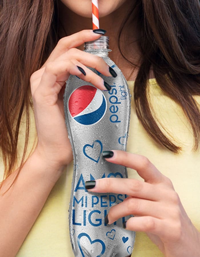
Pepsi Light. Packaging Design
largecenter Client: Pepsi Light Country: Mexico Task: Packaging Design Pepsi hired us to do the packaging design for the Pepsi Light special edition, associated with the […]
Mercado Libre. Branding, Brand Consulting
fullcenter Client: Mercado Libre Country: Latam Task: Branding, Brand Consulting Mercado Libre hired us to create their new brand image, in order to update and modernize […]
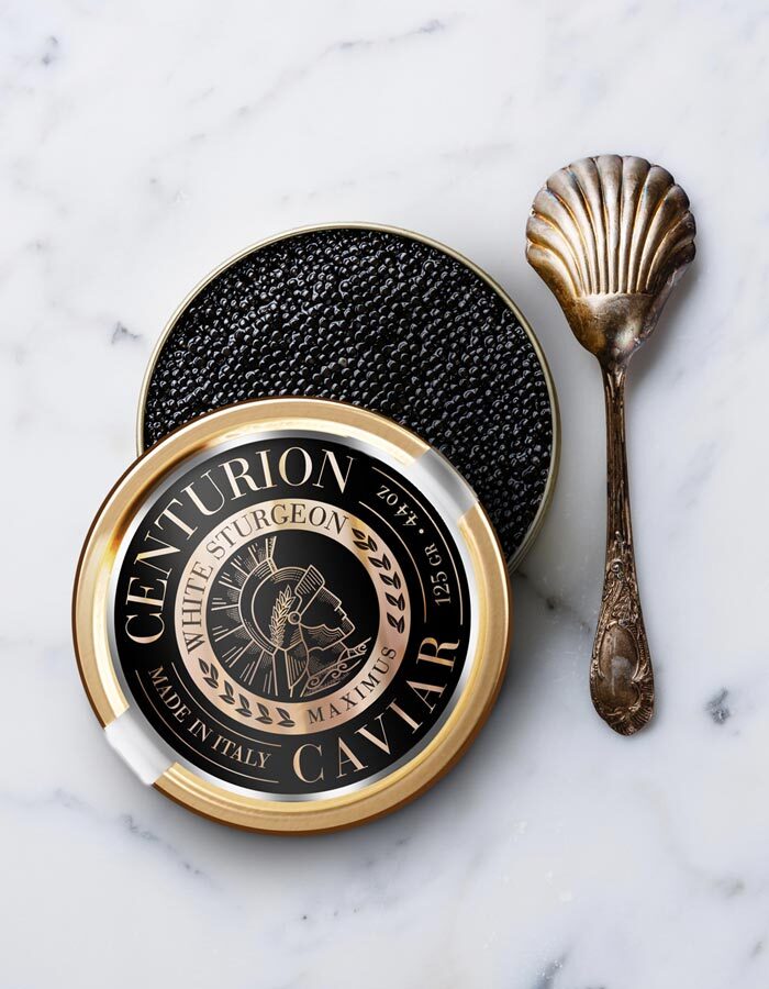
Centurion Caviar. Branding, Packaging Design
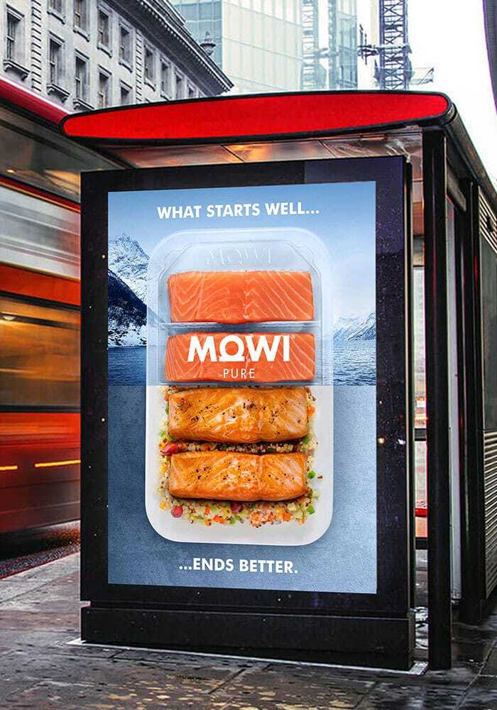
full Client: Centurion Caviar Country: USA Task: Branding and Packaging Design The brand Centurion Caviar called us to work on the Global Launch of its brand […]Mowi. Brand activation
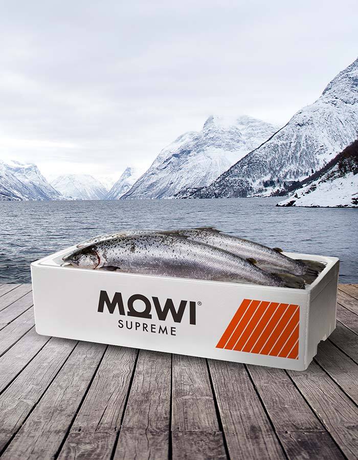
fullcenter Cliente: Mowi País: Noruega Tarea: Activación de marca, OOHH Mowi nos convocó para realizar las gráficas outdoor de los distintos cortes de salmón en los que […]
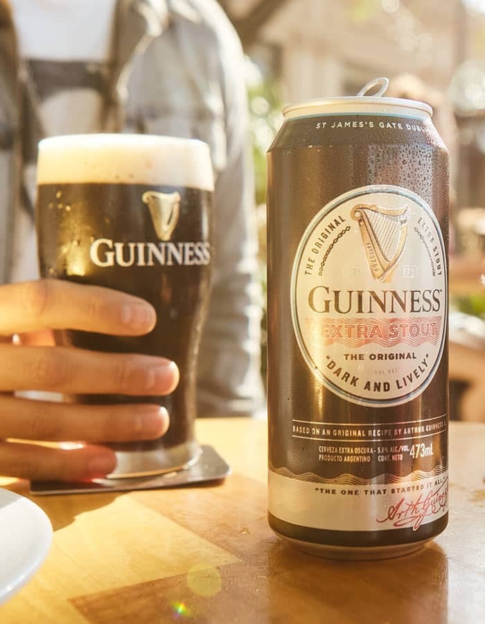
Guinness Extra Stout. Six Nations Rugby Championship Limited Edition. Can. Packaging Design
fullcenter Client: Guinness. 6 Nations Limited Edition Country: Argentina Task: Packaging Design Can and six pack packaging design for the limited Edition Guinness 6 Nations Rugby […]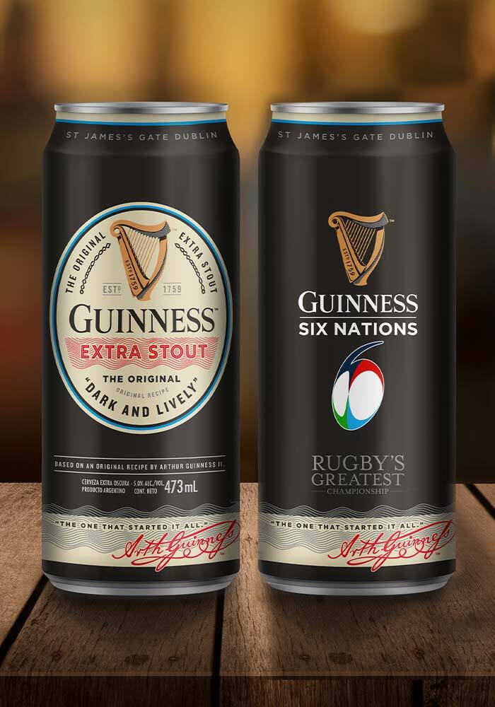
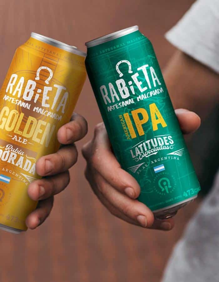
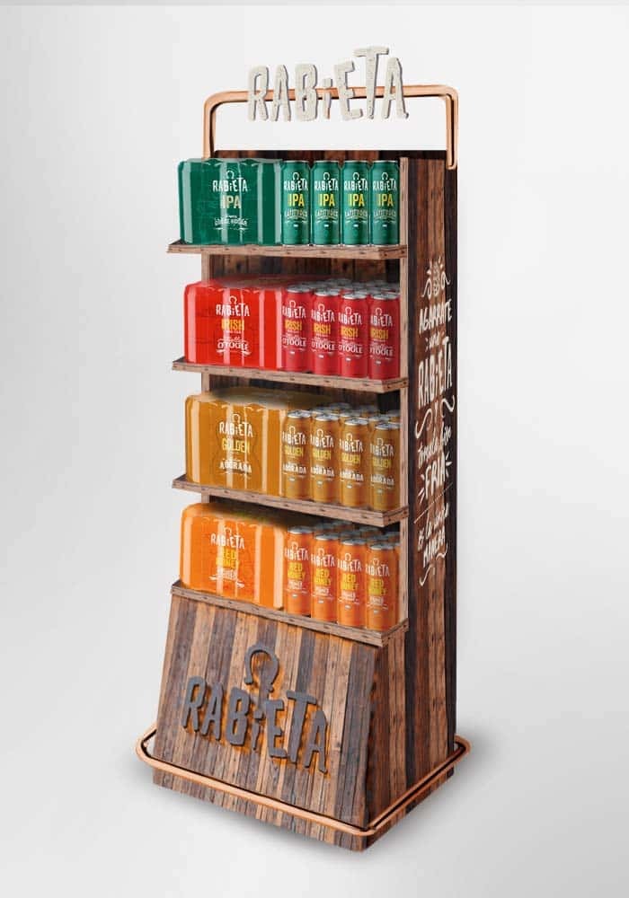
Rabieta. Packaging Design
fullcenter Client: Rabieta Country: Argentina Task: Packaging Design Rabieta assigned us the project of working on the adaptation of their visual identity for the 473 individual […]Sol Mix. Packaging Design
fullcenter Client: Sol Beer. Packaging Design Country: Chile Task: Packaging Design A unique mix of beer and cocktails. Sol launches its new line and calls on […]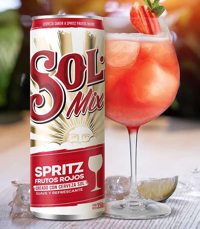
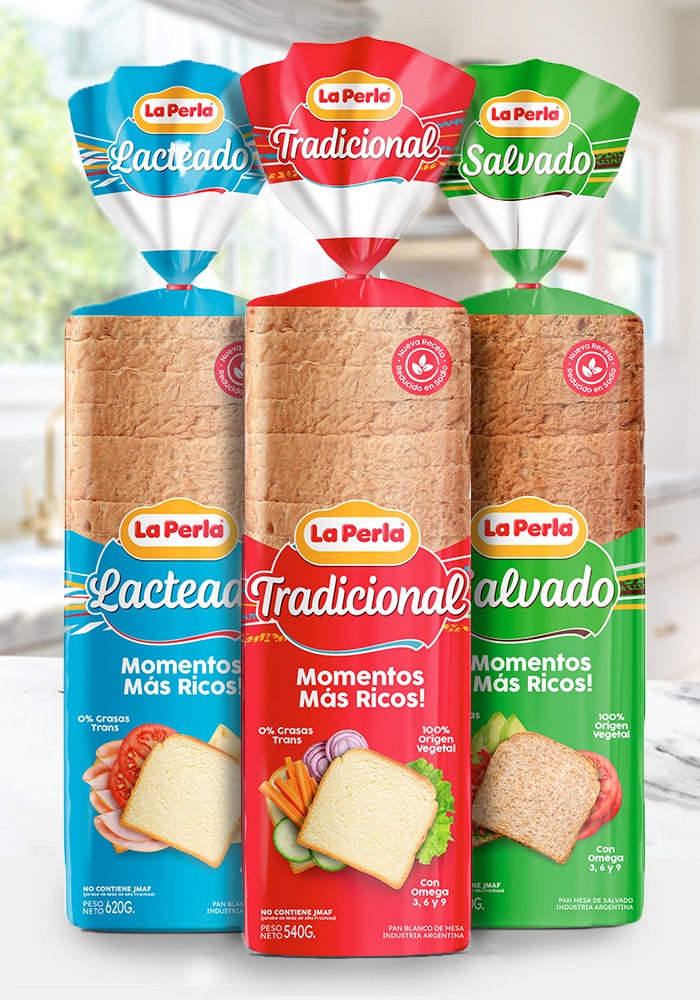
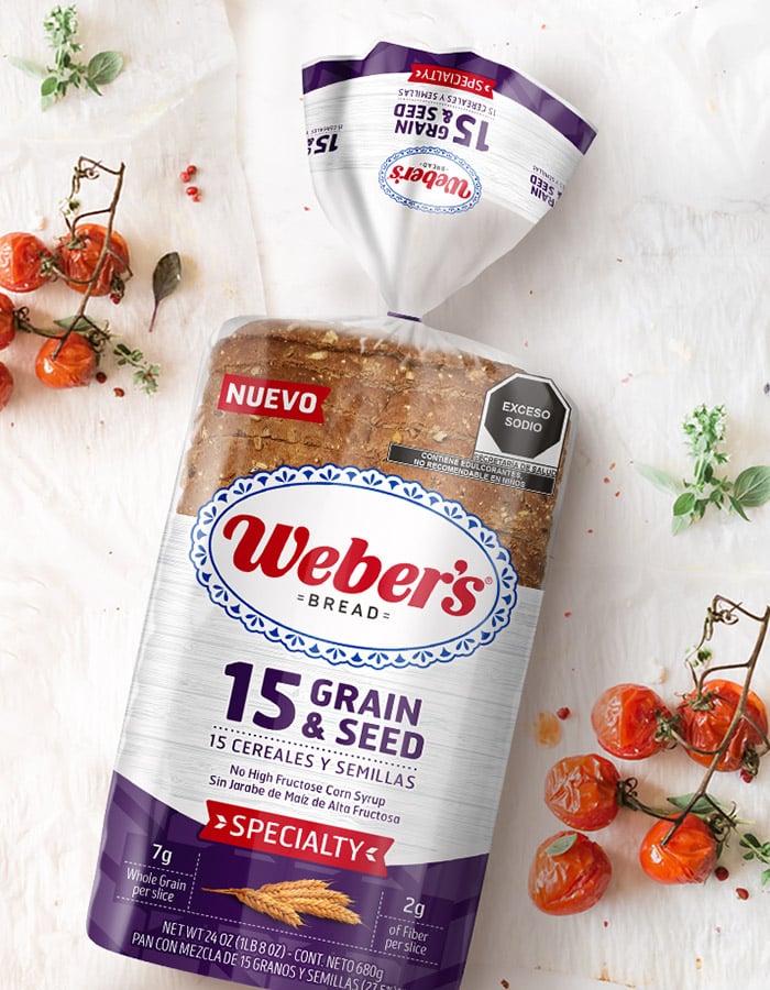
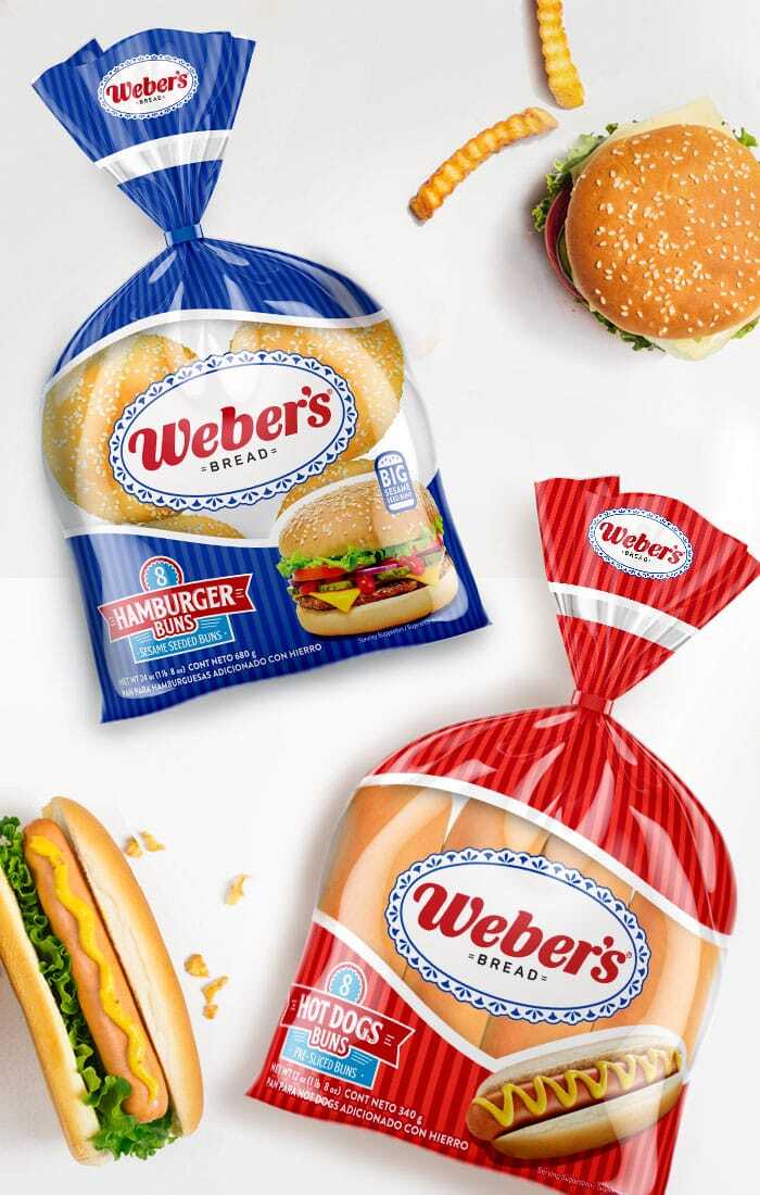
Weber’s. Naturals Bread. Naming. Branding. Packaging Design
fullcenter Customer: Weber´s Country: México Task: Naming. Branding. Packaging Design. We collaborated with Weber\’s as a packaging design agency when they ventured into expanding their product […]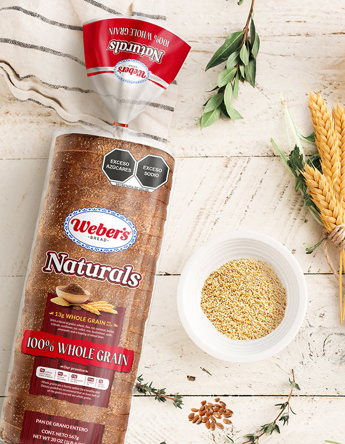
Bagóvit. Product Design
fullcenter Client: Bagóvit Country: Argentina Task: Product design Bagóvit, the Personal Care brand of Bagó Group, is now expanding into Hair Care. And we were asked […]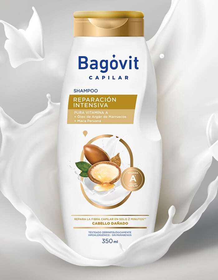
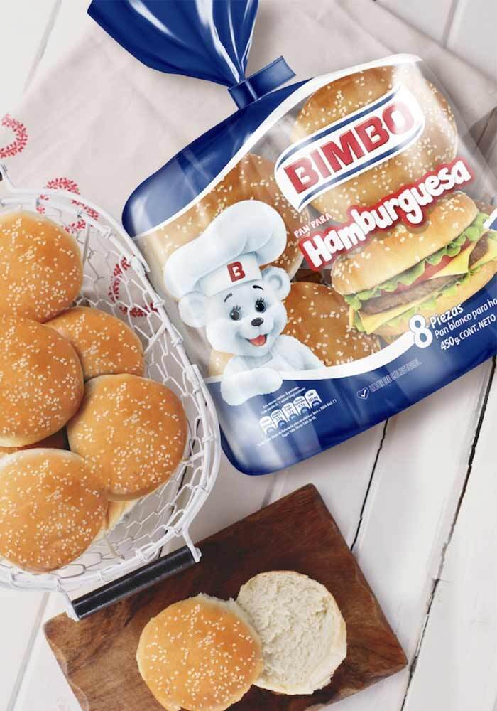
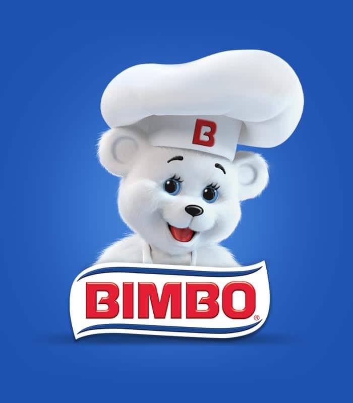
Bimbo. Branding
fullcenter Client: Bimbo Country: Global Task: Branding Our client Bimbo, brought the challenge: to design an evolution of the Bimbo brand logo.Our proposal was to “give […]
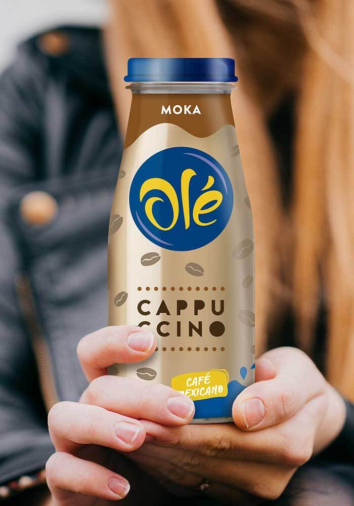
Cafe Ole. Packaging Design, Branding
full Cliente: Café olé País: México Tarea: Diseño de Packaging, Branding Un nuevo deisño de packaging y branding que evolucionan junto al target. Café olé se renovó, manteniendo […]Guinness. Can. Packaging Design
fullcenter Client: Guinness Country: Argentina Task: Packaging Design Diageo, the multinational premium beverage and beer company, signed an agreement with Rabieta, an Argentine craft beer company, […]Weber’s. Bagels. Packaging Design
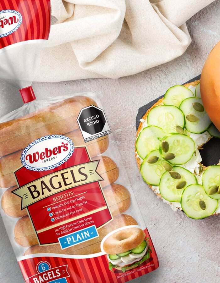
fullcenter Customer: Weber’s Country: Mexico Task: Packaging Design We had the privilege of working, as a design agency, on the packaging design for the highly-anticipated launch […]Nestlé. Fruit Delights. Packaging Design
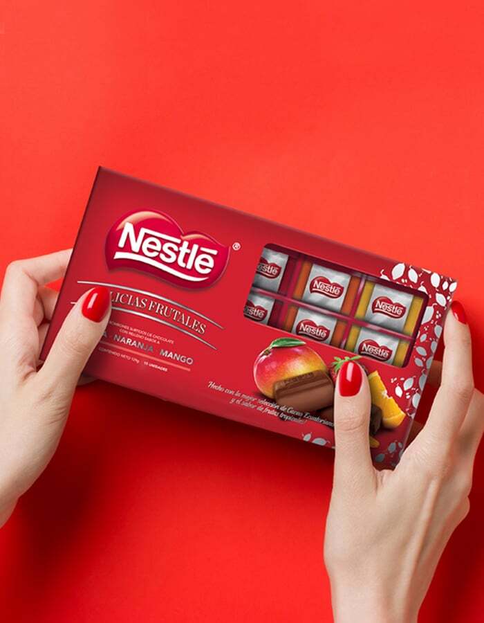
fullcenter Client: Nestlé Country: Colombia Task: Product Design Nestlé hired us to develop the packaging design for the limited edition of its new product Fruit Delights. […]Cristal Beer Bottle. Packaging Design
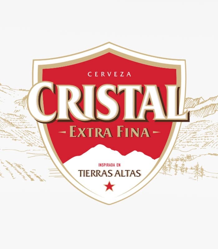
fullcenter Client: Heineken Panamá Country: Panamá Task: Packaging Design We have embarked on a packaging redesign project for the Cristal beer brand, aiming to establish a […]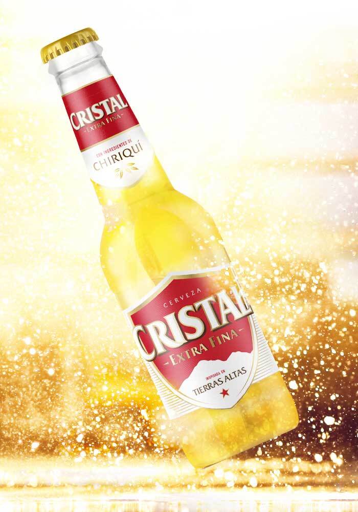
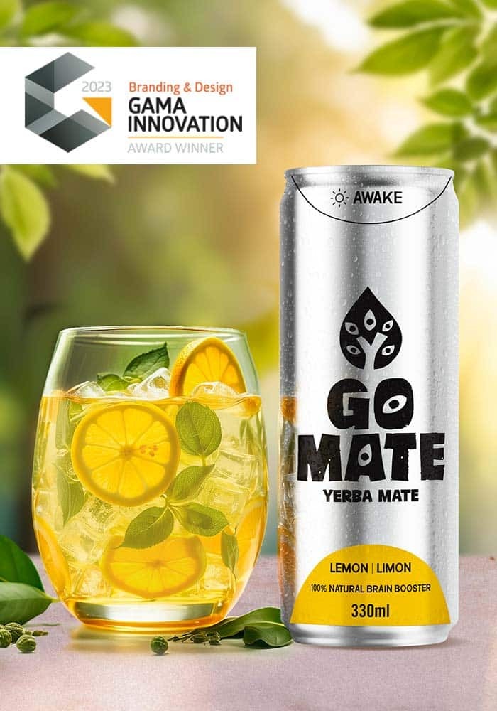
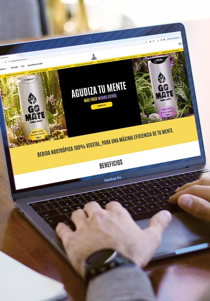
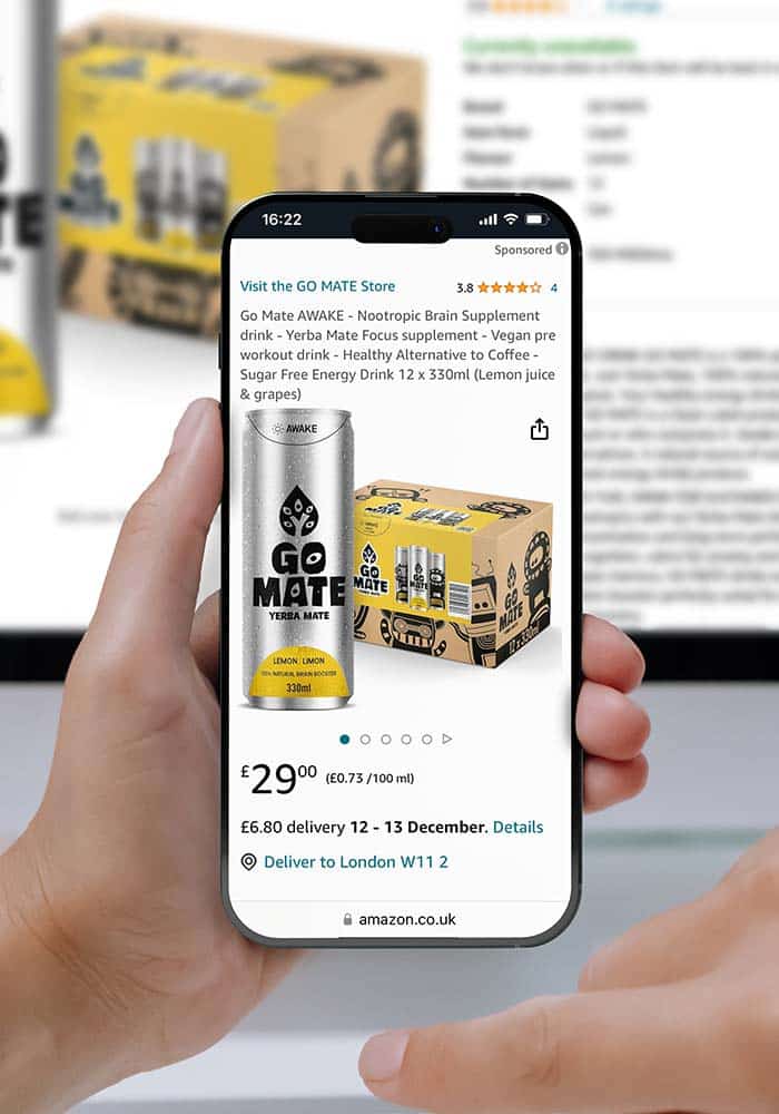
Go Mate. Web design
full Client: Go Mate web design Country: England Task: Packaging Design We work on design and strategy of communication of the Go Mate website. We think […]La Perla Pre Pizza. Packaging Design
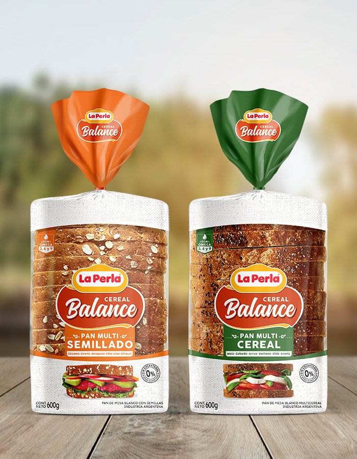
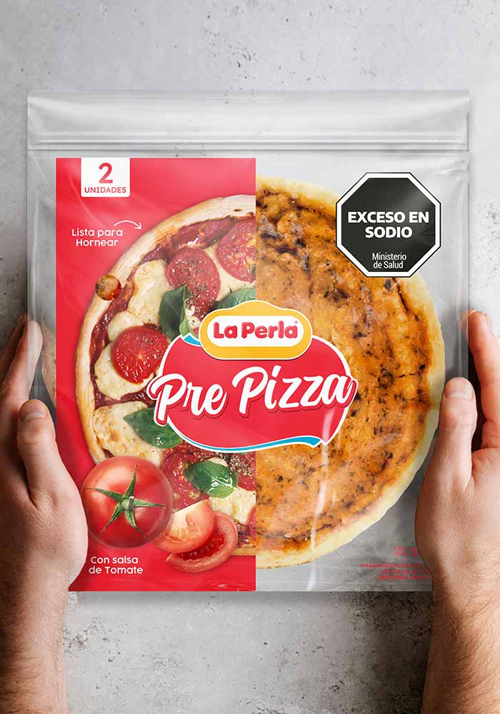
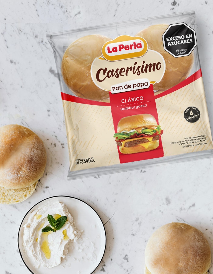
fullcenter Client: La Perla Pre Pizza Country: Argentina Task: Packaging Design We worked on the packaging redesign of Pre pizza La Perla, with the aim of […]La Perla Redonditas. Packaging Design
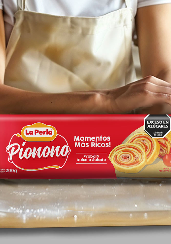
fullcenter Client: La Perla Redonditas Country: Argentina Task: Packaging Design We worked on redesigning the packaging of Redonditas La Perla, with the aim of modernizing the […]Bagó, Dioxaflex. Packaging Design
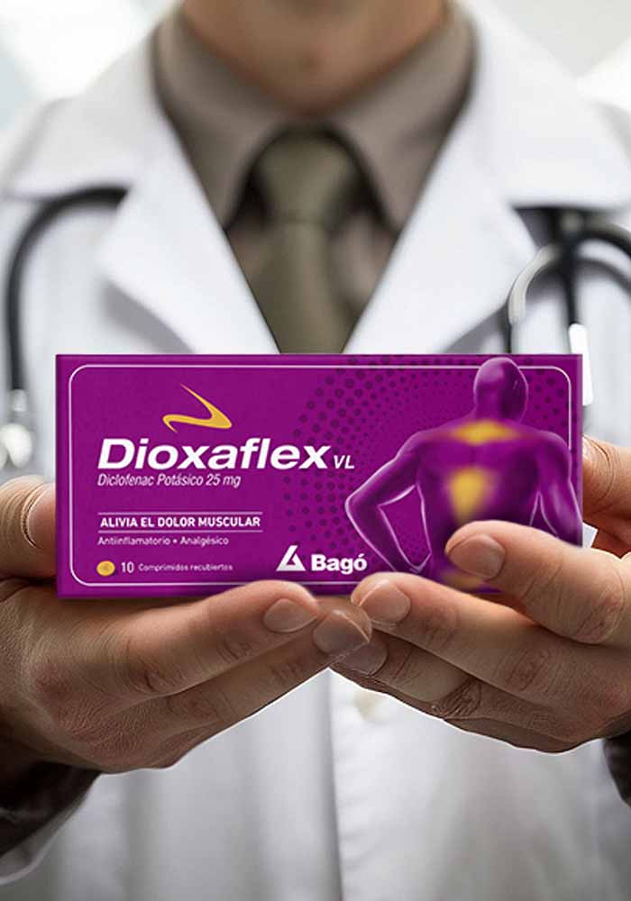
fullcenter Client: Bagó. Dioxaflex Country: Argentina Task: Packaging Design The challenge of the project was to design the packaging version of Dioxaflex within the world of […]Go Mate. E-commerce
fullcenter Client: Go Mate. Web, E-commerce Country: UK Task: Web. E-commerce We worked with our client Go Mate creating the designs and building the communication for […]Rabieta Craft Beer. Bottle & Packaging Design
fullcenter Client: Rabieta Country: Argentina Task: Bottle & Packaging Design We worked together with our client Rabieta on the launch of their Craft Beer to the […]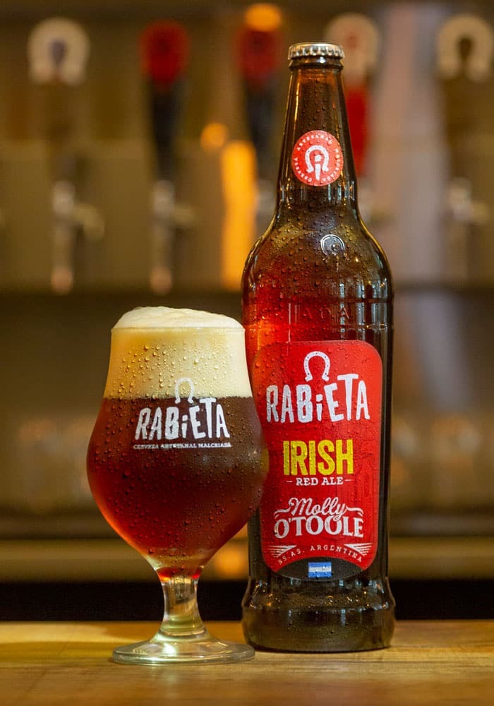
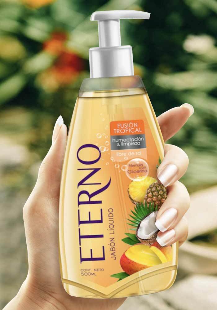
Eterno. Packaging Design, Product Design
fullcenter Cliente: Jabonería Wilson País: Ecuador Tarea: Diseño de Packaging, Diseño de Producto Jabonería Wilson nos convocó para trabajar en el diseño de morfología de su envase […]Caladryl. Brand activation, In Store
fullcenter Client: Caladryl Country: Argentina Task: Brand activation We worked on brand activation and building communication for the new intensive care line of the Caladryl brand. […]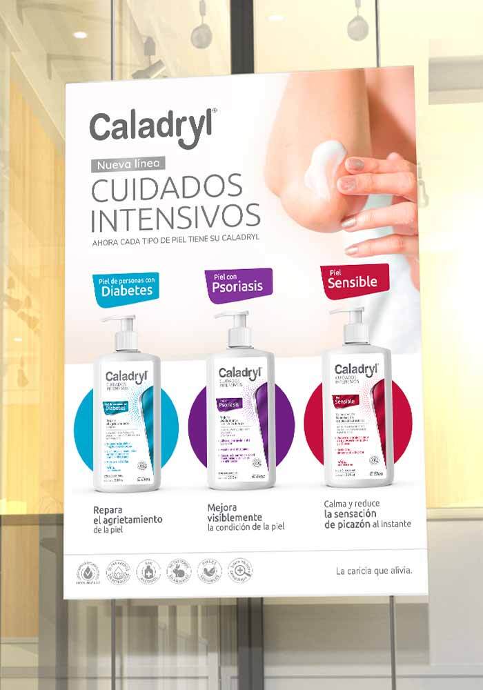
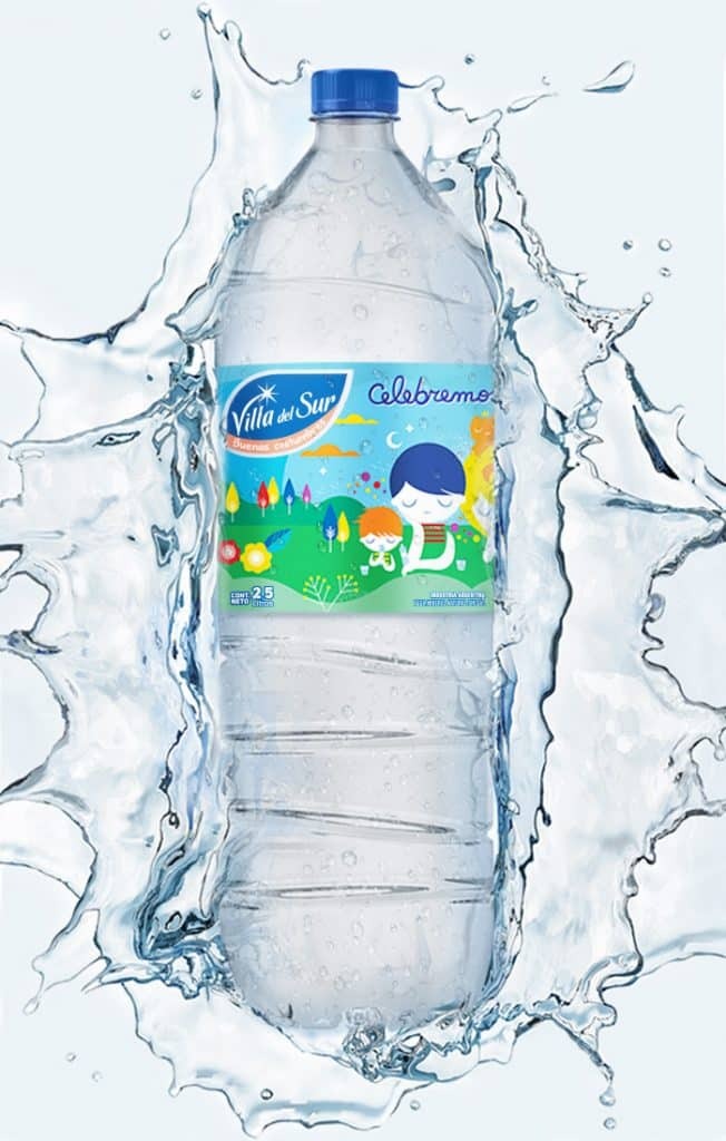
Villa del Sur. Artist Edition. Packaging Design
full Client: Villa del Sur Country: Argentina Task: Packaging Design Villa del Sur Mineral Water, Limited Edition: Celebrate Family with Water and Color. The objective: to […]
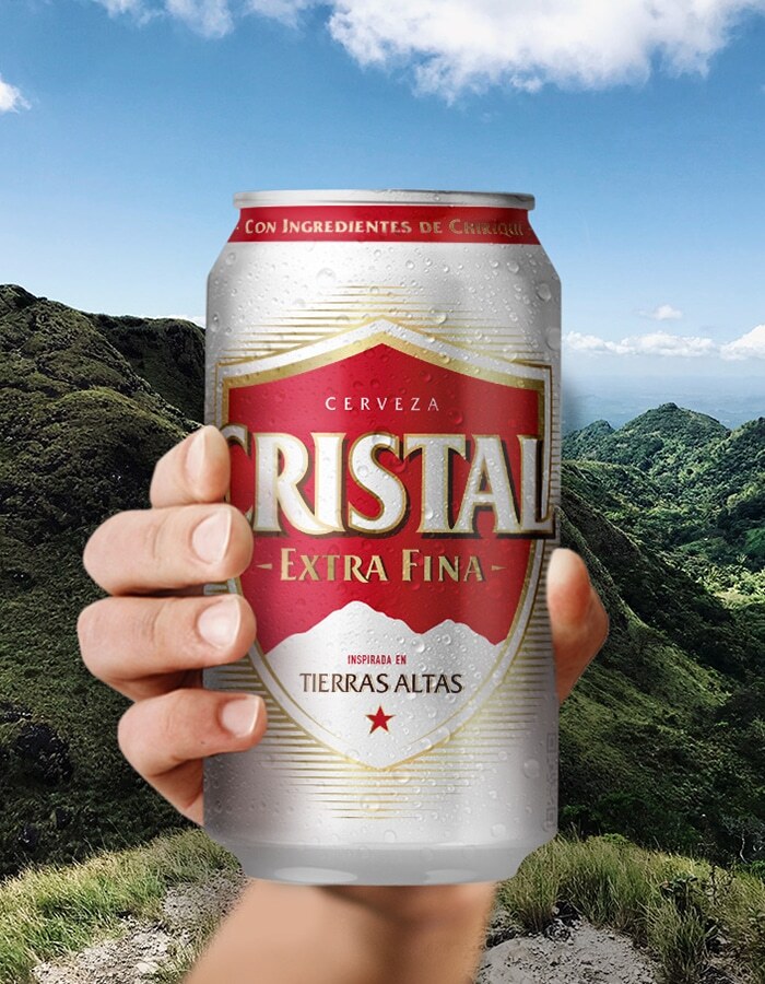
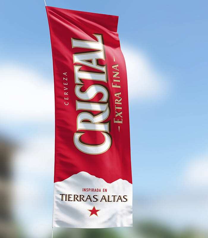
Cristal. Can and Multipacks Packaging Design
full Client: Heineken Panamá Country: Panamá Task: Packaging Design We redesigned the packaging for the Cristal brand: a 12 oz. can, and its multipacks: the 6-pack […]Sugerencias del Chef. Packaging Design, Branding
fullcenter Client: Sigma Alimentos, Sugerencias del Chef Country: Mexico Task: Packaging Design, Branding We worked on the new product line “Sugerencias del Chef”, a brand that […]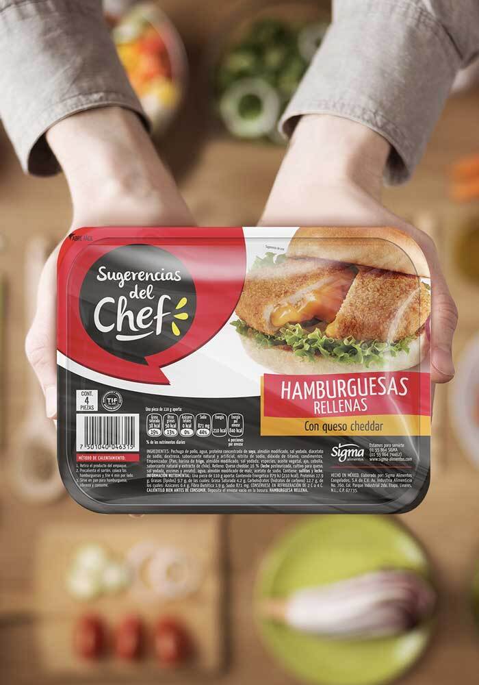
Café Olé. Special Editions. Packaging design
fullcenter Client: Café Ole Country: Mexico Task: Packaging Design Special edition packaging design for Café Olé, communicating and reinforcing the concept of mexican coffee. All of […]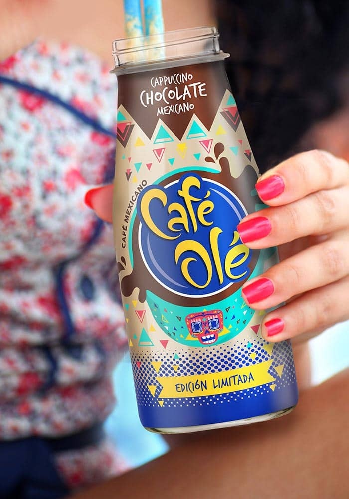
Deep River Snacks. Zesty Lime, Chimichurri. Packaging Design
fullcenter Cliente: Deep River Snacks País: EE.UU. Tarea: Branding, Diseño de Packaging Nos convocaron para el lanzamiento de dos nuevos sabores “Zesty Lime” y “Chimichurri” de papas […]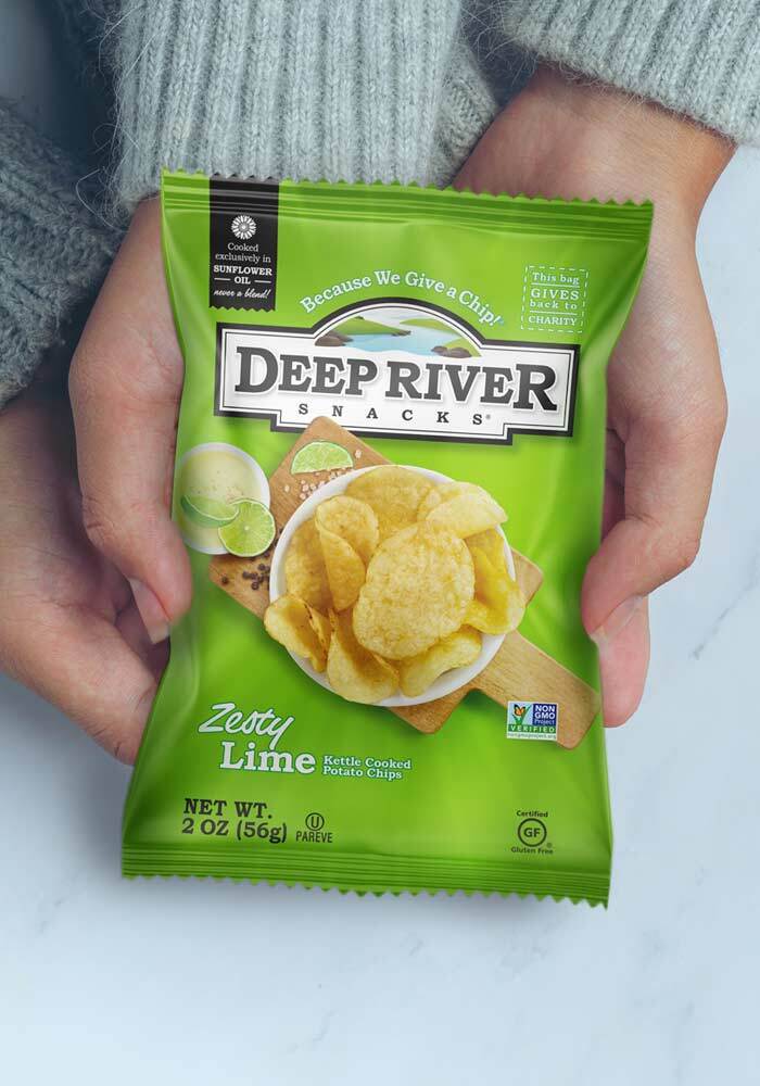
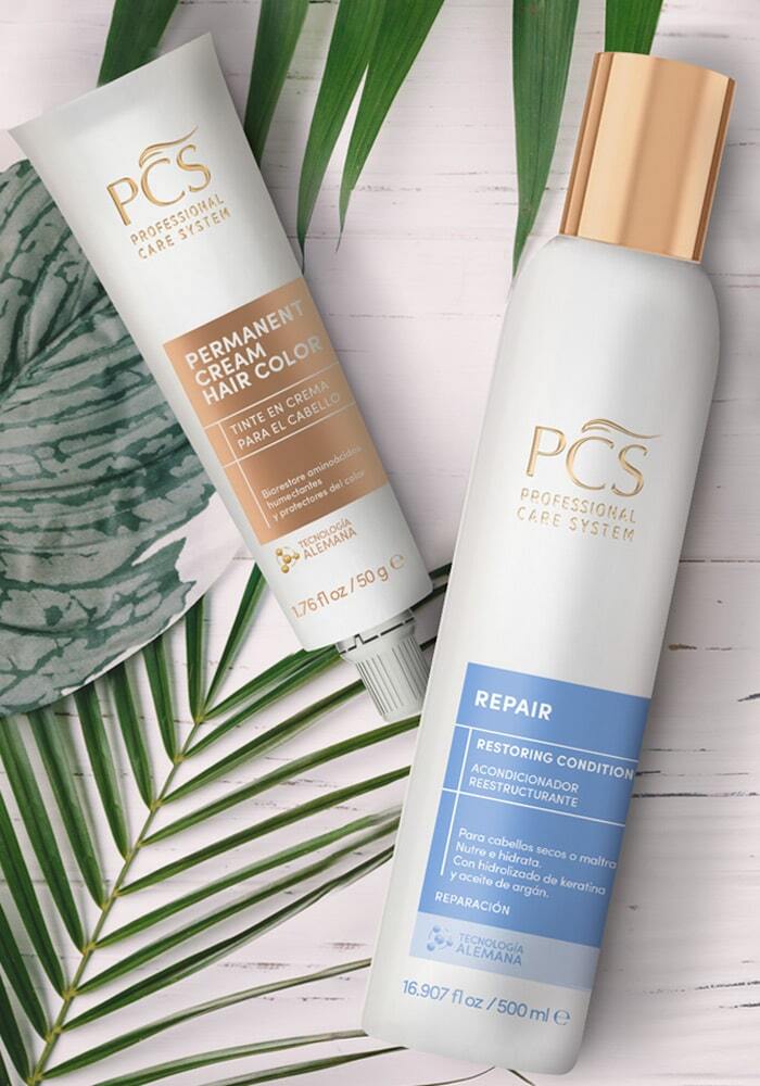
PCS. Branding, Packaging Design
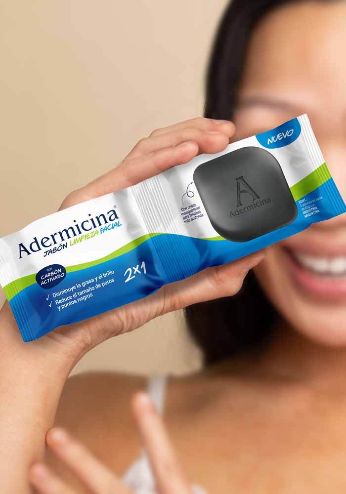
full Cliente: PCS País: Ecuador Tarea: Branding & Diseño de Packaging La línea de belleza capilar profesional PCS – Professional Care System, buscaba reinventar y actualizar […]Adermicina. Packaging Design
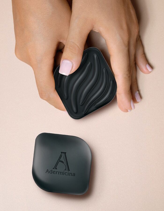
fullcenter Customer: Adermicina Country: Argentina Task: Packaging design We worked on the identity of the packaging design for the new facial cleansing soap, especially for acne, […]Kotex Liners. Product Design
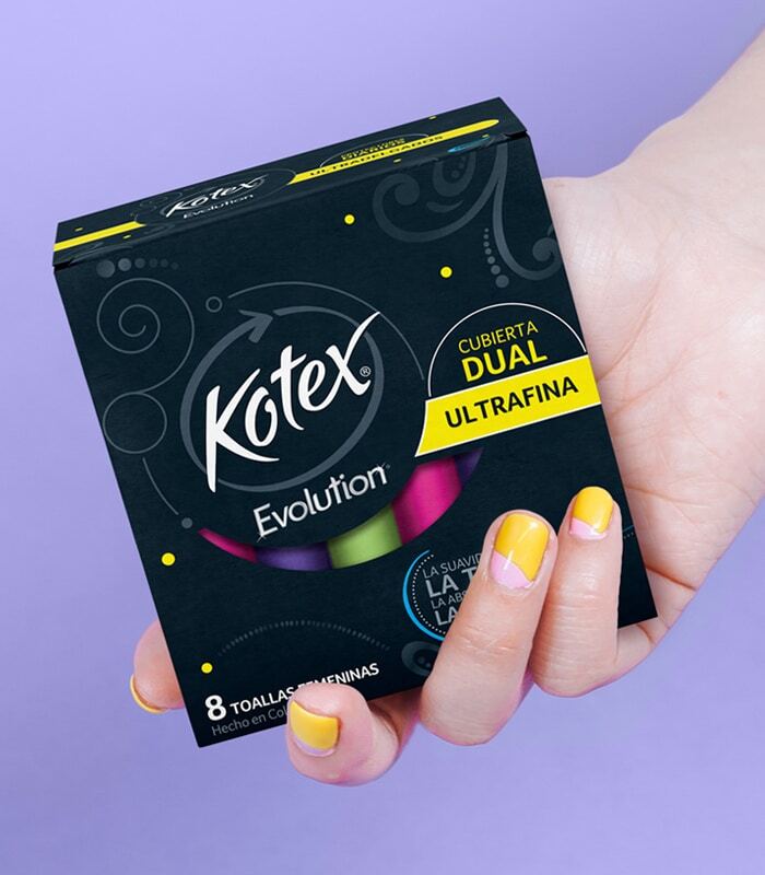
fullcenter Customer: Kotex, Kimberly Clark Country: Latin America Task: Product Design We worked together with our client Kimberly Clark on the product design of its new […]Colombina Snacky. Packaging Design
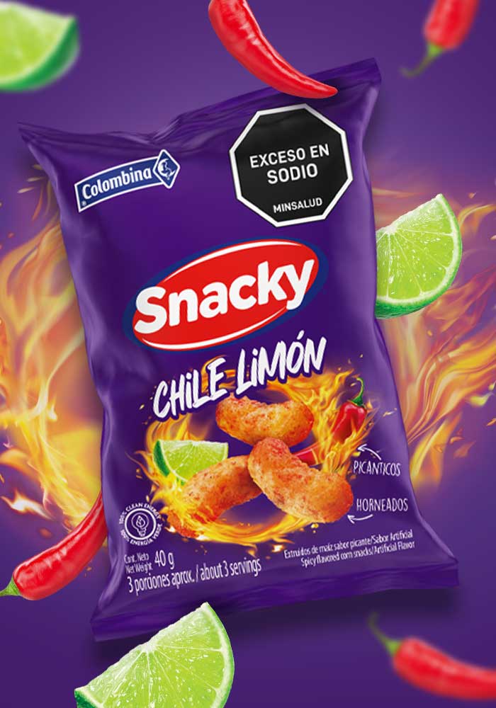
fullcenter Customer: Colombina, Snacky Country: Colombia Task: Packaging Design We redesigned the packaging line of the Colombina Snacky brand snacks, adding a new flavor, with the […]Keller’s Creamery. Web Design
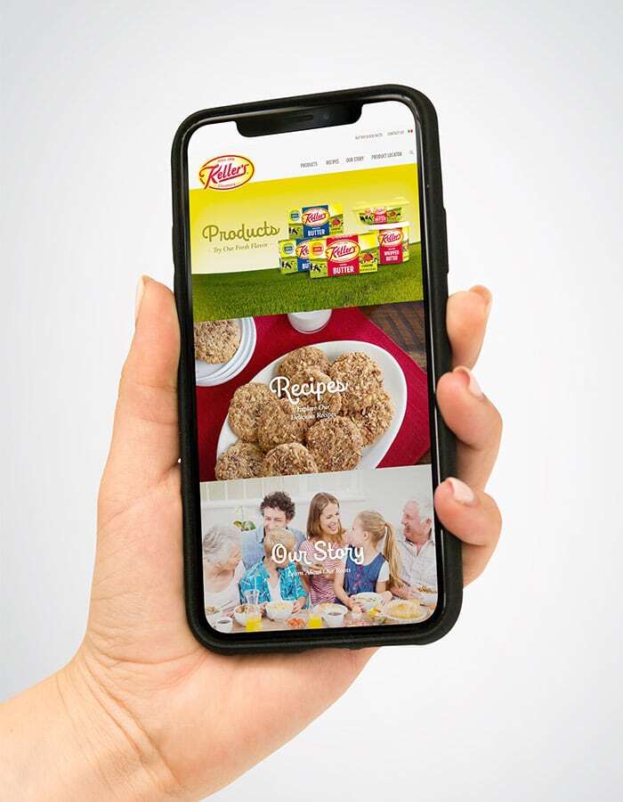
fullcenter Client: Keller\’s Creamery Country: USA Task: Web Design Keller’s is a Regional well-known brand. Our client needed an updated digital presence and we helped the […]Wise Snacks, Ridgies. Packaging Design
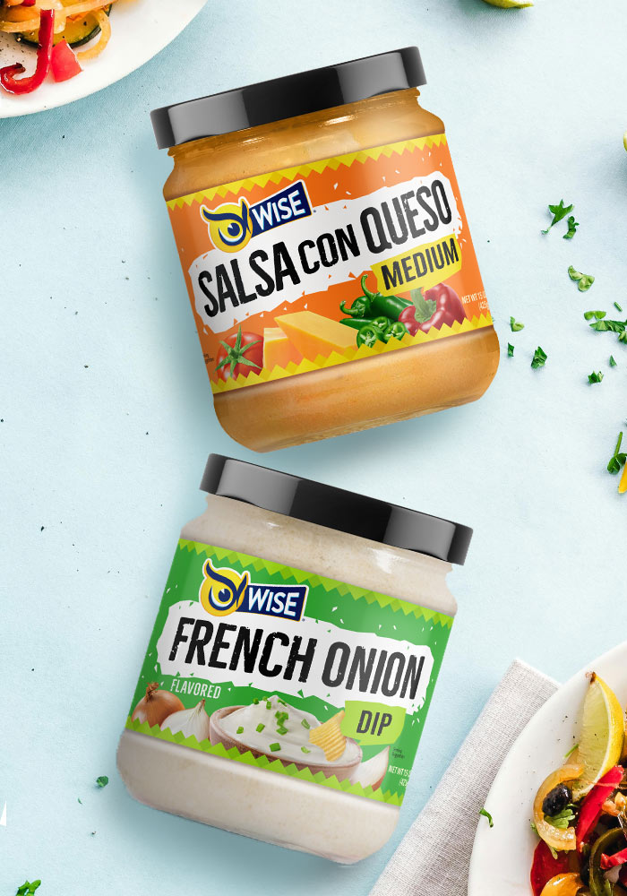
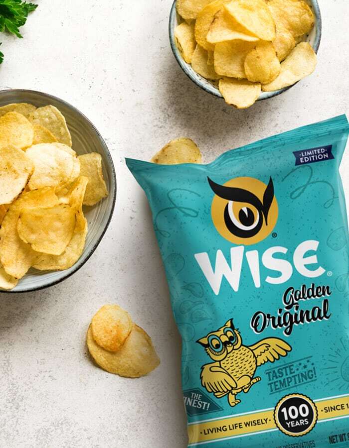
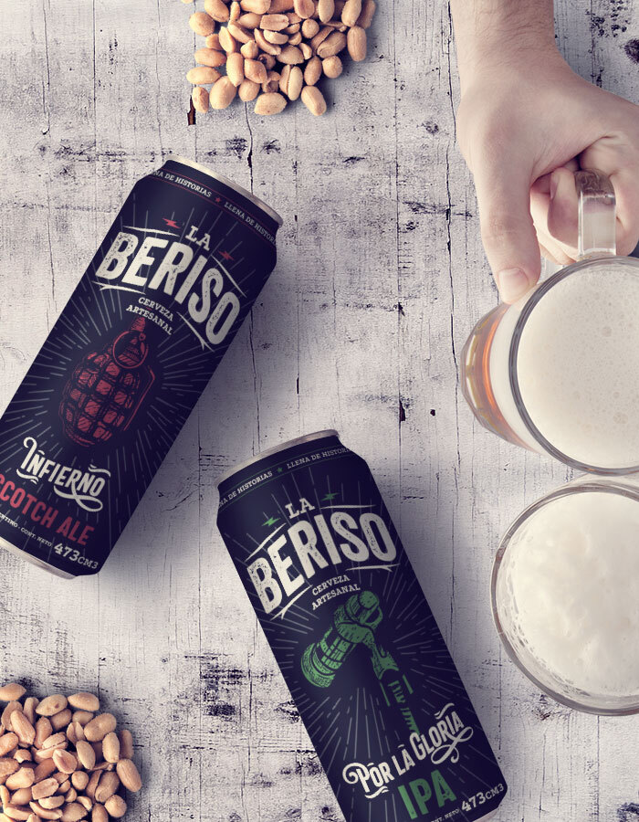
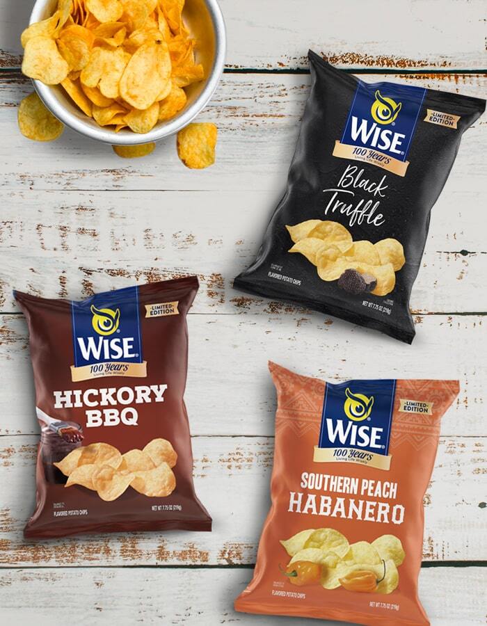
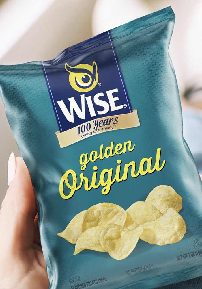
full Client: Wise Country: USA Task: Packaging Design Our client Wise Snacks called us to work on the redesign of their Ridges product. We design maintaining […]La Beriso Beer. Packaging Design
fullcenter Client: La Beriso Country: Argentina Task: Packaging Design Music & crafted beer. La Beriso, Argentinean famous Rock Band celebrated this year its 20th anniversary. Under […]Pepsi Kick. Packaging Design
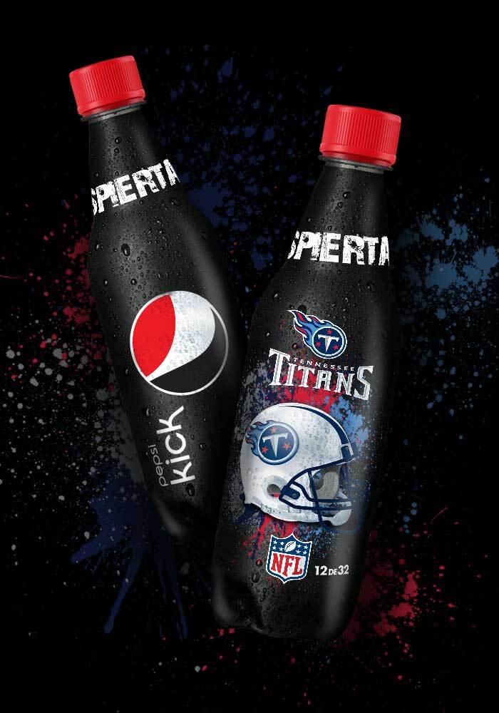
fullcenter Client: Pepsi Kick Country: USA Task: Pacakging Design To associate the Pepsi Kick brand with the NFL, the most important American-football league in the world, […]Borden. Print Ad
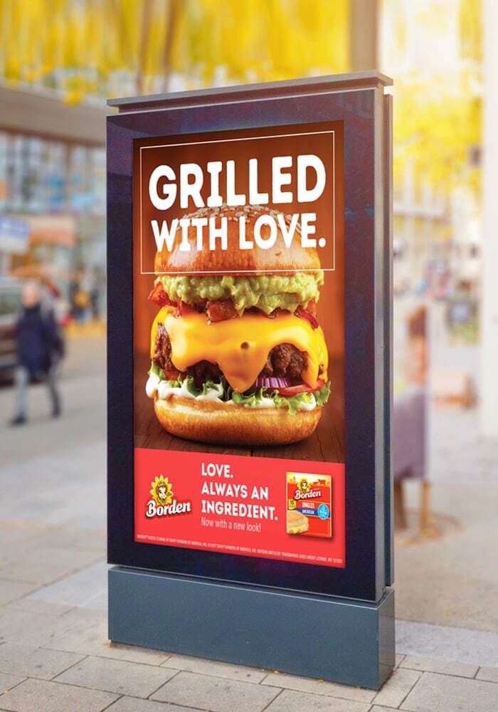
fullcenter Client: Borden Country: USA Task: Print Ad This campaign was developed to highlight the deliciousness of Borden in certain dishes. We took advantage of the […]La Vaquita. Web Design
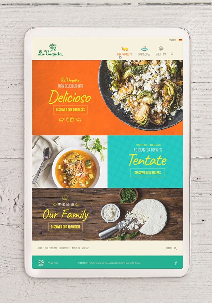
fullcenter Client: La Vaquita Country: USA Task: Web Design La Vaquita is a Regional brand we love, based on incredible small-batch products and a true Hispanic […]Aguila Beer. Packaging Design, Branding
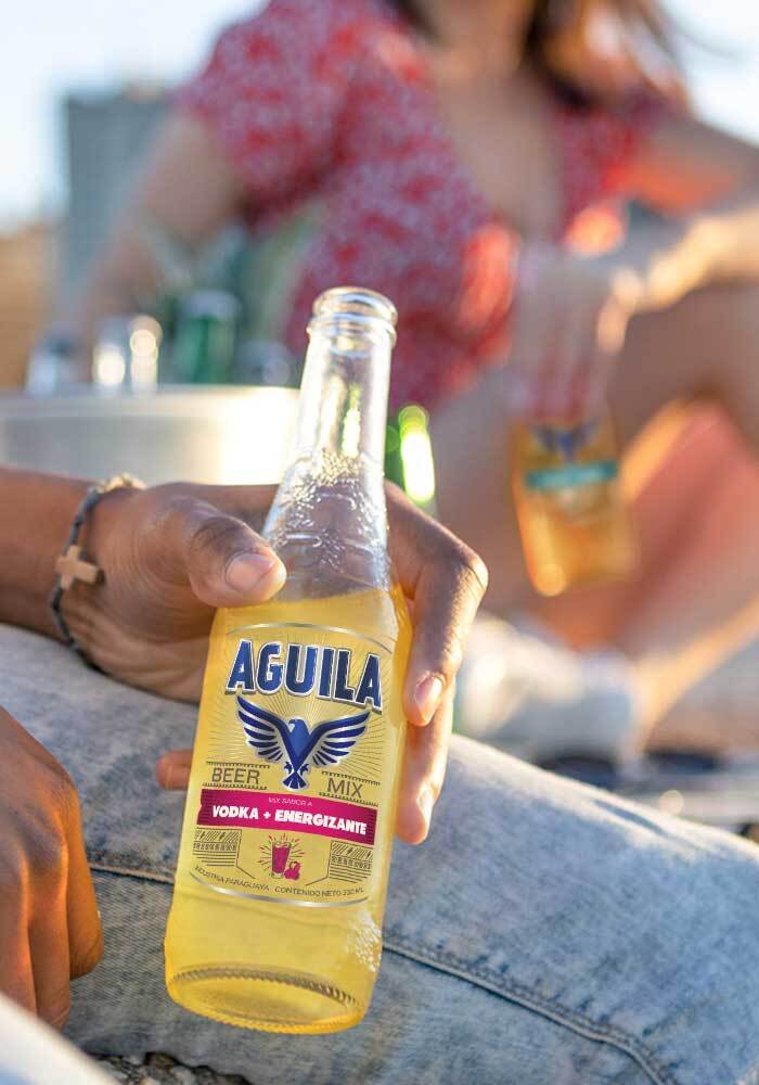
fullcenter Client: Emcesa, Aguila Beer Country: Paraguay Task: Packaging Design, Branding We collaborated closely, as a leading design agency, with our Paraguayan client, Emcesa, to develop […]Casasco Factor AE. Branding, Packaging design
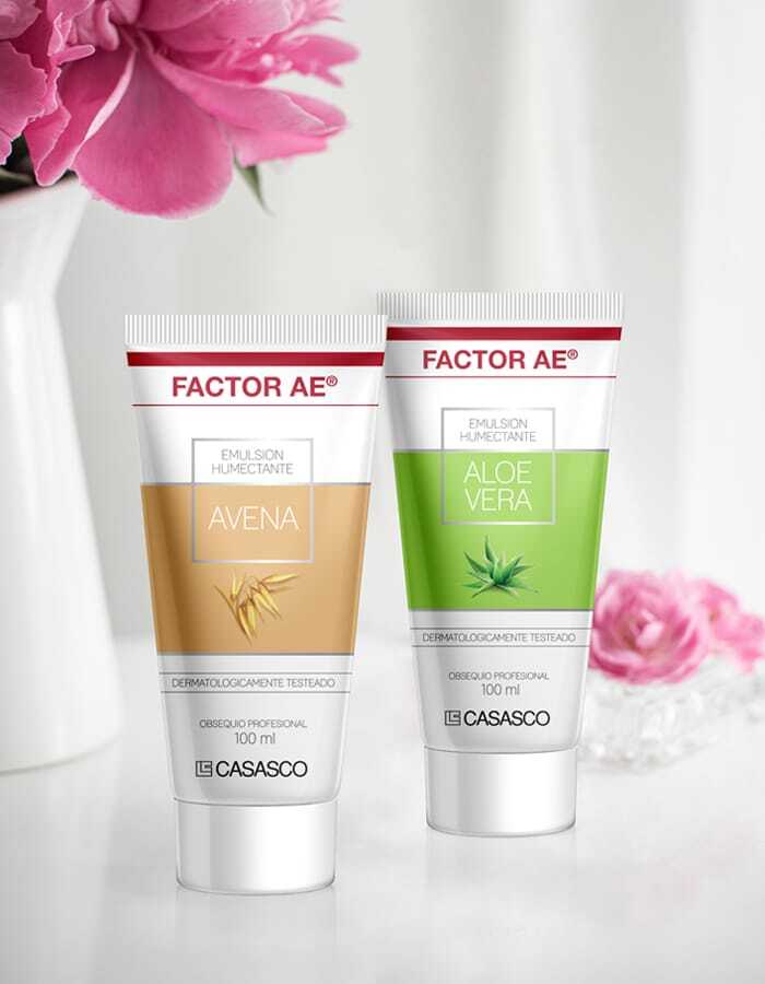
fullcenter Client: Casasco Country: Argentina Task: Branding and Packaging Design Branding and Packaging design for the new line of humectant creams for Factor AE of Laboratorios […]Ritz. Packaging Design
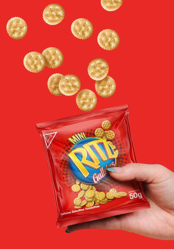
fullcenter Client: Ritz Country: Ecuador Task: Packaging Design The Ritz Crackers packaging project focused on giving the Ritz Crackers Line a new, fresh look. The challenge […]Wise Snacks, Roasted Green Pepper. Branding, Packaging Design
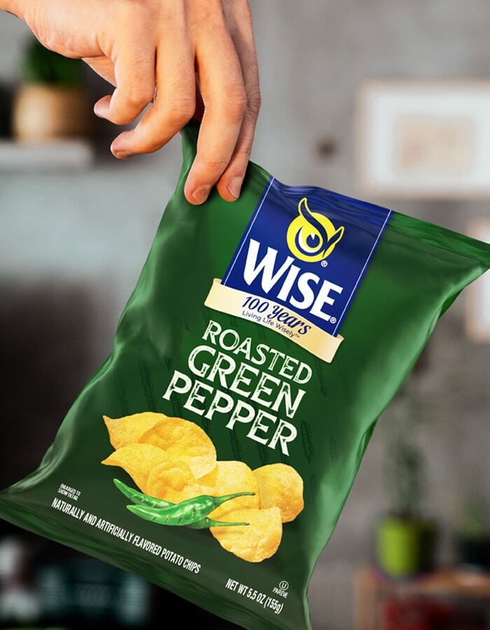
fullcenter Customer: Wise Snacks Country: USA Task: Branding, Packaging Design We designed the packaging for Roasted Green Pepper from the American brand Wise Snacks, where this […]Weber’s. English Muffins. Packaging Design
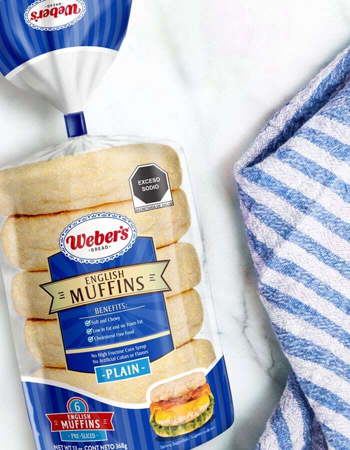
fullcenter Customer: Weber´s Country: Mexico Task: Packaging Design To complete the line of new Weber\’s products, we designed the packaging for the launch of English Muffins, […]Gloria. Packaging Design
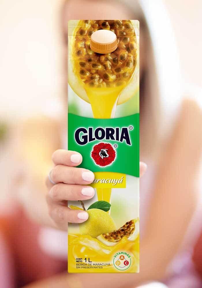
fullcenter Client: Gloria Country: Perú Task: Packaging Design We worked with our client Gloria in the fruit nectars packaging redesign, with the premise of achieving a […]Bimbo, trucks. Brand Activation
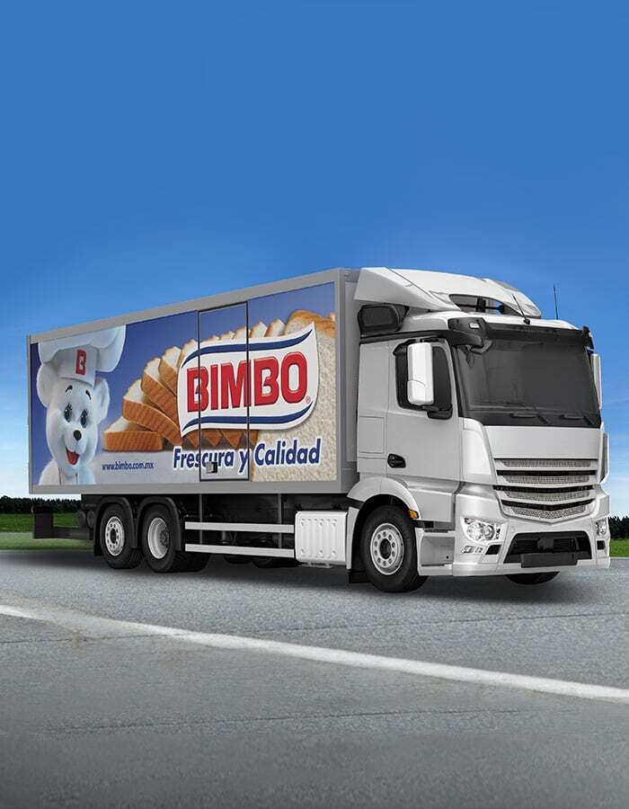
full Client: Bimbo Country: Mexico Task: Brand Activation This branding project for Bimbo, implemented in Latin America, aimed to take advantage of the company’s own trucks […]Lava. Lemon and Oat Dishwashing Detergent. Packaging Design
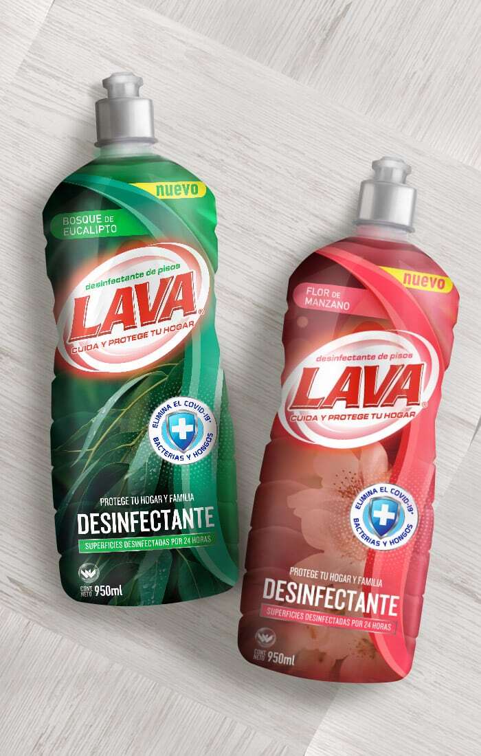
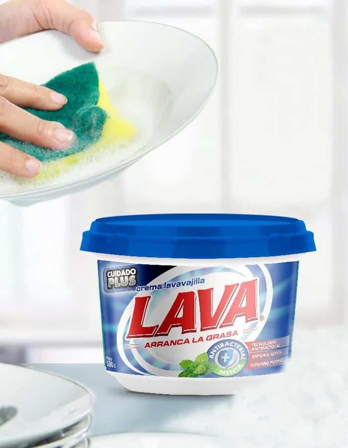
fullcenter Client: Lava Country: Ecuador Task: Packaging Design Jabonería Wilson summoned us after redesigning the line of cream detergents, to update its line of liquid detergent. […]Weber’s, Giant Bread. Packaging Design
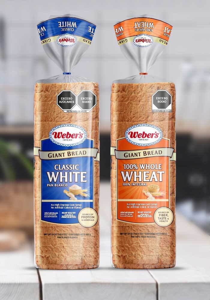
fullcenter Cliente: Weber\’s País: México Tarea: Para el lanzamiento de la marca Giant Bread de Weber\’s, realizamos una adaptación sobre los actuales panes Specialty a la […]Elisium, Ibumejoral. Branding, Packaging Design
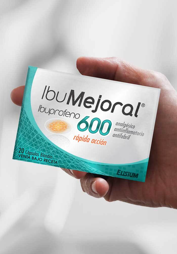
fullcenter Client: Elisium Country: Argentina Task: Packaging Design, Branding The Elisium laboratory hired us to do the branding and packaging design for the launch of its […]Kotex Day’s. Packaging Design, Branding
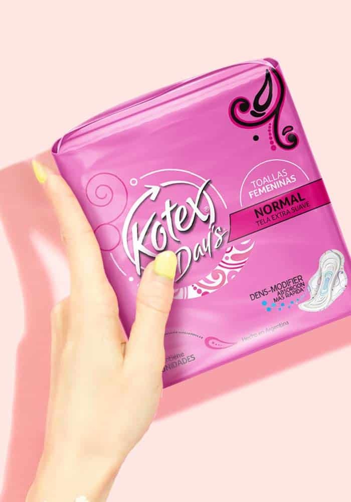
fullcenter Client: Kimberly Clark Country: Latam Task: Packaging Design, Branding Kotex was previously known as Day’s in Southern Latin America. As part of this project, we […]Mazzei. Crackers Chia. Packaging Design
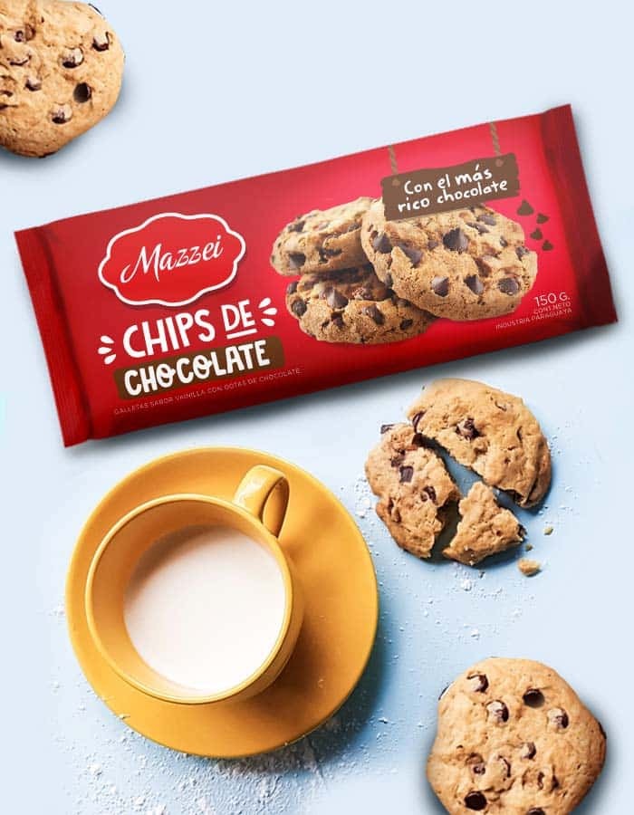
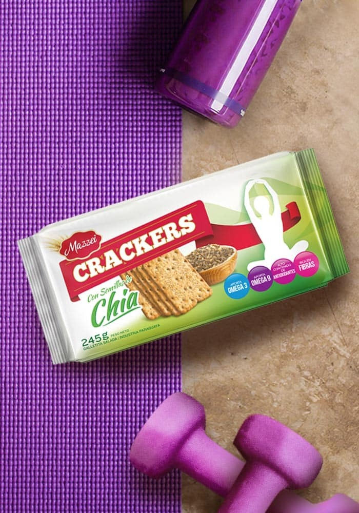
fullcenter Client: Mazzei Country: Paraguay Task: Packaging Design Mazzei launched a new product: Chia Seed Cookies, for those consumers looking for a natural and nutritious balance […]Borden Thick Cut Cheese. Packaging Design
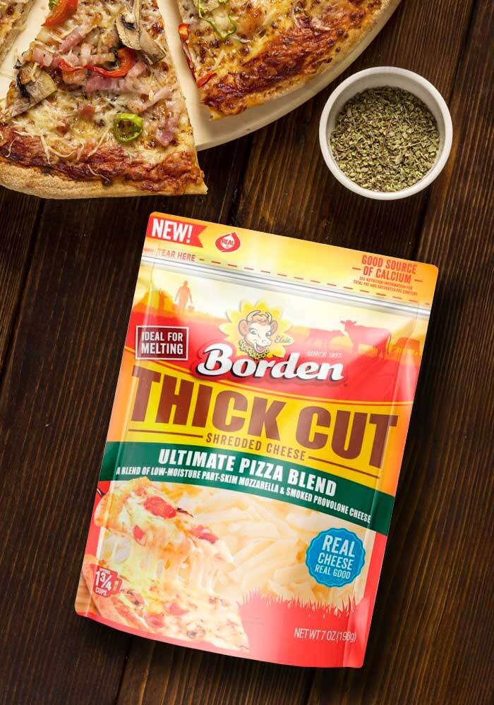
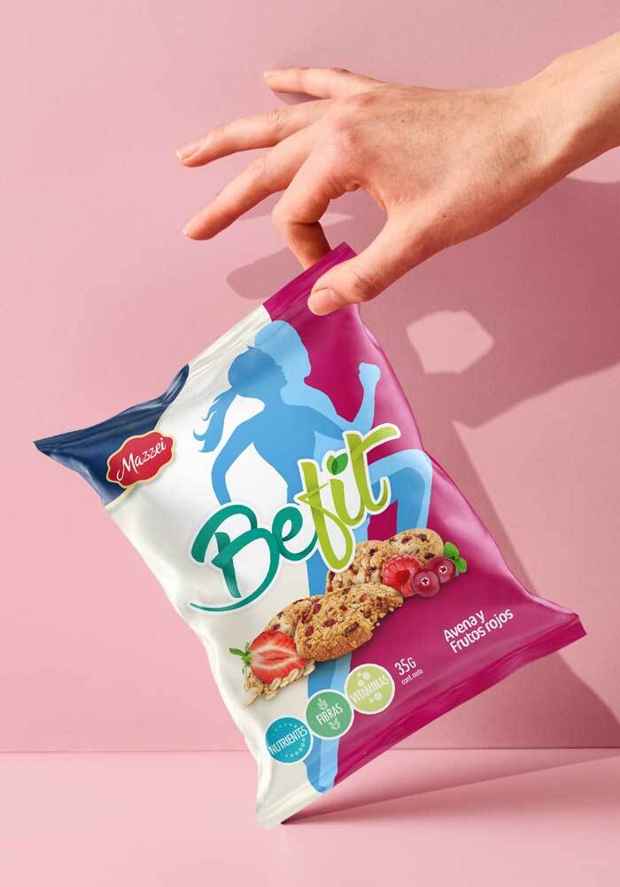
fullcenter Client: Borden Country: USA Task: Packaging Design Our Client DFA was redesigning the Brand Image for Borden and they needed to capitalize the impact of […]BeFit. Branding, Packaging design
fullcenter Client: Mazzei Country: Paraguay Task: Packaging Design Branding & packaging design for Mazzei BeFit Imaginity | Design Agency | Branding, Packaging Design, MarketingDescno-repeat;left top;;auto full […]La Vaquita. Brand Activation
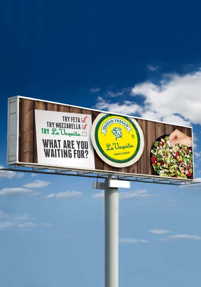
fullcenter Client: La Vaquita Country: USA Task: Brand Activation La Vaquita OOH was developed to invite non-users to try a very traditional style of crumbled cheese […]Borden. Sell Sheet
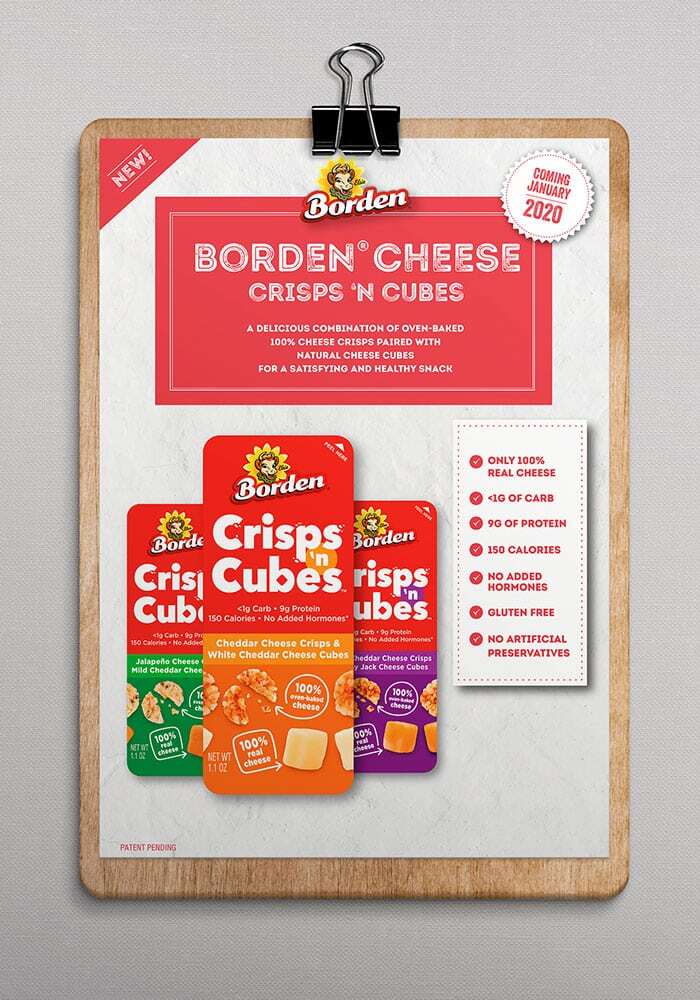
fullcenter Client: Borden Country: USA Task: Print Design The challenge here was to deliver rational information in a clear, distinctive way. We design and delivered sales […]Kotex Panty Liners Product Design
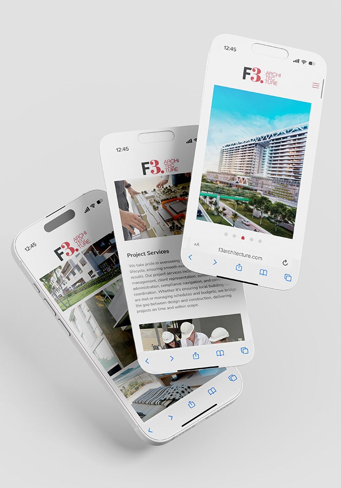
fullcenter Cliente: Kimberly Clark País: América Latina Tarea: Diseño de producto Nuestro cliente Kimberly Clark nos confió el diseño de su nueva línea de protectores diarios, abarcando […]F3 Architecture. Print & Web. Brand Consulting
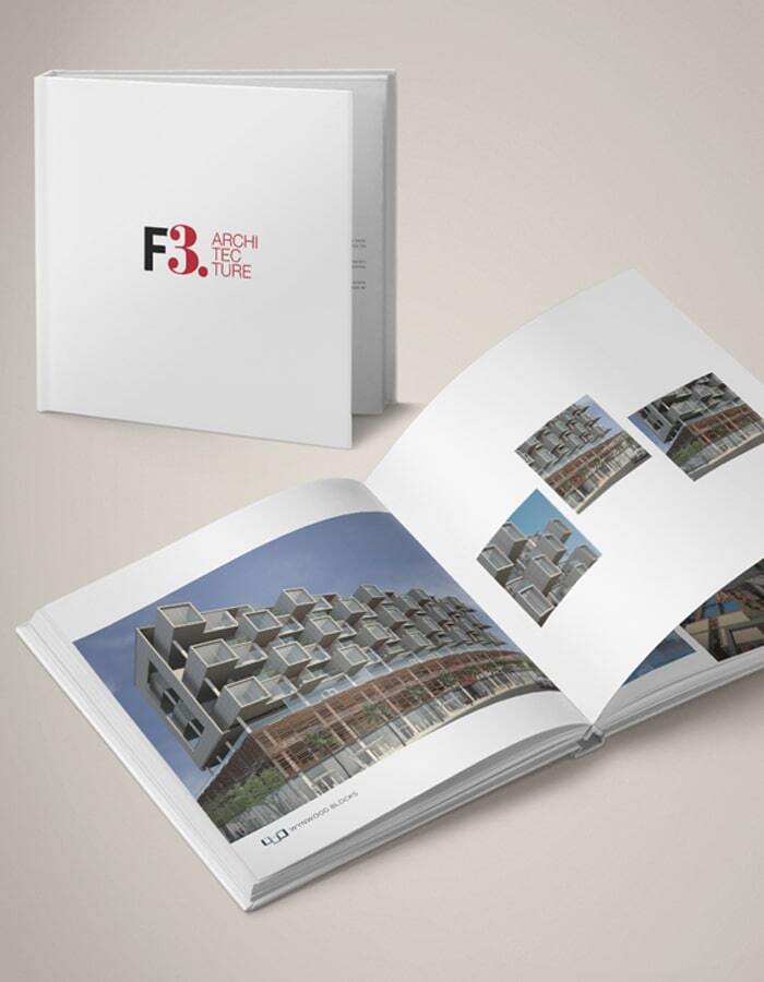
fullcenter Client: F3 Architecture Country: USA Task: Print & Web We work for our client the architecture studio F3 Architecture, making their web and designing their […]


