Client:
Weber's
Country:
Mexico
Task:
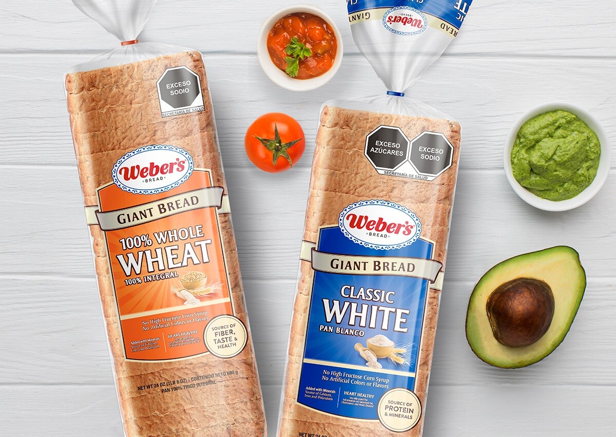
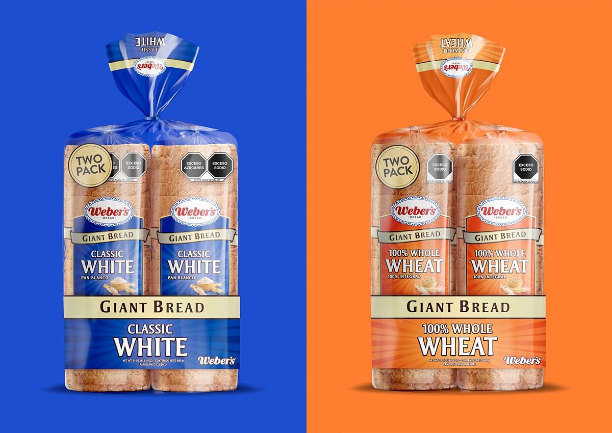
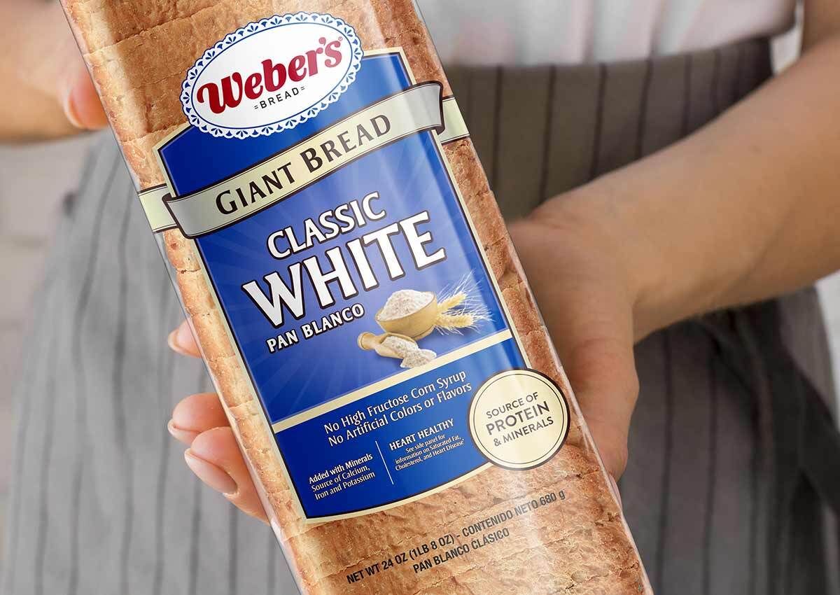
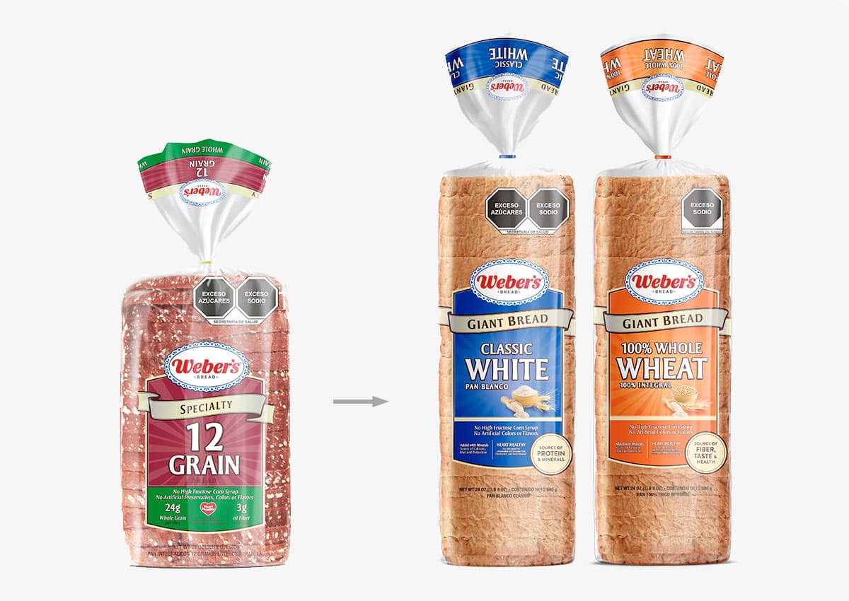
For the launch of the Weber's Giant Bread brand, we adapted the current Specialty breads to the White Bread and Integral Bread versions. We carry out the packaging design using a similar aesthetic, but with a great predominance of variety, both in terms of color and images that reinforce the flavor.
This project illustrates how clear variety coding, recognizable brand assets, and appetite-focused imagery can shape shopper response. The same principles are central to packaging design for U.S. retail brand perception, where products must communicate differentiation, quality, and brand consistency in seconds.
Imaginity | Design Agency | Branding, Packaging Design, Marketing
A Clear Extension of the Weber’s Bread Portfolio
The Giant Bread launch required more than transferring an existing look to a larger format. The design needed to remain unmistakably Weber’s while giving White Bread and Whole Wheat Bread a clear place within the broader portfolio. We retained the visual language established for the Specialty range, then used color and product imagery to make each variety easy to identify. This created continuity across the brand without making the new products feel interchangeable.
The project shows how product line architecture can organize new formats while protecting recognition. Explore more of Imaginity’s bread branding and packaging design experience or see the complete Weber’s 15 Grain & Seed project.