Client:
Weber's
Country:
Mexico
Task:
Branding, Packaging Design
IMAGINITY, a leading global packaging design agency, led the comprehensive relaunch of Weber's bakery line. Our objective was to transition the brand’s legacy identity into the high-growth hamburger and hot dog bun segments, establishing a modern visual identity that sets the stage for future premium sub-brands.
Imaginity | Design Agency | Branding, Packaging Design, Marketing
Visual Highlights
-
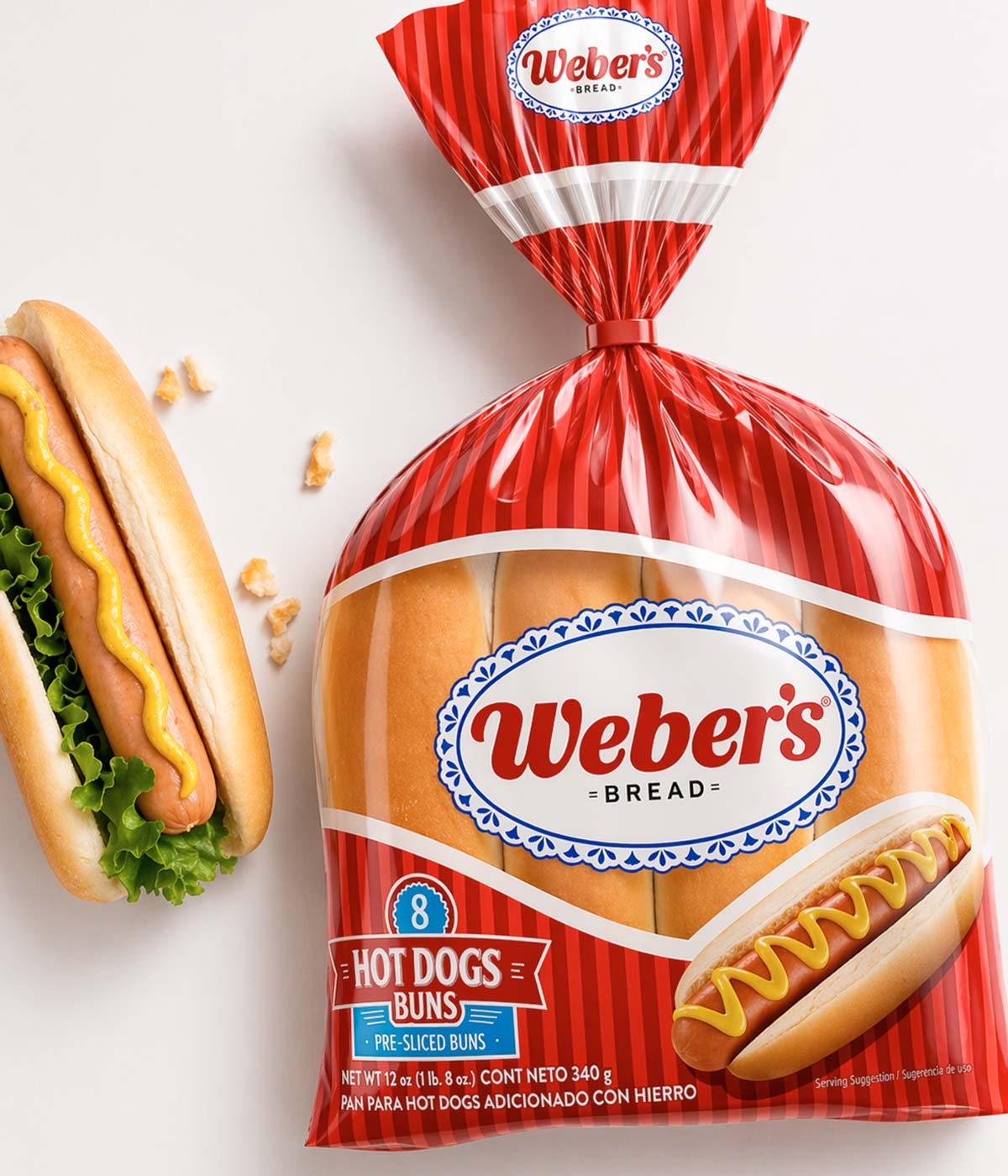
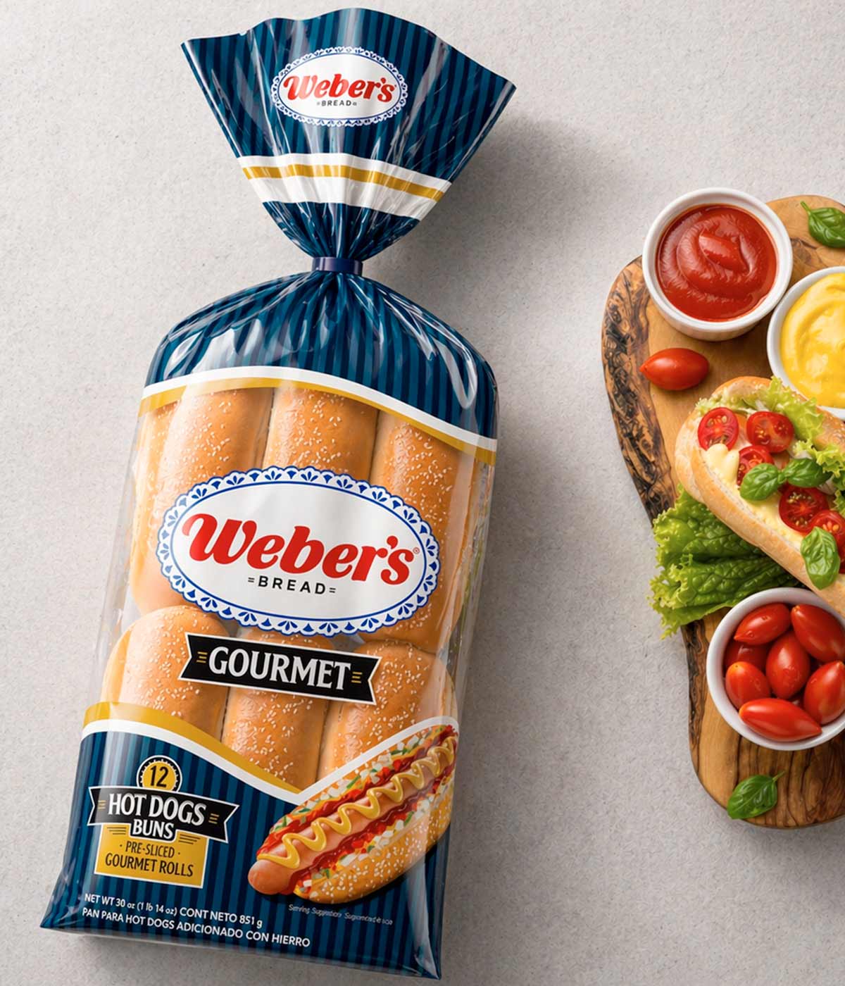
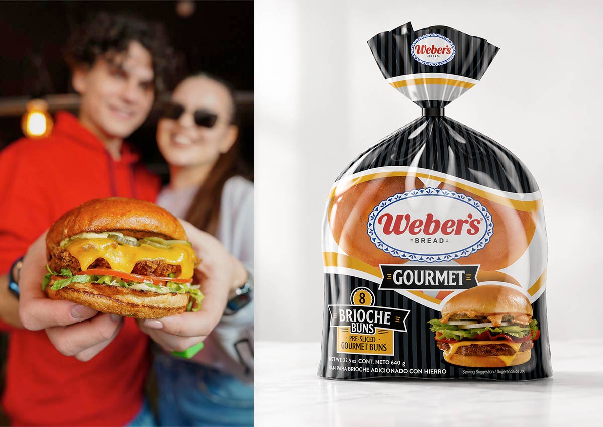
Strategic Color Hierarchy: Use of bold, solid tones (Blue, Red, and Black) to create clear category differentiation and improve consumer navigation.
-
Contemporary Graphic Evolution: A contemporary graphic language that replaces the traditional checkered design, providing a more premium and updated feel.
-
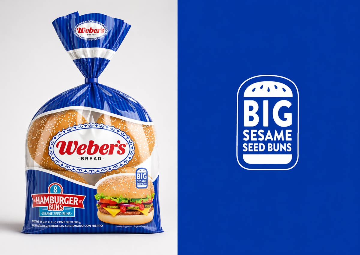
High-Impact Brand Lockup: Prominent and centralized placement of the Weber's logo maximizes brand recognition against the colorful backgrounds.
-
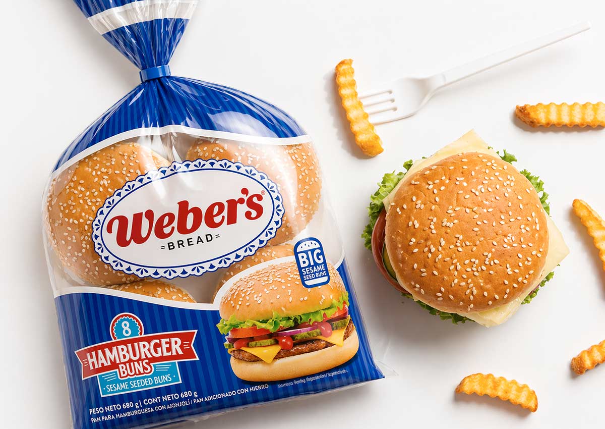
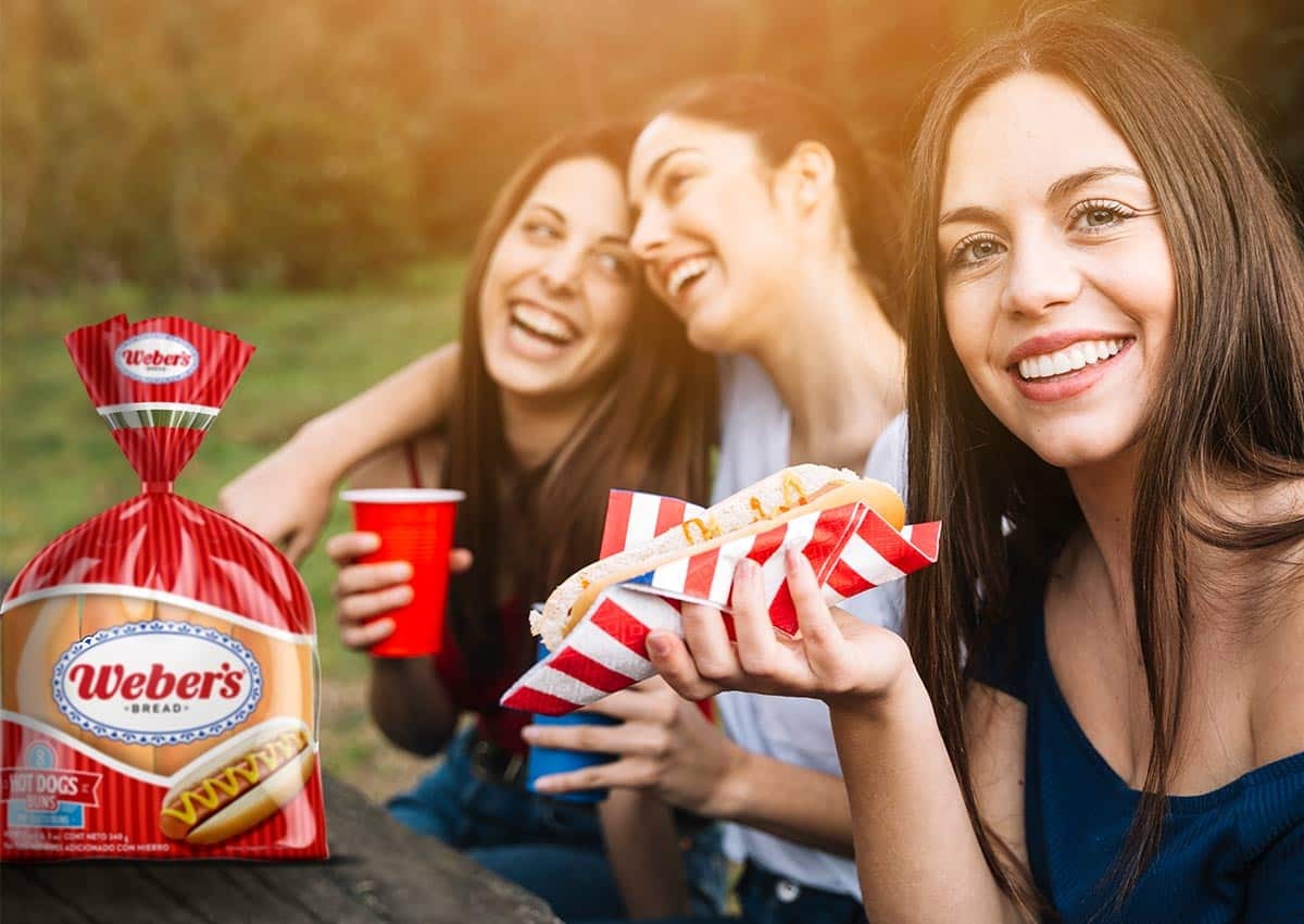
Appetite Appeal Integration: Clear window placements combined with clean typography showcase product freshness and soft texture.
-
Premium Category Expansion: Tailored design treatments for the Gourmet line, specifically highlighting textures like Brioche and Sesame through clear product windows.
The Challenge: Relunching a Legacy Brand into New Categories
The primary objective was the comprehensive relaunch of Weber’s bakery products, specifically targeting the highly competitive hamburger and hot dog bun segments. As a global packaging design agency, IMAGINITY was tasked with creating a visual identity that could transition from the traditional white bread category into the specialized buns market, while also establishing a scalable foundation for the future "Gourmet" sub-brand.
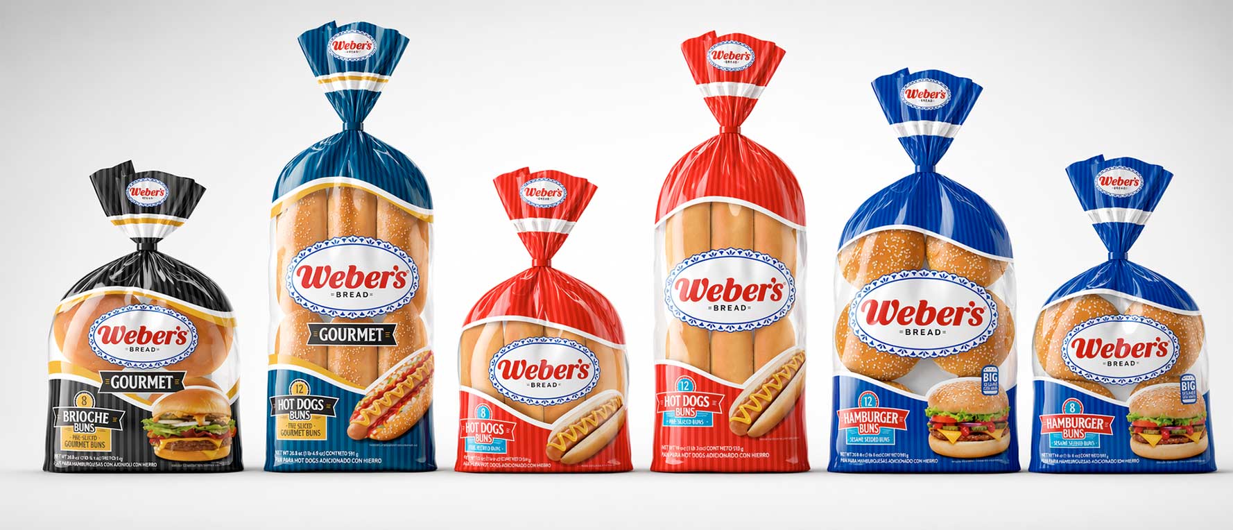
The Solution: Breaking Tradition with Strategic Color Coding
Leveraging our design process, we made the strategic decision to break away from Weber’s historical light-blue and white checkered pattern. We developed a sophisticated new graphic texture and implemented a high-impact color-coding system: Navy Blue for Hamburgers, Vibrant Red for Hot Dogs, and a Premium Black for the Gourmet line. This brand consulting approach ensured that each product variety was instantly identifiable while maintaining a unified brand family.
The Results: Enhanced Shelf Presence and Successful Market Entry
The project resulted in a powerful packaging design characterized by an orderly yet striking aesthetic. By refining the brand's hierarchy and increasing the scale of the visual identity, IMAGINITY achieved maximum shelf impact in store. The successful launch established Weber’s as a dominant player in the bakery category, delivering a professional and modern image that communicates quality and freshness at first glance.