Client:
Kimberly Clark
Country:
Latam
Task:
Packaging Design, Branding
Kotex & Day’s: Strategic Brand Migration & Packaging Architecture
Kimberly-Clark partnered with Imaginity, global design agency, to manage one of the most critical brand transitions in the Southern Latin American hygiene market: the migration of the established "Day’s" brand to the global visual identity. The challenge was to work on the packaging design introduce the Kotex name while protecting the massive market share and consumer trust held by Day’s. We developed a sophisticated dual-branding product line architecture strategy that allowed for a gradual, risk-free transition across the entire product portfolio.
Imaginity | Design Agency | Branding, Packaging Design, Marketing

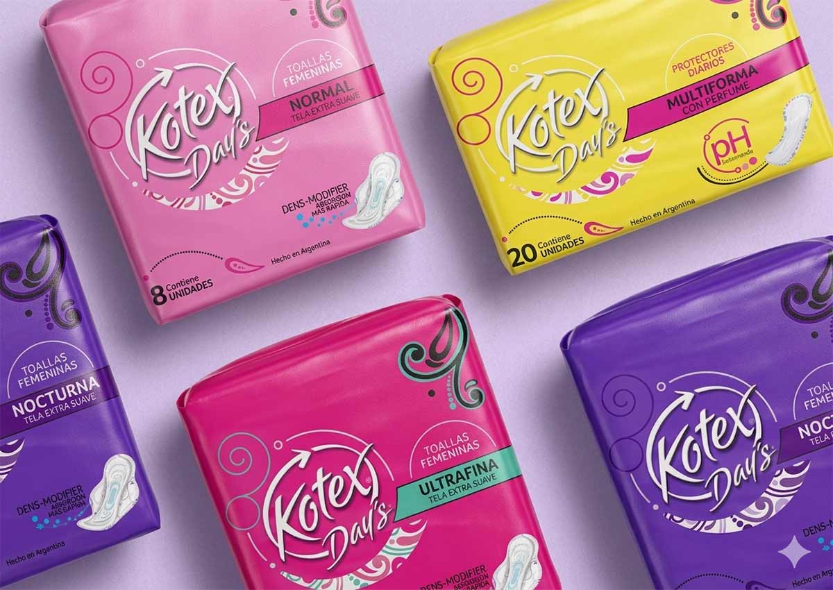
Visual Highlights
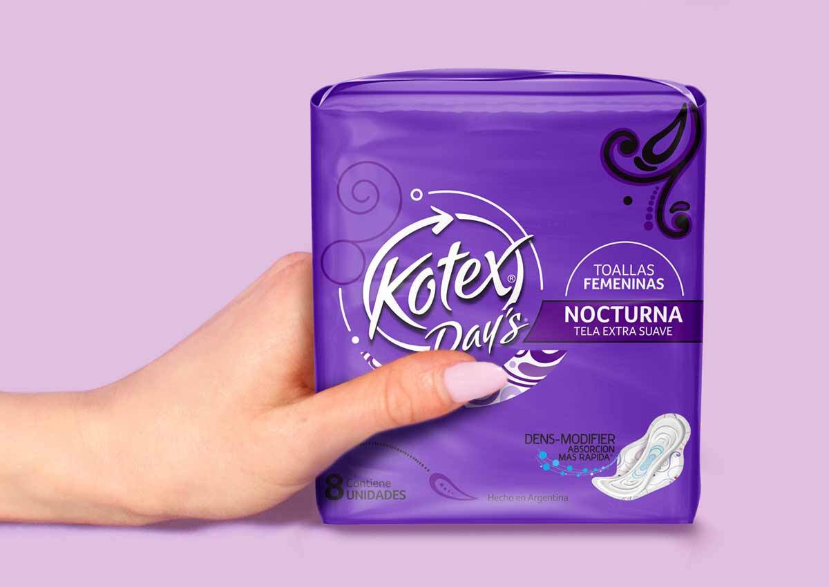
- Double-Faced Packaging Innovation: A strategic "two-sided" design featuring the Day’s-to-Kotex transition on one face and the Kotex-to-Day’s transition on the other.
- Unified Brand Architecture: A cohesive visual system that aligns the regional portfolio with the global Kotex Evolution identity.
- Preserved Market Color Codes: Strategic use of established regional color palettes to maintain immediate shelf recognition and consumer comfort.
- Dual-Logo Typographic Integration: Typographic integration of double logo: Logos designed by experts that work strategically by integrating both brands, to associate them with each other.
- Strategic Product Tiering: A design hierarchy that achieves visual unity across the brand while clearly differentiating between various product ranks and tiers.
1. The Branding Challenge: Transitioning a Market Leader
The primary objective of the Kotex Day's project was to execute a seamless brand migration without alienating a loyal consumer base. In Southern Latin America, "Day’s" was a household name; simply replacing it with "Kotex" overnight posed a significant commercial risk. The challenge lay in creating a packaging design system that could educate the consumer on the identity change while reinforcing that the high-quality product they trusted remained the same.
2. Our Design Process: The Hybrid Branding Solution
Taking advantage of the power of packaging as communicator, our team orchestrated a transition strategy centered on "Visual Continuity."
Our design process begins with the hand-sketching and drafting stage, which allows us to tap into creative potential, explore multiple solutions, and evaluate which best meet the brief.
By designing a double-faced pack, we provided retailers with a versatile tool that could be displayed according to the consumer's stage in the migration journey. On one side, Day’s remained the hero with Kotex as a supporting sub-brand; on the reverse, the hierarchy was flipped. This strategic branding approach allowed for a "soft landing" of the global brand, using the regional brand's equity as a bridge to the new identity.
3. The Outcome: Successful Regional Brand Unification
The result is a highly successful portfolio alignment that brought Southern Latin America in line with Kotex’s global brand image. By maintaining existing color codes and integrating them with the Kotex Evolution aesthetic, Imaginity achieved a unified brand presence that feels both modern and familiar. This project stands as a benchmark for strategic brand architecture migration, proving that thoughtful packaging architecture can successfully navigate complex cultural and commercial transitions.
This fem care brand transition project highlights Imaginity’s expertise in regional market strategy, packaging design and brand architecture. Consistent with our work in strategic brand identity and high-impact in store design, we have ensured that Kotex remains a dominant force in the feminine care sector.


