Client:
Wise Salsa con Queso & French Onion Dip. Packaging Redesign
Country:
Task:
Wise Salsa con Queso and French Onion Packaging Design
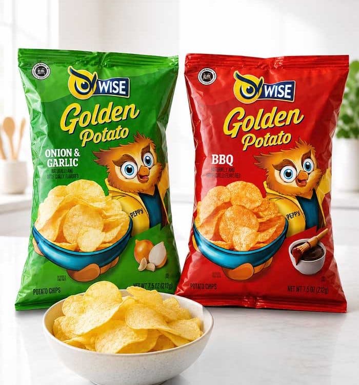
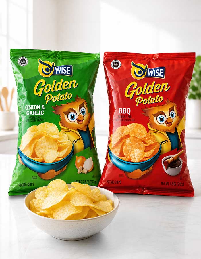
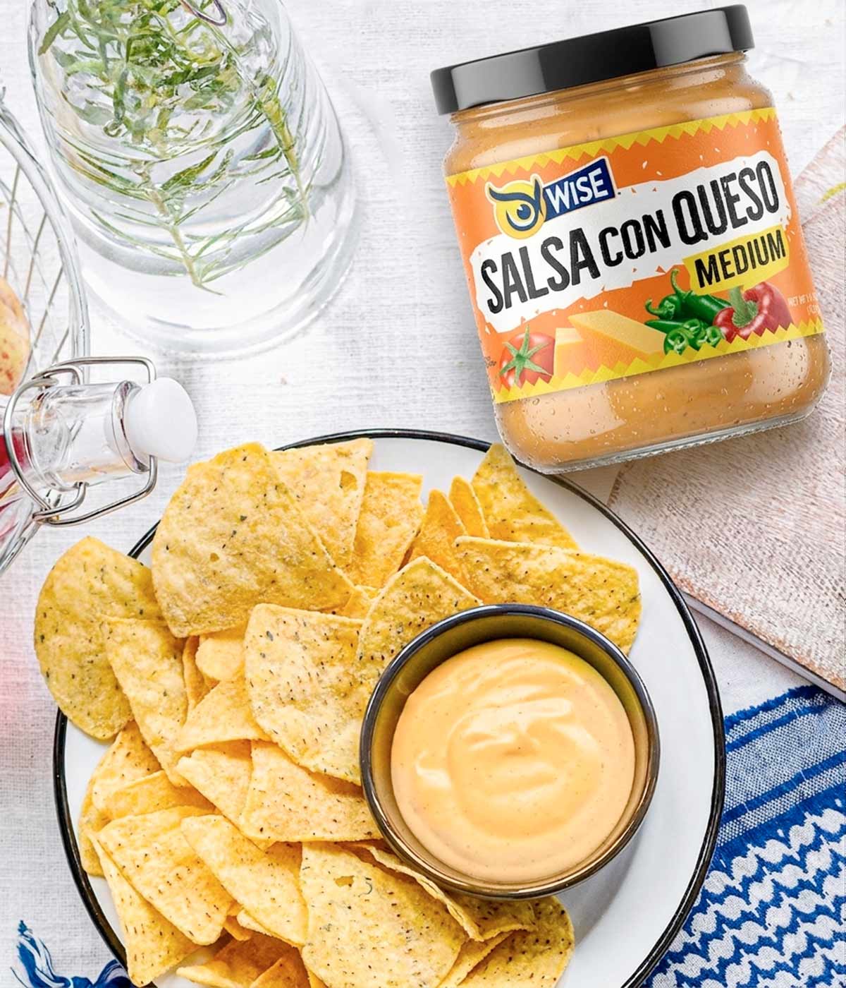
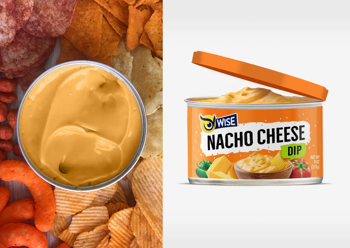
Wise Snacks is one of America's most recognized snack brands, and its dip portfolio plays a key role in extending the brand beyond chips into complete snacking occasions. As consumer expectations evolved, the French Onion Dip and Salsa con Queso packaging needed a more contemporary visual language that could better communicate flavor, quality, and appetite appeal while remaining instantly recognizable to loyal shoppers.
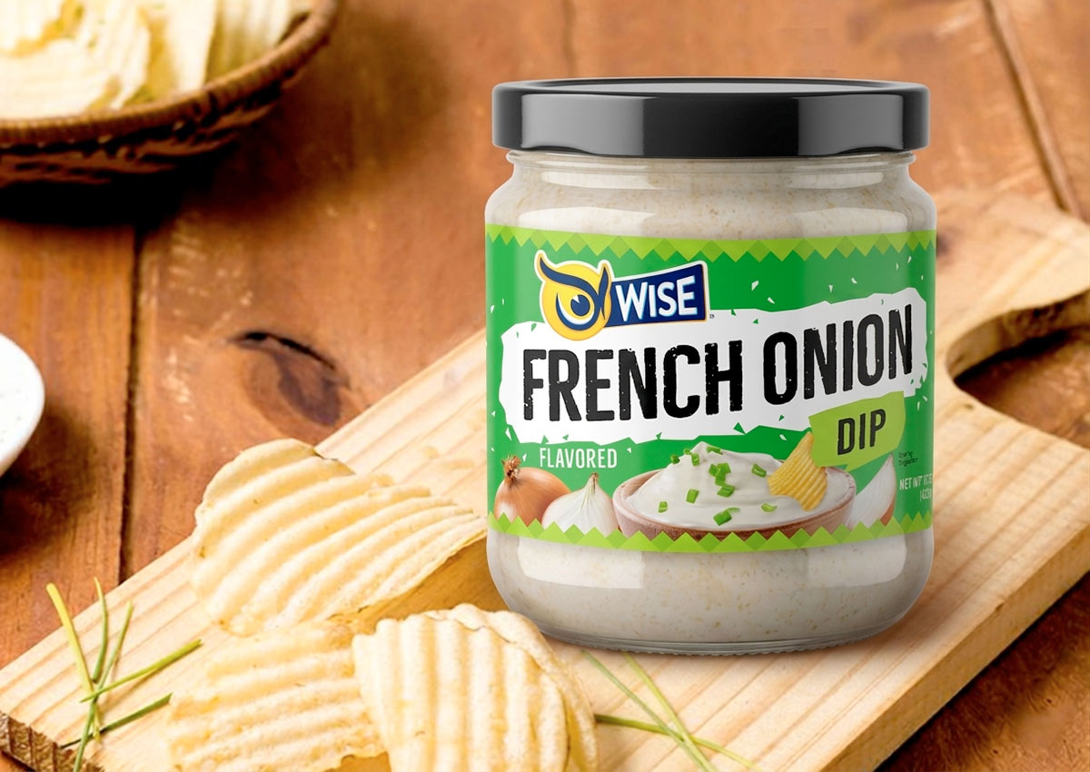
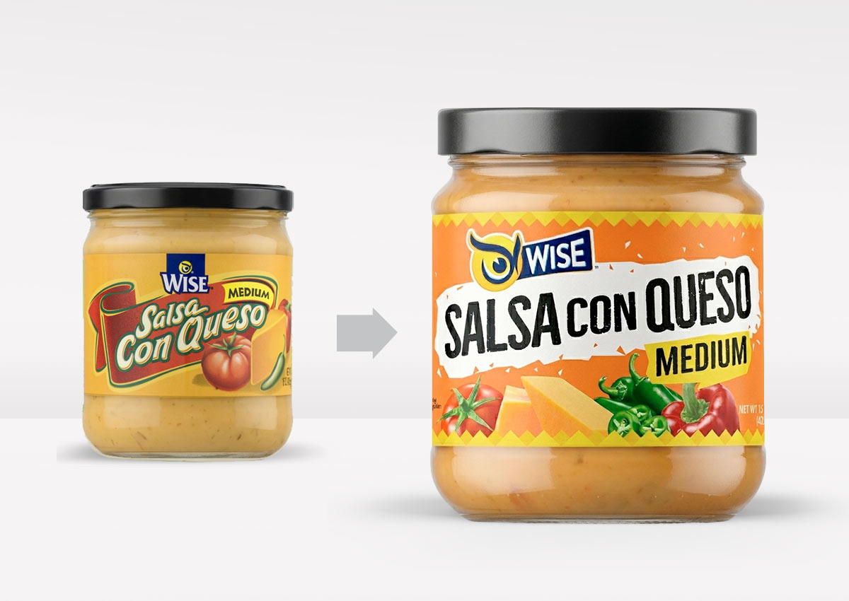
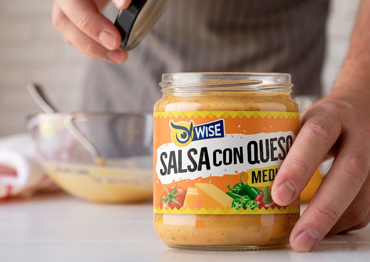
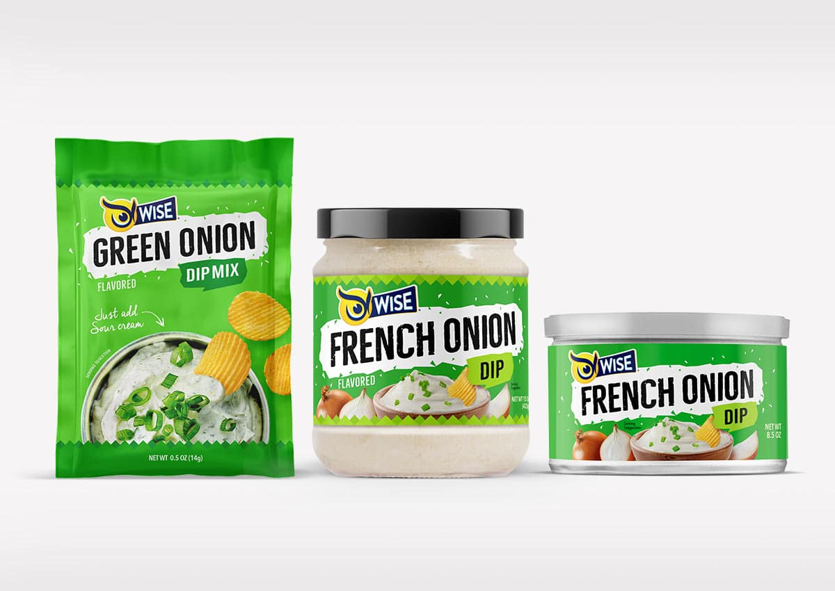
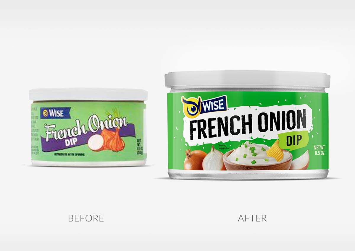
Imaginity was commissioned to redesign the packaging system, creating a stronger shelf presence through more impactful food photography, improved visual hierarchy, and a modern brand architecture. The result is a refreshed packaging design that elevates perceived product quality, reinforces the Wise brand identity, and builds a cohesive visual system across the expanding dips portfolio.
Imaginity | Design Agency | Branding, Packaging Design, Marketing
Visual Highlights
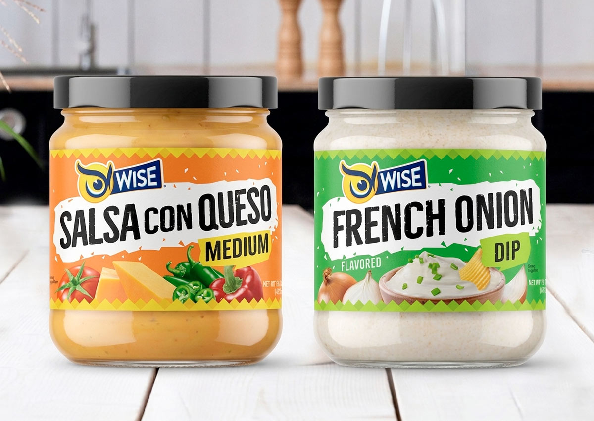
- Modernized packaging design: that preserves Wise's iconic brand recognition while delivering a fresher, more contemporary appearance.
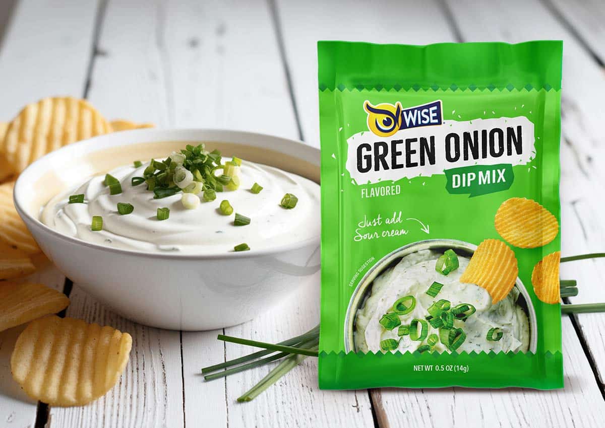
- Enhanced appetite appeal: through rich, realistic ingredient photography and more indulgent food presentation.
- Improved visual hierarchy: that makes the brand, flavor, and product benefits easier to identify at shelf.
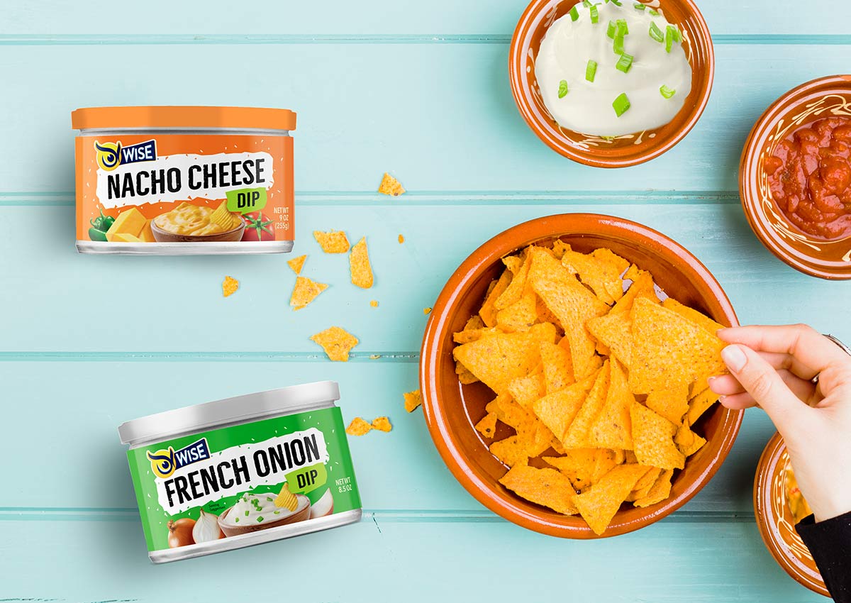
- Stronger flavor differentiation: while maintaining a consistent packaging system across the Wise dips portfolio.
- Refined color palette and typography: that increase shelf impact and reinforce premium product perception.
- Cohesive brand architecture: designed to support future flavor extensions and strengthen the overall Wise Snacks portfolio.
The Challenge: Revitalizing Classic Flavors
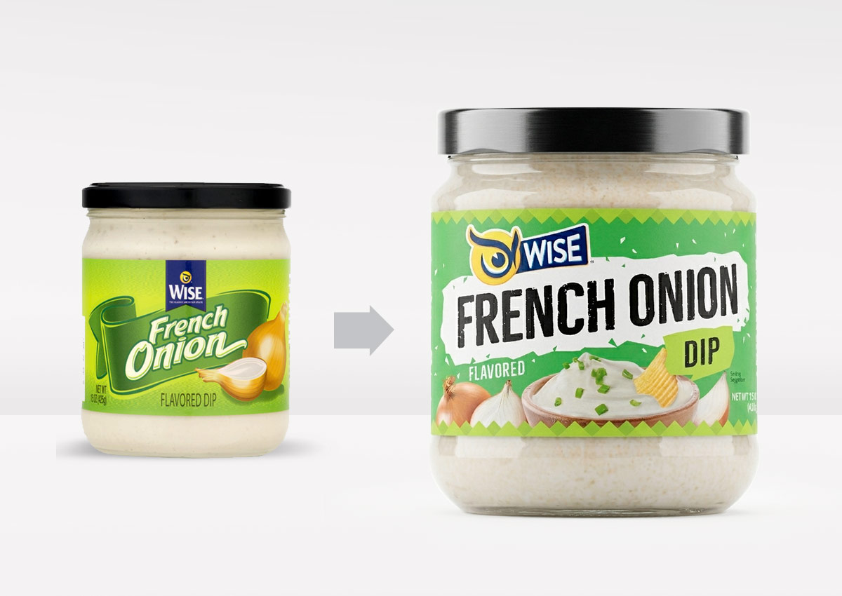
The core problem was to modernize the packaging for Wise's Salsa con Queso and French Onion Dip. The existing designs needed an update to enhance their visual appeal and better communicate the quality and richness of their ingredients to modern consumers. The goal was to make these classic products feel fresh and appetizing.
The Solution: A Modern Visual Identity
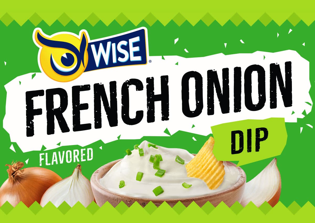
We redesigned the packaging to give these dips a contemporary look while ensuring they remained recognizable to loyal customers. By focusing on the appetite appeal and highlighting the richness of the ingredients, we created a new visual identity that was both appetizing and cohesive. The updated design was crafted to align perfectly with the broader Wise brand family.
The Results: Enhanced Appeal and Brand Cohesion
The new packaging successfully elevated the dips' appeal on the shelf. The design improvements made the product look more delicious and high-quality, encouraging consumer purchase. Furthermore, the updated visual identity created a stronger connection between these specific products and the overall Wise brand, reinforcing its consistency and recognition in the market.
This redesign shows how dip packaging design for U.S. CPG brands can combine appetite appeal, clear product hierarchy, and portfolio consistency to help familiar products compete more effectively on shelf.
IMAGINITY is a global packaging design agency specializing in consumer packaged goods (CPG), partnering with market-leading food, snacks, and FMCG companies across Latin America, North America, and international markets. Combining strategic branding, appetite-driven visual identity, disciplined brand architecture, and prepress print expertise, our agency delivers impactful visual storytelling across our entire portfolio to optimize in store shelf performance and drive commercial growth for global brands like Wise.
Explore the Wise Snacks system
Explore how Wise’s dips packaging connects with its salsa range, core snack packaging, anniversary identity, and broader brand evolution: