Client:
Borden
Country:
USA
Task:
Packaging Design
Borden: Thick Cut Cheese Innovation & Brand Transformation
Working alongside DFA USA, Imaginity, global design agency, led the packaging design for Borden’s latest product innovation: Thick Cut Shredded Cheese. As the parent brand underwent a significant image refresh, our objective was to capitalize on this new visual identity to drive trial and visibility. We engineered a visual system that translates the quality and "substance" of a thicker cut into a high-impact in store presence, ensuring Borden stands out in the densely populated dairy aisle.
Imaginity | Design Agency | Branding, Packaging Design, Marketing
Visual Highlights
- Optimized Brand Equity: Seamlessly integrating Borden’s refreshed logo and the Cow mascot icon to reinforce consumer trust and heritage.
- Powerful Shelf Impact: A bold design and brand architecture created specifically to disrupt the "visual noise" of the crowded cheese packaging design category.
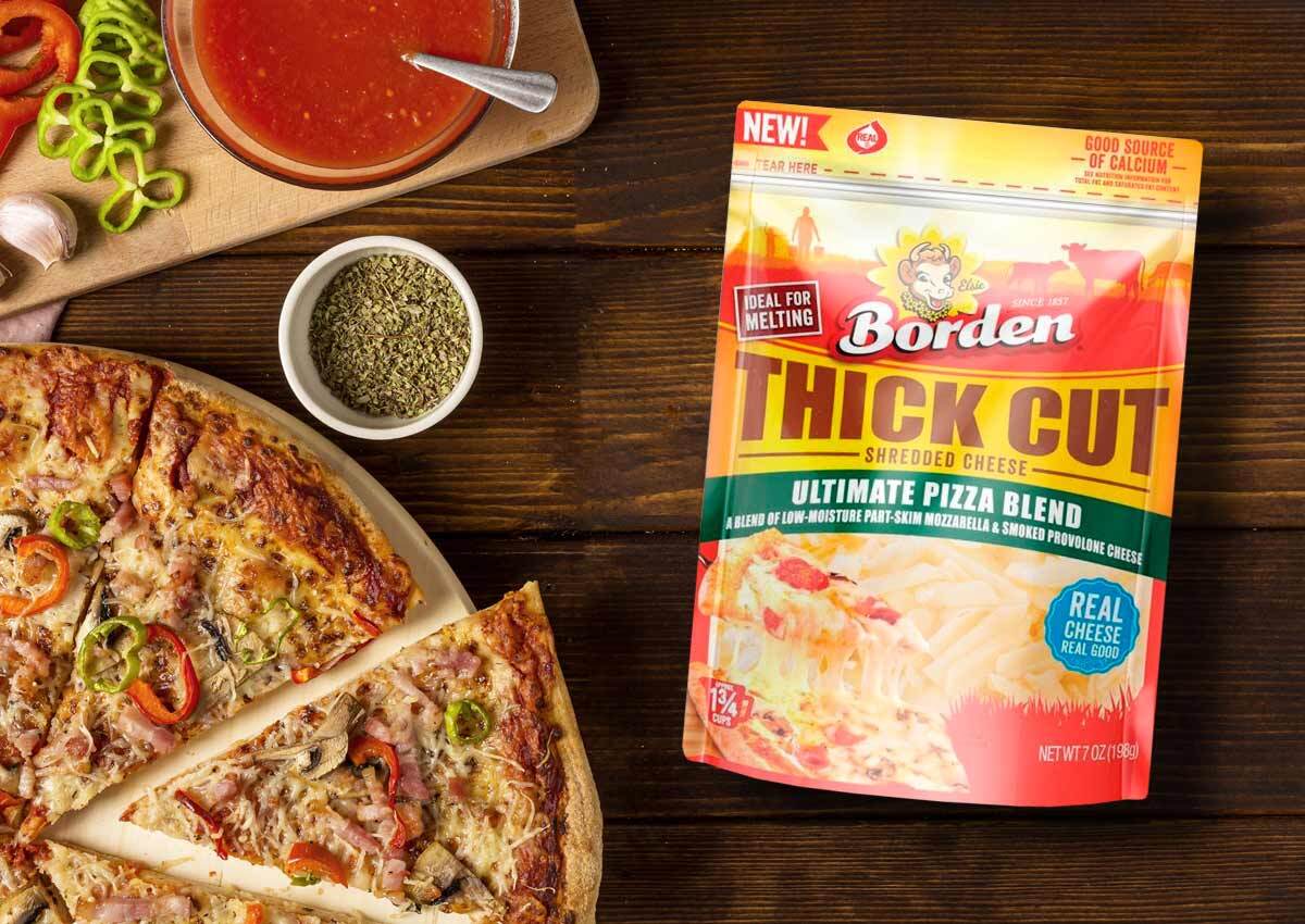
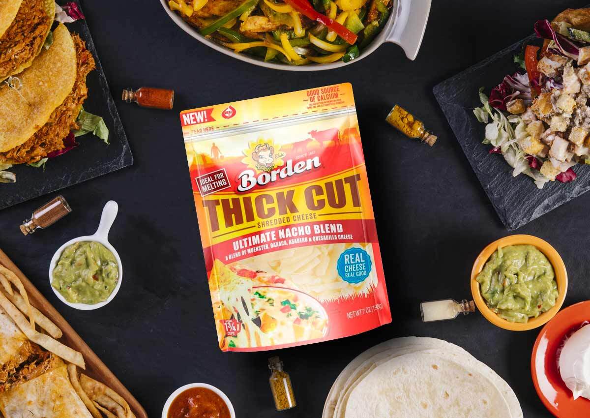
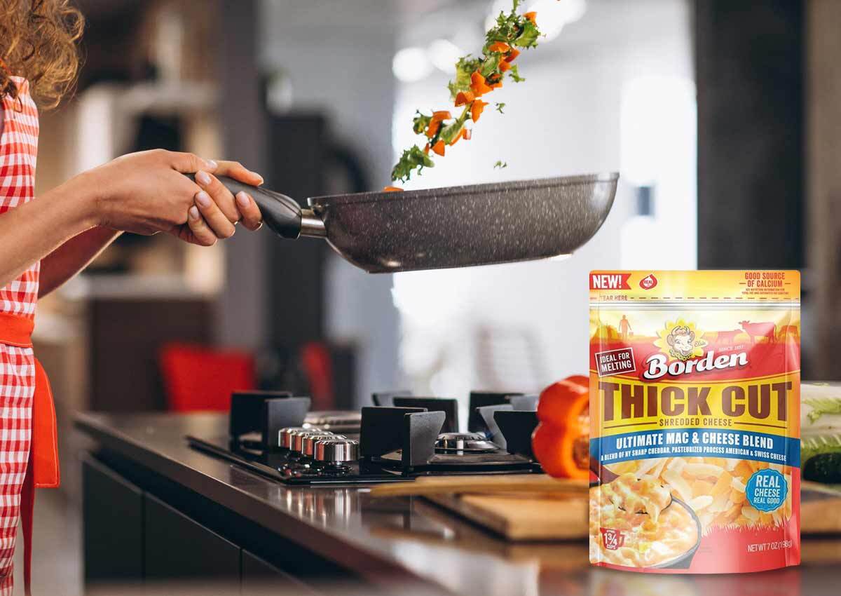
- Product-Centric Hierarchy: Strategic use of windowing and high-fidelity photography to emphasize the unique "Thick Cut" texture and appetite appeal.
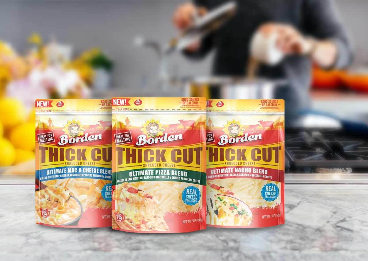
- Color Blocking Strategy: Vibrant, category-consistent colors to ensure the product line architecture and immediate flavor and variety recognition.
- Strong Storytelling: A layout that highlights the functional benefits of the thicker shred—better melt and bolder flavor—to justify the premium positioning.
1. The Branding Challenge: Capitalizing on a New Identity
The primary objective of the Borden Thick Cut project was to synchronize a major brand image redesign with a specific product launch. In the dairy sector, consumers make decisions in split seconds; therefore, the power of packaging is key to communicate both the "newness" of the brand and the specific benefits of the innovation. The challenge was to ensure that the refreshed Borden identity didn't just look "different," but felt more "essential" and visible than the competition.
2. Our Design Process: Strategic Disruption in the Dairy Aisle
Our team orchestrated a design solution focused on "Visual Weight." To reflect the "Thick Cut" nature of the product, we utilized bolder graphic elements and a more substantial information hierarchy. "Thick Cut" claim remain the primary focal points. This strategic packaging approach ensures that the innovation is the hero of the retail experience.
3. The Outcome: A Powerful Retail Launch
The result is a successful product activation that has significantly enhanced Borden’s presence on the shelf. Through Imaginity’s strategic design execution, the Thick Cut line effectively captures consumer attention, driving both brand reappraisal and immediate sales. This project serves as a definitive example of how to use brand architecture to support product innovation, proving that clear, high-impact design is the ultimate tool for market differentiation.