Client:
Mercado Libre (E-commerce & Fintech Leader)
Country:
Latin America (Regional & Global Implementation)
Task:
The Challenge: A Fragmented Brand Ecosystem and Outdated Identity
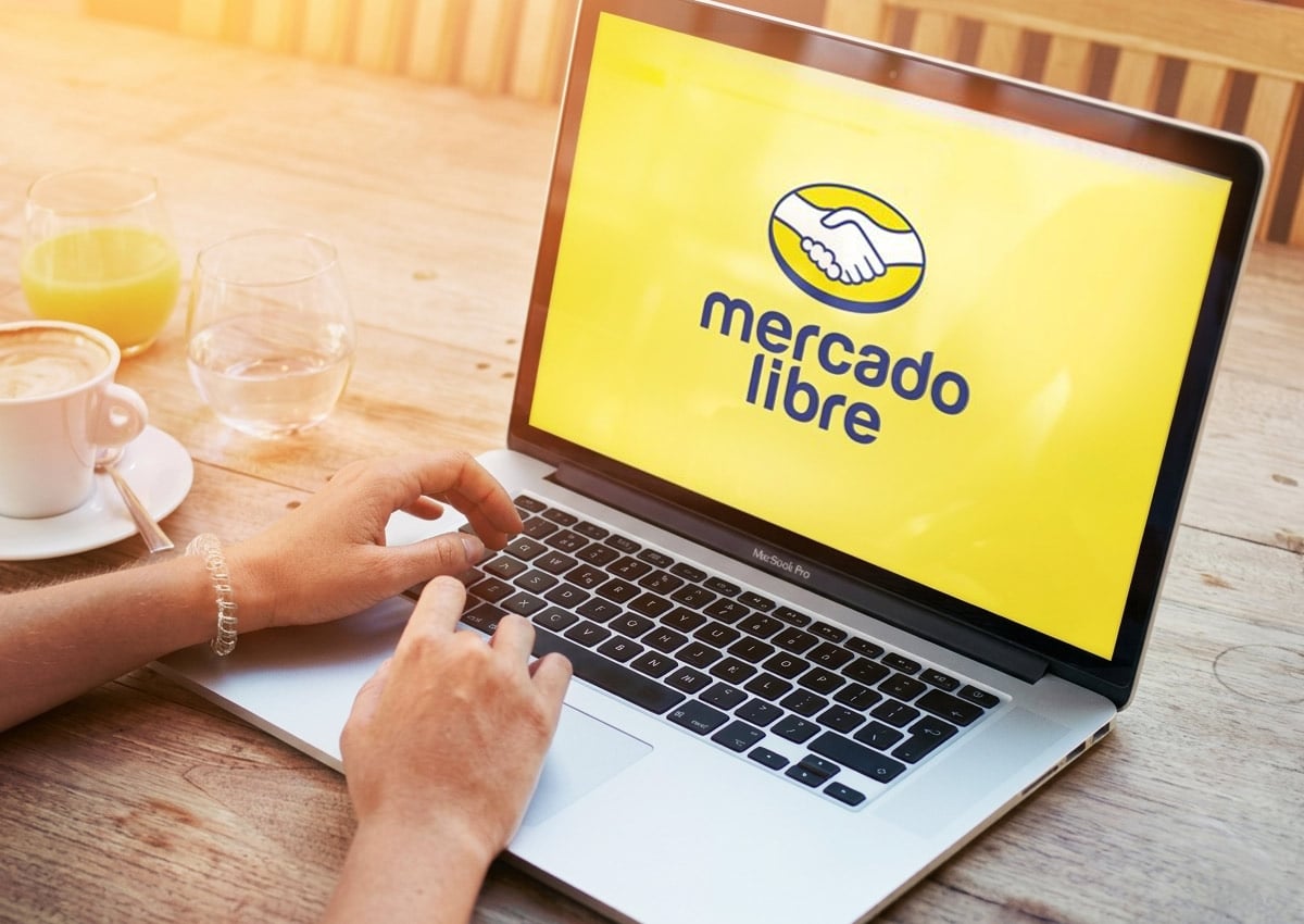
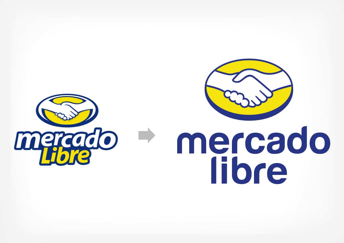
Mercado Libre, the leading e-commerce and fintech ecosystem in Latin America, entrusted Imaginity with the comprehensive renewal of its visual identity. The objective was to modernize and refresh its image while preserving the core values of efficiency and trust that define the brand. As a branding, packaging design and brand consulting agency with experience in complex brand architecture systems, Imaginity addressed two connected challenges: organizing a fragmented ecosystem of sub-brands, including Mercado Libre and Mercado Pago, and updating an outdated, visually complex logo for modern digital environments.
Imaginity | Design Agency | Branding, Packaging Design, Marketing
Project Highlights
- Structured Brand Architecture: A well-defined visual identity and cohesive architecture system designed to unify the entire ecosystem. This strategic framework ensures that Mercado Libre, Mercado Pago, and all other brands function in perfect harmony, maintaining a consistent global image while allowing each business unit to thrive in its specific category.
- Streamlined "Handshake" Isotype: A carefully redesigned version of the iconic handshake, simplified into a more impactful symbol that takes center stage.
- Modern Sans-Serif Typography: The introduction of a clean, friendly, and trustworthy typeface that ensures legibility and a contemporary feel.
- Digital-First Optimization: A lighter visual weight for the isologotype, specifically engineered for high performance in digital instore marketing and mobile interfaces.
- Refined Chromatic Palette: The signature yellow and blue are preserved but optimized for a more vibrant, energetic, and modern user experience.
1. The Branding Challenge: Resolving Ecosystem Fragmentation
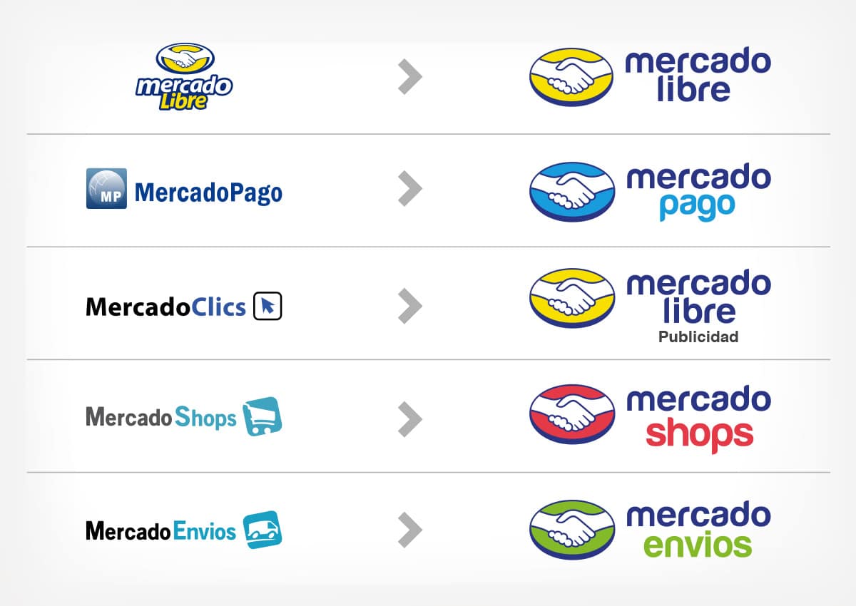
The brief required a solution for a dysfunctional branding landscape where different business units operated with disconnected visual languages. Our brand consulting process identified the need for a cohesive structure that could house the company’s diverse services under one unified roof. The challenge was to execute a design that balanced the brand's solid trajectory and reliability with the speed and innovation expected of a modern e-commerce giant, ensuring the local implementation of global brands felt seamless across the entire region.
2. Our Design Process: From Complexity to Clarity
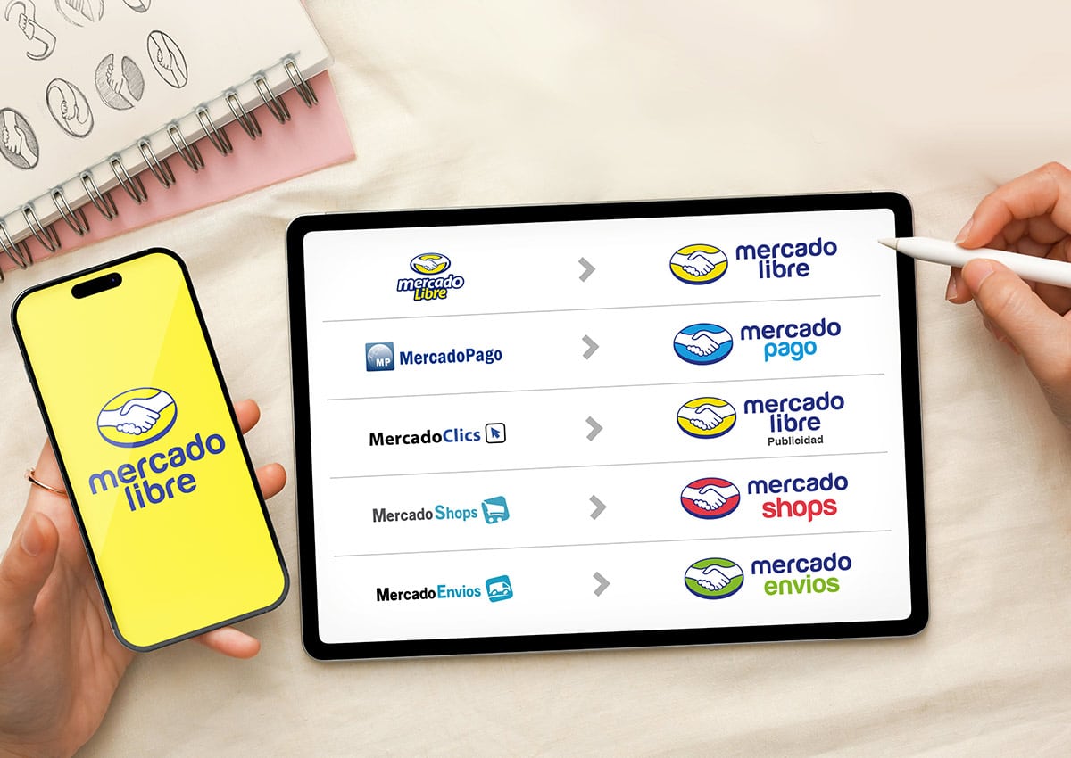
Leveraging our rigorous design process, we transitioned Mercado Libre from an outdated, detail-heavy logo toward a minimalist and powerful visual identity. Our solution involved two key strategic actions: First, planning a new, structured brand architecture to provide regional cohesion, strengthening each sub-brand—such as Mercado Pago—while reinforcing the unity of the parent group. Second, we executed a complete visual redesign that simplified core elements—the iconic "handshake," the oval, and the signature colors—to maintain instant recognition while improving storytelling and brand recall.
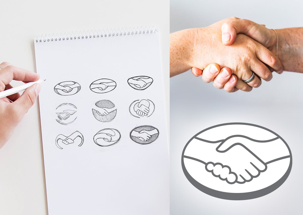
The previous iteration featured thick lines and complex details that became illegible in small digital formats. By refining these elements into a clean, "pregnant" style and introducing modern sans-serif typography, we created a system that is both simple and remarkably clear. This transformation was a strategic move by our brand consulting team to ensure the isologotype is lighter and more effective for high-performance digital use.
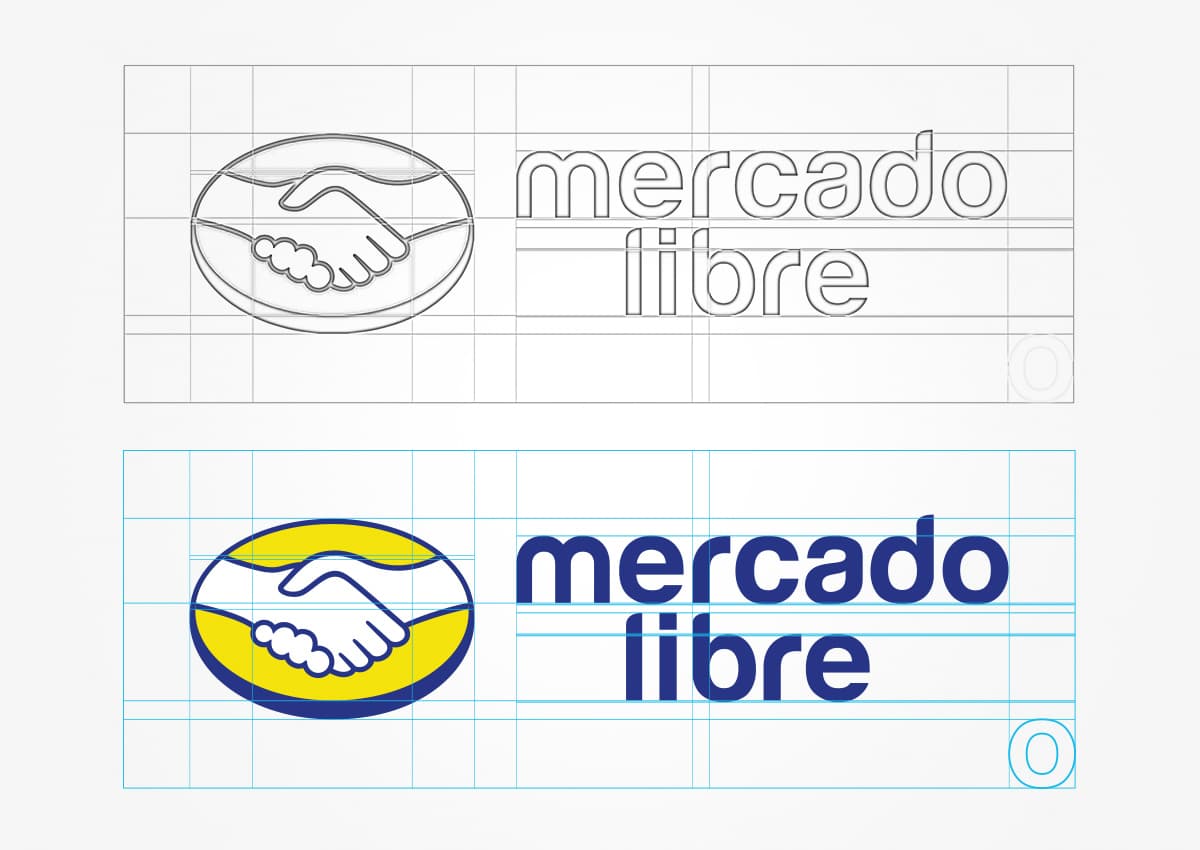
Through meticulous design, we defined a precise grid for the placement of every element, ensuring that whether the brand appears on a delivery truck or a smartphone screen, the identity remains consistent. We developed vertical and horizontal variations of the different logos to adapt to diverse implementation formats and packaging design categories. This level of technical precision is a hallmark of our global experience, allowing us to bridge the gap between physical packaging design and the digital user journey across Latin America.
3. The Outcome: A Cohesive and Trustworthy Global Brand
The project successfully delivered a solid brand system that unified the entire Mercado Libre group under a streamlined structure. The updated identity achieves a perfect balance between a long-standing corporate trajectory and a vibrant, modern feel. To ensure the long-term success of the branding, we developed an exhaustive brand manual. This guide serves as the definitive tool for the consistent and impactful application of the refreshed image across the now-cohesive ecosystem.

Mercado Pago Logo Redesign: From Payment Utility to Leading Fintech Platform
The Mercado Pago logo evolution shows how a payment feature can become a major fintech brand. The original identity worked as a functional payment mark within the Mercado Libre ecosystem, but the expanded business required a clearer, more scalable visual identity. The new design preserved the equity of the handshake while giving Mercado Pago a stronger digital presence for mobile apps, merchant tools, online checkout, QR payments, and financial services across Latin America.
Mercado Pago has become one of Latin America's leading digital payments and fintech platforms, supported by the reach and trust of the Mercado Libre ecosystem. Mercado Libre's investor materials describe Mercado Pago as the largest fintech acquirer in Latin America by TPV, and the company's Q2 2026 results reported 88 million fintech monthly active users and $101 billion in total payment volume for the quarter.
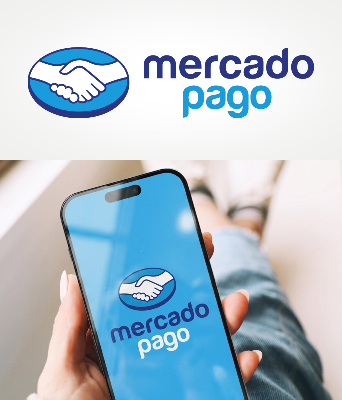
Mercado Pago: A Fintech Brand Connected to Marketplace Trust
Mercado Pago began as the payment solution inside Mercado Libre, giving buyers and sellers a safer way to transact within the marketplace. As the service expanded into online payments, QR payments, mobile point-of-sale, digital accounts, credit, and everyday financial services, its visual identity needed to feel more independent while still benefiting from the trust of the Mercado Libre ecosystem. The redesign clarified that relationship: Mercado Pago became a distinct fintech brand with a friendly, digital-first identity rooted in the same recognizable handshake symbol.
A Digital Payment Identity Designed for Everyday Use
Mercado Pago's visual system had to perform in the small, fast, and high-frequency environments where digital payments happen: mobile screens, app icons, checkout flows, QR codes, payment links, merchant dashboards, and point-of-sale devices. The simplified identity improves recognition at reduced sizes and supports a more consistent fintech experience for consumers and merchants. As Mercado Pago scaled beyond marketplace checkout, the brand system helped reinforce usability, accessibility, and trust in everyday financial interactions.
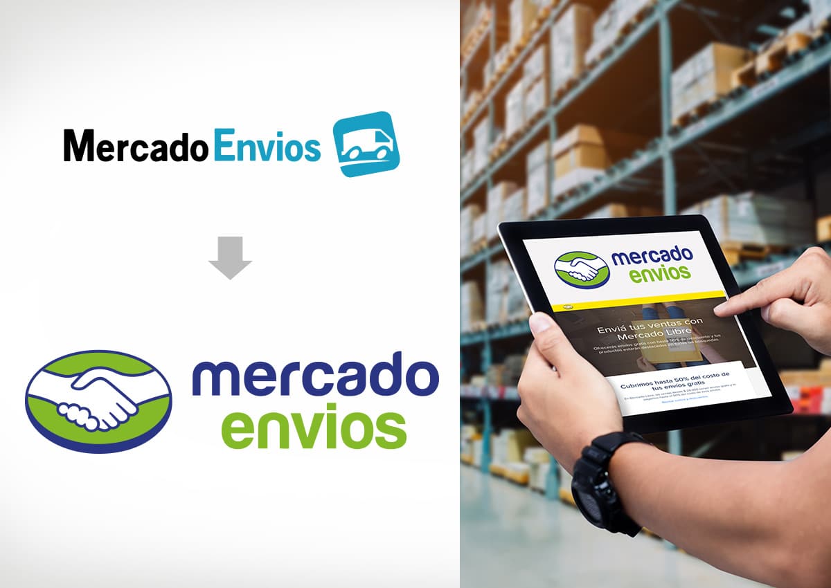
Mercado Envíos: A Logistics Identity Built for Trust at Every Delivery
The Mercado Envíos redesign extended the new Mercado Libre brand architecture into one of the ecosystem's most visible operational services: shipping. The identity needed to communicate speed, reliability, and regional scale while staying clearly connected to the master brand. By simplifying the symbol, refining the typography, and aligning the color language with the broader visual identity system, Mercado Envíos became easier to recognize across digital tracking interfaces, warehouse environments, delivery materials, and last-mile brand touchpoints.
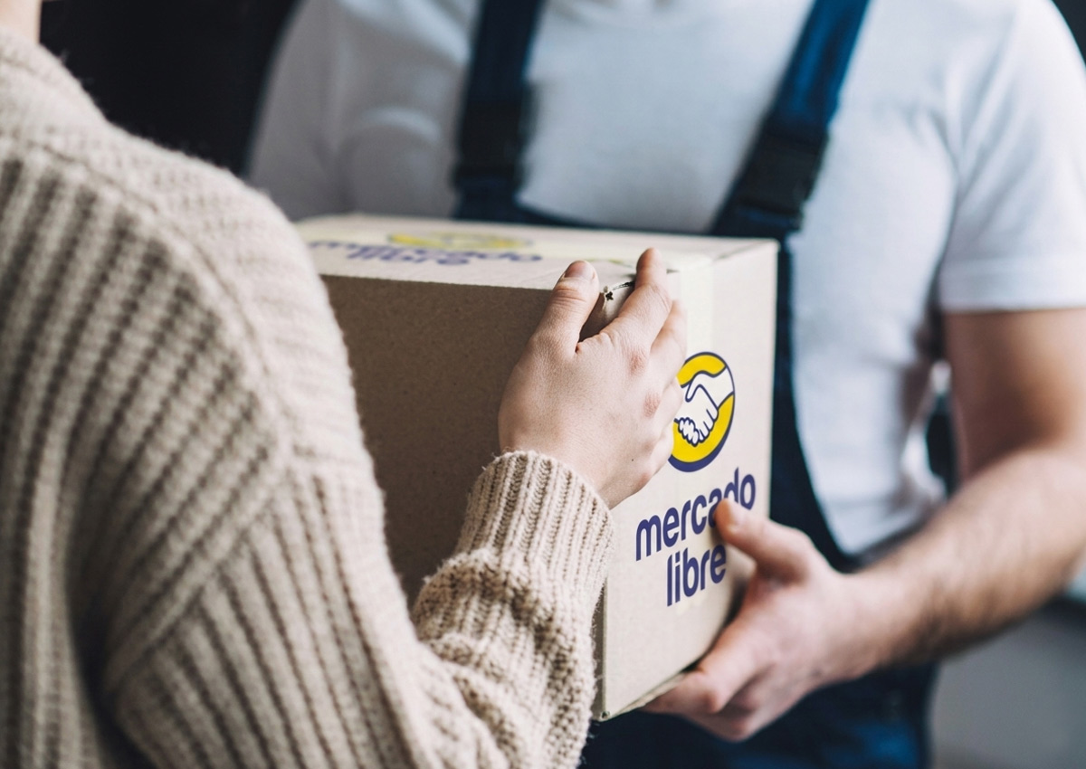
From Digital Marketplace to Physical Brand Experience
For an e-commerce brand, the customer experience does not end on the screen. Packaging, labels, delivery interactions, and fulfillment moments all become part of the brand story. The refreshed Mercado Libre identity was designed to travel from the digital marketplace into the physical delivery experience with the same clarity and trust. This consistency helps turn every shipment into a recognizable brand encounter, strengthening the connection between online shopping, logistics, and customer confidence across Latin America.
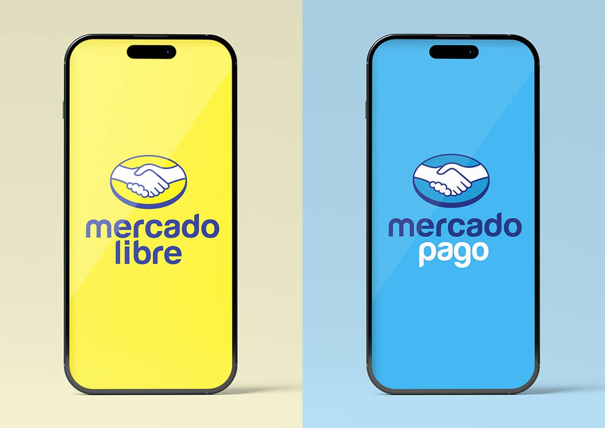
One Ecosystem, Complementary Digital Brands
The relationship between Mercado Libre and Mercado Pago is central to the strength of the brand architecture. Mercado Libre leads the commerce experience, while Mercado Pago extends that relationship into payments and financial services. The visual system gives each brand its own role, color expression, and application context, while keeping both clearly part of the same ecosystem. This balance supports a more coherent user journey across shopping, selling, paying, receiving money, and managing digital financial services.
The result is a brand that is not just seen as a platform, but felt as a reliable partner in the daily lives of millions. This project proves that strategic design and brand consulting are powerful tools for maintaining leadership in the competitive e-commerce landscape of Latin America.
How Imaginity can work with your brand
When a business expands across products, services, and customer journeys, Imaginity can clarify the relationship between the master brand and each offer. Our brand consulting service connects positioning, identity, and governance so the system can scale without losing recognition.
Read the detailed Mercado Libre brand architecture case. If your organization is managing new sub-brands, products, or markets, send us the current structure and the change you are planning.