Client:
La Perla Redonditas
Country:
Argentina
Task:
Packaging Design
An appetizing pack
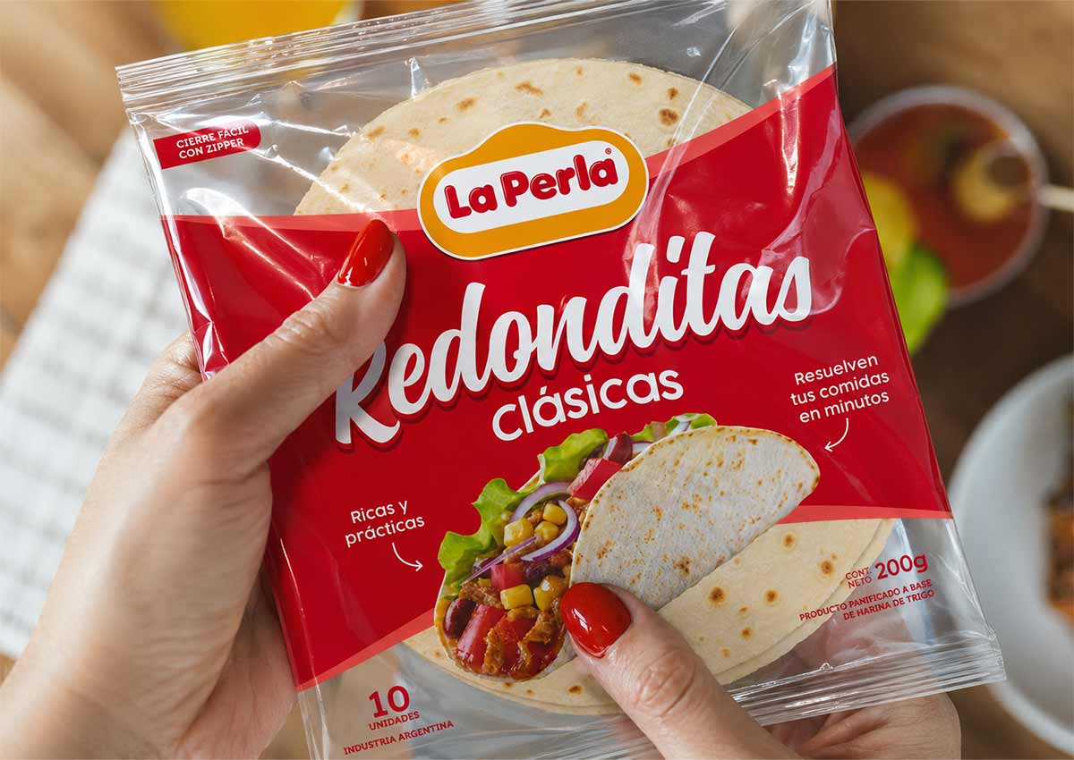
Imaginity, global design agency, worked on redesigning the packaging of the Argentinian brand La Perla Redonditas with the aim of modernizing the pack, creating a cleaner image that allows the product to stand out in store. The new design works with a larger transparency area, which allows you to see the product. the number of elements is simplified, helping for a clearer visualization of the information. We choose an image in which the product can be seen clearly, that can communicate and show appetizingness as well as an idea of how it can be consumed.
Imaginity | Design Agency | Branding, Packaging Design, Marketing
The challenge
Redesign La Perla Redonditas packaging and visual identity to enhance product visibility in the food category both in store and digital market. Simplify the design for greater impact and recognition, and add appetite appeal.

The solution
After the packaging design brief our design process starts with the hand sketching and drafting, to explore different conceptual and graphic options.
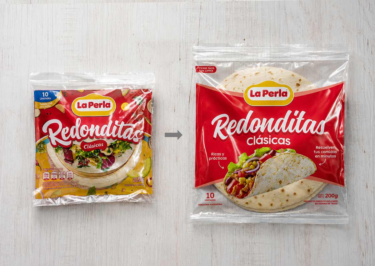
The new packaging of La Perla Redonditas design uses a larger transparent area, allowing the product to be seen more clearly. The number of elements has been simplified, resulting in a clearer visualization of the information.
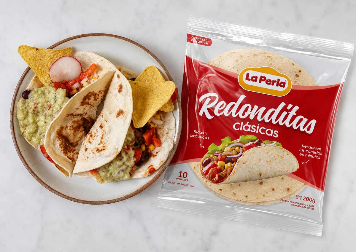
The product in a consumption situation: We chose an image in which the product can be seen clearly, which can communicate and show its appetizing nature as well as how it can be used.
The results
The power of packaging allows for results that change the perception of the product. A more appetizing pack that highlights the product through the use of consumption imagery and strategic transparency. By allowing consumers to see the product inside while showcasing it in an appealing serving suggestion, the packaging enhances desire, reinforces product quality, and creates a more engaging and trustworthy shelf presence.

