
Client:
Sigma Alimentos, Sugerencias del Chef
Country:
Mexico
Task:
Packaging Design, Branding
Sugerencias del Chef: Strategic Packaging Design & Visual Identity
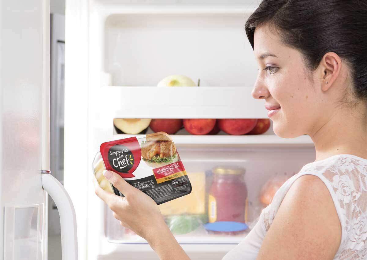
Sugerencias del Chef, a dynamic player in the convenient food sector in Mexico, partnered with Imaginity, global design packaging agency, to create a comprehensive brand visual identity branding and packaging design system for its new line of typical Mexican fast and frozen foods. To achieve retail success in a highly competitive category, we developed a high-impact visual strategy that relies on appetite appeal and striking, high-contrast aesthetics. The resulting packaging product line architecture not only commands attention on the shelf in store, but also simplifies the consumer journey through intuitive visual navigation.
Imaginity | Design Agency | Branding, Packaging Design, Marketing
Visual Highlights
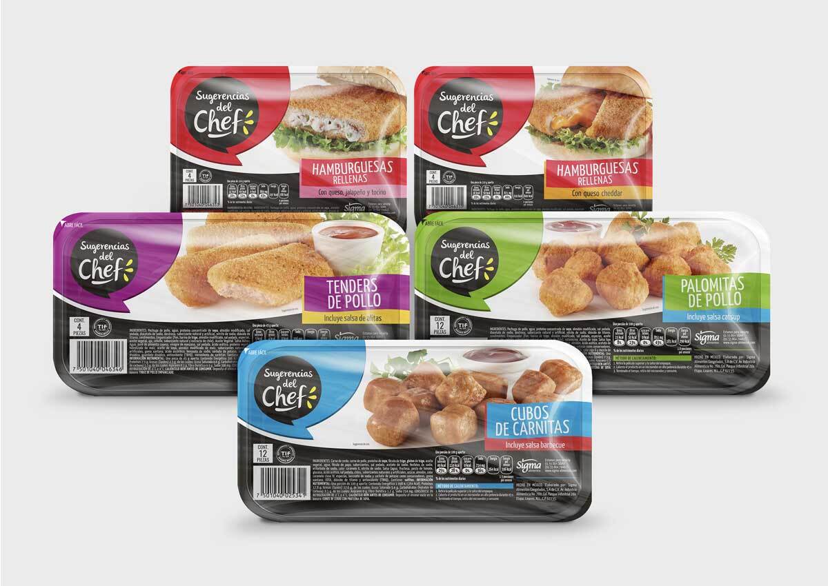
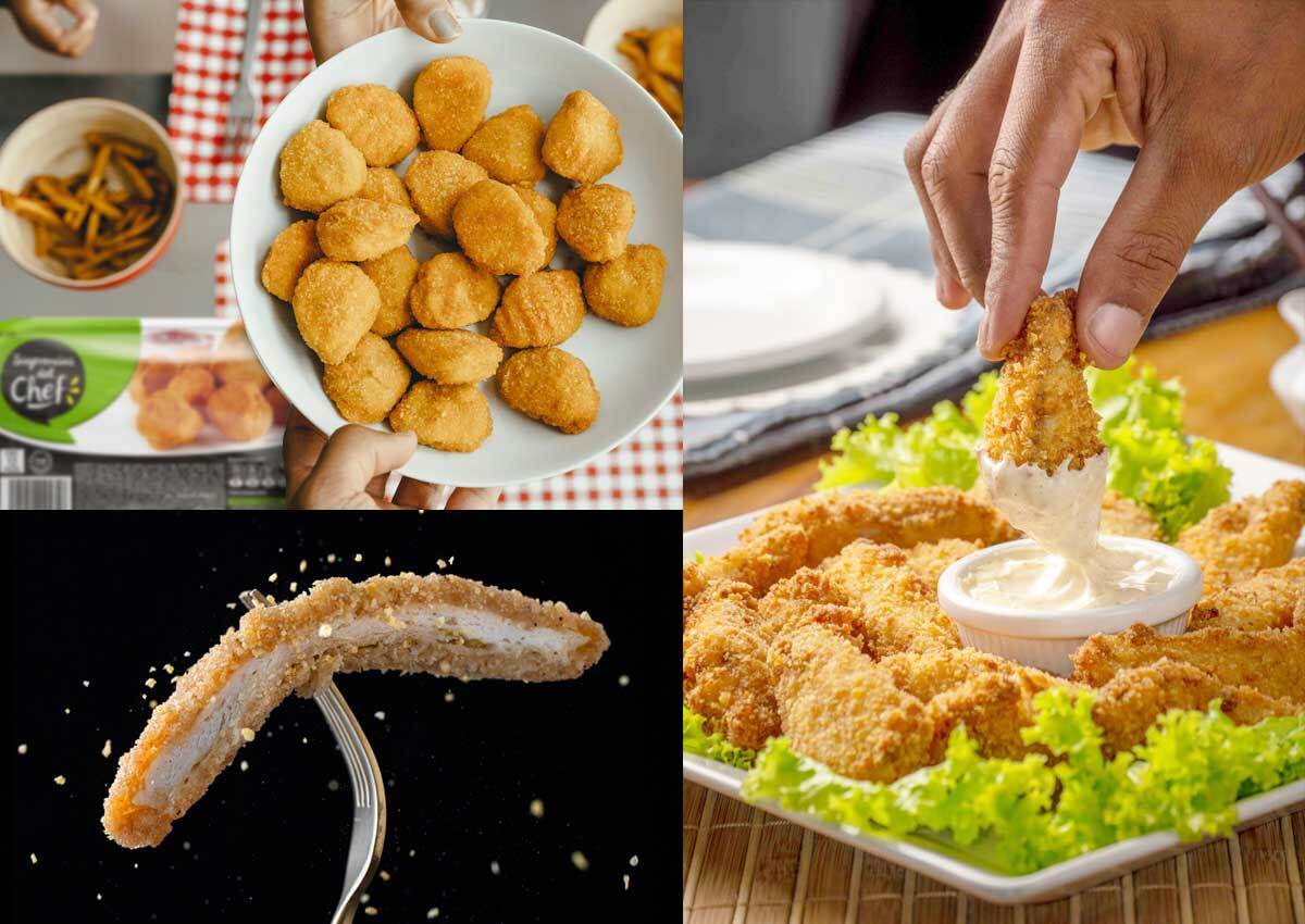
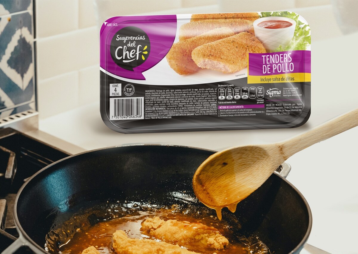
- Flavor-First Product Photography: Heroic, high-definition imagery of traditional Mexican dishes that serves as the visual protagonist of the pack to maximize consumer craving
- Color-Coded Asset System: A strategic palette of bright, contrasting colors that act as immediate encoders, allowing shoppers to effortlessly differentiate between product varieties.
- Cohesive Brand Typography: A distinctive, approachable logotype designed to project culinary quality, freshness, and the trusted warmth of a "chef's recommendation."
- High-Contrast Shelf Disruption:A bold design language specifically engineered to cut through visual clutter in frozen food and refrigerator retail environments.
- Scalable Packaging Architecture:A unified layout system structured to accommodate a wide and growing catalog of Mexican fast-food offerings seamlessly.
1. The Branding Challenge: Disruption in the Frozen Food Aisle
The primary objective for Sugerencias del Chef was to establish a distinctive and memorable presence in a category heavily saturated with generic designs. We understand the power of packaging as communicator; traditional fast-food packaging often blends together on the shelf; our challenge was to design a visual identity that communicates convenience without sacrificing authenticity or perceived food quality. We needed to bridge the gap between "speed of preparation" and the rich, vibrant flavors of traditional Mexican cuisine.
2. Our Design Process: Implementing a "Color-Encoder" System
Our team pioneered a creative solution centered on functional color theory and visual pragmatism. We moved away from muted corporate tones to embrace a palette that reflects the vibrancy of Mexican culture. By assigning a specific, contrasting color combination to each product variety, we created a clear information hierarchy and brand architecture. This "color-encoder" strategy ensures that whether a consumer is looking for tacos, tamales, or enchiladas, the product type is instantly recognizable, reducing cognitive friction at the point of purchase.
3. The Outcome: A Strong, Consumer-Friendly Retail Presence
The result is a highly successful FMCG packaging line that establishe a storytelling that creates an immediate emotional and sensory connection with the consumer. By combining striking product photography with bold structural color choices, Imaginity transformed Sugerencias del Chef into a visually compelling, cohesive brand. The new design not only drives strong shelf-stopping power but also establishes a highly scalable and organized framework for future product developments within the brand's portfolio. This frozen food packaging project highlights Imaginity’s expertise in category disruption and visual brand architecture. Consistent with our work in strategic packaging design and brand identity systems, we have ensured that Sugerencias del Chef stands out as a top-tier choice for convenient Mexican cuisine.