Client:
Wise Snacks
Country:
Task:
Packaging design inspired by its old packaging
Limited collectible edition to celebrate
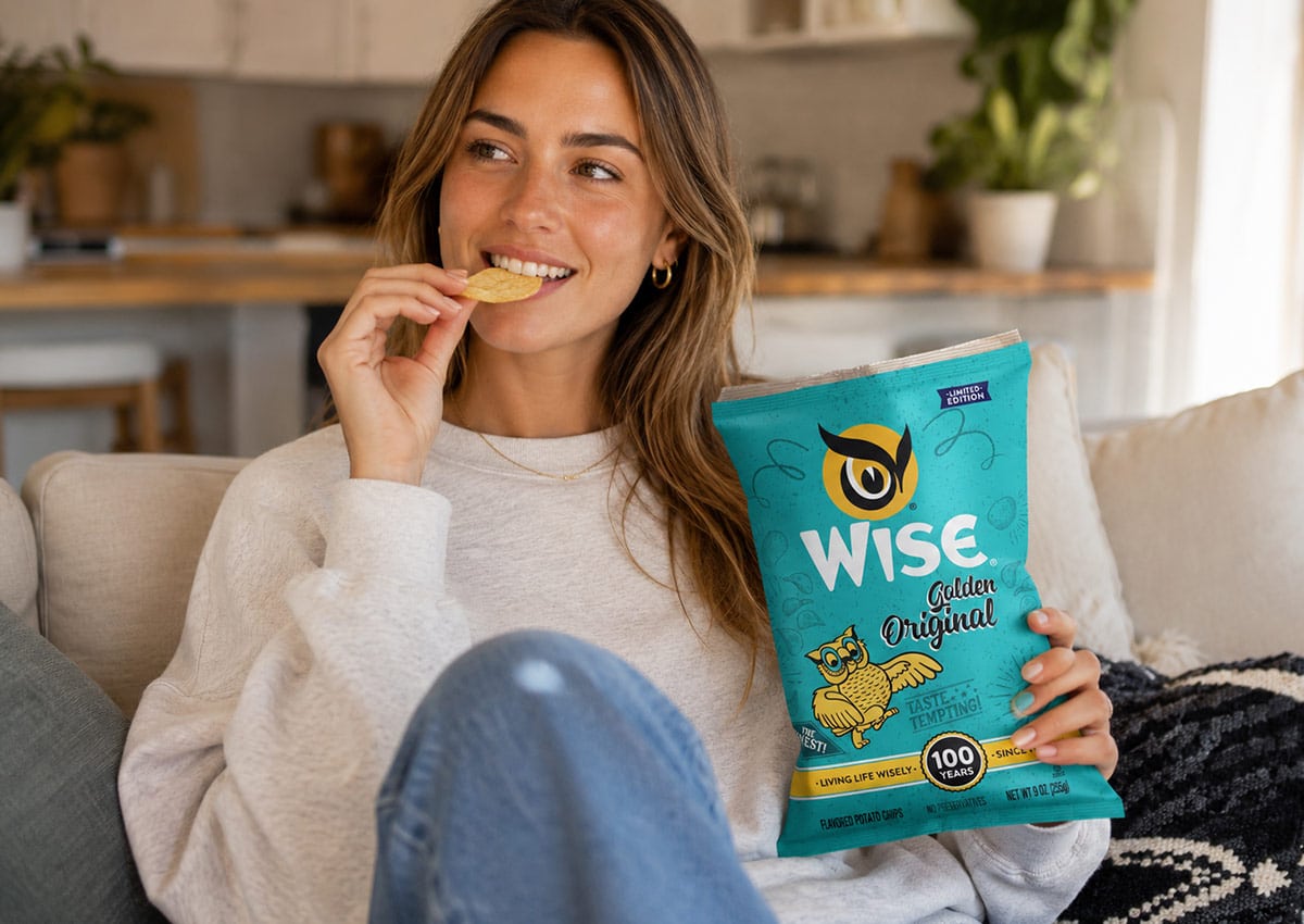
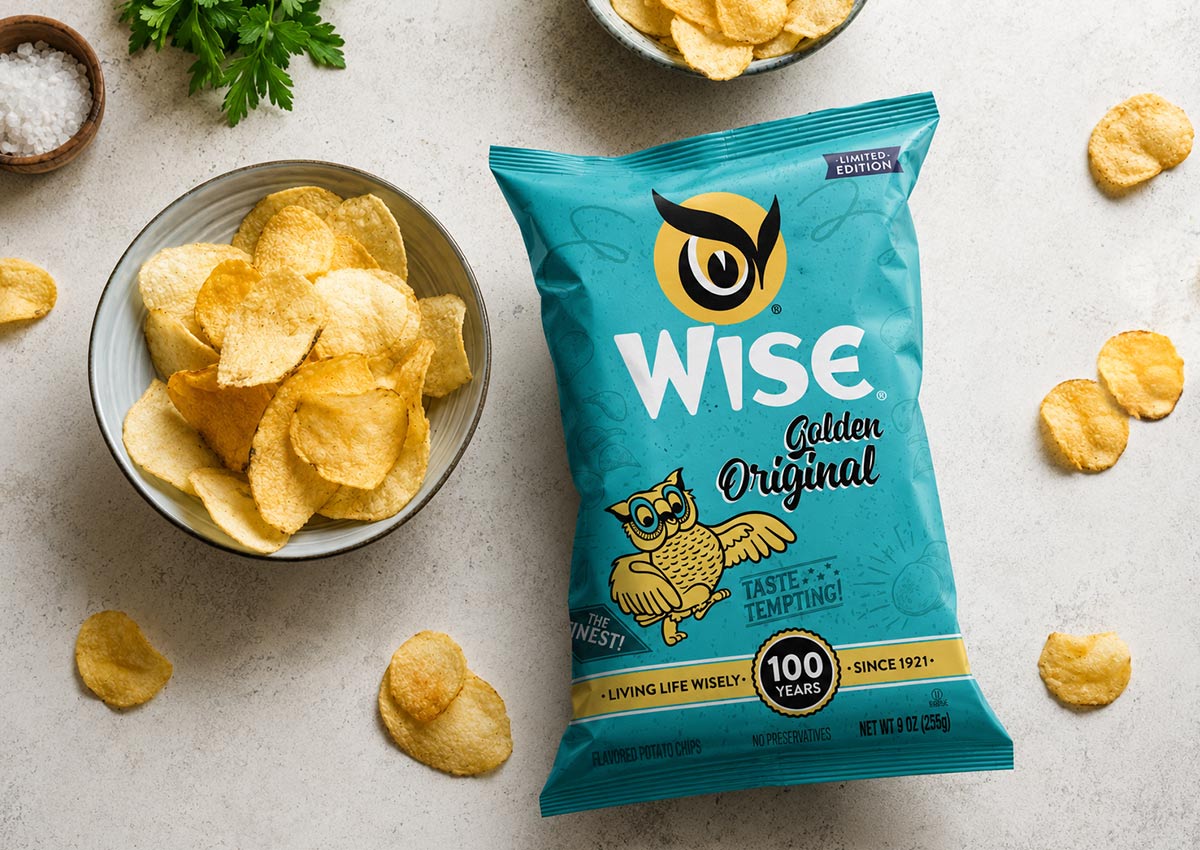
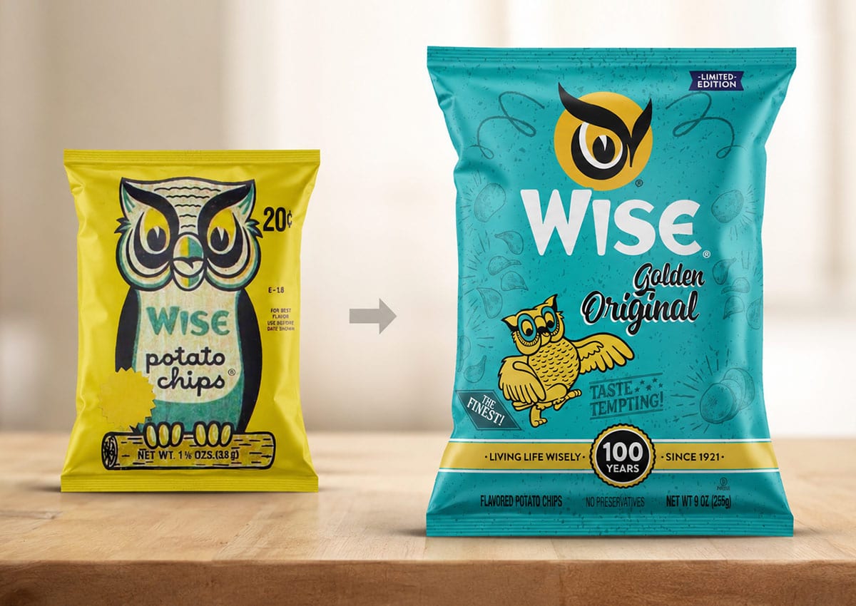
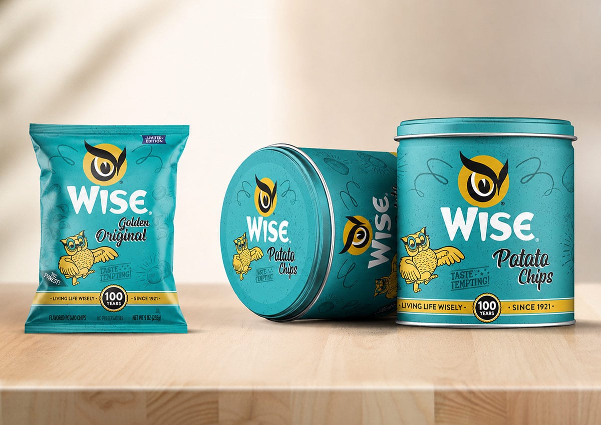
To mark a century of success, we partnered with Wise Snacks to create a commemorative experience that honors their 100-year legacy. By digging into the brand’s archives, we brought back the original owl emblem and vintage aesthetics, blending nostalgia with a modern premium feel. The result is a collectible series of tins and packs that doesn't just hold snacks—it holds a century of memories for the families who have grown up with the brand.
Imaginity | Design Agency | Branding, Packaging Design, Marketing
Visual Highlights
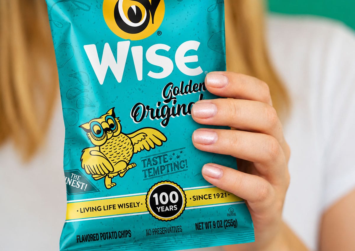
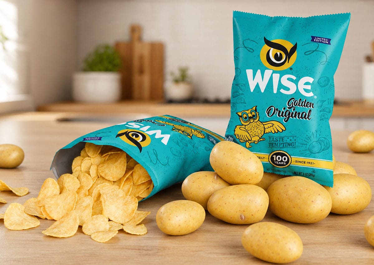
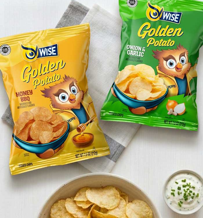
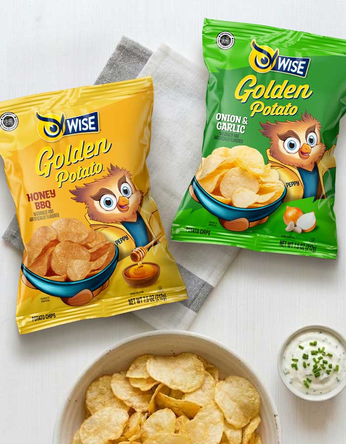
- Nostalgic Retro Packaging Design: A meticulously crafted vintage aesthetic—from the typography to every graphic asset—designed to build an emotional connection and take consumers on a visual journey through the brand's rich history.
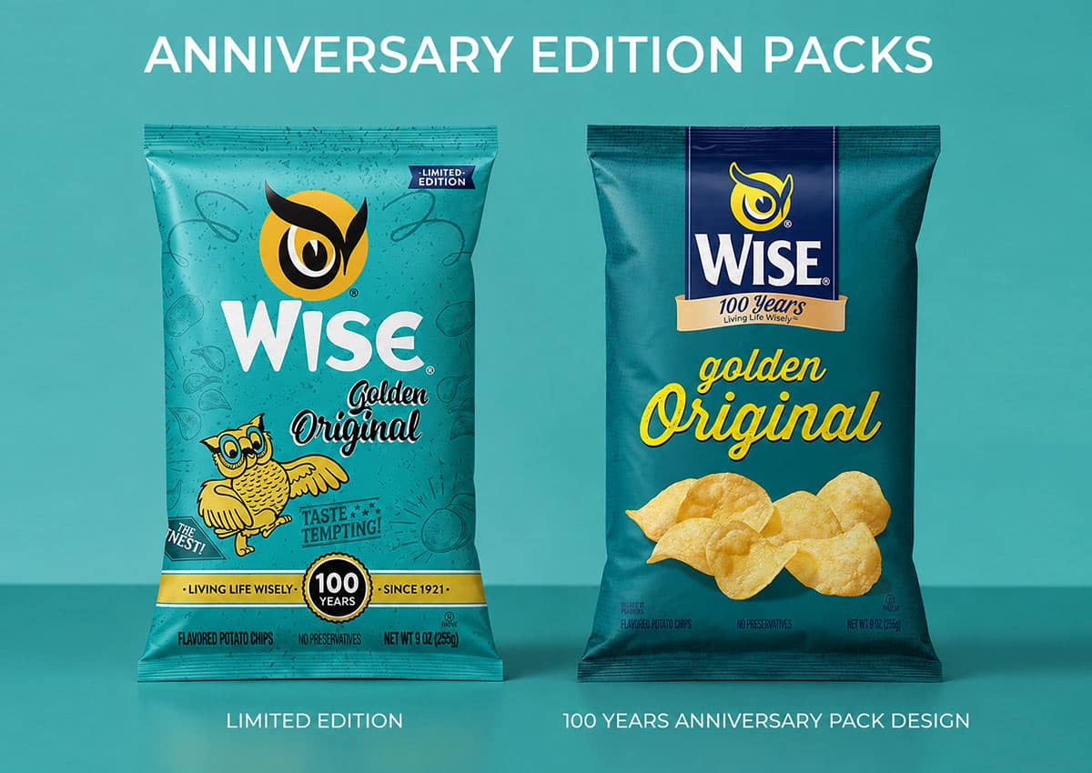
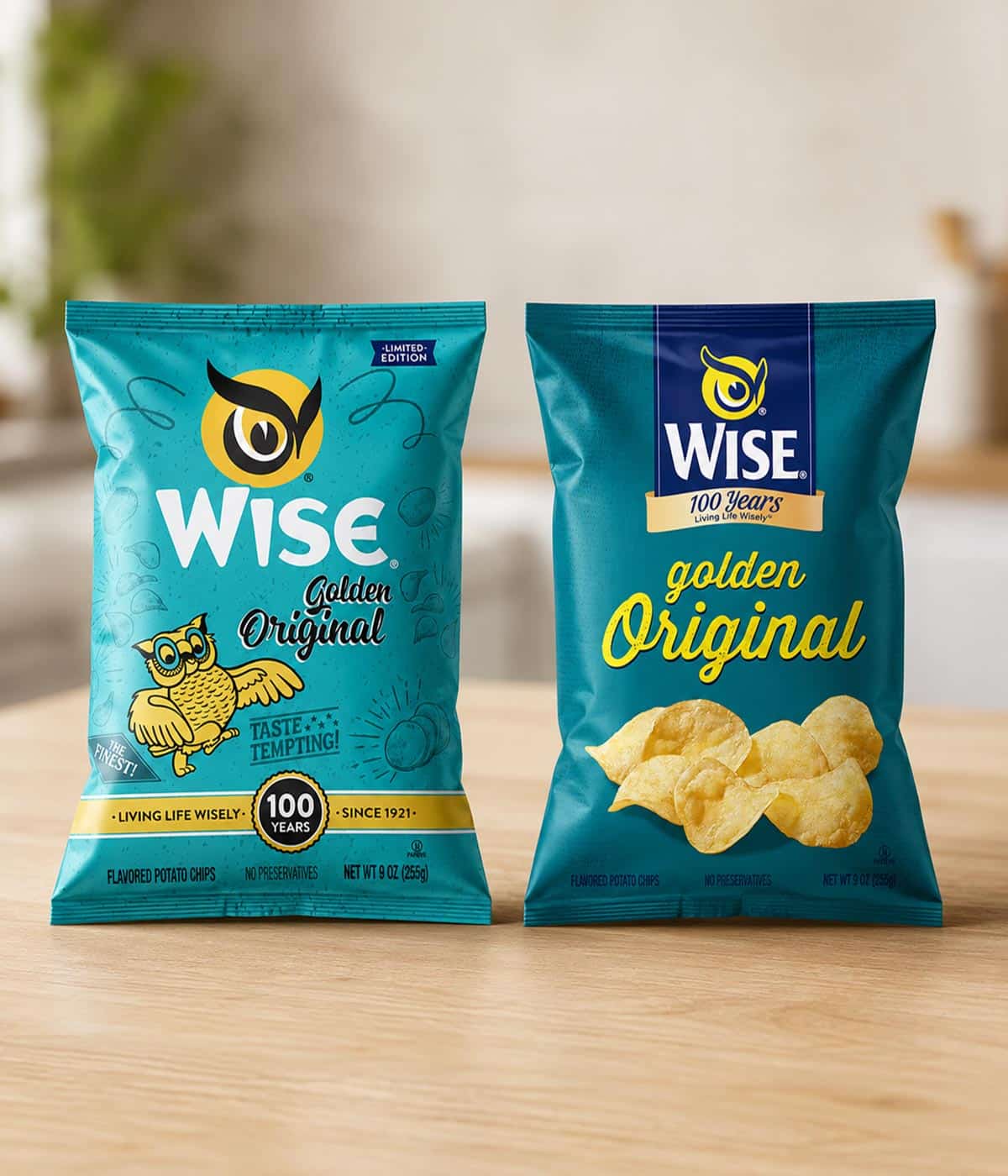
- Limited-Edition Anniversary Assets: Strategic implementation of a limited-edition packaging design framework to celebrate 100 years of the brand, utilizing custom vignettes, celebratory callouts, and commemorative graphic details.
- The Return of the Iconic Brand Mascot: The reintroduction of Wise Snacks' emblem character as the absolute protagonist of the layout, effectively leveraging nostalgia and reinforcing brand tradition in store.
- Strategic Dual-Era Color Palette: A highly calculated chromatic scheme that accurately recreates the brand’s original heritage tones while seamlessly blending them with the current regular pack identity to maintain recognition and shelf consistency.
- Vintage Illustrative Typography & Patterns: The integration of hand-drawn, gestural vintage lettering and retro graphic motifs arranged as a rich visual texture, elevating the product’s visual identity and turning it into a collector's item for true brand advocates.
1. The Challenge: Honoring a Century of Brand Heritage
The primary objective was to celebrate Wise Snacks' 100th anniversary by creating a collectible limited-edition packaging series that bridges the gap between the brand's history and the modern market. The challenge lay in capturing a century of tradition—built on family and memory—and translating it into a design that resonates with lifelong fans while attracting new consumers through a premium, nostalgic experience.
2. The Solution: A Vintage Reimagining for the Modern Era
We developed a comprehensive design system featuring four collectible cans and matching snack packs that evoke a powerful sense of nostalgia. The solution utilized a retro visual language, incorporating the original logo and the brand’s iconic owl emblem as the protagonist. By meticulously selecting vintage typography, a classic color palette, and period-accurate graphic details, we created a "layered" design that feels authentic to the brand's origins while remaining fresh and relevant on today’s shelves.
3. The Results: A Collectible Anniversary Experience
The project successfully delivered a premium, high-impact limited edition that turned everyday snack packaging into a collectible keepsake. The final design, highlighted by a special anniversary band, generated an immediate emotional connection with consumers by reviving fond memories of the brand’s first packs. By delivering a cohesive look across both the flexible packaging and the collectible metal tins, we ensured the 100-year celebration was both a commercial success and a fitting tribute to the brand's enduring legacy.
Imaginity is a packaging design agency specializing in snack and consumer brands. We work with FMCG companies to create limited edition packaging and commemorative brand experiences that combine heritage storytelling with modern design, strengthening emotional connection, increasing shelf impact, and driving engagement across retail environments.