Client:
Gloria
Country:
Perú
Task:
Packaging Design
Enhancing Appetite Appeal, Brand Navigation, and Natural Refreshment Across the Line
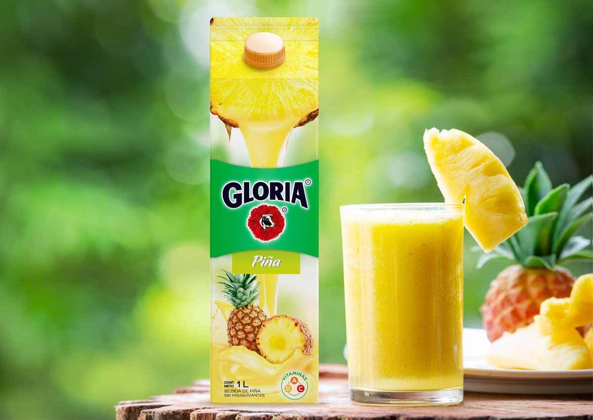
For Gloria, Imaginity developed a comprehensive packaging redesign and brand architecture strategy for its fruit juice line. By creating a dedicated brand area and standardizing visual elements, the new design organizes the product line while elevating shelf impact. The core focus was driving maximum appetite appeal and communicating raw naturalness, featuring vibrant fruit imagery and dynamic juice splashes on the front, complemented by engaging packvertising messaging on the side panels to build a deeper connection with target consumers.
Imaginity | Design Agency | Branding, Packaging Design, Marketing

Visual Highlights
- Brand Area & Architectural Order: Established a unified brand zone that anchors the primary Gloria identity, structuring the packaging layout and bringing visual harmony across the entire product line.
- Consistent Top Fruit Placement: Positioned high-impact fruit imagery consistently at the top section of every package across the line to streamline shelf recognition and drive immediate appetite appeal.
- Dynamic Naturalness Imagery: Visualized fresh juice bursting directly from the real fruit, driving appetite appeal while reinforcing freshness and natural quality.
- Side-Panel Packvertising: Integrated strategic packvertising storytelling on the lateral panels to deliver targeted brand messages that resonate directly with consumer lifestyle values.
- Seamless Multi-Format Execution: Applied unified brand architecture and color systems optimized for flexible and rigid paper carton packaging materials.

The Challenge
In the competitive fruit juice and CPG beverage sector, standing out requires balancing clear brand navigation with intense appetite appeal. The Gloria fruit juice line needed a unified brand architecture to organize its various flavor offerings while establishing strong shelf presence. Furthermore, the packaging had to overcome shelf clutter by instantly communicating core product benefits: vibrant naturalness, rich fruit content, and pure refreshment, while maximizing consumer engagement both on the front display panel and along the sides of the pack.

Our Design Process
Starting from a strategic design brief, Imaginity executed a comprehensive design process focused on visual hierarchy, appetite appeal, and packaging communication:
- Brand Architecture & Layout Structuring: We created a distinctive, standardized brand area across the top of the package, structuring the visual hierarchy to make flavor navigation intuitive for shoppers.
- Appetite Appeal & Imagery Realism: We designed a dynamic visual system with high-definition fruit graphics placed consistently across the upper section of each variant, depicting real juice flowing directly out of fresh fruit to emphasize naturalness.
- Lateral Packvertising: We leveraged the side panels to integrate targeted packvertising content, transforming secondary package space into an active brand voice that connects emotionally with target audiences.

The Outcome
The redesigned Gloria fruit juice line delivered a commanding, unified presence on retail shelves. By harmonizing the brand architecture and placing hyper-real fruit visuals in a consistent layout, the new packaging significantly increased appetite appeal and brand recognition. The addition of side-panel packvertising successfully turned functional packaging into a persuasive brand storytelling touchpoint.
Imaginity is a global packaging design agency specializing in consumer packaged goods (CPG), partnering with leading personal care, FMCG, and global enterprise brands across Latin America and international markets. Combining strategic branding, visual identity, brand activation, and print communication expertise, our agency crafts high-impact visual storytelling across our portfolio to elevate brand perception.