
Client:
Emcesa, Aguila Beer
Country:
Paraguay
Task:
Packaging Design, Branding
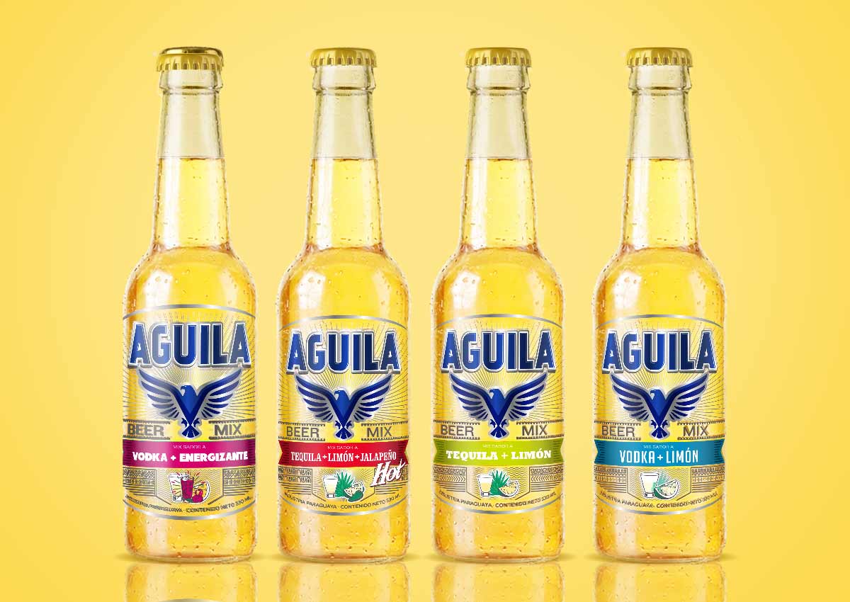
Aguila Beer: Premium Flavored Branding & Visual Identity
Emcesa, a prominent Paraguayan beverage producer, partnered with Imaginity, global packaging design agency, to develop the comprehensive branding and packaging design for Aguila, a new entrant in the premium flavored beer segment. The project was centered on a "Sophisticated Fusion" concept, designed to communicate the perfect balance between traditional beer quality and innovative flavor infusions. By utilizing high-end printing techniques and a bold symbolic identity, we created a brand that disrupts the retail shelf with elegance and modern appeal.
Imaginity | Design Agency | Branding, Packaging Design, Marketing
Visual Highlights
- The "No-Label-Look" Strategy: A transparent design approach that emphasizes the product’s purity and enhances appetite appeal by making the beverage itself the protagonist.
- Heritage-Iconic Eagle Emblem: A majestic brand symbol rendered in a striking Blue and Silver palette to reinforce the product's premium and authoritative character.
- Modern Minimalist Typography: Sleek, contemporary fonts that balance the brand's heritage-inspired icon with a forward-thinking aesthetic.
- Strategic Flavor Communication:A visual hierarchy that clearly signals the flavor differentiator while maintaining the core "beer" identity of the parent brand.
- Premium Finishing Cues:Design elements optimized for high-quality substrates, ensuring a tactile and visual experience of luxury in store.

1. The Branding Challenge: Defining a New Category of Fusion
The primary objective of the Aguila project was to successfully introduce a flavored beer into a market often dominated by traditional choices. The challenge lay in effectively communicating the "fusion" aspect—convincing consumers that a beer with "delectable flavor ingredients" could still be a sophisticated, premium choice. We needed to design a visual identity and a product line architecture that felt refreshing and modern without losing the grit and prestige associated with the "Aguila" (Eagle) name.
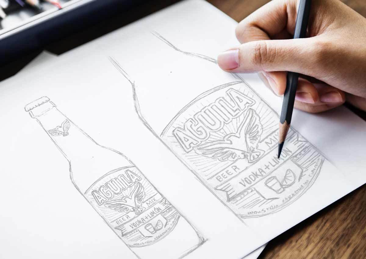
2. Our Design Process: Engineering Elegance and Appetite Appeal
Our team pioneered a design solution focused on "Visual Transparency." By opting for a no-label-look, we allowed the liquid's natural color to interact with the silver and blue branding, creating a sense of lightness and refreshment. The creation of the eagle emblem was a central pillar of our branding process, where we refined the icon to act as a seal of quality. Every element was meticulously curated to cater to a demographic that values both innovation in flavor and excellence in design.
3. The Outcome: A Remarkable Market Impact
The result is an exquisite and cohesive visual identity that has established Aguila as a distinctive player in the Paraguayan beer market. Taking advantage of the power of packaging successfully merges elegance with modernity, providing a clear differentiator that resonates with the target consumer. Through Imaginity’s strategic packaging design, Aguila stands as a powerful symbol of quality, proving that bold iconography and minimalist design are the keys to capturing the premium "flavored beer" audience.
This beverage branding project for Aguila highlights Imaginity’s expertise in market entry strategy, storytelling and luxury packaging. Consistent with our work in strategic brand architecture and high-impact retail design, we have ensured that Emcesa’s new offering delivers a lasting impression.