Cookies, Crackers & Biscuits Branding & Packaging Design
Global Brand, Packaging & Shopper Marketing Expertise



Imaginity creates branding and packaging systems for cookies, crackers, biscuits, wafers, and related baked snacks. We combine brand strategy, portfolio architecture, packaging design, and shopper marketing to communicate flavor, texture, ingredients, and benefits clearly—at retail and in e-commerce.
Our work addresses the practical demands of the category: a shopper may need to recognize the brand, understand the product type, identify a flavor, compare formats, and find the right benefit within seconds. A clear visual system brings those decisions together while giving each product enough character to be distinctive.
For chocolate, candy, gifting, and other non-baked confectionery projects, explore our Chocolate & Confectionery expertise.
Category Expertise in Cookies, Crackers, Biscuits & Wafers
Cookies and crackers share a retail environment, but they do not always use the same visual language. Sweet cookies may emphasize indulgence, fillings, inclusions, texture, or moments of enjoyment. Crackers may need to communicate simplicity, crunch, grains, ingredients, pairings, or everyday versatility. Wafers and filled cookies introduce additional layers of flavor, format, and product architecture.
We begin by defining what the product is, why it belongs in the shopper’s routine, and how it should relate to the rest of the portfolio. That foundation guides naming hierarchy, brand presence, product photography, ingredient cues, color coding, claims, and pack structure. The objective is not to add more messages; it is to establish the right order for them.
The same system must work across physical shelves, club and convenience formats, e-commerce thumbnails, multipacks, and future line extensions. We therefore evaluate every direction at full size and reduced size, considering how the brand and product proposition remain recognizable across channels.
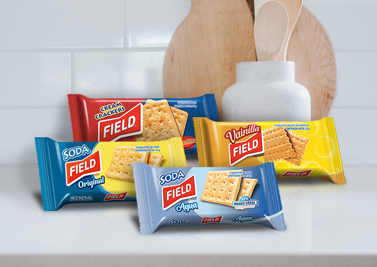

Brand Architecture for Growing Product Lines
A growing product line needs a clear relationship between the master brand, sub-brands, product names, flavors, and benefits. When every element competes for attention, the range becomes harder to navigate. When everything looks identical, individual products lose their distinction. Brand architecture creates a deliberate balance between recognition and differentiation.
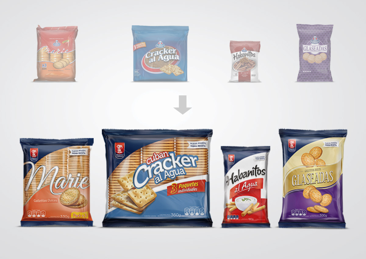
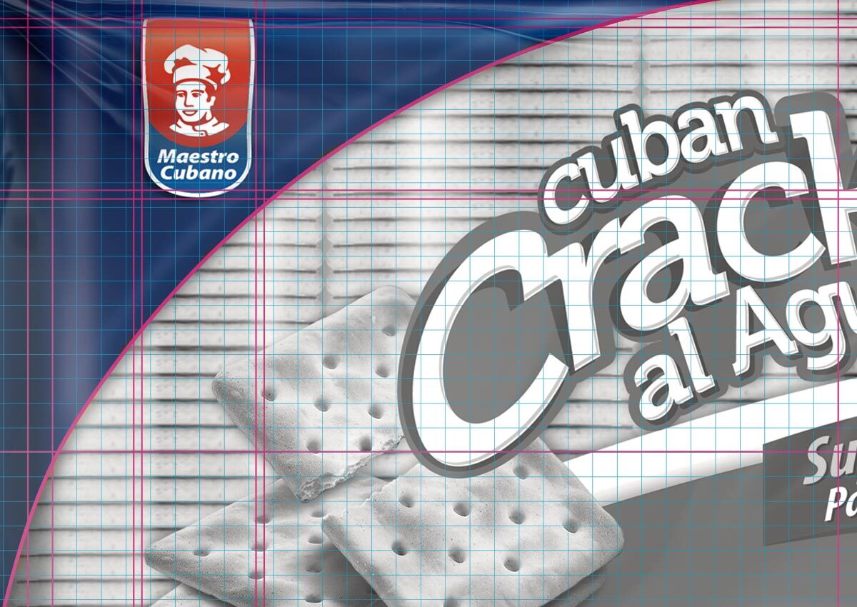
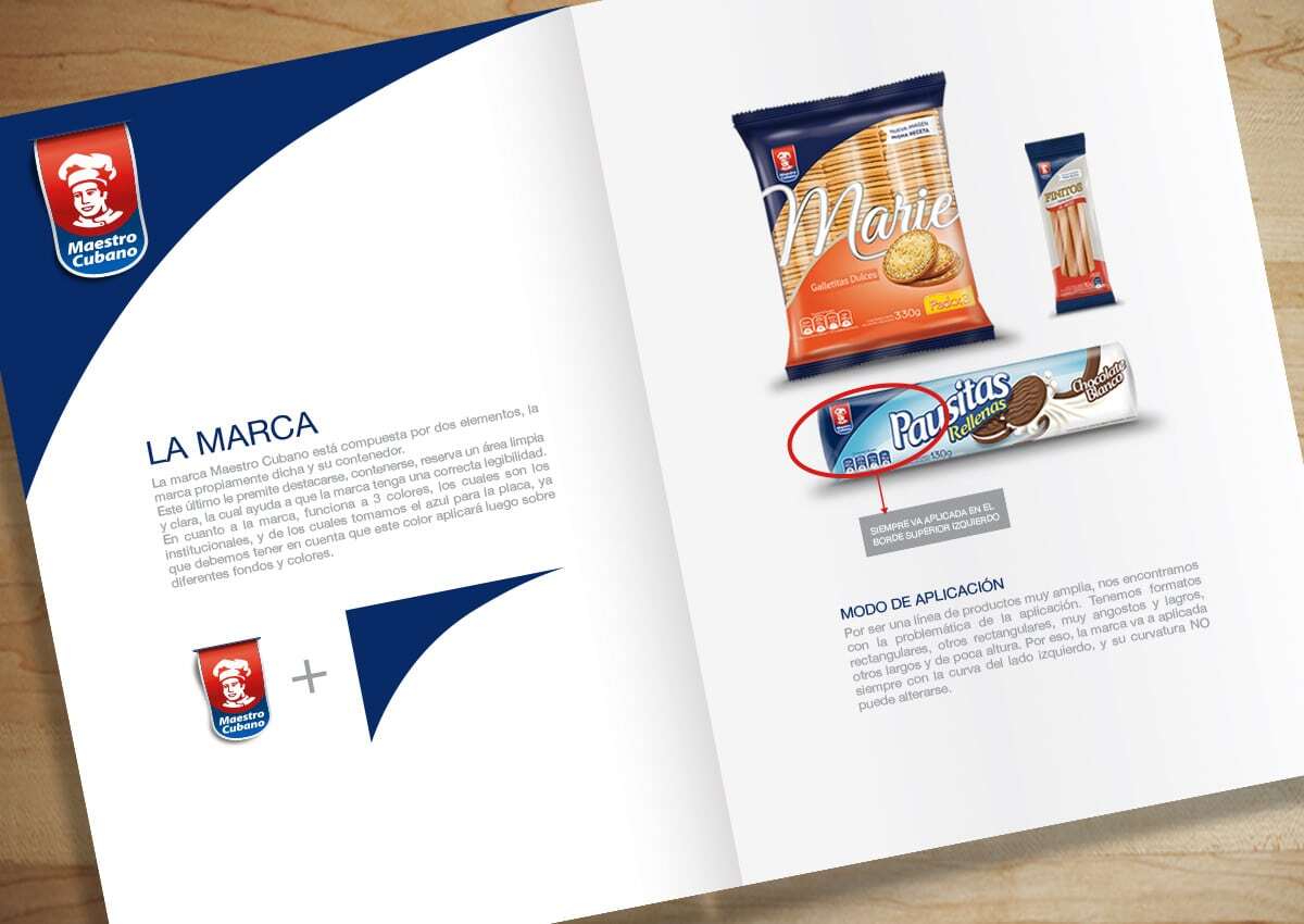
Imaginity develops visual rules for brand placement, typography, imagery, color, claims, and variant information. These rules create continuity across the portfolio while allowing each SKU to communicate its own product type and reason to choose. They can also provide a practical foundation for packaging guidelines, new formats, and future extensions.
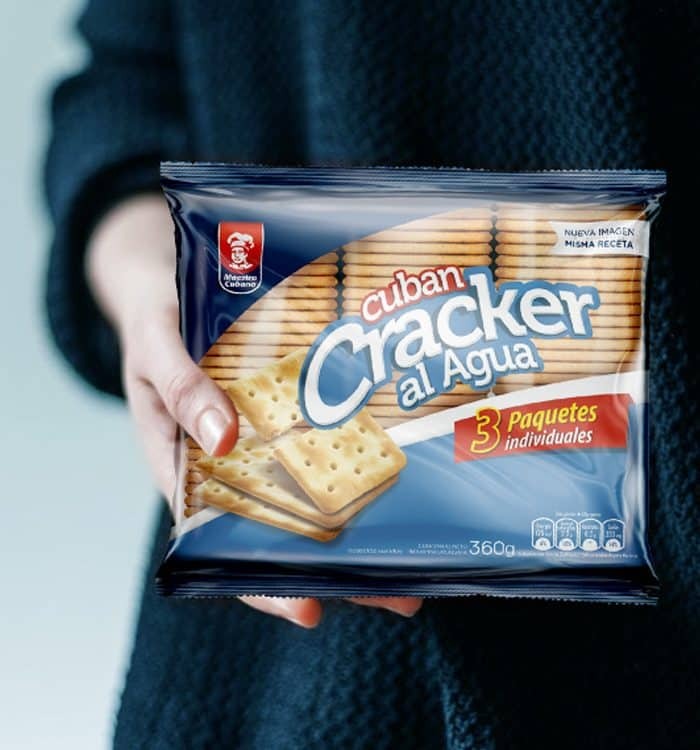
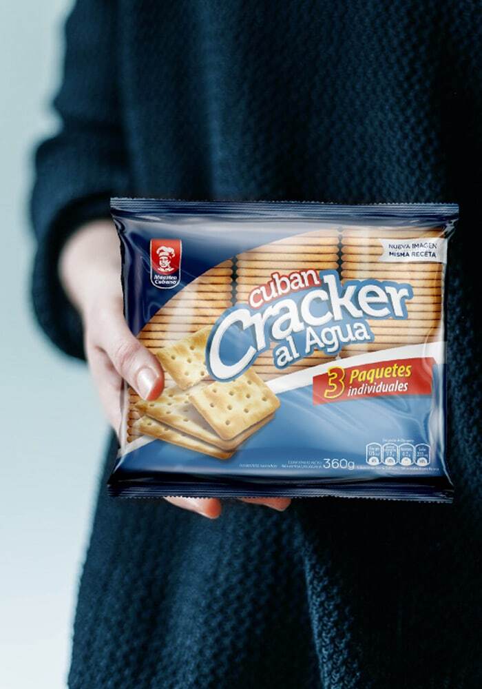
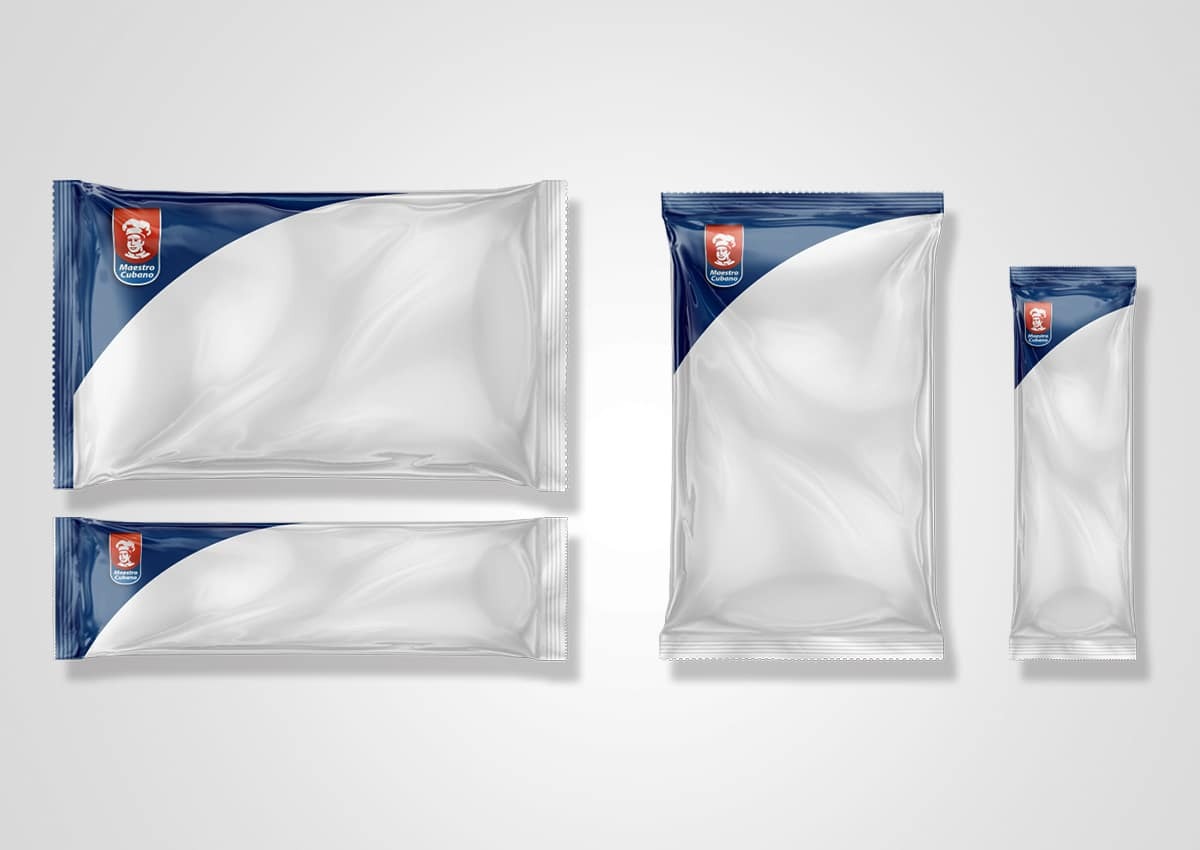
For Maestro Cubano, Imaginity reorganized the architecture of a broad cookie and cracker portfolio. A consistent brand area unified the lines, while product imagery, variety cues, and individual expressions preserved meaningful differences among products.
Consistent Systems Across Flavors & SKUs
Consistency does not mean repeating one layout without adjustment. A useful product-line architecture establishes which elements remain fixed, which elements signal a variety, and which elements change according to format or product promise. This makes the range easier to recognize and gives internal teams a clearer framework for expansion.
Flavor, Texture & Appetite Appeal
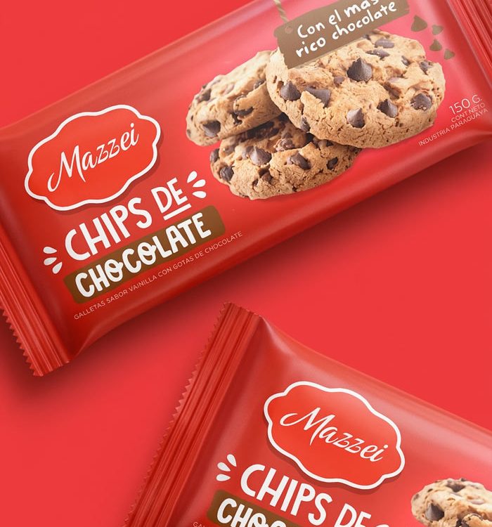
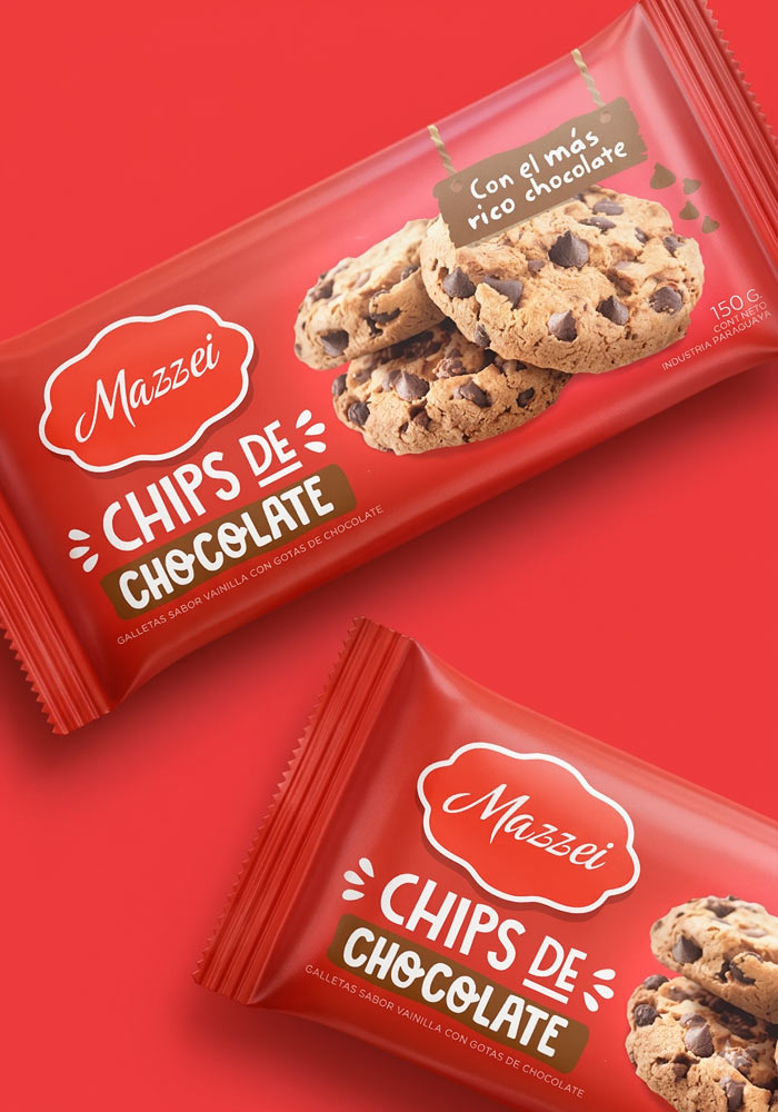
Product imagery plays a central role in this category. The image may need to communicate crispness, softness, filling, chocolate pieces, grains, seeds, or a particular serving occasion. Scale, cropping, lighting, ingredient movement, and the relationship between the product and the brand all influence how quickly the pack expresses its sensory proposition.
Color and typography reinforce that message. A playful cookie for a younger audience may call for energetic contrast and movement; an everyday cracker may require a lighter and more relaxed tone; a premium wafer may rely on restraint, material cues, and precise detail. The design direction should reflect the product experience rather than apply a generic category formula.
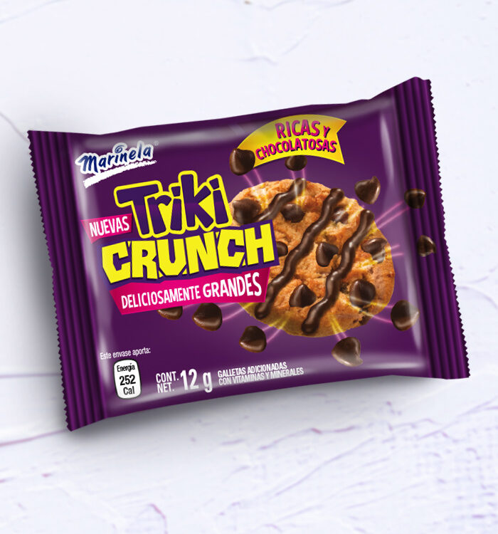
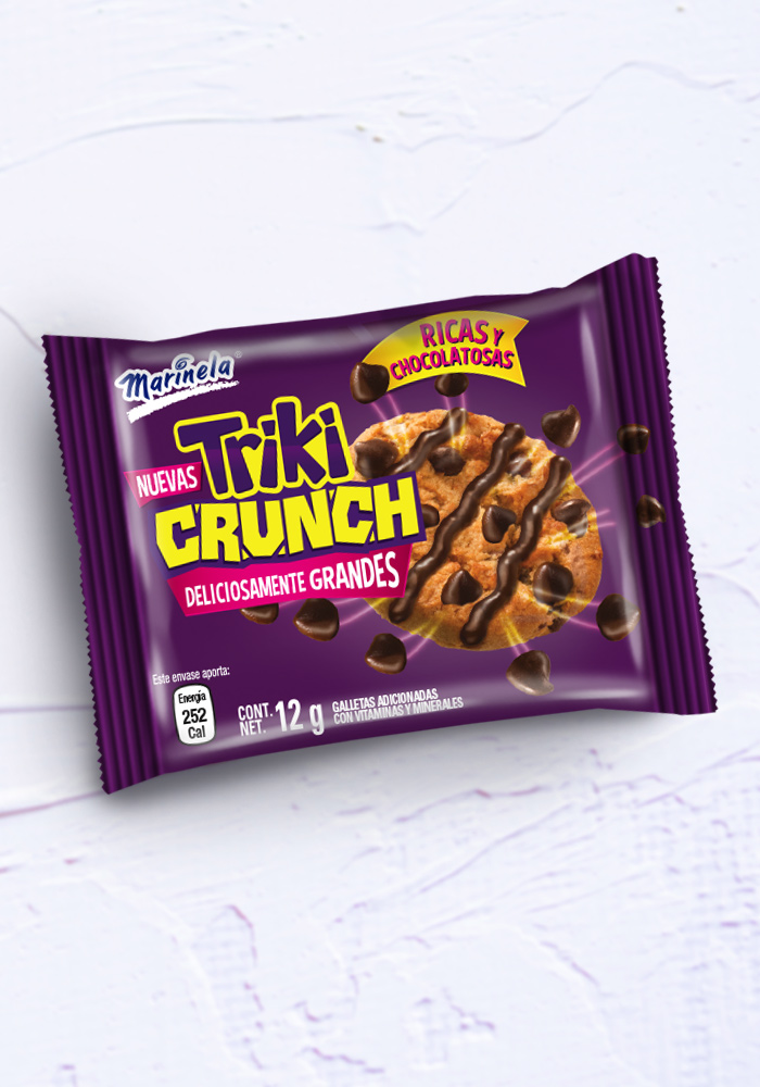
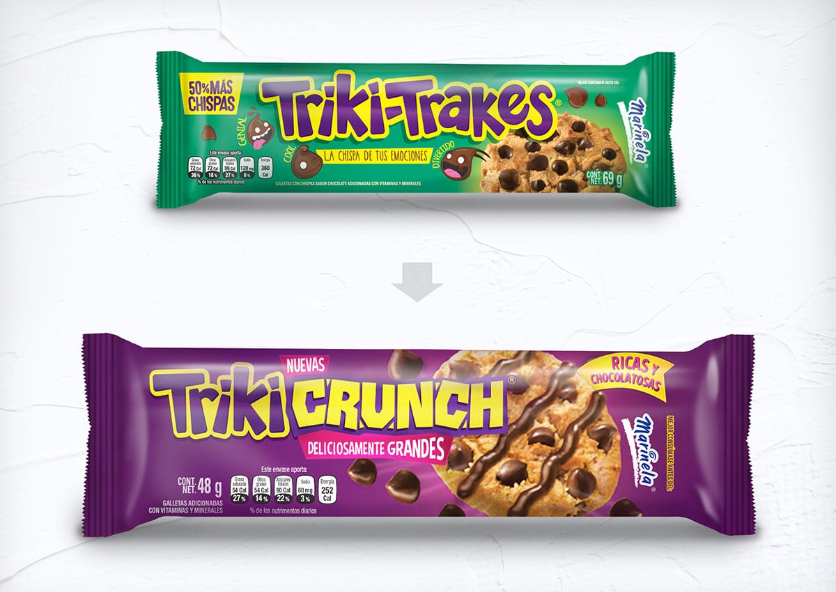
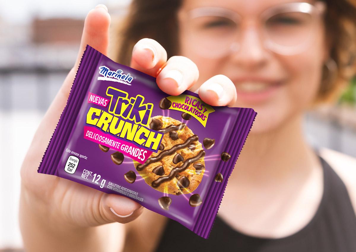
In the Marinela Triki Crunch project, an oversized cookie, visible chocolate chips, high-contrast purple and yellow, and energetic graphic elements brought crunch, flavor, and youthful character to the front of the pack while maintaining a visual connection to the Triki Trakes family.
Packaging That Makes the Product Clear
Effective packaging answers essential questions in a deliberate sequence: Which brand is this? What type of product is it? Which flavor or variety am I viewing? What makes it different? Which information matters before purchase? The hierarchy should remain understandable at a distance, at close range, and in a small digital image.
Product type, flavor, ingredients, texture, portion, and relevant benefits should be integrated into one communication system. Ingredient imagery and appetite appeal can create interest, but they must not obscure the brand or the product name. Claims should be concise, legible, and appropriate to the product and market.
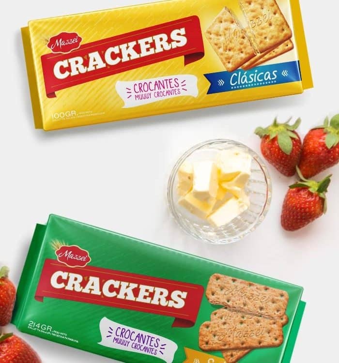
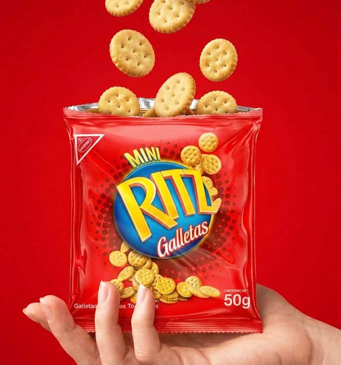
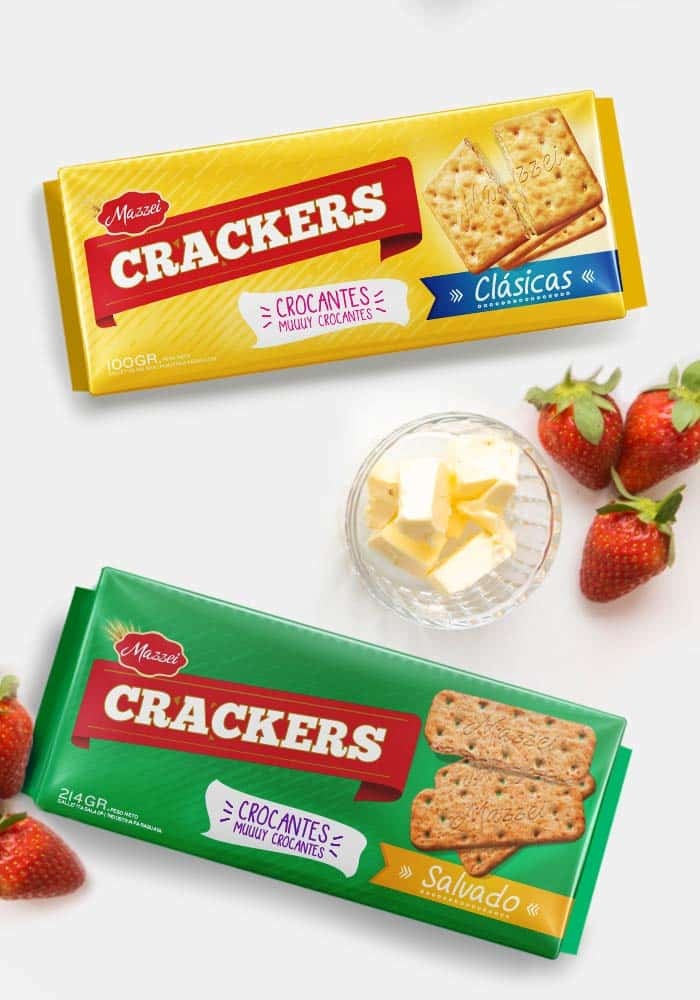
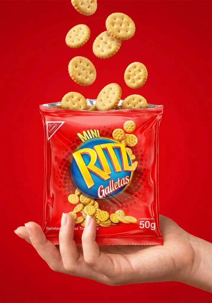
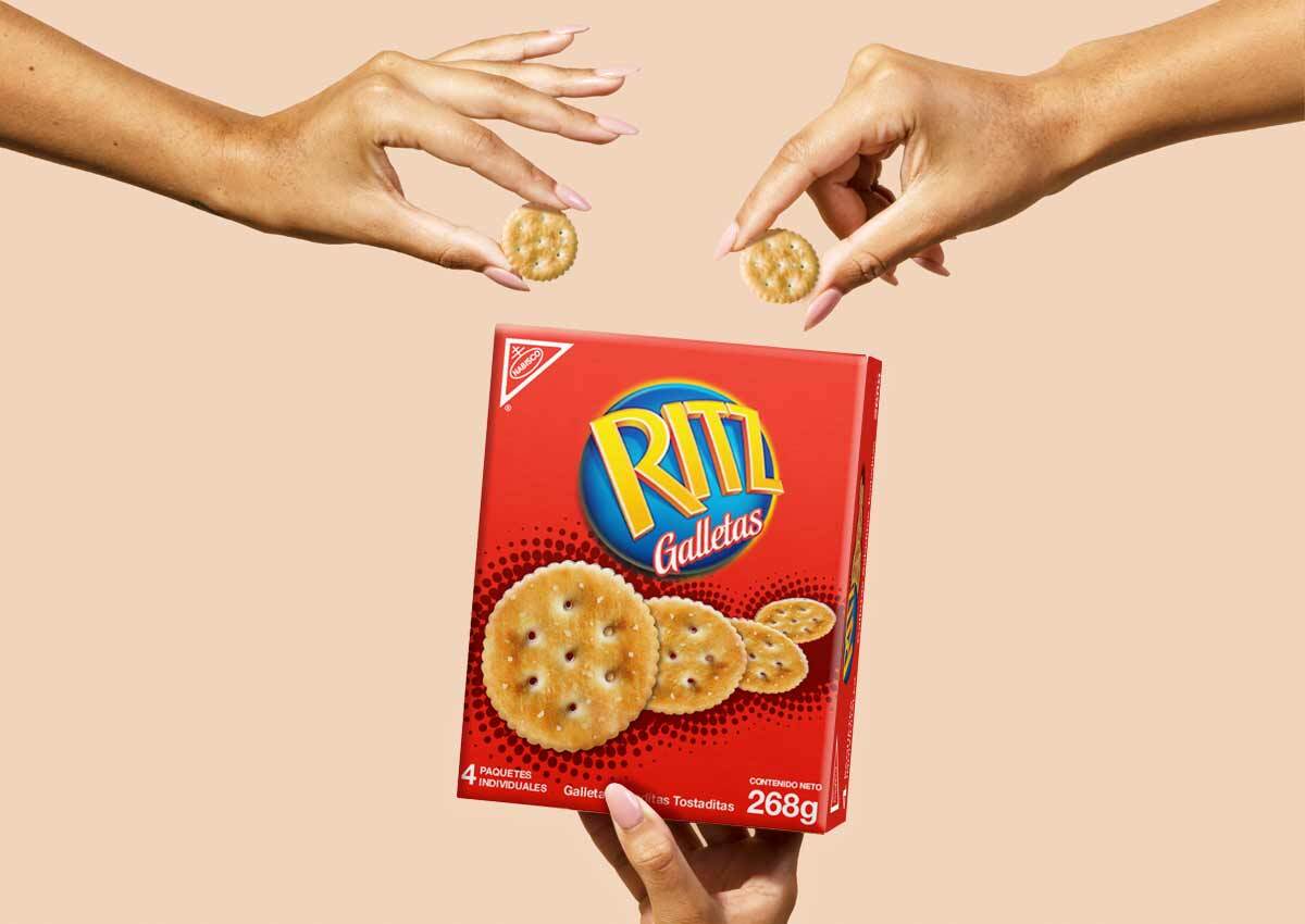
The Ritz Crackers redesign balanced a familiar global identity with clearer differentiation among products. For Mazzei Classic Crackers, distinct color codes and an approachable typographic style separated Original and Wheat varieties while keeping the line cohesive and suited to an everyday breakfast occasion.
Consumer Insights & Shopper Decisions
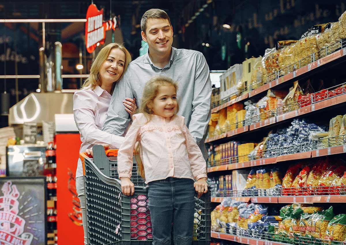
The consumer is the person who eats the product; the shopper is the person who makes the purchase decision. Sometimes they are the same person, and sometimes they are not. Family packs, lunchbox formats, better-for-you snacks, premium treats, and products aimed at younger audiences can each involve different motivations and decision criteria.
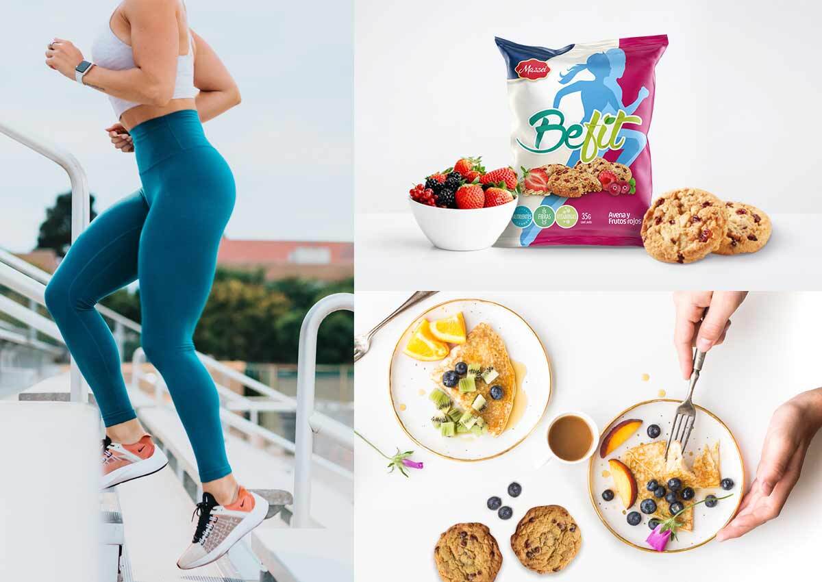
We translate consumer and category insights into visible design choices. These may include natural color palettes, active-lifestyle imagery, prominent ingredients, portion cues, playful brand assets, or a more refined tone. The resulting design should communicate relevance without depending on vague lifestyle language or unsupported product claims.
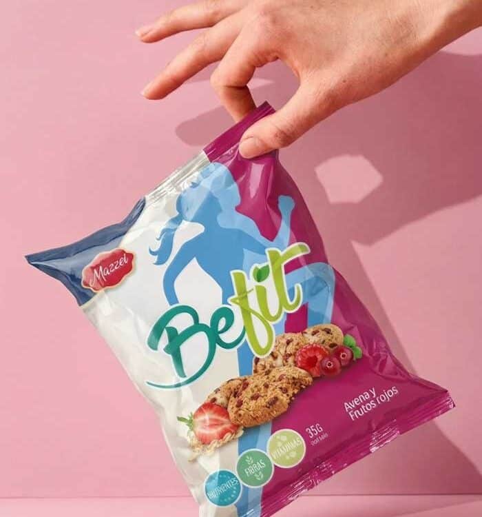
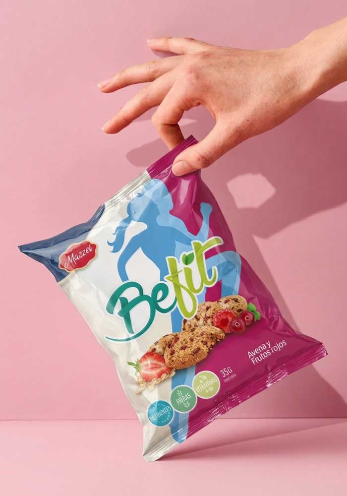
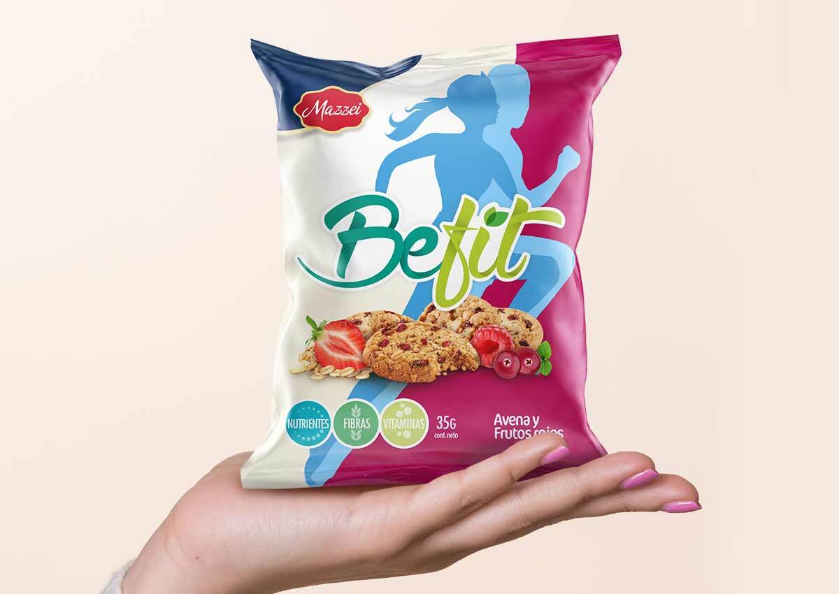
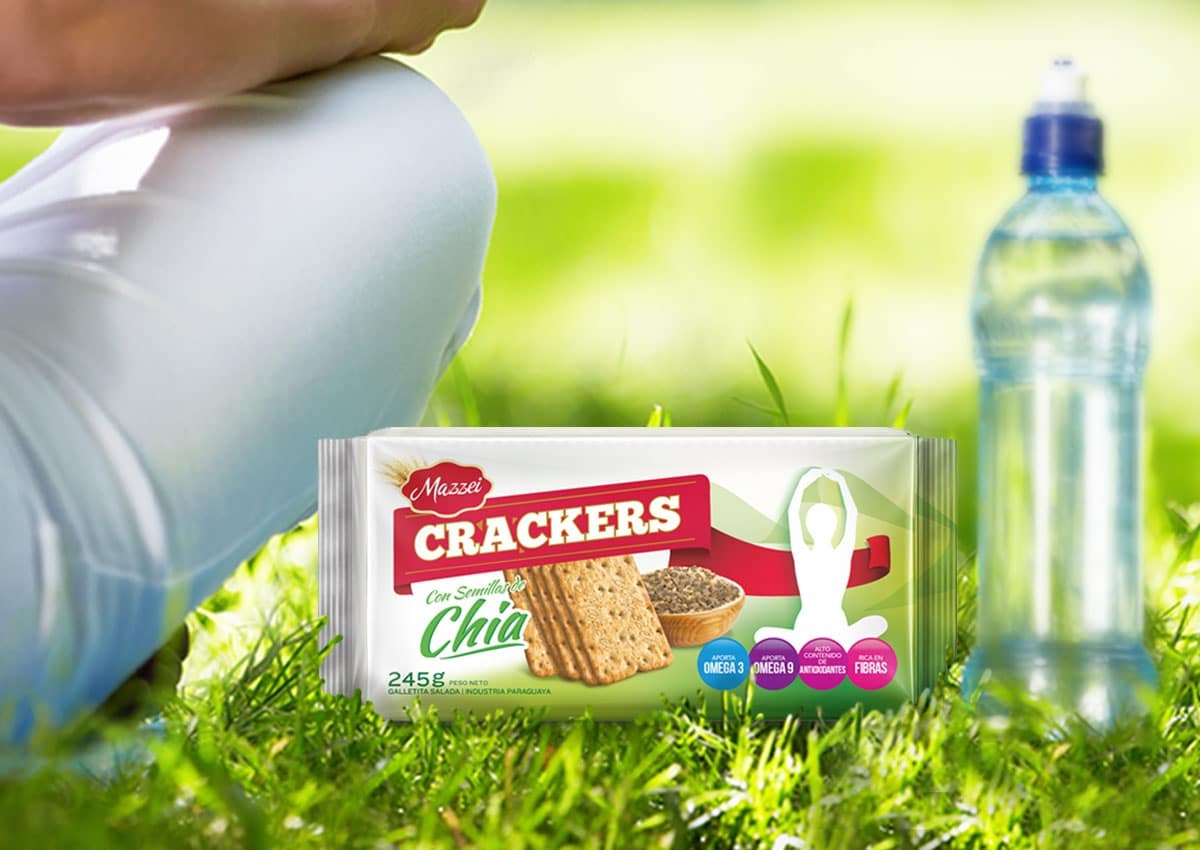
For Mazzei Chia Crackers, organic forms, seed cues, light colors, and active-lifestyle imagery expressed a balance of naturalness, nutrition, and flavor. The BeFit identity used soft forms, natural cues, ingredient imagery, and a clear color-coding system to organize a range of cookies, cereal bars, and related snacks.

Shopper Marketing & Point-of-Sale Visibility
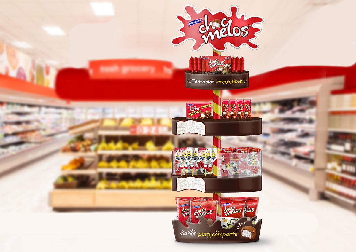
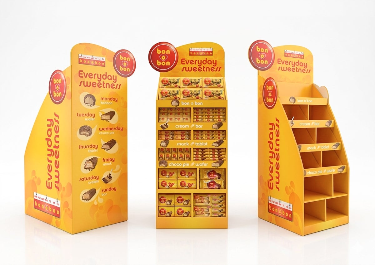
Shopper marketing extends the packaging system into the retail environment. Displays, endcaps, shelf talkers, promotional units, and other point-of-sale materials should make the brand recognizable, present the product range clearly, and communicate the most relevant reason to engage.
For cookies, crackers, wafers, and baked snacks, the strongest retail execution often combines clear brand blocking with concise benefit communication and appetizing imagery. The hierarchy must remain legible from the shopper’s path and continue to work when several flavors or pack formats appear together.
When the pack also carries campaign, promotional, or limited-edition messaging, Packvertising turns it into an owned brand-media surface. The message becomes part of the packaging system without weakening product identification or portfolio consistency.
We consider how packaging and retail materials operate as one system: where the logo appears, how the product is organized, which message leads, how varieties are grouped, and how the display functions in the available space. This coordination improves visibility and makes the range easier to understand at the point of sale.
Connected Pack
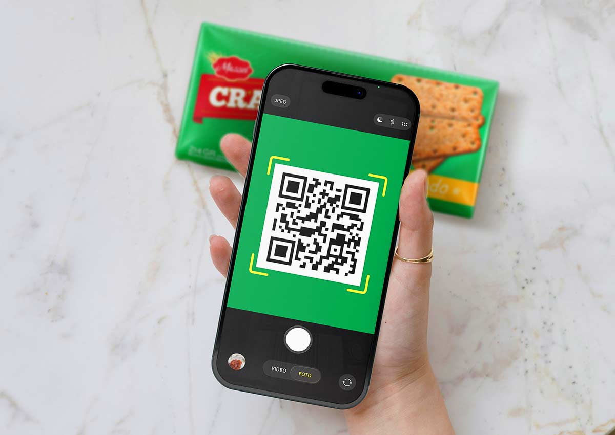
A Connected Pack can create a direct path to digital information. A QR code integrated into the design may lead to ingredient details, product education, serving ideas, campaign content, or other brand-managed experiences. The value depends on the relevance of the destination and the clarity of the invitation to scan.
Imaginity designs the physical pack and the connected experience as one communication journey. Visual continuity, information hierarchy, mobile usability, and a clear transition from pack to screen make the interaction easier to understand. Because digital content can evolve without redesigning the printed pack, the system can support changing campaigns and information needs over time.

Our Design Process
1. Define the Brief and Category Context
We align the business objective, target audience, product proposition, market, channels, formats, competitors, technical requirements, and project deliverables. This stage identifies the decisions the packaging must make clear.
2. Build the Strategy and Creative Directions
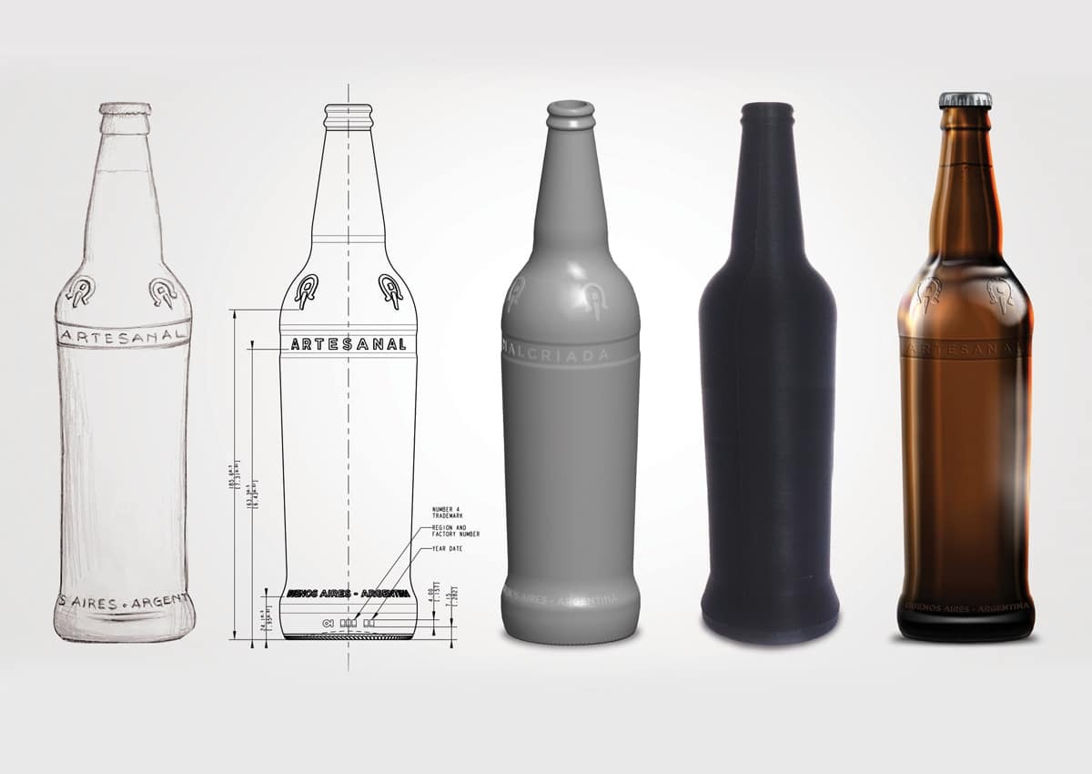
We establish the brand and portfolio logic, then explore visual territories through sketches, references, hierarchy studies, color, typography, imagery, and structural considerations. Each direction is evaluated against the brief rather than visual preference alone.
3. Develop the Packaging System
After selecting a direction, we refine the design across priority SKUs and formats. We test recognition, differentiation, product communication, appetite appeal, claims, and performance at physical and digital scale.
4. Prepare the Agreed Deliverables
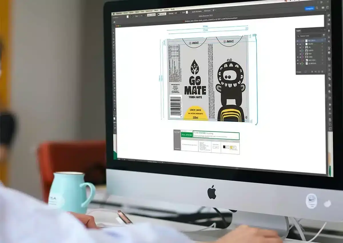
The final stage adapts the approved system to the agreed range and assets. Depending on scope, this may include packaging artwork, visual guidelines, retail materials, connected-pack touchpoints, or other launch components coordinated with the client’s production requirements.
Explore the complete Imaginity design process.


Relevant Cookies & Crackers Work
Ritz Crackers — portfolio consistency and clear differentiation across a familiar cracker line.
Mazzei Classic Crackers — variety coding and an approachable visual language for an everyday breakfast occasion.
Mazzei Chia Crackers — natural ingredient cues and active-lifestyle imagery organized around a clear product proposition.
Maestro Cubano — brand and portfolio architecture for multiple cookie and cracker lines.
Marinela Triki Crunch — bold appetite appeal and flavor communication within an established family brand.
BeFit — branding and packaging for a coordinated line of cookies, cereal bars, and related snacks.
Why Imaginity
Imaginity combines category experience with brand strategy, packaging design, shopper marketing, and production awareness. We approach an individual package as part of a larger system: the brand, the portfolio, the shelf, the digital listing, and the next extension all influence the solution.
Our international work includes established brands, portfolio redesigns, new product launches, and new brand creation across different markets. This perspective allows the team to separate durable brand principles from market-specific execution and to design systems that can adapt without losing recognition.
The result is a practical framework for communicating product, flavor, texture, ingredients, and benefits with greater clarity—while preserving the character that makes each brand and product distinctive.
Discuss Your Cookie or Cracker Portfolio
Whether the project involves a new brand, a packaging redesign, a line extension, portfolio architecture, shopper marketing, or a connected-pack experience, the conversation begins with the product, the audience, and the commercial context.
Contact Imaginity to discuss your cookie, cracker, biscuit, wafer, or baked-snack project.
For category strategy and packaging designed specifically for the United States, explore our U.S. cookies and crackers packaging expertise.