Client:
Caladryl
Country:
Argentina
Task:
Brand activation. In Store
Intensive Care Brand Activation & Key Visual Design
Laboratorio Elea Argentina partnered with Imaginity to lead the brand communication and in-store activation for the launch of the new Caladryl Intensive Care line. This project represented a significant strategic shift: evolving Caladryl from a niche product for insect bites into a comprehensive therapeutic skincare solution. Our challenge was to maintain the brand’s existing trust while introducing a high-performance range designed for deep repair, 48-hour hydration, and specialized care for sensitive and diabetic skin.
Imaginity | Design Agency | Branding, Packaging Design, Marketing
The Challenge: Expanding Brand Territory
The primary objective of the Caladryl Intensive Care project was to break the brand's association with "temporary relief" and move it into "long-term care." Caladryl is a household name for treating bites and rashes; the challenge was to educate consumers on its new capability to treat chronic conditions like extreme dryness, psoriasis, and diabetic skin. We needed to design a brand activation strategy that communicated professional efficacy without losing the approachable "family-favorite" nature of the brand.
The Solution: Clarity, Speed, and Medical Authority
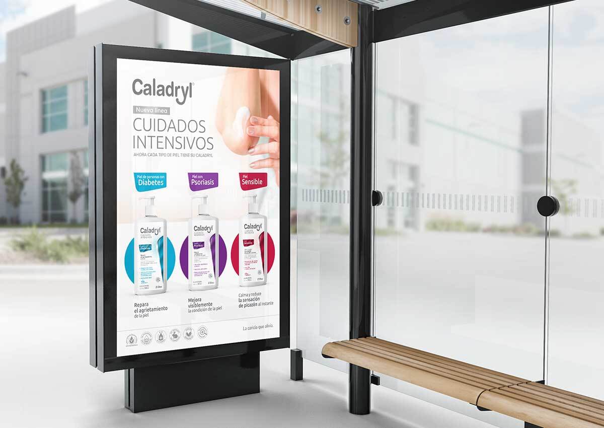
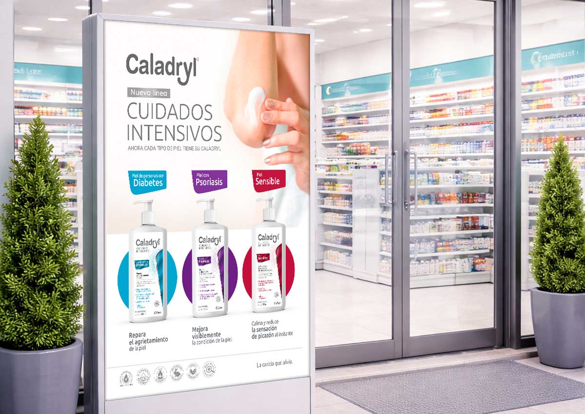
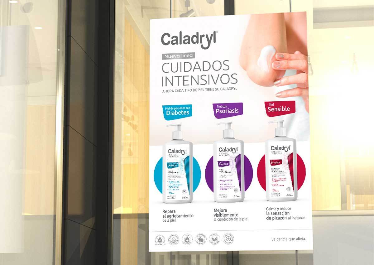
Our team spearheaded the creation of a Key Visual based on the premise of "Rapid Information Delivery." In a retail environment, consumers make decisions in seconds. We developed a visual identity that uses a clear, simple, and quick-impact layout to reach and inform the target audience. By focusing on the "Intensive Care" claim, we provided the technical validation needed for a therapeutic product. This strategic design approach transformed complex dermatological benefits into an easy-to-digest retail message.
The Results: A Successful Market Repositioning
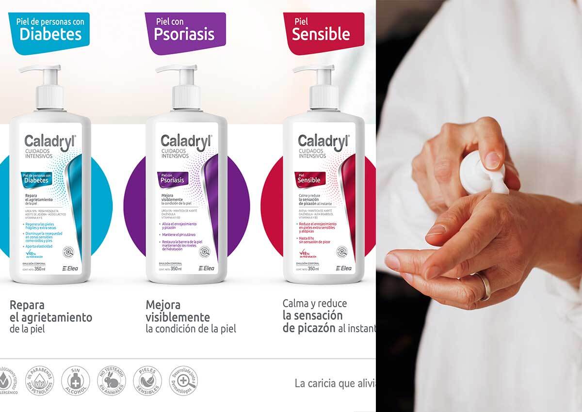
The result is a powerful in-store activation that successfully introduced Caladryl into new skin-care spaces. The clear product line architecture allows the differentiation of the three variants—Diabetic Skin (Repair), Sensitive Skin (Anti-Redness), and Psoriais Skin (Moisture)—allowed for precise consumer targeting. Through Imaginity’s strategic branding, Caladryl has effectively expanded its market share, proving that an iconic brand can successfully pivot into premium therapeutic segments through high-impact visual storytelling.
. Strategic Key Visual: A clean, clinical-grade visual anchor designed to reposition the brand within the dermocosmetic category.
. Information Hierarchy Optimization: A "direct-impact" messaging system that clearly differentiates the three new specialized variants (Diabetic, Sensitive, and Dehydrated skin).
. Scientific Visual Cues: Integration of dermatologist-backed elements and ingredient call-outs to build medical authority.
. In-Store Communication Suite: High-visibility retail assets designed to capture the consumer's eye in the competitive pharmacy and skincare aisle.
. Consistency in Brand Evolution: A balanced color palette that respects Caladryl’s heritage while utilizing "Intensive Care" semiotics to signal advanced repair.
Imaginity is a packaging design agency specializing in OTC product line extensions. We develop visual systems that maintain brand consistency while clearly differentiating new products within a portfolio.
