Client:
Lava
Country:
Ecuador
Task:
Packaging Design
Lava: Liquid Dishwasher Detergent Packaging Design
Imaginity | Design Agency | Branding, Packaging Design, Marketing
Visual Highlights
-
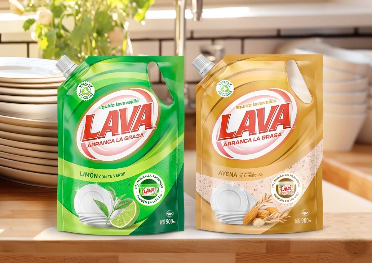
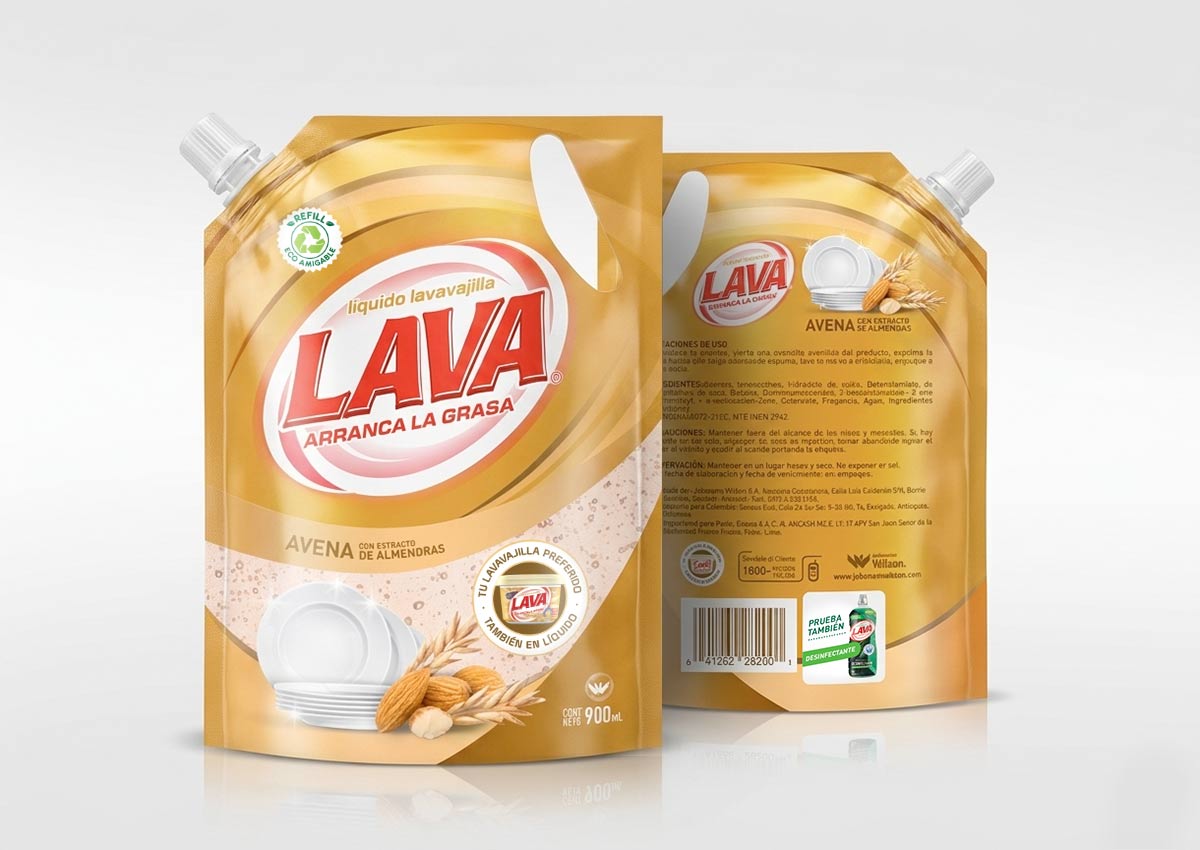
Aroma Chromatic Coding: Precise use of yellow and soft beige tones to instantly identify the Lemon and Oatmeal varieties.
-
"Visual Window" Effect: High-impact product photography that simulates transparency, highlighting the liquid's consistency.
-
Functional Iconography: Inclusion of a prominent "Refill" (Repuesto Económico) call-out to enhance consumer utility.
-
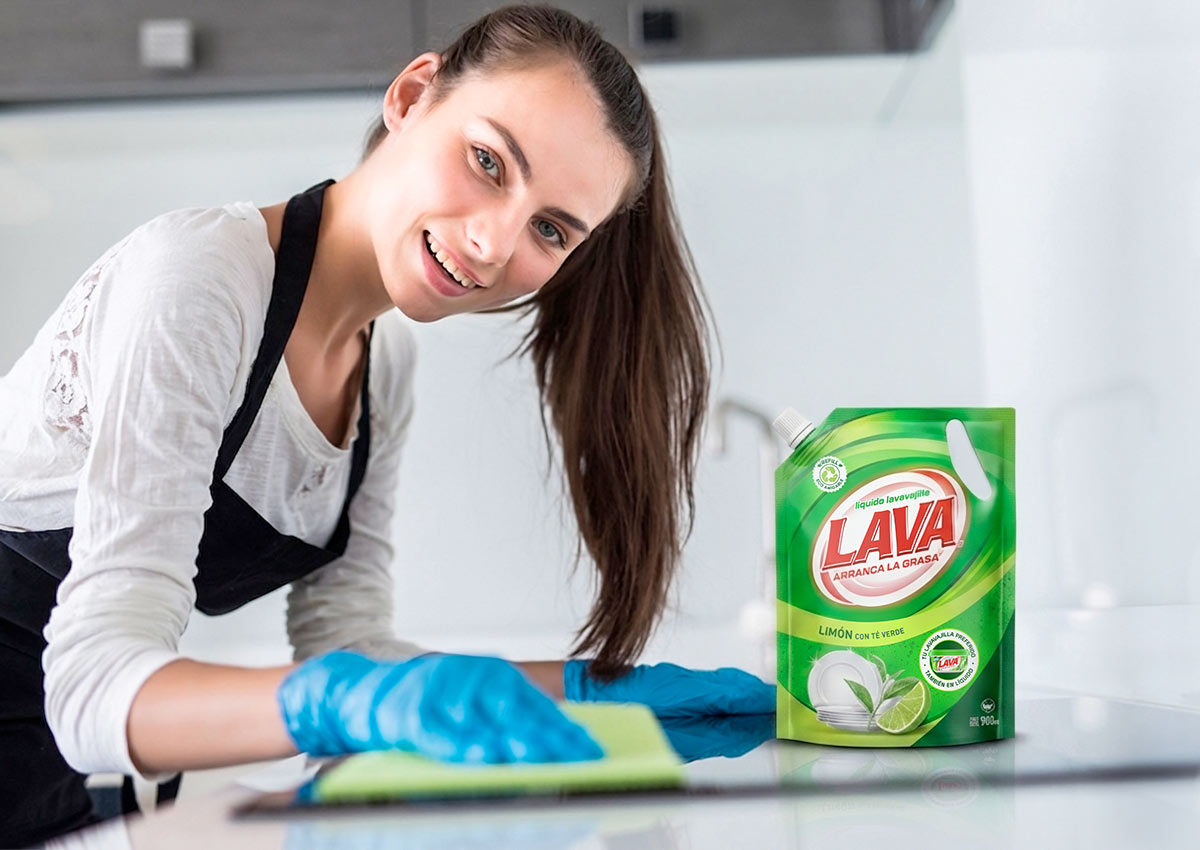
Clean Information Hierarchy: An organized layout that balances the iconic Lava logo with fragrance and grease-cutting benefits.
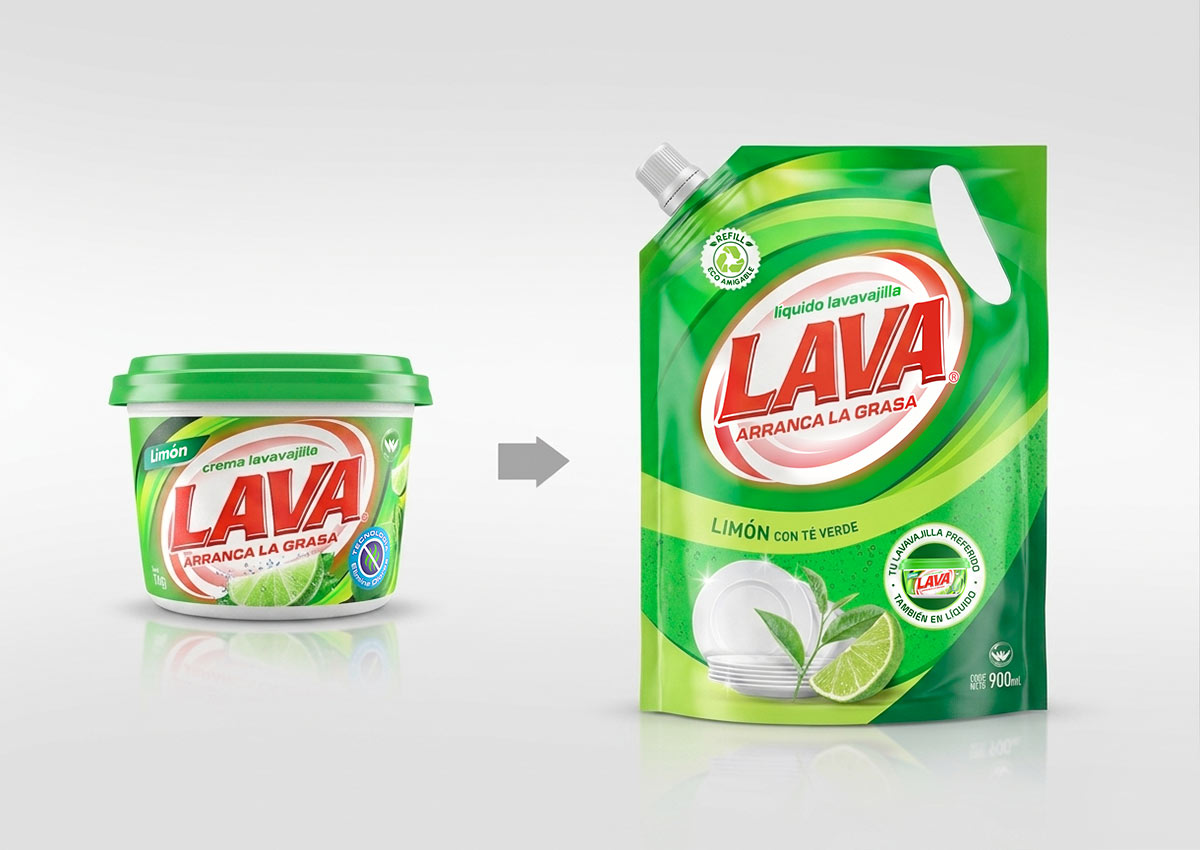
The Challenge: Category Expansion and Brand Consistency
Traditionally recognized for its leadership in the dishwasher cream sector, Lava faced the challenge of translating its established brand equity into the liquid detergent category.
As a global packaging design agency, IMAGINITY was tasked with launching a new line of liquid detergents in flexible pouch formats.
The objective was to maintain the core visual identity of the original brand while clearly differentiating the new liquid medium for two specific varieties: Lemon and Oatmeal.
The Solution: Clarity and Fragrance Focus
Traditionally recognized for its leadership in the dishwasher cream sector, Lava faced the challenge of translating its established brand equity into the liquid detergent category.
As a global packaging design agency, IMAGINITY was tasked with launching a new line of liquid detergents in flexible pouch formats.
The objective was to maintain the core visual identity of the original brand while clearly differentiating the new liquid medium for two specific varieties: Lemon and Oatmeal.
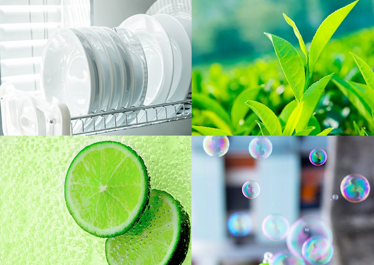
The Results: Impact and Order
The project resulted in a powerful packaging design that is significantly more striking and organized than traditional category standards. By aligning the new liquid line with the well-loved aromas of the creams, IMAGINITY achieved a seamless brand extension that reinforced Lava’s presence in store. The final visual identity delivers maximum shelf impact, ensuring the product's liquid nature and specific benefits are communicated at a glance to consumers across Latin America.