
Packaging Design Agency USA
Food, CPG & Multicultural Branding
From Miami to New York, we blend global expertise with multicultural insight to elevate U.S. brands.

At Imaginity, our team works with food, beverage, CPG, real estate and professional-service brands on packaging, brand architecture, visual identity, retail communication and digital experiences for the U.S. market. Our international perspective is applied to a specific task: creating brand systems that remain clear across categories, channels and culturally diverse audiences.
Use this USA hub to move from market context to the right capability or proof. For a defined packaging engagement, review our packaging design services. For market-specific work, explore packaging and branding for U.S. brands, brand architecture for product lines, strategy for U.S. Hispanic consumers, or the Wise Snacks design case study.
PACKAGING DESIGN AGENCY FOR U.S. FOOD AND CPG BRANDS
Imaginity works with U.S. food, beverage, and CPG brands to build packaging systems that work across retail shelves, e-commerce, club stores, convenience channels, and multicultural markets. As a packaging design agency with experience in the USA, Latin America, and Europe, we combine brand strategy, visual identity, product architecture, and shopper behavior to create design systems that are clear, distinctive, and commercially useful.
Winning in the U.S. starts with structure. We help brands decide how their portfolio should be organized, named and tiered, as we explain in brand architecture that sells. That structure is what delivers clarity, consistency and connection across every touchpoint, and what lets a brand keep a visual identity that scales as it grows. For a market as diverse as the U.S., we also look at balancing consistency and cultural relevance, at identity and packaging for multicultural, omnichannel America, and at designing for the Hispanic consumer in the U.S. We also cover what Latin American brands get right about storytelling.
Packaging is where that strategy meets the shopper. We cover how packaging influences brand perception in U.S. retail, how design shapes the way a brand is perceived and its impact on brand image. We show how packaging builds brand identity and how it can tell and sell your brand story, acting as both brand voice and sales tool and as a growth lever for U.S. brands. To get there, packaging has to connect with U.S. consumers and work from shelf to screen. For the full picture, see our packaging design and branding services for U.S. brands.
Our work in specific categories shows these ideas in practice. That includes our role as a packaging design agency for U.S. cookies and crackers, craft beer labels that stand out and sell and craft beer branding for the U.S. market. It also includes retro aesthetics where heritage meets today's shelf and Wise Snacks' heritage refreshed through design. Beyond packaging, we built the digital presence and portfolio for a U.S. architecture firm.
For brands entering or growing in the U.S. market, packaging must do more than look attractive. It must communicate fast, support product-line expansion, improve shelf recognition, and connect with diverse consumers. Our work helps brands organize SKUs, clarify benefits, adapt to digital commerce, and build stronger emotional relevance with American shoppers.
Creative Partnerships That Resonate Across Culture, Category, and Consumer
At Imaginity, we understand that entering or growing within the dynamic US market requires more than just a great product—it demands a brand that connects with American consumers on a deeply personal and cultural level. Our Miami-based team is at the forefront of this challenge, blending global creative excellence with sharp, multicultural insights to build brands that don't just stand out, they stand for something. We are not just designers; we are brand strategists, cultural navigators, and your dedicated partners in achieving measurable business growth.
Our Approach: A Fusion of Art and Strategy
Our methodology is built on a foundation of deep creative thinking and a nuanced understanding of the US consumer landscape. We go beyond aesthetics to create brands that are meaningful, memorable, and meticulously designed for market success.
- Strategic Multicultural Insight: The US is a melting pot of cultures, and a one-size-fits-all approach is a recipe for failure. We specialize in crafting brand and packaging solutions that authentically resonate with diverse audiences, from the vibrant Hispanic community to digitally native Gen Z consumers and beyond.
- Retail and E-commerce Expertise: Our experience extends from the physical shelf to the digital cart. We design compelling, retail-ready solutions for major stores like FMI, Safeway, and Target, ensuring your product captures attention where it matters most. Simultaneously, we optimize your brand for a seamless and engaging omnichannel and e-commerce experience.
Measurable Results: We believe in design that delivers. Our projects are focused on achieving tangible outcomes, such as increased shelf impact, higher trial rates, and enhanced brand recognition, ensuring a strong return on your creative investment
Explore Our Work: Brands We’ve Elevated in the US
Wise Snacks
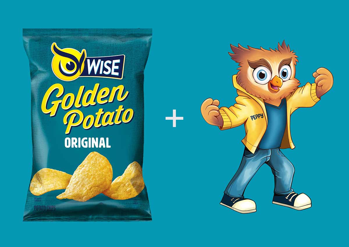
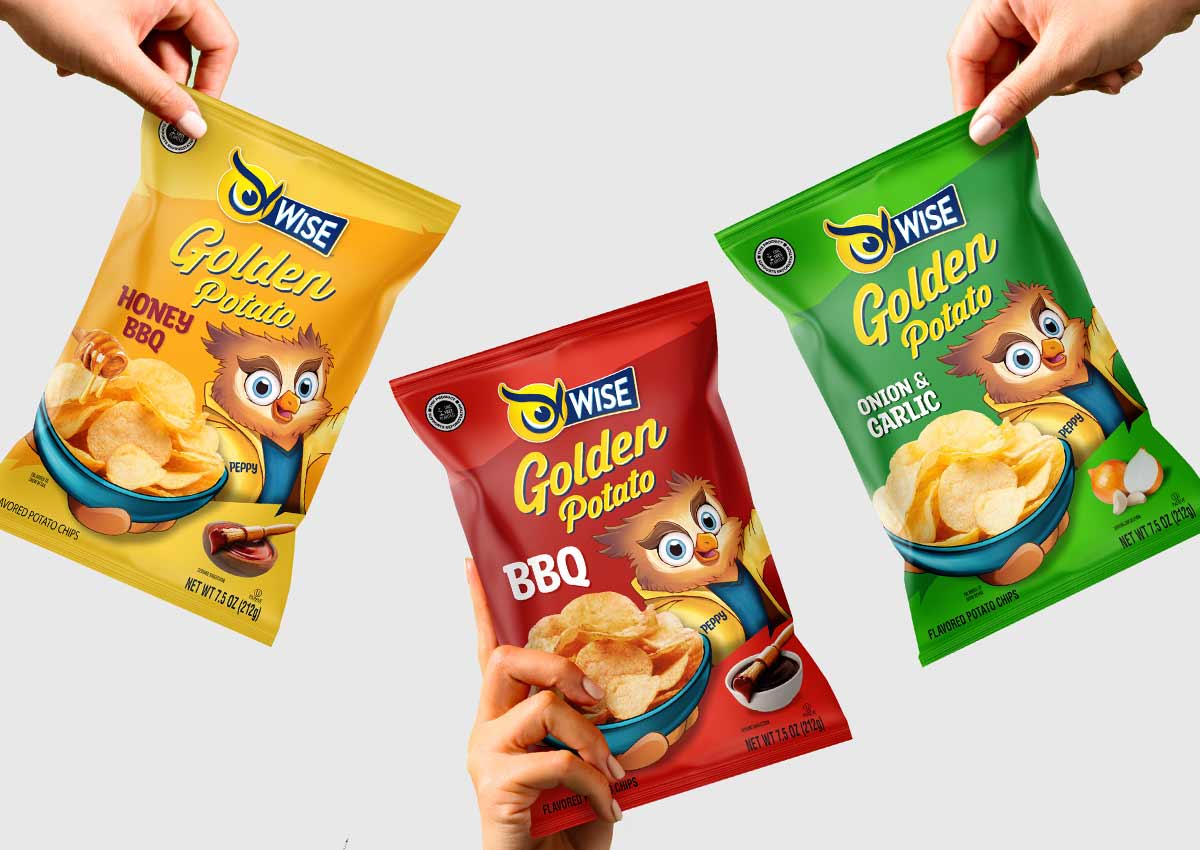
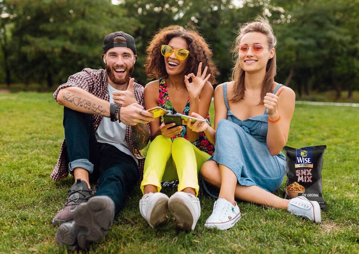
We collaborated with Wise Snacks to redesign their Golden Potato visual identity, placing a modernized version of their iconic mascot, Peppy, at the heart of the new design. Instead of simply featuring him as an additional element, we integrated Peppy directly into the brand narrative, positioning him front and center with a snack bowl in hand. In addition to this, we refined the overall brand architecture for the Original product line. This involved creating a unified, color-coded system for the low-sodium variants, which not only improves shopper clarity but also strengthens the brand's visual consistency across the entire range.
Wise Dips and Salsas
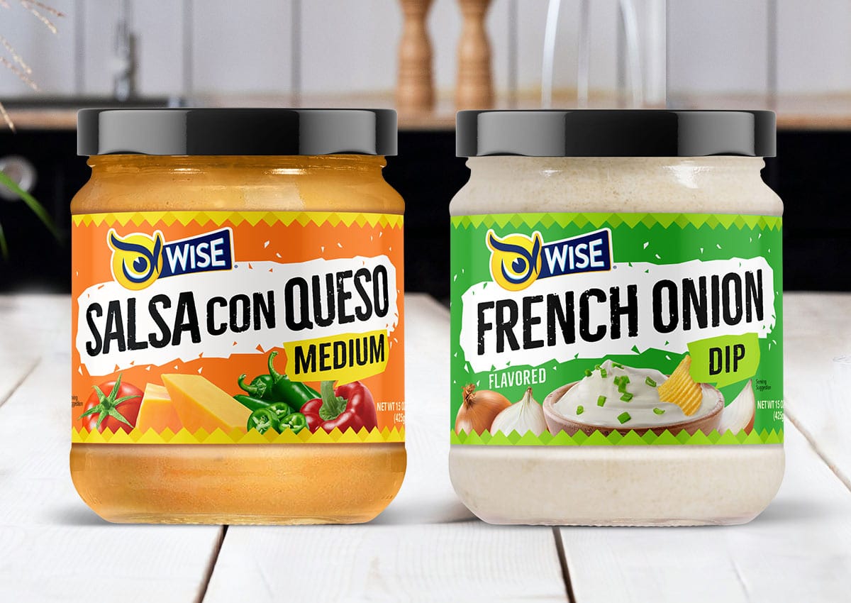
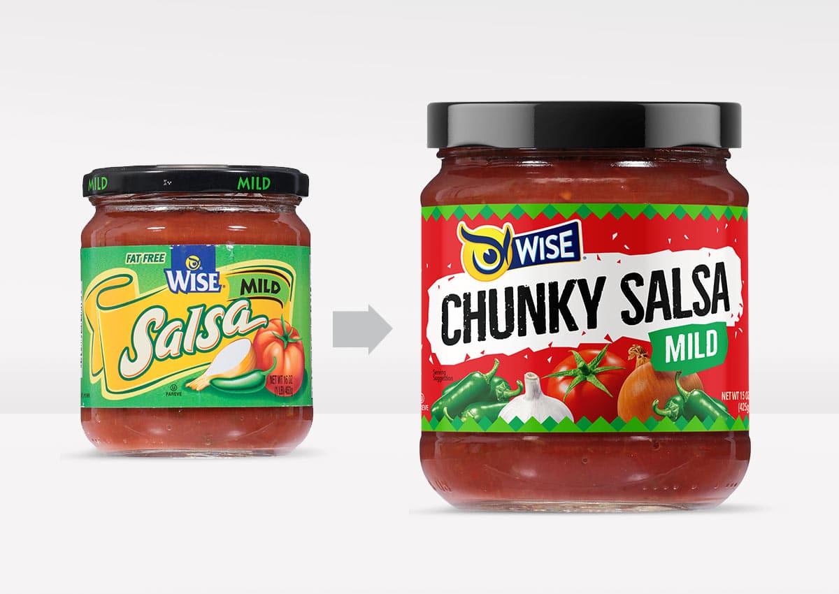
We partnered with Wise Snacks to refresh the packaging design for their classic Salsa con Queso and French Onion Dip range. The goal was to give these beloved flavors a modern, appetizing new look that would captivate today's consumers. Our design strategy focused on enhancing appetite appeal and highlighting the rich, high-quality ingredients, ensuring the packaging effectively communicates the deliciousness within. Our work went beyond aesthetics to create a more cohesive visual identity for the entire line, strengthening its alignment with the overall Wise brand. This strategic refresh ensures that these classic dips not only stand out on the shelf but also reinforce brand loyalty by delivering a consistent, contemporary experience that resonates with a broader audience.
Deep River
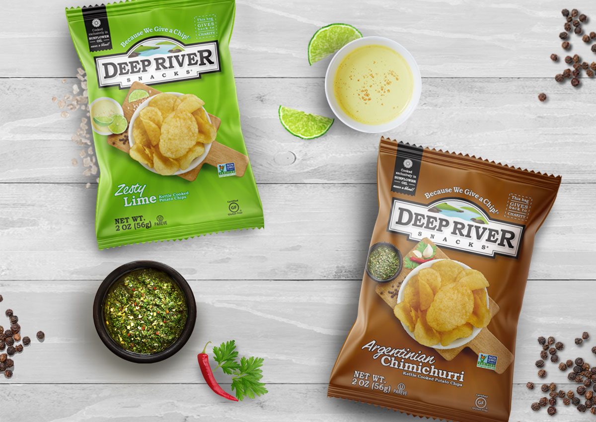
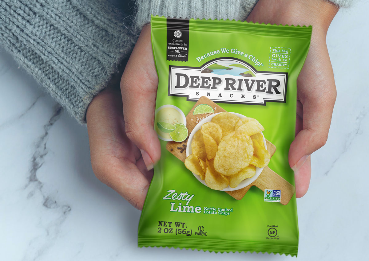
For the launch of two new Deep River potato chip flavors, "Zesty Lime" and "Chimichurri," our role was to design compelling packaging that seamlessly integrated with the brand's established identity. By meticulously following the existing brand and packaging guidelines, we ensured that the new graphics felt like a natural extension of the current product line, maintaining visual consistency across the entire portfolio. To boost appetite appeal and clarify the new flavors, we used high-quality, authentic images of raw ingredients. This approach not only made the packaging visually appealing but also helped the new products form an "indisputable part" of the Deep River family, making it easy for both loyal and new customers to identify and choose them.
Centurion Caviar
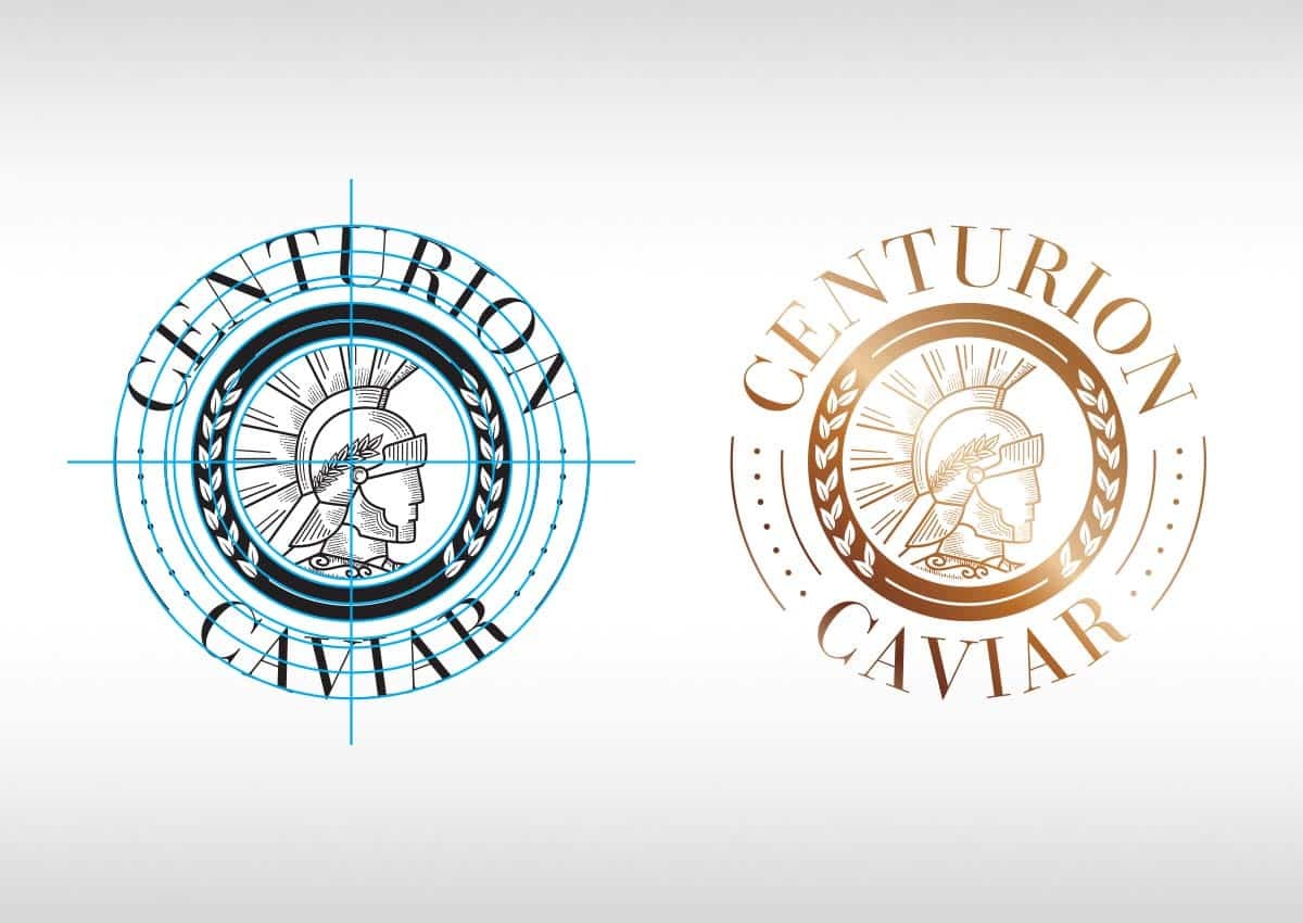
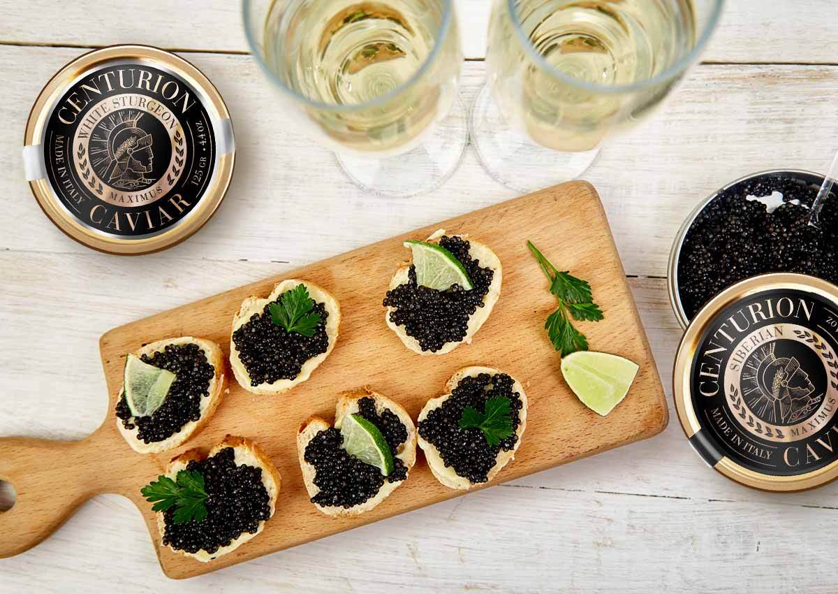
For the launch of the premium gourmet brand, Centurion Caviar, we developed a complete brand identity and packaging system. Our design approach was to take the Roman-inspired concept and elevate it into a refined, modern aesthetic. Every element was meticulously crafted to communicate exclusivity, tradition, and an international sense of luxury, positioning the brand as a top-tier choice in the high-end food market. The final packaging and brand identity speak volumes, serving as a powerful statement of quality. This comprehensive system ensures a cohesive and luxurious experience from the moment a customer sees the product. It successfully differentiates Centurion Caviar, building a reputation for elegance and sophistication that appeals to discerning consumers worldwide.
Pepsi Kick – NFL Edition
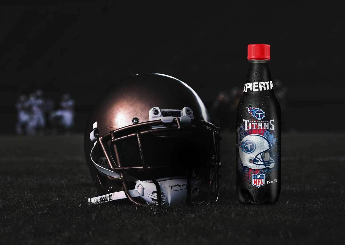
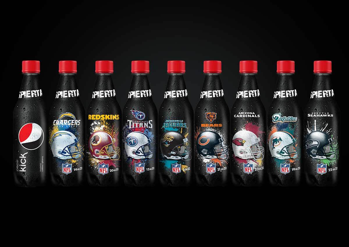
In a strategic partnership with PepsiCo, we designed a unique series of 32 collectible bottles for the Pepsi Kick – NFL Edition. Each bottle was a tribute to a specific NFL team, combining bold team graphics and colors with the dynamic, dark energy of the Pepsi Kick brand. The collection was designed to amplify the excitement of the football season and drive consumer engagement beyond just a single purchase. This project successfully turned everyday product packaging into a fan-driven experience. By creating a collectible item for each team, we tapped into the passion and loyalty of football fans. The campaign generated significant buzz and served as a powerful brand tool, solidifying Pepsi Kick’s connection with a dedicated audience.
Wynwood Blocks (Miami)
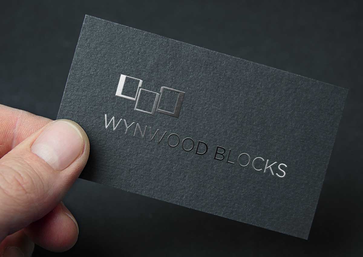

We were tasked with creating the complete brand identity for Wynwood Blocks, a new real estate development located in the vibrant Wynwood Arts District of Miami. Our challenge was to design a brand that would not only be modern but would also authentically reflect the unique architectural style and rich artistic energy of the surrounding area. The final logo design and brand identity successfully draw inspiration from the district's surroundings, offering a modern and modular look. This design reflects the project's contemporary vision and seamlessly integrates it with the local culture. The new branding serves as a powerful magnet for potential clients, clearly communicating the project's unique character and location. .
F3 Architecture

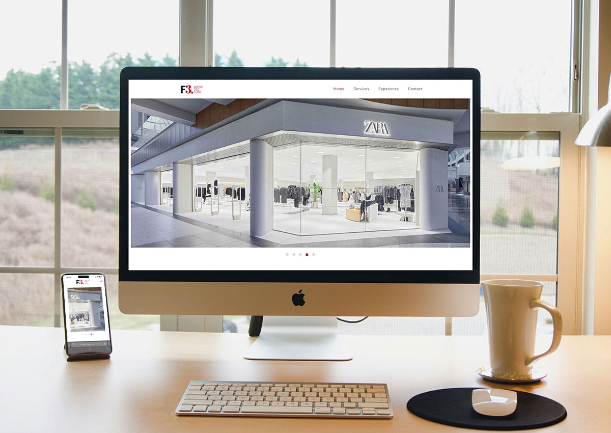
To accurately represent F3 Architecture's vision and professionalism, we developed a clean, modern website. The new site was designed to serve as both a digital showcase and a powerful brand tool, highlighting the firm’s impressive portfolio through the use of large-scale imagery and refined typography. Our goal was to create a platform where their architectural work could truly "speak for itself." The final website strikes a perfect balance between elegance and functionality. A clear and intuitive user flow allows visitors to easily navigate and explore projects, providing an immersive experience. This digital presence is now a crucial asset for F3 Architecture, enabling them to attract new clients and partners with a professional and visually stunning online portfolio.
Hispanic Consumer Packaging Design in the U.S.
For U.S. food, beverage, personal care, and CPG brands, multicultural relevance is part of packaging performance. Hispanic audiences differ by country of origin, language preference, generation, acculturation, household role, and category behavior. These differences influence how shoppers interpret claims, recognize cultural cues, and navigate product lines.
Our Hispanic market segmentation for packaging design perspective outlines the audience factors to evaluate before defining brand positioning, message hierarchy, language strategy, or visual direction.
For the design application of that strategy, explore our Hispanic consumer packaging design in the U.S. experience, covering cultural fluency, bilingual hierarchy, shopper clarity, visual identity, and retail-ready packaging systems. Brands connecting regional heritage with U.S. market expectations can also review our Latin America experience.
Merenguitos
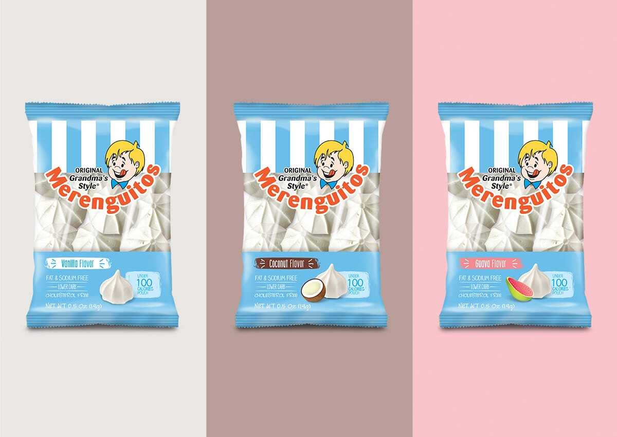
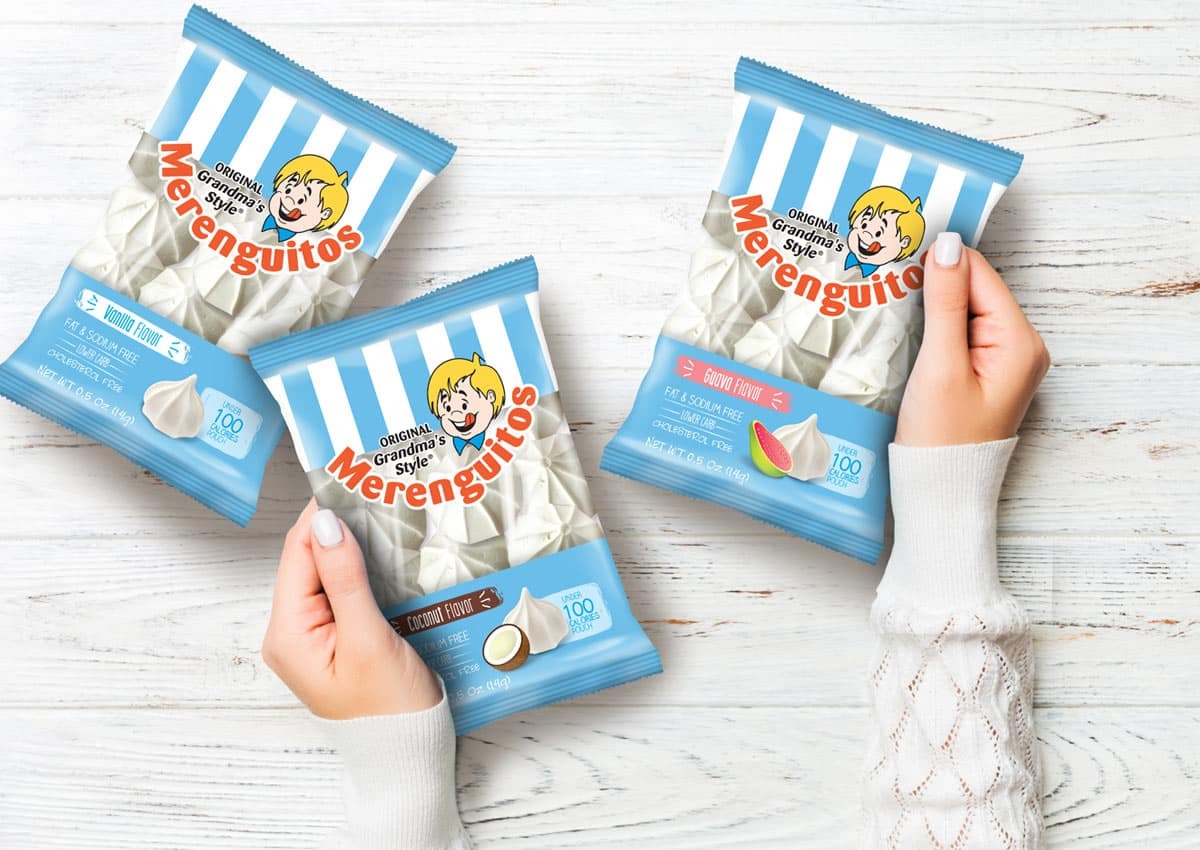
We led the comprehensive rebranding and packaging update for Merenguitos, a beloved American favorite. Our mission was to modernize a nostalgic product, preserving its original charm and emotional appeal while introducing a fresh, contemporary design that would captivate younger shoppers and open doors to new retail channels. The new identity successfully revitalizes the brand, balancing its classic feel with a modern aesthetic. The updated packaging is now well-positioned to stand out in today's retail landscape, appealing to a new generation of consumers. This strategic redesign ensures that Merenguitos remains a relevant and beloved brand for years to come.
La Vaquita
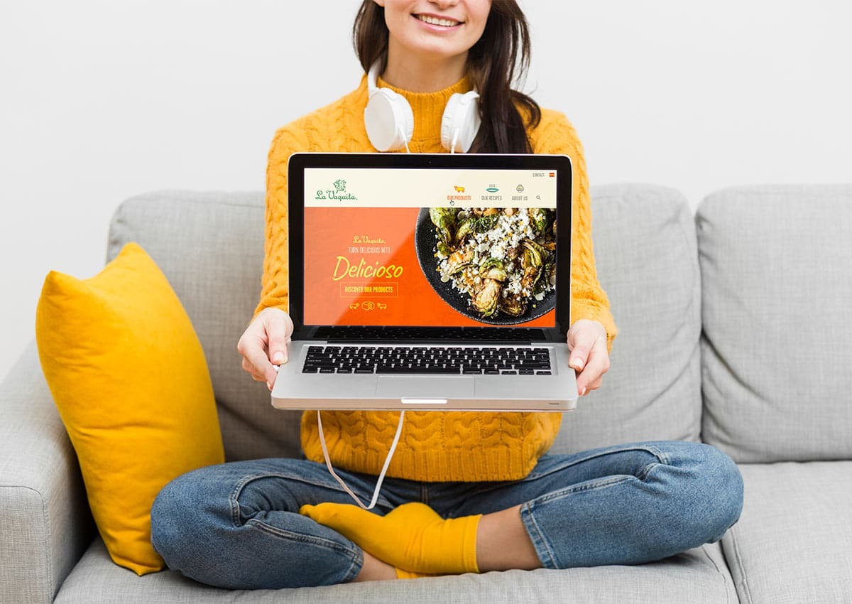
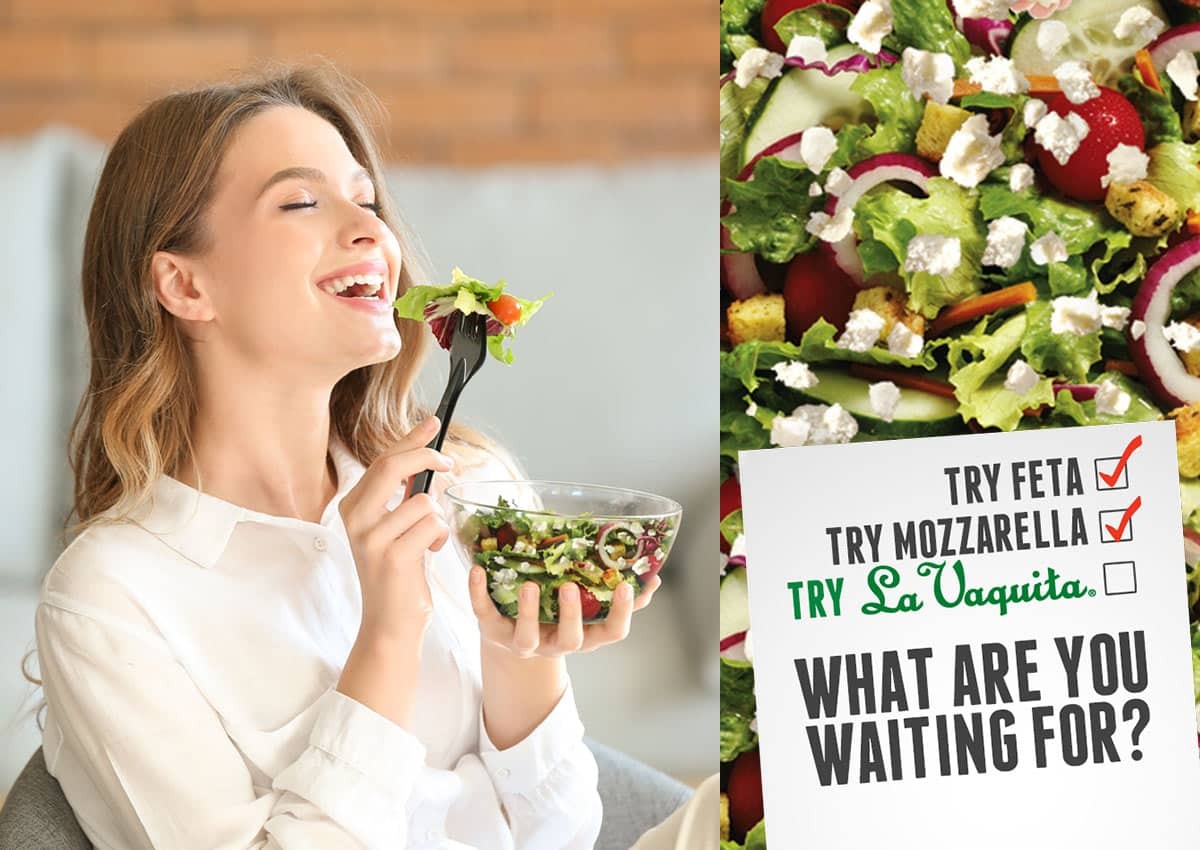
We provided strategic support for La Vaquita, a traditional Hispanic cheese brand, with an out-of-home campaign aimed at introducing its signature crumbled cheese to a broader U.S. audience. The creative was designed to highlight the product’s flavor, culture, and quality in a way that would pique the curiosity of new consumers. The campaign successfully helped a heritage brand feel new again by bridging its traditional roots with a contemporary message. By emphasizing cultural pride and delicious flavor, the advertising resonated beyond its core demographic, driving significant brand awareness and paving the way for La Vaquita to expand its footprint in the competitive U.S. market.
Related La Vaquita work includes shredded Oaxaca and Quesadilla cheese packaging design for the U.S. retail market and a U.S. brand activation campaign. Together, these projects show how packaging and communication can preserve cultural familiarity while adapting the message to different consumer and channel contexts.
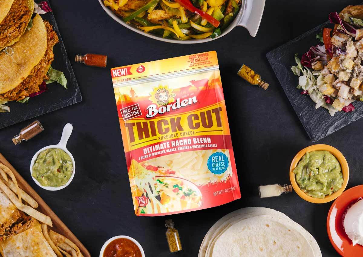
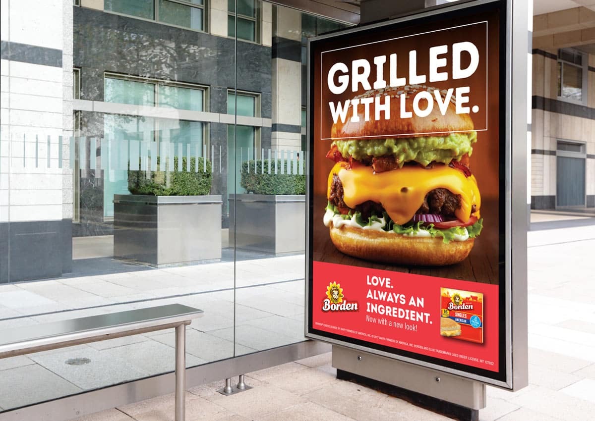
Working in partnership with DFA, we developed impactful packaging for Borden’s product line, creating bold new concepts specifically for their thick-cut and pizza packs. Our primary goal was to give Borden a stronger shelf presence and clearer communication, which are crucial for success in the highly competitive dairy aisle. The redesign successfully enhanced brand differentiation. By using strategic design and clear product communication, the new packaging stands out on crowded shelves, making it easier for consumers to find and choose Borden. The project solidifies the brand’s position and helps it compete more effectively in the market.
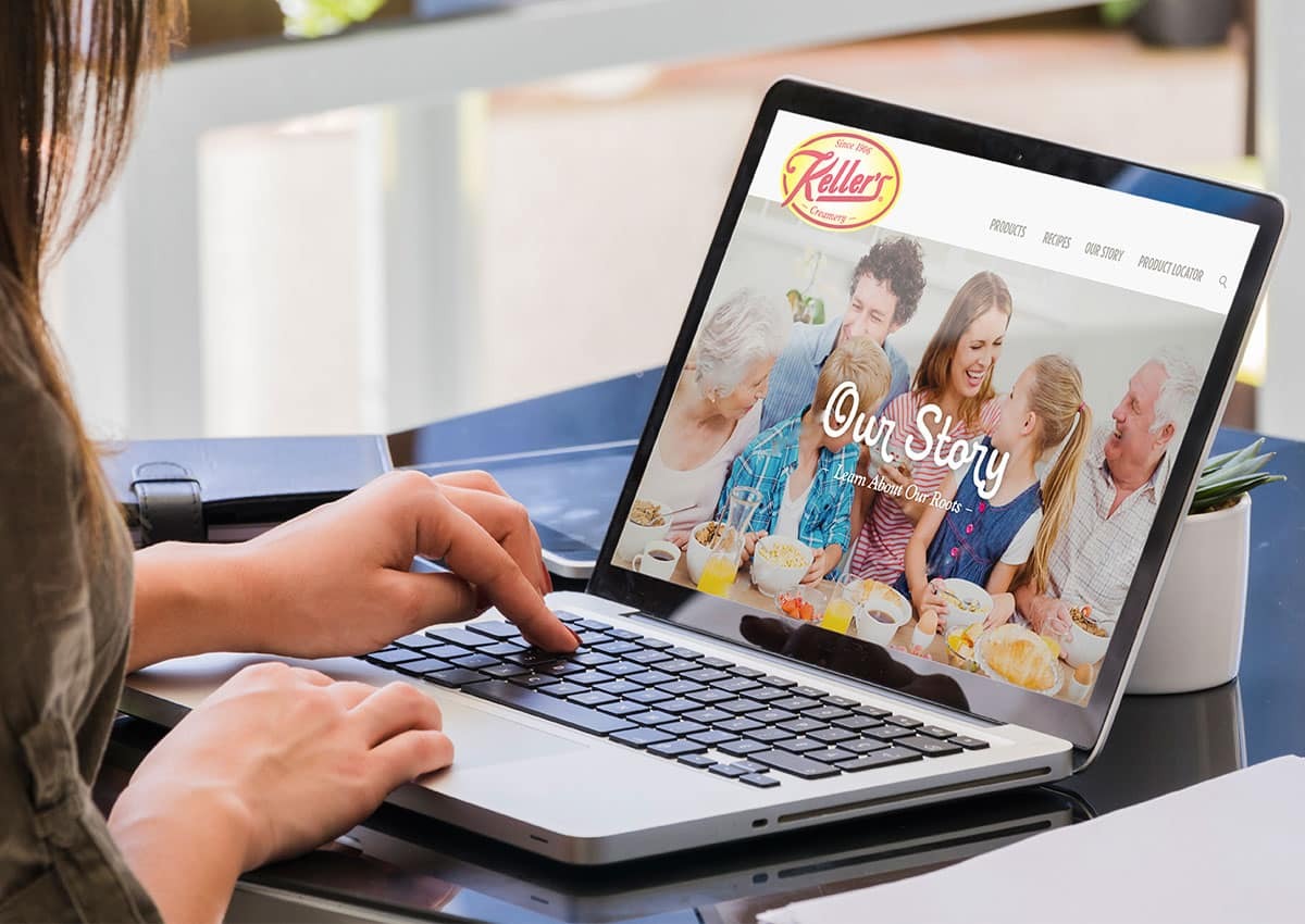
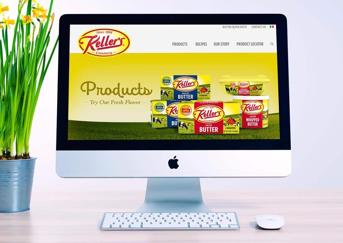
To modernize this heritage butter brand's digital presence, we designed a new website and overall online experience. The project focused on translating Keller’s long-standing tradition and reputation for quality into a more contemporary format that engages today’s online shoppers while honoring the brand's authentic roots. The updated digital platform serves as a powerful showcase for the brand. The new website is intuitive, visually appealing, and effectively communicates the brand’s history and commitment to quality. This modernization ensures that Keller’s Creamery remains relevant, strengthening its connection with both loyal and new customers in the digital age.
For additional context on cultural brand equity, our Bimbo brand architecture case study examines how a familiar Latin American mascot can evolve while preserving recognition, warmth, and portfolio consistency. This is supporting Latin American branding work rather than a U.S. Hispanic packaging project.