Leading Packaging Design Trends for 2026

Six CPG packaging design trends are reshaping how brands win at retail and on-line in 2026 — and each one plays out differently depending on your category, your shopper, and your retail channel. This report covers the trends, the market context driving them, real brand examples for each, and what they mean for your next packaging brief.
How to use packaging trends in a real design brief
A packaging trend is relevant when it strengthens the brand idea, makes the range easier to navigate, and works in the channels where the product will be sold. The visual style should follow those decisions, not replace them.
- Start with the business change: a launch, redesign, line extension, new format, or new market.
- Test the shopper decision: what must be recognized and understood in the first few seconds?
- Test the system: can the direction extend across SKUs, claims, sizes, languages, and future variants?
- Test both environments: review the pack at shelf distance and as a small digital thumbnail.
Imaginity applies trend research within brand strategy, product-line architecture, and packaging design. The objective is a distinctive system that remains useful after the visual trend evolves.
Explore our packaging design service or discuss your packaging brief.

HUMAN, EXPRESSIVE, AND EMOTIONALLY CHARGED
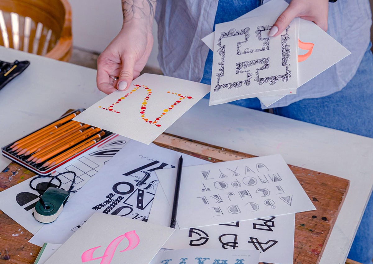
In 2026, packaging design moves beyond perfection and polish. What truly resonates is personality, sincerity, emotion, and a human touch. In an increasingly AI-driven world, brands that feel handcrafted, expressive, and imperfect stand out more than ever.
From hand-drawn elements and tactile textures to psychedelic digital worlds and bold cinematic aesthetics, packaging becomes a powerful emotional connector. These trends help brands feel modern, creative, and deeply authentic—turning every pack into a meaningful brand experience.
Below, we explore the key packaging design trends shaping 2026, and how brands can leverage them to connect with real people.
ELEMENTAL FOLK
MODERN DESIGN ROOTED IN TRADITION
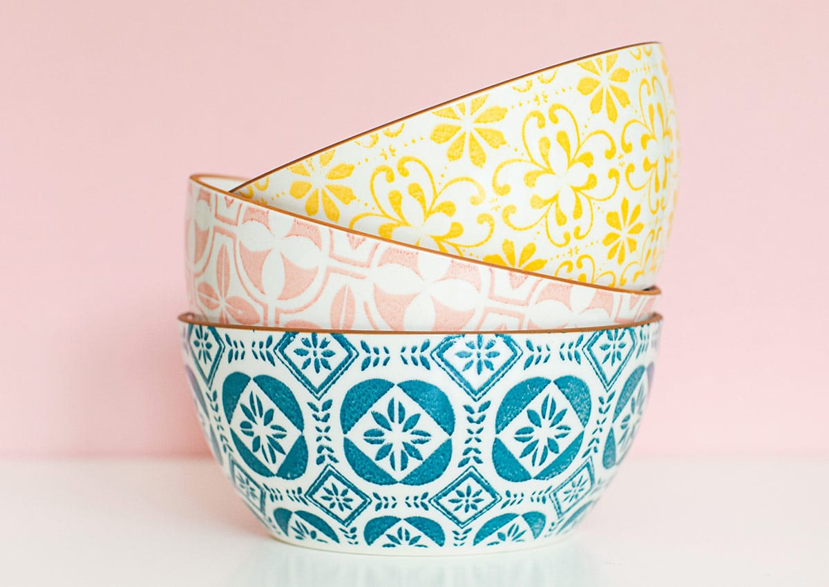
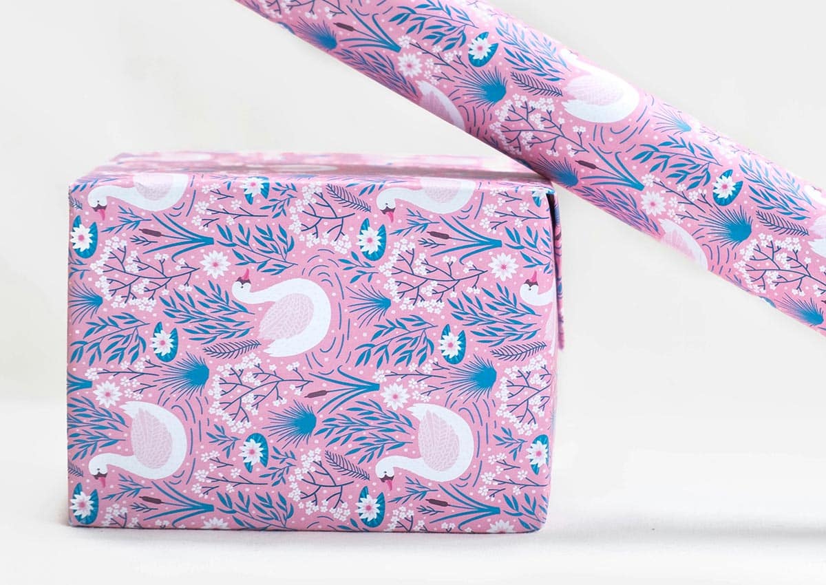
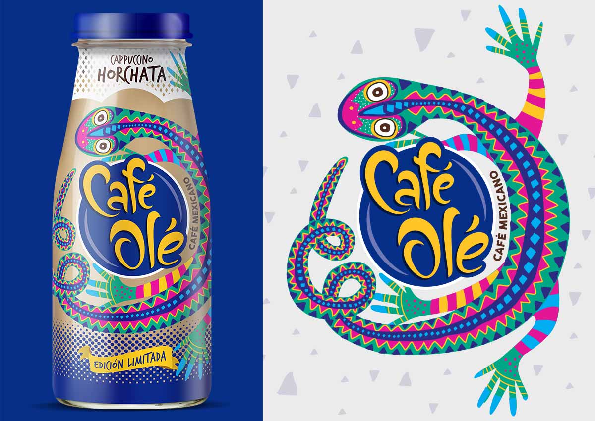
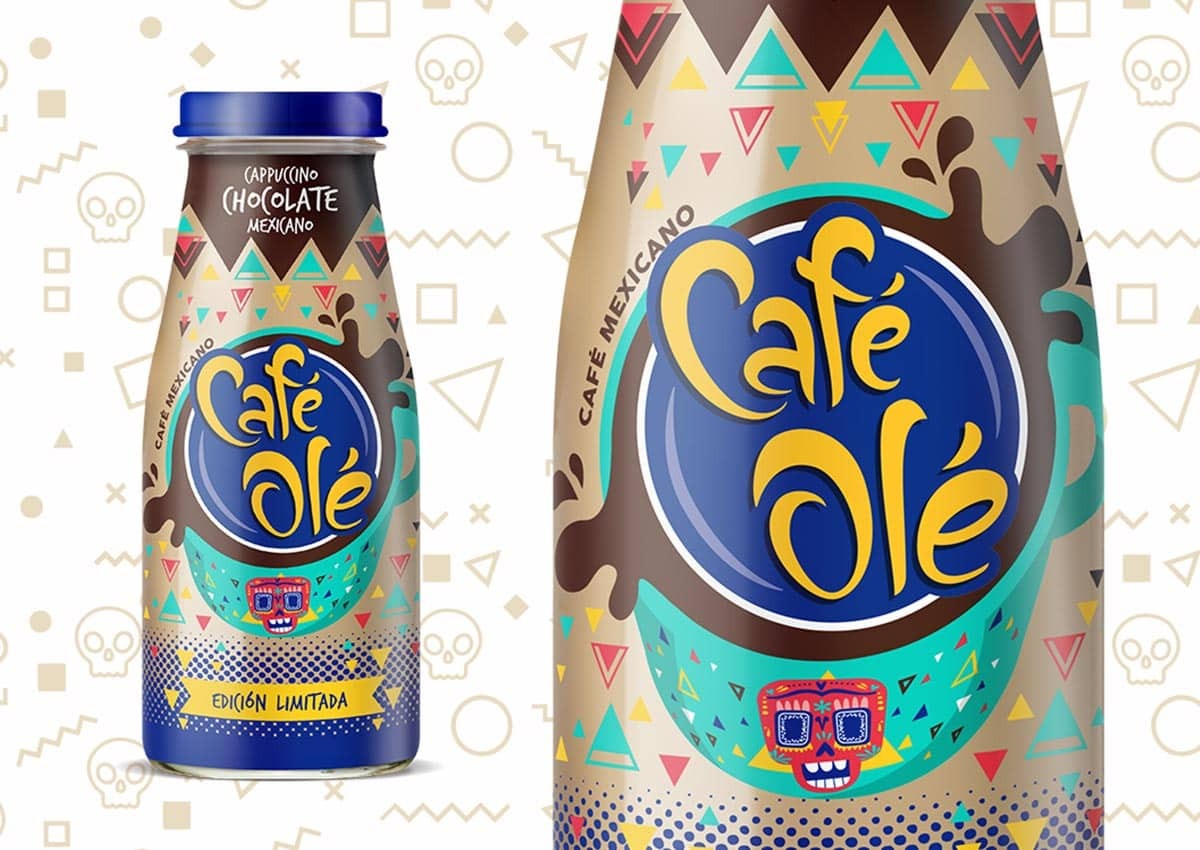
After years of ultra-thin digital minimalism, design in 2026 returns to warmth, serenity, and cultural depth. Elemental Folk draws inspiration from folk art, regional crafts, and ancestral visual languages—reinterpreted through a modern lens.
This trend blends floral patterns, animal symbols, ornamental borders, and earthy palettes into clean, contemporary compositions. The result is packaging that feels grounded and soulful, where heritage and modern branding coexist naturally.
Elemental Folk brings authenticity and emotional resonance, making brands feel rooted, trustworthy, and culturally rich—especially powerful for food, beverage, wellness, and lifestyle categories.
TACTILE CRAFT
HANDMADE ENERGY IN A DIGITAL WORLD
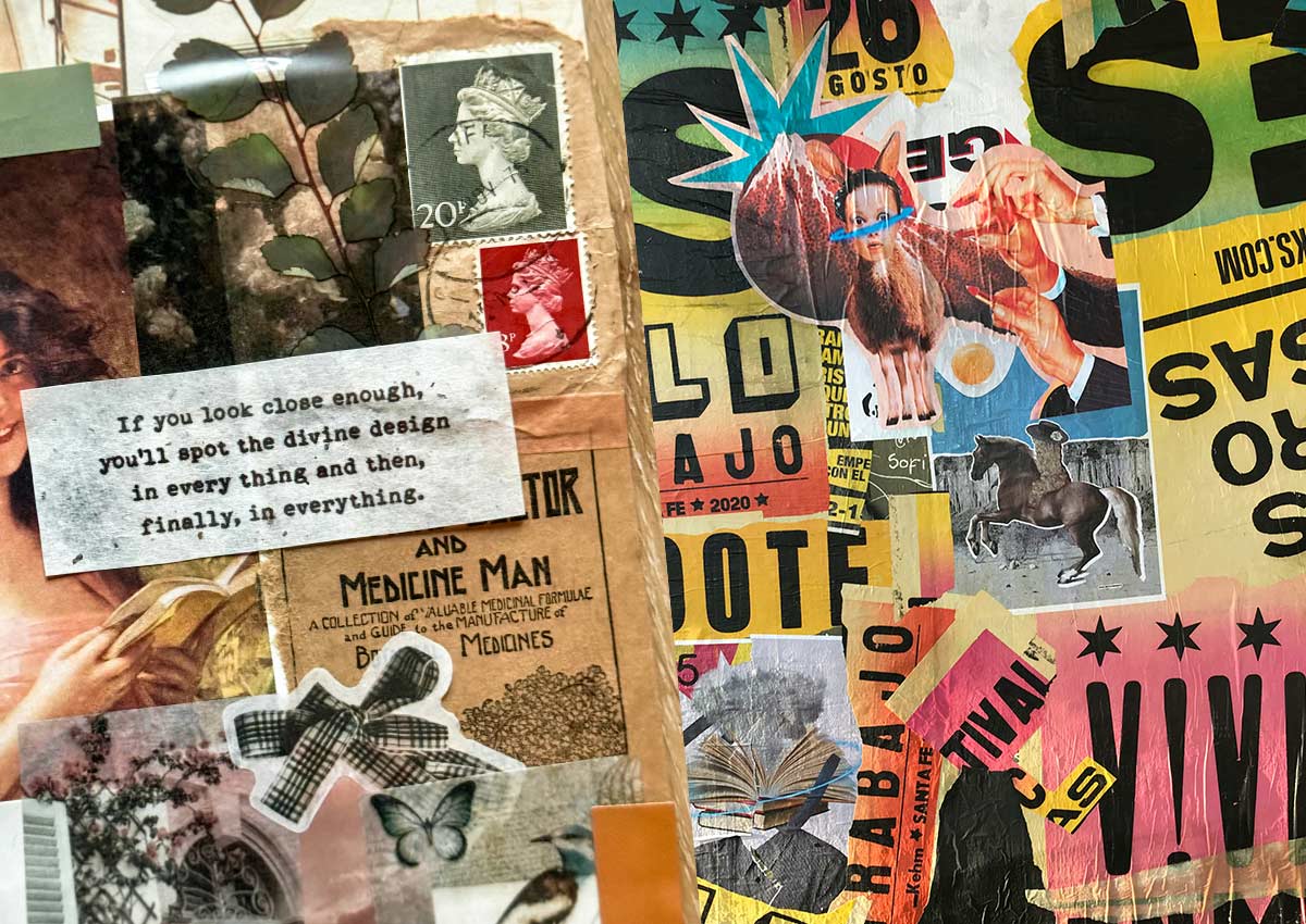
The Tactile Craft trend celebrates imperfection and materiality. Inspired by embroidery, felt, fabric, paper cuts, and DIY aesthetics, it introduces a handcrafted feel into both physical and digital packaging.
Visible seams, stitches, patches, layered textures, and 3D effects create warmth and playfulness—standing in deliberate contrast to the flawless output of AI-generated visuals.
Tactile Craft makes brands feel approachable, human, and creative. It’s ideal for challenger brands, artisanal products, and categories where emotional connection matters as much as functionality.

CANDID CAMERA ROLL
RAW, REAL, AND UNFILTERED
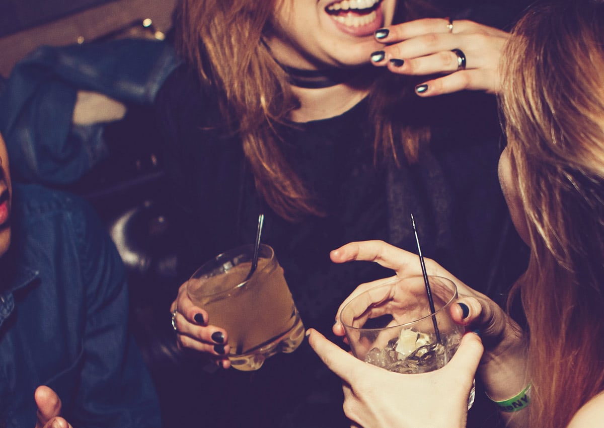
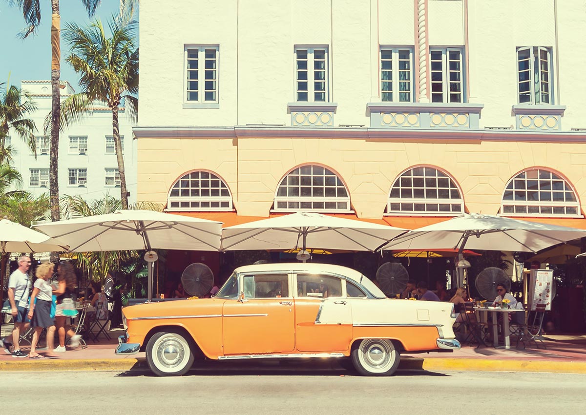
A reaction against overly polished visuals, Candid Camera Roll embraces authenticity through photography that feels spontaneous and real.
Think grainy film textures, light leaks, muted tones, cropped frames, and flash photography. Hand-drawn doodles, scribbled notes, underlines, and imperfect typography add to the sense of immediacy and sincerity.
This trend builds trust and emotional closeness. It feels personal, intimate, and relatable—perfect for brands targeting Gen Z and Millennials who value transparency over perfection.
NEON NOIR
CINEMATIC INTENSITY AND URBAN REBELLION
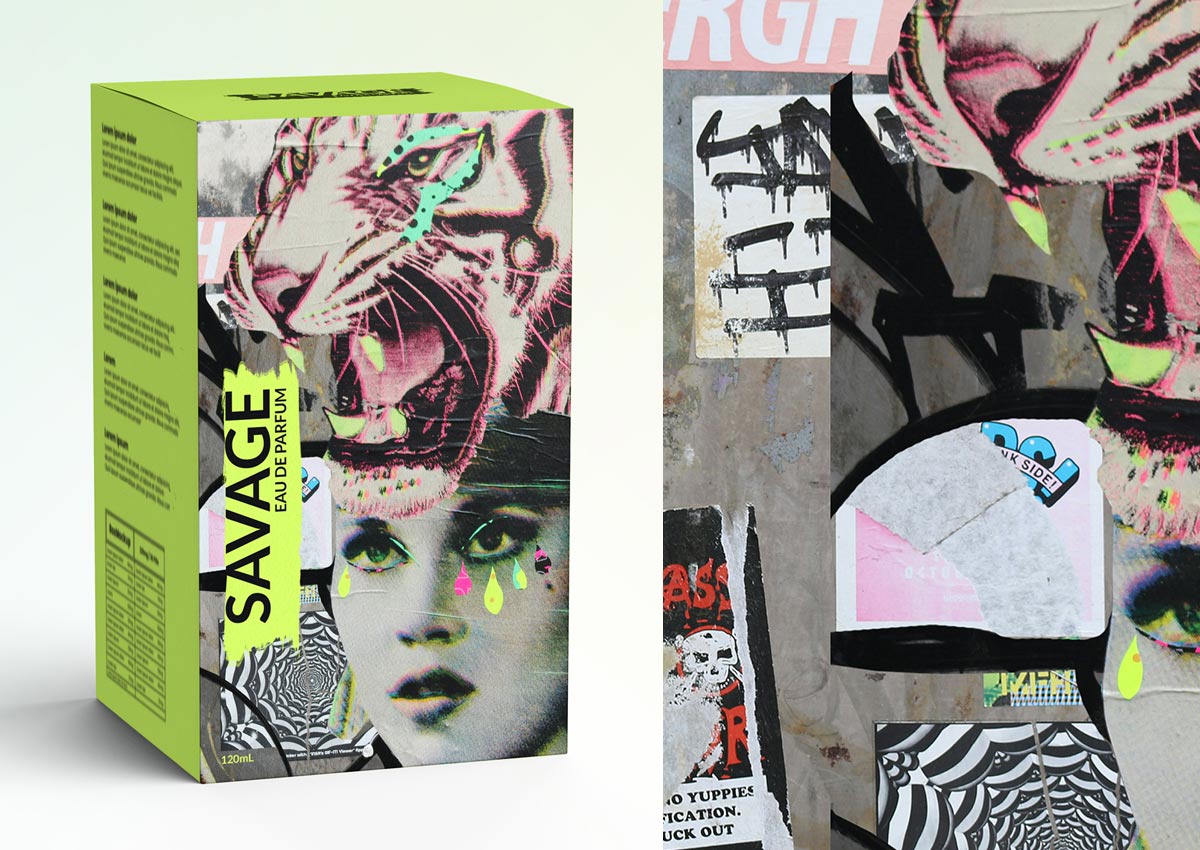
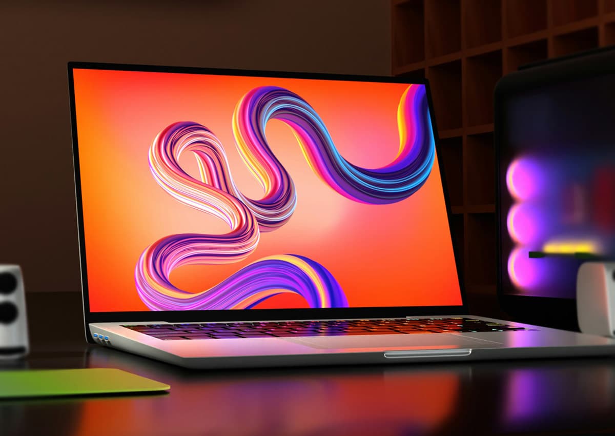
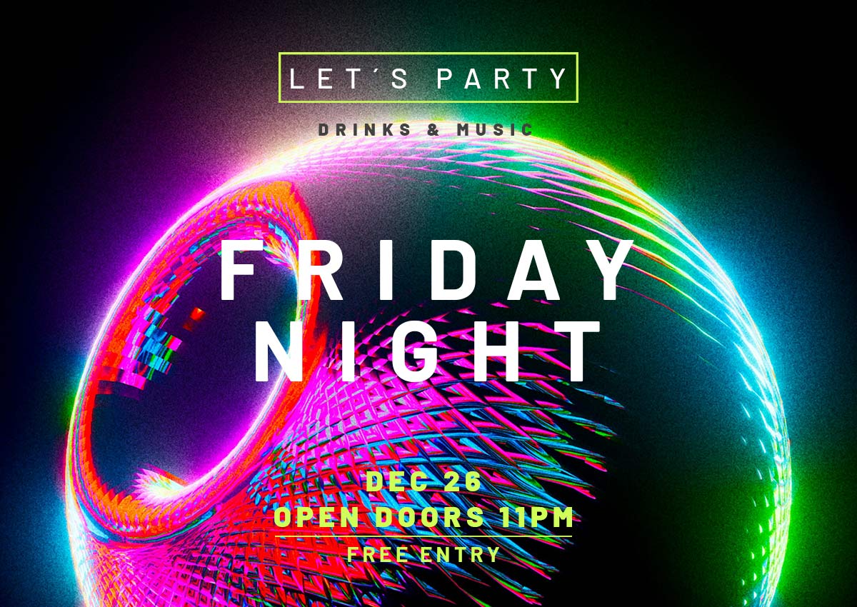
Neon Noir fuses bold reds, deep blacks, and neon accents with cinematic drama. Influenced by Japanese street culture, underground print, and classic film noir, this trend is all about contrast, energy, and attitude.
Motion blur, streaked lights, raw photography, oversized typography, and high-impact layouts create tension, movement, and emotional intensity.
Neon Noir is ideal for brands that want to feel bold, edgy, and expressive—especially in fashion, tech, beverages, and youth-driven categories.
MERMAIDCORE
DREAMLIKE FANTASY AND OCEANIC GLAMOUR
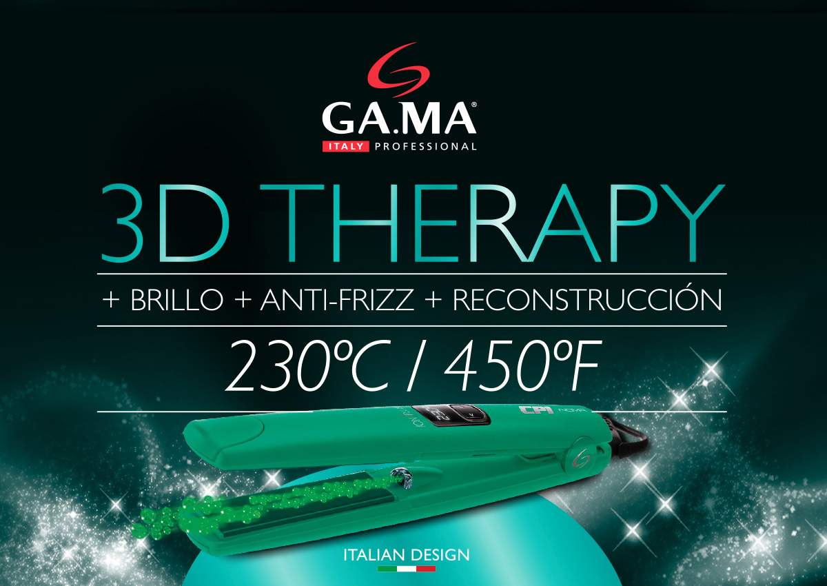
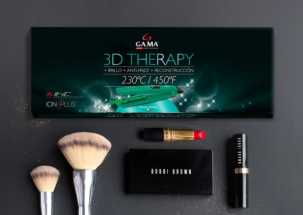
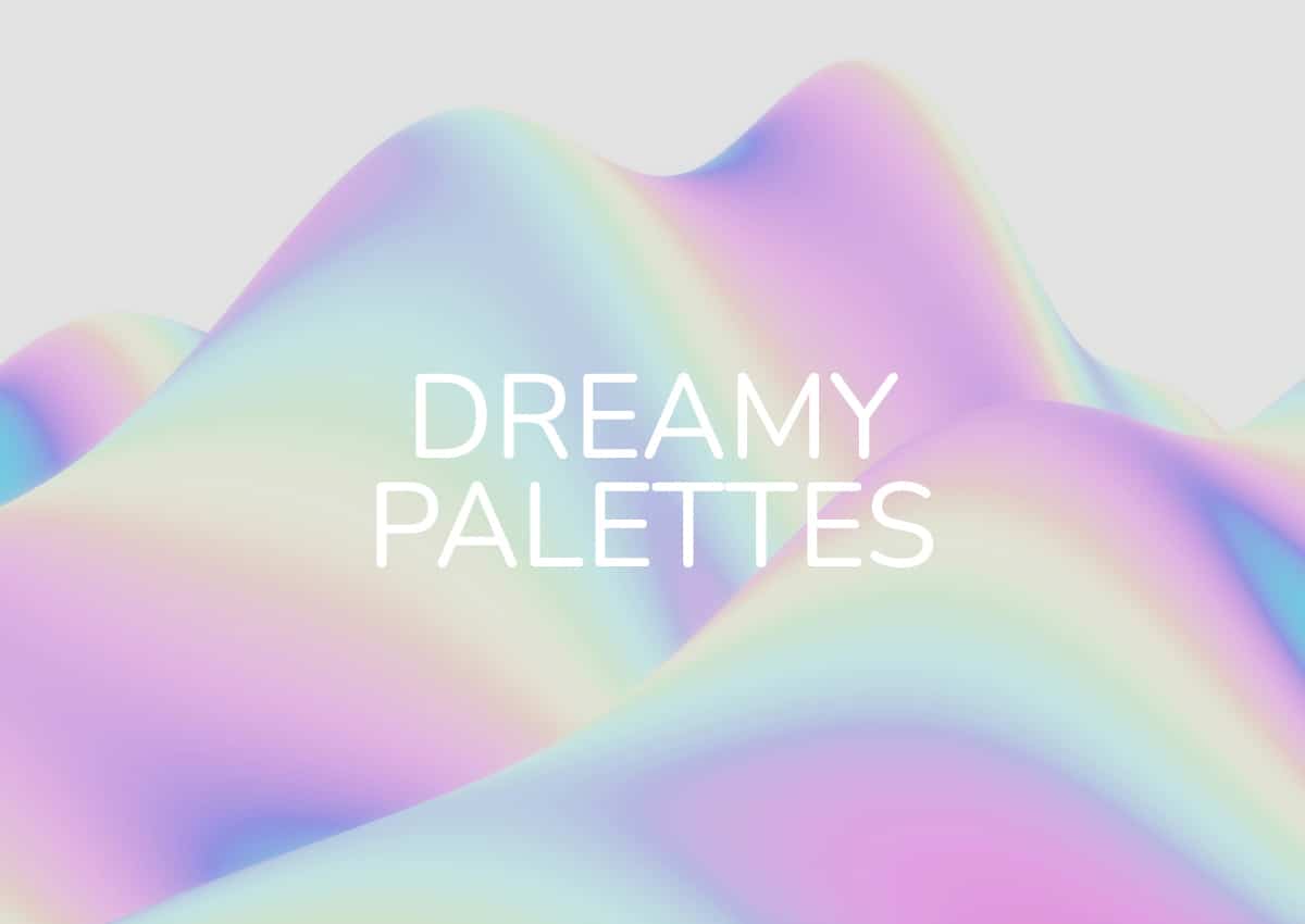
Mermaidcore dives into fantasy and escapism. Iridescent aquamarines, soft teals, pearly purples, shimmering silvers, and fluid gradients evoke light dancing on water.
Combined with deep midnight blues or pastel overlays, this palette feels magical, nostalgic, and otherworldly—offering a bold alternative to the muted neutrals of recent “quiet luxury” trends.
Mermaidcore brings emotion, imagination, and sensory appeal. It’s especially powerful in beauty, beverages, wellness, and premium lifestyle products seeking visual differentiation.

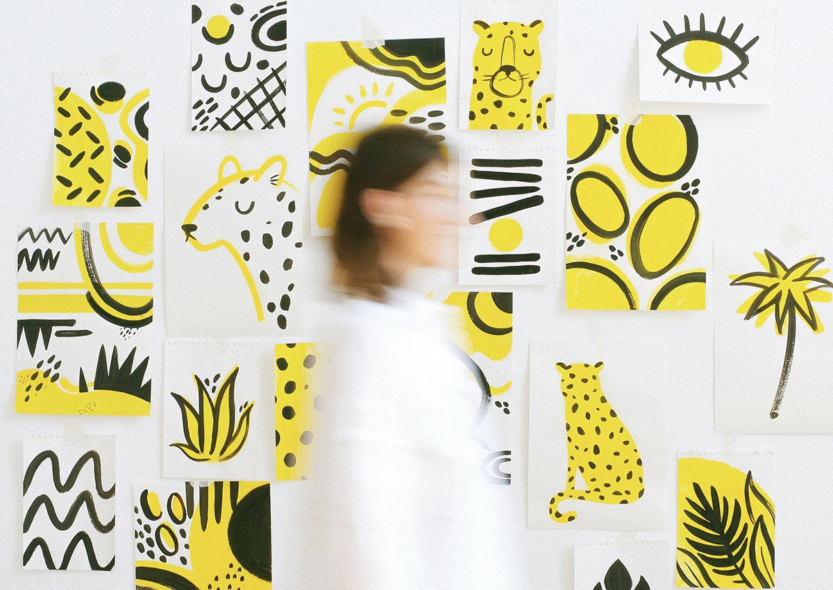
BANANA YELLOW
OPTIMISM, WARMTH, AND JOYFUL SIMPLICITY
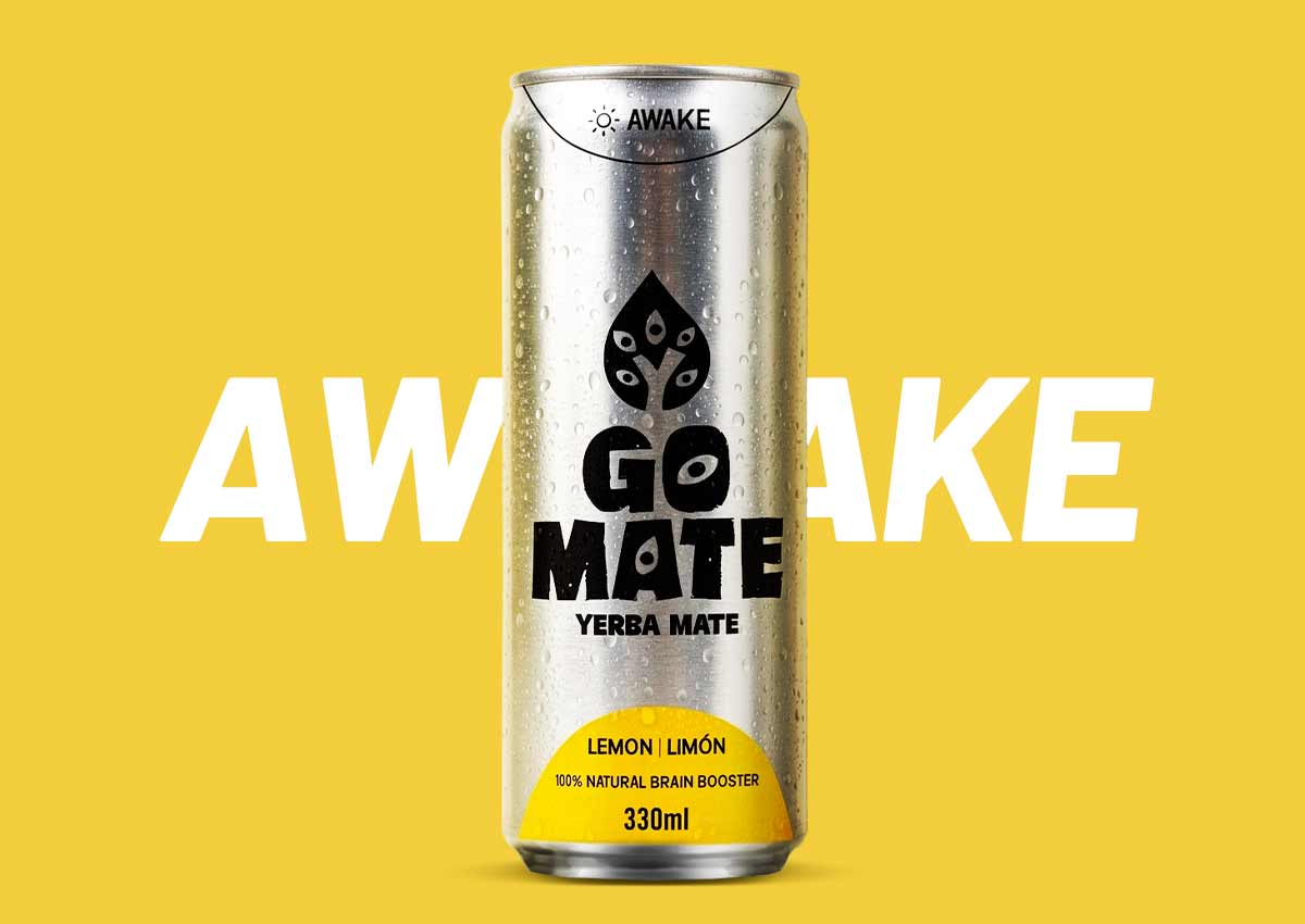
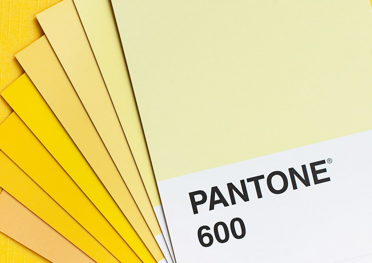
Banana Yellow is soft, cheerful, and energizing. Brighter than cream but gentler than neon, this pastel yellow adds optimism without overwhelming the design.
It pairs effortlessly with neutrals, earthy browns, or other pastels—making it perfect for accents, typography, and lifestyle imagery.
This trend signals a shift away from beige minimalism toward warmth and positivity. Banana Yellow instantly communicates friendliness, accessibility, and modern optimism.
HYPER-BLOOM
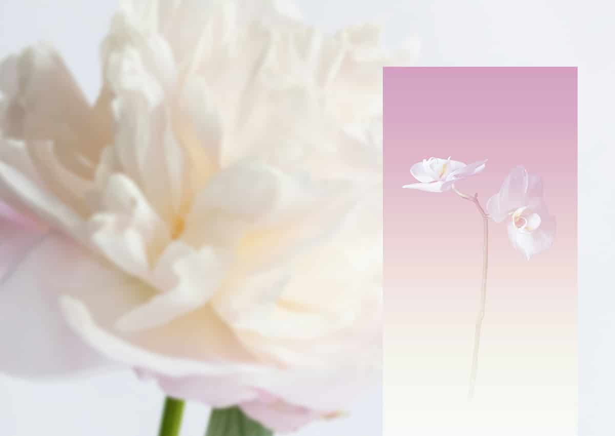
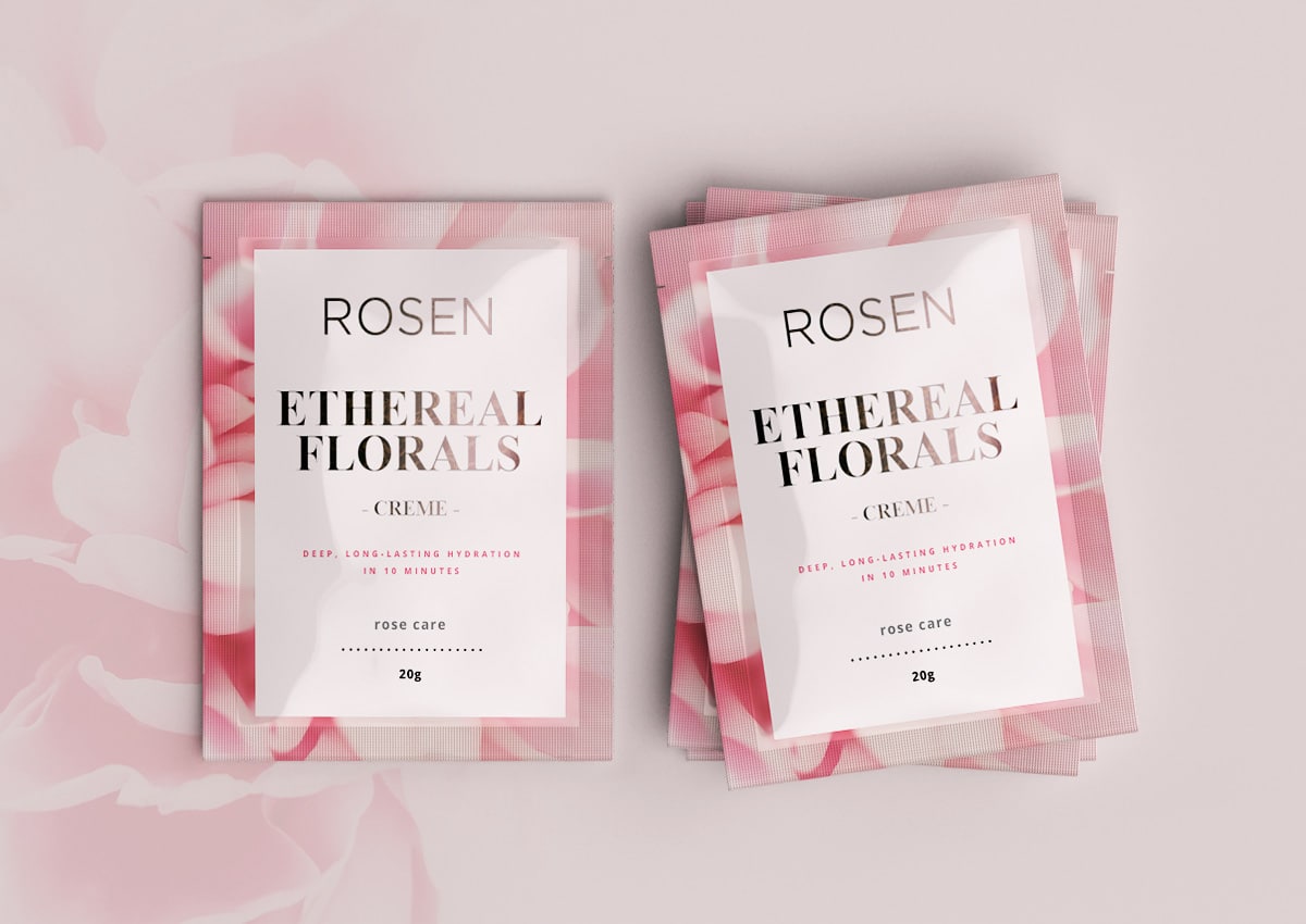
BLURRY ETHEREAL FLORALS
Hyper-Bloom emerges in 2026 as a poetic counterpoint to sharp, hyper-defined visuals, embracing softness, motion, and emotional ambiguity.
This trend reimagines florals through diffusion, blur, and layered translucency—creating dreamlike compositions that feel atmospheric, sensual, and almost alive.
Hyper-Bloom speaks to a desire for beauty that is felt rather than analyzed, adding romance, depth, and quiet escapism to contemporary packaging and visual identities.
MICRO-INDUSTRIAL
TECHNICAL AND ORGANIZED INSPIRATION
Micro-Industrial defines a 2026 design trend rooted in precision, structure, and functional clarity. Inspired by engineering systems, schematics, and industrial labeling,
it uses grids, modular layouts, technical typography, and restrained color codes to communicate intelligence, efficiency, and control.
This aesthetic resonates with brands seeking credibility and performance-driven storytelling, translating complexity into clean, confident, and highly organized visual systems.
PACKAGING IN 2026: DESIGNED TO FEEL HUMAN
Across all these trends, one idea stands out: packaging must feel human. Texture over perfection. Emotion over algorithms. Personality over uniformity.
At Imaginity, we translate these global design movements into strategic, high-impact packaging systems—helping brands not just follow trends, but use them meaningfully to connect, differentiate, and sell.
If you’re planning your next packaging evolution, 2026 is the year to design with feeling.
TRENDS BY CATEGORY
2026 Packaging Design Trends by CPG Category
Each CPG category interprets the 2026 trends differently. Here is how the macro trends translate into specific design direction for the US categories with the highest packaging design search intent.
Snack Packaging Trends 2026
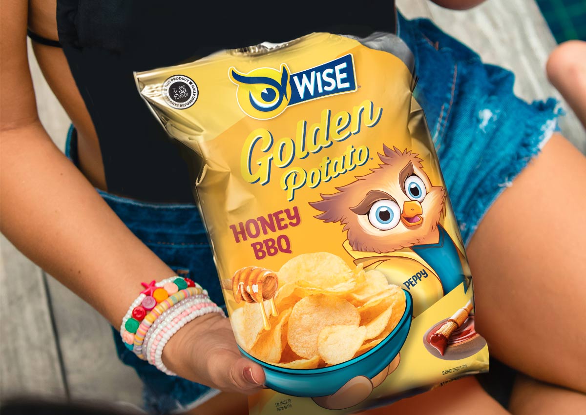
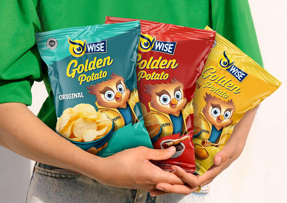
The US snack aisle is the most competitive shelf environment in CPG. Private label has moved aggressively into snacks with design investment that would have been unthinkable five years ago. Branded snack packaging in 2026 is responding with stronger brand personality, mascot-led design systems, and heritage/nostalgia signals that private label cannot replicate.
- Heritage mascot redesigns front-and-center (Wise Snacks model)
- Bold typography dominating front panel — flavor first, brand second
- Limited edition retro packaging driving impulse and social sharing
- Tactile finishes (matte, soft-touch, spot UV) signaling premium at mass
- Multicultural variant lines with culturally specific visual language
See our snack packaging experience →
Beverage Packaging Trends 2026
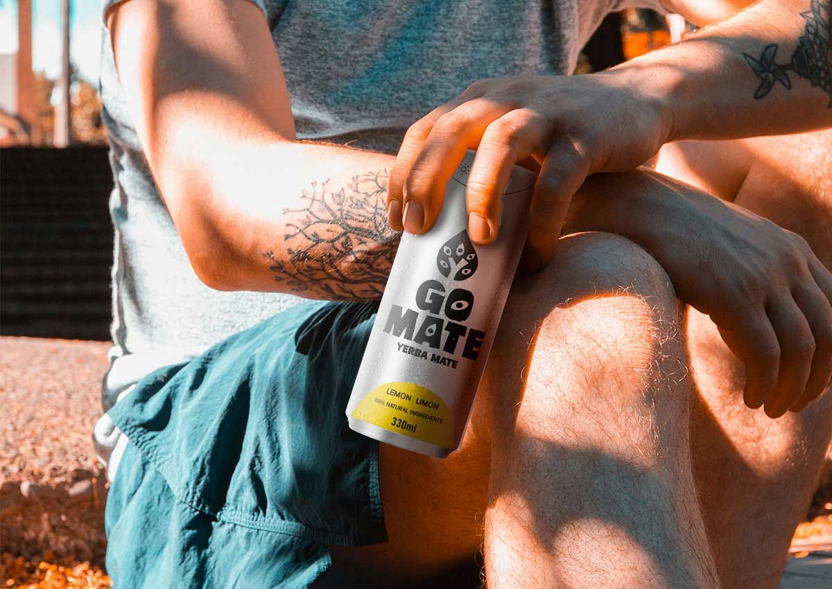
The beverage category is bifurcating: on one side, premium functional and better-for-you formats with clean, expressive design; on the other, high-intensity energy and performance packaging using Neon Noir vocabulary. The middle ground — generic, photography-led packaging — is being squeezed from both directions.
- Functional ingredient callouts as design hero — not footnote
- Lo-fi, candid photography for RTD and kombucha brands
- Neon Noir for energy, gaming, and performance categories
- Structural differentiation: cans, pouches, glass as brand signal
- Amazon thumbnail optimization driving simpler front-of-pack hierarchy
See our beverage packaging experience →
Personal Care Packaging Trends 2026
Personal care packaging is navigating a tension between clinical efficacy signals (which build trust) and expressive brand personality (which builds desire). The 2026 shift toward emotional authenticity is most visible in the indie and DTC personal care space, where it is now migrating into mass retail through brands gaining Walmart and Target listings.
- Minimalist layouts with bold ingredient claim hierarchy
- Sustainable format transitions (pump-to-refill, mono-material)
- Inclusive imagery and representation in lifestyle photography
- Gender-neutral design language in hair and skincare
- Tactile finishes communicating sensorial product quality
Frozen Food Packaging Trends 2026
The frozen food category's most important 2026 packaging trend is structural, not aesthetic: the transition from polybag to paperboard is accelerating under retailer sustainability pressure and is simultaneously creating a brand premiumization opportunity. Brands making this transition are treating it as a redesign moment, not just a material substitution.
- Polybag-to-paperboard format transitions as brand upgrades
- Appetite photography optimization for frosted glass visibility
- Multicultural frozen (Hispanic, Asian) moving mainstream
- Bold color blocking for freezer aisle standout
- Premium tray-and-sleeve formats in the meal category
Food Packaging Trends 2026
Across ambient food categories — bread, condiments, sauces, specialty food — the dominant 2026 direction is provenance and authenticity storytelling. Post-inflation consumers who traded down to private label are trading back up to brands, but only those that can articulate why they're worth the premium. Packaging that tells a story outperforms packaging that only describes a product.
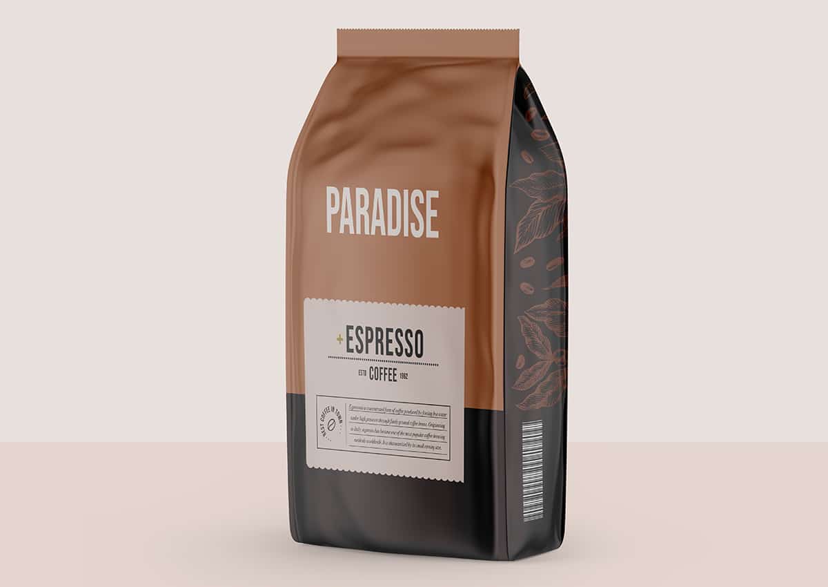
- Elemental Folk illustration for provenance and cultural storytelling
- Founder or origin stories on pack (side panel and back panel)
- Clean ingredient callouts as front-of-pack hero
- Hand-lettered or tactile typography for artisan positioning
- Reduced packaging — minimalism as sustainability signal
See our food packaging experience →
E-Commerce Packaging Trends 2026
E-commerce packaging design trends in 2026 are shaped by two realities: the Amazon thumbnail is the new shelf, and the unboxing experience is the new retail moment. Packaging that only works in one context is failing at the other. Brands that have designed for both simultaneously are reporting higher conversion rates in e-commerce and stronger brand recognition in physical retail.
- Thumbnail-first design hierarchy — brand and benefit at 500×500px
- Unboxing experience design for DTC and Amazon FBA formats
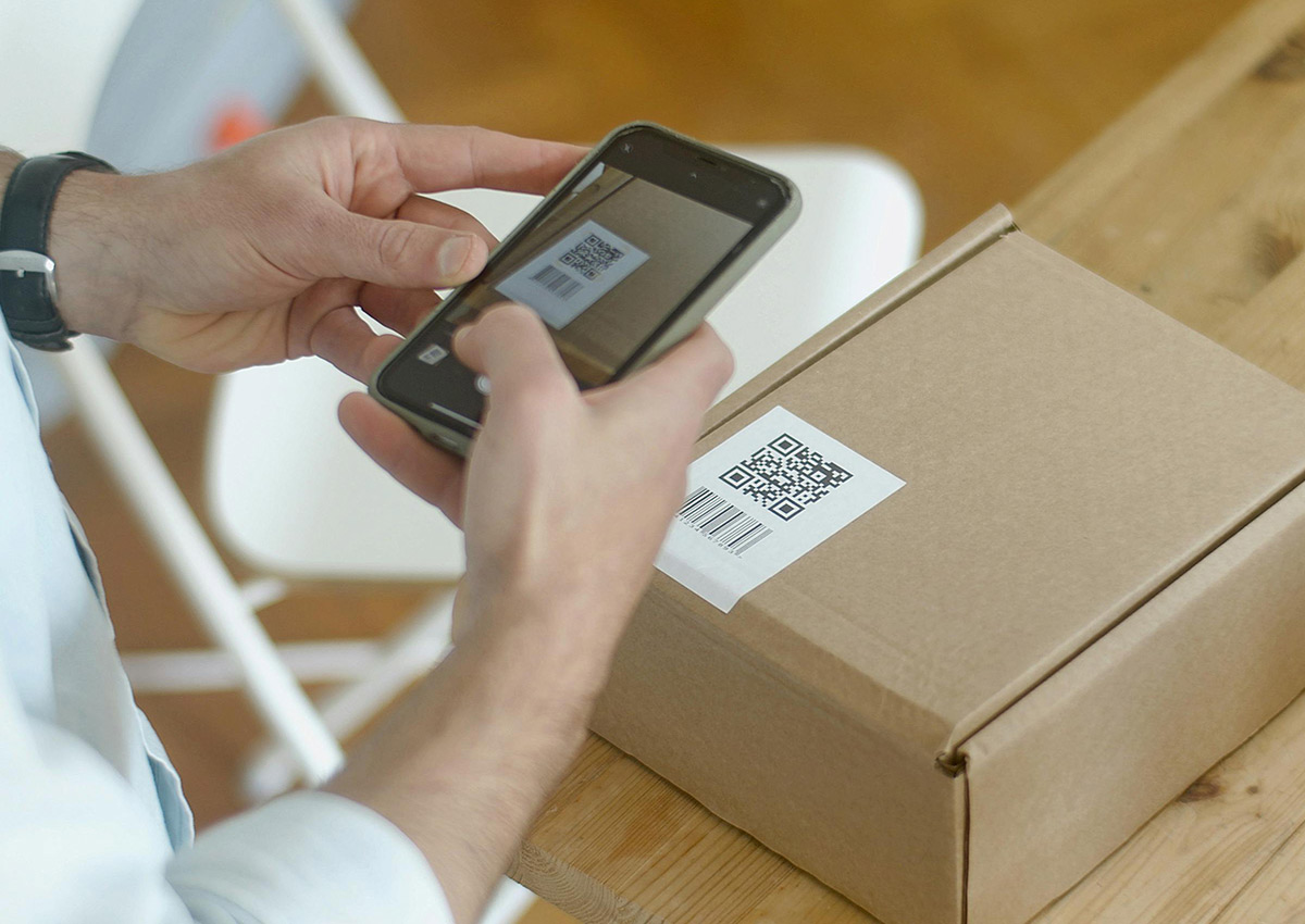
- QR codes as digital brand extension, not compliance tools
- Secondary packaging (mailer, insert) as brand touchpoint
- A+ content and Brand Store architecture as packaging system extensions
2026 Trends at a Glance: Retail vs. E-Commerce Performance
How each trend performs across the two environments that matter most for CPG brands:
TREND
PHYSICAL RETAIL
AMAZON
E-COMMERCE
BEST CATEGORIES
Tactile Craft
Premium perception; texture cue
Distinctive vs. flat competitors
Bakery, artisan food, DTC
Candid Camera Roll
Gen Z engagement; anti-corporate feel
Authentic thumbnail; social content fuel
RTD beverages, snacks, challenger brands
Neon Noir
Gen Z engagement; anti-corporate feel
Bold thumbnail in competitive search
Energy drinks, spirits, personal care
Sustainable Design
Retailer compliance + shelf upgrade
Filter-match for eco searches
Frozen, personal care, household
PRACTICAL APPLICATION
What the 2026 Trends Mean for Your Packaging Brief
Trends become useful when they change the questions you bring to a packaging project. Here are the eight questions the 2026 CPG packaging design trends should prompt in any brand manager's next redesign brief.
01
Does our packaging have a point of view — or just a category code?
In 2026, brands with personality outperform brands with category convention. If your packaging is hard to tell from a private label alternative, the design brief needs to start with brand character, not product description.
02
What cultural story can we tell that our competitors genuinely can't?
Elemental Folk and multicultural design work because they're authentic to a specific brand's origin. If your brand has a genuine heritage, provenance, or cultural connection, your packaging brief should ask how to make that visible — not generic.
03
Does our design work at 500×500 pixels on a phone screen?
Test every design direction as a small thumbnail before committing to full development. If the brand name isn't legible, the product isn't identifiable, and the color doesn't differentiate at thumbnail size, the design needs revision.
04
Is our sustainability transition a brand upgrade or just a material swap?
If you're moving to a new sustainable format, treat it as a full packaging redesign opportunity. The format change gives you permission to rethink the entire brand presentation — use it.
05
Are we designing for the shopper who sees us first — or the shopper who already knows us?
Most CPG packaging is designed for the loyal buyer who already knows the brand. In 2026, with Amazon as the primary discovery channel for new shoppers, the new-buyer first impression deserves equal design weight.
06
Does our packaging system accommodate the multicultural shopper?
For any brand targeting grocery channels, the Hispanic shopper is a significant and growing portion of the category. Is the packaging system designed to resonate with them — or is it designed for a demographic that represents a shrinking share of the shopper base?
07
Can a new shopper navigate our product line in under five seconds?
Brand architecture and variant coding are preconditions for effective packaging design, not afterthoughts. If your line architecture is unclear, no trend-led design direction will resolve it.
08
What would make a shopper photograph this packaging and share it?
Organic social content is the most efficient media channel available to CPG brands in 2026. Packaging that gets photographed and shared drives awareness and trial at zero media cost. Every design brief should include a social shareability question.
09
Does our packaging system have room to grow, or will the next SKU break it?
A brief that only solves today's packaging problem is only half a brief. Before finalizing any design direction, ask whether the system can accommodate a line extension, a new format, or a seasonal edition without requiring a full redesign.
THE FUTURE OF VISUAL IDENTITY
At Imaginity we explore cutting-edge packaging design trends shaping 2026. Our design strategies redefine shelf impact, strengthen consumer connections, and establish new standards in packaging excellence. Discover the power of designs that not only captivate and inspire trust but also drive sales, ensuring your brand stays ahead in a competitive market.
WHAT ARE THE LEADING PACKAGING DESIGN TRENDS?
The leading packaging design trends are the shifts that help brands become easier to recognize, understand, and choose across physical shelves, digital commerce, and omnichannel retail. In 2026, the most important packaging design trends include smart packaging, minimalist design, bold typography, transparent materials, sustainable packaging, limited-edition systems, digital-shelf optimization, reusable formats, custom color palettes, and stronger brand storytelling.
For brands, these trends are not just visual styles. They are strategic tools that improve shelf impact, clarify product benefits, build trust, and create emotional connection with consumers. A strong packaging system should make the product visible at a glance, communicate the brand promise clearly, and adapt across formats, markets, SKUs, campaigns, and online product images.
The best packaging design trends are the ones that support a brand's business goals. Smart packaging can increase interaction and transparency. Sustainable materials can strengthen credibility. Minimalist systems can improve clarity and premium perception. Bold graphics can increase recognition in crowded categories. Limited-edition packaging can create urgency, collectibility, and cultural relevance.
At Imaginity, we approach packaging trends through strategy, not decoration. We use trends to build stronger visual identities, clearer product architectures, and more effective brand storytelling across consumer goods categories. The goal is packaging that looks current, performs commercially, and remains coherent as the brand grows.
SMART PACKAGING
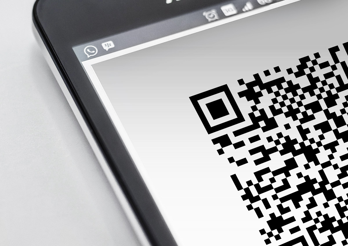
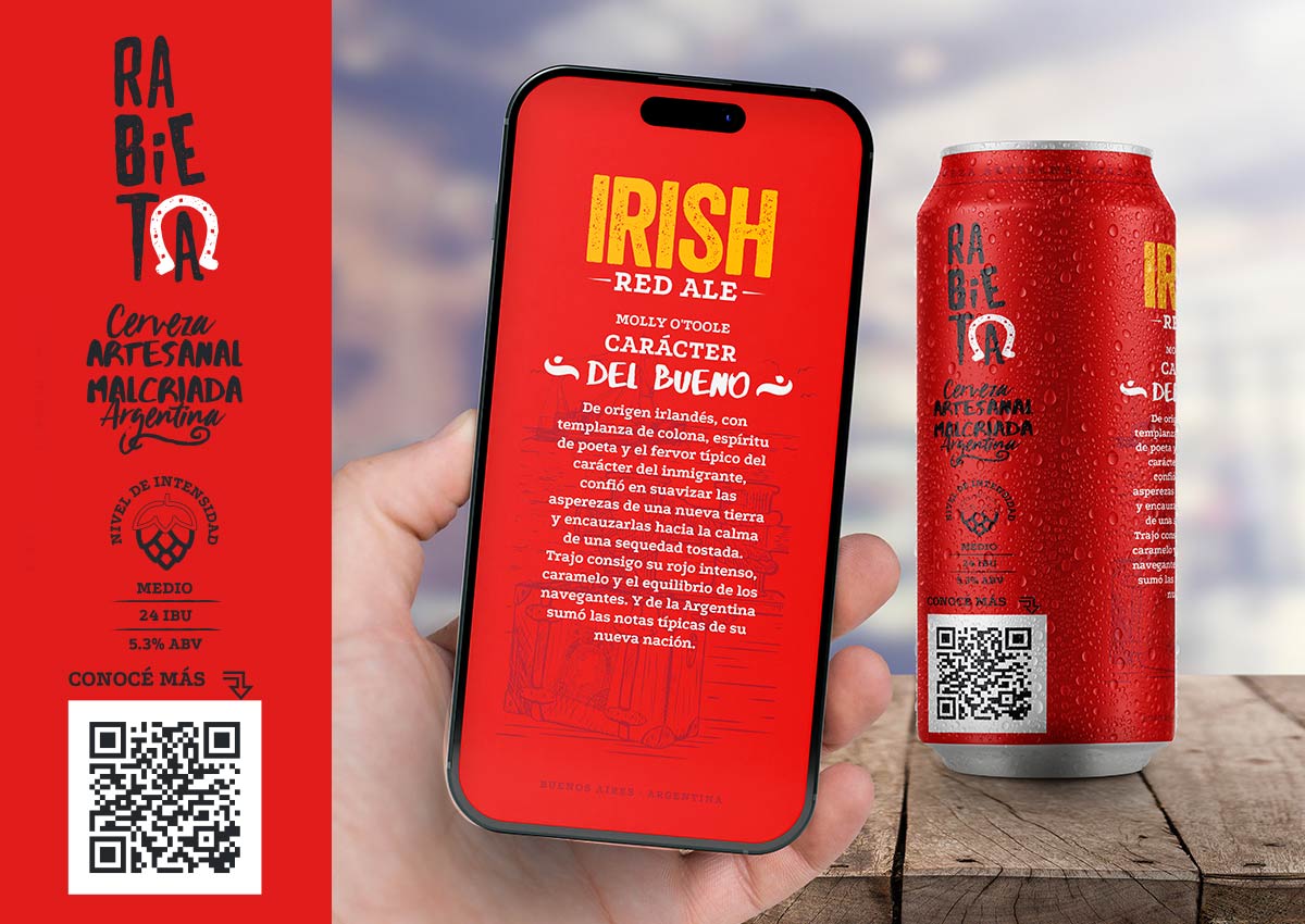
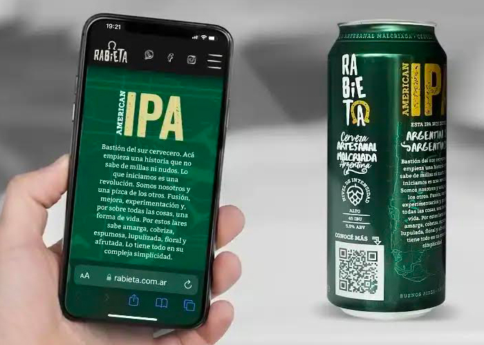
Smart packaging leverages QR codes, NFC technology, and augmented reality (AR) to create an interactive consumer experience. With a simple scan, consumers can access detailed product information, promotional content, or even gamified features. For instance, QR codes can link to instructional videos or sustainability certifications, enhancing transparency and consumer trust. AR adds an engaging layer, allowing users to visualize how a product fits into their lives, such as trying out a shade of paint virtually or seeing how a food item pairs with recipes.
This trend is also a valuable tool for brands to collect consumer data and insights. By tracking interactions with smart packaging features, businesses can fine-tune their marketing strategies and personalize the customer journey. The fusion of technology and packaging not only elevates the product’s value but also strengthens the emotional connection with consumers in an increasingly digital world.
MINIMALIST DESIGN
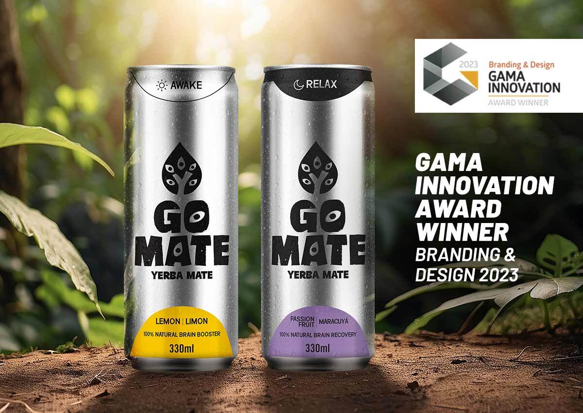
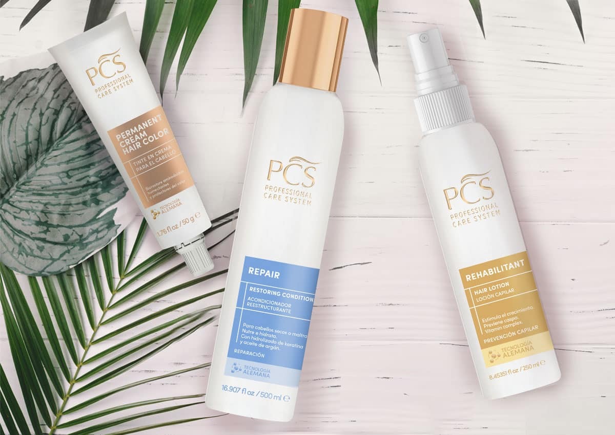
Minimalism in packaging design conveys sophistication and premium quality through its use of clean layouts, simple typography, and abundant white space. This trend aligns perfectly with modern consumers’ preference for clarity and transparency. By stripping away unnecessary elements, minimalist packaging ensures that the core message and key product benefits are immediately apparent. For instance, in home-care products, the sleek design reinforces reliability and efficacy while appealing to eco-conscious buyers. Beyond aesthetics, minimalist designs reduce production costs and environmental impact by using fewer materials and inks.
The understated elegance of such packaging also makes it versatile, allowing it to stand out both on physical retail shelves and in digital e-commerce spaces. In an era where less is more, minimalist packaging proves that simplicity can be incredibly impactful.
BOLD TYPOGRAPHY AND GRAPHICS
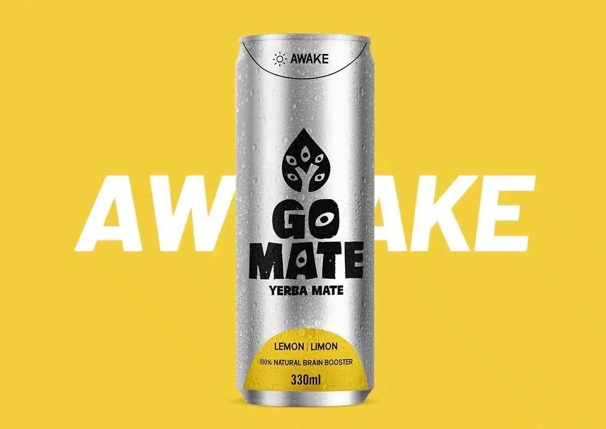
Bold typography and vibrant graphics are key elements for creating packaging designs that grabs consumer attention and establishes a strong shelf presence. Large, impactful fonts communicate brand identity and key product benefits instantly, helping products stand out in a crowded market. This trend is particularly effective for FMCG brands, where quick consumer decisions are often influenced by visual cues. Vibrant graphics and dynamic layouts work in harmony with bold typography to evoke specific emotions or associations, such as energy, cleanliness, or indulgence.
In addition to enhancing visibility, bold typography ensures readability across various formats, from retail shelves to e-commerce platforms. This approach also aligns with inclusive design practices by making important information accessible to all demographics, including those with visual impairments. By combining striking visuals with clear messaging, brands can achieve both aesthetic appeal and functional communication.


TRANSPARENT PACKAGING
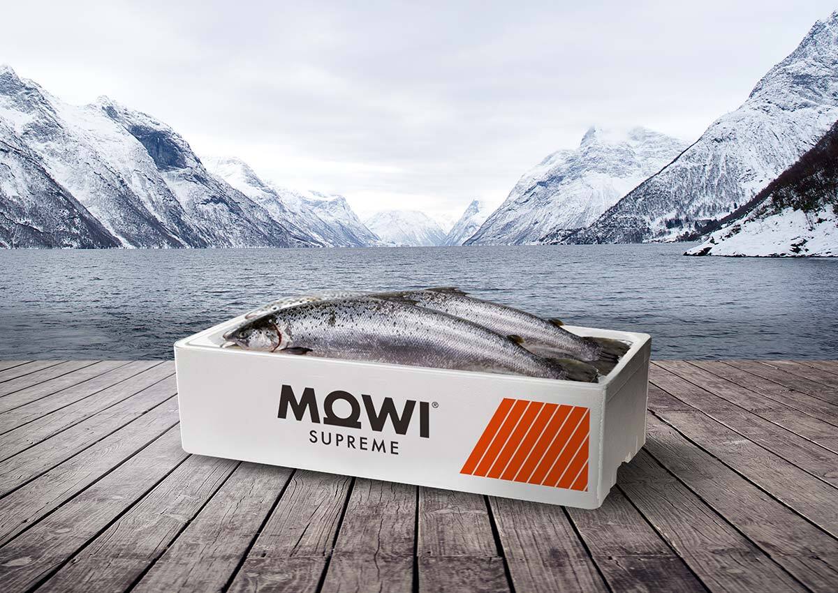
A transparent packaging design creates an immediate sense of trust and authenticity by allowing consumers to see the product inside. This approach in visual identity is particularly effective in categories like food, beverages, and cosmetics, where aesthetic cues of quality can strongly influence purchase decisions. For instance, clear windows in food packaging highlight freshness, while in cosmetics, transparency underscores purity and natural ingredients.
From a design perspective, transparent packaging complements minimalist aesthetics, creating a clean and modern look. It also provides an opportunity for creative layering of labels, graphics, or textures that interact with the product itself, enhancing the overall visual impact. Beyond aesthetics, transparency aligns with consumer demands for honesty and sustainability, reinforcing brand credibility and fostering long-term loyalty.
LIMITED EDITION PACKAGING
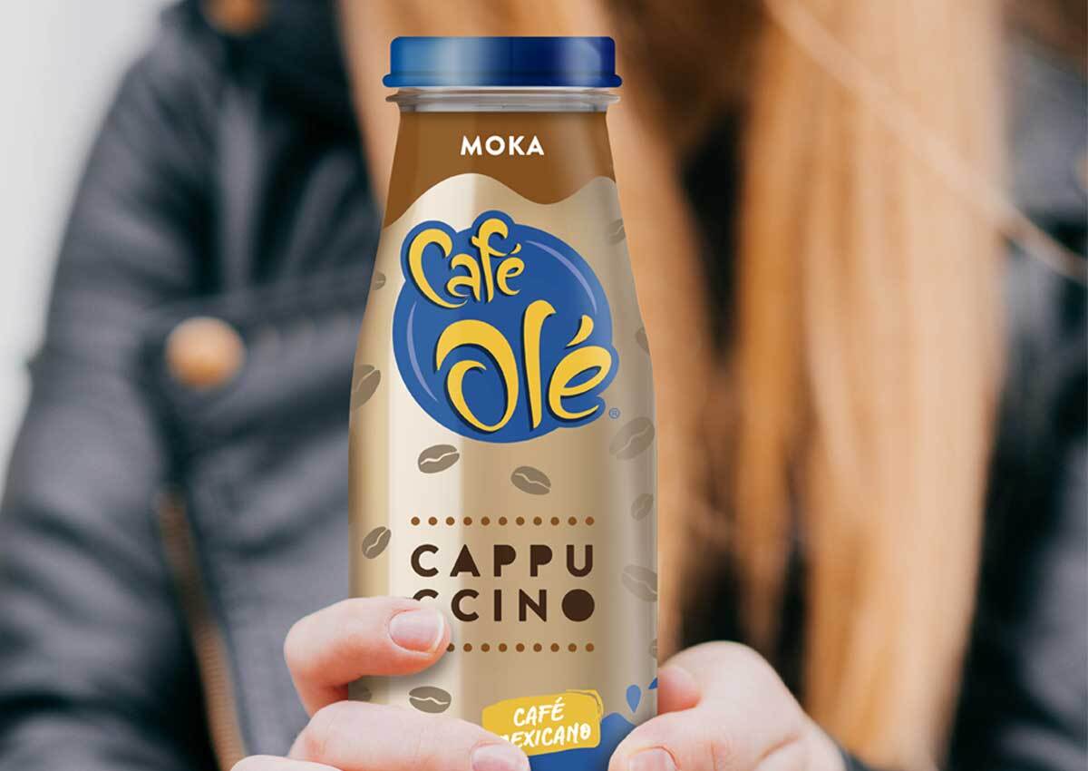
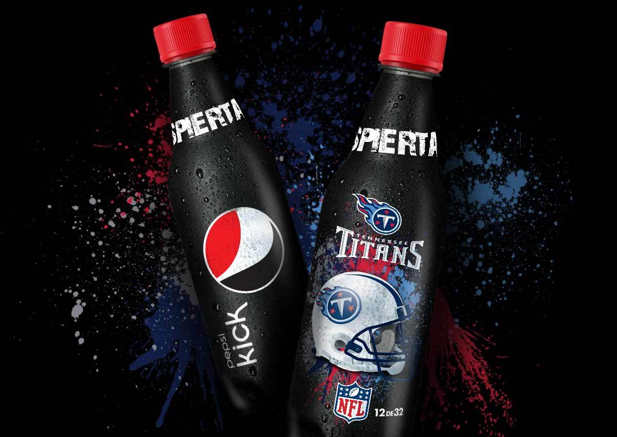
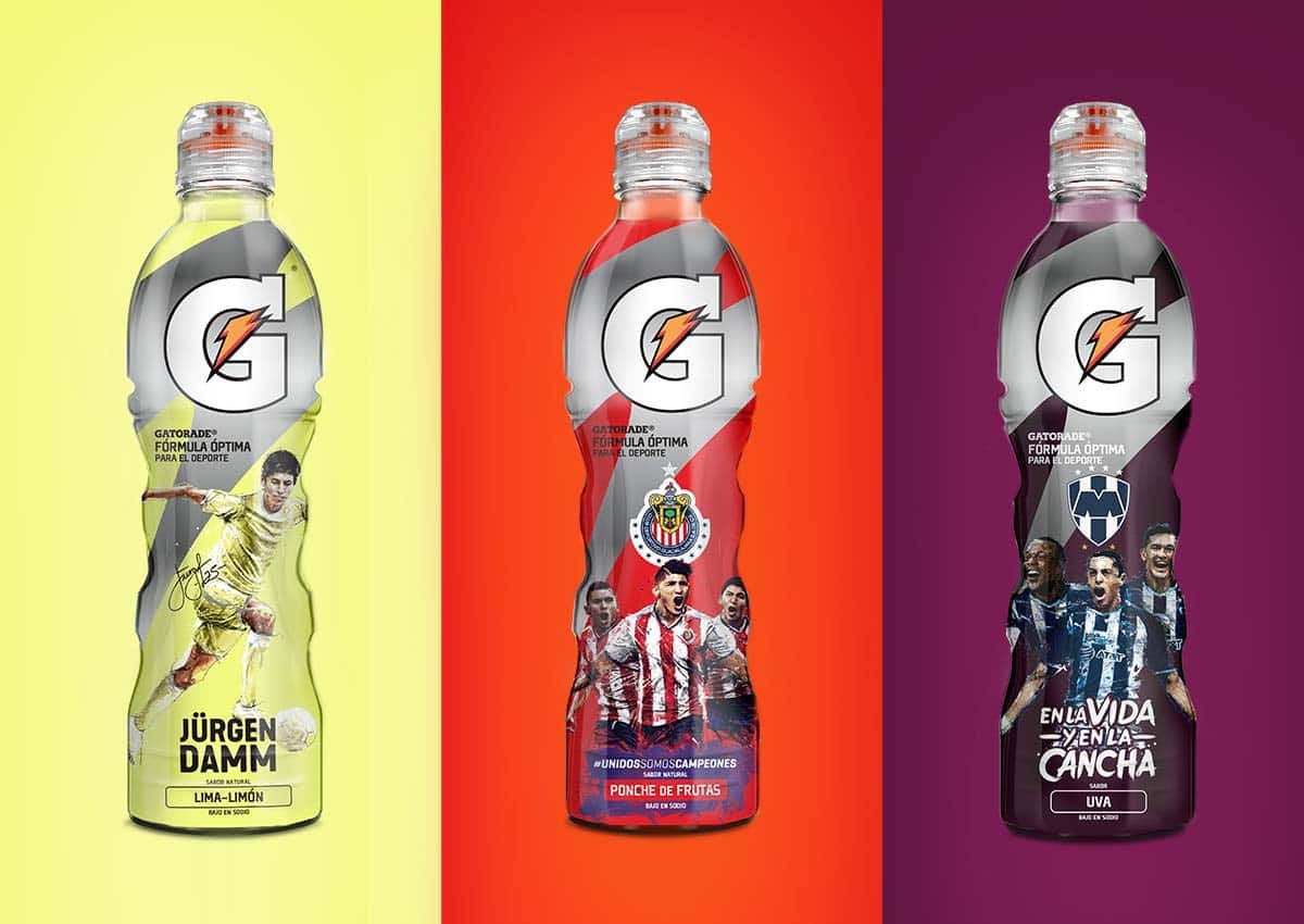
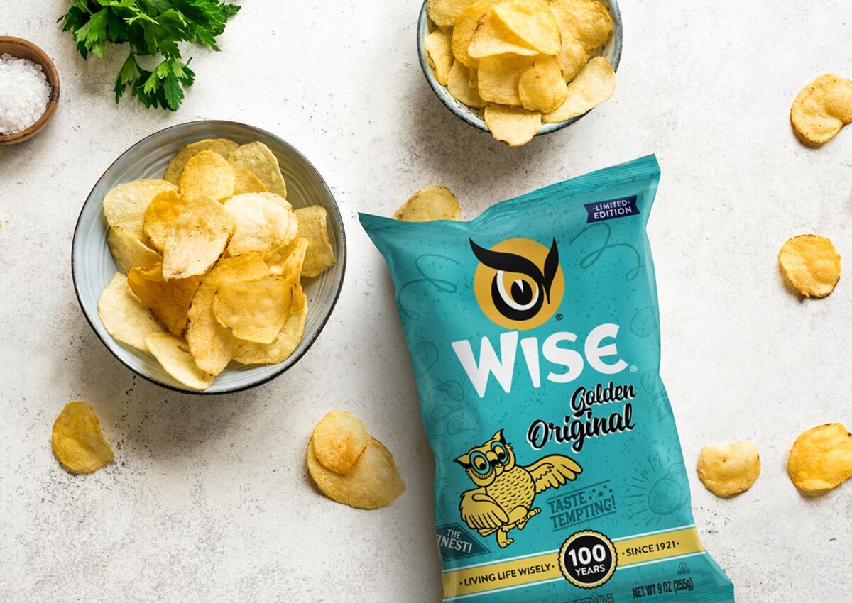
Limited edition packaging is a powerful way to create a sense of exclusivity and urgency, encouraging immediate consumer action. These designs often feature unique visual elements, such as commemorative themes, seasonal patterns, or region-specific artwork, which differentiate them from standard offerings. By aligning limited-edition packaging with cultural moments or consumer interests, brands can foster emotional connections that increase desirability
In addition to driving short-term sales, limited-edition packaging serves as a tool for brand storytelling and creating collectibility. These packages often become conversation starters, boosting word-of-mouth marketing and social media engagement. The ability to stand out on shelves while simultaneously generating buzz makes limited-edition packaging a strategic choice for capturing consumer attention and enhancing brand equity.
RETRO NOSTALGIC PACKAGING
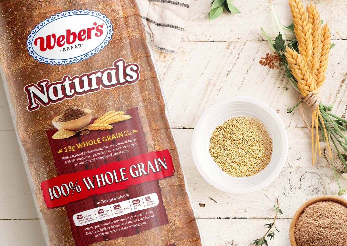
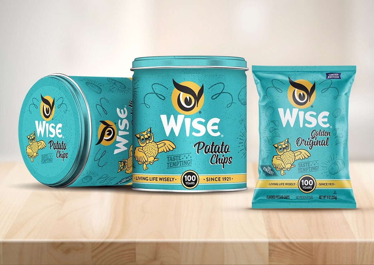
Retro-inspired packaging taps into the emotional power of nostalgia, evoking memories and positive associations with simpler times. This trend resonates particularly well with millennial and Gen X audiences, who often seek products that remind them of their childhood or past experiences. Throwback designs, vintage typography, and classic color palettes are commonly used to create an authentic, timeless appeal.
Nostalgic packaging is not just about aesthetics; it’s a strategic move to differentiate products in competitive categories. For example, snack brands might use retro visuals to highlight heritage and tradition, reinforcing a message of quality and trustworthiness. These designs foster emotional connections, giving consumers a reason to choose a product beyond its functional benefits.
SUSTAINABLE MATERIALS
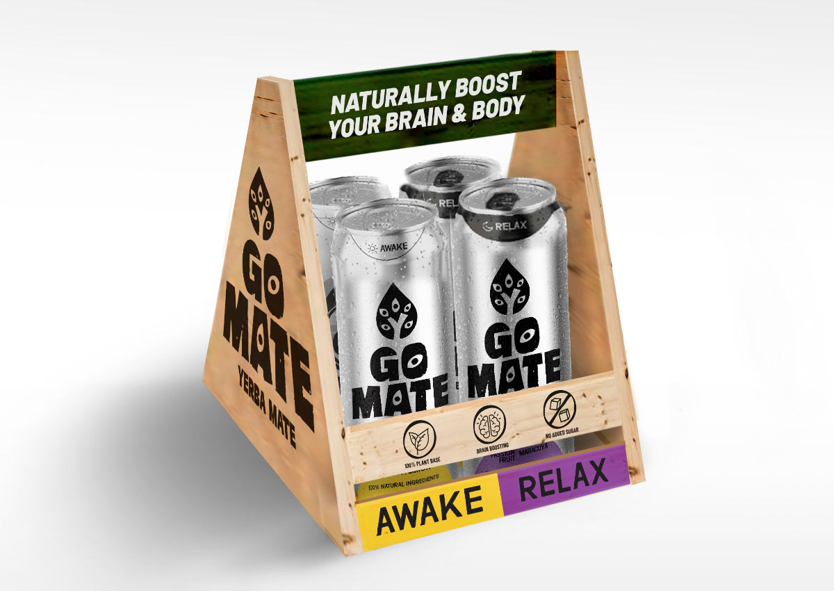
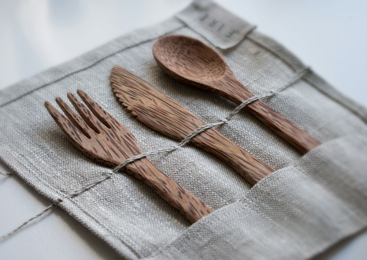
Sustainability continues to dominate packaging trends, with brands adopting eco-friendly materials to meet rising consumer demand for environmental responsibility. Recyclable, biodegradable, and compostable options are increasingly common, alongside innovative solutions like plant-based plastics or mushroom-based packaging. Beyond materials, refillable and reusable designs are gaining traction, allowing consumers to reduce waste while staying loyal to a brand.
Brands leveraging sustainable packaging also benefit from stronger positioning in terms of corporate social responsibility. Clear labeling about eco-friendly attributes can enhance transparency and trust, influencing purchase decisions. By embracing sustainability, companies can cater to modern consumers who prioritize both environmental values and product quality.
E-COMMERCE FRIENDLY PACKAGING
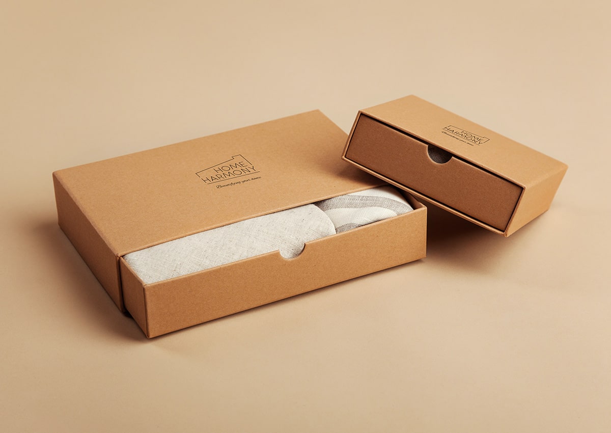
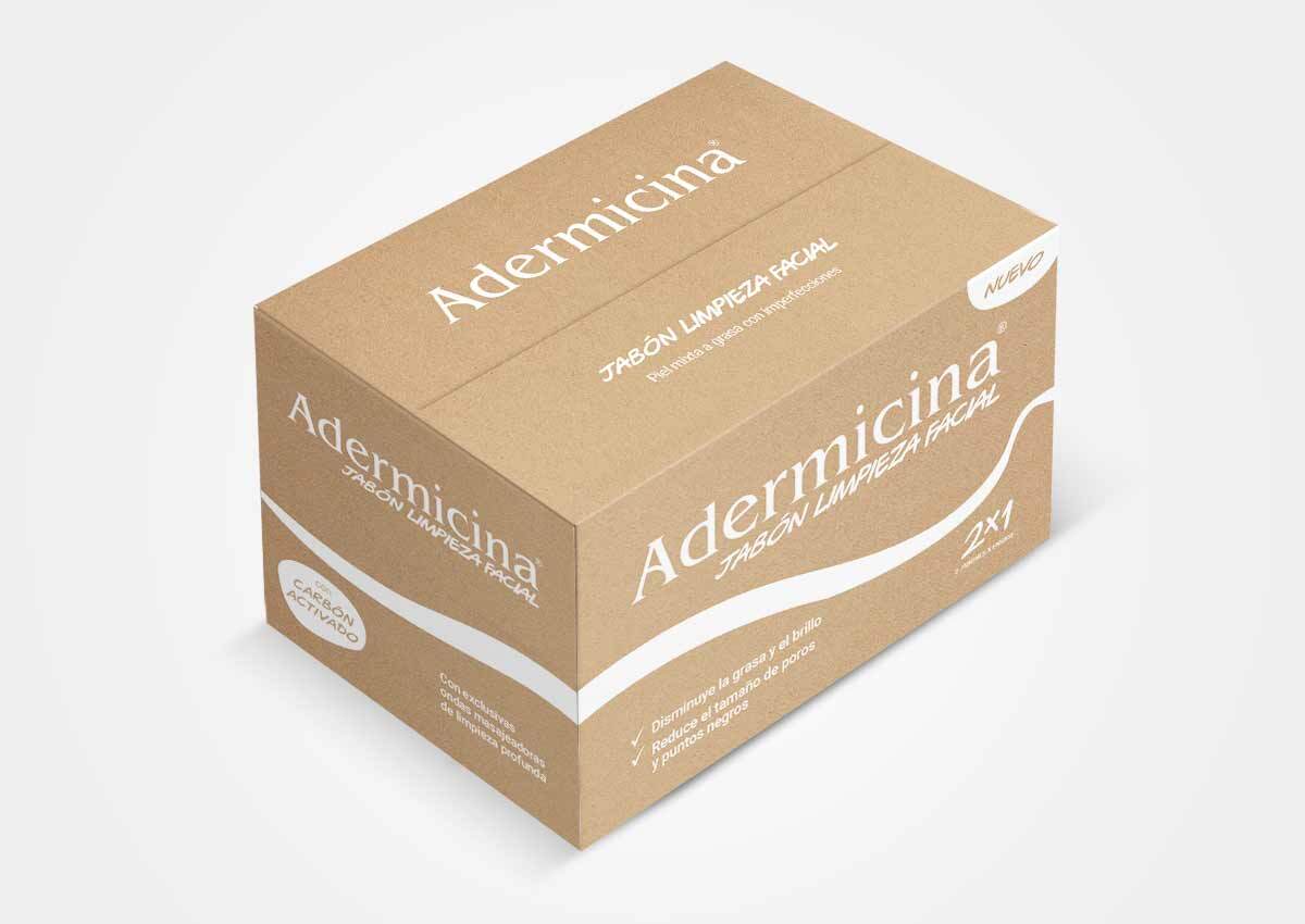
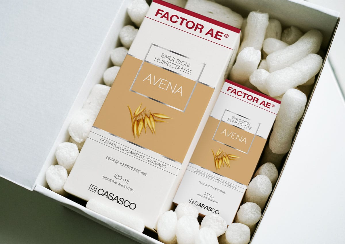
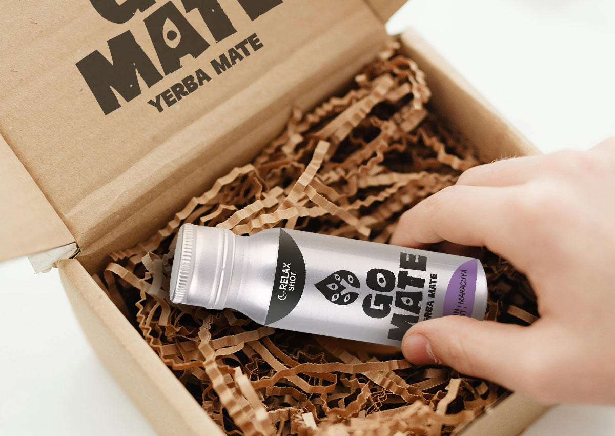
As online shopping continues to grow, e-commerce friendly packaging is becoming an essential trend. Packaging must withstand the rigors of shipping while maintaining its visual appeal. This means using durable materials, compact designs to optimize shipping costs, and easy-to-open structures for a better unboxing experience. Furthermore, minimalistic designs combined with striking branding help products stand out in crowded online marketplaces.
Unboxing has become a key moment for consumer engagement in e-commerce. Thoughtful designs that incorporate storytelling, product protection, and branding elements create memorable experiences that are often shared on social media, boosting brand visibility. E-commerce packaging is no longer just functional—it’s a crucial element of the customer journey that blends practicality with aesthetics.
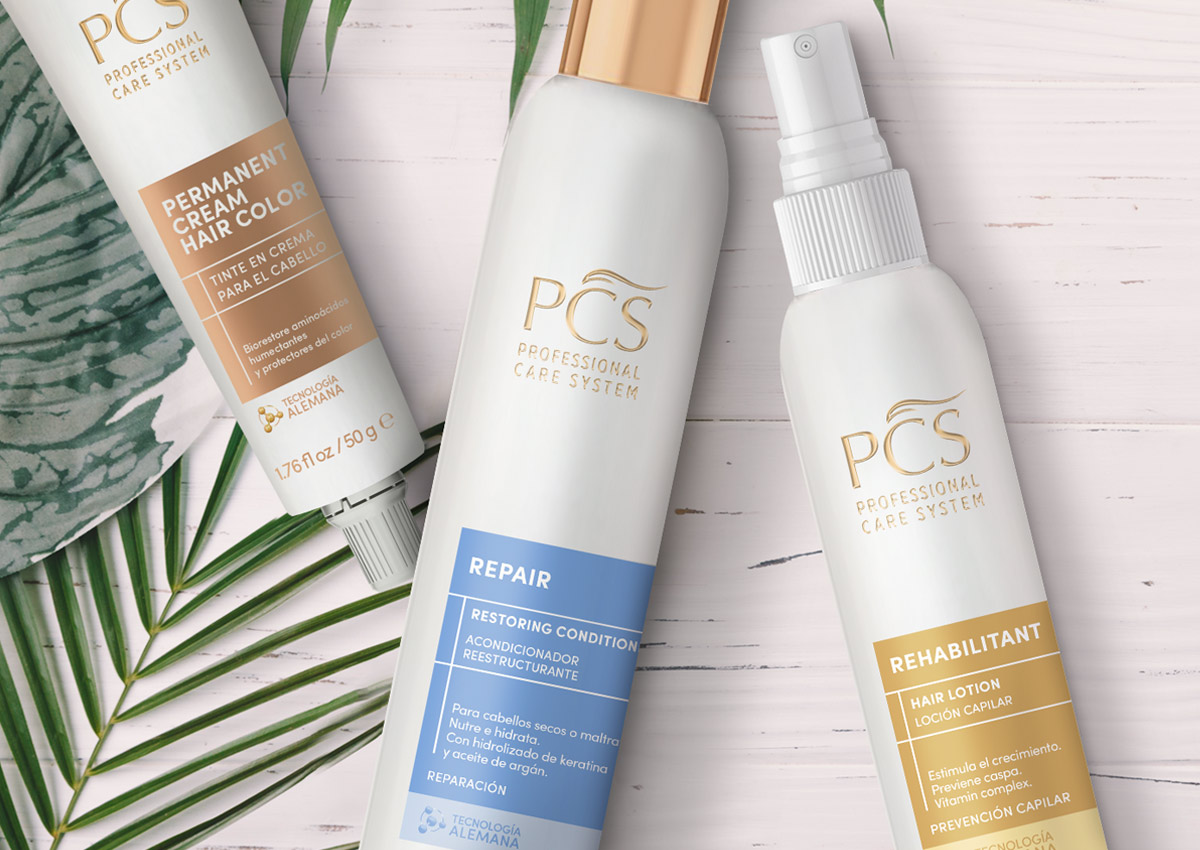
MINIMALIST LUXE
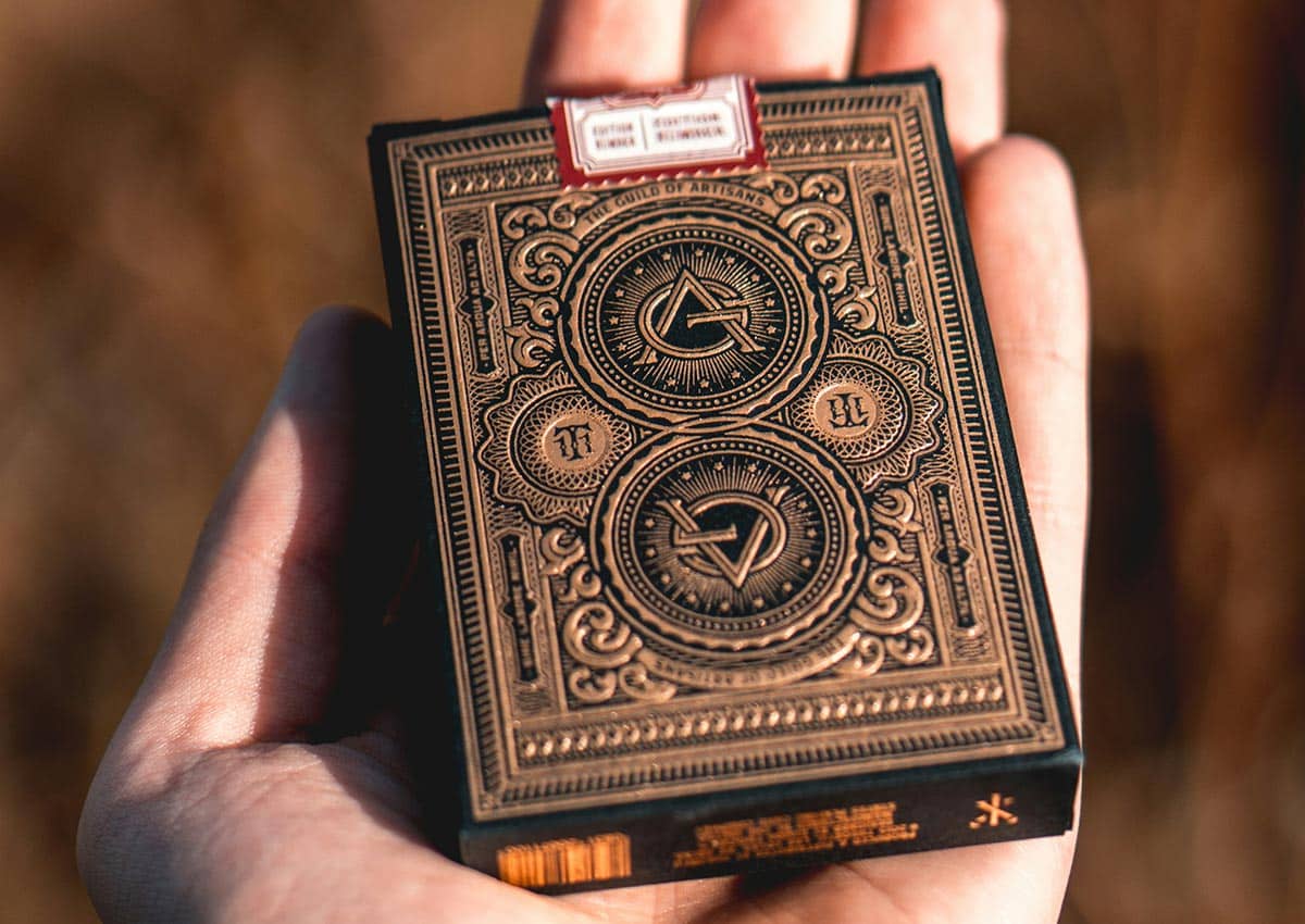
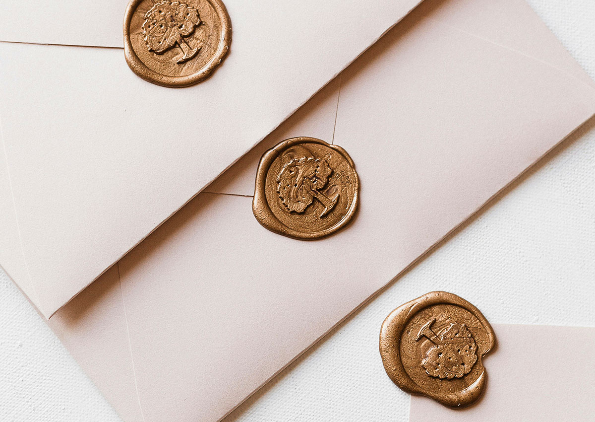
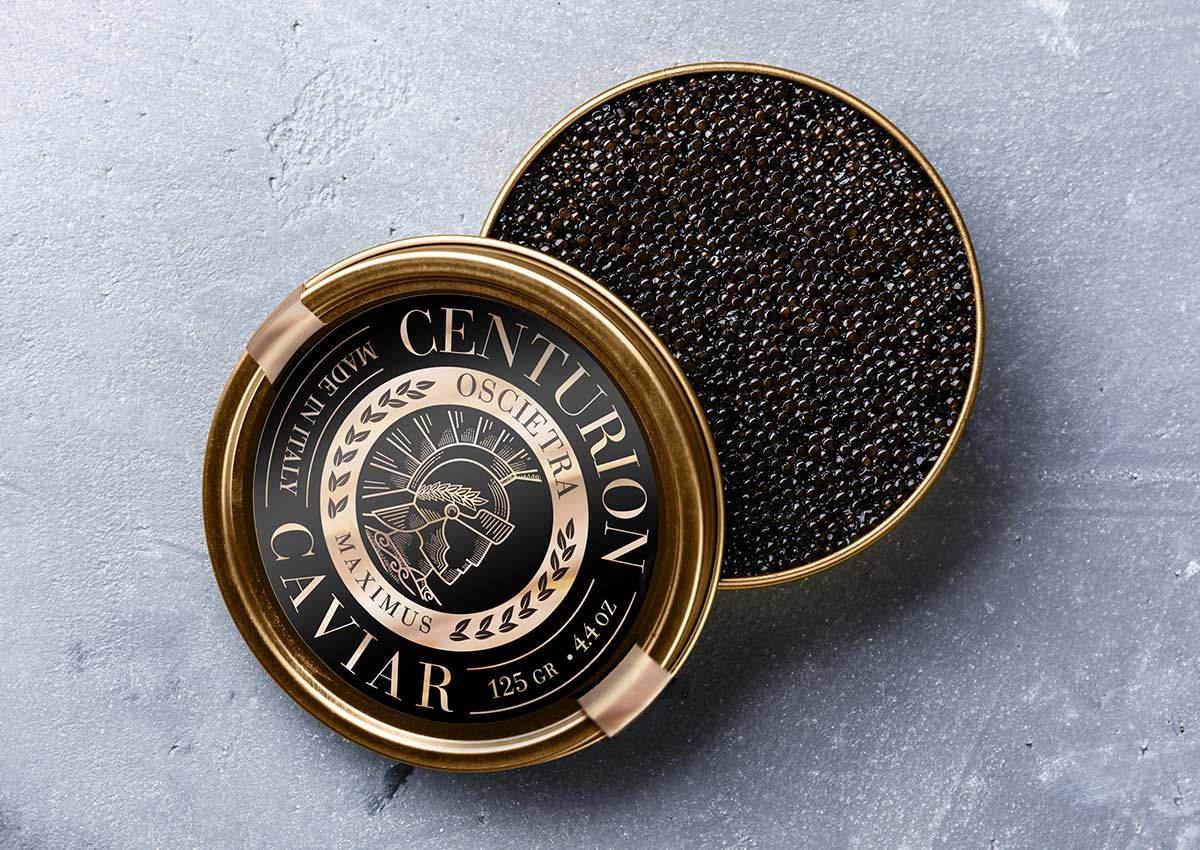
Minimalist luxe continues to redefine premium packaging by pairing simplicity with refined, high-end details. Designs in this trend rely on clean layouts, restrained color palettes, and ample white space, allowing the product itself to take center stage. Metallic finishes, such as gold or silver foils, and embossed typography elevate the aesthetic, creating a tactile and visual experience that feels modern and exclusive. This blend of minimalism and luxury caters to consumers seeking sophistication and a sense of elegance in their purchases.
The appeal of minimalist luxe lies in its versatility and ability to convey quality across categories, from cosmetics to gourmet foods. By removing unnecessary elements, these designs feel timeless while communicating the brand's confidence and focus.
REUSABLE PACKAGING
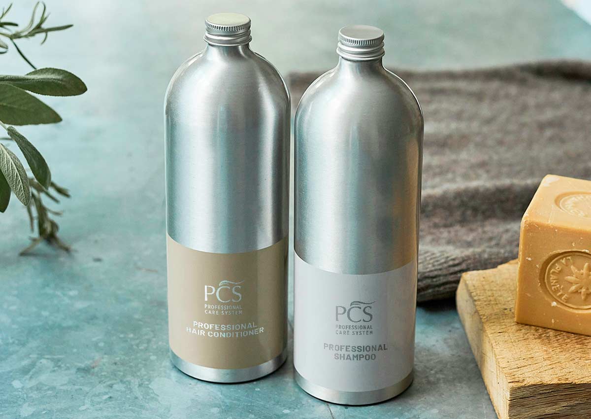
Reusable packaging aligns with growing consumer demand for sustainability, offering multi-functional designs that extend the product's lifecycle. This trend includes refillable containers, packaging that transforms into storage solutions, or designs that can be repurposed creatively. Such innovations not only reduce waste but also enhance brand loyalty by emphasizing eco-consciousness.
This approach positions brands as leaders in sustainability, appealing to environmentally conscious consumers who seek products with minimal environmental impact. Additionally, reusable packaging can serve as a branding opportunity, keeping the brand visible in consumers’ homes long after the initial purchase. By integrating functionality and eco-friendliness, reusable packaging delivers both value and sustainability.
VIBRANT CUSTOM COLORS
The use of vibrant custom color schemes in visual identities has become a powerful tool for brand differentiation in packaging design. Advances in printing technology allow brands to create unique, bold colors that align closely with their identity. Vibrant hues catch the eye, while custom shades can reinforce the emotional tone of the product—whether it’s calming blues for wellness products or energetic reds for cleaning solutions.
These custom colors go beyond visual appeal by helping consumers associate specific hues with a particular brand or product line. They create a seamless brand experience across packaging, advertisements, and online platforms, reinforcing recognition and loyalty in competitive categories and on busy retail shelves. Custom, brand-specific color schemes will allow products to stand out more effectively and communicate unique brand personalities.

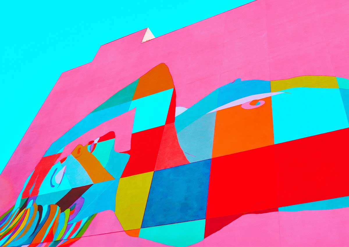
FLUID AND GEOMETRICAL SHAPES
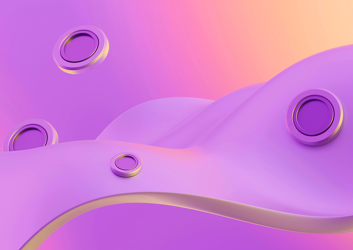
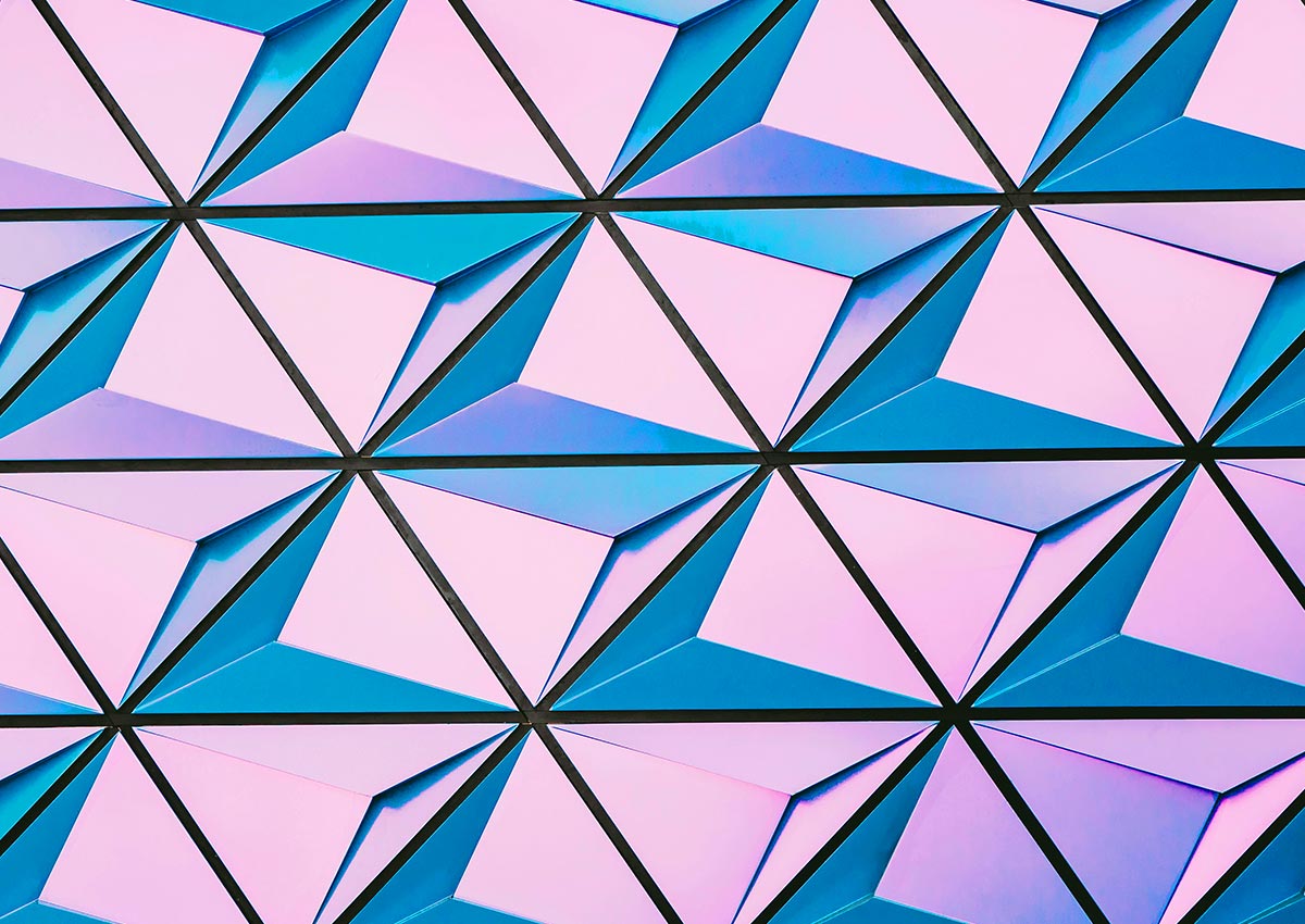
Packaging designs that incorporate fluid, asymmetrical, or geometric shapes challenge traditional boxy structures, providing a fresh and dynamic aesthetic. These unconventional shapes not only attract attention but also evoke feelings of creativity and modernity. They often serve functional purposes as well, such as ergonomic handling or improved stacking efficiency.
Such designs make products feel innovative and premium, appealing to younger or design-savvy audiences. By breaking away from conventional norms, fluid and geometric shapes allow brands to signal uniqueness and boldness, ensuring their packaging feels as forward-thinking as their product offerings.
METALLIC ACCENTS
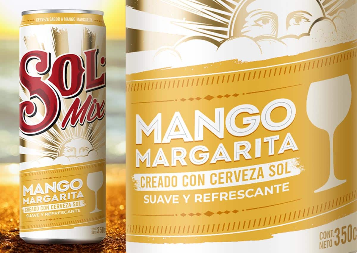
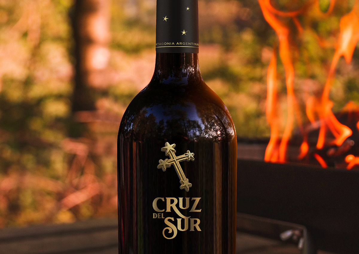
Gold, silver, and other metallic tones are increasingly used in packaging to evoke a sense of luxury, refinement, and exclusivity. These accents are especially prevalent in high-end categories such as premium beverages, cosmetics, and gourmet foods. By incorporating metallic finishes—whether through foil stamping, embossing, or metallic inks—brands create packaging that commands attention on the shelf while reinforcing the idea of superior quality. The shimmer and shine of metallic elements are visually captivating, making the product feel more aspirational and desirable to consumers.
Beyond aesthetics, metallic accents serve functional purposes, such as enhancing the tactile experience with raised textures or adding depth through reflective surfaces. These details elevate minimalistic designs, creating a balance between simplicity and opulence. In competitive markets, this approach helps brands differentiate their products, aligning them with a sophisticated and luxurious image that resonates with discerning customers seeking premium experiences.
COLORS THAT CONNECT
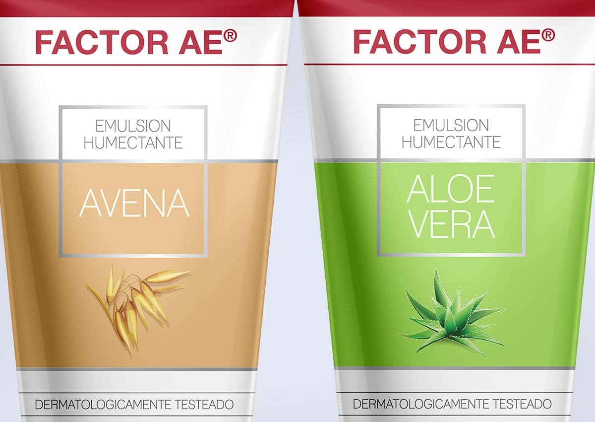
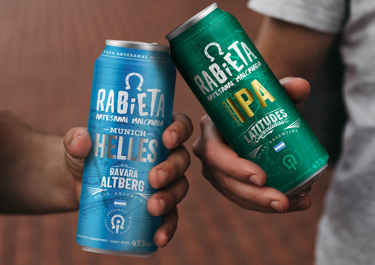
The growing trend toward colors that evoke comfort, balance, and self-care reflects a shift in consumer preferences, driven by a desire for emotional well-being and harmony in a fast-paced world. In packaging design, these colors—such as earthy neutrals, soft pastels, and warm muted tones—create an immediate sense of calm and approachability. Brands are leveraging these palettes to foster deeper connections with consumers, using color psychology to evoke trust, safety, and relaxation. This trend aligns with broader movements toward wellness and sustainability, as these hues often carry connotations of nature, mindfulness, and holistic living.
In terms of visual identity, incorporating these comforting colors helps brands position themselves as more relatable and human-centered. For packaging, these palettes serve as a tool to stand out subtly yet effectively on crowded shelves by offering a sense of reassurance rather than overstimulation. When paired with thoughtful textures, typography, and materials, these colors reinforce a cohesive brand message that resonates with modern values. Whether in personal care, home care, or even food and beverage industries, designs that prioritize emotional resonance through color are increasingly seen as a powerful way to build brand loyalty.


PACKAGING DESIGN FOR THE DIGITAL SHELF
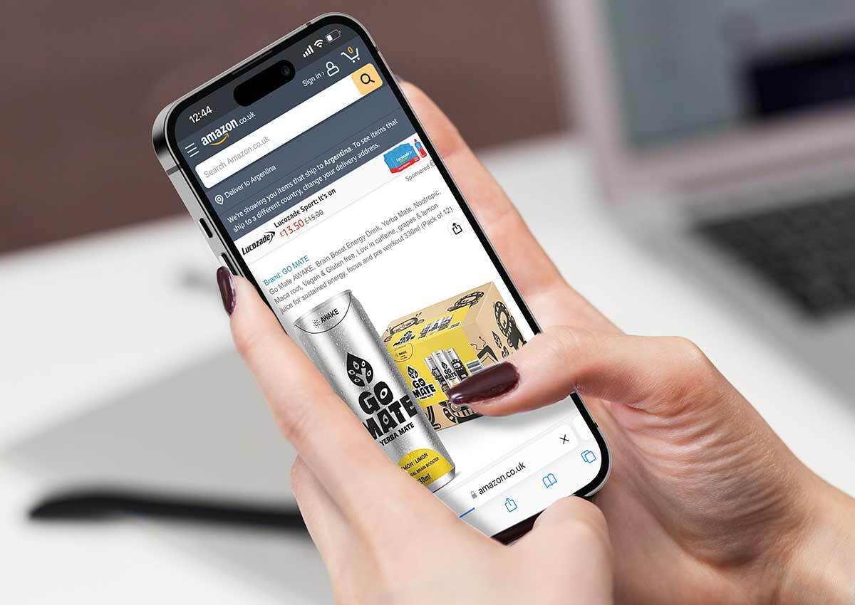
E-commerce platforms such as Amazon, Mercado Libre, and brand-owned online stores have transformed the way consumers interact with packaging.
On digital shelves, the first interaction with packaging is through imagery, making visual appeal paramount. Designs must prioritize clear and bold branding, ensuring that the product and its key features are instantly recognizable even at thumbnail size. Simple layouts, legible typography, and striking colors help brands stand out in crowded product listings.
Additionally, packaging design needs to reflect the product’s core benefits and usage directly in its visuals or through concise text to meet the fast-paced decision-making process of online shoppers. Moreover, functional aspects of packaging for the digital shelf focus on practicality and logistics. Packages should be optimized for efficient shipping, minimizing excess material while ensuring durability to protect the product during transit. This includes compact designs that prevent damage and frustration upon delivery. For the consumer's unboxing experience, brands can leverage clean, attractive inner packaging to create a positive, shareable moment that enhances brand loyalty. Ultimately, success on the digital shelf requires a balance of visual allure, functional resilience, and brand storytelling tailored to the e-commerce context.

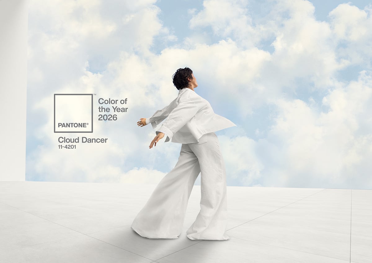
PANTONE COLOR OF THE YEAR 2026
The Pantone Color of the Year continues to influence design and packaging by setting the tone for creative industries worldwide. It becomes a focal point for designers, shaping visual identities →, product packaging, and marketing strategies. In packaging design, the selected color often reflects cultural shifts, consumer emotions, and the visual language brands use to stay relevant.
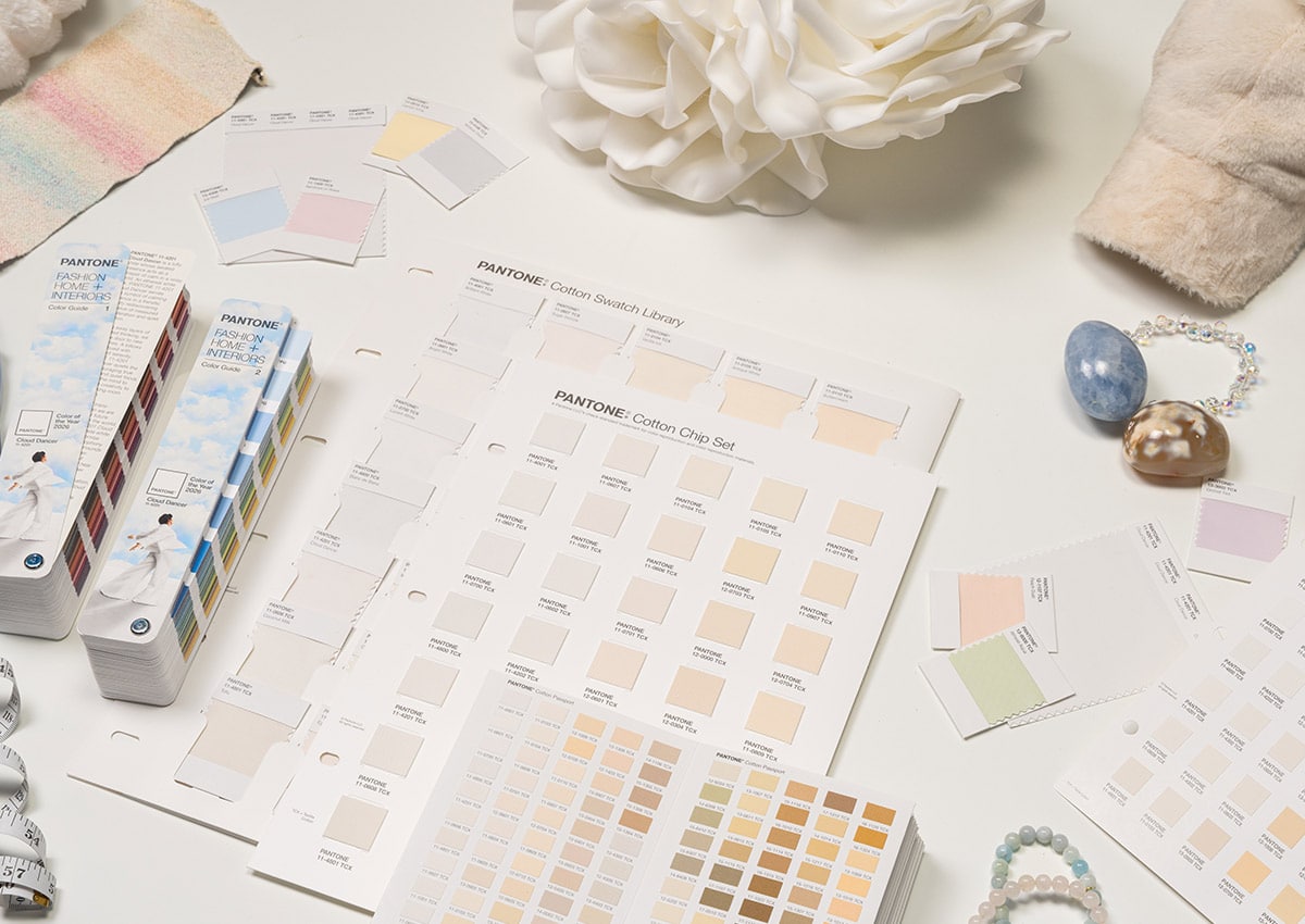
For 2026, Pantone selected PANTONE 11-4201 Cloud Dancer, a soft white tone associated with calm, clarity, quiet reflection, and the idea of a fresh start. In a world filled with visual noise, Cloud Dancer points toward simplification, focus, and breathing room. For packaging, this makes white more than a neutral background: it becomes a strategic tool for creating contrast, improving legibility, and allowing brand assets, materials, typography, and color accents to stand out.
Cloud Dancer is especially relevant for brands looking to communicate purity, balance, wellness, premium simplicity, or modern restraint. It can support minimalist packaging systems, refined limited editions, seasonal launches, and more flexible brand architectures across multiple SKUs. Its strength lies in adaptability: it can soften bold palettes, elevate subtle ones, and create a clean visual structure that helps consumers understand a product quickly.
Beyond aesthetics, the Pantone Color of the Year also serves as a tool for differentiation. Brands can incorporate Cloud Dancer into limited-edition designs, promotional campaigns, or seasonal collections to demonstrate cultural relevance and trend awareness. Used thoughtfully, this color direction can enhance shelf impact while enriching packaging innovation and storytelling → across categories.
The key lesson for packaging trends in 2026 is not simply to use white, but to use restraint strategically. Cloud Dancer reflects a movement toward clarity, emotional calm, and intentional design →. For brands, that means packaging that communicates faster, feels more considered, and creates stronger impact through simplicity.
Source: Pantone Color of the Year 2026 →