Frozen Food Packaging Design for CPG Brands
U.S. Retail & Omnichannel Expertise
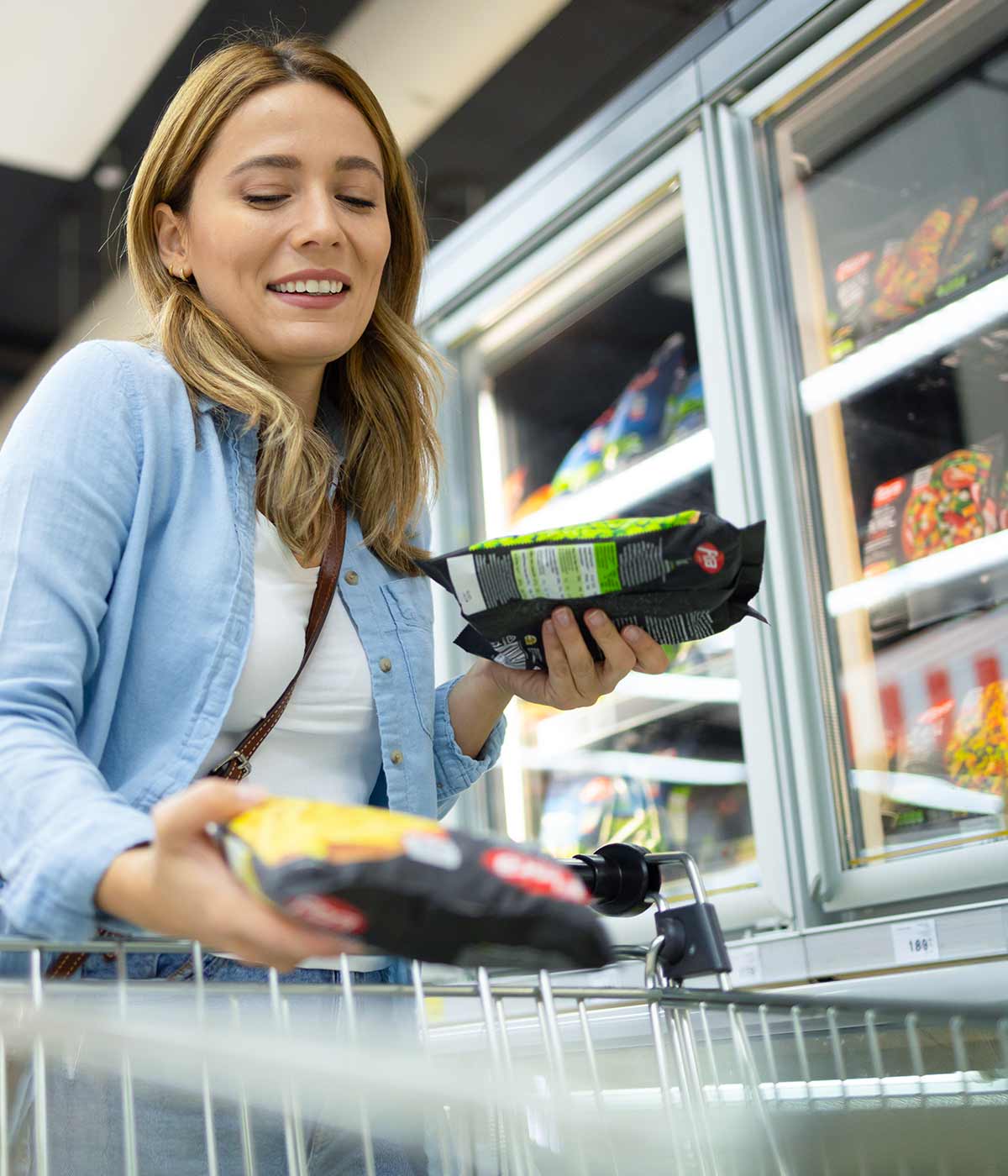
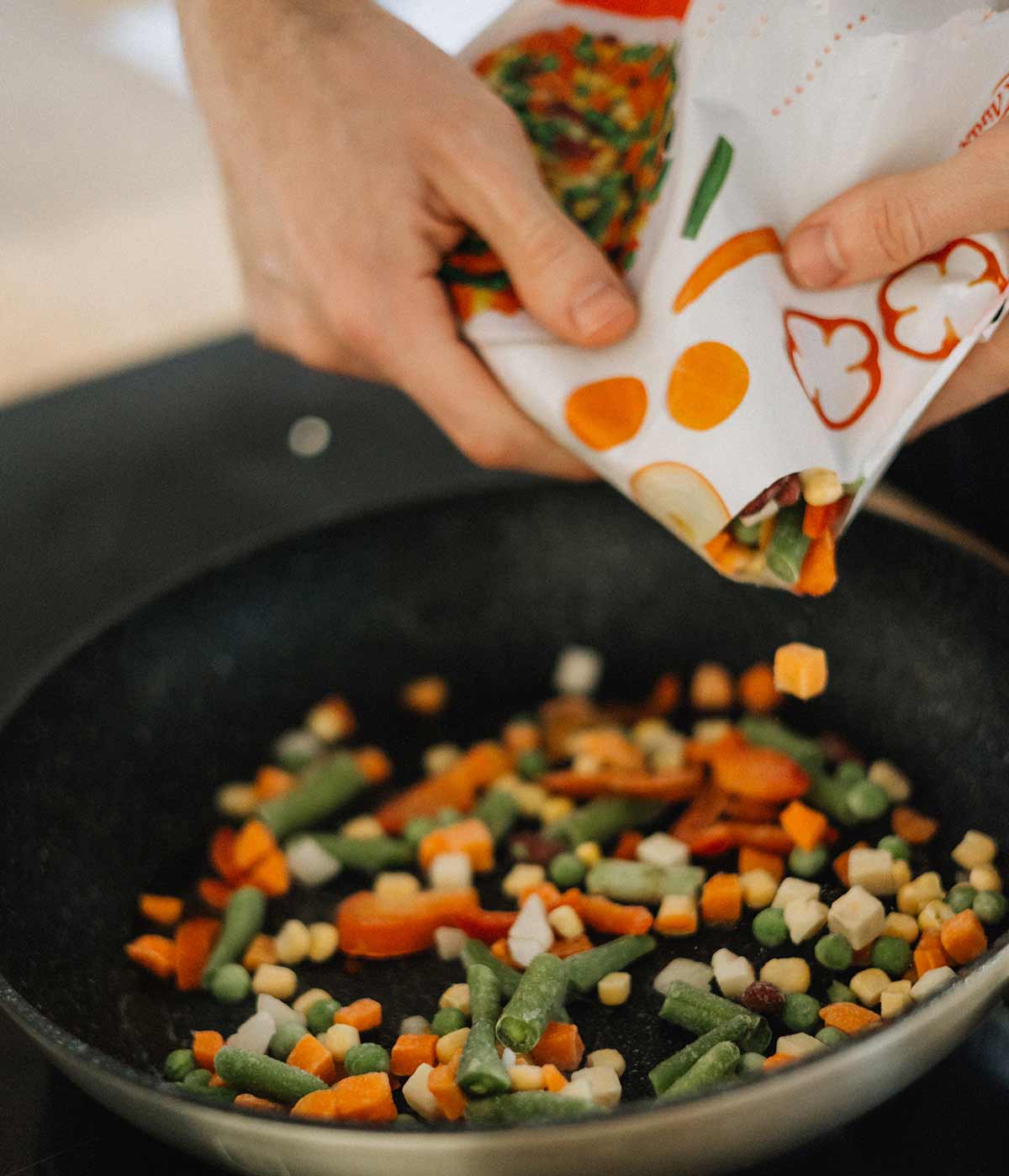
Need packaging design for a frozen food brand?
Imaginity helps frozen food brands design packaging systems that stay visible behind freezer doors, create appetite appeal, and make product choices clear across retail shelves and digital grocery platforms.
For frozen meals, vegetables, ready-to-cook foods, snacks, desserts, and specialty frozen ranges, we balance food photography, brand identity, claims hierarchy, flavor navigation, cooking cues, format information, and omnichannel thumbnail performance.
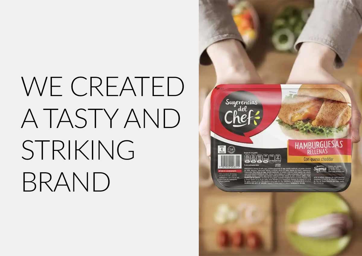
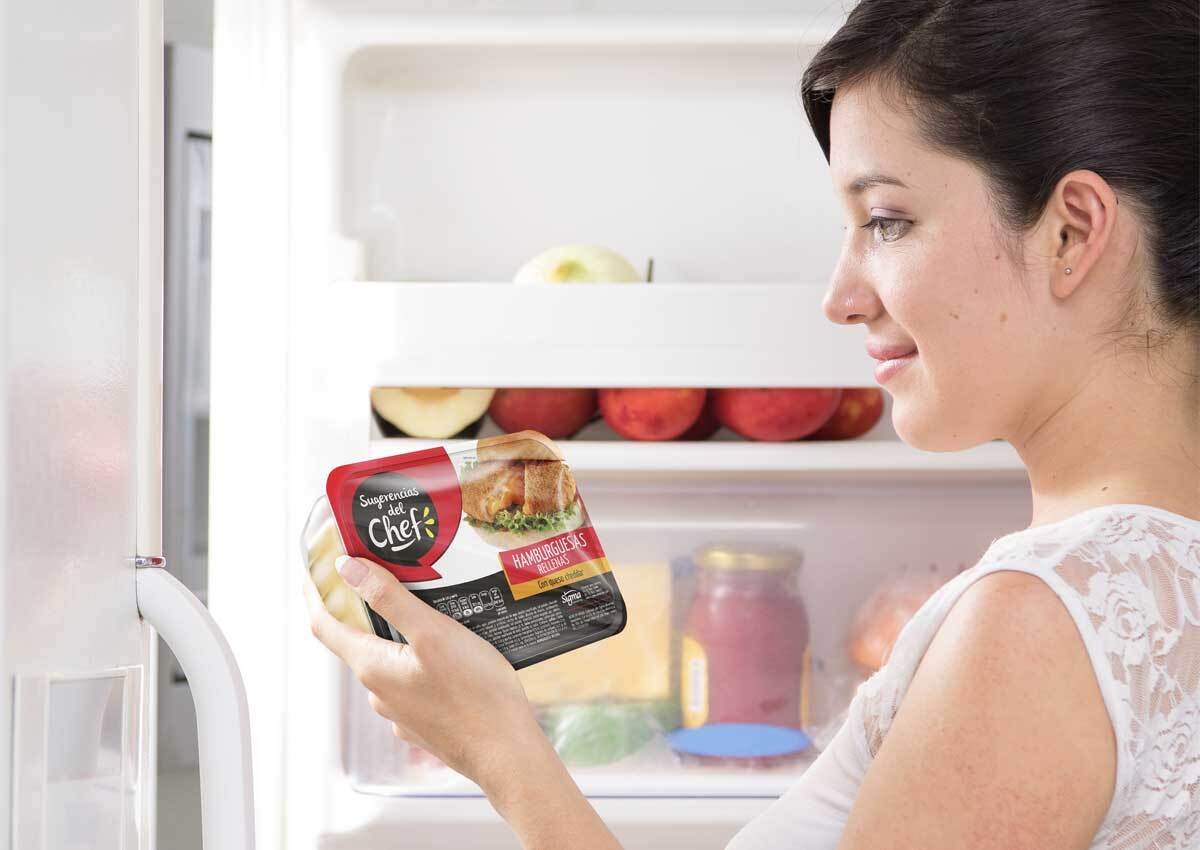
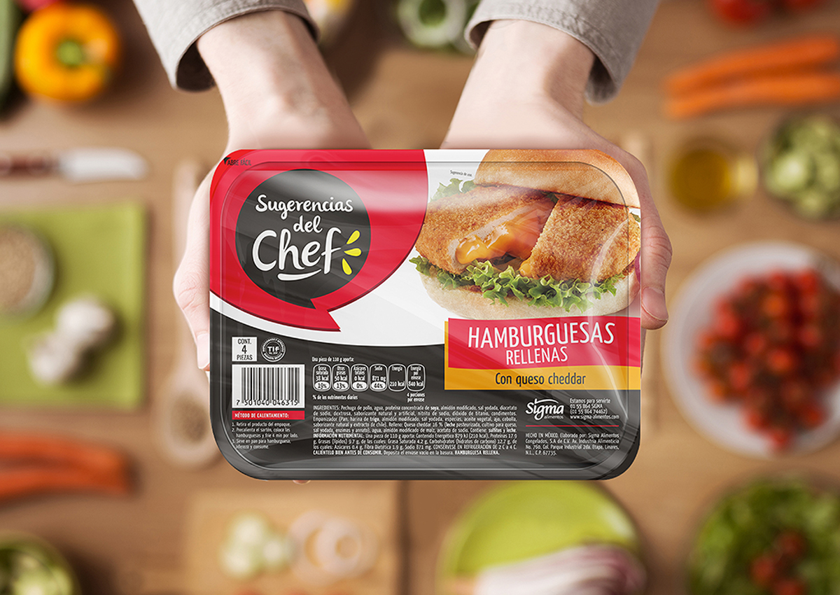
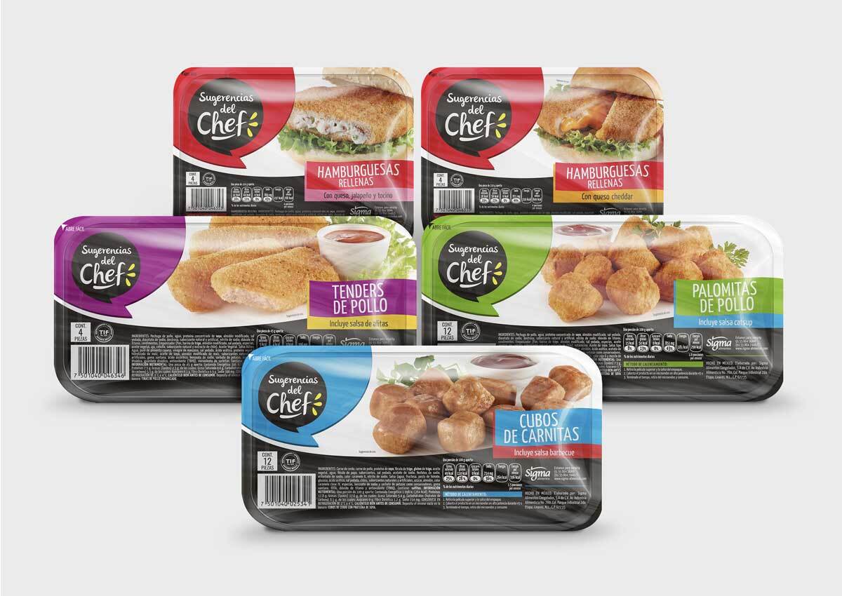
Our Sugerencias del Chef work shows how a frozen food range can use bold color, strong appetite imagery, and clear product-line architecture to refresh the brand and make each SKU easier to shop.
CPG Frozen Food
Packaging Design for the Modern Frozen Food Aisle
Imaginity designs frozen food packaging that cuts through frosted glass, converts on Amazon Fresh, and builds brand equity in the fastest-growing segment of grocery retail. Strategy-first. Shelf-ready. Omnichannel-optimized.
YEARS CPG EXPERIENCE
CATEGORIES
COUNTRIES
CONTINENTS
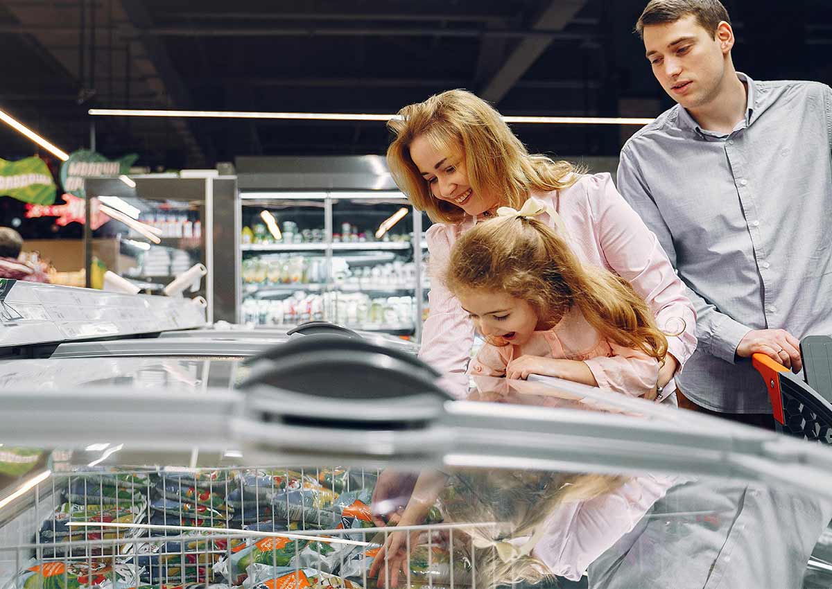
Design Expertise
Why Frozen Food Packaging Is a Different Design Problem
Most packaging design challenges are about standing out on a well-lit ambient shelf. Frozen food packaging design adds four constraints that apply nowhere else in the supermarket. Agencies that don't understand these constraints design beautiful packs that disappear behind the glass.
The condensation
& Freezer Fog
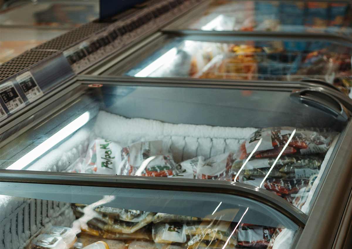
Frost builds on freezer door glass continuously, blurring fine typography, thin lines, and mid-tone imagery. Effective frozen food packaging design is built for the blurred view first — high-contrast color blocks, bold type, and a dominant hero image that reads clearly when detail is lost. If your packaging only works when the door is open, it isn't working.
The 3-Second Freezer Aisle Test
Shoppers scan freezer aisles faster than any other category — the ambient cold is a physical incentive to decide quickly. The pack must communicate brand, product type, and key benefit within three seconds through glass. This is not a headline-writing problem; it is a visual hierarchy problem that requires brand architecture and pack design to be resolved together.
FDA Frozen Food Labeling Requirements
Frozen food packaging must comply with FDA nutrition labeling requirements, safe handling instructions, storage and cooking guidelines, and allergen declarations—all in a format that typically offers less usable surface area than room-temperature packaging. Regulatory compliance and visual appeal are at odds. Designing without sacrificing either requires expertise.
The Shift from Bag to Premium Tray
The frozen food category is undergoing a structural format transition. Commodity polybag formats are giving way to paperboard cartons and CPET tray-and-sleeve formats that offer significantly more branding surface and shelf presence in store. Brands that make this transition well use it as a brand equity step-up. Those that don't treat it as a packaging decision create brand confusion.
Related content
- Brand Architecture for CPG & FMCG Brands — how to structure product lines before briefing a packaging redesign
- Product Line Architecture — variant coding systems for multi-SKU frozen food ranges
Design Principles
Four Design Principles for Winning Frozen Food Packaging
These are the principles we apply on every frozen food packaging design brief — across frozen meals, protein, snacks, desserts, and vegetables. Each principle addresses a constraint unique to the frozen category.
01. Visibility Through Frost & Condensation
Design for the blurred view, not the open-door view
The packaging must perform visually under three conditions: behind frosted glass at three feet, at arm's reach with the door open, and as a 500×500px thumbnail on a phone screen. These three contexts require different design decisions — a color contrast that reads at three feet may be too aggressive for an e-commerce product page. We design a hierarchy that satisfies all three simultaneously, using high-contrast color blocking as the primary freezer aisle tool and detailed appetite imagery as the close-range and digital conversion tool. Is the power of packaging as communicator that give us the change to perform under this conditions.
02. Appetite Appeal
Sell the meal, not the frozen product
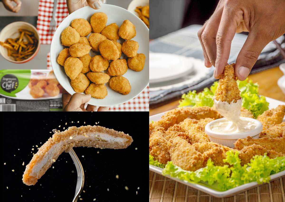
The most effective frozen food packaging shows the finished, plated, warm end-state of the product — not the frozen item itself. Hero food photography shot at warm color temperature, with steam, texture, and depth-of-field cues, creates appetite appeal that overcomes the intrinsic perception gap of frozen food. The photography brief must specify the plated state, not the product out-of-pack. Brands that show their product in its frozen form — crystalline, pale, and unappetizing — are making a brief error before any design decisions are made.
03. Sustainability Pressure
The format transition is an opportunity, not just a compliance cost
Retailers are accelerating the transition away from single-use plastic in frozen food formats. Walmart and Target have both issued packaging sustainability guidelines that affect frozen food SKUs specifically. For most brands, moving from a polybag to a paperboard carton significantly increases the available branding surface and elevates perceived product quality — the sustainability investment pays dividends in shelf presence and brand perception simultaneously. We brief format and material selection alongside visual identity design, so sustainability decisions are made as brand strategy, not afterthoughts.
04. Omnichannel Adaptation
The Amazon Fresh context is completely different from the Walmart freezer aisle
On Amazon Fresh, Instacart, and Walmart+, frozen food packaging is encountered as a small digital image accompanied by a product title and a price. The shelf-presence logic of the physical freezer aisle — color blocking for three-foot visibility, large-format photography for close-range appeal — must be translated into thumbnail-optimized imagery, SEO-structured product titles, and A+ content that converts a digital shelf browser into a buyer. We design the digital shelf assets in parallel with the physical packaging, not as a secondary deliverable.
Freshness, Flavor, and Convenience in Every Pack
In the frozen food category, packaging must instantly communicate quality, taste, and ease of preparation. Whether it’s vegetables, ready-to-cook meals, fries, or frozen specialties, design plays a crucial role in reassuring consumers about freshness while sparking appetite appeal.
For brands, frozen food packaging design is both a promise and a differentiator—helping products stand out behind freezer doors, on crowded shelves, and across digital grocery platforms. At Imaginity, we design frozen food packaging and branding that highlight flavor, convenience, and trust, creating clarity in a category where choices happen quickly.
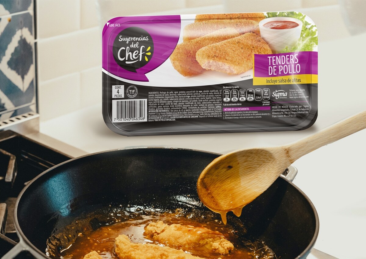
Our work with Sugerencias del Chef demonstrates this: we redesigned its frozen food line with modern visual identity that communicates flavor variety, quality, and ease, helping the brand refresh its image and attract new consumers.
Crafting a Modern Frozen Food Identity
Frozen food brands must balance freshness and convenience with clarity and appetite appeal in this packaging design category. At Imaginity, we create design systems that feel contemporary and trustworthy, with a solid brand architecture that ensures easy navigation across product ranges.
For Sugerencias del Chef, we developed packaging with a strong storytelling that emphasizes strong appetite photography, clean layouts, and bold branding, making it easy for shoppers to identify each meal option and feel confident in their purchase in store. This flexible design language scales across formats—single-serve meals, family packs, and multipacks—ensuring consistency while celebrating flavor variety.
Freshness and Flavor at the Core
Consumers turn to frozen food not only for convenience but also for the promise of fresh taste and nutrition. The power of packaging as communicator delivers on a vibrant imagery, appetizing textures, and clear product communication.
Differentiation is also essential. Whether it’s vegetables, meats, or ready-to-cook meals, frozen food packaging needs to make formats and flavors instantly recognizable while still part of a unified brand system. Our approach ensures that every product—from fries to full meals—feels connected to the master brand, while highlighting its unique flavor and occasion.
From Shelf Impact to Everyday Connection
In the frozen food aisle, packaging is often the first and most powerful selling tool. It must be visually striking enough to cut through frosted glass and crowded freezers, while also providing clarity and trust.
Our work with Sugerencias del Chef shows how strategic design and a clear product line architecture can balance modern branding, appetite appeal, and clear navigation, ensuring frozen packs are easy to shop and rewarding to use. Beyond packaging, frozen food brands also need to connect across channels—retail promotions, catalogs, and digital grocery platforms. At Imaginity, we create adaptable designs that deliver impact in-store and online, building recognition and long-term loyalty.
Packaging as a Growth Engine in Frozen Food
Frozen food packaging shapes how consumers perceive quality, freshness, and convenience. By designing systems that are cohesive, adaptable, and appetite-driven, Imaginity helps frozen food brands thrive in today’s competitive landscape. From single meals to bulk multipacks, vegetables to specialty dishes, our designs transform packaging into a growth driver, reinforcing trust while capturing attention in seconds.
Our experience working in food packaging gives us expertise and a deep understanding of the specific needs of this category. Lorenzo Rice is a prime example of this, having worked on the logo and packaging design for their complete line of microwaveable rice. The challenge was to present each flavor in an appealing way and design packaging that clearly communicated the product's functionality—a key factor in introducing a new category to the market.
From Everyday Meals to Brand Loyalty
Frozen food is part of consumers’ everyday routines, from quick weeknight dinners to convenient meal prep. At Imaginity, we help global brands with packaging design that makes frozen meals feel fresh, easy, and worth choosing every time.
Our collaboration with Sugerencias del Chef shows how thoughtful packaging design can transform frozen food from a simple convenience into a trusted brand experience. By blending flavor appeal, clarity, and strong identity, we help frozen food brands stand out in freezers, build recognition, and grow consumer loyalty over time.
Case Study
Frozen Food Packaging Design in Practice:
Sugerencias del Chef — Frozen Food Range Redesign
Client
Sugerencias del Chef
Category
Frozen Food
Scope
Full range design
Market
US & Latin America
The Brief
Sugerencias del Chef — a frozen convenience food brand with an established presence in Latin America — needed a packaging redesign that would modernize the brand, communicate flavor variety across a wide product range, and strengthen visual coherence across the entire frozen line.
The Challenge
The range included frozen meals, appetizers, and ready-to-cook products — formats with genuinely different appetite appeal requirements and different preparation occasions. The design system needed to unify all of these under a single brand architecture while allowing each sub-category to communicate its distinct occasion and flavor proposition. Compounding this, the packs needed to work across both modern retail freezer formats (clear-door upright cases) and traditional frozen chest freezers common in Latin American retail environments.
What Imaginity Designed
Imaginity developed a unified design system for the full Sugerencias del Chef range, establishing a consistent brand architecture that allowed individual products to maintain their specific flavor personality within a coherent visual family. Key design decisions included:
- A standardized appetite photography system: consistent lighting, plating style, and color temperature across all SKUs, creating a coherent brand presentation when the full range is viewed together on shelf.
- A flavor and format coding system: that used color and secondary typography to differentiate sub-categories (ready-to-eat meals vs. ready-to-cook vs. appetizers) while maintaining master brand unity.
- A modernized brand identity application: the Sugerencias del Chef wordmark and brand elements were refined and applied consistently across all packaging formats, from small portion packs to family-size trays.
- Freezer aisle visibility testing: all designs were evaluated under simulated frosted glass conditions to confirm shelf impact before final art direction sign-off.
The outcome
The redesigned Sugerencias del Chef range communicates flavor variety and convenience clearly while presenting as a coherent brand family at shelf — attracting both loyal consumers who knew the brand and new shoppers encountering it for the first time. The unified system also provides a scalable framework for future SKU additions without requiring individual design decisions for each new product.
Related work
- Food Packaging Design Experience — our broader food category portfolio across ambient and chilled formats
- Product Line Architecture — how we build variant coding systems for multi-SKU food ranges
Frequently Asked Questions
Frozen Food Packaging Design: Common Questions
Questions we hear regularly from US brand managers and marketing directors briefing a frozen food packaging redesign or new product launch.