Client:
Original Grandma Style. Merenguitos
Country:
Task:
Capturing Home-Baked Nostalgic Warmth Through Elegant Confectionery Packaging
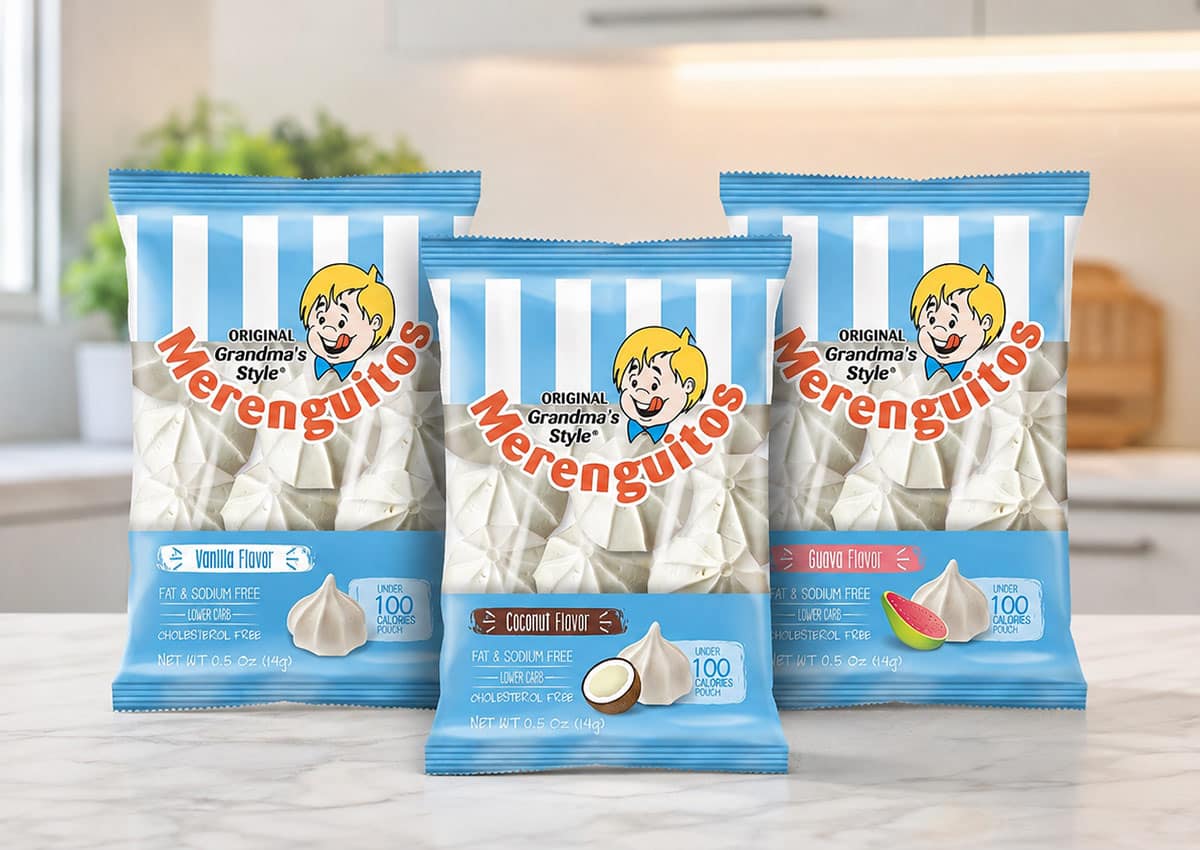
For Original Grandma-Style Merenguitos, Imaginity created a warm, nostalgic branding and packaging design strategy that translates traditional homemade confectionery into an attractive, high-value CPG offering. By pairing vintage-inspired typography with strategic product visibility and delicate appetite appeal, our team elevated the brand’s artisanal equity across modern retail channels.
Imaginity | Design Agency | Branding, Packaging Design, Marketing
Visual Highlights
- Heritage Graphic Accents: Subtle vintage borders and craft-style badges that underline authentic origin and quality craftsmanship.
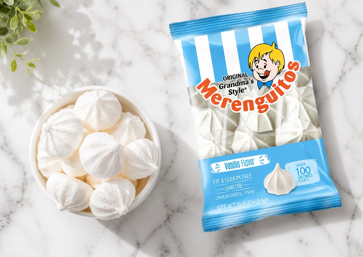
- Strategic Window Product Visibility: Integration of a clear packaging window that showcases the delicate texture, light quality, and shape of the Merenguitos inside.
- Pastel & Cream Color Palette: Soft, appetizing background hues that reinforce lightness, sweet indulgence, and artisanal elegance on retail shelves.
- Consistent Variant Architecture: A flexible graphic layout that adapts across different pouch sizes and flavor varieties without losing brand coherence.
Packaging Details That Turn Artisanal Character into Retail Clarity
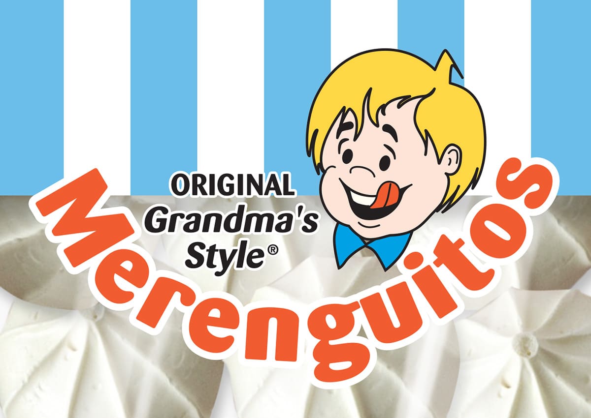
The Merenguitos identity relies on small design details working as one system. Vintage-inspired typography and decorative accents establish nostalgic character, while the restrained pastel palette keeps the package light, contemporary and appropriate for the delicate product. These elements communicate tradition without making the brand appear visually dated.
The transparent window performs a practical and emotional role. It allows shoppers to see the texture, shape and handmade variation of the Merenguitos, turning the product itself into part of the visual identity. The surrounding graphics frame that view while preserving enough contrast for the logo, product name and variety to remain clear.
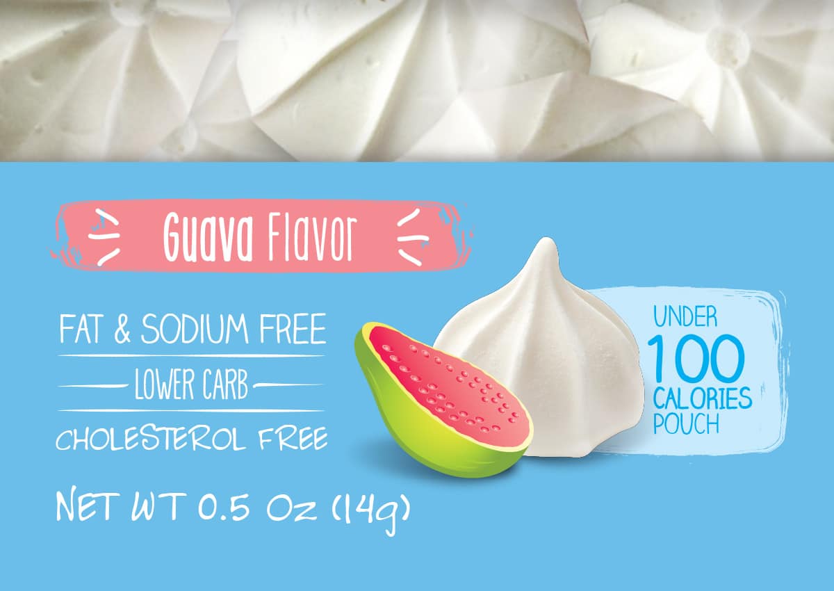
At shelf level, the package must distinguish itself among confectionery and bakery products without relying on excessive color or decoration. Online, the same design needs a recognizable silhouette and a clear product name at thumbnail size. See Imaginity’s broader experience in chocolate and confectionery packaging and packaging designed from shelf to screen.
Production decisions are also part of the design. Window placement, material selection, color reproduction and finishing need to preserve product visibility and brand consistency across pouch sizes. Learn more about the printing processes used in packaging design.
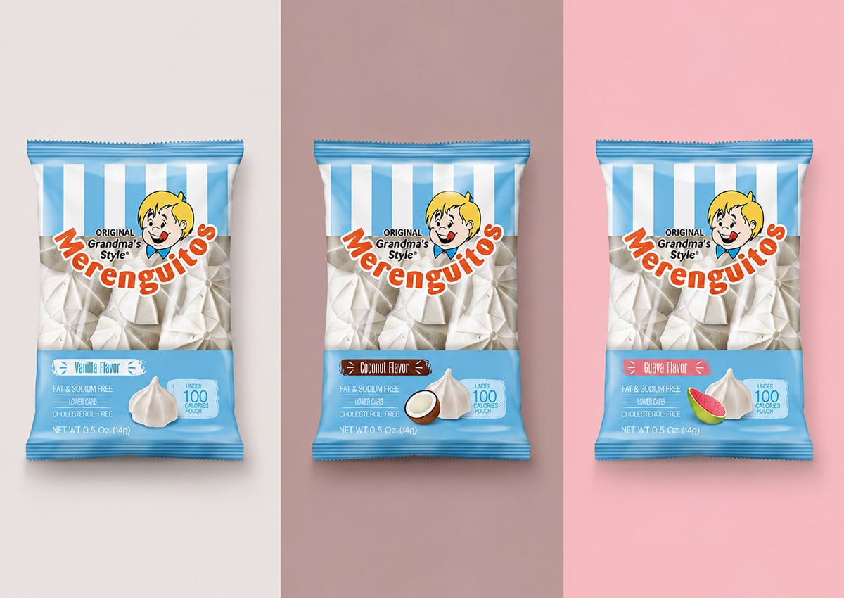
The Challenge: Modernizing a Nostalgic Brand
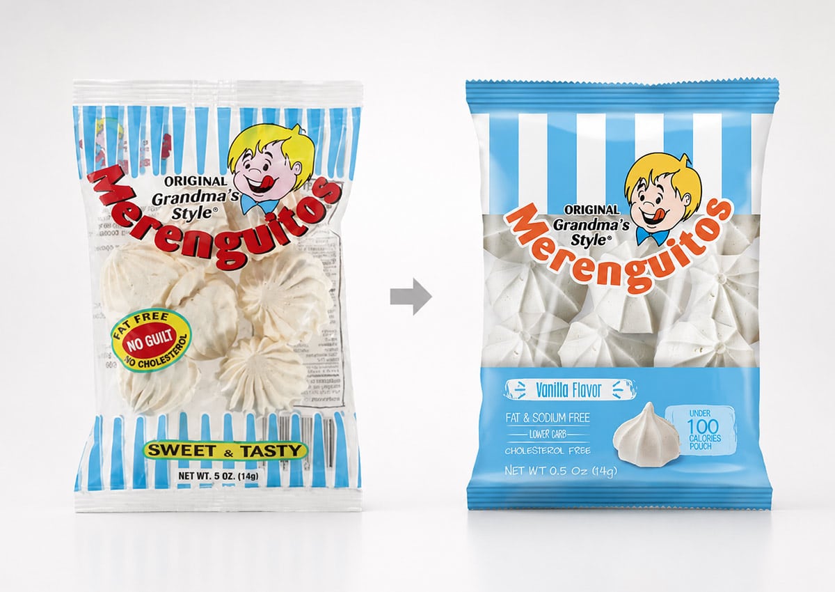
The main challenge was to update the branding and packaging design for Merenguitos, a beloved American product with a long history. The brand needed a fresh, contemporary look to attract younger consumers and enter new retail channels without alienating its existing loyal customer base or losing its nostalgic charm.
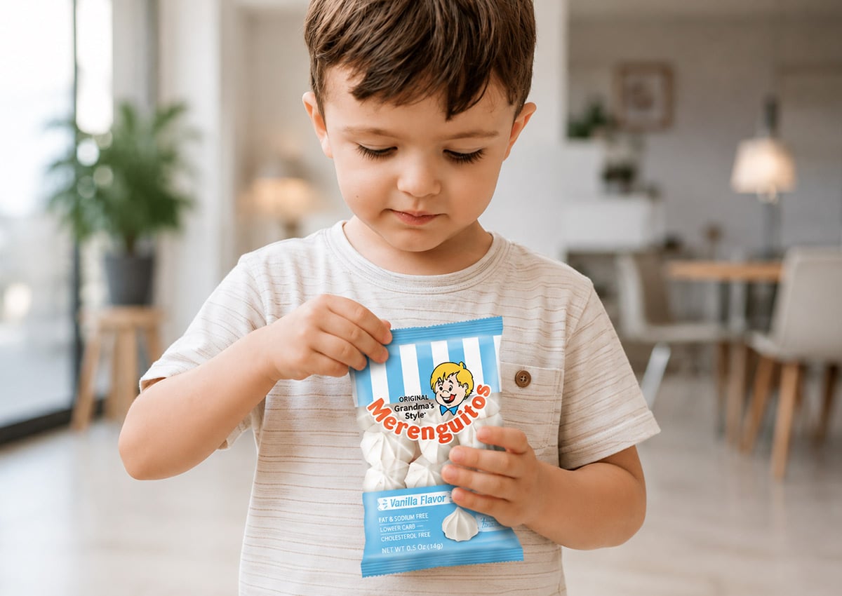
Nostalgia, Heritage and Brand Recognition Across Generations
Merenguitos was not developed as a Hispanic-market campaign, but it demonstrates a design challenge that is highly relevant to heritage brands and culturally connected audiences: how to modernize a familiar product without discarding the memories and recognition associated with it. The project preserved the brand’s nostalgic warmth while creating a clearer and more adaptable identity for contemporary U.S. retail.
Nostalgia is most effective when it comes from specific brand assets rather than generic vintage styling. A familiar name, type style, package structure, color or product presentation can carry emotional meaning across generations. The design process must distinguish between equity worth protecting and visual habits that no longer support product clarity or retail performance.
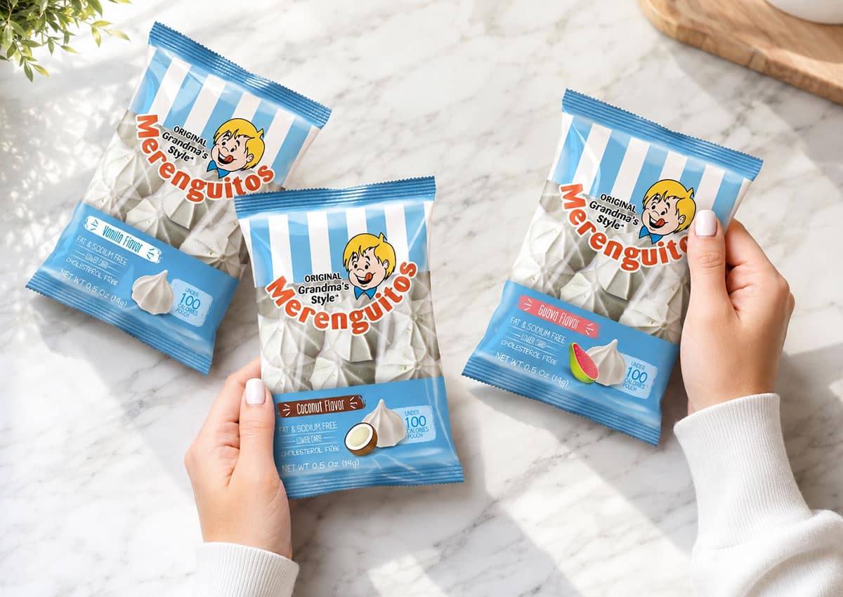
The Solution: A Balanced Rebranding
We executed a comprehensive rebranding and packaging update that carefully balanced tradition with modernity. The new identity preserved the original charm of the product, ensuring its nostalgic appeal remained intact. Simultaneously, we introduced a fresh, contemporary design that was specifically tailored to appeal to a new generation of shoppers and adapt to modern retail environments.
Product visibility plays an important role in the outcome. The clear window allows shoppers to see the light texture and handmade character of the Merenguitos, while the surrounding design communicates sweetness, craftsmanship and quality. The package is designed to remain recognizable at physical shelf distance and legible in retailer listings, where brand and product information must perform at a much smaller scale. Read more about Imaginity’s approach to designing packaging from shelf to screen.
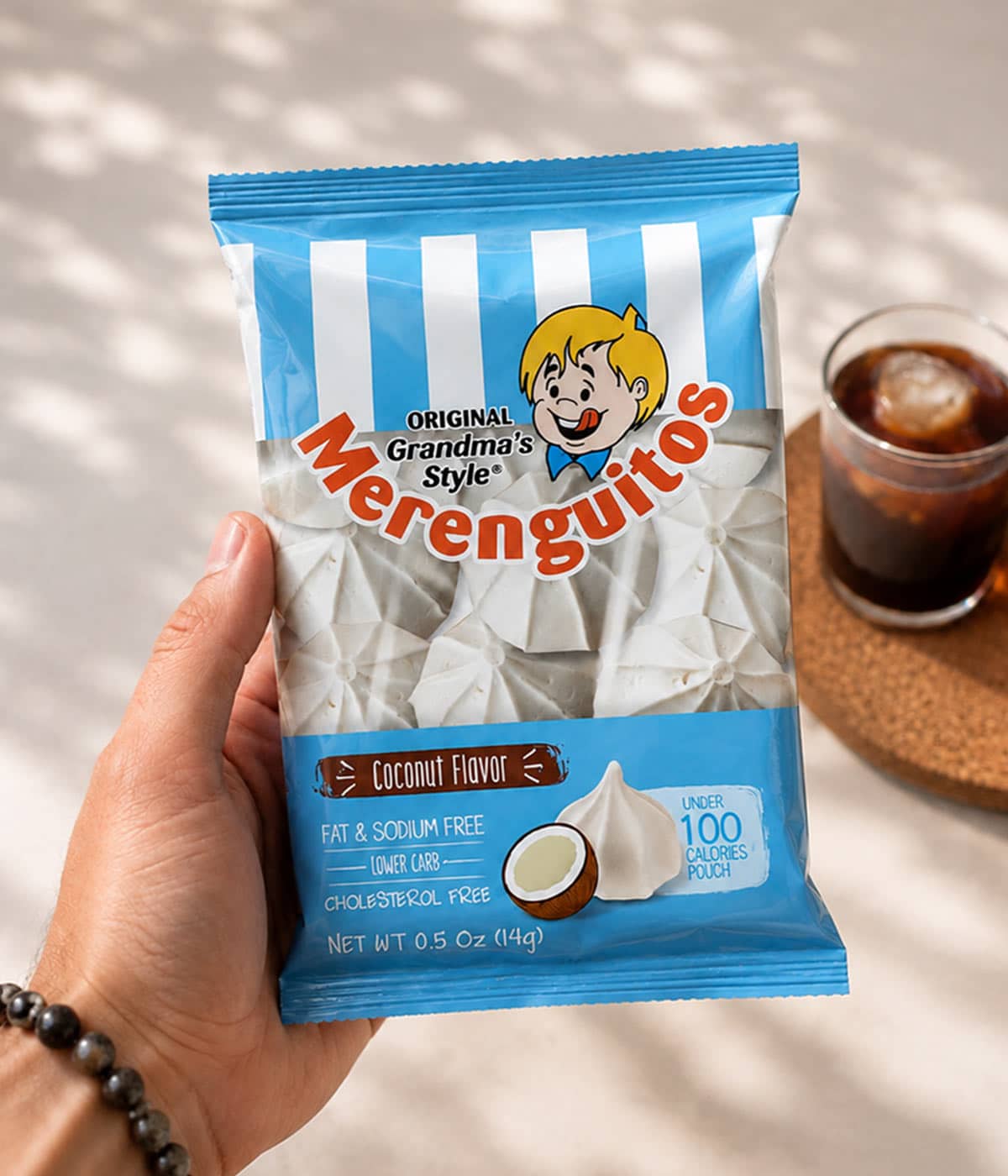
The Outcome: A Heritage Brand Prepared for Modern Retail
The Merenguitos project revitalized a classic brand without discarding the visual familiarity and nostalgic character valued by existing consumers. The updated identity preserves the product’s homemade warmth while giving the brand a clearer, more contemporary presence for modern U.S. retail.
The redesigned logo, vintage-inspired graphic details and refined typography create a more distinctive visual identity while maintaining continuity with the product’s history. Rather than treating nostalgia as a decorative style, the design uses familiar brand cues as strategic assets, balancing recognition with a presentation capable of reaching younger and design-conscious shoppers.
The packaging also establishes a more consistent system across pouch sizes and product varieties. A flexible product line architecture organizes the logo, product name, color palette, appetite appeal and transparent window so that each package belongs to the same family while remaining easy to identify. This structure gives the brand a foundation for introducing future varieties or formats without losing coherence.
The result is a branding and packaging system positioned for broader retail use while retaining the emotional qualities that distinguish the product. Merenguitos demonstrates how strategic packaging design can modernize a heritage brand, organize a growing product line and present a traditional confectionery product with greater clarity across stores and e-commerce.
From Heritage Brand Equity to Hispanic Market Strategy
Our guide to U.S. Hispanic market segmentation examines how heritage and nostalgia can influence first-generation, U.S.-born and bicultural consumers differently. For Hispanic and Latin American brands entering or expanding within the United States, our Hispanic branding and packaging design approach connects those audience distinctions with positioning, language and packaging decisions.
Explore Imaginity’s broader work in branding, packaging design and packaging and branding for U.S. brands.
Imaginity is a global packaging design agency specializing in consumer packaged goods (CPG), partnering with market-leading food, confectionery, bakery, and FMCG companies across Latin America, North America, and international markets. Combining strategic branding, custom visual identity, disciplined brand architecture, and prepress print expertise, our agency delivers impactful visual storytelling across our entire portfolio to optimize in store marketing performance and drive commercial growth for global brands.
Explore more of Imaginity’s experience in packaging design and branding for U.S. brands and in-store marketing