
Beverage Packaging Design
How Imaginity Solves the Category's Hardest Challenges

Beverage brands face a few recurring packaging problems. How do you launch a new product without diluting a famous brand? How do you keep a global identity intact across local formats and regulations? How do you make a limited edition exciting without losing the brand behind it? How does a local brand compete against global giants?
This page brings together Imaginity's beverage branding and packaging design experience for Sol, Heineken, Guinness, PepsiCo, Danone and others, organized by the challenge each project solved. Each section explains the challenge, what we did, and the strategic design decisions behind the work, with links to the full projects.
Beverage experience at a glance: Our beverage experience spans 40+ projects for 30+ brands across 10+ countries, covering beer, wine, RTD cocktails, soft drinks, juices, isotonic and functional beverages, RTD coffee and mineral water.
1. Extending a Famous Brand into a New Product
The challenge. When a well-known brand launches a new product, its product-line architecture has to do two conflicting jobs at once. The pack must be recognized instantly as part of the parent brand, while signaling clearly that this is something different. Lean too far toward the parent and shoppers miss the news. Lean too far toward the new product and the brand's equity does not carry over.
Sol Mix
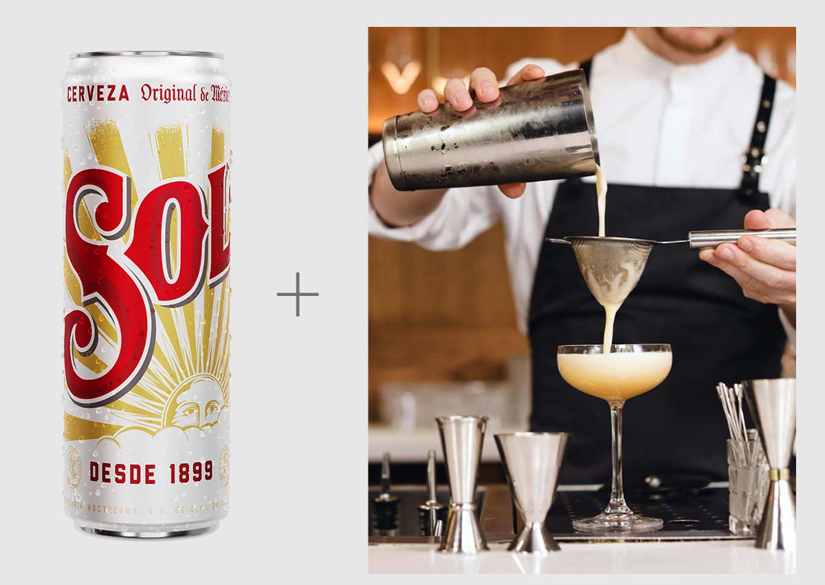
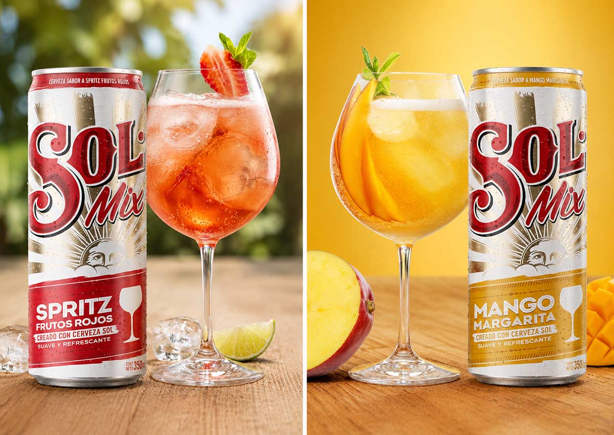
Sol extended into beer-cocktail drinks with flavors such as Mango Margarita and Spritz Frutos Rojos. We kept Sol's sun rays as the fixed brand anchor. The new product's story was carried by three added elements: a bold color band for each flavor, a cocktail-glass illustration and fruit cues. On the 6-pack, a photograph of the drink in a social setting shows the occasion itself.
Soberana Radler
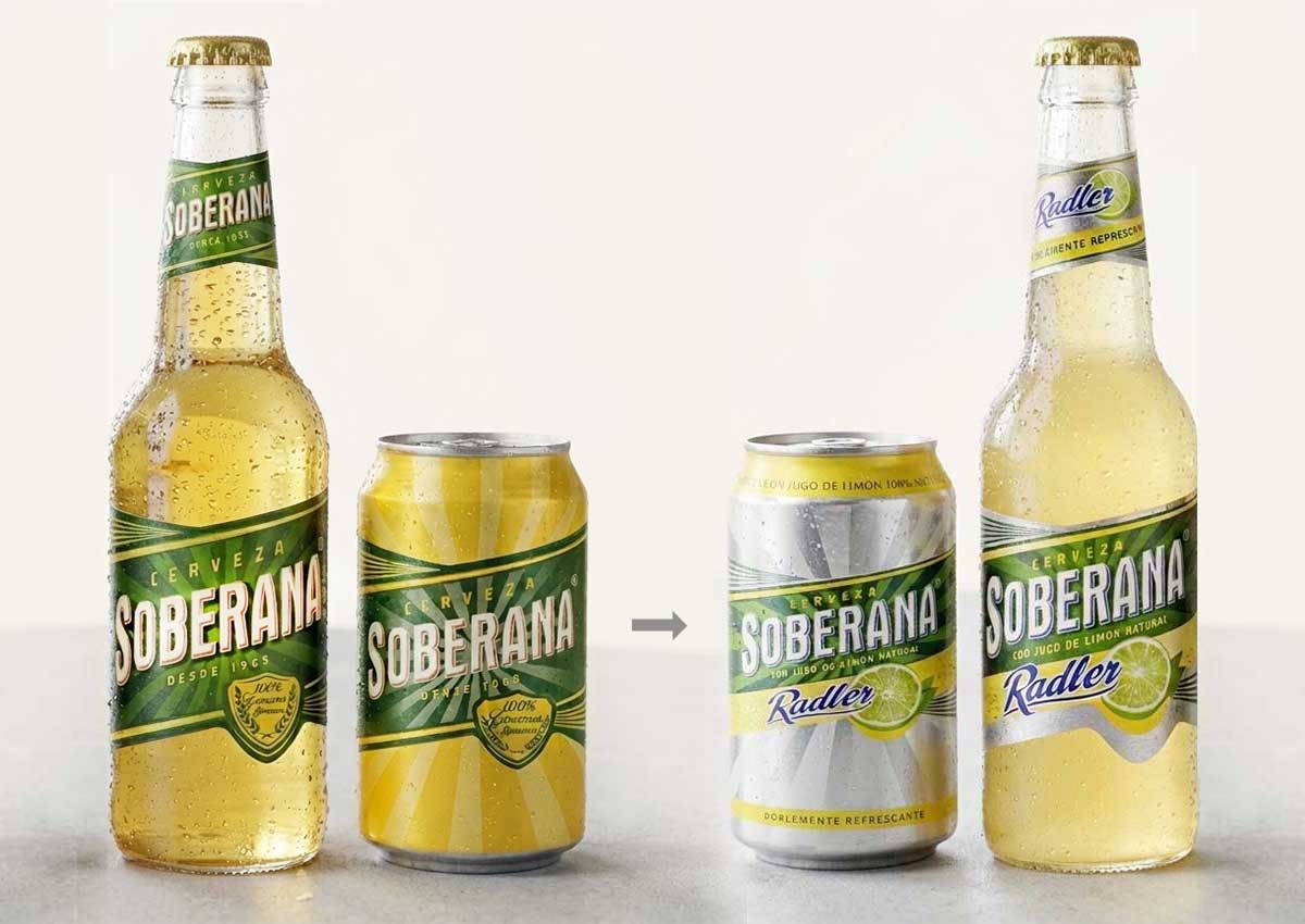
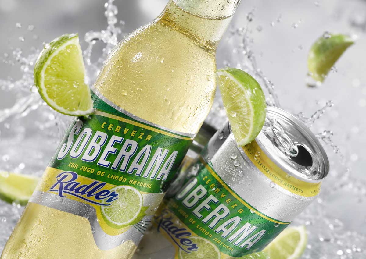
A new radler beer had to sit in harmony with both the Soberana brand and the recognized visual codes of the radler style. We combined the Soberana identity with a Radler sub-brand and lemon imagery to communicate flavor and freshness.
Strategic design decisions
-
Fix the anchors, move the news. Decide which parent-brand assets remain consistent, then put everything new into a separate, clearly defined visual layer.
-
Give each variant one ownable signal. A single color per flavor lets shoppers tell variants apart instantly without cluttering the brand.
-
Show the occasion, not just the product. A cocktail glass tells shoppers “this is not regular beer” faster than a line of copy.
Related: RTD alcoholic packaging · beer and craft beer
2. Adapting a Global Brand for a Local Market
The challenge. Global beverage brands have strict design standards, but each market brings its own formats, regulations and production partners. The work demands rigor around the assets the global brand has fixed, along with precise judgment about how everything else fits local requirements.
Heineken Silver
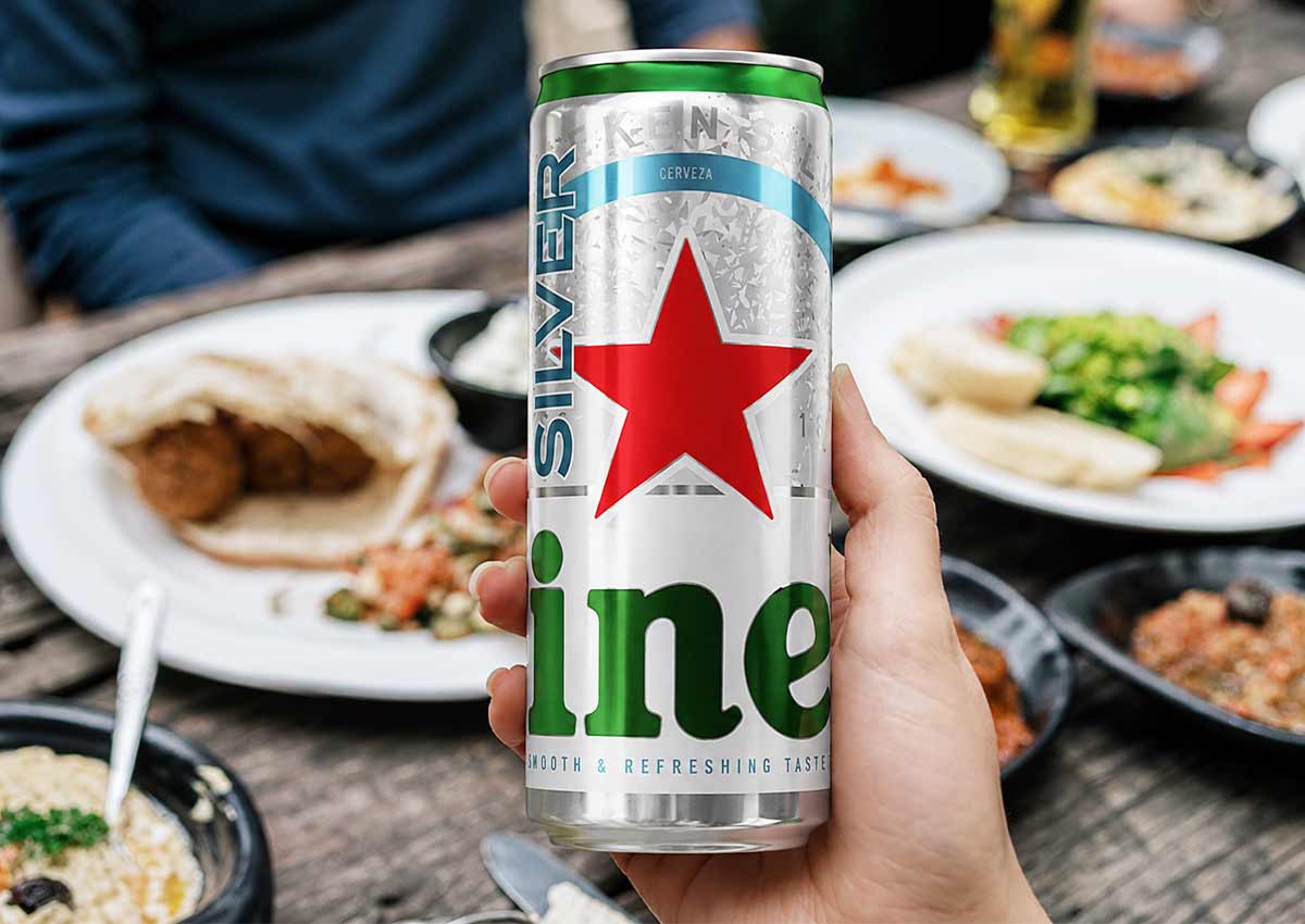
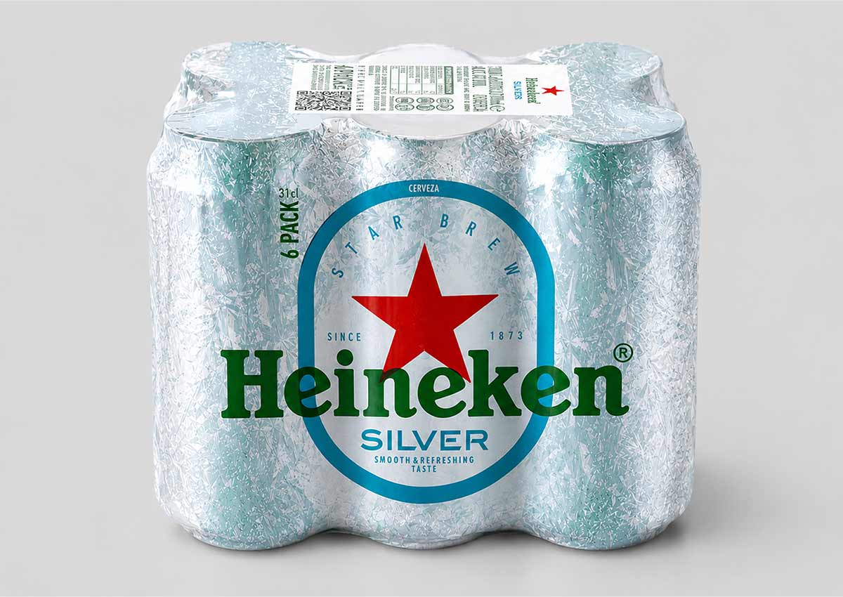
For Heineken Silver's launch in Panama, we adapted the brand's visual identity to the 310 ml sleek can. On the taller, thinner can, every element, from the red star to the turquoise accents, had to be re-proportioned so it kept its impact. The result feels like a natural part of the global Heineken portfolio while matching local on-the-go and social drinking habits.
Guinness Extra Stout
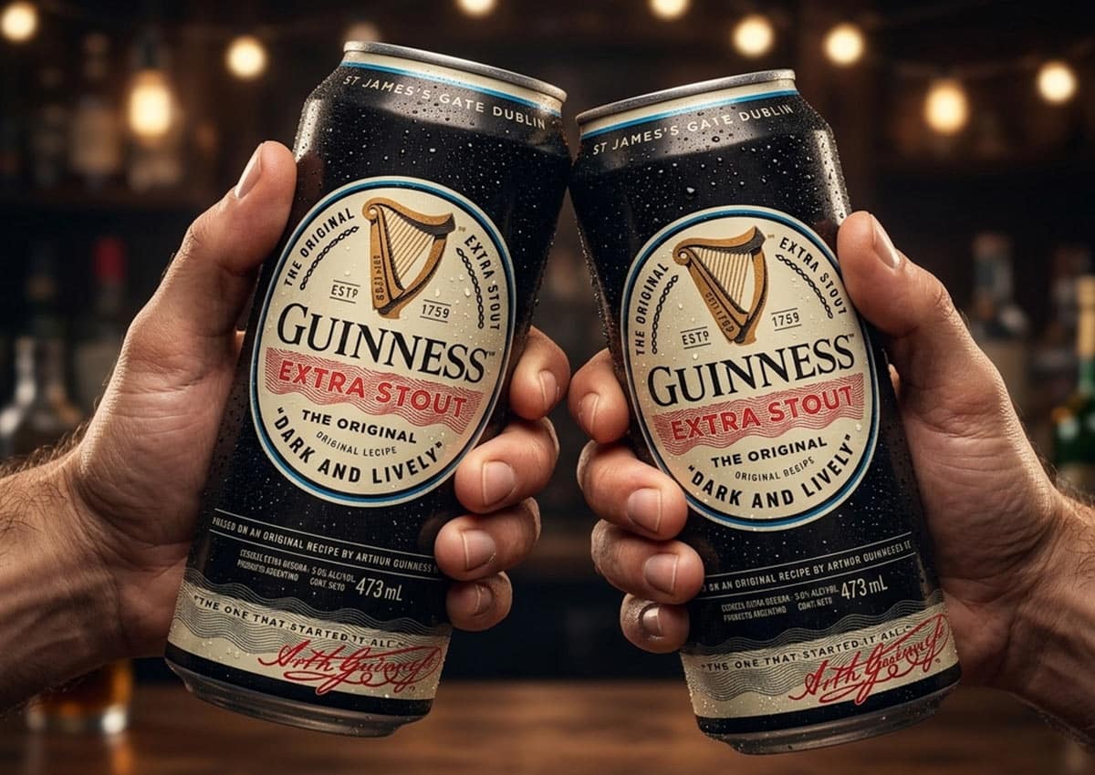
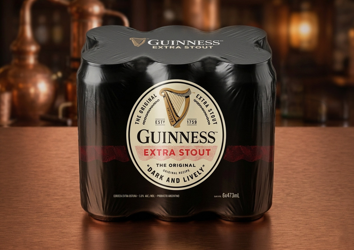
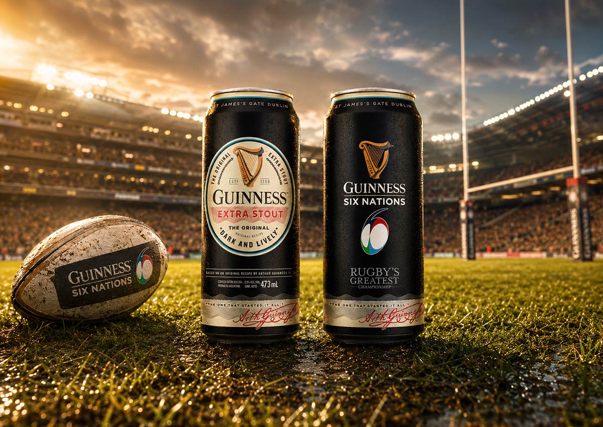
When Guinness expanded into Argentina, we led the local packaging design for “The Original” Extra Stout in the 473 ml can, followed by its six-pack. We applied the harp symbol and typography according to Guinness's global standards. The layout was reorganized to balance the brand's international prestige with local legal information, and we managed prepress to keep color consistent across high-volume production.
Hop House 13
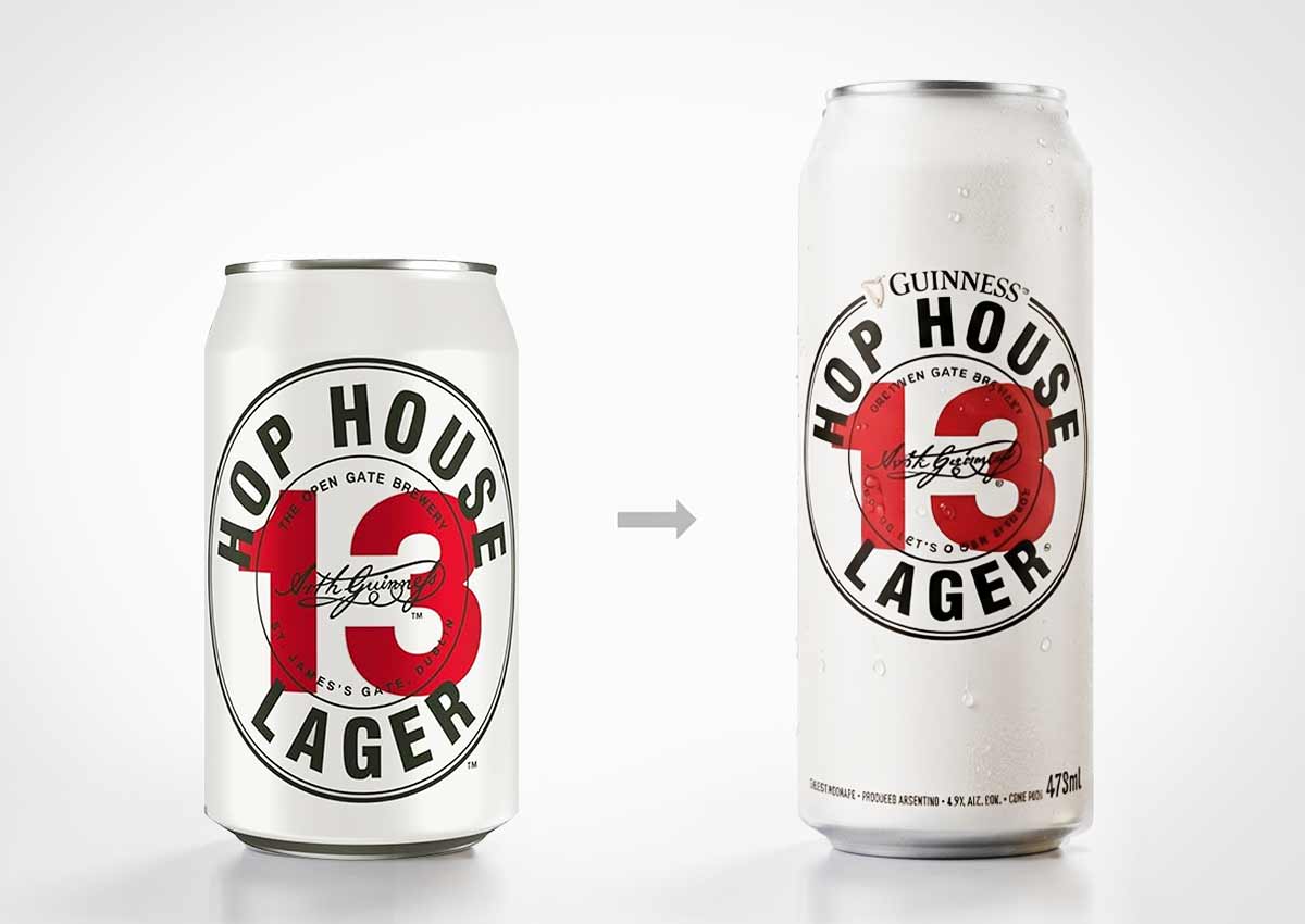
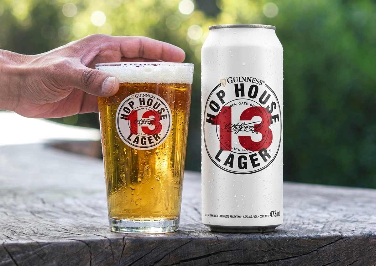
We then brought Guinness's premium lager to Argentina, working with Diageo and the local brewers at Rabieta. The global design had to be adapted to 473 ml (16 oz) cans and shrink-wrapped 6-packs, with mandatory regulatory text built in without weakening the premium look. We kept the bold red-and-white palette and the iconic “13” logo at the center, rearranged the other elements to meet local specifications, and delivered production-ready artwork.
Strategic design decisions
-
Treat formats as redesigns, not resizes. A sleek can or a shrink-wrapped 6-pack changes the proportions of every element, so each design is rebuilt for the new shape.
-
Build regulatory text into the design from the start. Local legal requirements are part of the layout plan, not something squeezed in at the end. This protects the premium presentation.
-
Know which rules are absolute. The Guinness harp, the Hop House “13” and Heineken's red star remain defining anchors. Identifying them first makes clear where local adaptation is allowed.
-
Stay involved through production. Prepress supervision keeps colors consistent from the first print run through high-volume production.
-
Apply one standard across a portfolio. Working on both Guinness Extra Stout and Hop House 13 in Argentina, in the same formats, allowed the two brands to reach the shelf with consistently executed packaging.
Related: local implementation of global brands · global brands
3. Limited Editions That Drive Engagement
The challenge. A limited edition has a short window to create excitement, earn shelf attention and give consumers a reason to buy now. The risk is that the borrowed theme, whether a sport, an event or a season, overshadows the brand behind it.
Pepsi Kick × NFL
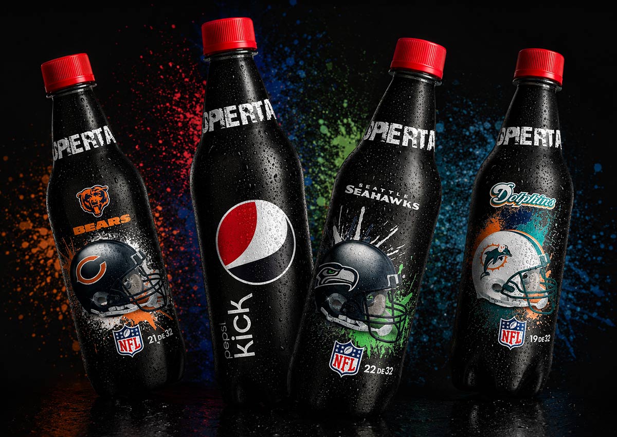
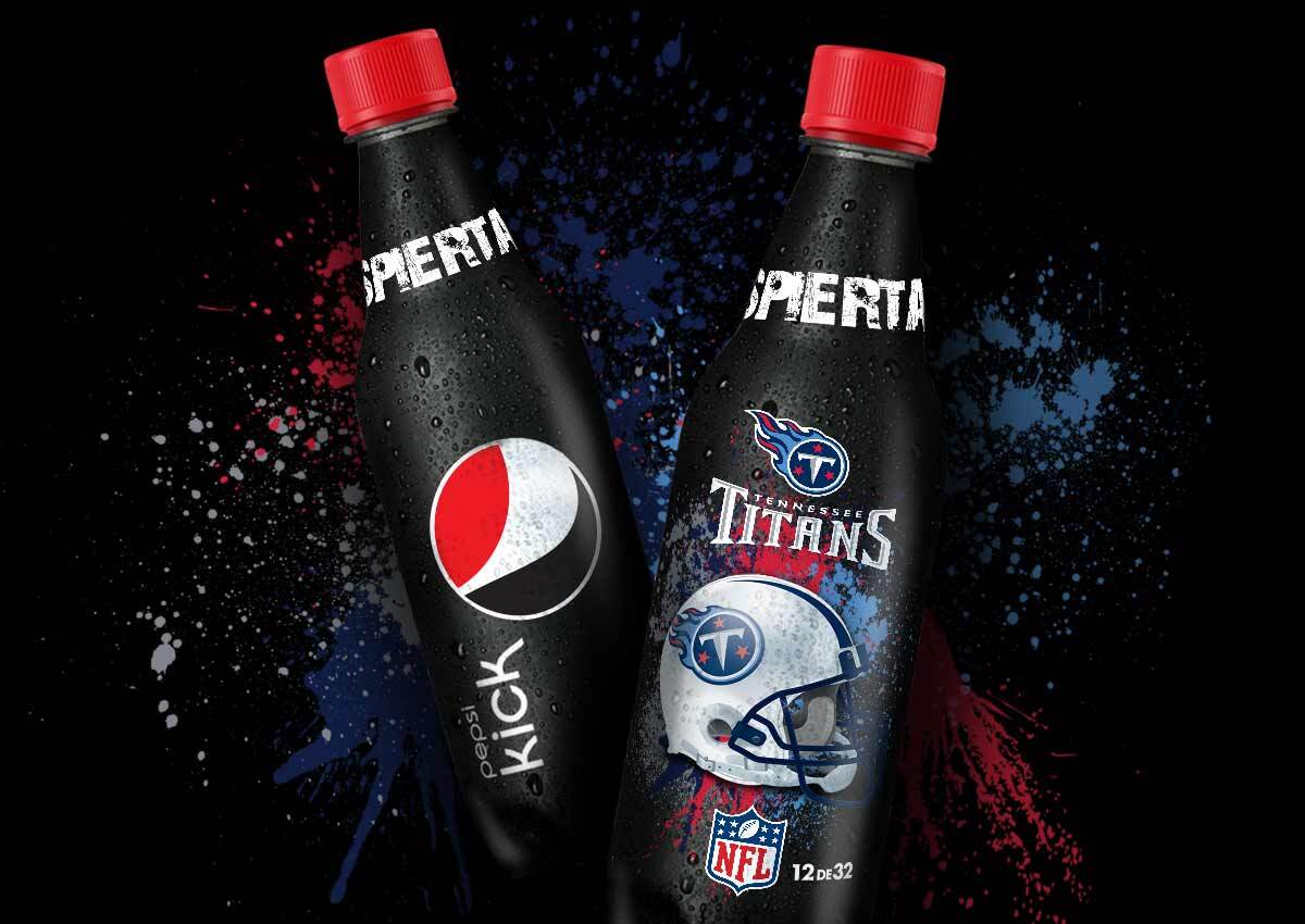
To connect Pepsi Kick with the NFL, PepsiCo asked us to design 32 collectible bottles, one for each team. Vibrant team graphics contrast with Pepsi Kick's signature black, and each bottle was numbered to encourage collecting.
Guinness Six Nations
A limited-edition 473 ml (16 oz) can and 6-pack were created for the Six Nations Rugby Championship. One side of the can carries the Guinness identity and the other is dedicated to the championship, blending Guinness's black and gold with accent colors from the participating nations.

Gatorade
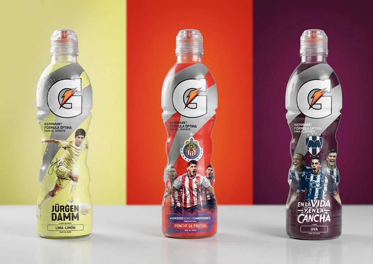
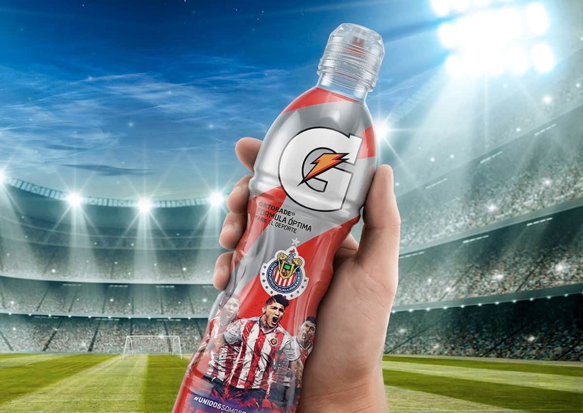
A soccer-themed limited edition used 360-degree shrink labels. Dynamic, on-field athlete poses reflect the product's performance and recovery benefits, with the artwork executed for the full wraparound label.
Pepsi Light
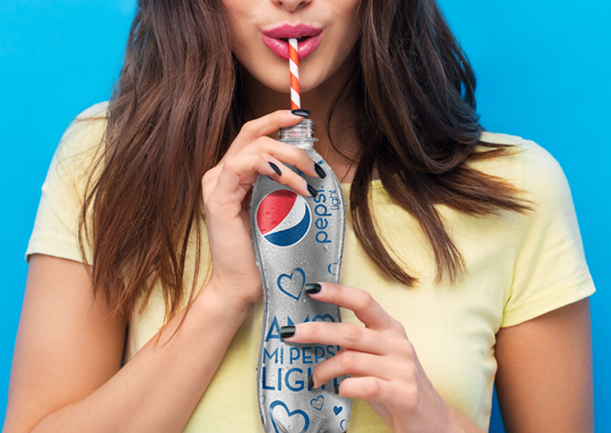
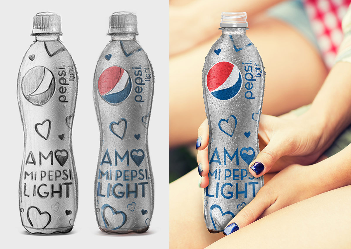
A special edition built around the “I Love My Pepsi Light” concept shows that a limited edition can celebrate the brand relationship itself, without a sports or event tie-in.
Strategic design decisions
-
Borrow the passion, keep the brand in charge. Guinness split the can between brand and championship, while Pepsi Kick kept its black as the base. The theme adds energy without taking over.
-
Design for collecting. Numbering and one design per team turn a single purchase into a series.
-
Let the format do some of the work. A 360-degree label gives the design room for movement and a complete visual story.
Related: special and limited editions · packvertising · sports
4. Revitalizing a Local Brand Through Its Origin
The challenge. Local beers compete against global brands with far bigger budgets. Their strongest advantage is something global brands cannot claim: a real origin. The challenge is making that origin visible and appealing without making the brand look old-fashioned.
Cristal
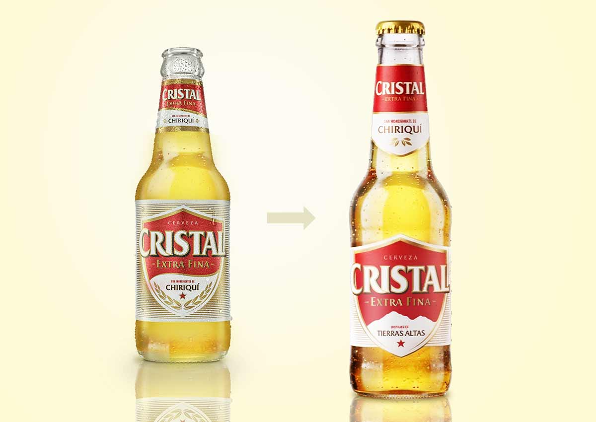
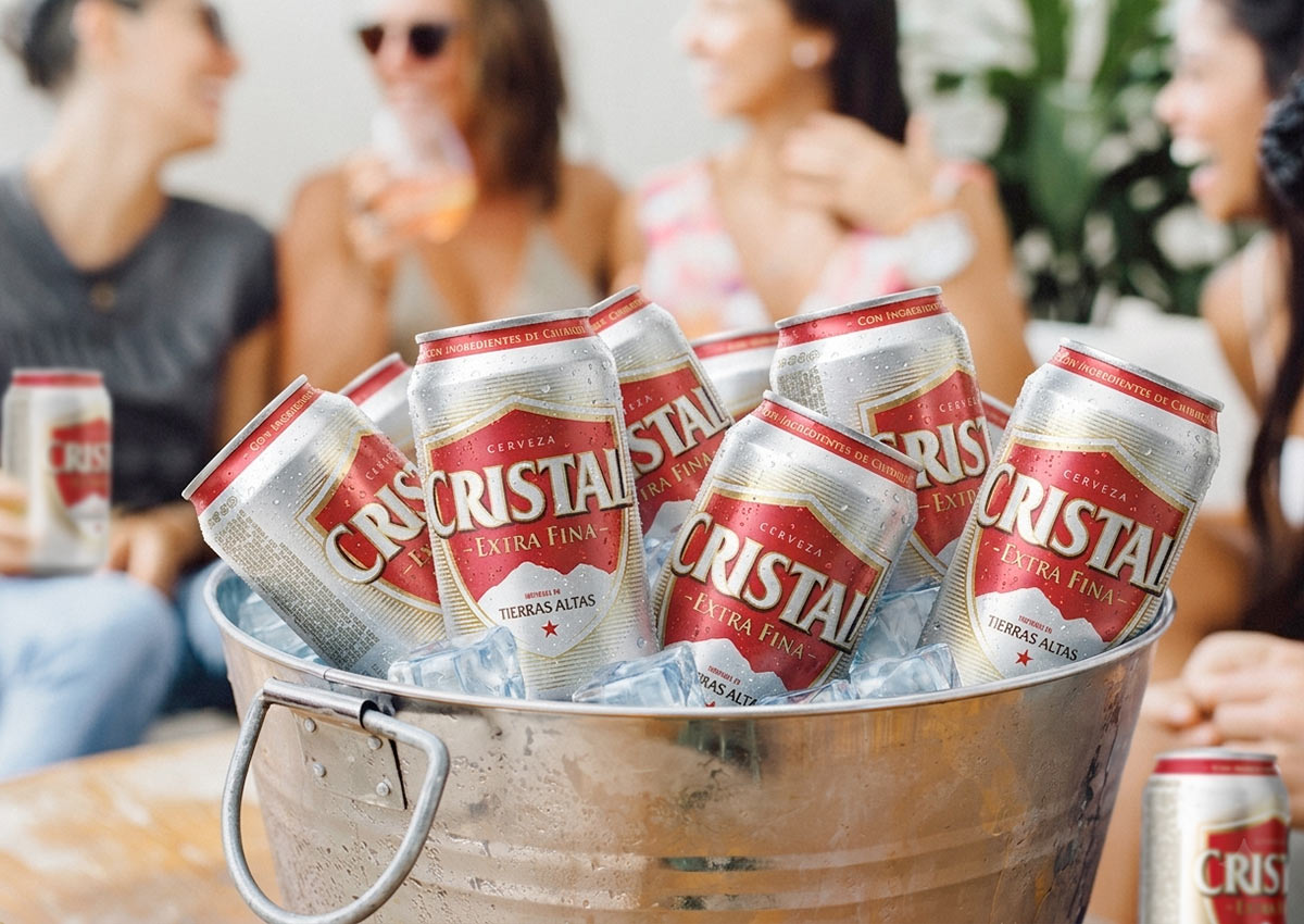
We redesigned Cristal to strengthen its connection to Panama's Tierras Altas. We evolved the shield logo to include the mountains, designed a bottle label using the shield's shape, and carried the system across the 12 oz can and the 6-pack and 12-pack multipacks, where a mountain illustration creates a clean, upscale look. The goal was to add a visual link to the brand's origin and a fresher, younger feel while keeping Cristal instantly recognizable.
See the Cristal bottle project → · See the Cristal can and multipacks project →
Strategic design decisions
-
Use origin as a difference competitors cannot copy. A real place gives a local brand a story no global competitor can take.
-
Build the story into the brand mark itself. Putting the mountains inside the shield means the origin travels with the logo everywhere, not just on the label.
-
Refresh without breaking recognition. Small, meaningful additions modernize the brand without asking loyal drinkers to relearn it.
Related: Latin America
5. Storytelling Through the Pack
The challenge. In some categories, the product itself is hard to tell apart from competitors. Mineral water is the clearest example. In these categories, the story the pack tells becomes the difference. That story has to come from a real truth about the brand, and it has to be readable in the few seconds a shopper spends at the shelf.
Villa del Sur Artist Edition
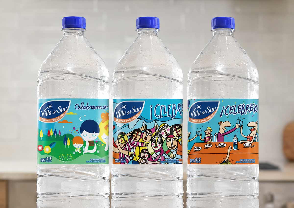
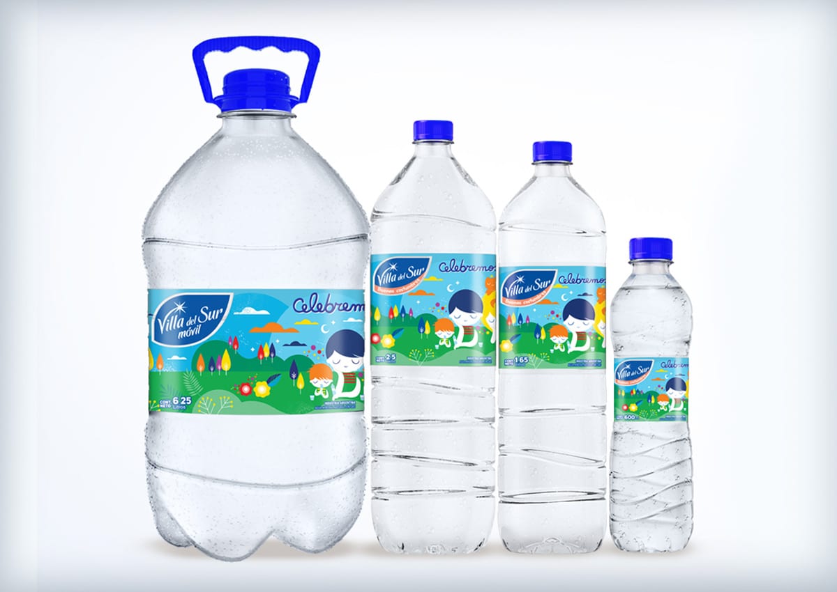
The goal was to position Villa del Sur as a fun, colorful water. The obstacle was the category itself: mineral water is uniform and almost entirely blue, and the flavored-water segment already uses bright color codes. Villa del Sur had to add color without looking like a flavored water.
We started from the brand's truth: Villa del Sur is family fun, the water of the Argentine family. Art became the way to add color and tell that story at the same time, showing families together with color and joy. We created a limited edition with Argentine artists Pum Pum, Claudio Baldrich and Tute, chosen because they share the everyday character of the Argentine family. Each artist interpreted the concept on the label, and a special logo tied the edition together across the full line.
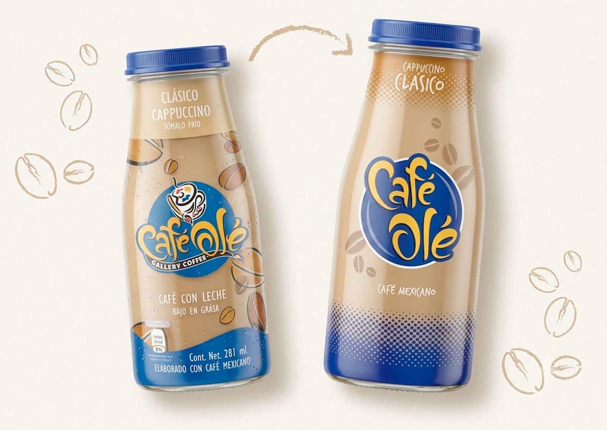
Café Olé → Olé
For Sigma Alimentos' cold RTD coffee brand, storytelling has run through three stages of work, each building on the last:
-
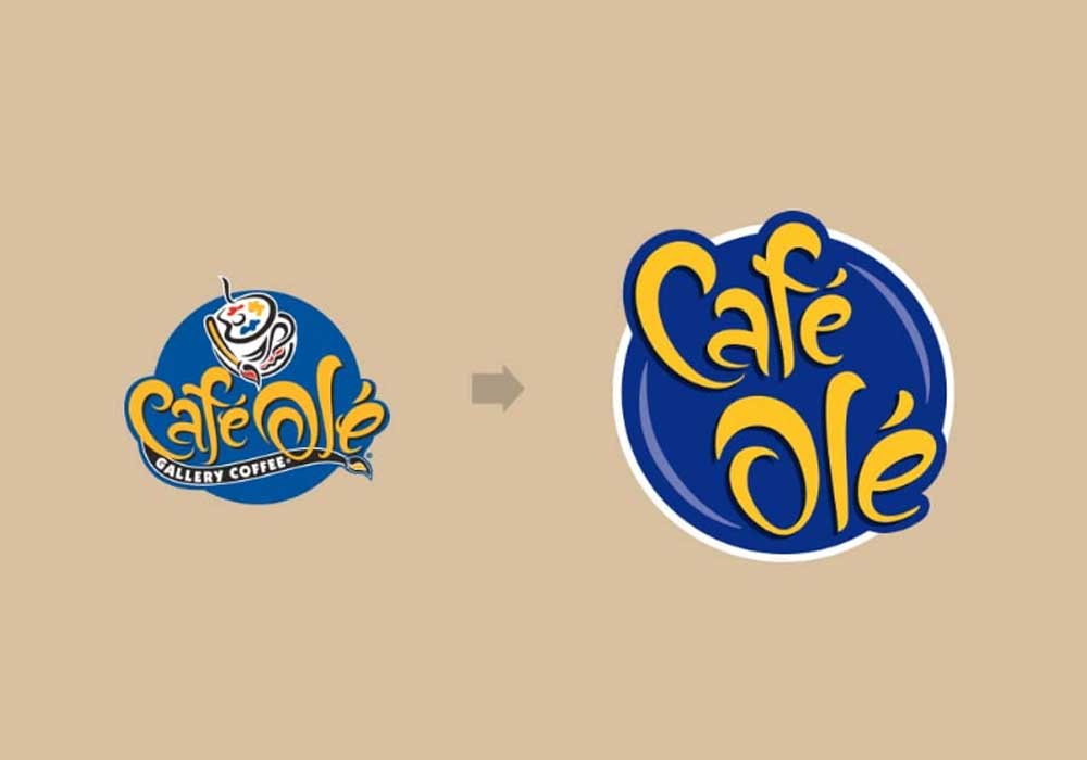
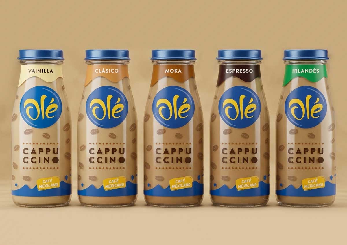
The first redesign refreshed the brand's packaging and identity. We evolved the logo to make it more eye-catching, legible and modern, then created a stronger, unified packaging system that preserved brand recognition while differentiating each flavor.
-
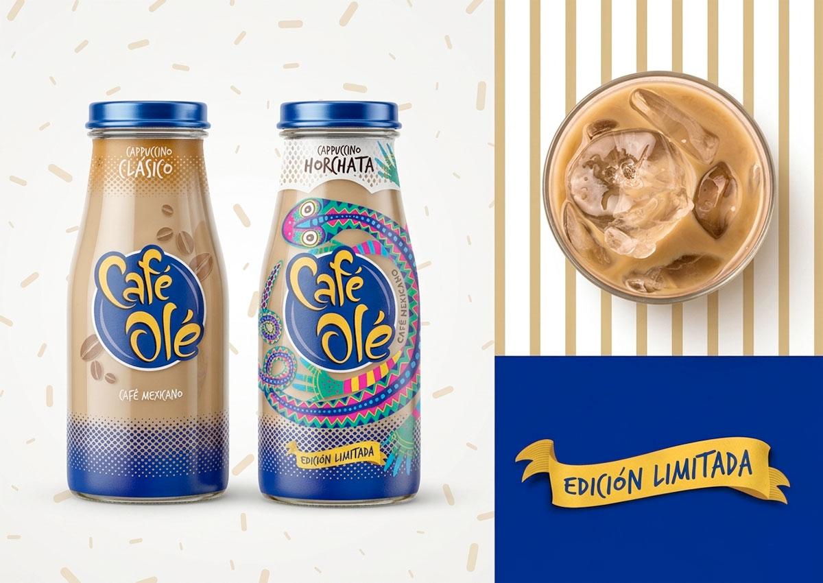
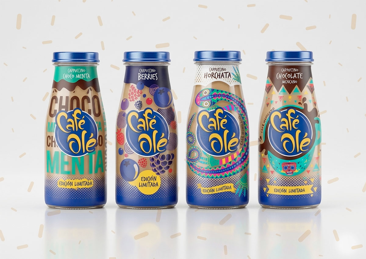
Special editions celebrated Mexican coffee culture while staying consistent with the core line. The Chocolate edition uses earthy tones and alebrije-inspired graphics. Horchata features delicate hand-drawn Mexican patterns. Choco-Menta uses bold, modern typography, and Red Berries uses bright fruit illustrations. Each flavor tells its own story, but all four clearly belong to Café Olé.
-
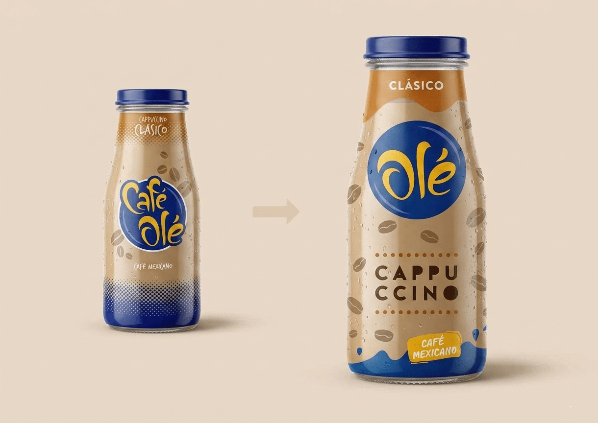
The evolution to Olé began a planned brand migration from Café Olé to simply Olé, keeping the brand's youthful, fun personality. To avoid confusing consumers, the first step was to make the word “café” less prominent rather than remove it. The new design uses fluid shapes inspired by dripping coffee, playful coffee beans and a distinctive typeface, aimed at a young, digital, fast-moving audience in store and online.
La Beriso
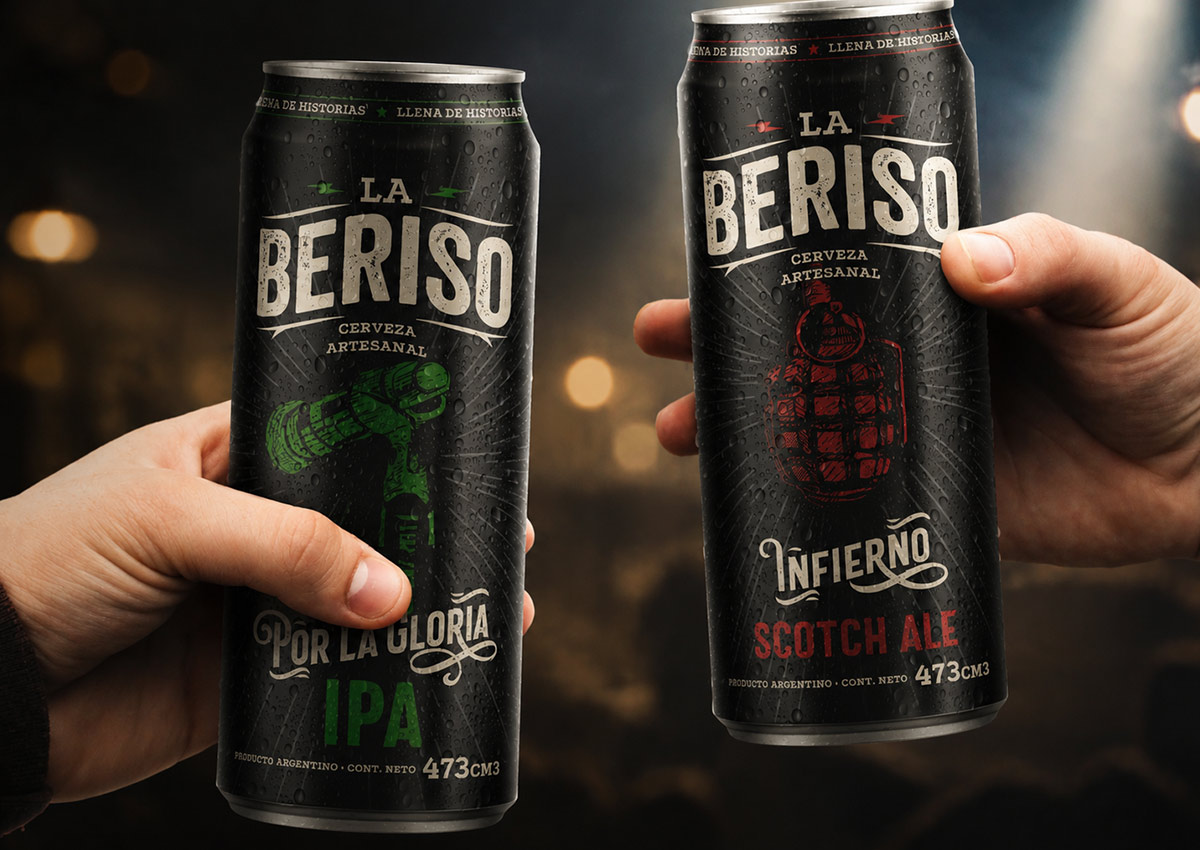
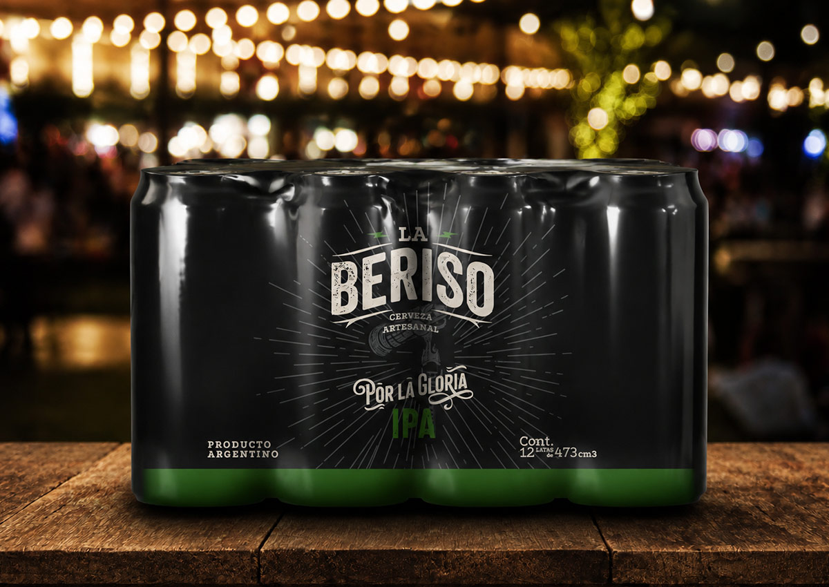
A limited-edition beer tied to the Argentine rock band La Beriso carries the band's identity and connects with its fans. We created cans and multipacks with a black visual system, symbolic illustrations—including a grenade, boxing gloves and a microphone—and song titles distinguishing the IPA and Scotch Ale variants.
Strategic design decisions
-
Start from a brand truth, not a theme. Villa del Sur's edition grew out of what the brand already stood for: family. Café Olé's special editions grew out of its Mexican roots.
-
Use culture as the storyteller. Argentine artists for Villa del Sur, together with alebrijes and traditional patterns for Café Olé, give each story authenticity that generic graphics cannot.
-
Solve the category constraint, then tell the story. Villa del Sur had to add color without borrowing flavored water's codes. Artwork made that possible.
-
Keep one thread through the variety. Several artists under one special logo, and four flavors within one brand system: each design is distinct, yet all read as one family.
-
Change the name in stages, not overnight. Shrinking “café” before dropping it lets loyal consumers follow the brand's evolution without losing it on shelf.
Related: storytelling · mineral and bottled water · RTD coffee
Frequently Asked Questions
How do you launch a line extension without diluting the parent brand?
Keep the parent brand's key assets fixed, and give the new product its own clearly separate visual layer. For Sol Mix, the sun rays stayed while color bands and a cocktail glass communicated the new product.
How do you adapt a global beverage brand to local formats and regulations?
Identify which brand elements must remain consistent, then rebuild the layout around them for each new format, with local legal text planned in from the start. We did this for Heineken Silver in Panama, and for Guinness Extra Stout and Hop House 13 in Argentina.
What makes a limited-edition beverage pack effective?
A clear link to something consumers care about, the brand kept visibly in charge, and a reason to buy more than one, such as the 32 numbered Pepsi Kick NFL bottles.
How can a local beer compete with global brands on packaging?
By making its real origin visible. For Cristal, we built the Tierras Altas mountains into the brand's shield logo.
How can packaging tell a story in a category where products look alike?
Start from a real brand truth and find a way to show it at the shelf. Villa del Sur used art by Argentine artists to express family and bring color to a blue category.
Which beverage categories does Imaginity work in?
Beer and craft beer, RTD cocktails, soft drinks, functional and isotonic drinks, juice, mineral water and RTD coffee, across Latin America, the USA and Europe.
Planning a launch, line extension, local adaptation or limited edition? Explore our packaging design services or talk to Imaginity.
We work with brand, marketing and innovation teams on brand identities, packaging systems and retail activation, from new launches to portfolio redesigns.