Client:
Sigma Alimentos
Country:
Task:
Branding and Packaging Design
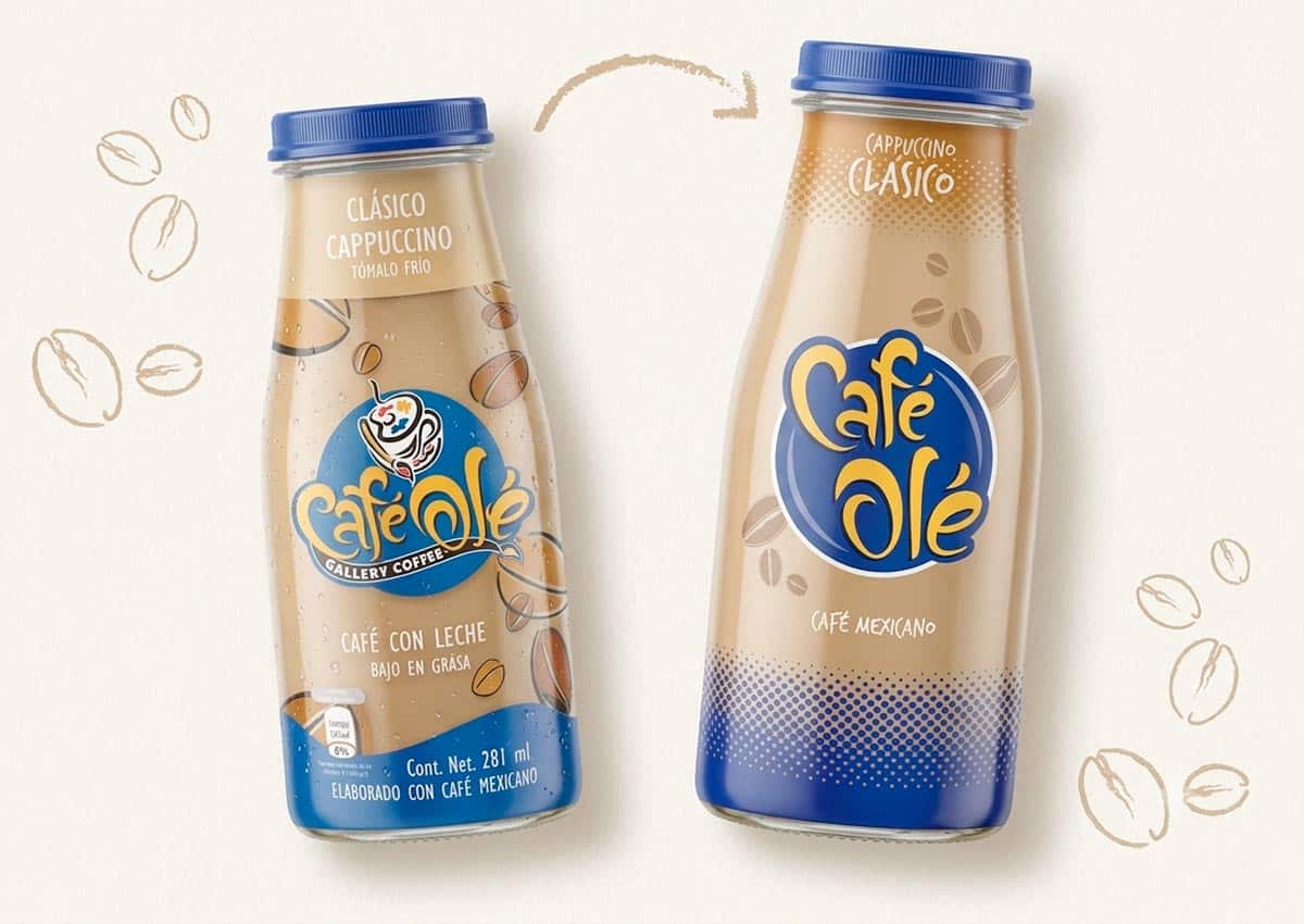
A clearer, more vibrant packaging system for a younger audience
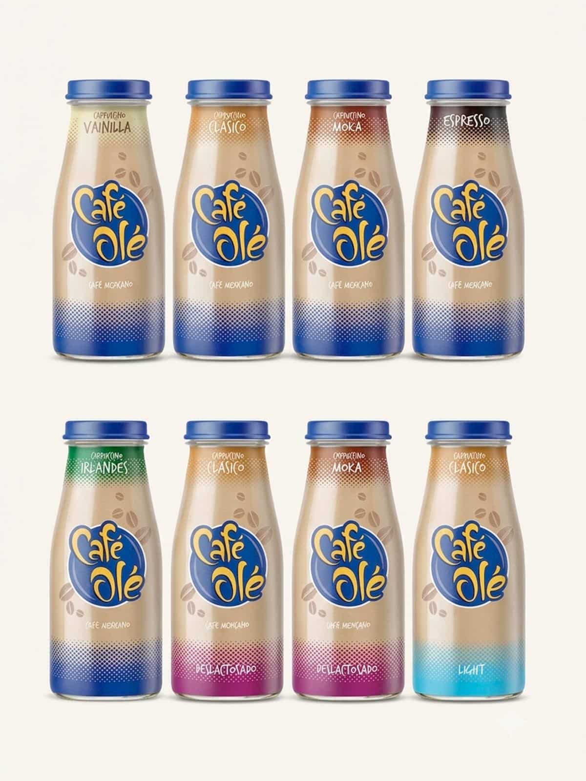
Sigma Alimentos commissioned Imaginity to evolve the branding and packaging design of Café Olé, its bottled ready-to-drink coffee line. The project preserved recognizable elements of the brand while simplifying the logo, establishing a clearer flavor system, and using the transparent bottle as part of the visual identity. The resulting design gives the product line a more legible, energetic, and cohesive presence across refrigerated retail displays.
Imaginity | Design Agency | Branding, Packaging Design, Marketing
Visual Highlights
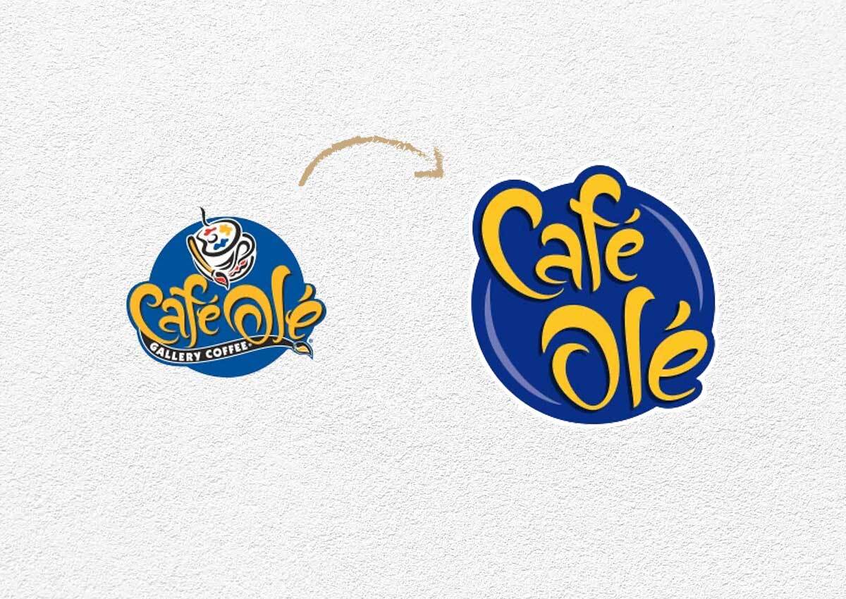
- Logo Evolution: The Café Olé logo was simplified and strengthened to improve legibility while preserving the character of the original identity.
- Color-Coded Flavor System: A vibrant color system differentiates the flavors while maintaining consistency across the product line.
- Clear Front-of-Pack Hierarchy: The layout organizes the master brand, coffee style, flavor, and supporting information for faster recognition in retail environments.
- Strategic Bottle Transparency: The graphics preserve a generous transparent area that makes the coffee visible and integrates the product’s color into the packaging design.
- SCohesive Shelf Presence:A consistent visual structure allows the variants to work together as one recognizable family while retaining clear flavor differentiation.
The challenge
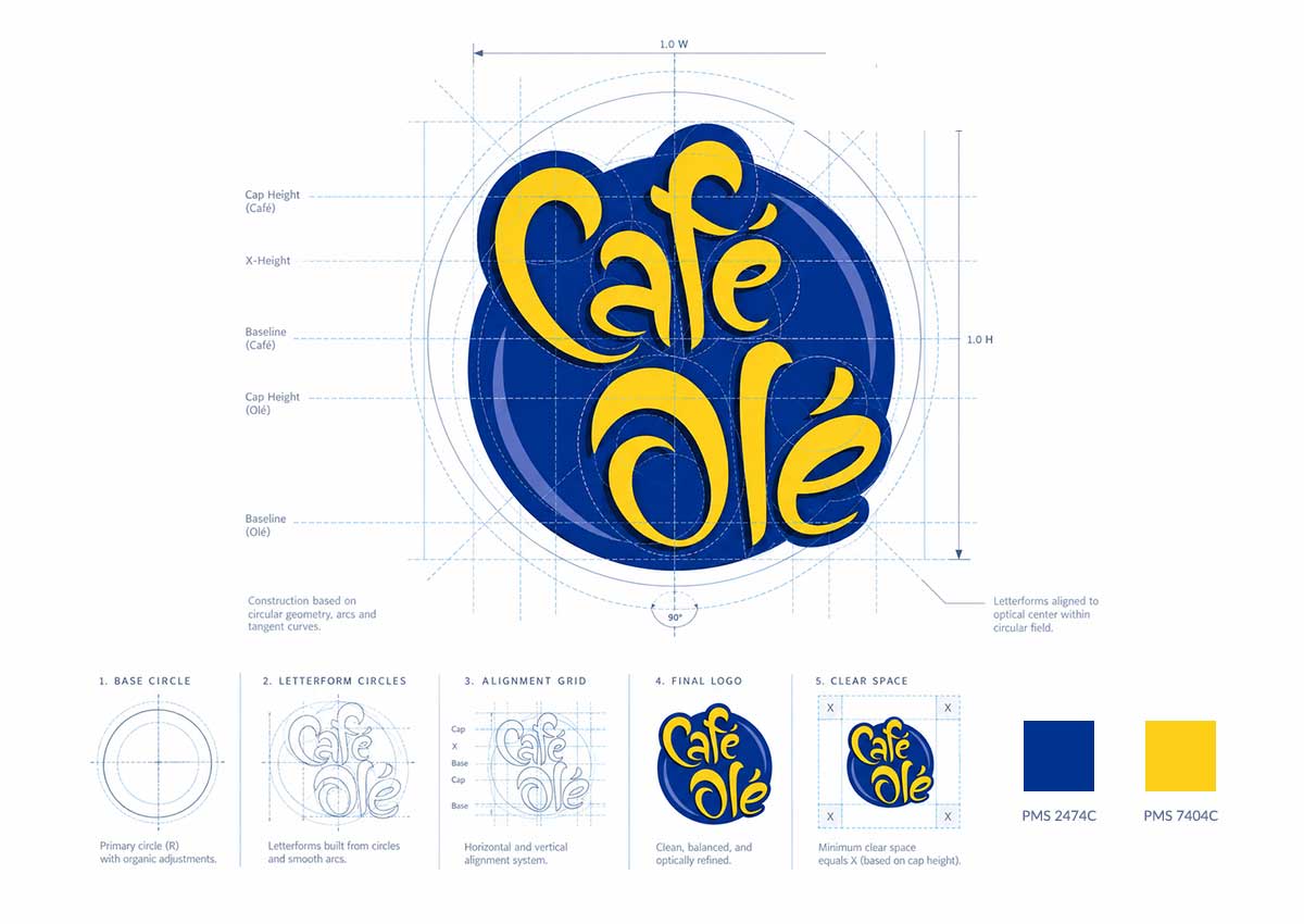
Café Olé needed to update its legacy identity without losing the recognition already established with consumers. The existing packaging required a clearer information hierarchy, stronger flavor differentiation, and a more cohesive presence across the complete line. The challenge was to modernize the logo and packaging while preserving the youthful, approachable personality of the brand and working effectively with a transparent bottle.
Our design process
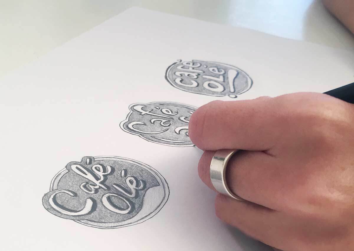
Imaginity began by reviewing the existing logo, packaging hierarchy, and variant system. We simplified the Café Olé logo and strengthened its most recognizable visual characteristics to improve legibility. Each flavor received a distinctive color while remaining part of a consistent product-line system. The front-of-pack hierarchy was reorganized so the brand, coffee style, flavor, and supporting information could be identified more easily. The transparent bottle remained an active part of the design, allowing the color of the coffee to complement the graphics. The final artwork was developed to maintain contrast, clarity, and consistency across the different variants and production conditions.
The outcome
The redesigned system gave Café Olé a clearer and more contemporary presence while preserving continuity with the established brand. The strengthened logo, color-coded flavor system, transparent bottle, and consistent layout make the variants easier to distinguish and allow the complete range to function as one recognizable family in store. This project established the visual foundation for the special editions that followed and for the subsequent evolution of the brand from Café Olé to Olé.
Continue the Café Olé story: explore the special-edition packaging created for Café Olé, then review the next brand evolution from Café Olé to Olé.

About Imaginity
Imaginity is a global branding and packaging design agency working with beverage, coffee, food, and consumer packaged goods brands across Latin America, North America, and international markets. Our experience in packaging design for U.S. CPG brands combines brand strategy, visual identity, scalable packaging systems, and production-ready design for physical and digital retail environments.