Client:
La Beriso
Country:
Argentina
Task:
Commemorating 20 Years of Argentine Rock Through Collectible Craft Beer Packaging
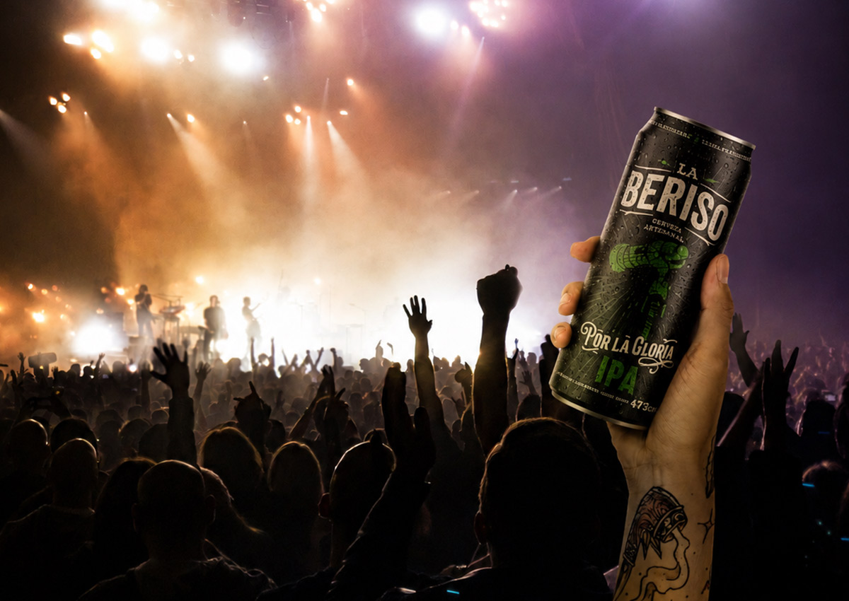
To celebrate the 20-year milestone of La Beriso, one of Argentina’s most iconic rock bands, Imaginity created the branding and packaging design strategy for a limited-edition craft beer. The project fused musical heritage with brewing craftsmanship, creating a visually striking, highly collectible beverage line across Buenos Aires and national retail channels.
Imaginity | Design Agency | Branding, Packaging Design, Marketing
Visual Highlights
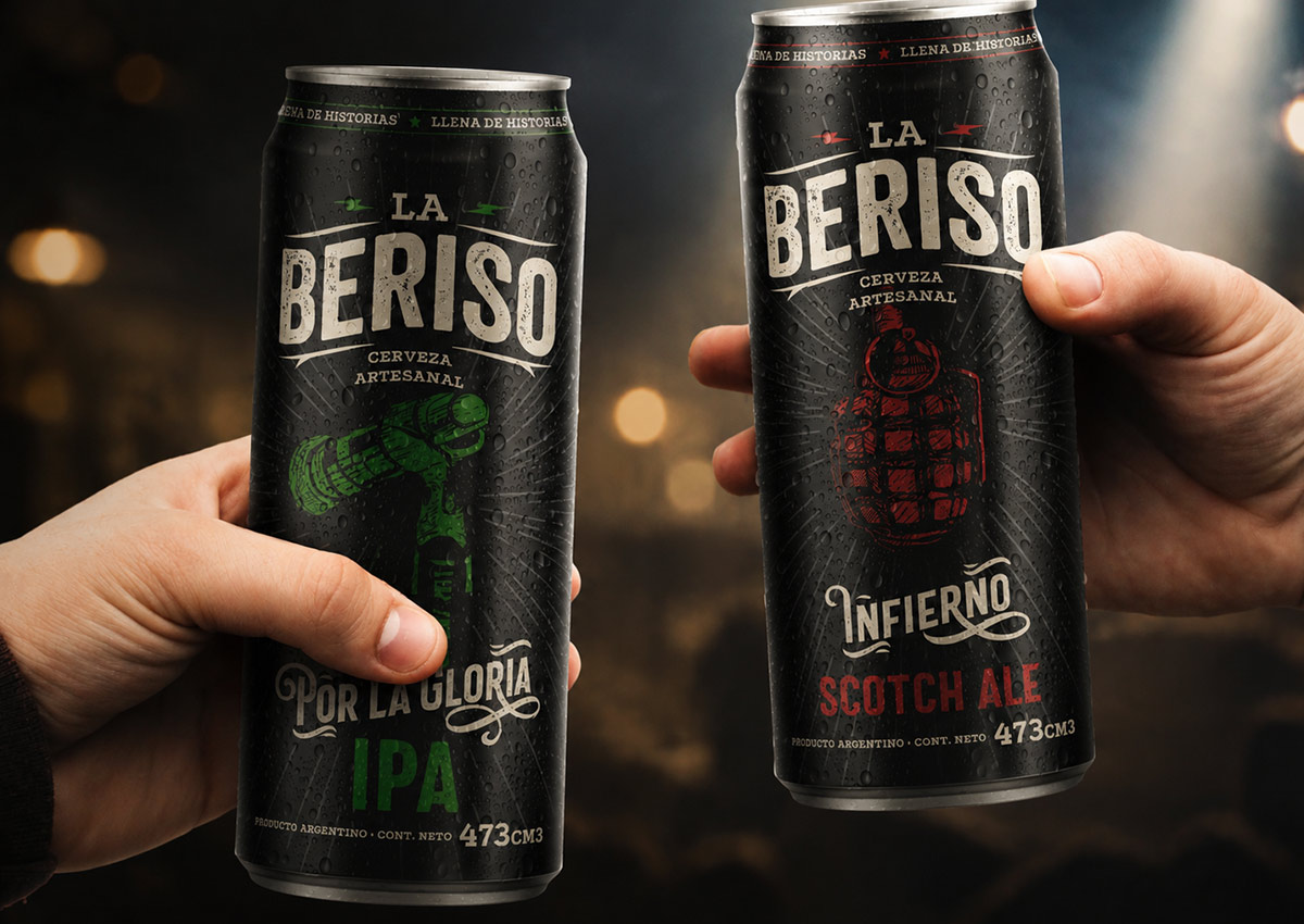
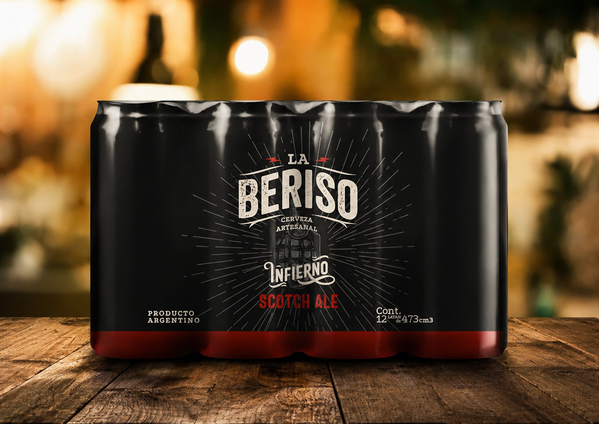
- Matte Black Visual Canvas: A deep black base color that unifies the product line and evokes night-time rock aesthetics, projecting an imposing shelf presence.
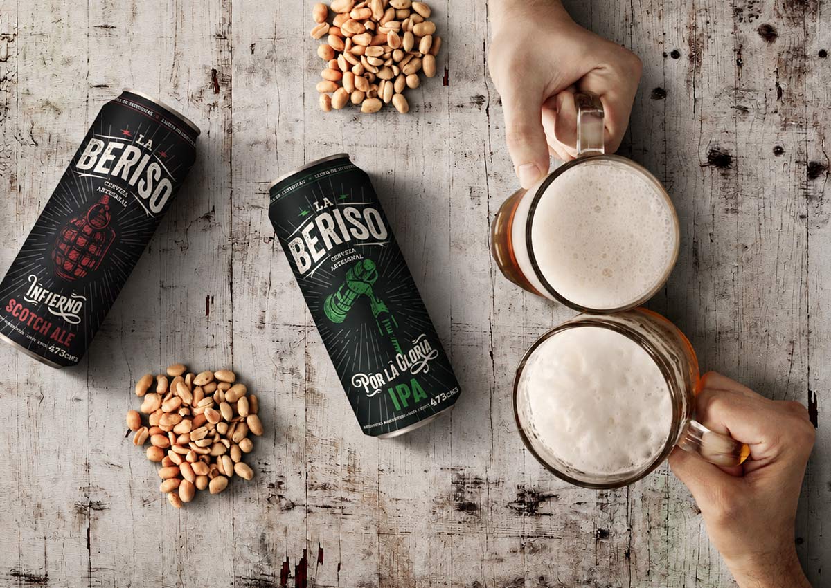
- Conceptual Iconography Illustrations: Custom illustration system incorporating symbolic elements—such as grenades, boxing gloves, and microphones—connecting directly with the band’s lyricism.
- Song-Title Naming Strategy: Naming each flavor after iconic songs ("Por la Gloria" for IPA and "Infierno" for Scotch Ale), transforming style names into brand identity statements.
- Character-Driven Typography: A bold typographic hierarchy blending La Beriso's iconic logotype with craft beer aesthetic codes.
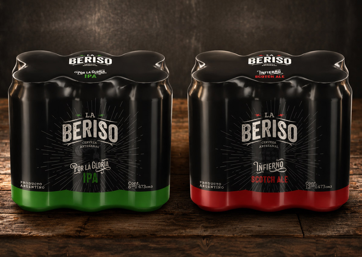
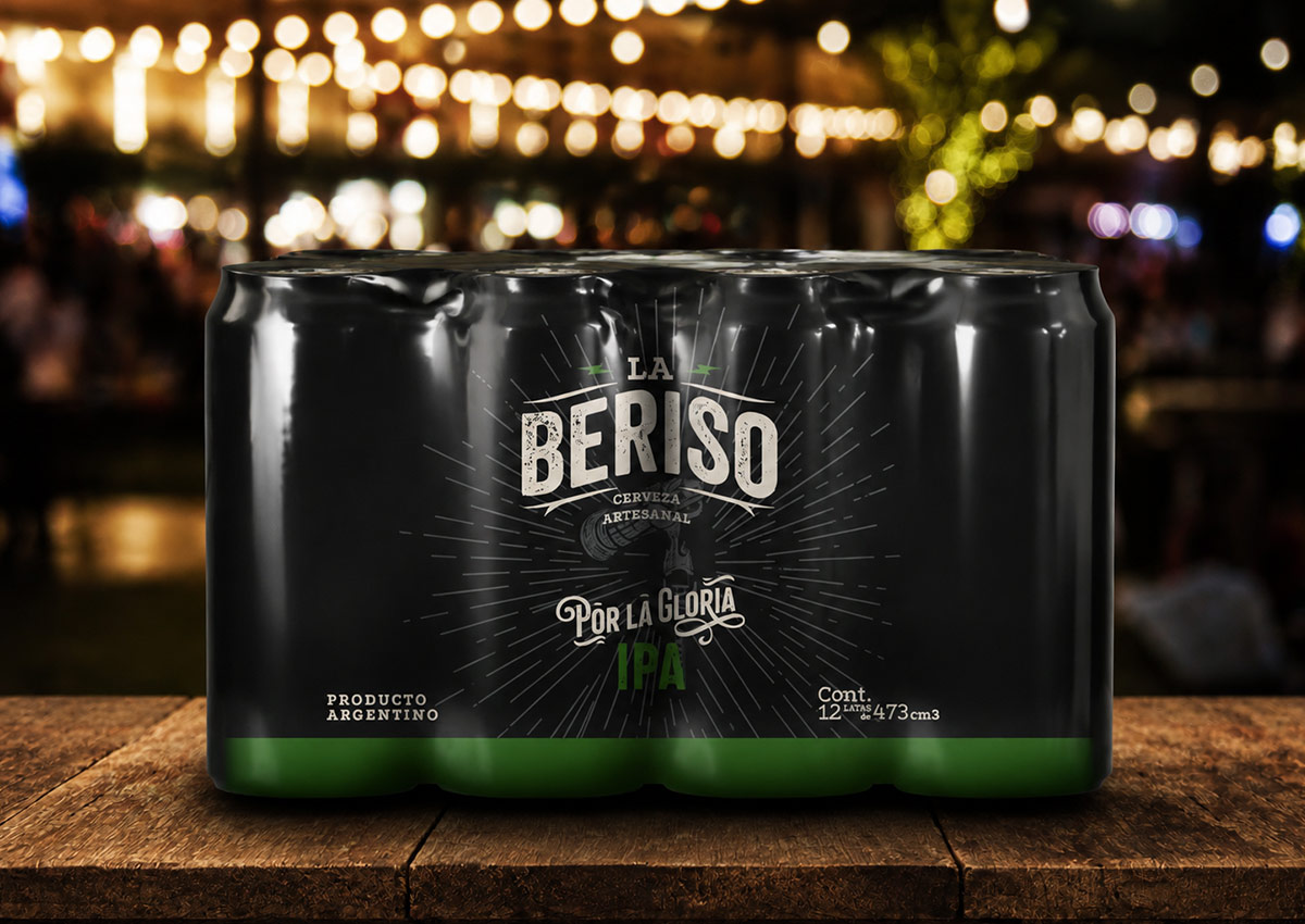
- Balanced Line Architecture: A tailored visual framework harmonizing band identity with craft beer style cues, allowing each variant to amplify the collection.
The Challenge
The central challenge involved celebrating La Beriso’s two decades of music through a physical product that felt like an authentic, collectible extension of the live show experience rather than a generic promotional item. The band and brewery needed to translate the energy and camaraderie of Argentine rock into a multi-can packaging format capable of standing out on supermarket shelves in Argentina and concert venue bars alike.
Our Design Process
Starting from a strategic brief, Imaginity developed an immersive visual storytelling concept connecting music with taste. Our team crafted detailed, symbolic illustrations on matte black backgrounds to express attitude and raw rock energy. We structured a cohesive brand architecture where flavor names paid homage to the band's hit songs, ensuring each can acted as a narrative piece. Working closely with prepress printing guidelines, we ensured high-contrast reproduction on aluminum cans and six-pack carrier packaging materials.
The Outcome
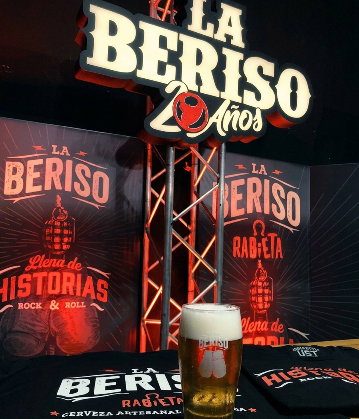
The collectible packaging redesign successfully merged rock culture with craft beer, creating immediate commercial impact following its launch in Buenos Aires and nationwide rollout across Argentina. By establishing an iconic, highly recognizable visual system, Imaginity strengthened the band's emotional connection with fans, enhanced in store marketing performance, and enriched our portfolio with a high-profile beverage line.
Imaginity is a global packaging design agency specializing in consumer packaged goods (CPG), partnering with market-leading beverage, beer, craft beer, food, and FMCG companies across Argentina, Latin America, and international markets. Combining strategic branding, custom visual identity, disciplined brand architecture, and prepress print expertise, our agency delivers impactful visual storytelling across our entire portfolio to optimize in store marketing performance and drive commercial growth for global brands.
Explore more beverage packaging storytelling and brand-evolution case studies.