Client:
Heineken Silver
Country:
Panamá
Task:
Packaging Design
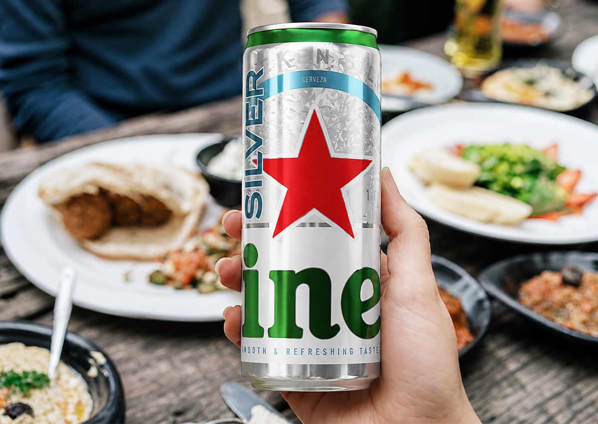
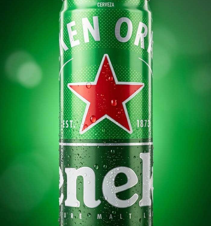
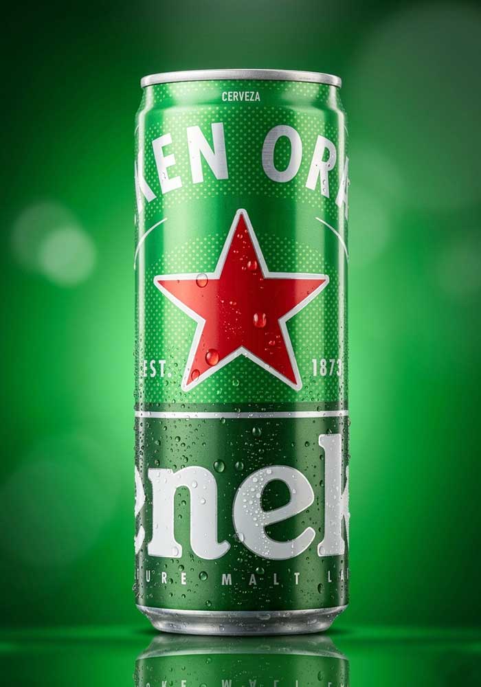
Heineken Silver: Strategic Packaging Adaptation & Sleek Format Launch
Heineken, a global leader in the international premium beer segment, partnered with Imaginity, global design agency, to lead the design adaptation for the launch of Heineken Silver in Panama. The project focused on transitioning the brand's iconic visual identity into the modern 310ml sleek can format. Our primary objective was to ensure absolute brand cohesiveness, maintaining the rigorous design standards of the Heineken Silver line while optimizing the graphics for a new physical dimension and consumer touchpoint.
Imaginity | Design Agency | Branding, Packaging Design, Marketing
Visual Highlights
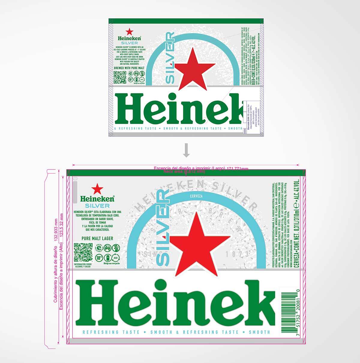
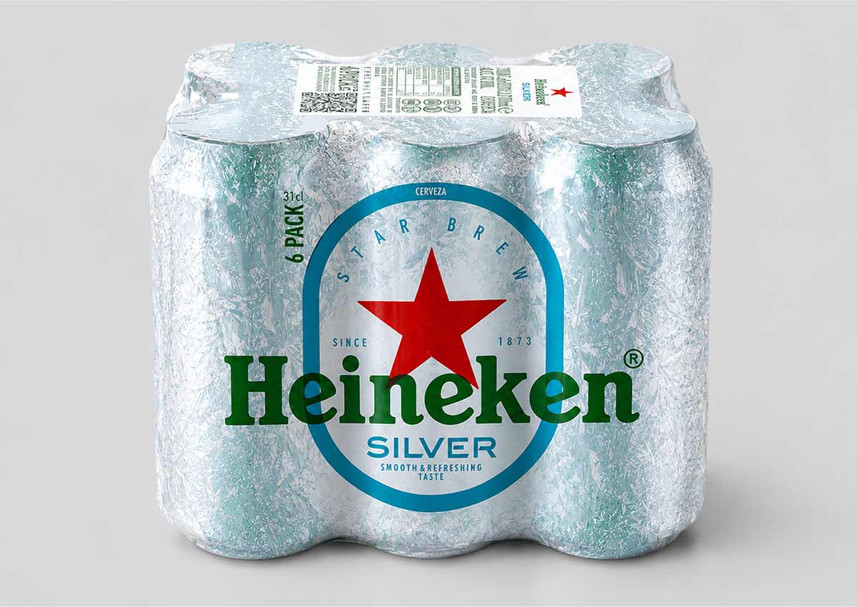
- Sleek Format Optimization: Precise adaptation of the brand’s visual assets to fit the 310ml "sleek" profile, enhancing the product's modern and premium feel.
- Global Brand Consistency: Rigorous application of Heineken Silver’s signature color palette and typography to ensure an unmistakable presence across all packaging formats.
- Technical Packaging Precision: Expert management of printing constraints and metallic finishes to maintain the "Silver" brand’s characteristic luminosity and "extra-refreshing" appeal.
- Regional Market Activation: A strategic entry into the Panamanian market, leveraging a format that resonates with contemporary on-the-go and social consumption trends.
- Unified Brand Architecture: A seamless integration into the existing Heineken portfolio, ensuring the sleek can feels like a natural extension of the global product line architecture.
1. The Branding Challenge: Maintaining Global Rigor in New Formats
The primary objective of the Heineken Silver project was to open the brand to new packaging formats without diluting its premium identity. In the world of global beverage giants, "rigor" is the keyword. The challenge lay in translating the established visual language of a standard can into the taller, thinner sleek format, ensuring that every design element—from the iconic red star to the turquoise accents—retained its proportional integrity and impact.
2. Our Design Process: Precision Engineering for Premium Identity
Our team led the technical and creative adaptation process, focusing on the premise of "unbroken cohesiveness. By adhering to strict global design guidelines while acknowledging local market logistics in Panama, we achieved a result that provides the exact same brand experience across every support and format.
3. The Outcome: Seamless Expansion in the Panamanian Market
The result is a successful product line expansion that reinforces Heineken Silver’s position as a modern, premium choice for Panamanian consumers. Through Imaginity’s strategic design application, the new sleek can has achieved immediate recognition on the shelf. This project demonstrates our capability to manage high-stakes brand guardianship for international leaders, proving that technical precision and aesthetic consistency are the foundations of successful global expansion.
This international beverage packaging project highlights Imaginity’s expertise in brand consistency and format adaptation. Consistent with our work in strategic brand architecture and high-volume packaging design, we have ensured that Heineken continues to set the standard for premium excellence..