
Wise Snacks: 100 Years of Flavor, Refreshed by Imaginity
From retro editions to new packaging, Imaginity modernized Wise Snacks’ look while honoring 100 years of flavor and brand equity.
A Century of Flavor
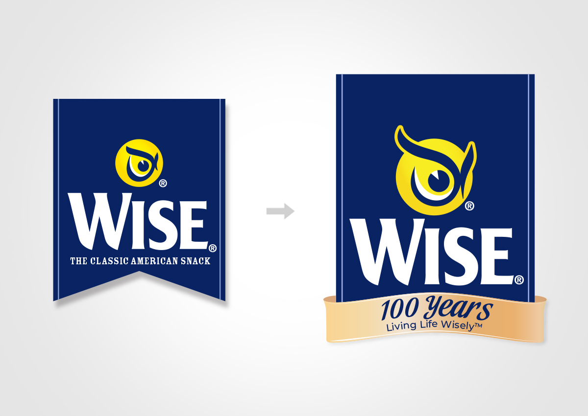
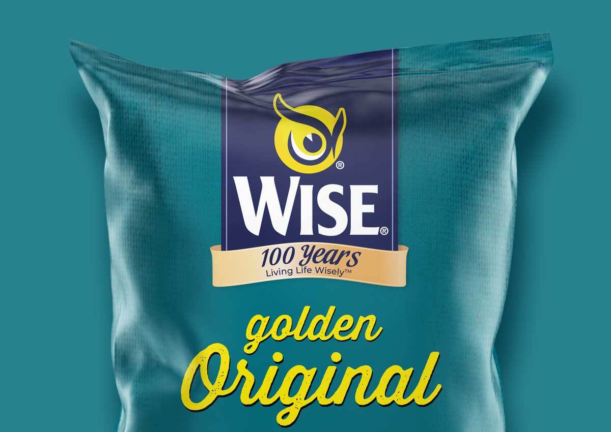
Wise Snacks, an iconic American snack brand, partnered with Imaginity to celebrate its centennial and lay the groundwork for the next century. Through a variety of initiatives, from limited editions to complete packaging redesigns, and leveraging our extensive experience as a packaging design agency, we contributed to the evolution of the Wise brand through storytelling, visual consistency, and intelligent design systems.
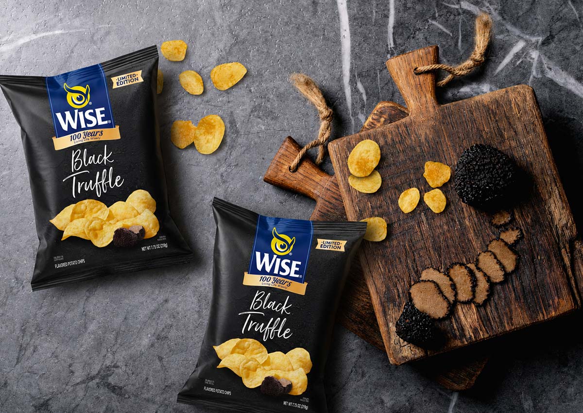
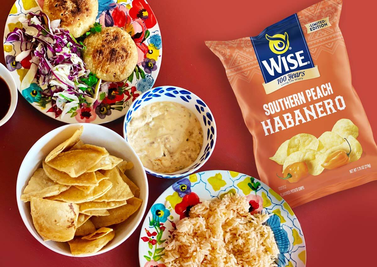
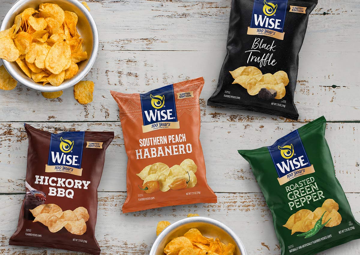
We also focused on expanding the product lineup with bold new flavors, each requiring its own standout identity while remaining unmistakably part of the Wise family. Through carefully crafted visuals, flavor-specific color cues, and consistent brand architecture, we ensured that each variety feels fresh yet familiar—strengthening brand recognition and supporting continued growth across shelves and channels.
100-Year Anniversary: Retro Packaging Edition
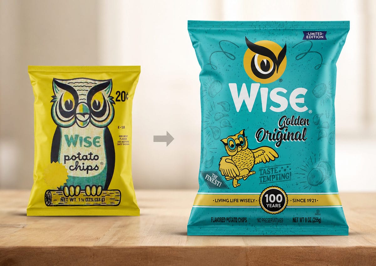
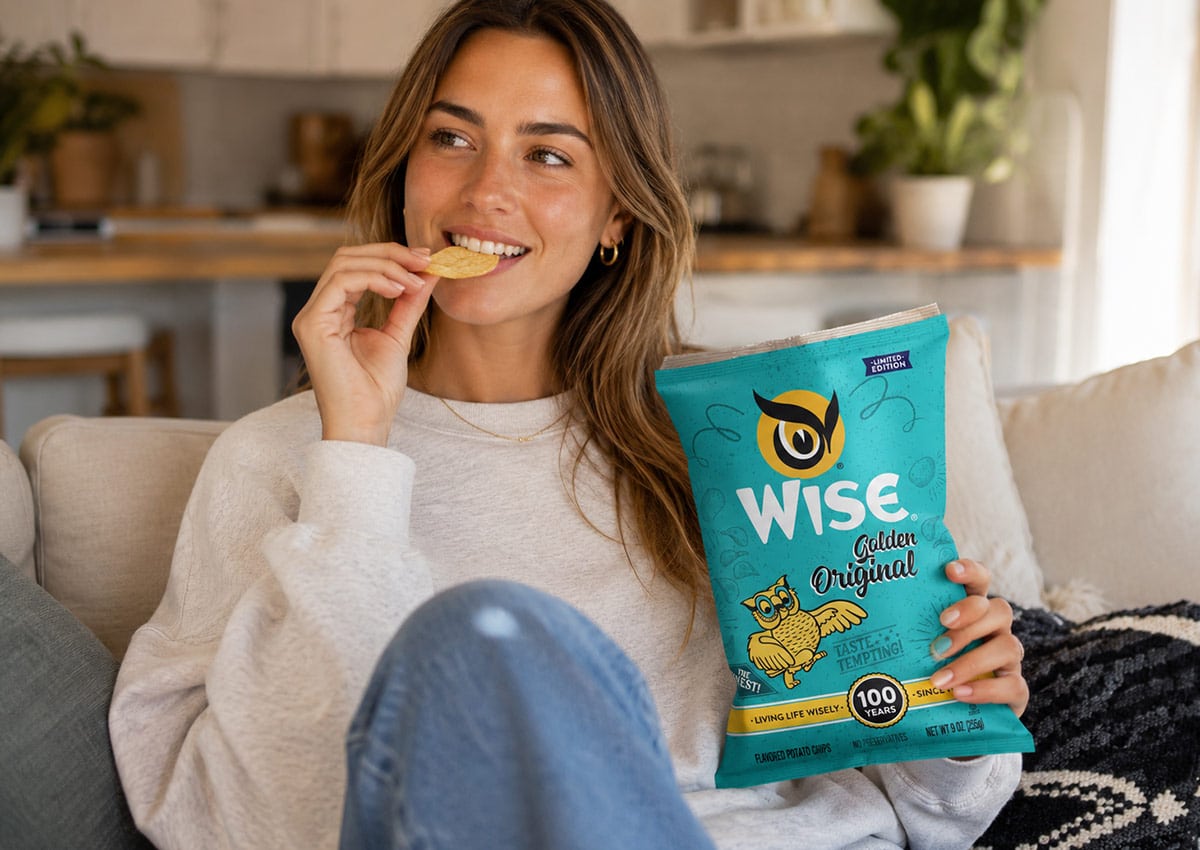
To celebrate Wise Snacks’ centennial, we brought the brand’s rich legacy to life through a special anniversary edition with a nostalgic twist. We modernized the iconic vintage logotype and developed a dedicated 100-year brand implementation that honors the past while looking ahead. The owl’s eye—one of Wise’s most recognizable brand elements—was redesigned to feel more elegant and prominent, reinforcing the character of the brand in a refined, timeless way. The result was the same trusted Wise product, reimagined through retro packaging design for heritage brands. The new look connects with longtime fans while bringing celebratory distinction to today’s shelf.
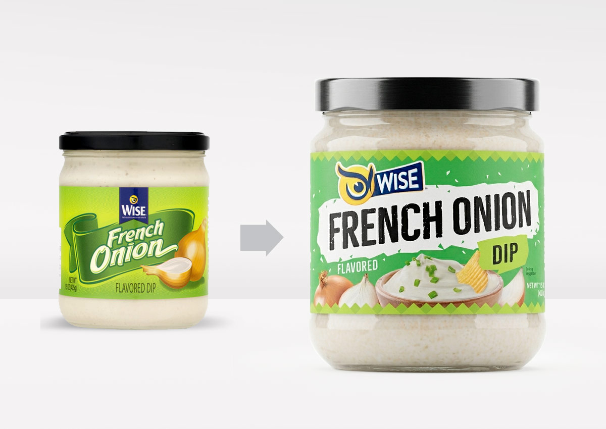
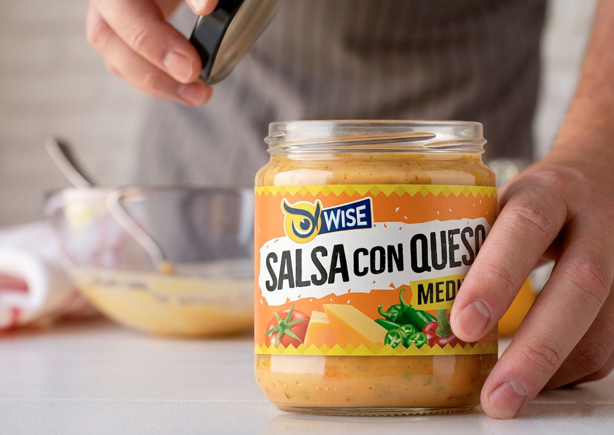
Wise’s dip range—French Onion and Salsa con Queso—received a packaging overhaul to align with the brand’s updated visual system. The challenge was to modernize the packaging while enhancing appetite appeal and clarity on shelf. We used rich ingredient imagery, clear flavor coding, and updated typography to elevate the products’ perceived quality. The result: a family of products that feels both familiar and freshly relevant.
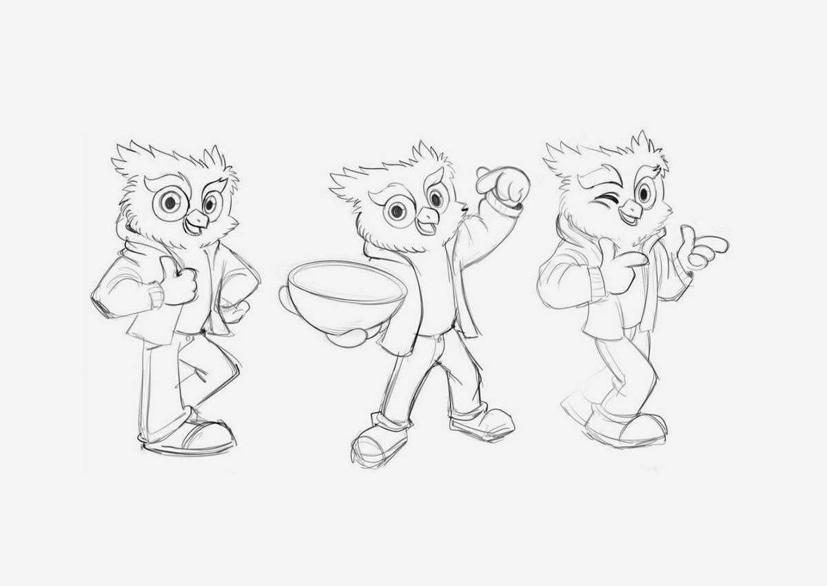
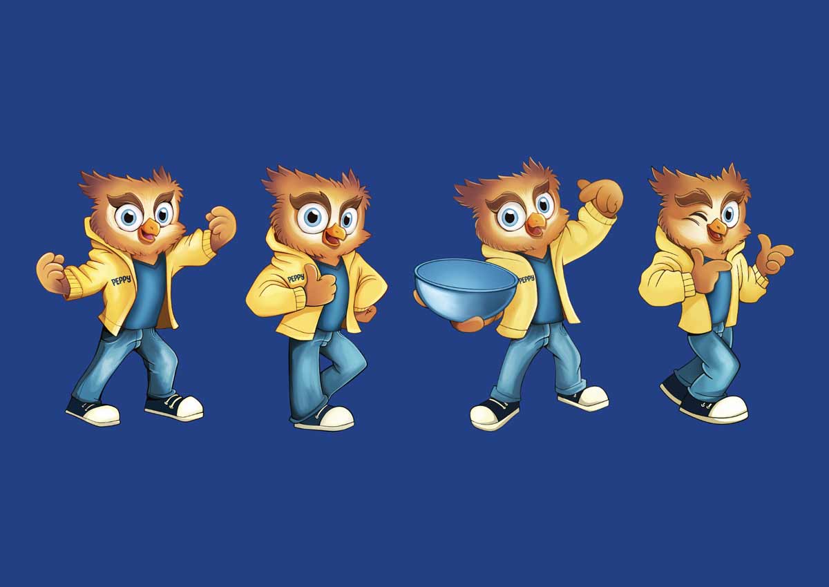
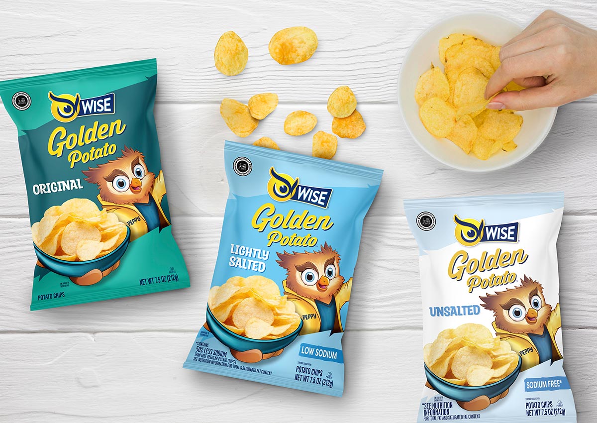
Peppy, Wise’s beloved mascot, has long symbolized the brand’s personality. Our task was to evolve Peppy’s presence so that he could live across today’s diverse packaging needs. We re-illustrated Peppy in a more expressive, dynamic pose, making him feel both timeless and energetic. His new posture (holding a bowl of chips) was designed to integrate him seamlessly into the pack layout, turning him into an active brand ambassador rather than a static icon.
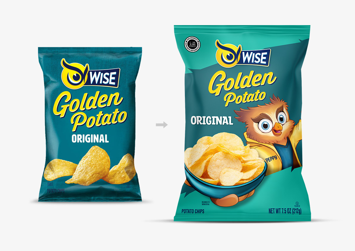
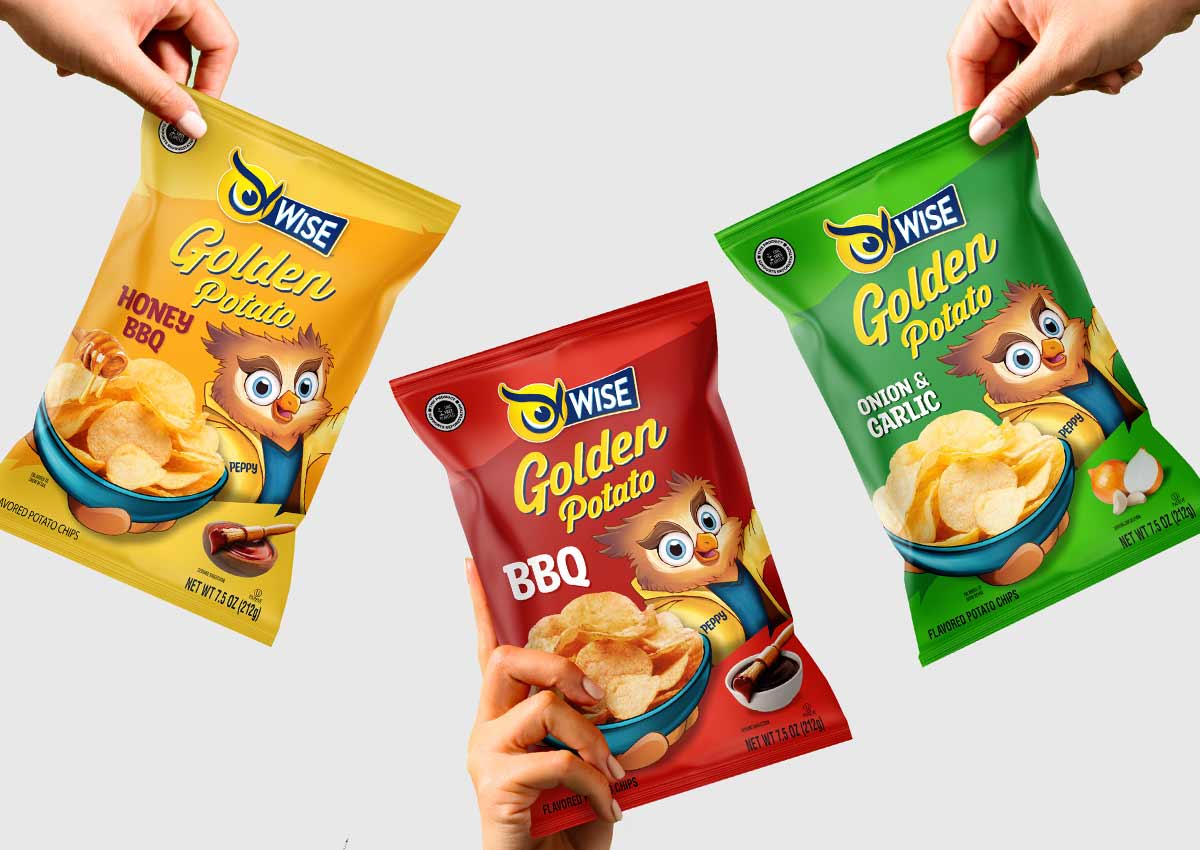
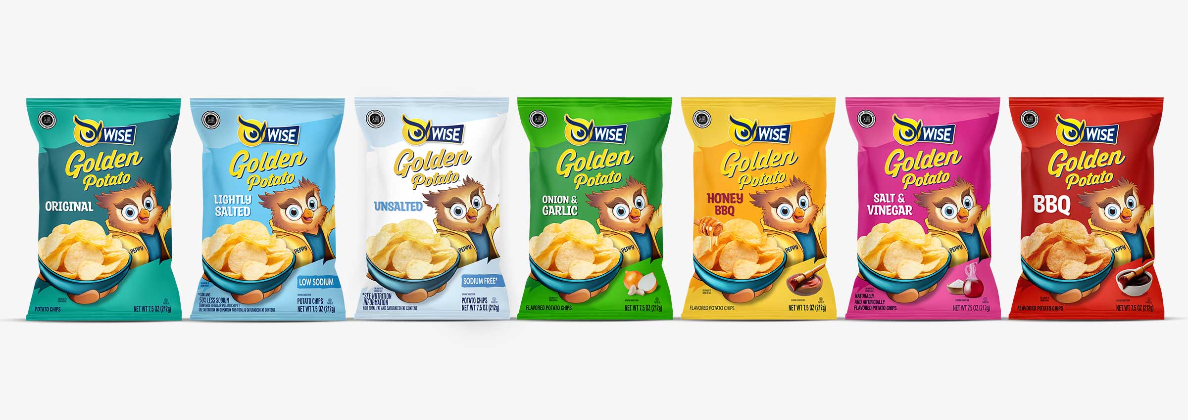
We redesigned the full Golden Original line to incorporate the evolved Peppy and strengthen the brand’s visual system. Using clean layouts, color-coded sodium levels (from Regular to Unsalted), and improved flavor callouts, we created a more structured and scalable architecture. Peppy’s role was carefully calibrated for each pack—he doesn’t just appear, he participates. This approach brought cohesion to the lineup while allowing each SKU to communicate clearly.
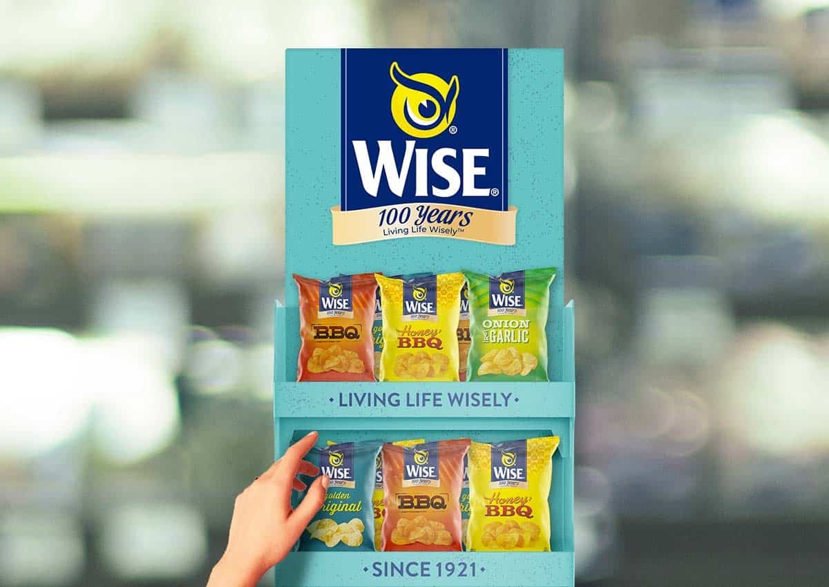
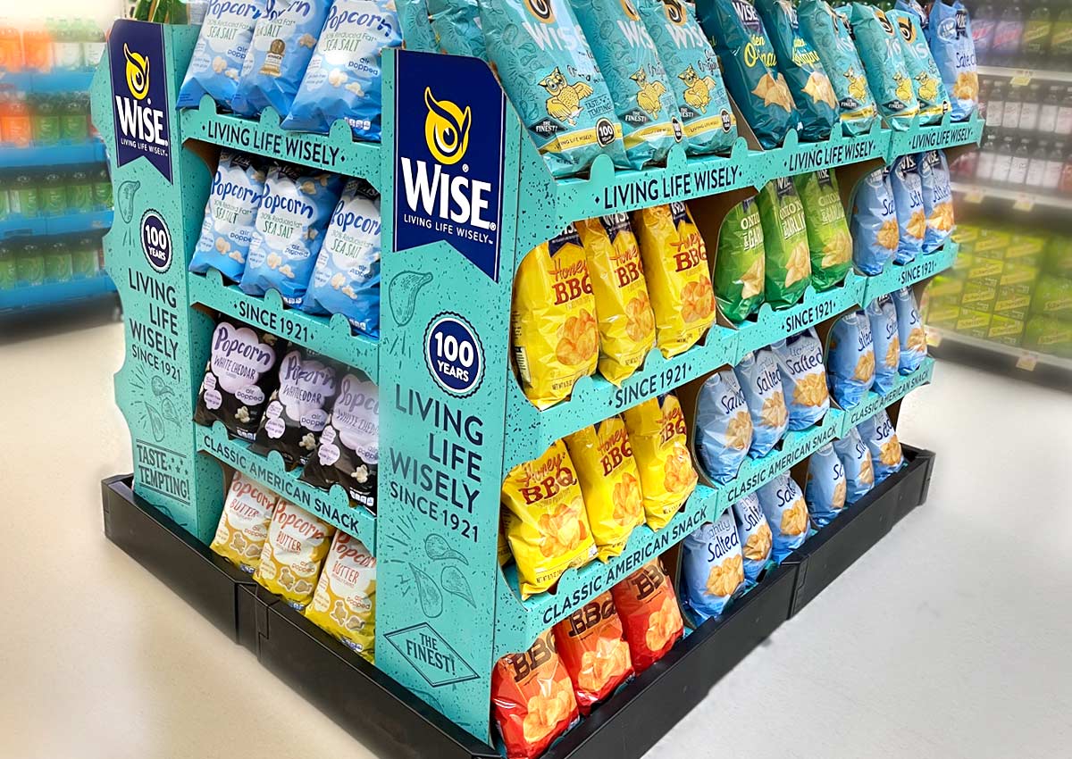
To amplify the impact of Wise Snacks’ 100-year anniversary, we extended the brand refresh into the shopper marketing space with custom in-store displays. These special edition units were designed to showcase the anniversary packs, bringing visibility and excitement to the point of sale. Bold, celebratory graphics combined with the tagline “100 Years Living Life Wisely” reinforced the milestone and invited shoppers to engage with the brand in a fresh, memorable way—turning retail environments into immersive brand moments.
1. Use Heritage as a Springboard, Not a Limitation:
Wise’s 100-year story was a valuable asset—but it became even more powerful when connected to fresh, modern execution.
2. Mascots Can Evolve Without Losing Recognition:
Peppy’s redesign honored the past but gave the character new energy and flexibility across formats.
3. Category Design Systems Matter:
Wise’s Golden Potato line features seven flavor varieties, unified through a cohesive design system that maintains brand consistency while clearly distinguishing each flavor through color and detail.
4. Special Editions Can Reignite Brand Love:
The retro pack didn’t just sell product—it created emotional connection and brand storytelling in physical form.
5. Packaging Design Fuels Shopper Marketing at Retail:
Packaging becomes a platform for in-store engagement. Wise’s 100-year anniversary packs extended into shopper marketing with custom displays, turning the packaging into a retail experience that captured attention and reinforced the celebration at the point of sale.
What Wise Shows About Heritage Across Diverse U.S. Audiences
Wise Snacks was not a Hispanic-market assignment, but the project demonstrates a challenge shared by many heritage brands serving a diverse U.S. audience: how to modernize familiar assets without weakening the recognition accumulated over time. Longtime shoppers may connect with the logo, Peppy the Owl and established flavor cues through personal memory, while younger consumers encounter those same assets within a contemporary retail environment.
The design system gives the brand room to address both groups. Heritage elements remain visible and recognizable, while clearer hierarchy, expressive character design and organized flavor coding make the portfolio easier to navigate. This balance between familiarity and renewal is relevant to any brand whose consumers include several generations or cultural relationships to the product.
For Hispanic and Latin American heritage brands, the same principle requires additional audience distinctions. Country of origin, generation, language preference and product familiarity can change which assets carry recognition and which need explanation. Our U.S. Hispanic market segmentation guide examines those variables.
Teams applying heritage equity specifically to Hispanic consumers can also explore Imaginity’s approach to Hispanic branding and packaging design in the U.S.. The Wise project remains a U.S. heritage-brand example, while the principles of recognition, generational continuity and controlled evolution can inform a broader multicultural strategy.
A U.S. CPG PACKAGING DESIGN CASE STUDY
The Wise Snacks work shows how packaging design can help a heritage U.S. CPG brand stay recognizable while becoming more flexible for modern retail. By refreshing Peppy the Owl, organizing the product line, and creating stronger visual consistency across flavors and formats, Imaginity helped the brand protect its existing equity while building a clearer system for future growth.
This type of work connects directly to CPG packaging design, brand architecture for product lines, and packaging systems built for U.S. retail and e-commerce.
Results
The documented outcome is a coordinated design system spanning anniversary identity, retro editions, mascot evolution, core-line packaging and point-of-sale applications. The work gave Wise a consistent way to use heritage assets while distinguishing flavors, sodium variants and special programs across the portfolio.
For a similar packaging-system engagement, review Imaginity’s packaging design service. For focused food-category considerations and an adjacent internal route from this snack case, explore our cookies and crackers packaging experience.
Explore the Wise Snacks system
Discover how the Wise brand evolved across packaging, mascot design, anniversary identity, special editions, and retail activation: