
How Packaging Design Shapes Brand Image in the U.S.

From first recognition to everyday use, the pack gives consumers a working picture of what a brand means
Brand image is not created in one campaign. It accumulates through encounters: a product recognized from across an aisle, a claim understood in an online listing, a structure that works smoothly at home, or a range that remains familiar as new products appear.
For consumer goods brands, packaging is present in many of those encounters. It identifies the product, frames expectations of quality, organizes the portfolio and becomes part of the experience after purchase. In the U.S., it must often perform across mass retail, grocery, club, convenience, pharmacy, Amazon and retailer ecommerce—sometimes in a shopper's hand and sometimes as a small image on a phone. That makes packaging a powerful contributor to brand image, but not a substitute for the product, price, service or communication around it.
The pack earns its role when the promise outside matches the experience inside. Brand image and brand equity are related, but they are not identical.
Brand image describes the associations people hold; brand equity is the value created by recognition, preference, loyalty and other responses. For the evidence and measurement question, read Can Packaging Design Drive 20% of Brand Equity?
1. Brand image begins with recognition


Before a package can communicate personality, quality or purpose, people need to know which brand they are looking at. Recognition comes from a system of cues: the brand mark, color relationships, typography, structure, illustration, imagery and the way those elements occupy the pack.
The strongest cues are not necessarily the largest or most fashionable. They are the ones that consumers connect to the brand consistently. A familiar color block may do more recognition work than a new campaign line. A structural silhouette may remain identifiable even when the label cannot be read.
A recurring illustration style may connect products that use different formats. This is where redesign becomes a strategic decision. Modernization can improve clarity and relevance, but novelty is not the objective by itself.
The team first needs to identify which assets already carry memory, which have become weak or generic, and which changes would make the brand easier to recognize without making it unfamiliar. For a global brand entering or expanding in the U.S., recognition also has to survive new retail conditions.
A design developed for one shelf configuration, language environment or channel may need adjustment, but the valuable brand cues should remain visible enough to transfer existing memory.
2. The pack sets expectations at the moment of choice


Packaging gives shoppers an immediate theory of the product: what it is, who it is for, what benefit it offers and what level of value to expect. Those judgments may be revised after purchase, but they begin before the product can prove itself.
In a 2018 Ipsos survey conducted for the Paper and Packaging Board, 72% of U.S. adults agreed that packaging design often influenced their purchase decisions. This is self-reported survey evidence rather than observed sales behavior, but it underlines the pack's visibility in the U.S. choice process. The physical and digital shelf create different constraints.
In a store, the design competes at distance, beside adjacent products and variants. Online, the front panel may be reduced to a thumbnail and surrounded by prices, ratings, badges and retailer interface elements. A strong packaging system keeps the brand, product type and variant understandable in both settings.
The objective is not maximum visual intensity. It is useful priority. Shoppers should be able to identify the brand, understand the product and find the information most relevant to the occasion without decoding several competing messages. For a closer examination of the point-of-choice environment, read how packaging cues influence brand perception in U.S. retail.
3. Quality is promised before it is experienced


People use packaging as evidence when the product itself cannot yet be evaluated. Image quality, typography, print execution, material choices, closure behavior and information clarity can all contribute to expectations of care, efficacy, freshness, indulgence or value.
Those signals are contextual. Minimalism does not automatically mean premium. Matte materials do not carry one fixed meaning. Bright color can communicate energy in one category and low credibility in another. What matters is the relationship between the cue, the category, the price position, the audience and the product promise.
The U.S. market adds another layer: consumers encounter brands across different regions, communities, retail formats and cultural references. A design should not assume that one visual code speaks identically to everyone. It should establish a clear brand point of view while checking how language, imagery, claims and symbols will be interpreted by the audiences in scope. Imaginity's work on visual identity and packaging for multicultural, omnichannel America explores that broader context.
Expectation also creates responsibility. If a package signals premium quality but the structure feels unreliable, the contradiction becomes part of the brand image. If the front panel suggests simplicity while the information is difficult to navigate, the experience undermines the promise. Design earns trust when expression and performance agree.
4. A portfolio builds one brand—or fragments it


Brand image is shaped by the whole range, not only by the hero SKU. Each extension can reinforce the brand's recognizable system or weaken it with another exception.
A coherent portfolio makes several relationships clear at once: what belongs to the master brand, which products belong together, how variants differ, and where tiers or formats change the offer. Consistency creates recognition; controlled variation makes the range usable. If everything changes, the brand disappears. If nothing changes, the portfolio becomes difficult to shop.
This balance becomes especially important when a brand moves between U.S. channels. Club packs, convenience formats, multipacks, ecommerce images and regional assortments may require different proportions and information, but they should still appear to come from the same brand system.
Clear product line architecture establishes the rules behind that consistency: brand position, product naming, variant coding, benefit hierarchy and the elements that can flex. The result is not visual repetition for its own sake. It is a portfolio that grows without asking shoppers to relearn the brand with every launch.
5. Trust continues after purchase

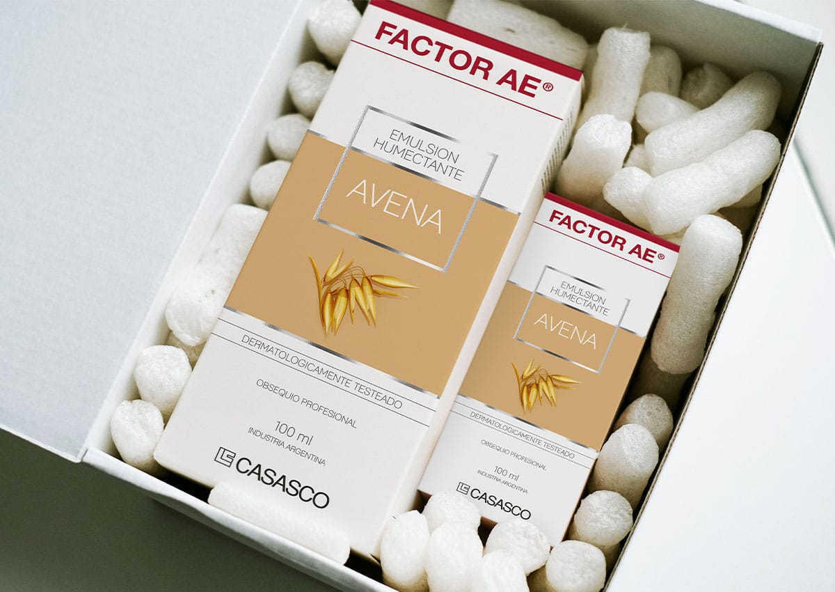
The brand image created by packaging does not end at checkout. The pack may be opened, poured, carried, stored, resealed, read and discarded. These interactions turn visual promises into lived experience.
A structure that protects the product, instructions that are easy to follow and a format that fits the intended routine can reinforce competence. A leaking closure, confusing dose or hard-to-read panel can do the opposite. For many consumer goods, packaging is one of the few parts of the brand experience that remains physically present throughout use.
Trust also depends on the precision of what the pack says. Product, ingredient, performance and environmental claims should be specific enough to understand and supportable in practice. Symbols, colors and material effects should not imply more than the brand can substantiate. The design can make information accessible and engaging, but it cannot replace the evidence behind the claim.
The strongest packaging systems therefore align three things: what the brand intends to communicate, what people understand at the point of choice, and what the product and package deliver after purchase. When those layers agree, repeated encounters can strengthen a coherent brand image.
What U.S. brand teams should review before a redesign
A useful packaging review should move beyond “Do we like it?” and examine what the current and proposed designs ask consumers to recognize, infer and do.
-
- Recognition: Which visual or structural assets already identify the brand?
- Product clarity: Can shoppers understand the product type and primary benefit without unnecessary effort?
- Variant navigation: Are flavors, formats, tiers or use cases easy to distinguish?
- Positioning: Do the complete design and materials support the intended price and brand meaning?
- Retail context: Does the design work in the actual competitive set, not only in a presentation?
- Digital context: Are the brand, product and variant clear at retailer-thumbnail size?
- Audience interpretation: Have language, imagery and symbols been reviewed with the U.S. audiences and markets in scope?
- Use experience: Does the structure deliver the convenience, protection and clarity the design promises?
- Claim credibility: Can product and environmental claims be understood and substantiated?
- Continuity: Does the redesign protect valuable memory while giving the brand room to evolve?
The answers give the design brief a strategic point of view. They also create criteria against which concepts can be evaluated before taste or internal preference takes over the discussion.
From brand image to measurable brand value


How does packaging design affect brand image?
Packaging affects brand image by shaping recognition, expectations of quality, product understanding, portfolio consistency and the experience of using the pack. Those signals accumulate into a broader impression of what the brand means and how reliably it delivers.
Is brand image the same as brand identity?
No. Brand identity is the system a company creates to express the brand. Brand image is the impression audiences form from that identity and their wider experience. Packaging connects the two, but the intended message and the received impression are not always the same.
What packaging elements influence brand image most?
The answer varies by brand and category. Brand marks, color, typography, imagery, structure, materials, information hierarchy and ease of use can all contribute. Their value comes from how clearly and consistently they work together, not from one isolated design feature.
Should an international brand redesign its packaging for the U.S.?
Not automatically. The first step is to determine which assets carry recognition and which aspects create friction in U.S. retail, ecommerce, language or portfolio conditions. Adaptation should solve a defined market problem without discarding equity that can transfer.
How should packaging be evaluated before launch?
Review it in a realistic competitive set, at physical viewing distance and digital-thumbnail size. Test brand linkage, product comprehension, variant navigation, intended associations and expected quality. Where the decision warrants it, connect pre-launch research to in-market brand and commercial measures.
Build a packaging system that expresses one clear brand across every encounter
Imaginity works with consumer goods teams on packaging systems designed for recognition, clear portfolio navigation and consistent performance across physical and digital retail.
Explore Imaginity's CPG packaging design services or discuss the brand, portfolio and market decisions behind your next packaging project.
Research note
Ipsos (2018), “Most Americans Say That the Design of a Product’s Packaging Often Influences Their Purchase Decisions”. The finding refers to a U.S. online survey conducted for the Paper and Packaging Board and represents self-reported influence, not observed purchase behavior.