LATIN AMERICA
Design Experience
![]()
A leading design agency with a notable presence in Latin America, Imaginity has garnered a reputation for excellence in branding, packaging design, and shopper marketing
As a design agency with extensive experience across Latin America, we have successfully delivered impactful projects in countries such as Mexico, Colombia, Argentina, Chile, Paraguay, Ecuador, Uruguay, Panama, Nicaragua, and Costa Rica. Each country presents its unique cultural nuances, consumer behaviors, and market dynamics, which we carefully consider to create tailored branding and packaging solutions.
Across the region, from Mexico to Argentina, our designs have been adapted to cater to the specific needs and cultural preferences of each market, ensuring a seamless brand experience while maintaining local relevance.Whether it’s developing product listings, promotional materials, or packaging that aligns with the company’s commitment to efficiency and consumer satisfaction, our work contributes to solidifying their position as the dominant player in the region’s rapidly expanding digital marketplace.
LATAM - Regional WORK
Regional Work in Latin America for the Largest E-commerce Company
Our collaboration with the biggest e-commerce company in Latin America has spanned multiple countries, involving large-scale projects focused on creating a consistent and engaging brand experience across diverse markets. We’ve worked on developing digital assets, branding, and packaging solutions tailored to the fast-paced nature of online retail. This involved designing product packaging that not only stands out visually but also maintains functionality and sustainability to meet the demands of e-commerce logistics.
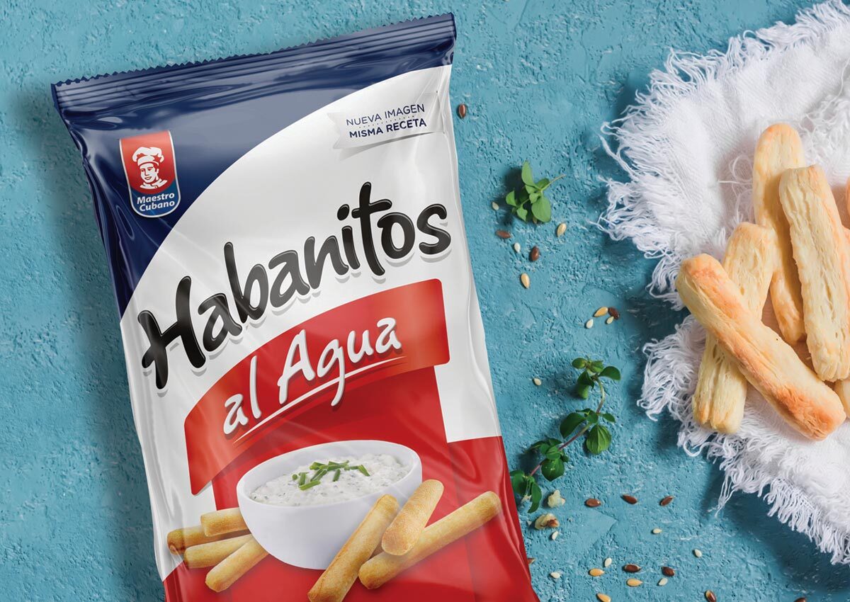
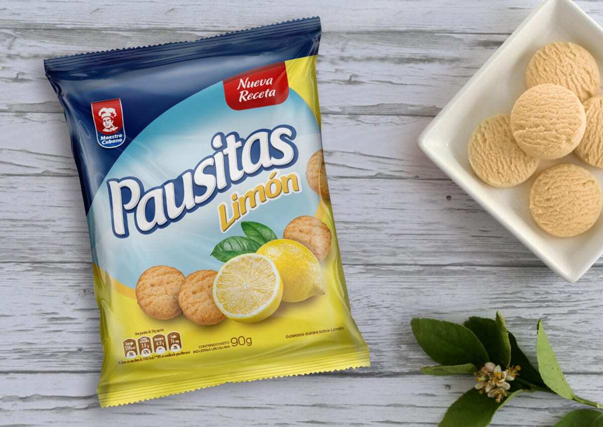
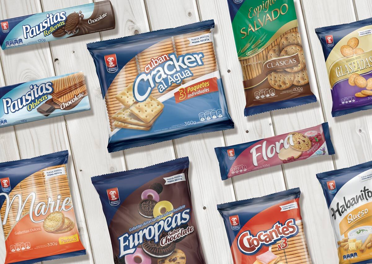
Regional Brands with Presence Across Latin America
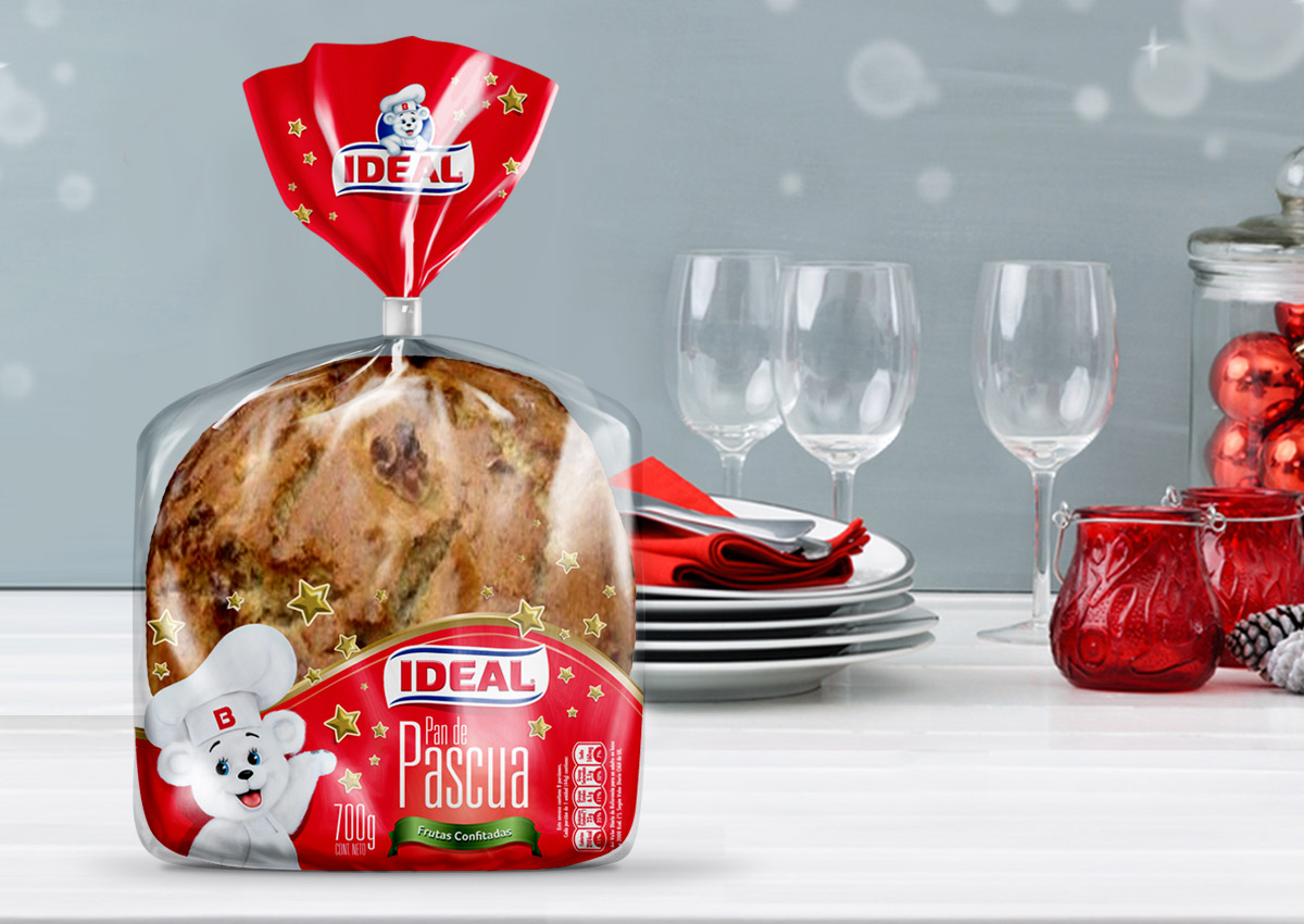
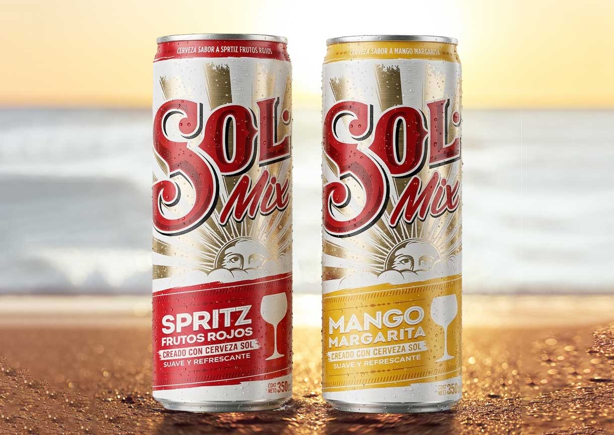
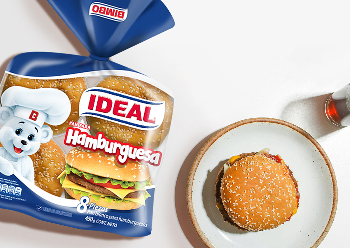
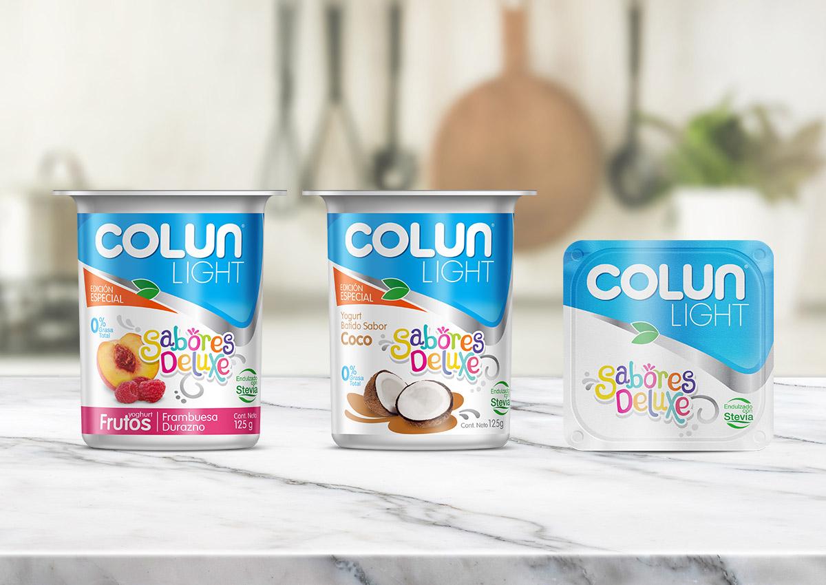
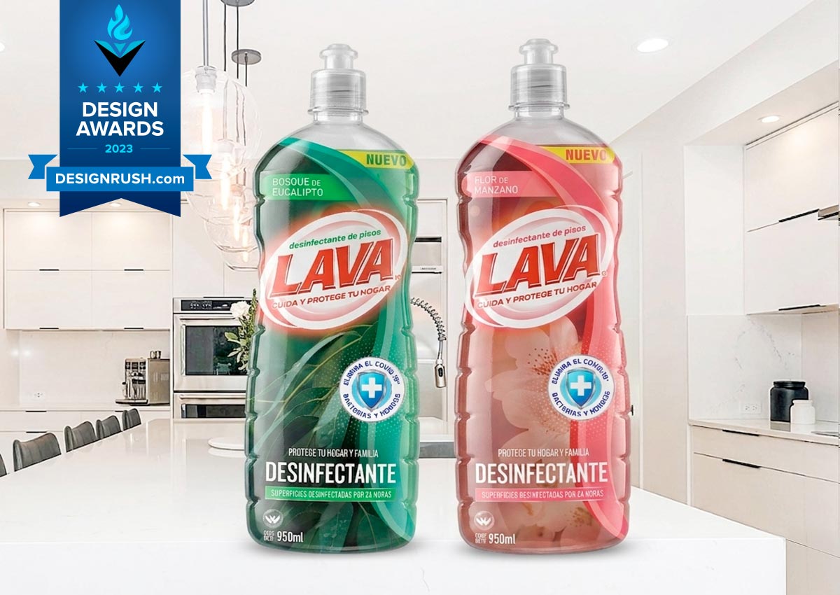
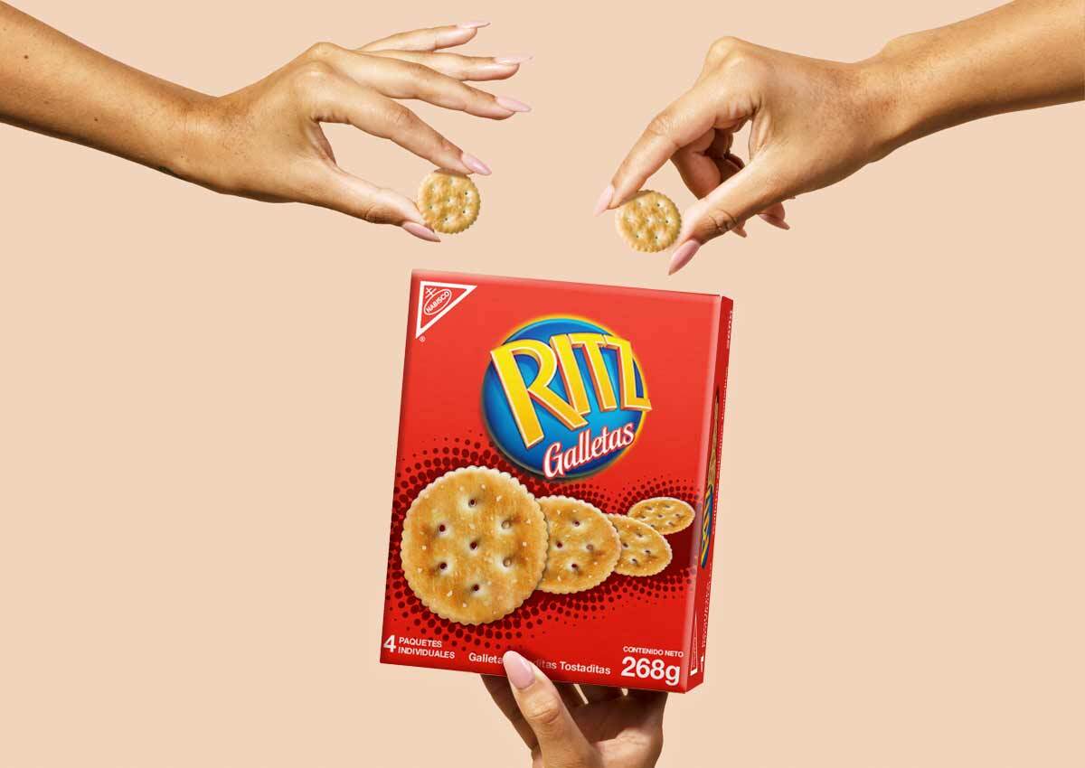
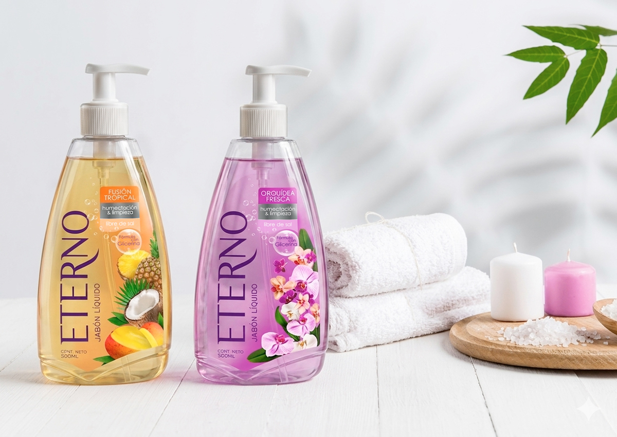
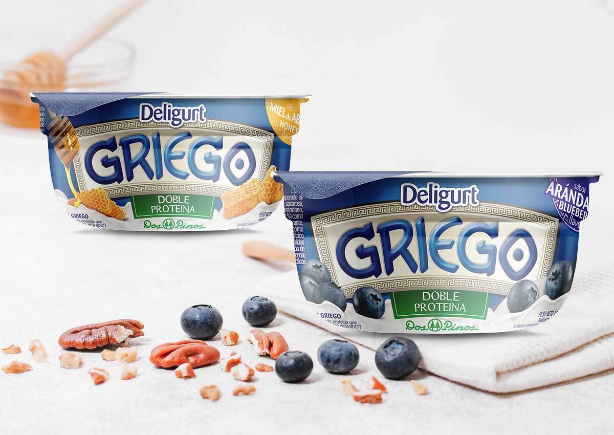
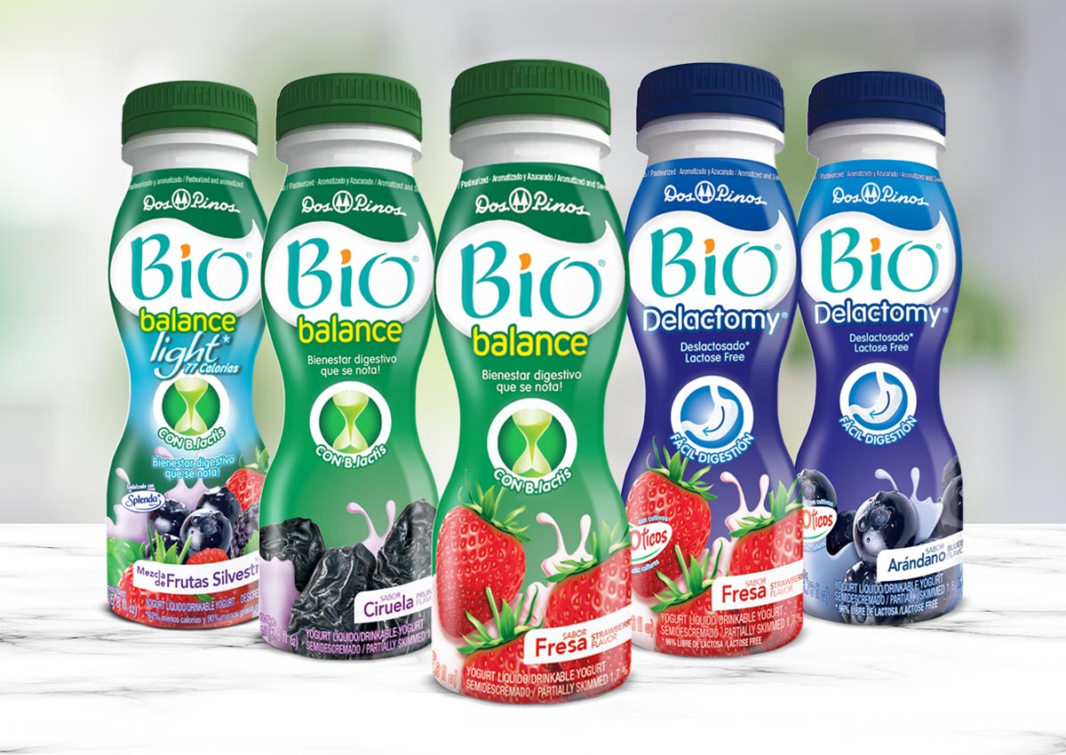
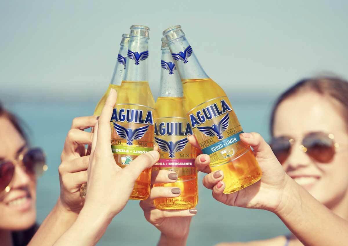
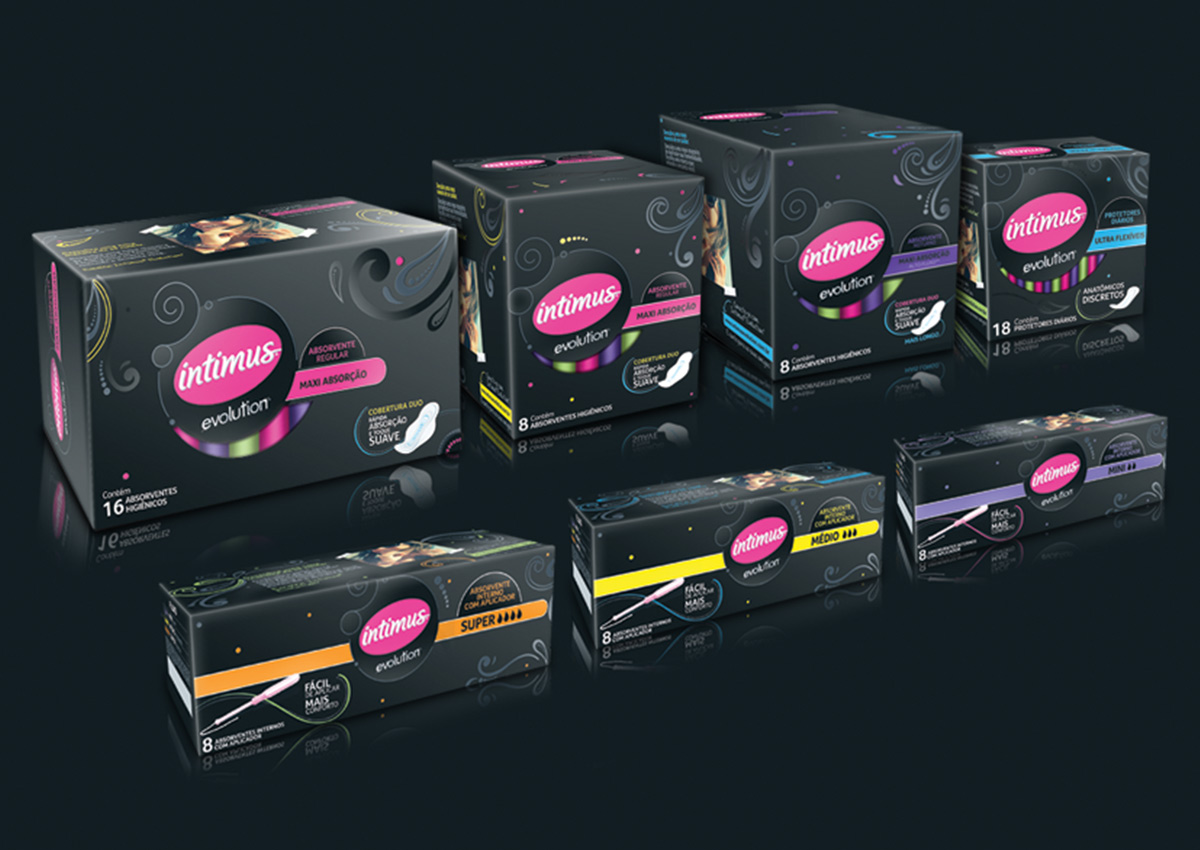
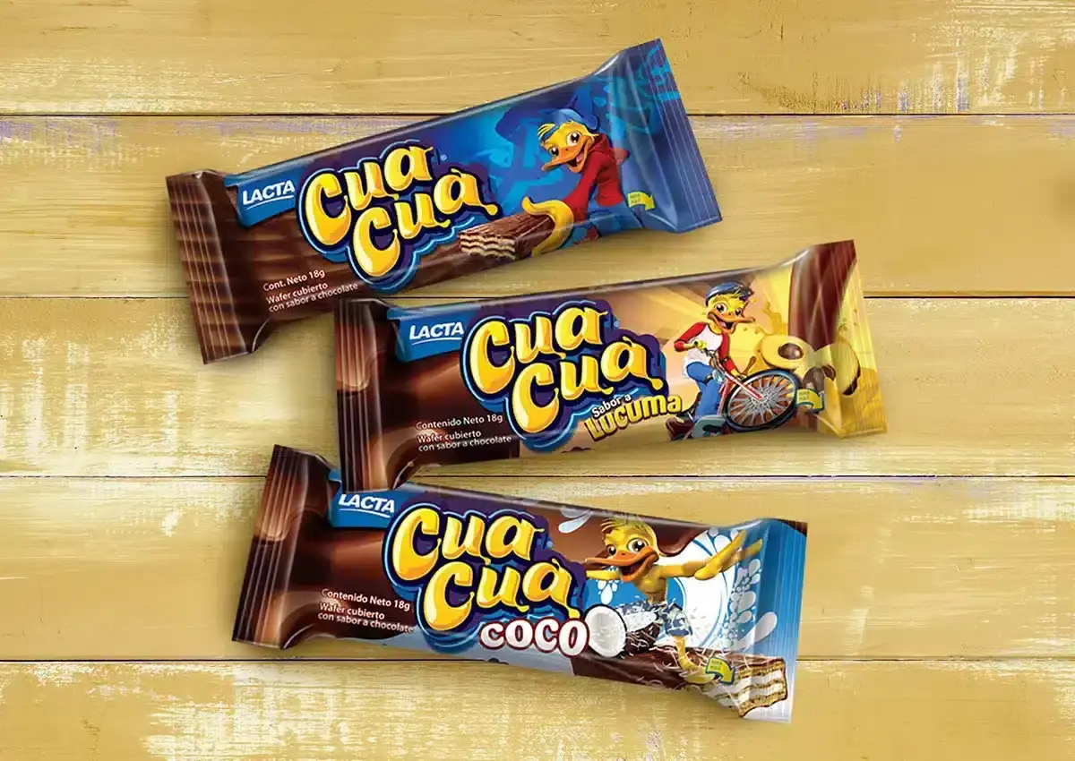
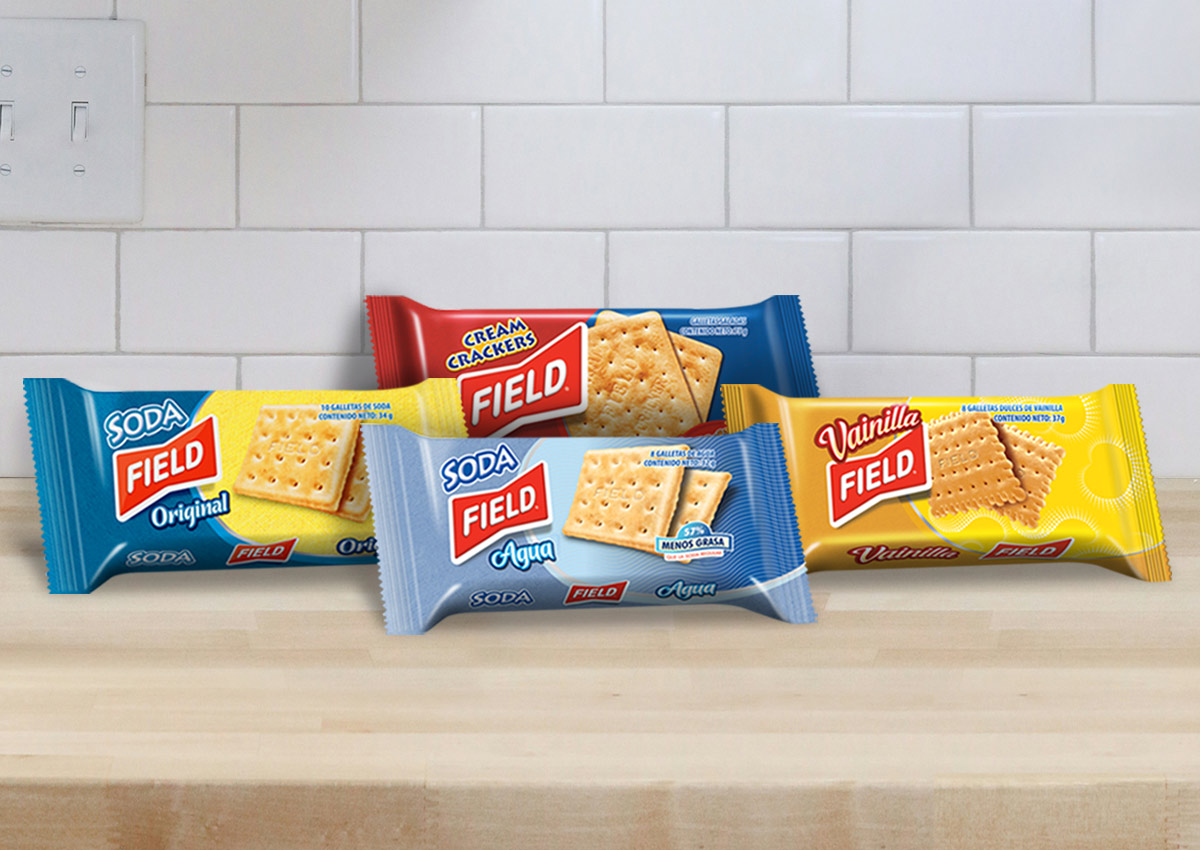
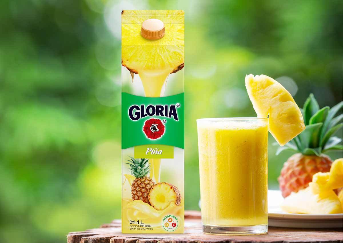
For regional brands with a footprint across multiple Latin American countries, we’ve designed packaging and branding solutions that resonate with diverse audiences while maintaining a cohesive brand identity. These projects often involve navigating the varying consumer preferences, regulations, and market dynamics of countries like Mexico, Colombia, Argentina, Chile, and Brazil, ensuring that the brands maintain a unified voice while appealing to local tastes. For example, we’ve worked with leading food and beverage brands, developing packaging designs that emphasize consistency across countries while allowing for customization in flavors, product offerings, and promotional campaigns. This work ensures that the brand identity is instantly recognizable across the region, while still allowing each market to feel uniquely catered to. Our designs are crafted to highlight the essence of the brand, making sure it resonates with both local and regional consumers, thus enhancing brand loyalty and visibility across Latin America. In addition to product packaging, we’ve been instrumental in creating regional marketing campaigns that reflect the cultural richness of Latin America. Whether it’s adapting promotional materials for different markets or conceptualizing region-wide campaigns that tap into shared experiences, our work has helped these brands maintain a strong presence in a highly competitive landscape.
MEXICO
A Dynamic Market for Bold and Culturally Rich Designs

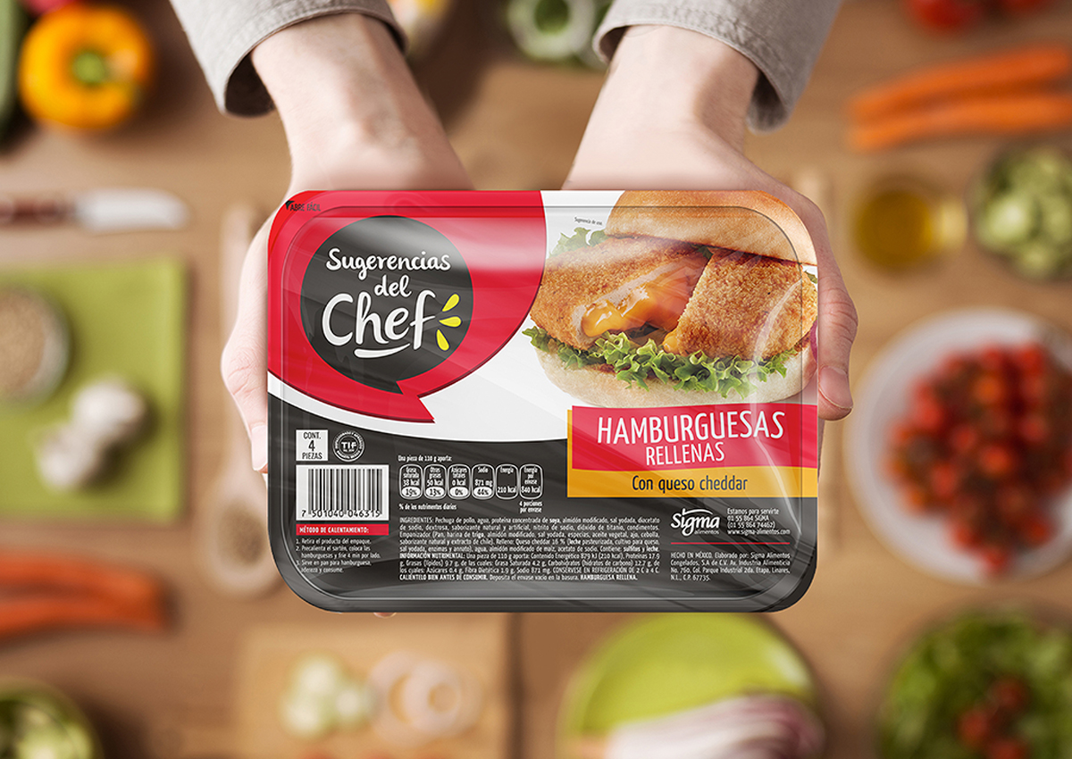
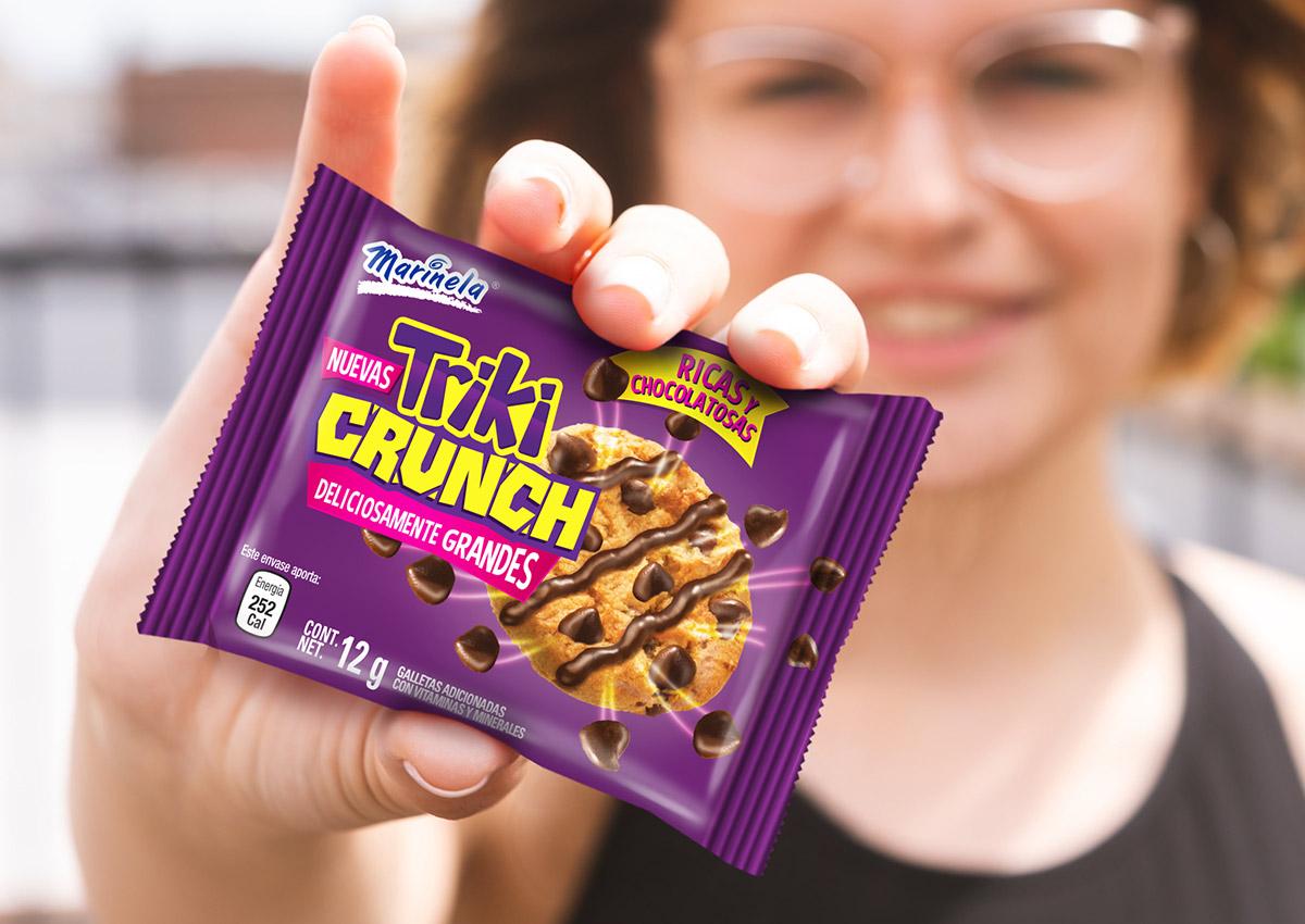
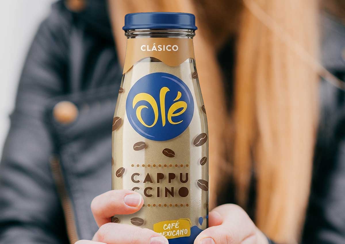
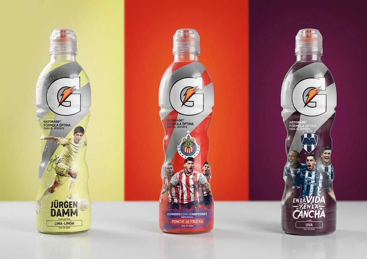
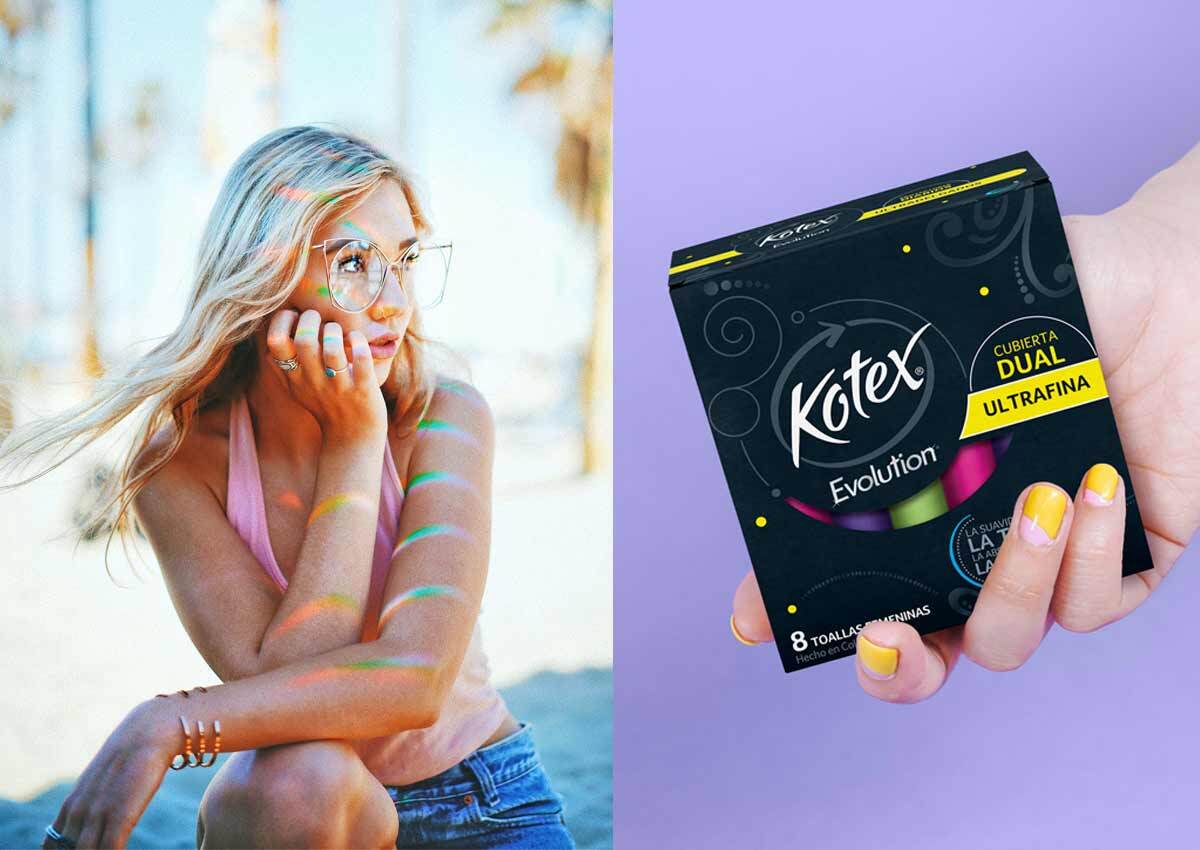
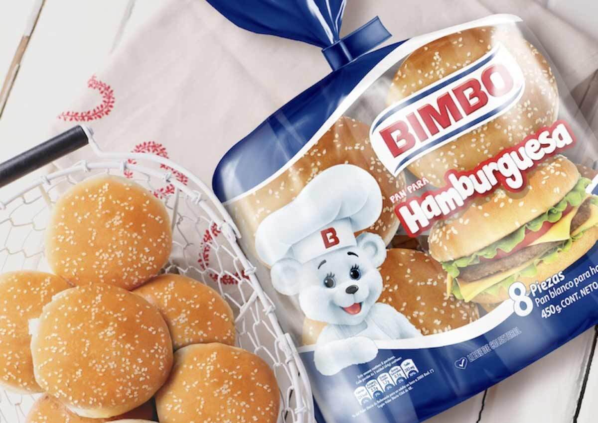
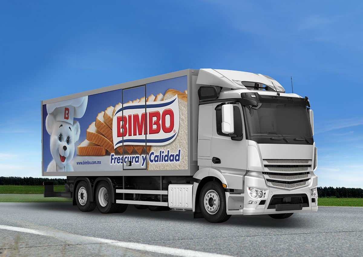
In Mexico, we’ve partnered with both global and local brands to create innovative packaging and branding that resonates with the country’s rich cultural heritage and diverse consumer base. Our work spans various industries, including food, beverages, and personal care, where we’ve developed designs that incorporate the vibrant colors, patterns, and traditions of Mexican culture. From crafting entirely new brand identities to refreshing established brands, our designs tap into Mexico's lively marketplace, ensuring products stand out on shelves and connect deeply with local consumers.
COLOMBIA
Blending Tradition with Modernity
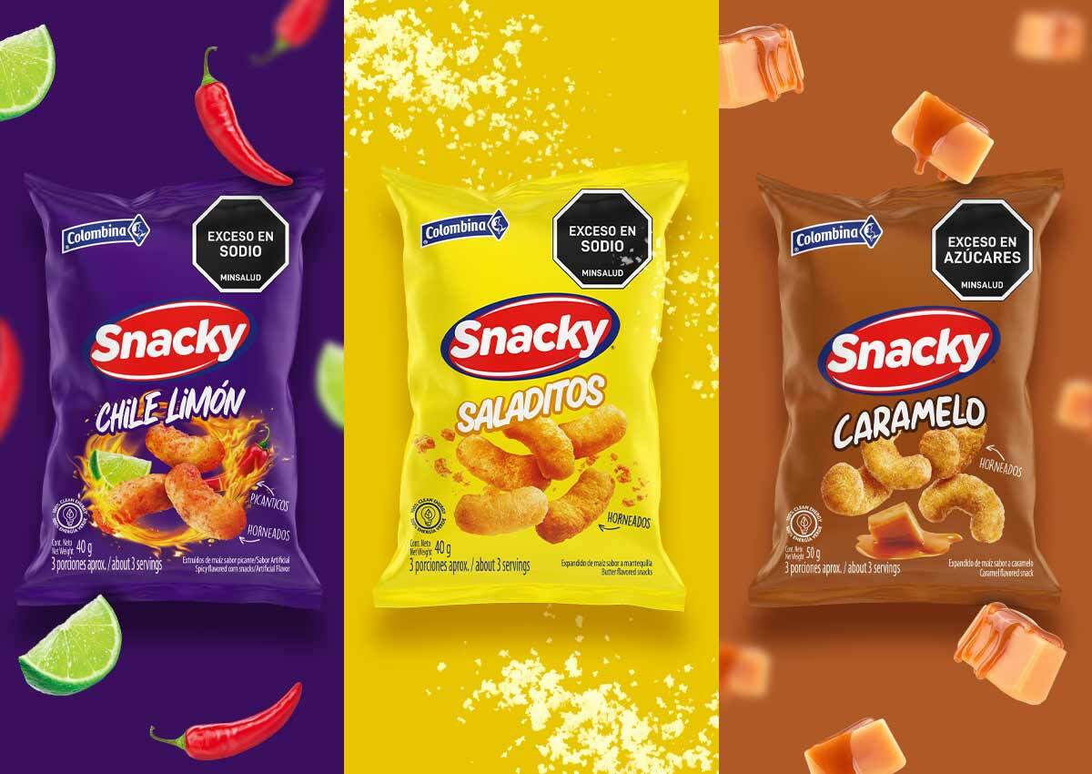
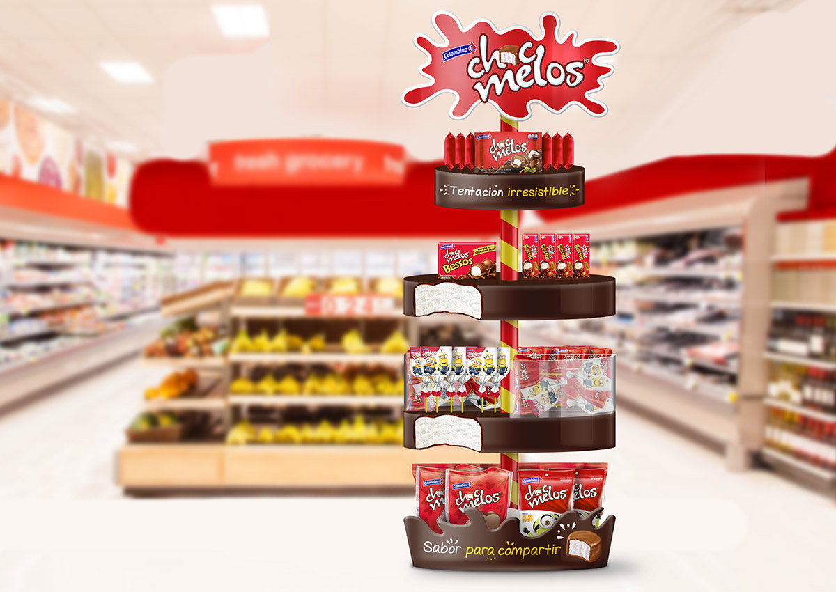
In Colombia, we focus on balancing tradition with modern consumer expectations, designing packaging and branding that honors Colombia’s unique heritage while embracing contemporary trends. Whether working on artisanal products, beverages, or larger consumer goods, we ensure that the designs reflect Colombia’s dynamic markets and rich cultural diversity. By blending local traditions with modern visuals, our work captures the spirit of Colombian pride and meets the demands of a growing and evolving market.
ARGENTINA
Creative Excellence Rooted in Cultural Passion
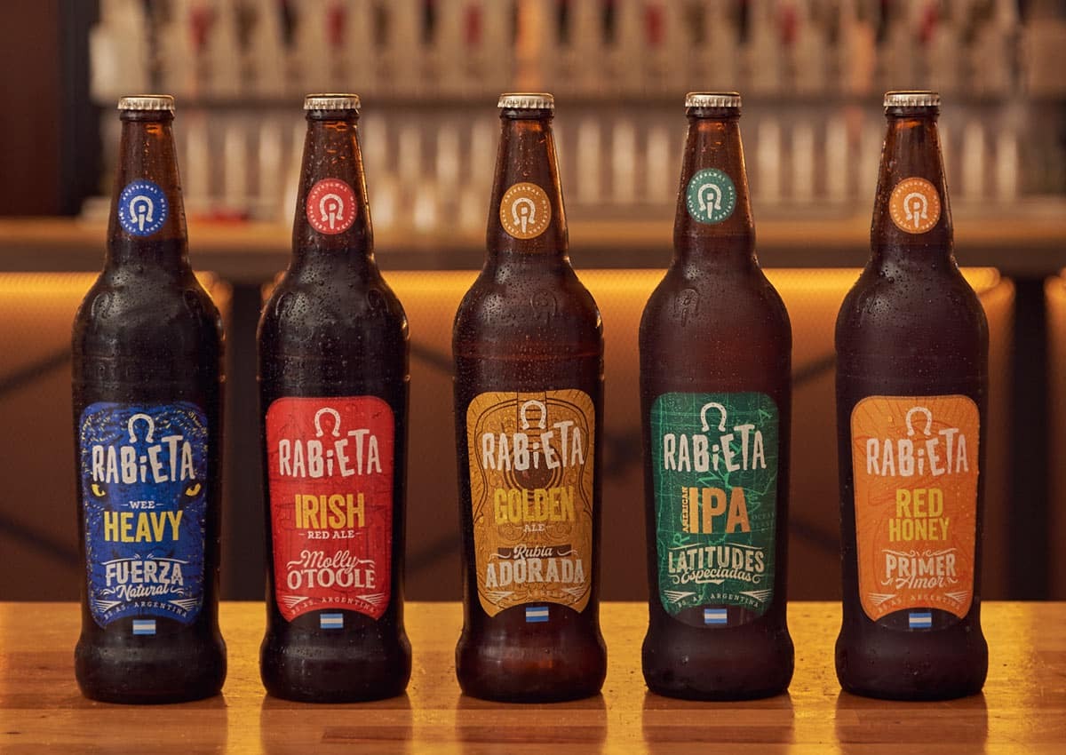

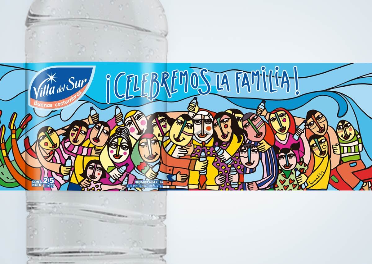

Our work in Argentina is characterized by its deep understanding of the country’s creative and passionate culture. We’ve worked with leading brands across food and beverage sectors, developing packaging and branding that reflects the bold, expressive nature of Argentine consumers. From local wine and craft beer labels to iconic national snacks, our designs integrate Argentina’s vibrant spirit with cutting-edge design trends. Our team has also been involved in branding for special editions, aligning with major cultural and sports events that resonate with Argentina’s strong national identity.
CHILE
Innovation in Packaging and Branding
In Chile, our work emphasizes innovation and sophistication, catering to both local tastes and the country’s growing global influence. We’ve partnered with brands in sectors like wine, beverages, and packaged goods to develop forward-thinking designs that speak to Chile’s modern, upwardly mobile consumers. Our projects often highlight the country’s natural beauty, incorporating elements like the Andes and the Pacific coast into visual narratives. Whether launching a new product or refreshing an established brand, our designs help position Chilean brands competitively both at home and abroad.
PANAMA
Tailoring Global Brands and Developing Local Identities
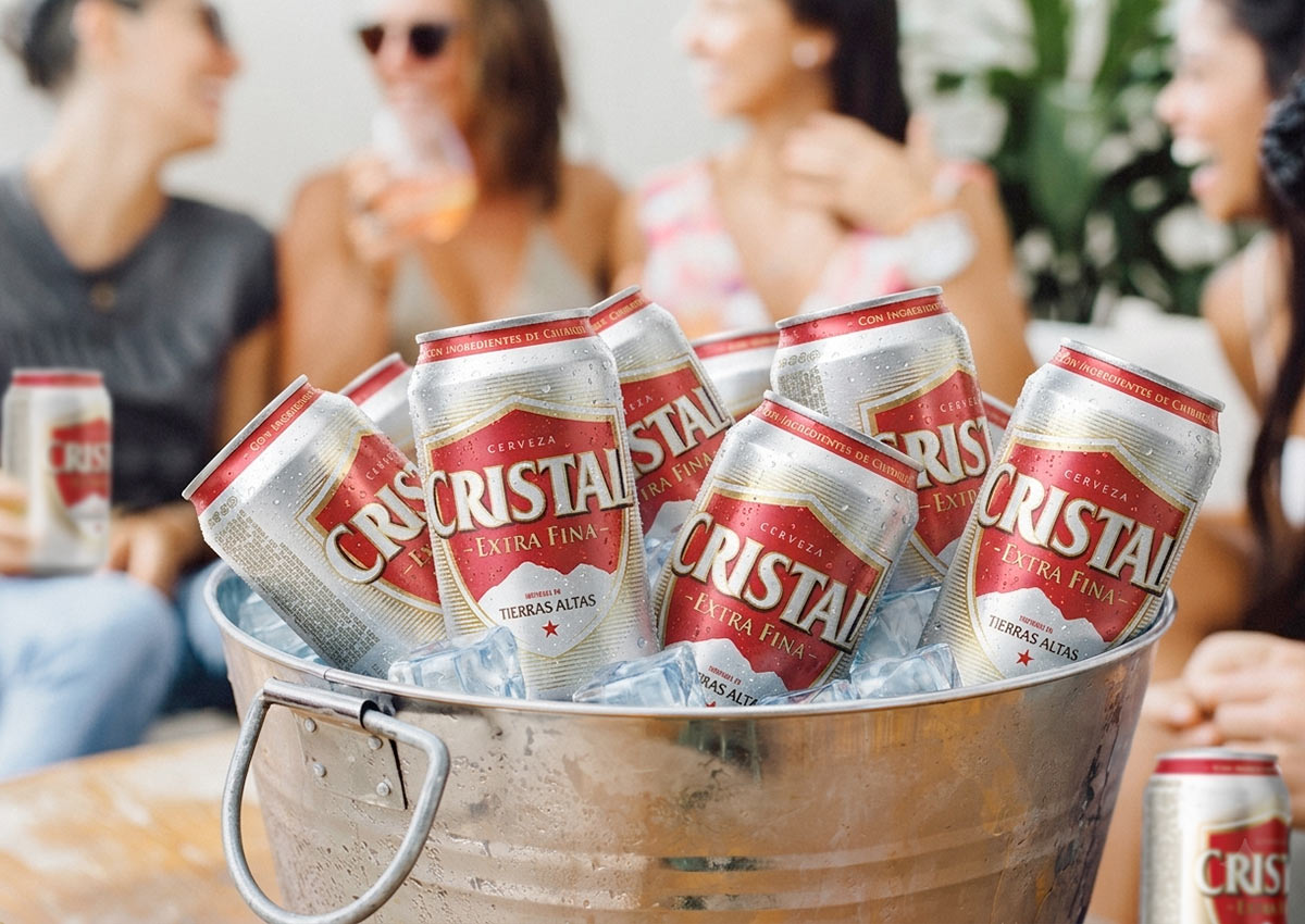
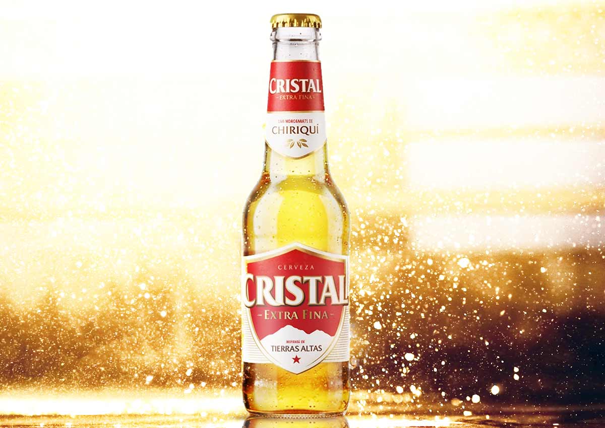
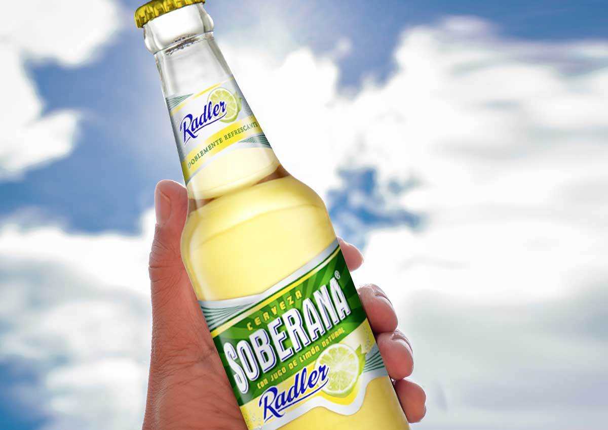
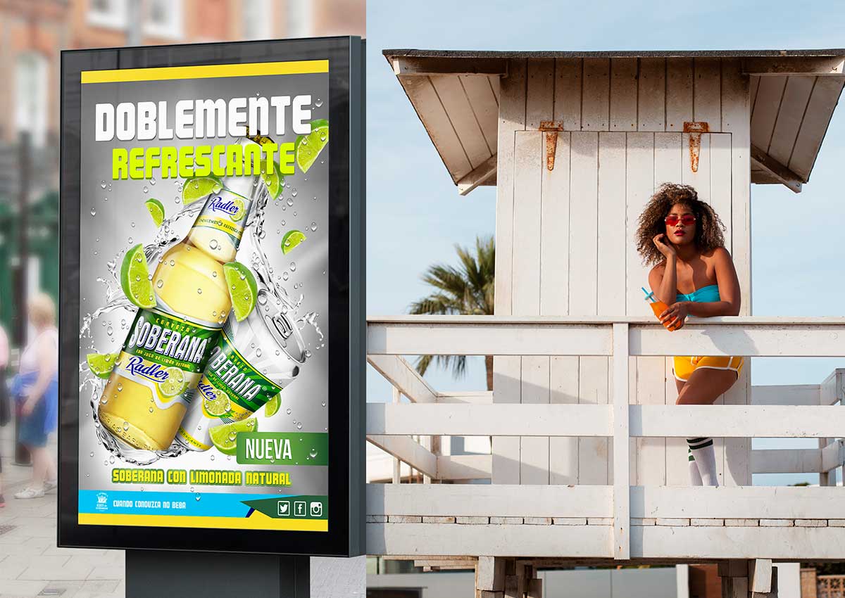
In Panama, our work spans both the adaptation of global brands to resonate with the local market and the development of uniquely Panamanian brands. Panama’s dynamic consumer landscape, influenced by its cultural diversity and strong sense of national pride, presents a unique environment where global and local identities must coexist seamlessly.
ECUADOR
Crafting Distinct Local Identities

In Ecuador, we’ve worked closely with local companies to create branding and packaging designs that capture the country's rich cultural heritage and evolving market trends. Whether developing new food and beverage brands or refreshing established products, we integrate Ecuador's vibrant landscapes, traditions, and flavors into compelling visual narratives. Our work reflects Ecuador's distinct identity, making brands stand out in both local and regional markets, resonating with consumers through a blend of modern design and local authenticity.
COSTA RICA
A Central Hub for Regional Projects
Costa Rica serves as a strategic hub for our work across Central America, where we lead a variety of projects that expand throughout the region. From here, we’ve successfully implemented regional campaigns, branding strategies, and packaging designs that cater to diverse markets across Central America. Our work often involves crafting cohesive identities that resonate locally while maintaining consistency for regional reach. In Costa Rica specifically, we collaborate with a range of industries, leveraging the country's position as a business and innovation leader to drive impactful creative solutions.
PARAGUAY
Growing with Local Brands
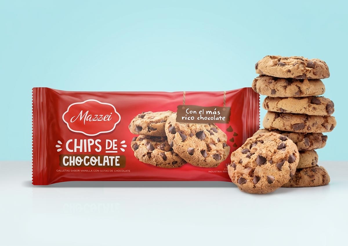
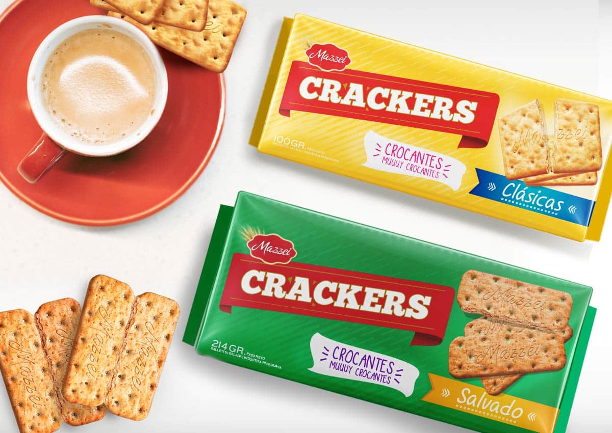
In Paraguay, we focus on helping emerging local brands grow their presence through thoughtful branding and packaging design. By working closely with clients to understand the nuances of Paraguayan consumer preferences, we create designs that stand out in a competitive marketplace. Our projects here often involve modernizing traditional products to appeal to younger audiences while maintaining a connection to the country’s heritage. Through tailored design solutions, we help Paraguayan brands achieve greater visibility and success both regionally and nationally.
URUGUAY
Premium and Artisanal Branding
Uruguay’s growing market for premium and artisanal products is a key focus in our design work for the country. We’ve collaborated with local producers in sectors like wine, craft beer, and gourmet foods to create packaging that exudes quality and craftsmanship. Our designs reflect Uruguay’s dedication to excellence and authenticity, using clean, elegant visuals that appeal to discerning consumers. By highlighting the artisanal nature of products and the country’s strong agricultural heritage, we create memorable and impactful designs for Uruguay’s premium market.
BRAZIL
A Diverse and Dynamic Market for Culturally Resonant Designs


In Brazil, we collaborate with both global and local brands to develop packaging and branding that reflect the country's unique blend of modernity and tradition. Our work spans various industries, including food, beverages, and personal care, with a focus on creating designs that tap into Brazil’s rich natural resources, vibrant colors, and festive culture. Brazil’s consumer base is diverse, with strong regional identities and a growing focus on sustainability, which we incorporate into our designs by using eco-friendly materials and nature-inspired aesthetics. From creating dynamic designs that reflect the energy of Brazilian cities to developing packaging that honors the country’s agricultural heritage, we ensure that our work connects deeply with consumers. Our designs not only stand out on shelves but also resonate with Brazil’s love for innovation, nature, and celebration, offering brands a powerful way to engage with this vibrant market.
PERU
Merging Tradition with Modern Innovation
In Peru, our work has involved collaborating with both international and local brands to develop design strategies that resonate deeply with the country’s rich cultural heritage and modern consumer trends. Peru’s diverse regions, from its bustling cities to its rural landscapes, offer a unique environment where traditional values meet modern aspirations. This has allowed us to engage in projects that honor the country’s traditions while pushing the boundaries of creativity and innovation.
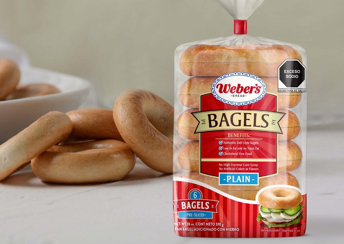
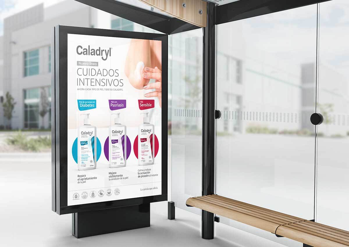
Work for U.S. Hispanic and Latin Communities
Our agency has extensive experience working with brands targeting the U.S. Hispanic and Latin communities, a diverse and growing market segment with strong cultural ties to Latin America. We understand the unique preferences, values, and traditions that shape consumer behavior within these communities, and we specialize in creating packaging and branding that resonates deeply with this audience.
Our work involves adapting global brands to align with the cultural nuances of U.S. Hispanic consumers, ensuring that everything from language to visual elements reflects their heritage and lifestyle. This includes developing bilingual packaging, crafting culturally relevant marketing materials, and integrating themes that appeal to the shared identities of this diverse group.
For food and beverage brands, we've designed packaging that highlights authentic flavors and traditions, making a connection between the products and the home countries of the consumers. Whether it's Mexican, Caribbean, Central, or South American influences, our designs emphasize authenticity and appeal to nostalgia, while still delivering modern and fresh visuals.
We also work with brands that aim to reach the broader Latinx market through digital and physical campaigns, ensuring that the messaging is not only culturally sensitive but also speaks to the dynamic, multifaceted identities of U.S. Hispanics. By incorporating insights into family values, celebrations, and community-driven behaviors, our work strengthens brand connections with the U.S. Hispanic community, fostering loyalty and engagement.