How Packaging Influences Brand Perception in U.S. Retail
Visual Cues, Shelf Behavior, And The Subtle Signals That Shape Consumer Choice
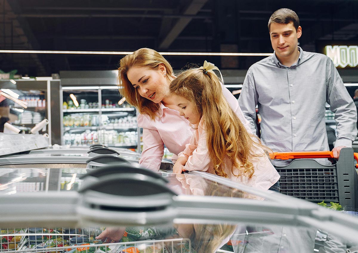
In the US retail landscape, packaging design plays a critical role in shaping brand perception and influencing purchase decisions. More than just a container, packaging acts as a silent but persuasive salesperson—whether it’s competing for attention on a crowded store shelf or standing out in a split-second scroll on an e-commerce site. The way a package looks, feels, and functions directly impacts how consumers perceive a product’s quality, credibility, and relevance to their lifestyle.
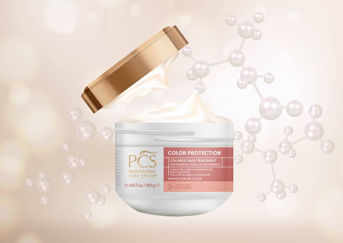
In this competitive environment, building consumer trust is essential—and high-quality packaging design is one of the most effective tools for doing so. When a package reflects attention to detail through premium materials, refined print finishes, and smart structural choices, it elevates the perceived value of both the product and the brand. At Imaginity, we specialize in crafting packaging that not only looks visually striking but also communicates reliability, care, and consistency. Effective branding isn’t just about standing out—it’s about telling your brand story, connecting with consumers, and reinforcing confidence at every touchpoint. In the US market, where expectations are high and first impressions matter, your packaging must do more than catch the eye—it must build lasting trust.


The 3-Second Shelf Test: First Impressions Matter
Research shows consumers take just 3 to 7 seconds to make a purchase decision in-store. In that narrow window, packaging must:
- Grab attention
- Signal product type and benefit
- Evoke a feeling or value (premium, fun, functional, natural, etc.)
In U.S. retail, where shelves are packed and decision fatigue is high, clarity and emotional resonance win. Clean layouts, confident use of color, and concise messaging are key.
Visual Cues That Signal Brand Positioning
Packaging design sends unconscious signals about price point, target audience, and even taste or texture. Here’s how U.S. shoppers often interpret these cues:
- Visual Element: Signals to U.S. Consumer
- Matte finishes: Premium, natural, modern
- Glossy / foil accents: Indulgent, festive, high-end
- Bold sans-serif fonts: Contemporary, direct, often masculine
- Script or serif fonts: Traditional, nostalgic, artisanal
- Minimalist layouts: Wellness, upscale, clean-label
- Illustrations: Craft, storytelling, small-batch
- Photographic imagery: Functional, mainstream, FMCG
Understanding how these cues vary by category—and how they align with shopper expectations—is essential.
Category-Specific Packaging Behaviors
The definition of "premium" isn't universal. It changes depending on the product category:
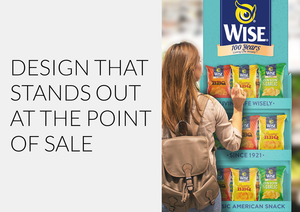
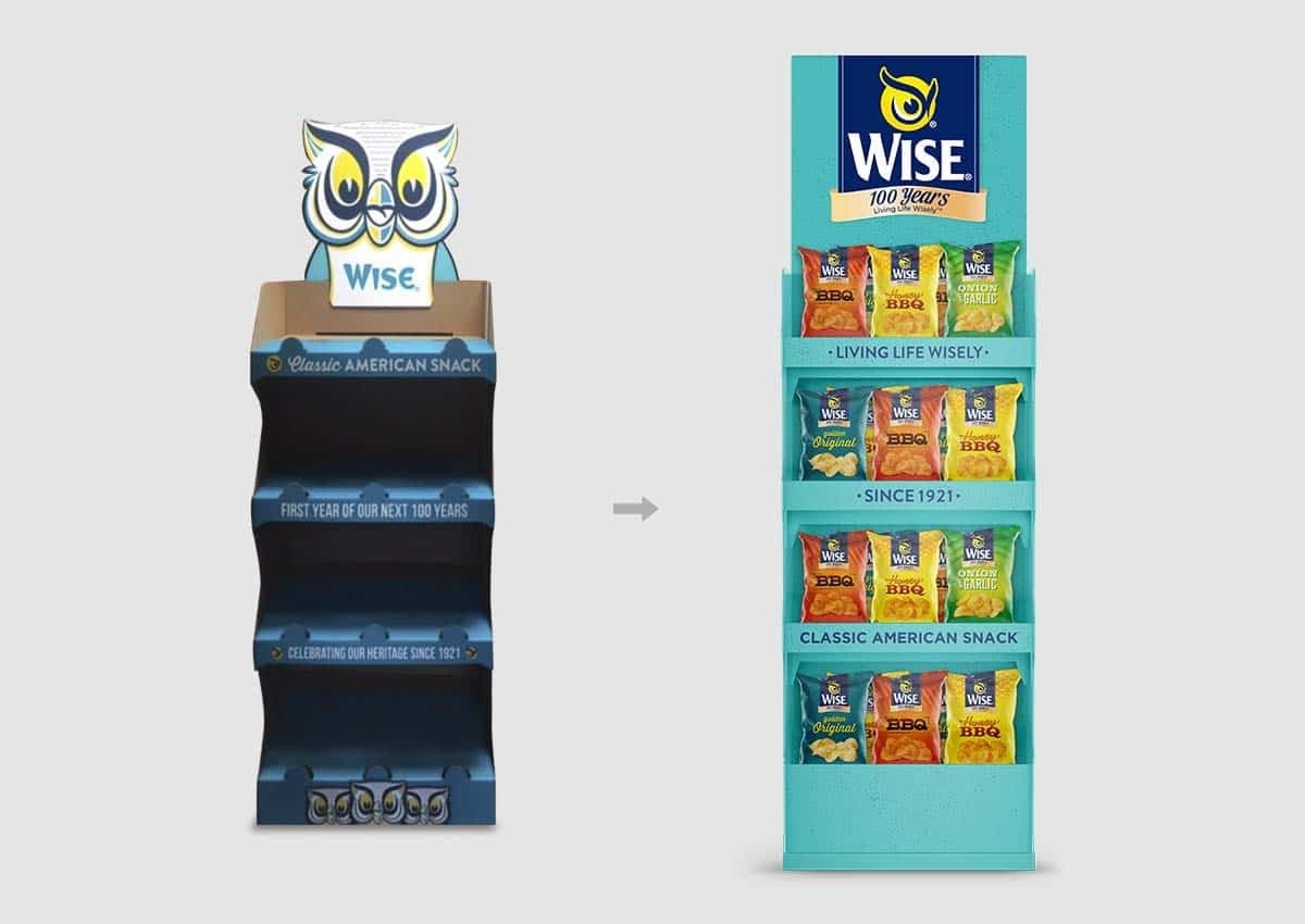
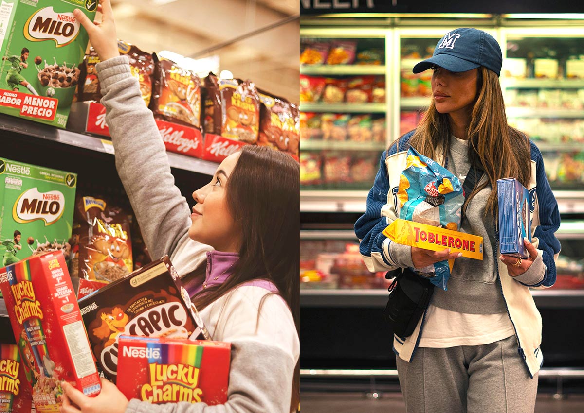
Snacks & Confectionery
- Playfulness, color, and tactile finishes = premium cues
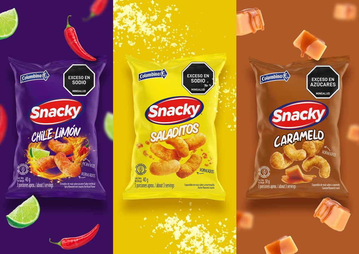
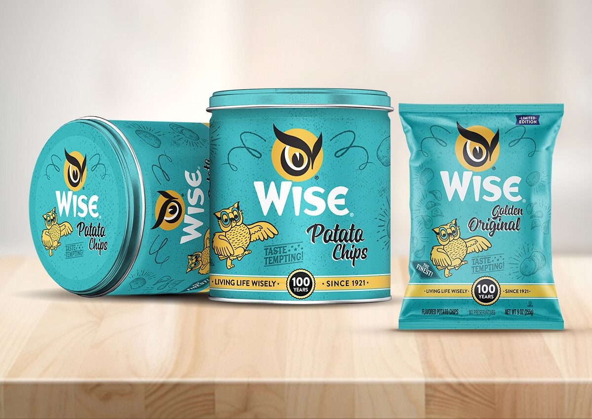
In the U.S. snacks and confectionery aisle, premium is often signaled through bold colors, playful typography, and tactile packaging finishes like embossing or soft-touch coatings. These design elements evoke a sense of indulgence and delight, encouraging impulse purchases.
- Retro or nostalgic designs are trending, especially among Millennial shoppers.
Retro-inspired visuals—such as vintage logos, hand-drawn mascots, or color palettes from the '80s and '90s—are especially popular among Millennial consumers, who associate them with nostalgia and authenticity. For emerging or artisanal brands, this approach can help stand out in a crowded shelf while conveying emotional value.
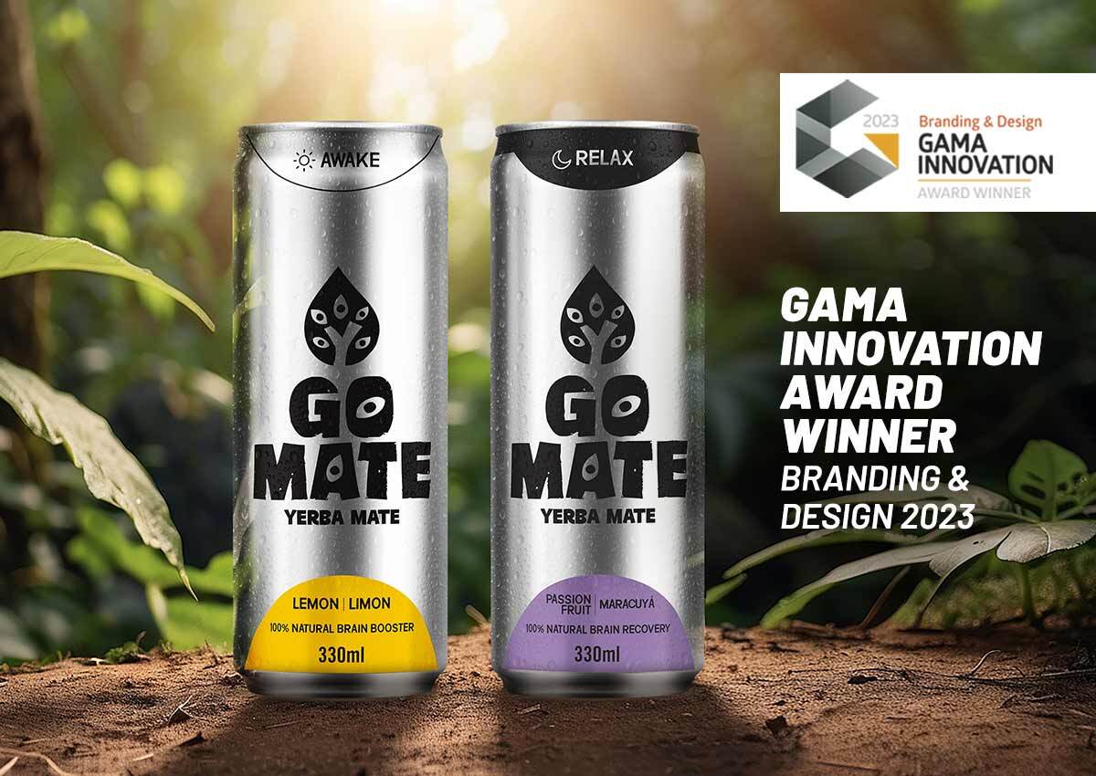
Beverages (Alcoholic & Non-Alcoholic)
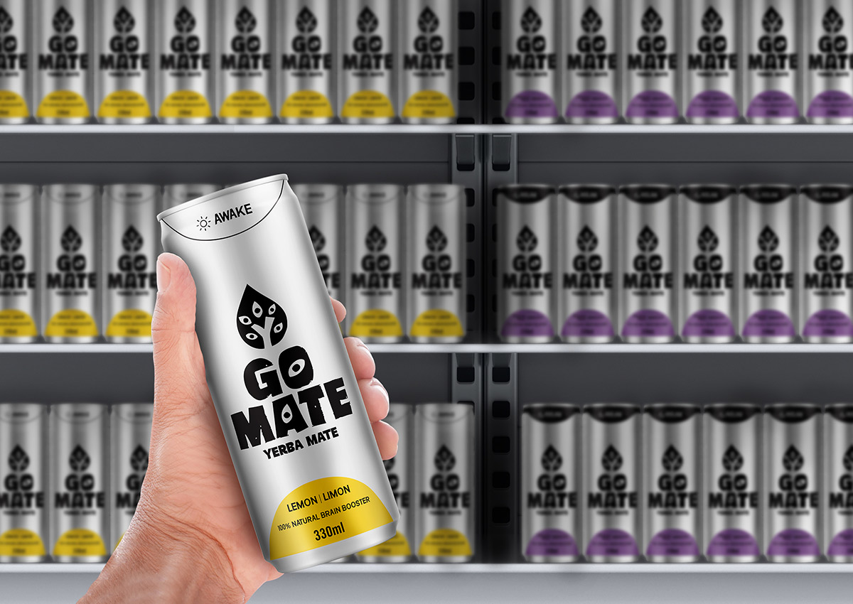
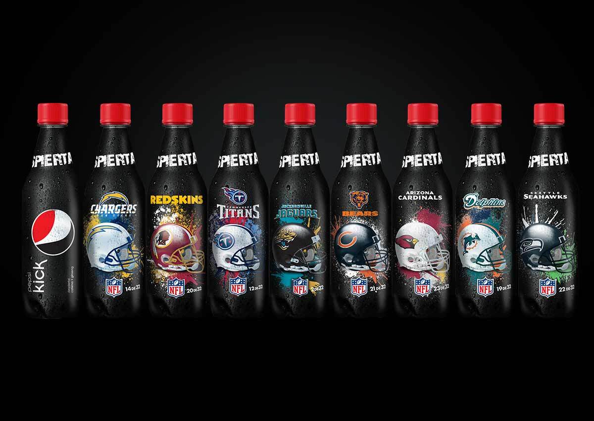
- Proprietary bottles or cans set brands apart visually.
In both alcoholic and non-alcoholic beverages, packaging is a major point of differentiation. Custom bottle shapes, textured labels, or minimal can designs help convey uniqueness and elevate perceived quality.
- Labels with storytelling (e.g. origin, process, craft) help justify higher price points.
U.S. consumers in this category respond to story-driven packaging—labels that highlight origin, production methods, or small-batch craftsmanship create a narrative that justifies premium pricing. Craft beer, kombucha, and cold brew brands especially benefit from this approach, where visual identity becomes an extension of the brand’s backstory and ethos.
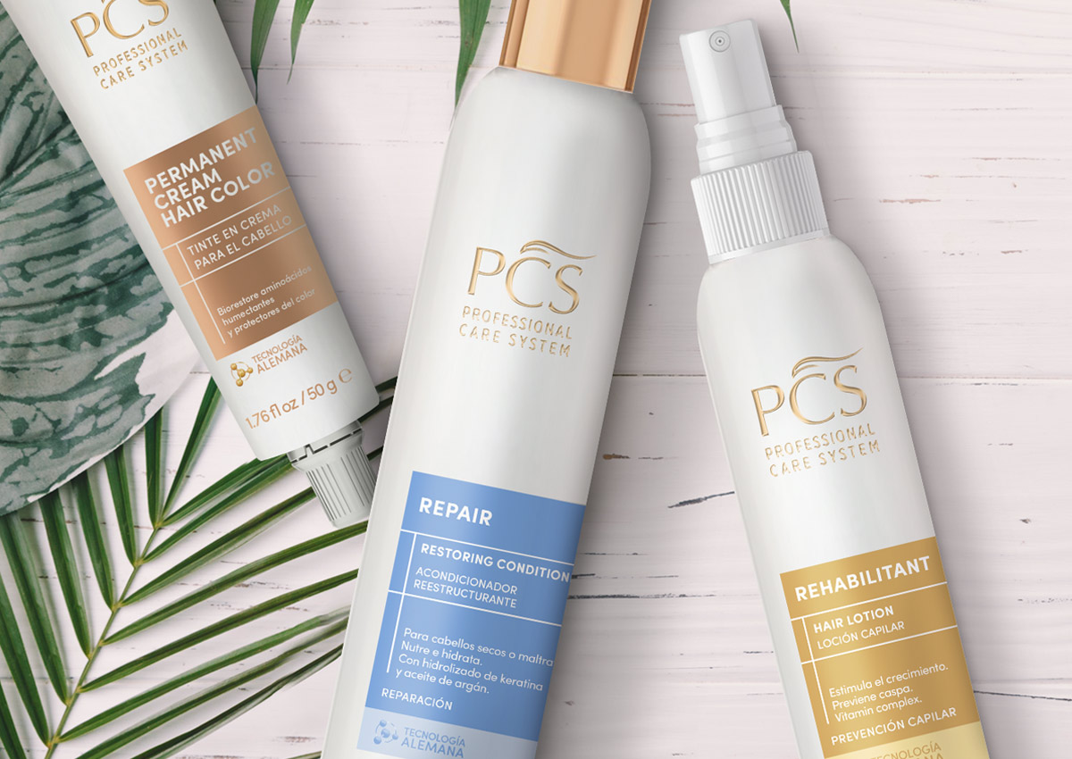
Personal Care & Wellness

- White space, matte textures, and muted tones feel more "clean" and upscale.
In personal care and wellness products, minimalism is the new luxury. U.S. consumers associate clean design—ample white space, soft color palettes, and matte or natural finishes—with purity, transparency, and trustworthiness.
- Consumers equate simplicity with purity and safety.
Premium packaging in this category avoids clutter and embraces subtle elegance, often emphasizing ingredients or benefits through restrained typography and iconography. For skincare, supplements, and wellness products, simplicity is not just a style—it’s a cue for safety, efficacy, and high value.
Mass-Market Grocery

- Packaging must balance value messaging with brand distinction.
In the mainstream grocery channel, premium cues must coexist with value messaging. U.S. shoppers expect packaging to clearly communicate product benefits while still offering an emotional or practical hook.
- Claims like “organic,” “no preservatives,” or “family-owned” should be placed prominently and designed for fast recognition.
A balance between bold, benefit-led visuals and unique brand touches—like heritage illustrations or distinctive color blocking—can help products in this space compete effectively without compromising on perceived quality.
Beyond the Shelf: The Rise of Digital Packaging

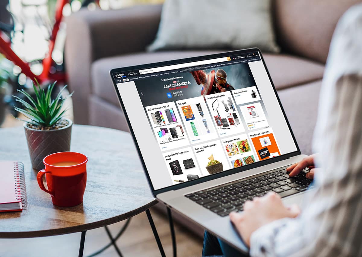
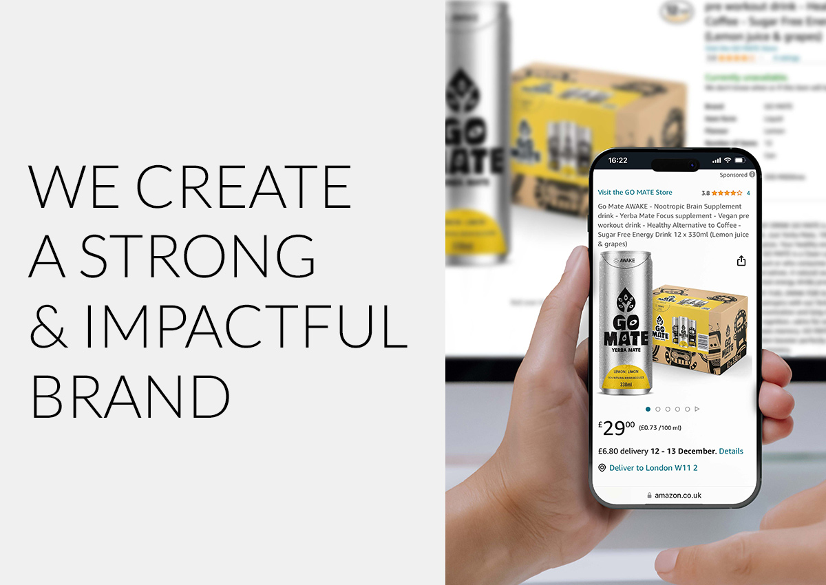
The rise of product display in digital environments is redefining how brands present themselves and communicate with consumers. To stand out in this context, packaging design must go beyond physical functionality—it must deliver instant visual impact, optimized for screens and mobile-first experiences. This shift demands a deeper understanding of consumer behavior in digital channels, where attention spans are short and competition is just a scroll away.
Brands must now develop packaging and branding strategies that are not only persuasive in traditional brick-and-mortar stores, but also highly effective across e-commerce and online marketplaces. In both retail stores and digital storefronts, design is no longer just an aesthetic choice—it’s a strategic tool for conversion.
In e-commerce and social media, packaging must perform at thumbnail size. That means:
- Legibility at small scale
- Impactful color blocking
- Consistent hero visuals across SKUs
Many U.S. brands now create a digital-first packaging version to stand out in online retailers like Amazon, Walmart.com, and Instacart.
Beyond Packaging: Building Brand Architecture for U.S. Growth
Strong packaging design in the U.S. market works best when it’s supported by a clear brand strategy. At Imaginity, we help companies create brand architecture that sells, from portfolio structure and naming systems to tiering strategies that connect with shoppers.
Consistency is just as critical. Our expertise in developing clarity, consistency, and connection through brand identity ensures that every package tells a unified story across categories and channels.
For brands ready to grow, we also design brand architectures and visual identities that scale seamlessly—across retail, e-commerce, and international markets.
Final Takeaway: Packaging Is Brand Perception
In the U.S., consumers judge a product in seconds—often before they touch it, taste it, or read the label. Your packaging design is your brand’s first handshake. It’s your story, your value, your positioning—all in one.
At Imaginity, we help brands craft packaging that doesn’t just fit the shelf—it owns it.