Designing for the Hispanic Consumer in the U.S.:
What Works—and What Doesn’t
Color, Language, Heritage Cues, and Emotional Design Strategies
With over 62 million people identifying as Hispanic in the U.S.—and accounting for over $2.8 trillion in buying power—the Hispanic consumer segment is one of the most influential, yet often misunderstood, audiences in American marketing today.
For brands aiming to connect authentically, packaging design plays a central role. It’s more than a language choice or a “Latin-inspired” pattern—it’s about cultural relevance, emotional connection, and respect.
At Imaginity, we’ve spent decades helping brands engage with Hispanic and Latino consumers across the Americas, and in this post, we share what truly works—and what to avoid.


Understanding the U.S. Hispanic Market


The U.S. Hispanic community is not monolithic. It’s richly diverse in origin (Mexican, Puerto Rican, Cuban, Dominican, Central and South American), language preference (Spanish-dominant, bilingual, English-dominant), and cultural values.
Designing for this audience requires sensitivity, insight, and nuance—not stereotypes.

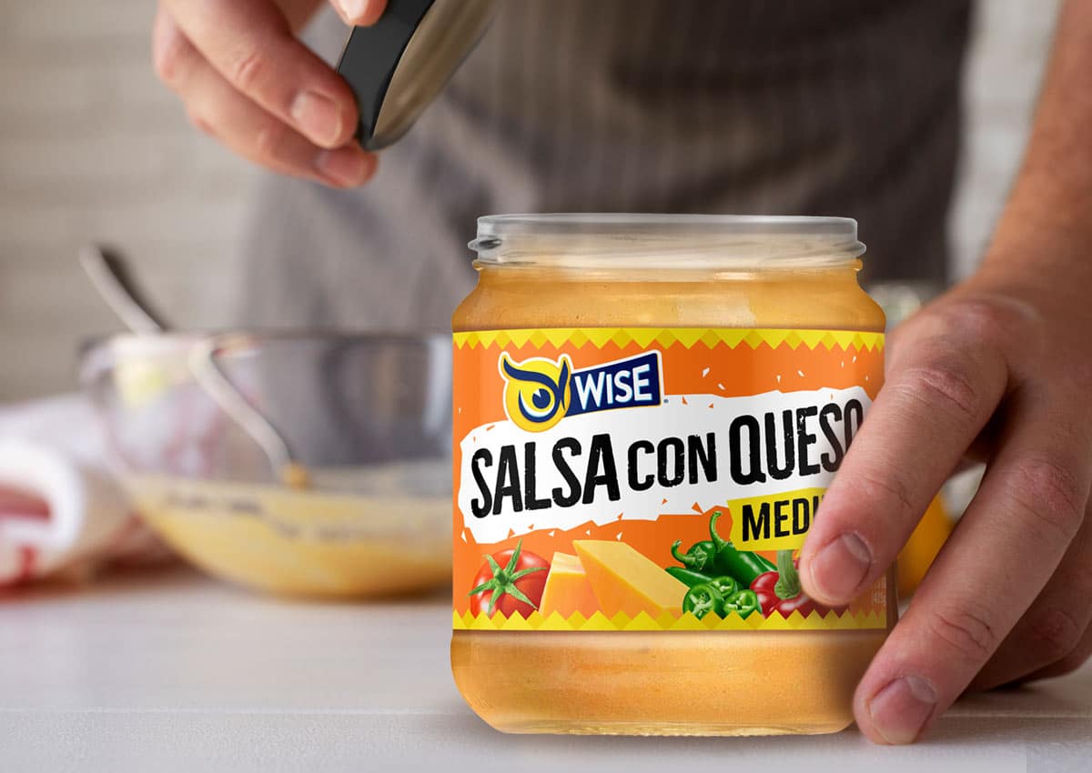
Vibrant colors resonate well—but it's essential to use them intentionally. Bright, saturated palettes can evoke joy, celebration, and tradition when rooted in authentic references (e.g., hand-painted signs, textiles, or culinary packaging from Latin America).
- Tip: Use color to celebrate, not caricature. Deep greens, terracottas, rich blues, and warm neutrals often convey authenticity and warmth without feeling cartoonish.
2. Language That Reflects Identity
Language matters—but context matters more. For bilingual or bicultural consumers, seeing Spanish used fluently and respectfully can create an instant emotional bond. However, poor translations, forced Spanglish, or token use can alienate.
- Use Spanish where it adds value: product names, benefits, or cultural storytelling.
- Avoid generic phrases or direct translations without cultural adaptation.
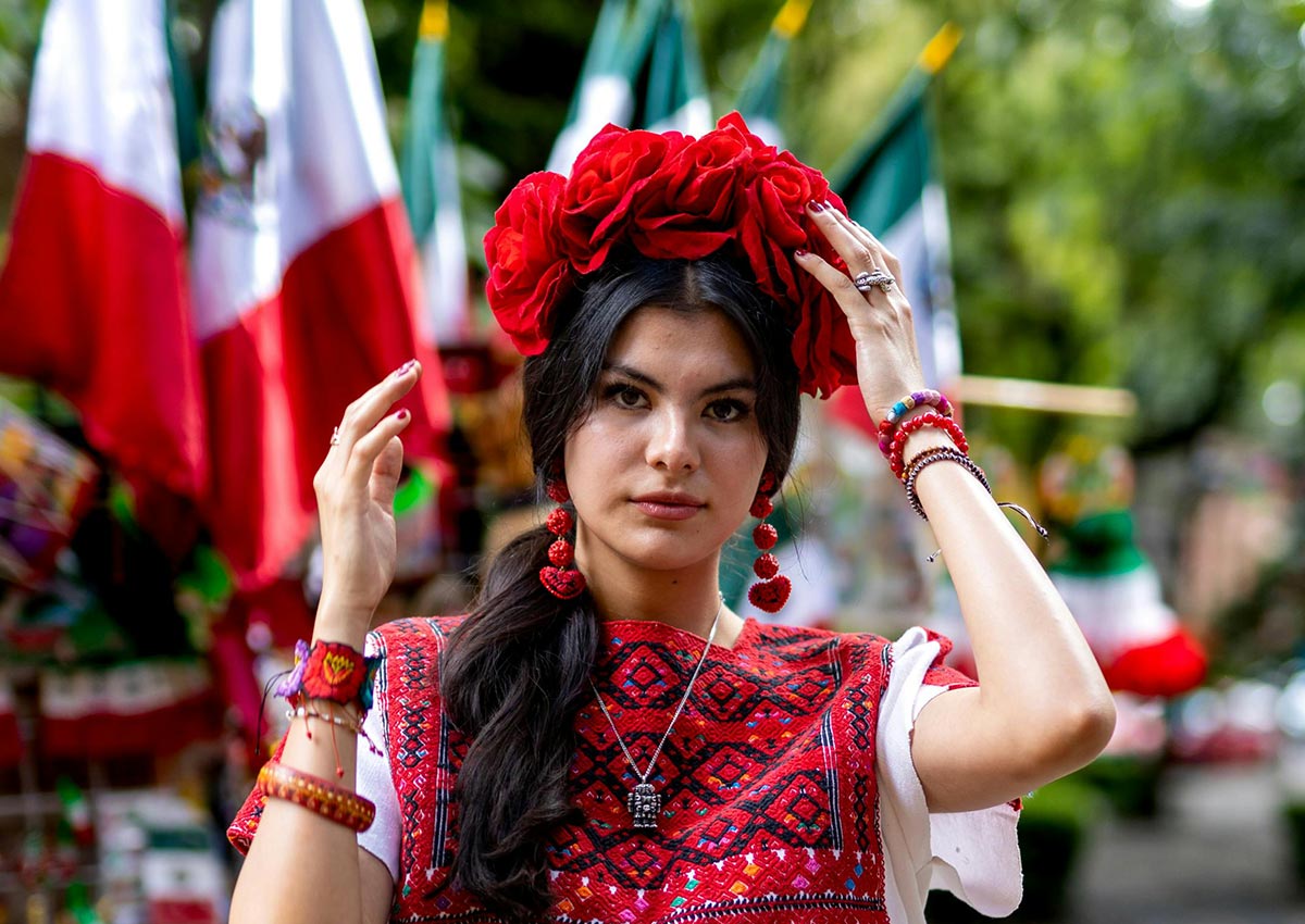
3. Heritage Cues That Tell a Story
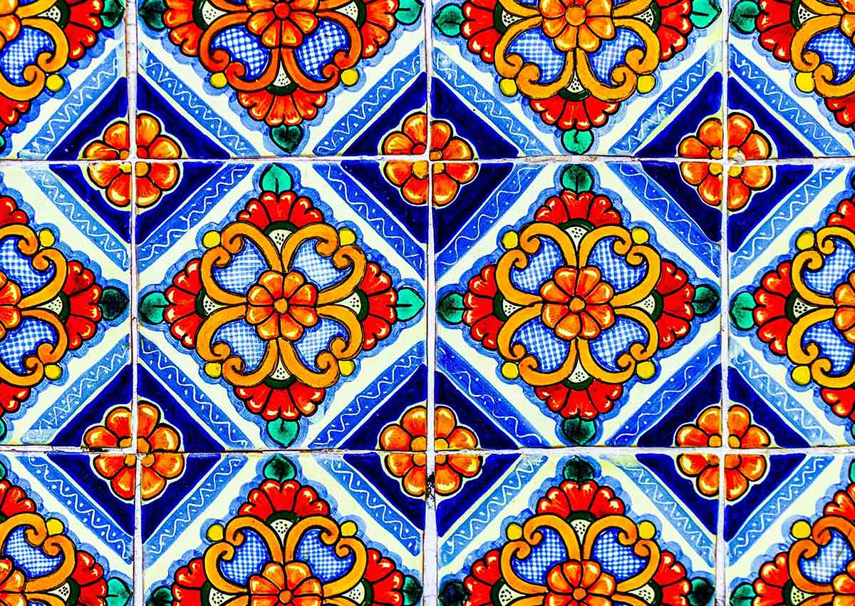

Incorporating visual elements like traditional motifs, textures, or region-specific references can strengthen authenticity—when tied to the brand’s story. Don’t just decorate—narrate.
Examples of successful cues:
- Iconography inspired by well-known cultural symbols
- Typography that nods to old storefront signage or food packaging
- Natural materials or finishes that reflect artisanal roots
4. Emotional Drivers That Resonate
Across Hispanic segments, certain emotional themes consistently connect:
- Family Bonds
- Tradition and Belonging
- Flavor as a Celebration of Life
- Happiness, Vibrancy, and Optimism
Great packaging taps into these values—not by stating them, but by expressing them visually through imagery, tone, and layout.
What Doesn’t Work: Common Mistakes
1. One-Size-Fits-All Latinization
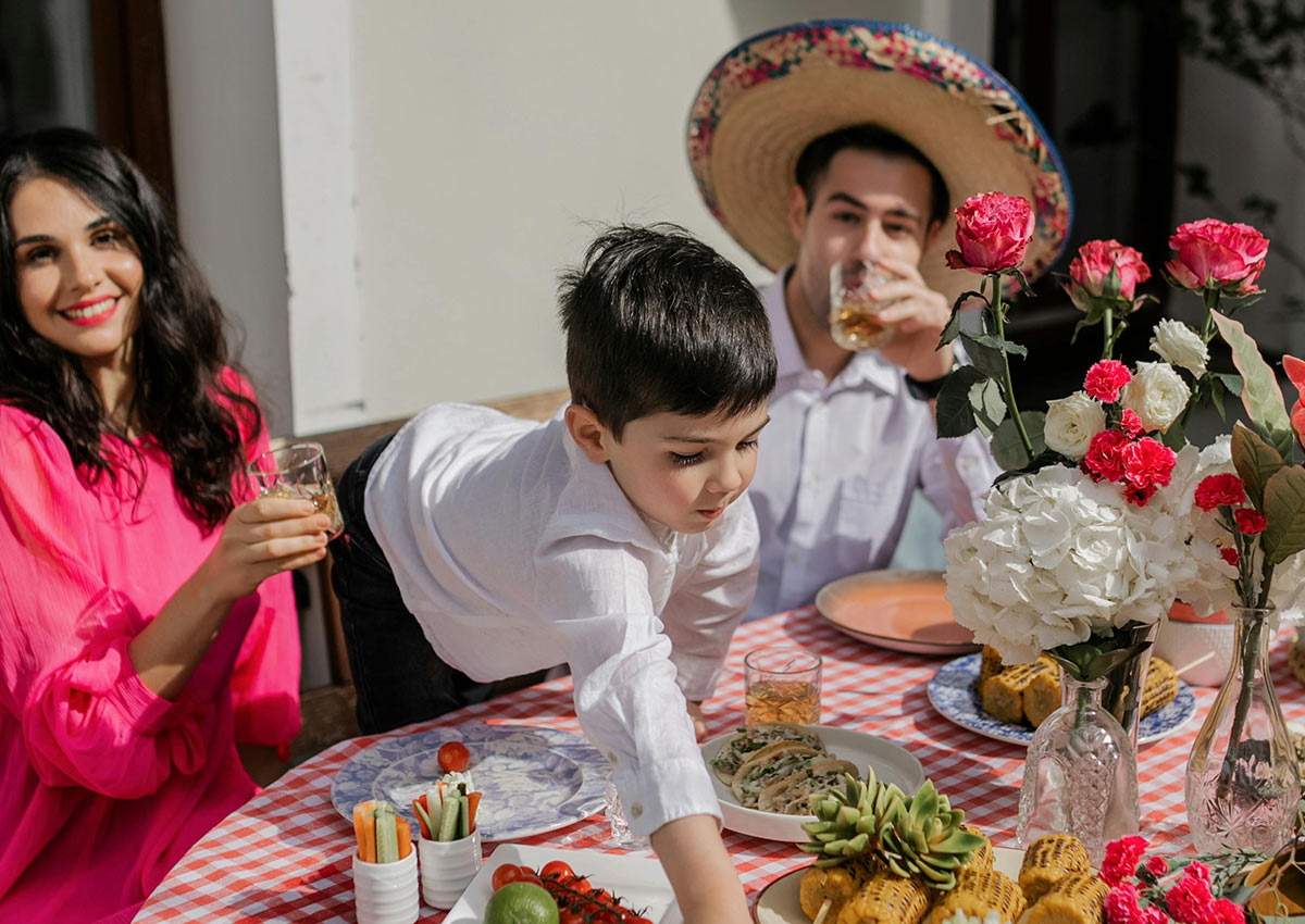
Relying on outdated symbols like sombreros, chili peppers, or maracas to signal “Latino” identity is not only lazy design—it’s ineffective. These visual clichés reduce a vibrant, multifaceted community to simplistic stereotypes that often feel more offensive than inclusive. Today’s Hispanic consumers, especially younger and U.S.-born audiences, are more design-literate and culturally aware than ever. They expect nuance, not caricature.
Instead of flattening diversity into tired tropes, brands should explore what truly resonates—regional flavors, family traditions, bilingual storytelling, or aesthetic references that reflect real cultural pride. A thoughtful, localized design approach that acknowledges differences within the Hispanic community—Mexican, Puerto Rican, Colombian, etc.—is far more likely to forge emotional connections than a generic “Latin look.”
2. Surface-Level Spanish
Dropping in a few Spanish words or poorly translated slogans may seem like a shortcut to relevance, but it often has the opposite effect. Mistranslations or forced code-switching can appear superficial and even disrespectful to bilingual consumers who easily detect when a brand is “faking fluency.” These missteps can alienate more than attract, signaling that the brand sees the Hispanic audience as a box to check—not a community to engage with meaningfully.
Authentic communication starts with collaboration. If your team doesn’t speak the language or understand the cultural context deeply, the best move is to partner with people who do—bilingual designers, copywriters, and cultural strategists. The difference is instantly recognizable. When a brand speaks the language naturally and with respect, it not only builds credibility but also shows that it values its audience on more than a superficial level.
3. Overdesigning
There’s a misconception that to appeal to Hispanic consumers, packaging must be loud, colorful, and filled with traditional motifs. While vibrancy has its place, it’s a mistake to assume that all Latin American shoppers prefer maximalist design. In fact, many second- and third-generation Hispanic consumers gravitate toward modern, clean, and premium aesthetics—just like their non-Hispanic peers.
The key is balance. A sleek design can still carry cultural meaning through subtle cues: a word, a color palette, a nod to heritage ingredients or rituals. When done well, this understated approach can feel more authentic—and more premium—than overt visual references. Designing for today’s Hispanic market means understanding evolving identities and preferences, not relying on outdated assumptions.

Designing for the U.S. Hispanic market means understanding identity as layered, evolving, and multidimensional. It’s about celebrating heritage, yes—but also recognizing how Hispanic consumers shape mainstream trends, not just niche ones.
At Imaginity, we believe the most impactful design comes from cultural fluency, not formula. We work with brands to develop packaging that speaks with respect, relevance, and resonance.