BREAD & BAKERY PRODUCTS
Design Experience
Comprehensive branding, packaging design and shopper marketing solutions for the bread category.
At Imaginity, we specialize in creating impactful branding and marketing strategies tailored to the bread category. From crafting memorable brand identities to designing standout packaging, in-store communication, and innovative truck-fleet advertising, we help bread brands connect with consumers and thrive in competitive markets. Whether it’s white sliced bread, specialty loaves, or breakfast staples like bagels and muffins, we ensure every design element reflects your brand’s values and resonates with your target audience.
BRANDING: BUILDING TRUST AND TRADITION
Bread is more than a product; it’s a symbol of tradition, nourishment, and togetherness. Our branding services for bread focus on creating a cohesive identity that communicates these values while building trust with consumers. Through in-depth market research and creative strategy, we develop identities that reflect the unique qualities of each bread brand—whether rooted in artisanal craftsmanship or modern convenience.
NAMING PROCESS: CAPTURING WHOLESOMENESS
The right name is essential in the bread category, where brands compete for consumer attention in crowded markets. At Imaginity, as a packaging design agency, we craft names that evoke warmth, authenticity, and the promise of quality. Whether naming a new line, sub-brand, or a single product, our names capture the essence of your brand and resonate with your audience, setting the stage for long-term loyalty.
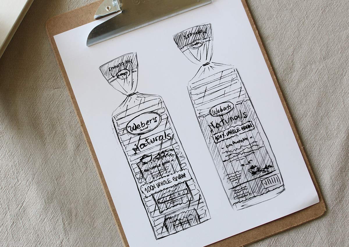
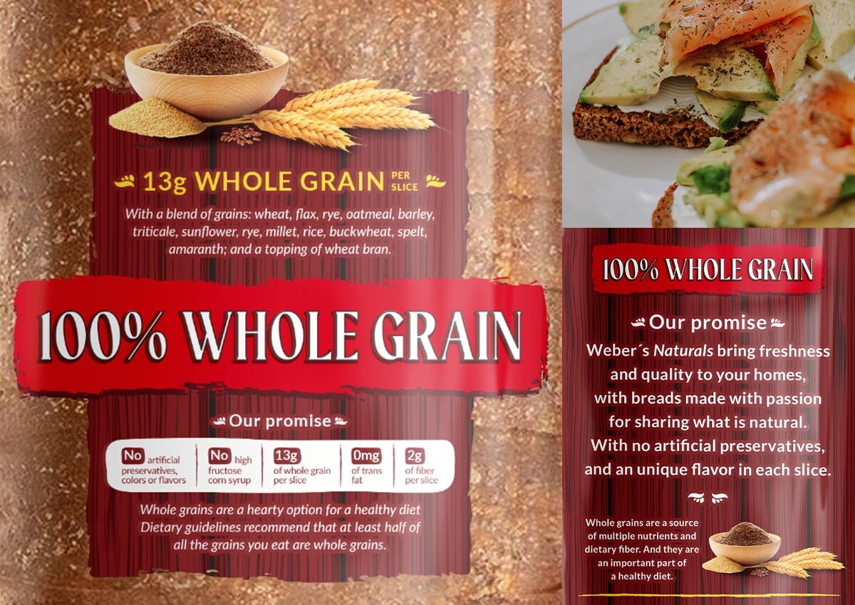
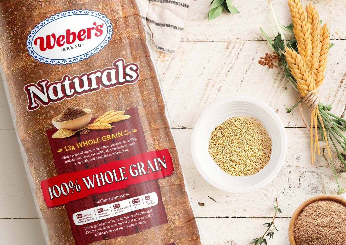
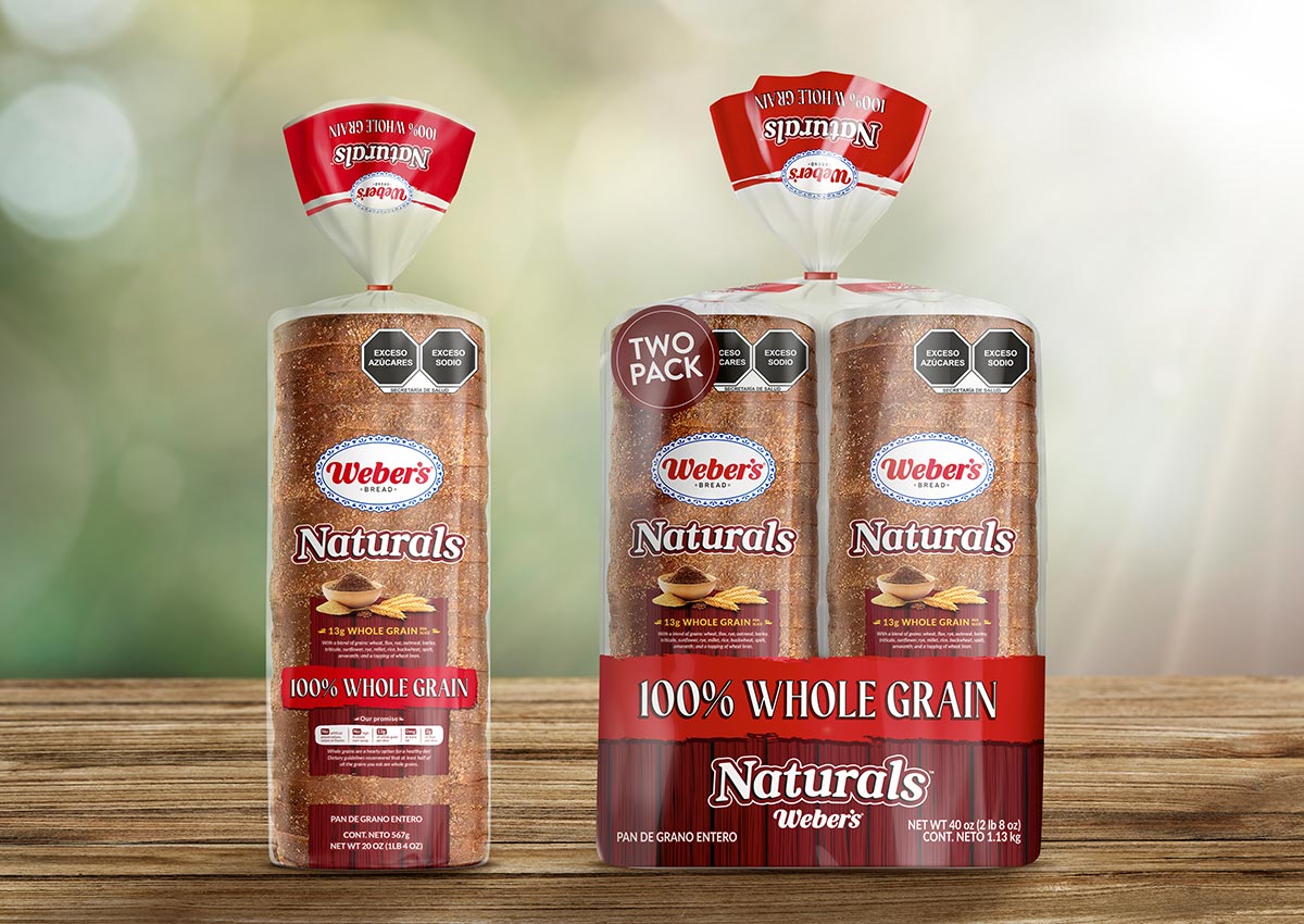
The name “Naturals” was born out of a desire to convey simplicity, authenticity, and the wholesome qualities of Weber’s bread range. During the naming process, we prioritized words that evoke trust, health, and nature to appeal to a health-conscious audience. “Naturals” encapsulates the brand’s commitment to clean ingredients, whole grains, and a back-to-basics philosophy that resonates with modern consumers seeking transparency in their food choices. The name strikes the perfect balance between approachable and premium, aligning seamlessly with Weber’s brand identity.
PACKAGING DESIGN: STANDING OUT ON SHELVES AND ONLINE
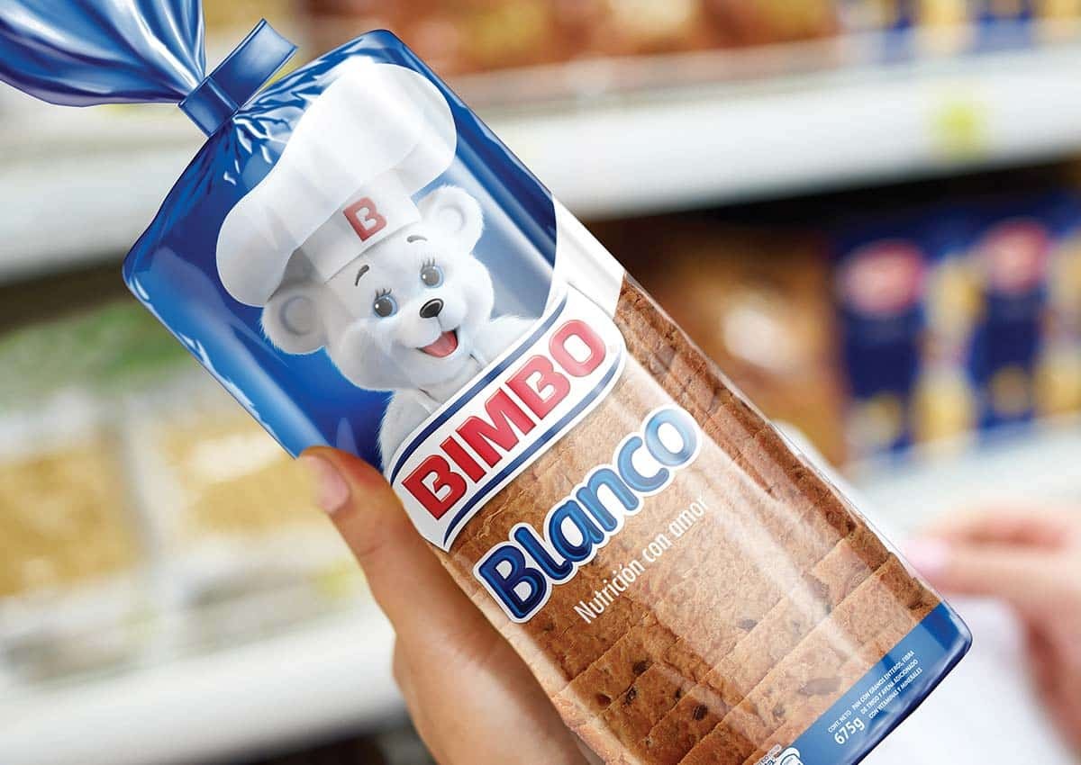
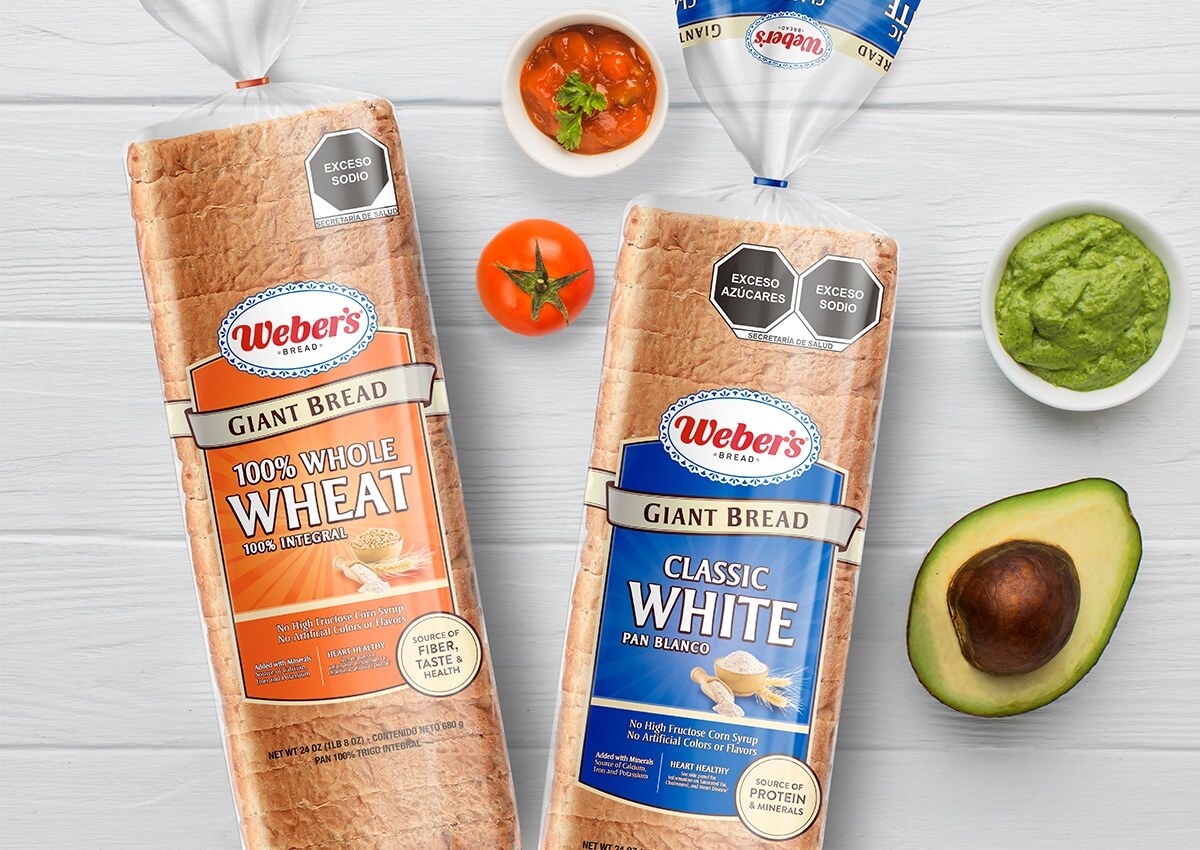
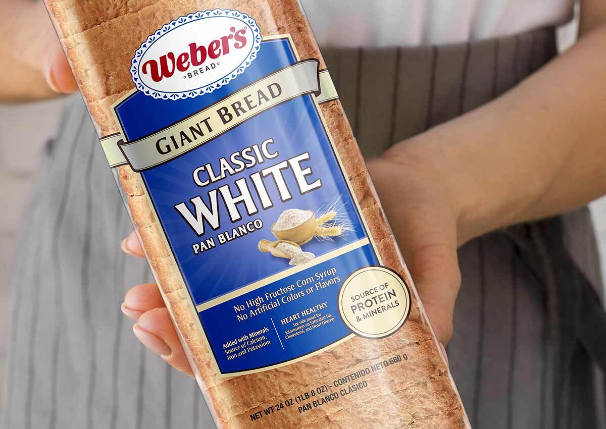
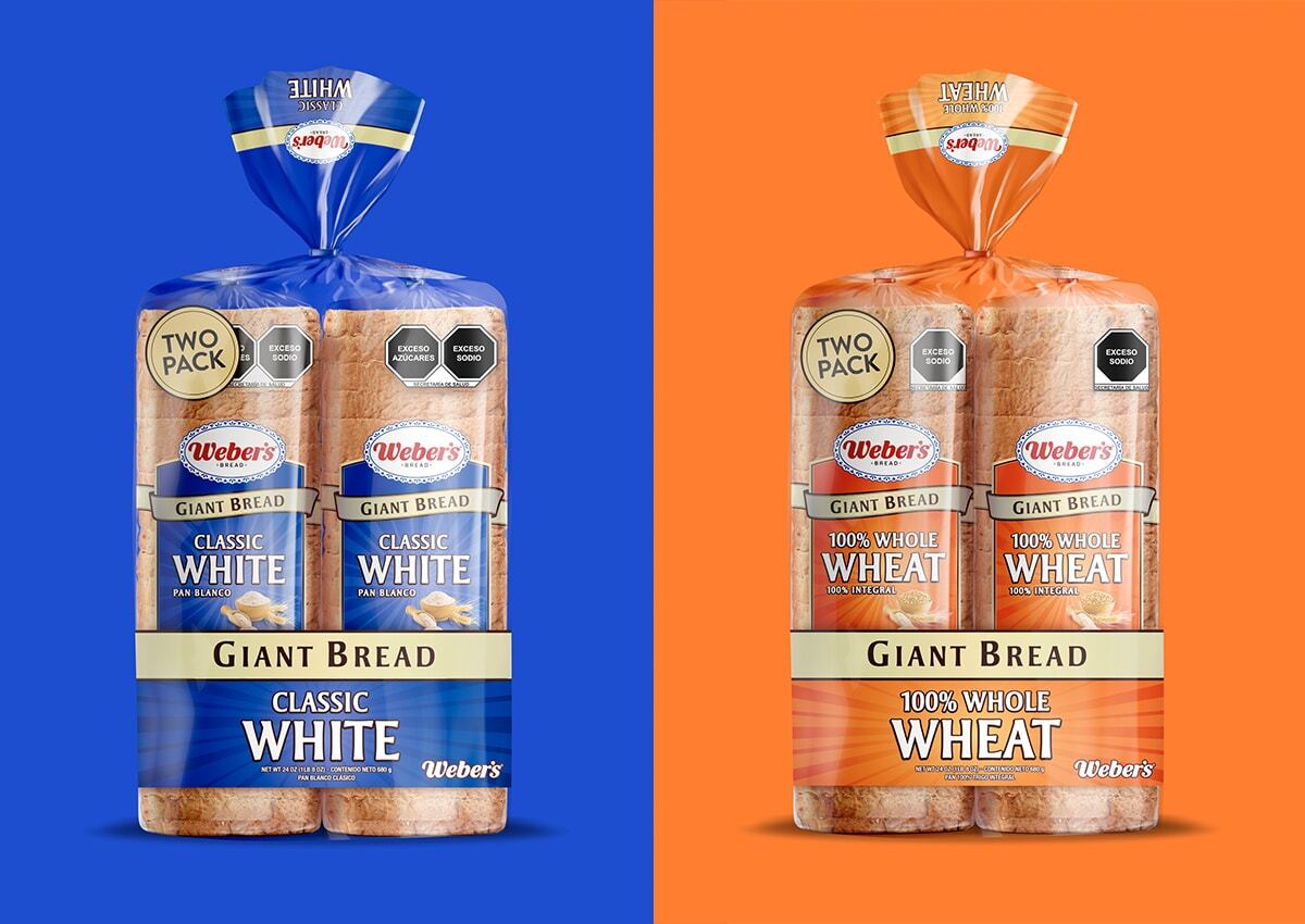
In the bread aisle, packaging plays a critical role in capturing attention and conveying product benefits. Our packaging designs are tailored to each product range—using vibrant blues for white bread, warm oranges for wheat varieties, and earthy tones for whole-grain and specialty breads. Clear windows showcase product freshness, while design elements like bold typography and appetizing visuals highlight flavor and quality. Whether for everyday staples or premium artisanal loaves, we craft designs that elevate your brand and connect with your target audience.
Building on the success of Weber’s 12-Grain bread, known for its hearty and nutritious appeal, we developed a cohesive packaging for the “White” and “Wheat” bread variants. The goal was to create a visually unified product range that reflects the brand’s quality and versatility while catering to different consumer preferences. By drawing inspiration from the 12-Grain packaging design, we ensured a strong sense of brand continuity across the product line, making the range easily identifiable and trusted by shoppers.
A NEW IDENTITY FOR HEALTH-CONSCIOUS CONSUMERS
For La Perla’s Cereal Balance range, we developed a branding and packaging design that speaks directly to health-conscious consumers seeking natural, balanced nutrition. The branding reflects La Perla’s established reputation for quality, while the new Cereal Balance line introduces a fresh, contemporary identity tailored to the wellness category. The design balances a modern aesthetic with elements that emphasize natural ingredients and wholesome living, creating an engaging and trustworthy visual appeal.
As an extension of La Perla’s brand, the Cereal Balance packaging maintains a cohesive identity within the company’s portfolio. The signature La Perla logo is prominently displayed, acting as a seal of quality and trust, while the Cereal Balance sub-brand introduces a fresh, innovative look tailored to its specific audience. The result is a design that stands out on the shelf, resonates with health-conscious consumers, and reinforces La Perla’s commitment to delivering quality and nutritional value.
BRAND ARCHITECTURE: MAKING YOUR BRAND UNMISSABLE
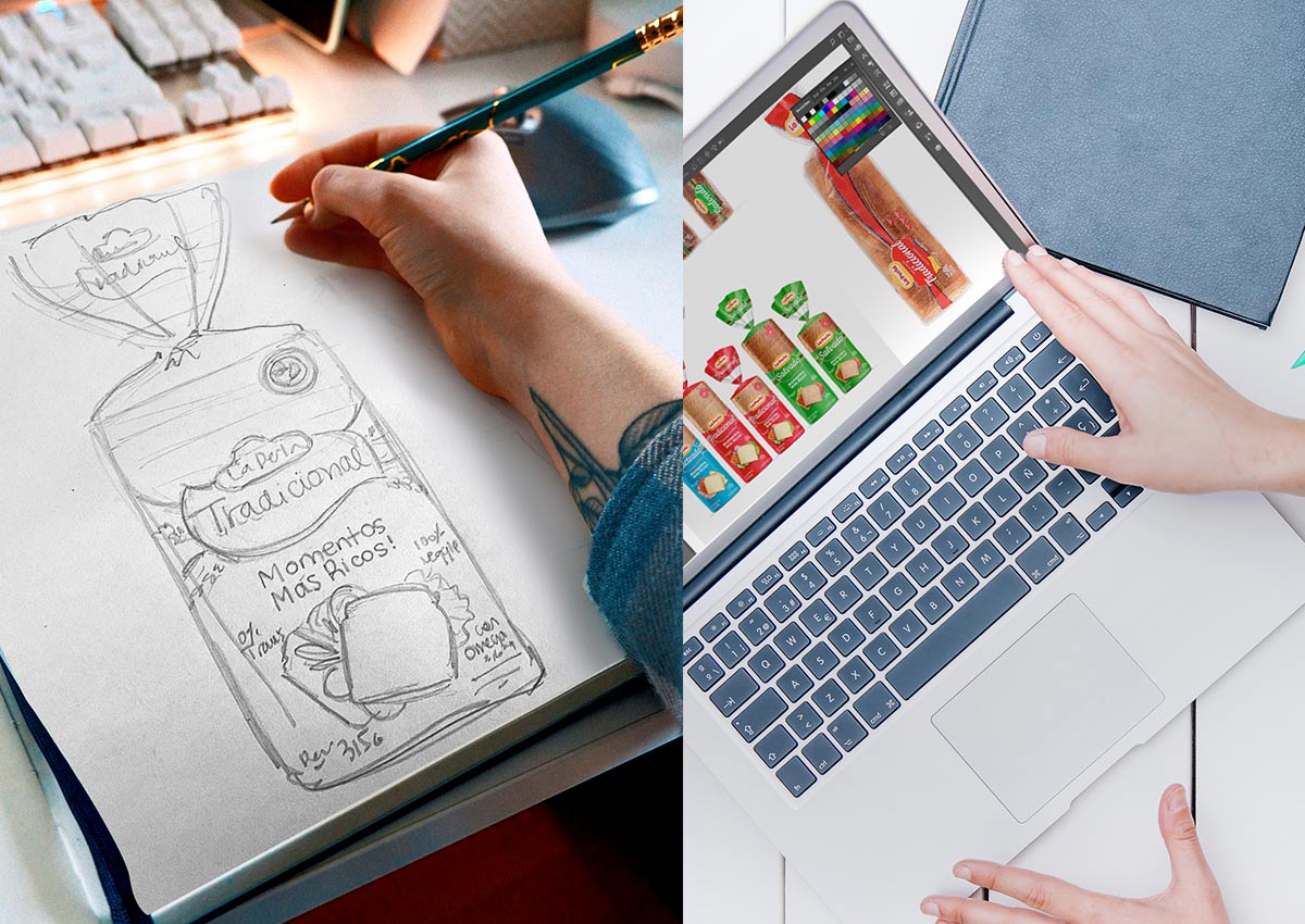
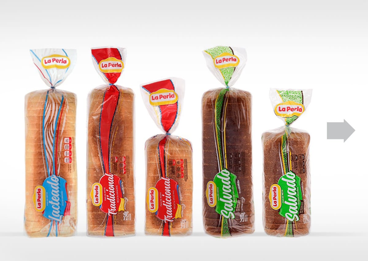
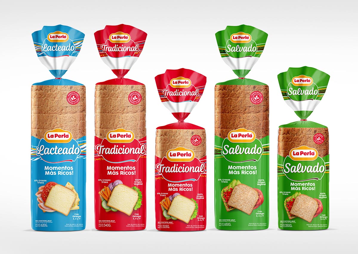
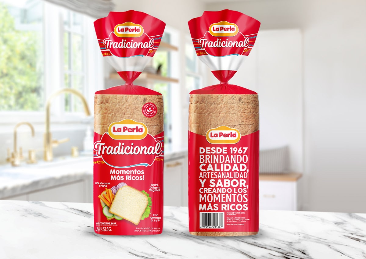
For La Perla’s sliced bread line, the brand architecture was designed to balance consistency across the product range while allowing each variety to maintain a distinct identity. The architecture emphasizes La Perla’s heritage and reputation for quality while creating visual distinctions between product variants. By developing a unified framework, we ensured that the sliced bread line reflects La Perla’s overarching values of trust, taste, and tradition while addressing the specific needs of diverse consumer segments.
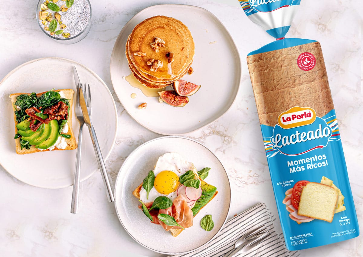
The packaging design for La Perla’s sliced bread captures a sense of freshness and approachability, aligning with the brand’s promise of delivering high-quality products for every family table. A vibrant color-coding system ensures quick identification of each bread type: red for Traditional White Bread, light blue for Milk Bread, and green for brand breads. These colors not only adhere to established category conventions but also create a cohesive yet varied visual appeal on the shelves.
PACKAGING DESIGN THAT BRINGS CONVENIENCE TO LIFE
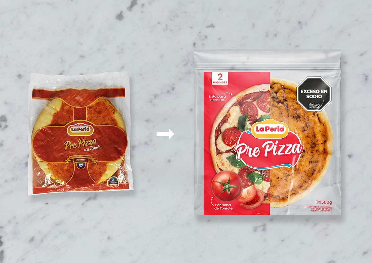
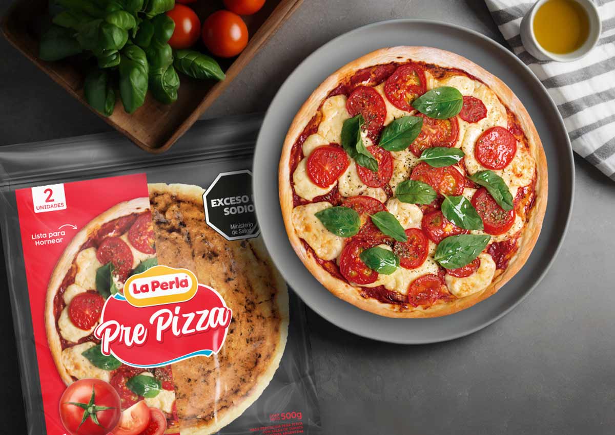
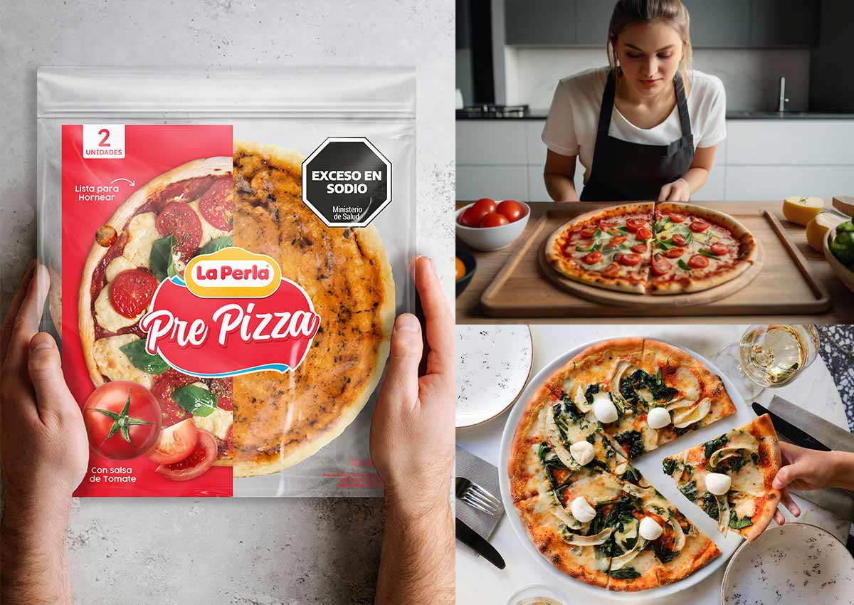
La Perla’s Pre Pizza product offers consumers the perfect solution for creating homemade pizzas with ease and enjoyment. The packaging design focuses on conveying convenience, quality, and the authentic experience of crafting a delicious pizza at home. The design ensures that the product stands out on shelves while maintaining the brand’s trusted identity in the market.
The packaging features vibrant, appetizing imagery of a freshly baked pizza topped with melted cheese and colorful toppings, inspiring consumers with the possibilities of customization. A warm, inviting color palette dominated by red hues aligns with the brand's primary color, effectively communicating the richness of the tomato sauce and the product's quality. Clean typography highlights key product benefits, such as 'With Tomato Sauce' and 'Ready to Bake,' ensuring clarity and appeal.
Transparent elements in the packaging allow consumers to view the Pre Pizza base and tomato sauce, reinforcing freshness and quality. The layout is thoughtfully designed to guide the consumer’s eye, with clear instructions and serving suggestions prominently displayed. These elements work together to build trust and ensure a seamless at-home pizza-making experience.
VISUAL IDENTITY FOR BREAKFAST ESSENTIALS
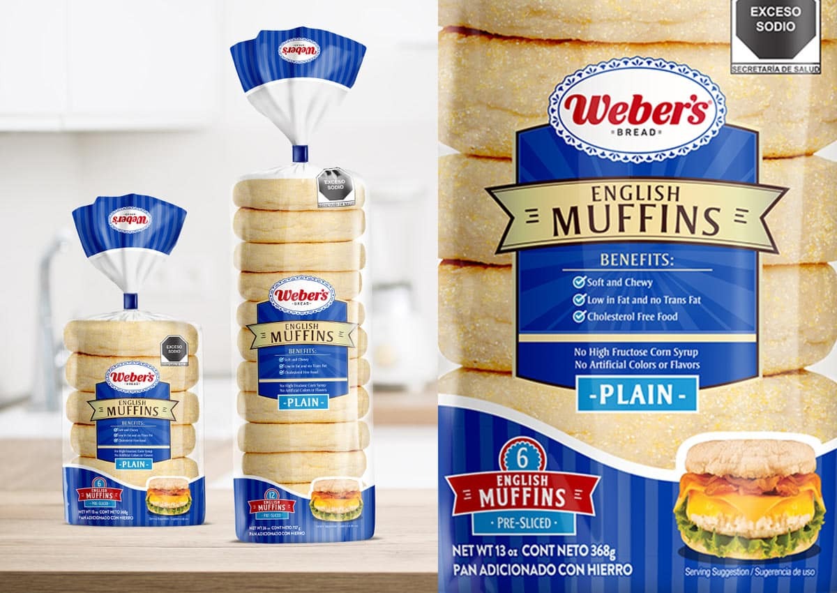
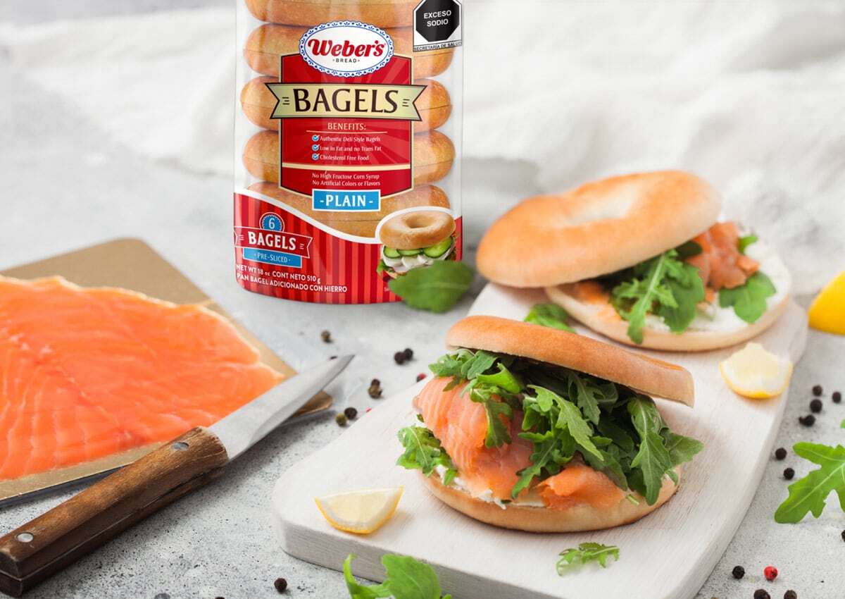
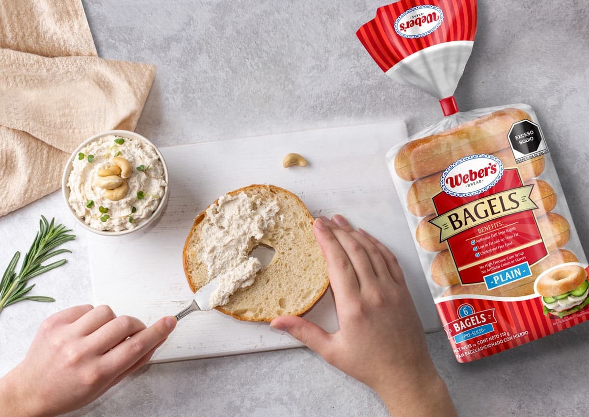
Weber’s packaging design for its Bagels and English Muffin focuses on celebrating the quality and versatility of these breakfast staples. The design combines Weber’s trusted brand identity with visuals that highlight the products’ delicious texture and fresh-baked appeal, ensuring they resonate with consumers seeking quick, high-quality meal solutions.
The visual identity for Weber’s Bagels and English Muffins effectively communicates their versatility, showcasing a variety of serving options. Both packages include transparent windows, allowing consumers to see the product’s texture and freshness, and the Weber’s logo is prominently displayed, reinforcing brand trust and familiarity. By blending tradition with modern design elements, the packaging not only enhances shelf appeal but also reinforces Weber’s commitment to quality and care in every product. This thoughtful approach ensures that these bakery staples stand out in a competitive market while connecting with consumers’ daily routines and culinary creativity.
TRUCK-FLEET ADVERTISING: BREAD ON THE MOVE
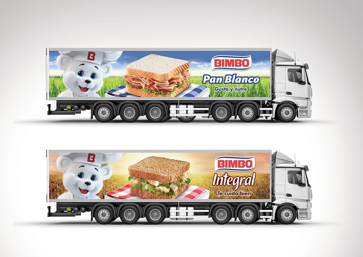
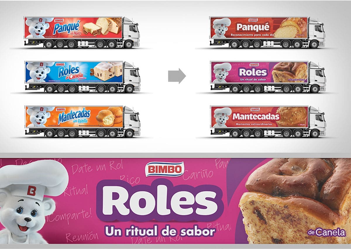
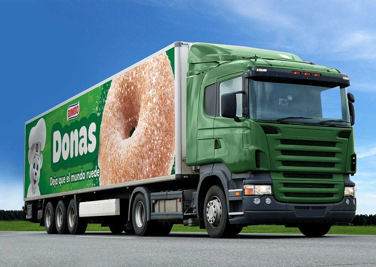
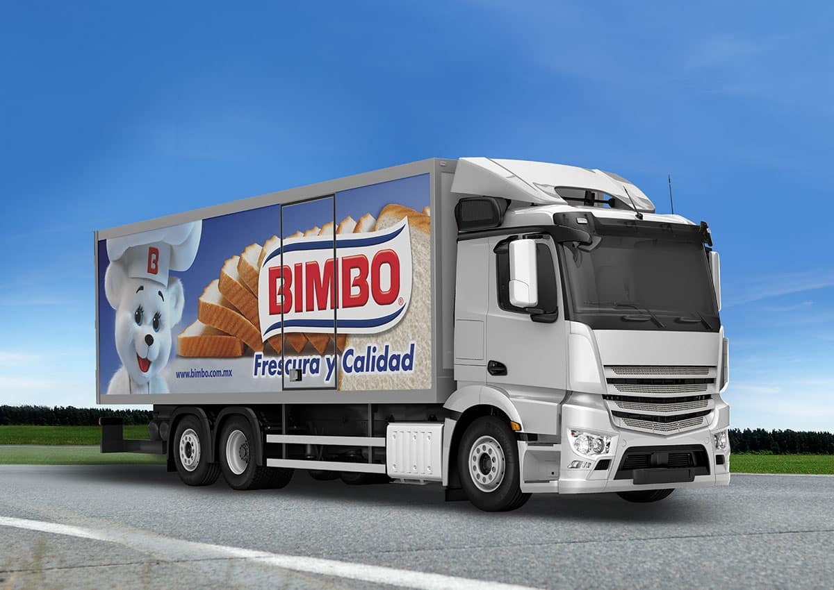
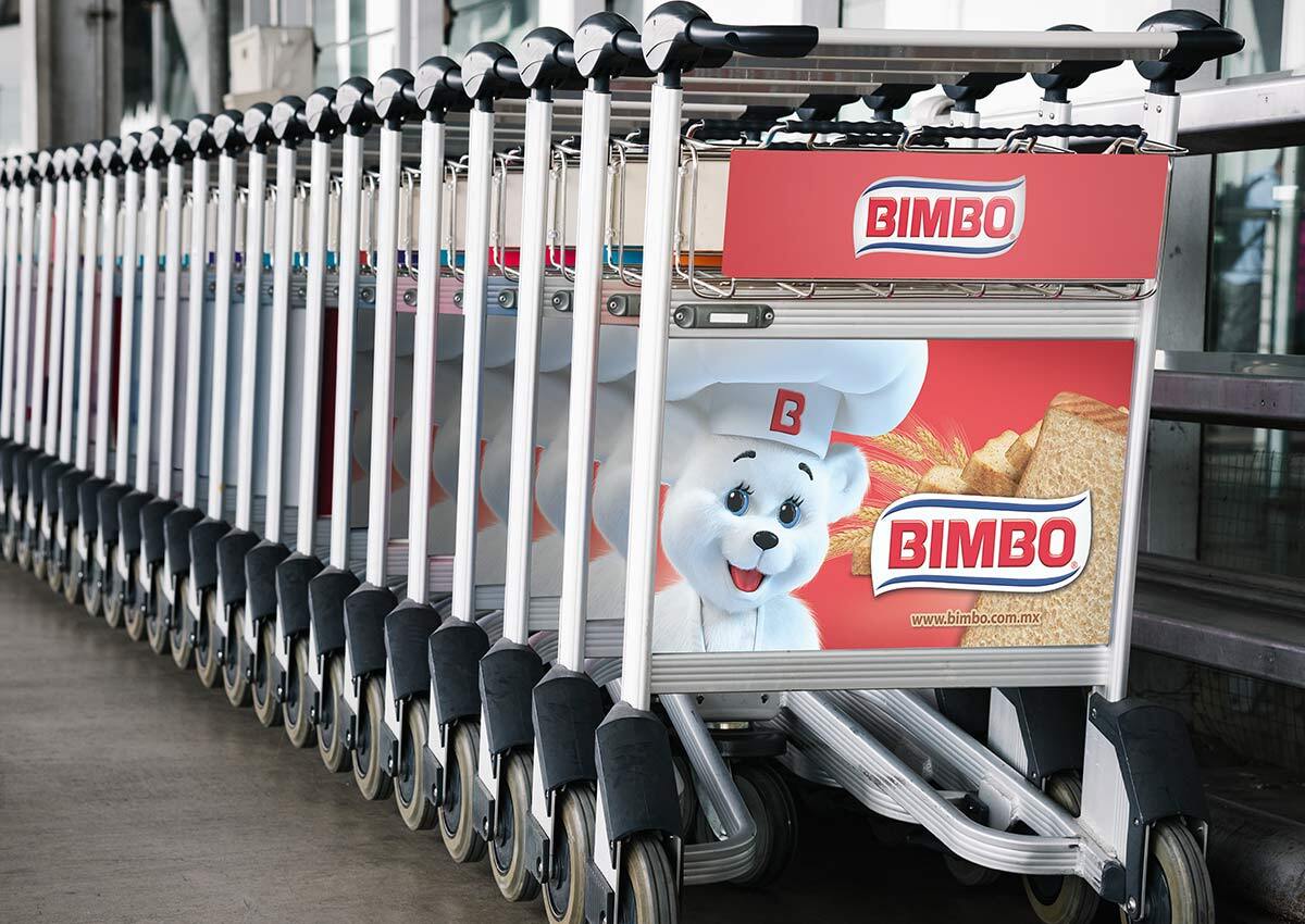
Your brand doesn’t stop at the shelf—it travels. Delivery trucks are more than just vehicles; they’re mobile advertisements that can reinforce your brand identity wherever they go. Bold, memorable vehicle wraps capture your brand’s essence while ensuring key messaging is clear and impactful. For bread brands, we design truck-fleet advertising that celebrates your product’s freshness and quality.
'Truckvertising' turns your delivery fleet into mobile billboards, allowing your bread brand to reach a wider audience as it moves through city streets and neighborhoods. We design bold, memorable vehicle wraps that capture your brand’s essence while ensuring key messaging, like freshness or special promotions, is clear and impactful. Whether it’s vibrant visuals of steaming loaves or cheerful branding that emphasizes trust and tradition, our designs create lasting impressions on the road.
ELEVATING BREAD PACKAGING DESIGN WITH CUSTOM PRODUCT IMAGERY
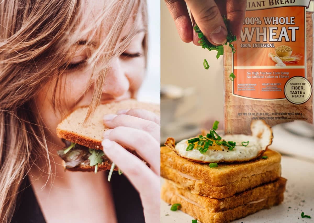
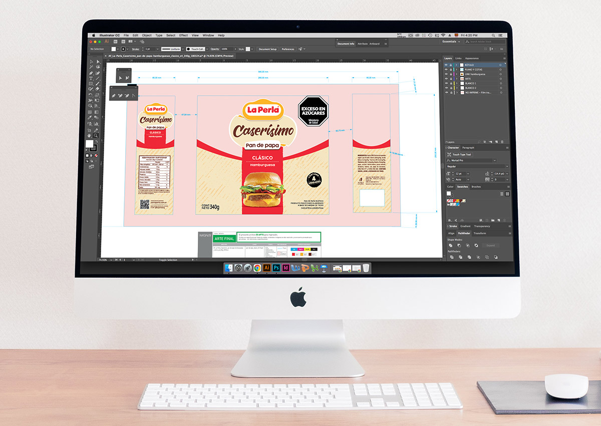
While bread packaging is typically printed using flexography, advancements in design and printing techniques allow for the incorporation of highly detailed designs and illustrations. This enables brands to include specially crafted images that enhance the visual appeal of the packaging, making it more engaging and distinctive.
These custom illustrations and designs not only elevate the aesthetic value of the packaging but also help communicate key brand messages, such as artisanal quality, natural ingredients, or freshness. By leveraging flexography's versatility alongside meticulous design work, brands can create packaging that stands out on shelves while resonating with their target audience.
PACKAGING THAT EVOKES THE JOY OF SHARED MEALS
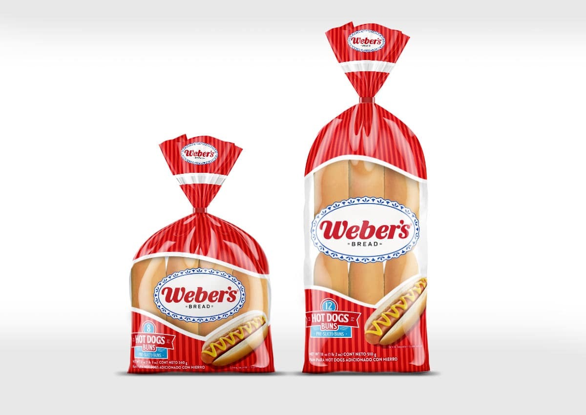
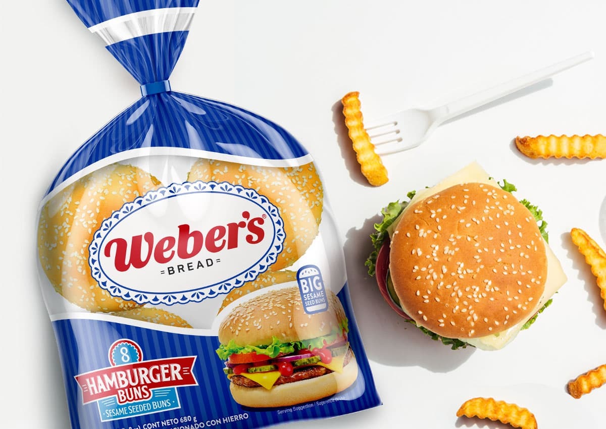
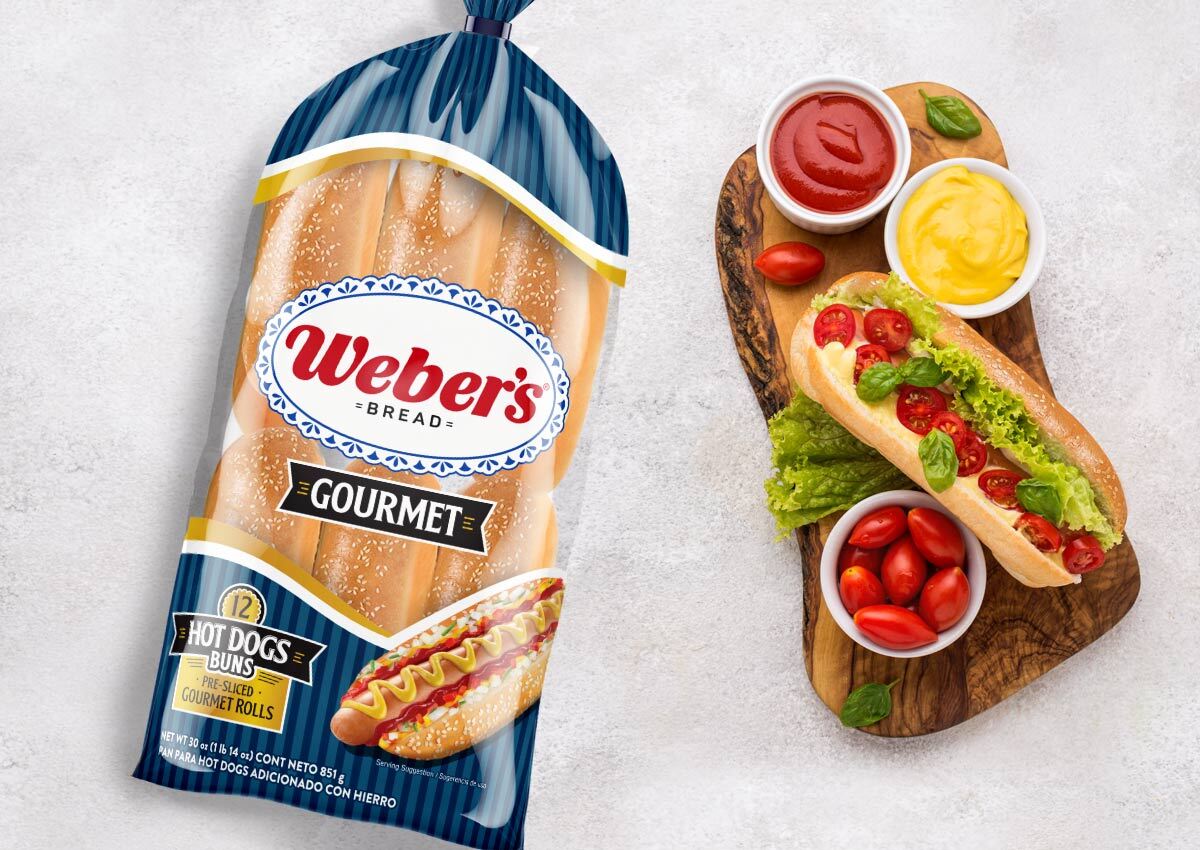
Packaging design for hamburger buns and hot dog buns leverages the emotional appeal of shared meals and social gatherings. Bright, bold colors like red and blue dominate the design, complemented by a transparent window that showcases the buns' softness and freshness. Appetizing imagery of freshly prepared burgers and hot dogs enhances the visual appeal, evoking the joy of summer barbecues and casual family meals.
The design focuses on delivering freshness, quality, and Weber’s brand identity, ensuring the product stands out on the shelves while connecting with consumers on an emotional level. These designs celebrate the fun, carefree moments that these products represent, ensuring they stand out on the shelves and connect with consumers seeking products for gatherings and celebrations.
SHOPPER MARKETING: ENGAGING CONSUMERS AT THE POINT OF SALE
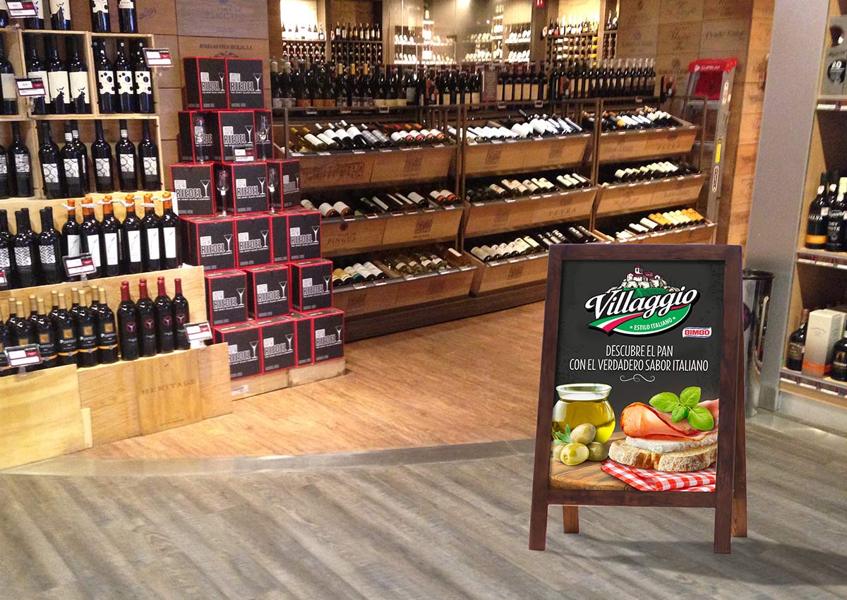
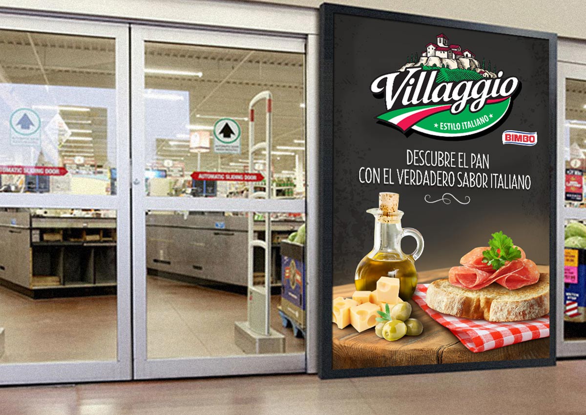
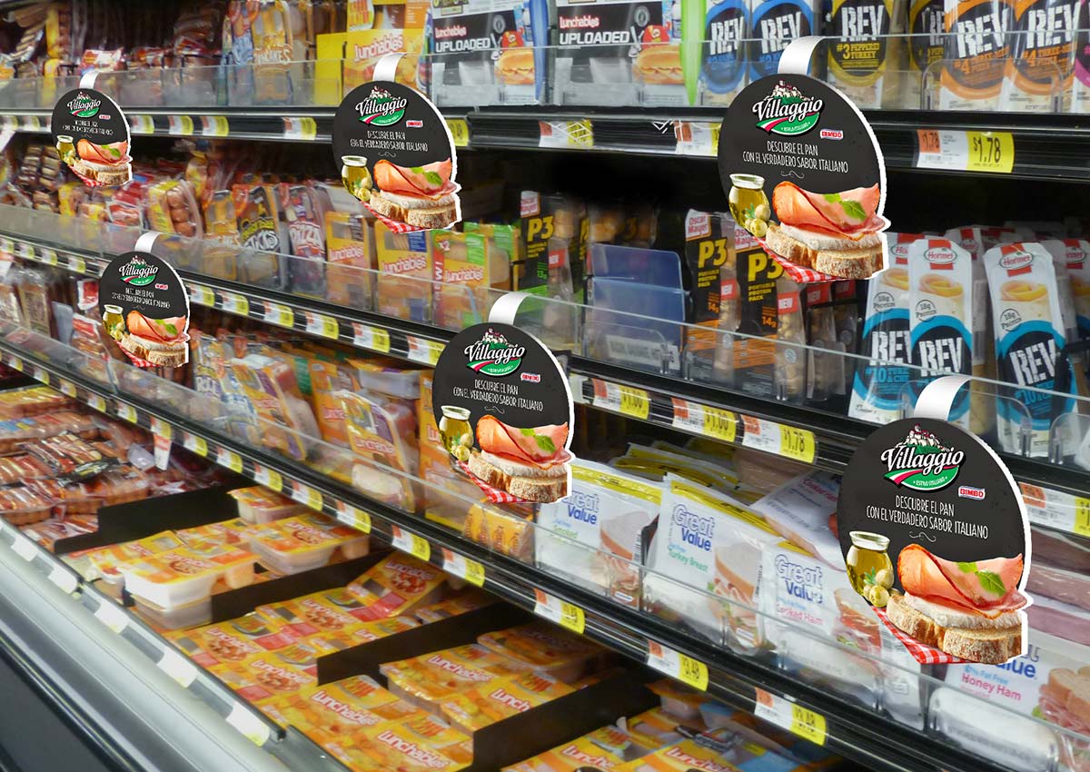
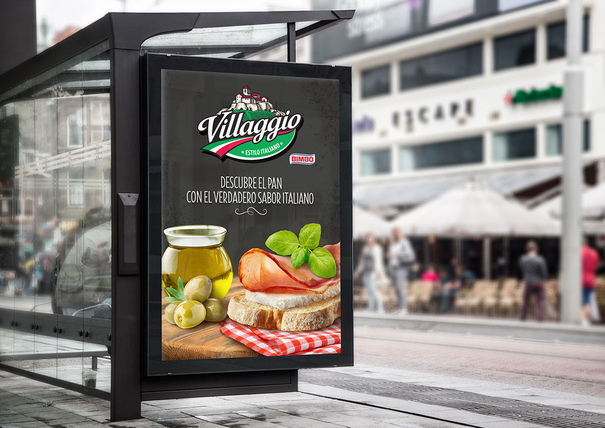
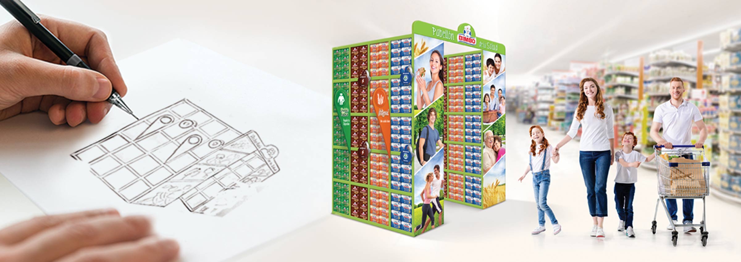
In-store experiences can significantly influence purchasing decisions in the bread category. Our shopper marketing strategies include creating shelf-ready displays, end-cap activations, and promotional signage that guide consumers toward your products. By understanding the unique needs of bread shoppers—such as freshness, health, and family appeal—we design materials that encourage trial, build loyalty, and drive sales
Effective in-store communication is essential to standing out in a competitive bread aisle. We design materials such as shelf talkers, banners, and product displays that highlight your product’s key benefits—whether it’s whole grains for health-conscious shoppers or indulgent flavor for special occasions. By blending creativity with shopper insights, we ensure your brand captures attention and drives conversions in even the busiest retail environments.
WHY IMAGINITY FOR BREAD PROJECTS?
In the bread category, every detail matters—from the feel of the packaging to the message on the truck. At Imaginity, as a branding and packaging design agency, we combine industry expertise with creative innovation to deliver tailored solutions that help bread brands connect with consumers and stand out in crowded markets. Let us help you rise to the occasion with branding and marketing strategies that leave a lasting impression.
Contact us today to begin baking up success for your bread!

