Client:
Bagó — Anaflex
Country:
Argentina
Task:
Packaging Design,
Branding
Bagó Anaflex Packaging Design: A Unified System for an Expanded Pain Relief Range
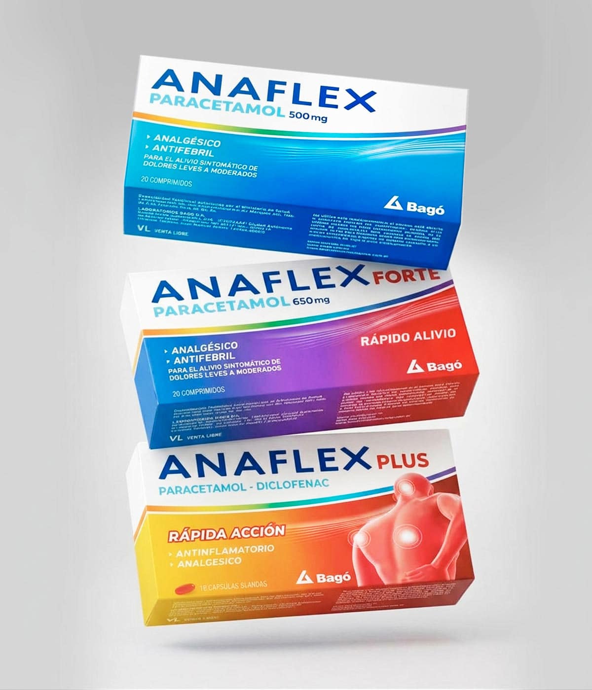
Anaflex is one of Argentina’s most recognized over-the-counter pain relief brands. As Bagó expanded the portfolio with two paracetamol products and an evolution of Anaflex Plus, the brand needed a packaging system that could organize three distinct formulations within one recognizable identity.
The resulting range comprises Anaflex Paracetamol 500 mg, Anaflex Forte Paracetamol 650 mg, and Anaflex Plus, which combines paracetamol and diclofenac. We created a unified design architecture that strengthens brand recognition while giving every product a distinctive visual code.
A clearer information hierarchy, more prominent ingredient communication, and consistent brand presentation make the range easier to understand and navigate within the competitive pharmaceutical and OTC market.
Imaginity | Design Agency | Branding, Packaging Design, Marketing
A Unified Brand Module for the Complete Range
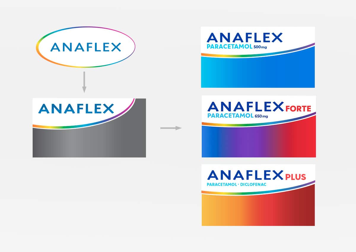
The previous packaging used different shapes, proportions, and treatments for the Anaflex identity. As the portfolio expanded, this variation made it more difficult to establish a consistent relationship between products.
We redesigned the brand module as a flexible brand architecture system that remains uniform across the range. The Anaflex logo, active ingredients, dosage, and sub-brand identifiers now occupy clearly defined positions, creating a recognizable signature on every pack. The module can incorporate names such as Forte and Plus without altering the fundamental structure of the identity. This gives each product its own designation while preserving a cohesive look throughout the portfolio.
The Anaflex logo also evolved from a shaded treatment reproduced through a CMYK color combination to a solid Pantone, or PMS, blue. This change gives the brand a cleaner and more distinctive appearance while making its reproduction more consistent across print runs, substrates, and packaging formats. The solid color improves definition and reinforces the logo as the most prominent element of the brand’s visual identity.
The technical refinement also reflects the importance of considering printing processes in packaging design from the beginning of the project.
Designed for Consistency and Flexibility
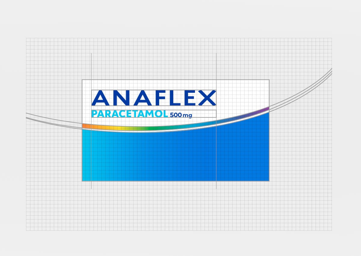
A structured design grid establishes the proportions and relationships between the logo, product name, active ingredients, dosage, benefit information, and color fields.
The enlarged white brand area creates a consistent visual anchor across the range. Beneath it, curved lines and product-specific color fields provide flexibility, allowing each formulation to establish its own identity without losing its connection to Anaflex.
This modular approach creates a clear hierarchy from brand to formulation and benefit. It also provides Bagó with a scalable packaging design system that can accommodate future line extensions and different product formats.
The system balances the requirements shared by the complete portfolio with the distinctive communication needs of each packaging category and formulation.
The Challenge: Expanding the Brand While Preserving Recognition
The project addressed three related packaging challenges. Anaflex was extending into paracetamol with two concentrations, each of which needed to be immediately distinguishable. At the same time, Anaflex Plus required a redesign that would bring it into the new visual system without losing the recognition of the existing product.
For the paracetamol range, the design needed to communicate the active ingredient and dosage clearly while establishing meaningful differences between the 500 mg and Forte 650 mg variants.
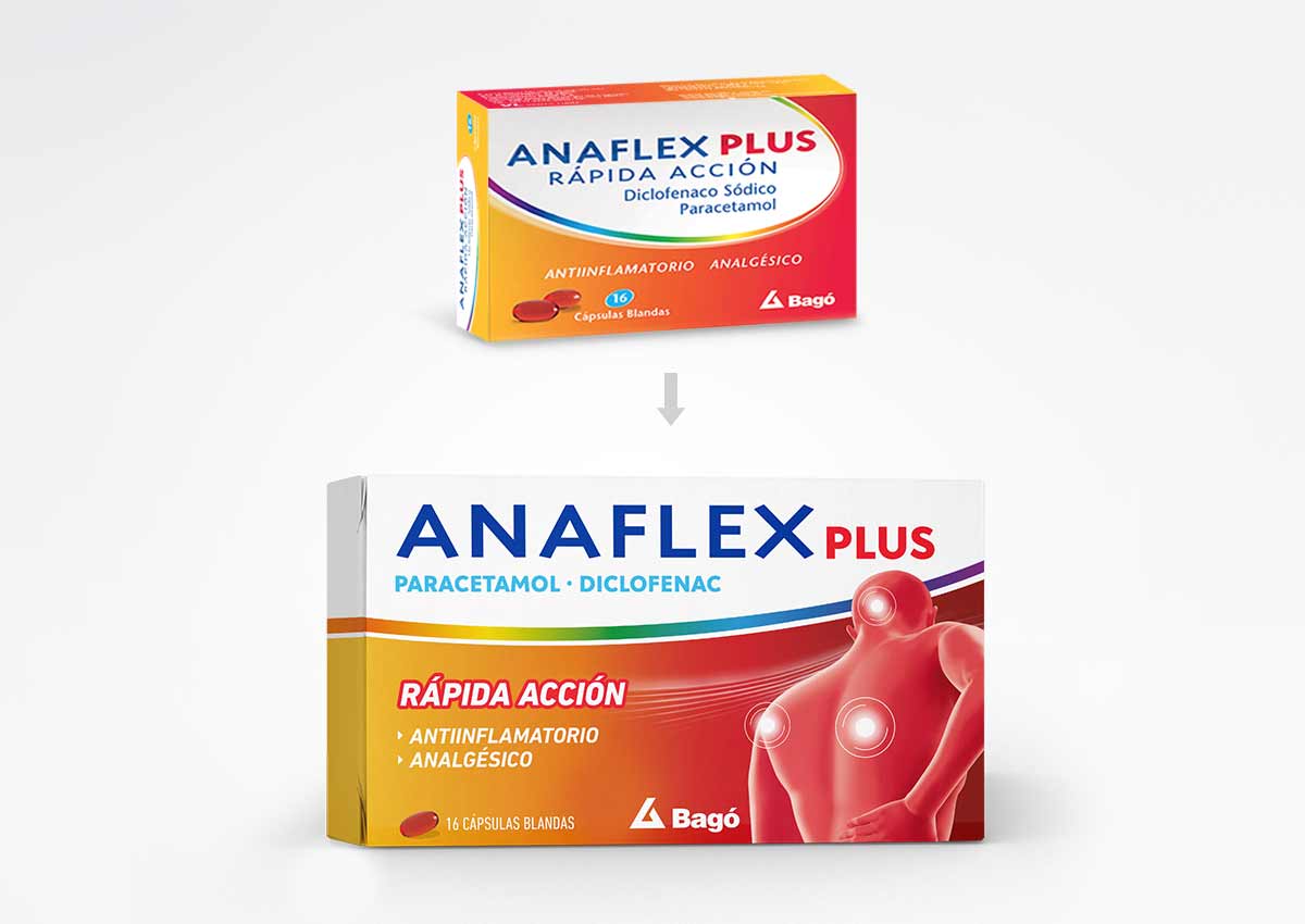
For Anaflex Plus, the objective was to retain its established orange and red color codes while making its dual formulation and anti-inflammatory positioning easier to understand. The redesign preserves visual continuity with the previous pack while giving the product greater clarity, relevance, and impact.
The challenge called for a brand architecture capable of balancing portfolio consistency with clear product differentiation.
Visual Highlights
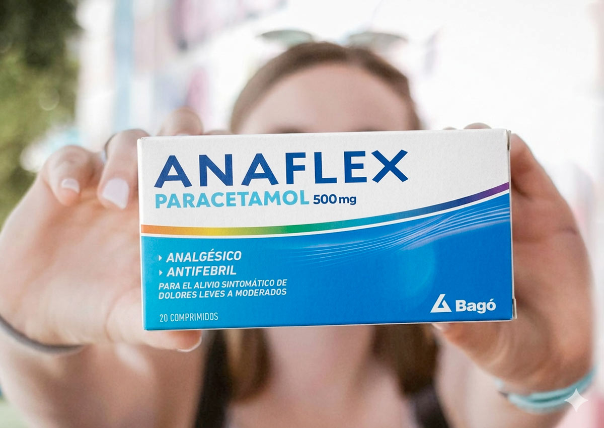
A consistent brand module: The same logo area and information structure unify all three products and create a recognizable visual signature.
A new color for paracetamol: Light blue introduces a fresh visual territory for Anaflex Paracetamol 500 mg and clearly distinguishes the new offering.
Prominent active-ingredient communication: Paracetamol, diclofenac, and dosage information are positioned directly beneath the brand for faster identification.
Clear product hierarchy: Brand, formulation, concentration, benefits, and pack information follow a structured reading order.
Improved logo reproduction: A solid Pantone blue replaces the previous CMYK-shaded treatment, producing a cleaner and more consistent brand signature.
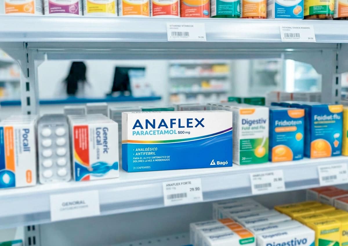
Stronger shelf presence: The larger logo, simplified layout, and distinctive color fields reinforce the power of packaging in a competitive OTC environment.
The Solution: Distinctive Colors Within One Brand System
We created an individual visual territory for each product while applying the same structural principles throughout the range.
Anaflex Paracetamol 500 mg introduces light blue as a new color for the brand. The clean blue field communicates the new paracetamol offering and creates a calm, distinctive presence on the pharmacy shelf.
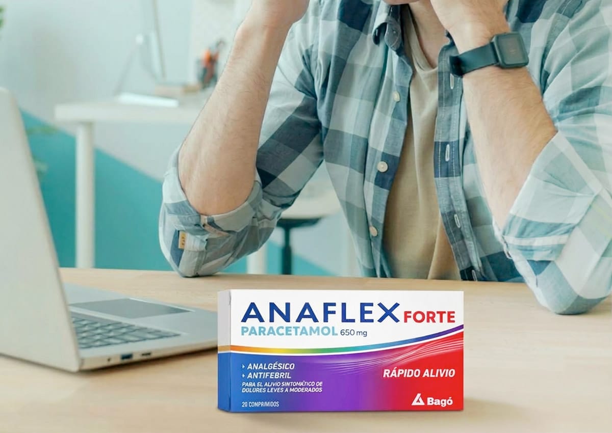
Anaflex Forte extends this system through a transition from blue and purple to red. The Forte sub-brand, the 650 mg concentration, and the front-of-pack claim “Rápido Alivio” clearly identify the higher-concentration variant.
Anaflex Plus retains the orange and red colors associated with the previous pack, now incorporated into the new architecture. This continuity protects existing recognition while connecting the product visually with the complete Anaflex range.
Together, the three palettes establish clear differentiation without fragmenting the brand. This balance between consistency and distinction increases visibility across both the pharmaceutical packaging portfolio and the physical retail environment.
Making the Anaflex Plus Benefit More Visible
Anaflex Plus combines paracetamol and diclofenac, providing analgesic and anti-inflammatory benefits for muscular pain, including back pain.
To communicate this role more directly, we introduced a human figure in a pain-related posture. Illuminated points identify relevant areas of discomfort, including the back, shoulder, and joints, creating an immediate visual connection with the product’s intended use.
The illustration, the “Rápida Acción” claim, and the prominent presentation of both active ingredients work together to give Anaflex Plus a distinctive, benefit-led identity within the portfolio.
The result demonstrates how strategic branding and visual communication can clarify a product’s position while preserving established recognition.
The Results: One Brand, Three Clearly Defined Products
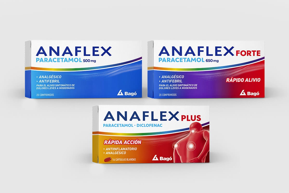
The redesigned range gives Anaflex a stronger, more coherent presence across three complementary products. The consistent brand module and solid Pantone logo reinforce recognition throughout the portfolio. Product-specific colors, dosage information, sub-brand names, claims, and benefit imagery make the individual formulations easier to distinguish.
Anaflex Paracetamol 500 mg establishes the new paracetamol offering through light blue. Anaflex Forte creates a more intensive expression through purple and red, while Anaflex Plus retains its established warm color codes and introduces a more direct representation of its anti-inflammatory benefits.
The result is a scalable brand and packaging system that preserves Anaflex’s familiar identity while supporting clearer navigation, stronger shelf impact, and future portfolio growth. The project expands Imaginity’s experience in pharmaceutical and OTC packaging design, combining brand consistency, technical print performance, and clear product communication.
IMAGINITY is a global packaging design agency specializing in pharmaceutical, OTC, and health & wellness sectors, partnering with premier healthcare and FMCG companies across Argentina, Latin America, and international markets. Combining disciplined brand architecture, compliant visual identity systems, typography optimization, and precision printing expertise, our agency delivers clear, trust-building storytelling across our portfolio to enhance shelf clarity and drive commercial growth for leading brands like Bagó Anaflex.