Client:
Terrapura
Country:
Task:
Naming, Branding, Packaging Design
Pasture-Raised Egg Brand Naming, Branding & Packaging Design
Creating a new premium egg brand built around ancestral hen lineages, origin and care.
Imaginity, global design agency, partnered with a new pasture-raised egg brand to create a complete brand identity from the ground up: naming, logo design, visual identity and packaging design. The product range was built around a highly distinctive proposition: pasture-raised eggs from ancestral hen lineages that naturally produce blue and green colored eggs. This gave the brand a strong visual and emotional starting point — a product that feels special before the carton is even opened. Our challenge was to transform this product difference into a clear, ownable brand world: premium, natural, memorable and easy to understand at shelf.
Imaginity | Design Agency | Branding, Packaging Design, Marketing
Brand Positioning & Concept Development
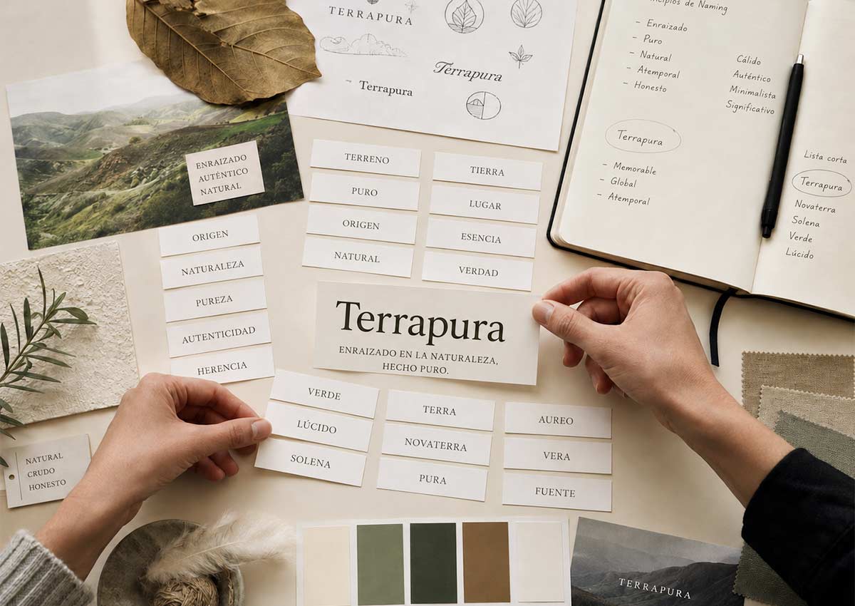
As a first step, we focused on developing a concept that would clearly communicate Terrapura's positioning and core values. The new brand needed a distinctive concept and communication strategy to stand out in a highly competitive category, transforming the hens' lineage and the eggs' natural color into a comprehensive brand platform. The goal was to help consumers immediately understand what makes these eggs different, while creating a premium, natural, and memorable presence at the point of sale.
Naming
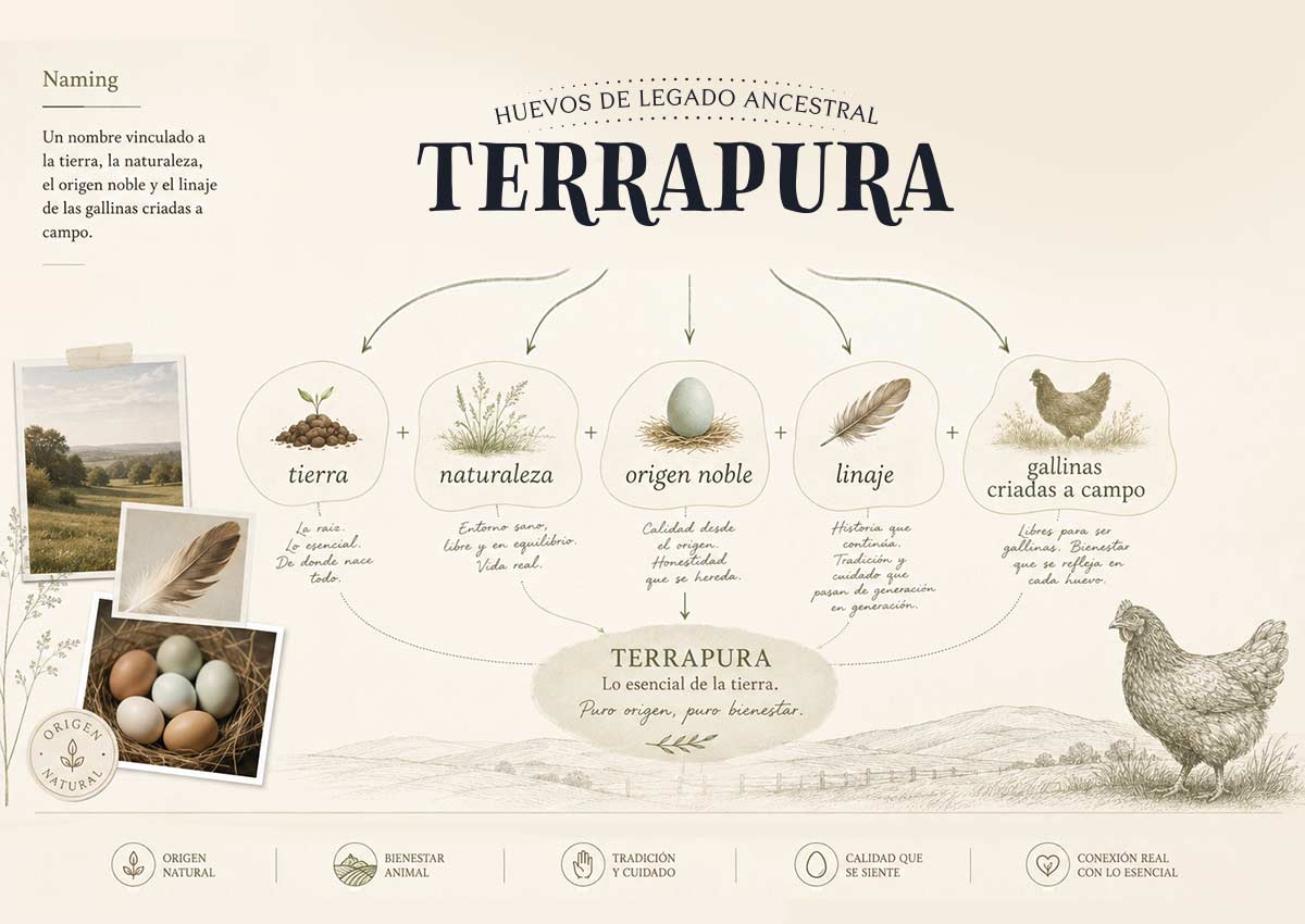
The naming process explored concepts related to nature, origin, heritage, lineage, color, care and everyday nourishment. The selected name created a strong foundation for the brand: simple, warm and connected to the product’s natural difference. It helped frame the eggs not only as a food product, but as a more considered choice — eggs with character, origin and care behind them. The naming system also allowed the product varieties to be clearly organized, giving each egg lineage its own identity while keeping the range unified under one brand.
Branding and Logo Design
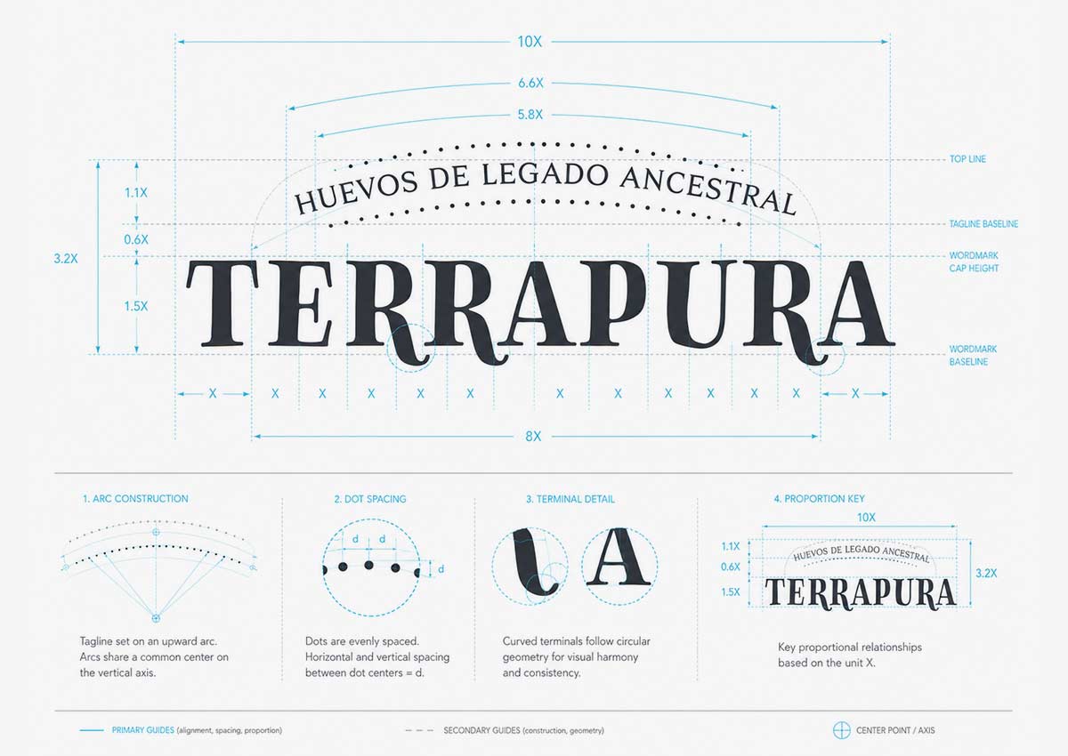
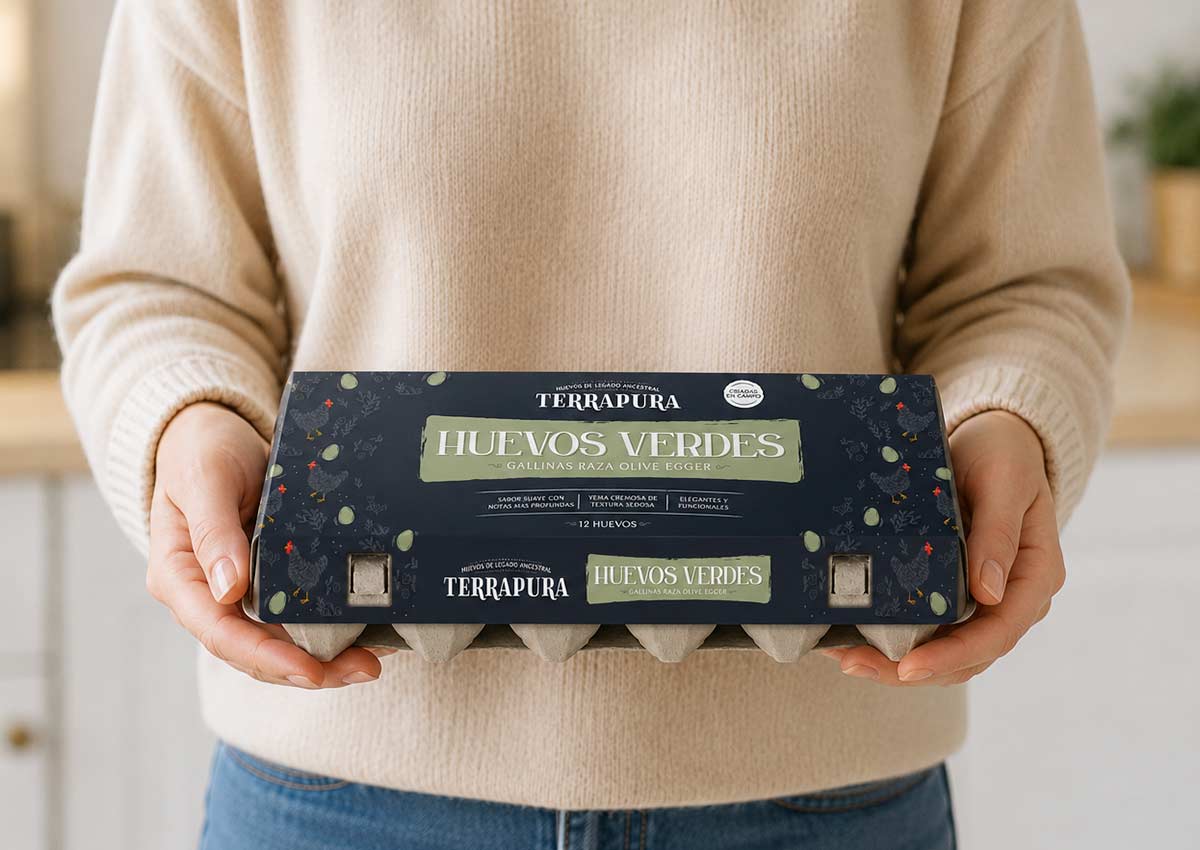
Branding and logo design For the logo, we created a brand mark that feels natural, crafted and distinctive. A strong storytelling, an identity that avoids generic farm clichés and instead focuses on a more ownable expression of warmth, origin and premium simplicity. The logo was designed to work clearly on egg cartons, labels, digital communication and future brand applications. Its visual personality supports the brand’s positioning: honest, natural, memorable and contemporary. The identity system includes typography, color palette, graphic elements and composition rules to ensure consistency across every touchpoint.
The Challenge
Eggs are a highly competitive category where most brands rely on similar cues: farms, hens, fields, freshness and naturalness. For this new brand, the opportunity was to move beyond generic category language and create a differentiated identity rooted in hen lineage, origin and the natural beauty of the product itself. The brand needed to communicate pasture-raised quality, animal care and everyday nutrition, while also celebrating the uniqueness of blue and green eggs in a way that felt authentic, not artificial or decorative. The design system also needed to work across different egg varieties, creating clear navigation between blue eggs, green eggs and future product extensions.
Design Solution
Imaginity created a complete brand identity for a new pasture-raised egg brand, turning ancestral hen lineage and naturally colored eggs into the foundation for naming, branding, packaging and communication.
The design system gives the brand a clear role in the premium egg category: natural, distinctive, warm and easy to recognize.
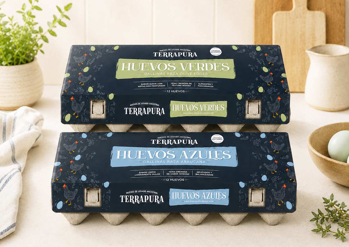
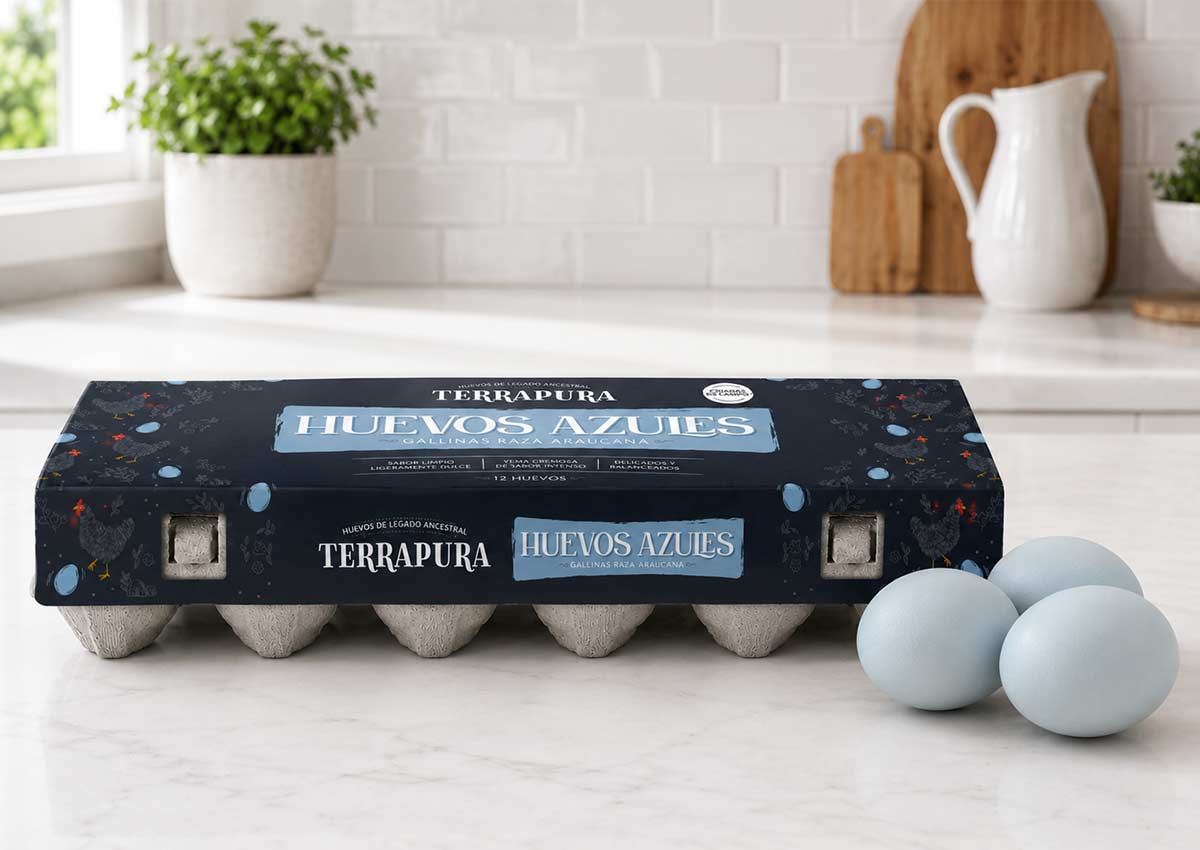
By organizing the range around blue eggs from Araucana hens and green eggs from Olive Egger hens, the packaging builds immediate shelf visibility while creating a simple, scalable architecture for future growth.
Our Approach
We started by defining the brand positioning and naming strategy around the idea of eggs with a more natural, distinctive origin — eggs connected to specific hen lineages and the unique shell colors they produce. The name needed to feel simple, ownable and premium, while suggesting a deeper connection to the land, the hens and the product’s natural character. From there, we developed a complete visual identity system that could bring the brand to life across packaging, communication and future retail applications. The visual direction was designed to balance three key dimensions:
Ancestral origin: A visual language connected to hen lineage, open pastures, responsible farming and honest food.
Distinctive egg varieties: A brand system that highlights blue & green eggs as the natural result of specific hen lineages, not as a decorative color cue.
Premium everyday appeal: A design that feels elevated and special, but still accessible for a daily food product.
Pacakging Design
We understand the power of packaging to create strong shelf impact while making the product difference immediately clear.
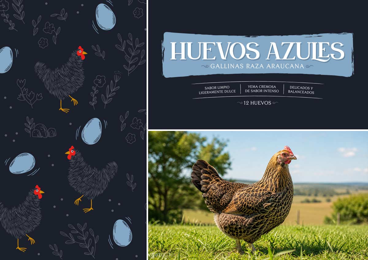
Blue eggs and green eggs became central to the packaging architecture, but the story goes deeper than color. Each variety is connected to a specific hen lineage, helping consumers understand the natural origin behind the product difference.
The carton design combines clear product information with a warm, premium brand expression. The front of pack highlights the brand, the egg variety, the pasture-raised proposition and key product cues in a simple hierarchy.
The result is a packaging system that feels natural and distinctive, with enough flexibility to support future SKUs and product extensions.
Visual identity
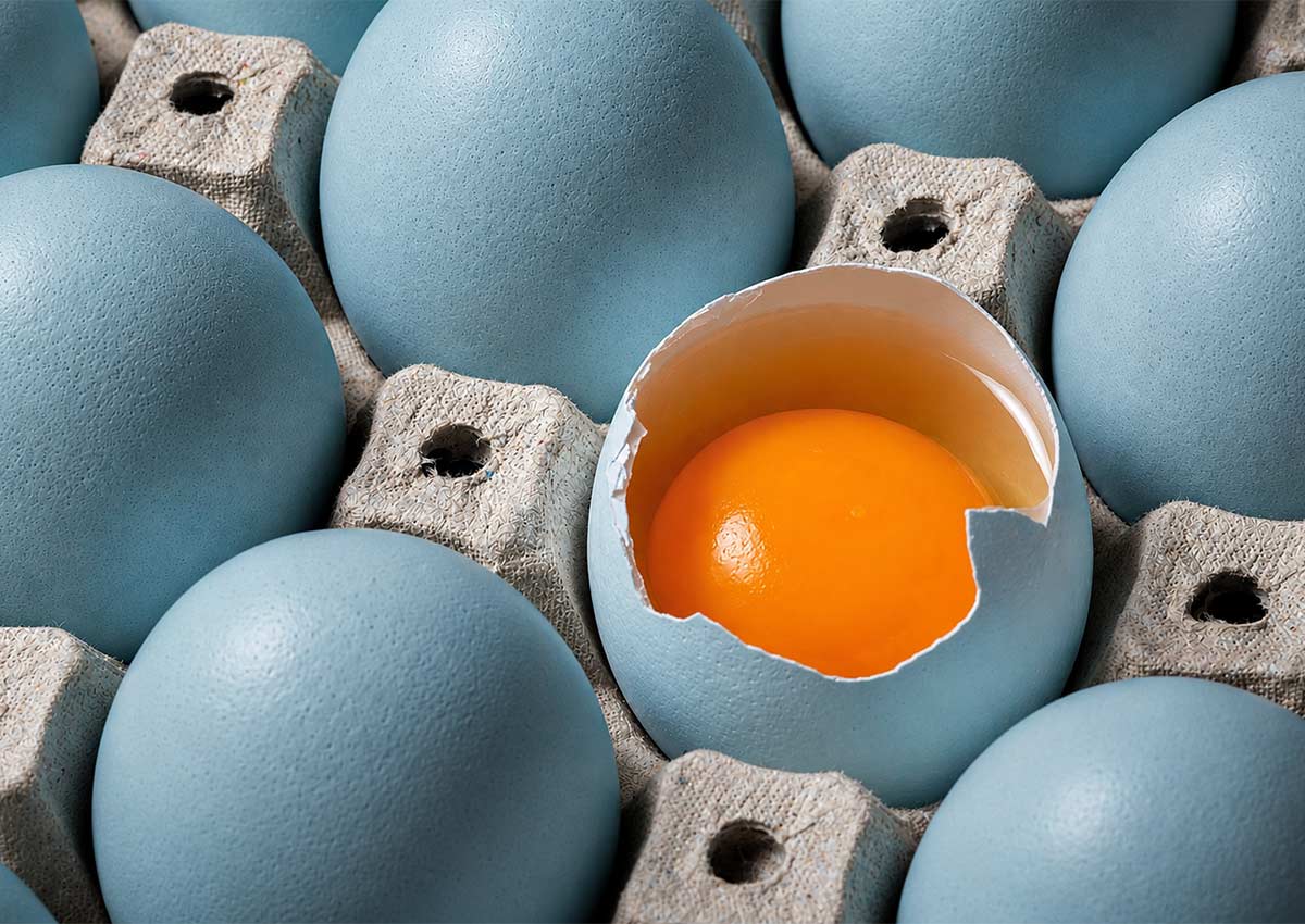
Beyond the pack, we created a visual identity system that extends the brand world into communication, retail and digital environments.
The system includes color, typography, graphic textures, and visual principles. Every element was designed to reinforce the same idea: naturally distinctive eggs from specific hen lineages, raised with care.
This gives the brand a consistent and recognizable presence across packaging, website, social media, point of sale and future brand activations.