Client:
Laboratorio Luar. Covadenil
Country:
Argentina
Task:
Branding, Packaging Design
Covadenil: Strategic Brand Redesign & Packaging Architecture
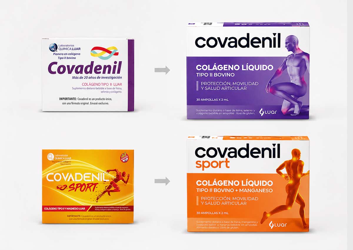
Imaginity partnered with Covadenil, in Argentina, to direct a comprehensive branding and packaging redesign aimed at unifying the product line architecture and increasing its market authority. The primary goal was to transition the brand into a more cohesive visual identity that resonates with modern consumers while ensuring immediate recognition on the shelf. By clarifying the information hierarchy and introducing high-impact visual cues, we transformed the packaging design into a powerful communication tool for the competitive pharma, health and wellness category.
Imaginity | Design Agency | Branding, Packaging Design, Marketing
Visual Highlights
- Optimized Brand Cohesion: A unified design system across the entire line to strengthen brand architecture and establish a professional, trustworthy presence.
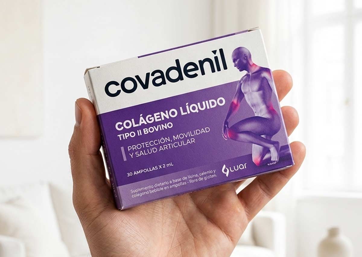
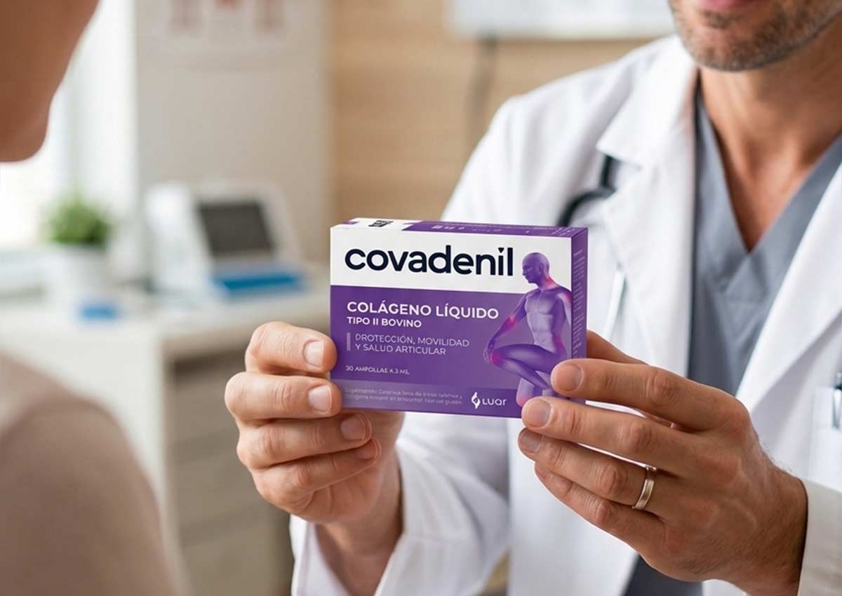
- Functional Silhouette Integration: The strategic addition of a human silhouette to provide a fast, non-verbal explanation of the product’s benefits and anatomical focus.
- Enhanced Category Identification: Re-engineered typography to make "Collagen" the focal point, ensuring the product is instantly identified within the supplement aisle in store.
- Improved Information Hierarchy: A cleaner, more direct layout that allows consumers to quickly grasp key benefits and product functionality.
- Contemporary Aesthetic Refresh: A modernized visual language designed to increase shelf relevancy and appeal to a broader, health-conscious demographic.
1. The Challenge: Increasing Category Relevance
The primary objective of the Covadenil project was to solve the lack of consistency across its product range and create a stronger storytelling. In the crowded supplement market, a fragmented brand image can lead to consumer confusion. The challenge was to create a recognizable design system that not only looked premium but also clearly communicated the specific advantages of collagen. We needed to bridge the gap between medical efficacy and consumer-friendly aesthetics to drive both trust and trial.
2. The Process: Visual Clarity and Anatomical Focus
Our team pioneered a "Communication-First" design approach taking advantage of the power of packaging as communicator. We identified that the most important information for the consumer was the product type and its area of action. To address this, we elevated the prominence of the word "Collagen" to ensure category leadership. Furthermore, we integrated a stylized silhouette as a core brand asset. This graphic element acts as an instant visual shorthand, explaining the product's functionality and health benefits without the need for dense text, making the brand more approachable and intuitive.
3. The Results: A High-Impact Presence in the Wellness Market
The result is a unified brand architecture that stands out for its clarity and sophistication. By aligning the branding across all touchpoints (digital and physical), Covadenil now enjoys a more professional and relevant presence on the shelf. This redesign has effectively transformed the product line into a cohesive family of supplements, making it easier for consumers to navigate the brand and for retailers to merchandise the collection. The project proves that strategic visual simplification is key to winning in the highly competitive pharmaceutical and supplement sectors.
Imaginity is a branding and packaging design agency specializing in pharma, OTC, and health products. We design packaging systems that enhance information hierarchy, build trust, and communicate efficacy clearly, helping brands stand out in highly regulated and competitive pharmacy environments.