Client:
Cua Cua
Country:
Task:
Unifying Portfolio Brand Architecture Through High-Impact Snack Packaging Design
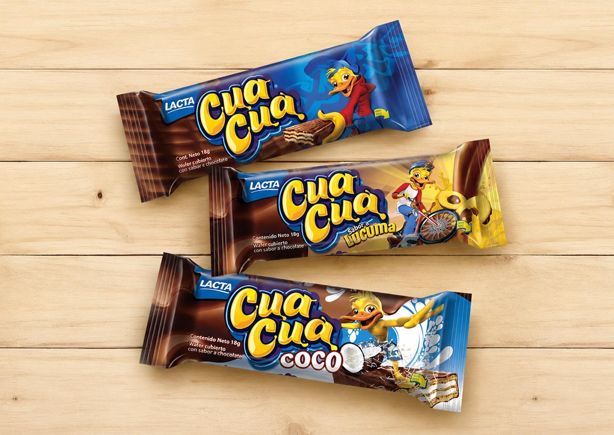
Sustaining leadership in competitive snack aisles requires an integrated packaging system capable of capturing young consumers while unifying an entire product family. For Cua Cua, Imaginity created an action-inspired packaging design strategy across Peru and Latin America that elevates shelf visibility, standardizes product navigation, and drives retail performance.
Imaginity | Design Agency | Branding, Packaging, Design Marketing
Visual Highlights
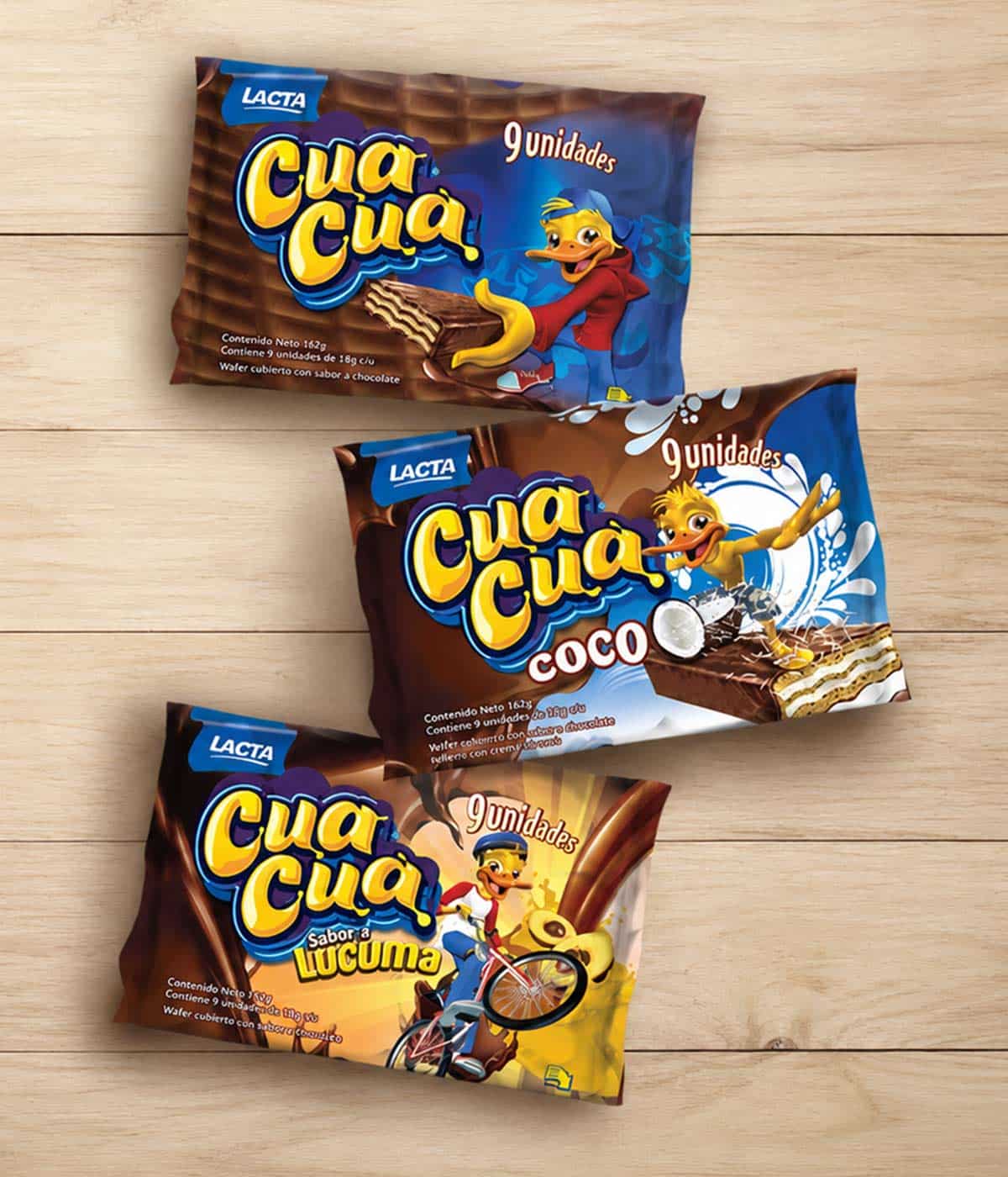
- Action-Sports Graphic Direction: Integration of alternative sports concepts, dynamic background angles, and fluid motion graphics into the front-of-pack composition.
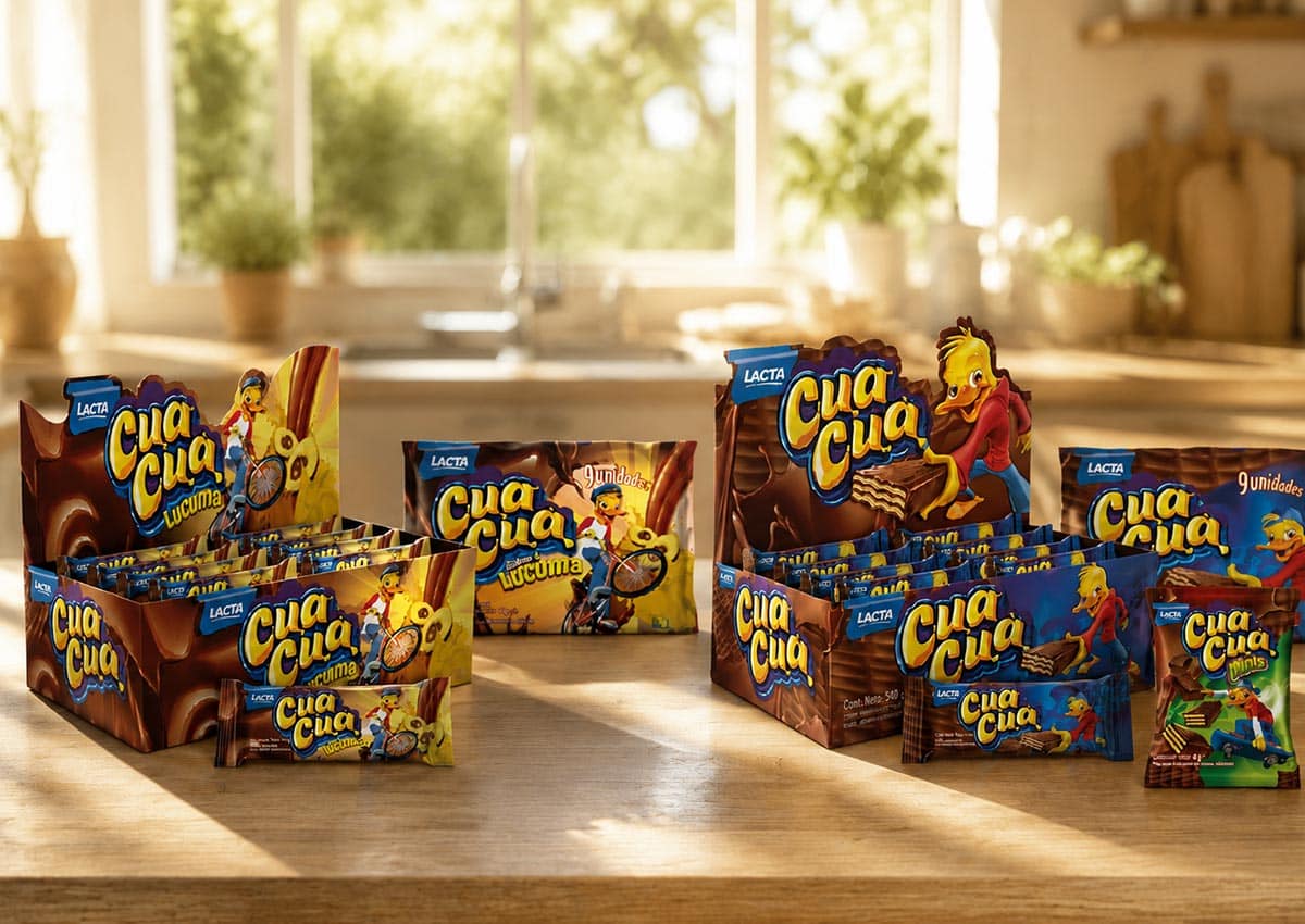
- Unified Portfolio Brand Architecture: A structured visual framework that standardizes logo positioning, flavor banners, and variant coding across every format.
- High-Impact Shelf Blocking: A bold, cohesive color strategy formulated to build a dominant visual presence on crowded retail snack shelves.
- Optimized Information Hierarchy: Clean typography, crisp product titles, and clear benefit callouts that accelerate consumer buying decisions.
- Scalable Line Packaging: A flexible visual identity framework constructed to accommodate future flavor variations, multi-packs, and limited editions seamlessly.
The Challenge
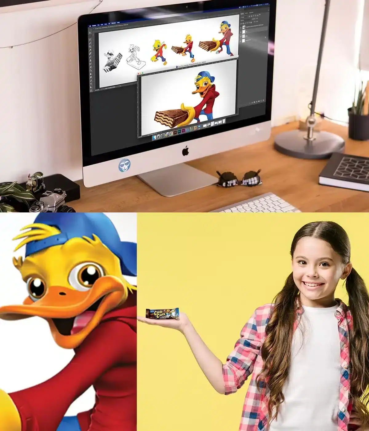
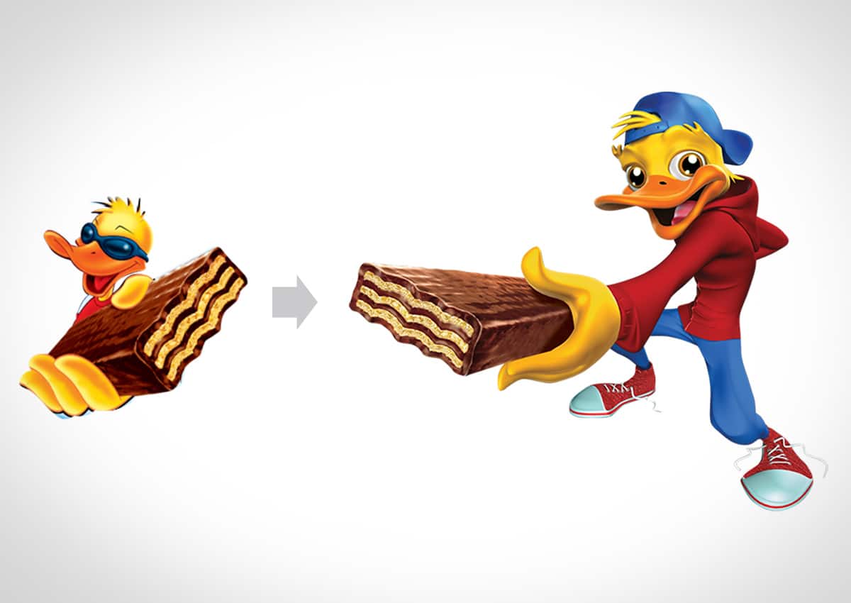
While Cua Cua enjoyed high brand awareness in the Peruvian chocolate and wafer category, its packaging visual identity faced fragmentation and outdated shelf aesthetics. The legacy wrapper layouts struggled to project energy and contemporary relevance, making it harder to stand out against aggressive competitor snacks. The strategic task required establishing a comprehensive brand architecture that brought structural visual unity, improved variant recognition, and maximized in store presence.
Our Design Process
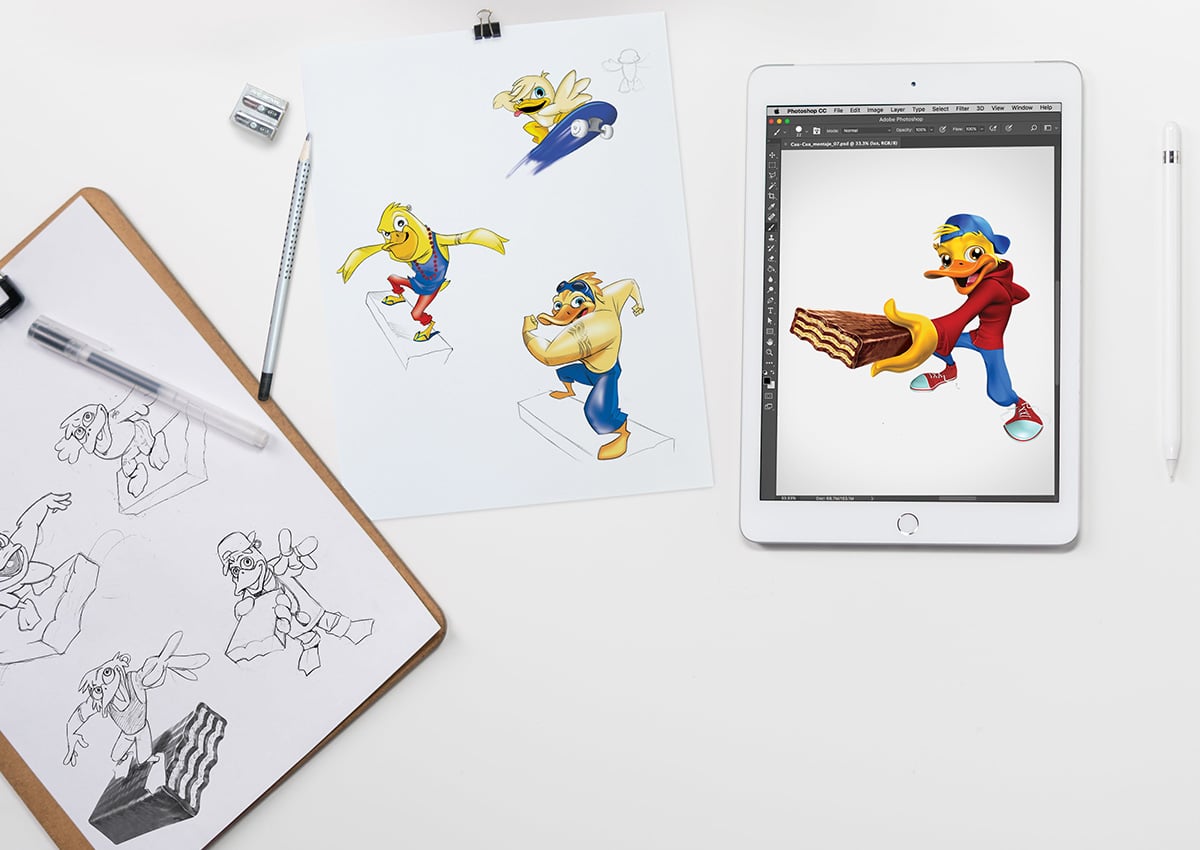
Imaginity deployed a structured design process tailored for CPG retail performance. Starting from a comprehensive creative brief, our designers formulated a clean visual layout that highlights flavor distinction through strategic background graphics and vibrant color coding. We structured the front-of-pack hierarchy to prioritize brand recognition, product descriptions, and appetite appeal, working closely with technical printing specifications to guarantee sharp contrast and color fidelity across flexible packaging materials.
The Outcome
The comprehensive redesign established a powerful, scalable visual ecosystem across Cua Cua’s full product line in Peru. By aligning the product family's external aesthetic with active youth culture and structured brand architecture, the brand strengthened its retail presence and improved variant navigation for shoppers. Through our strategic branding and packaging design solutions, Imaginity delivered a high-performing visual system that maximizes in store shelf impact throughout Latin America.
Imaginity is a global packaging design agency specializing in consumer packaged goods (CPG), helping leading food, snacks, and chocolate companies build sophisticated visual identity systems and brand architecture across Peru, Latin America, and worldwide. Combining deep retail strategy, prepress print precision, and impactful visual storytelling, our agency services showcase across our portfolio how targeted packaging evolution drives shelf presence and commercial growth.