Packaging Design Trends for 2025
THE FUTURE OF VISUAL IDENTITY
At Imaginity we explore cutting-edge packaging design trends shaping 2025. Our design strategies redefine shelf impact, strengthen consumer connections, and establish new standards in packaging excellence. Discover the power of designs that not only captivate and inspire trust but also drive sales, ensuring your brand stays ahead in a competitive market.
SMART PACKAGING
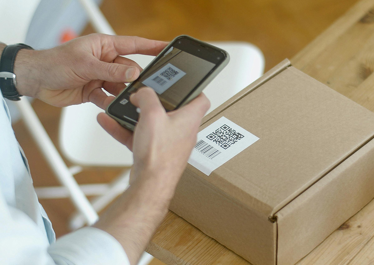
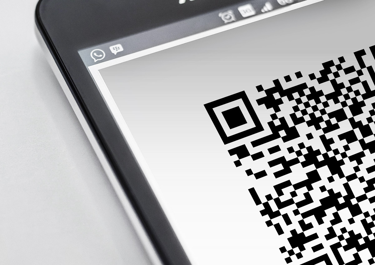
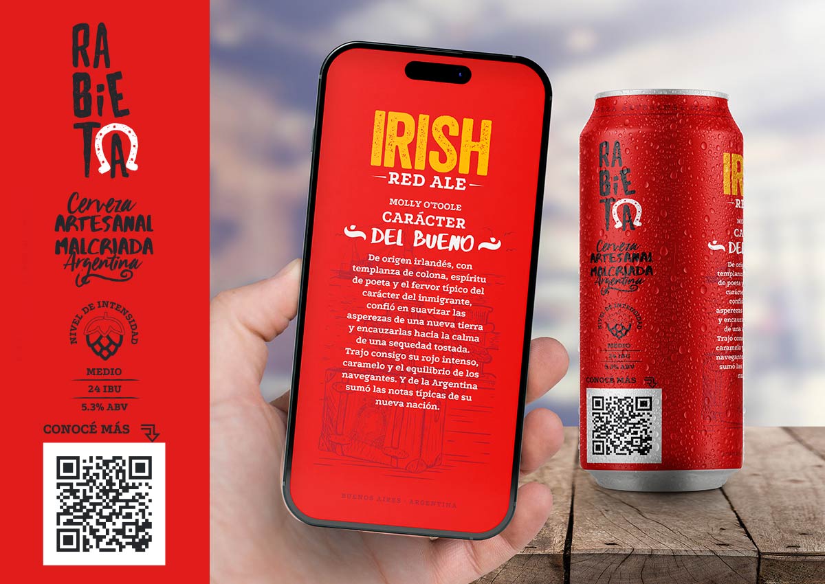
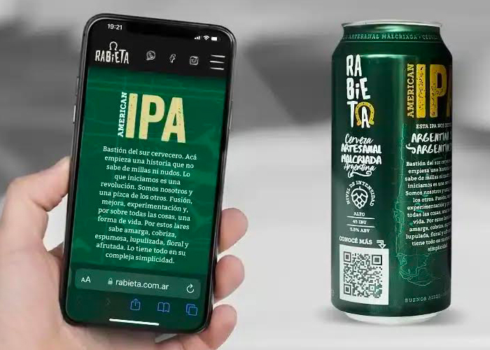
Smart packaging leverages QR codes, NFC technology, and augmented reality (AR) to create an interactive consumer experience. With a simple scan, consumers can access detailed product information, promotional content, or even gamified features. For instance, QR codes can link to instructional videos or sustainability certifications, enhancing transparency and consumer trust. AR adds an engaging layer, allowing users to visualize how a product fits into their lives, such as trying out a shade of paint virtually or seeing how a food item pairs with recipes.
This trend is also a valuable tool for brands to collect consumer data and insights. By tracking interactions with smart packaging features, businesses can fine-tune their marketing strategies and personalize the customer journey. The fusion of technology and packaging not only elevates the product’s value but also strengthens the emotional connection with consumers in an increasingly digital world.
MINIMALIST DESIGN
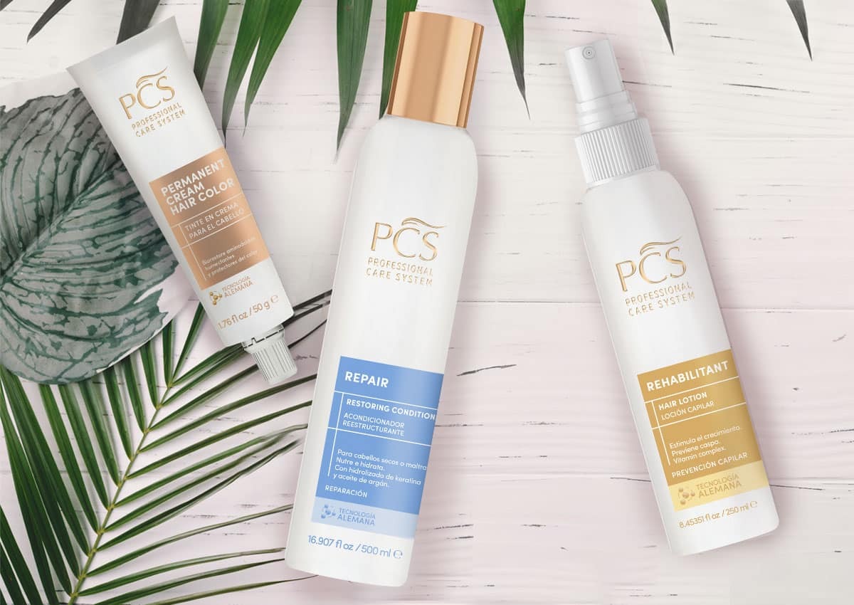
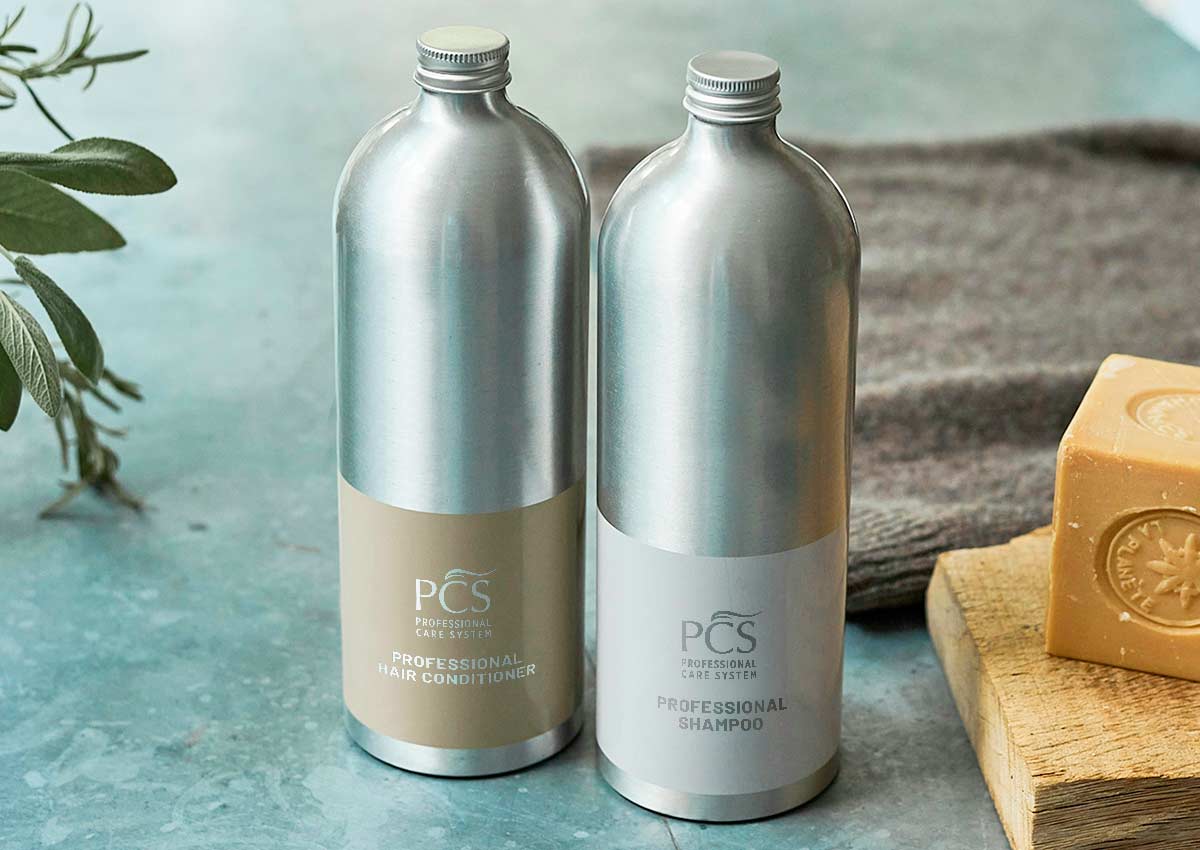
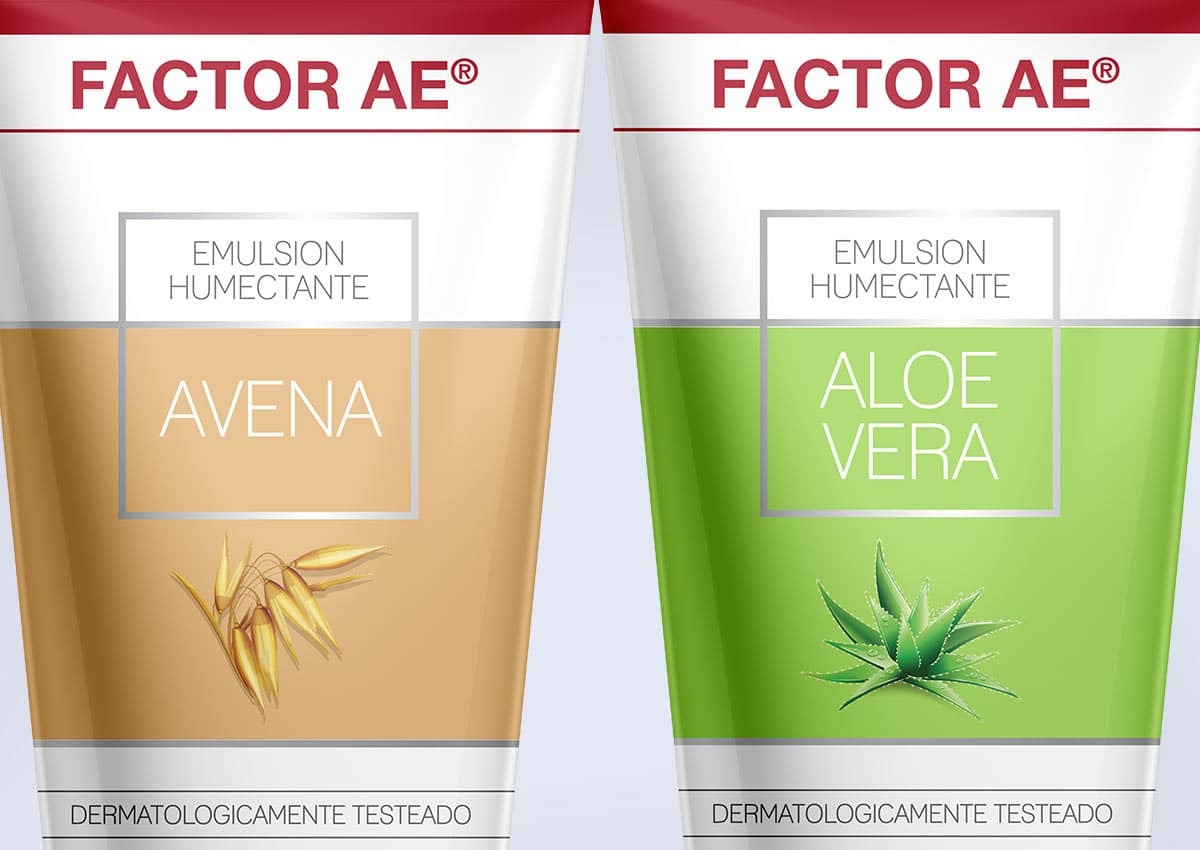
Minimalism in packaging design conveys sophistication and premium quality through its use of clean layouts, simple typography, and abundant white space. This trend aligns perfectly with modern consumers’ preference for clarity and transparency. By stripping away unnecessary elements, minimalist packaging ensures that the core message and key product benefits are immediately apparent. For instance, in home-care products, the sleek design reinforces reliability and efficacy while appealing to eco-conscious buyers. Beyond aesthetics, minimalist designs reduce production costs and environmental impact by using fewer materials and inks.
The understated elegance of such packaging also makes it versatile, allowing it to stand out both on physical retail shelves and in digital e-commerce spaces. In an era where less is more, minimalist packaging proves that simplicity can be incredibly impactful.
BOLD TYPOGRAPHY AND GRAPHICS
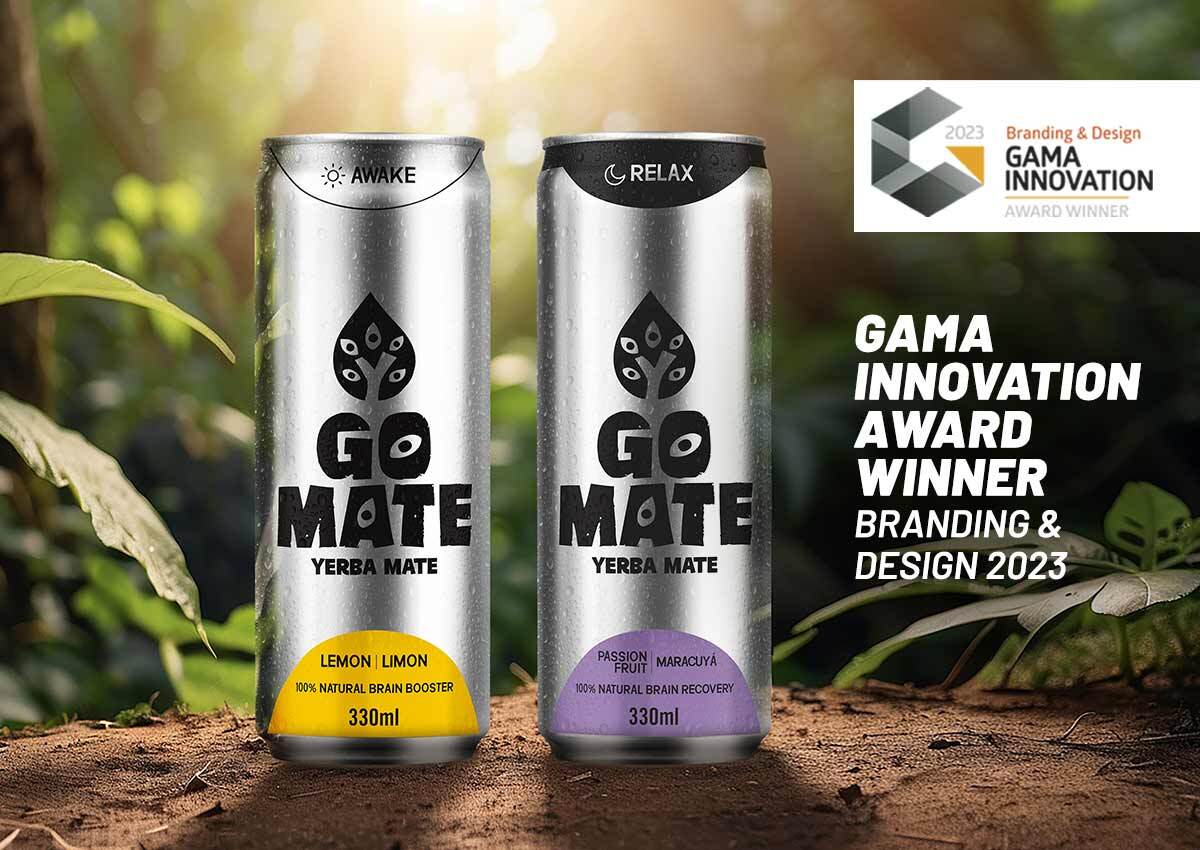
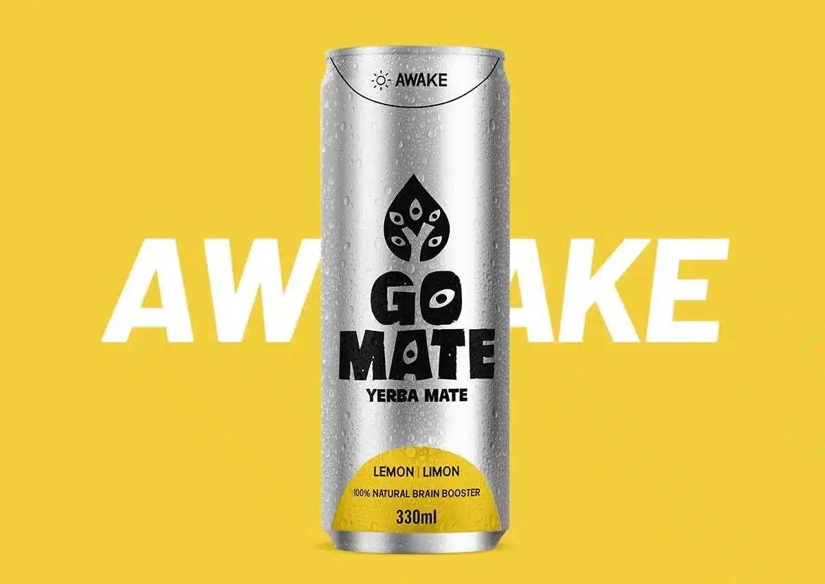
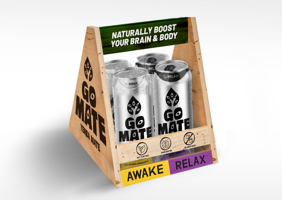
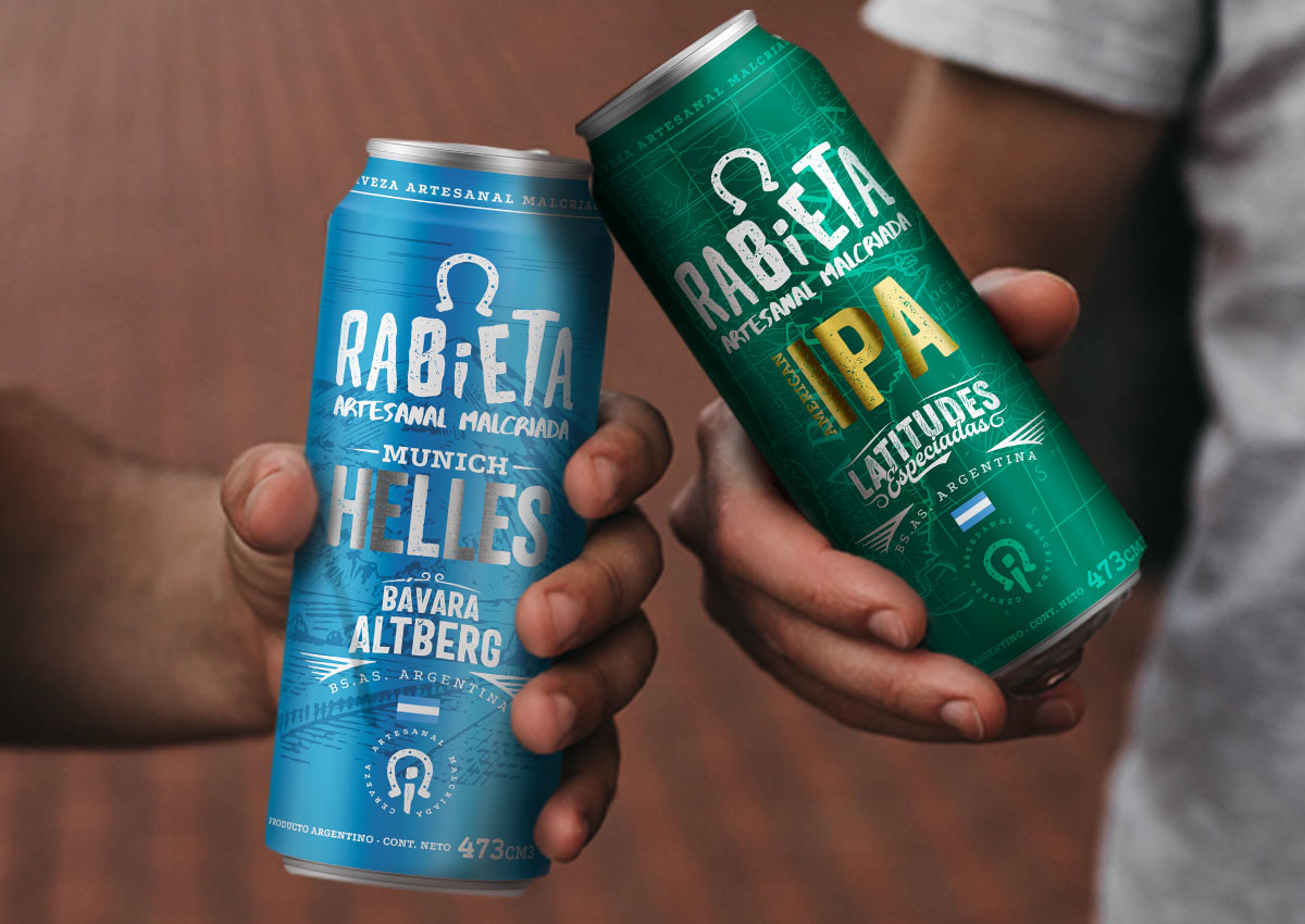
Bold typography and vibrant graphics are key elements for creating packaging designs that grabs consumer attention and establishes a strong shelf presence. Large, impactful fonts communicate brand identity and key product benefits instantly, helping products stand out in a crowded market. This trend is particularly effective for FMCG brands, where quick consumer decisions are often influenced by visual cues. Vibrant graphics and dynamic layouts work in harmony with bold typography to evoke specific emotions or associations, such as energy, cleanliness, or indulgence.
In addition to enhancing visibility, bold typography ensures readability across various formats, from retail shelves to e-commerce platforms. This approach also aligns with inclusive design practices by making important information accessible to all demographics, including those with visual impairments. By combining striking visuals with clear messaging, brands can achieve both aesthetic appeal and functional communication.
TRANSPARENT PACKAGING
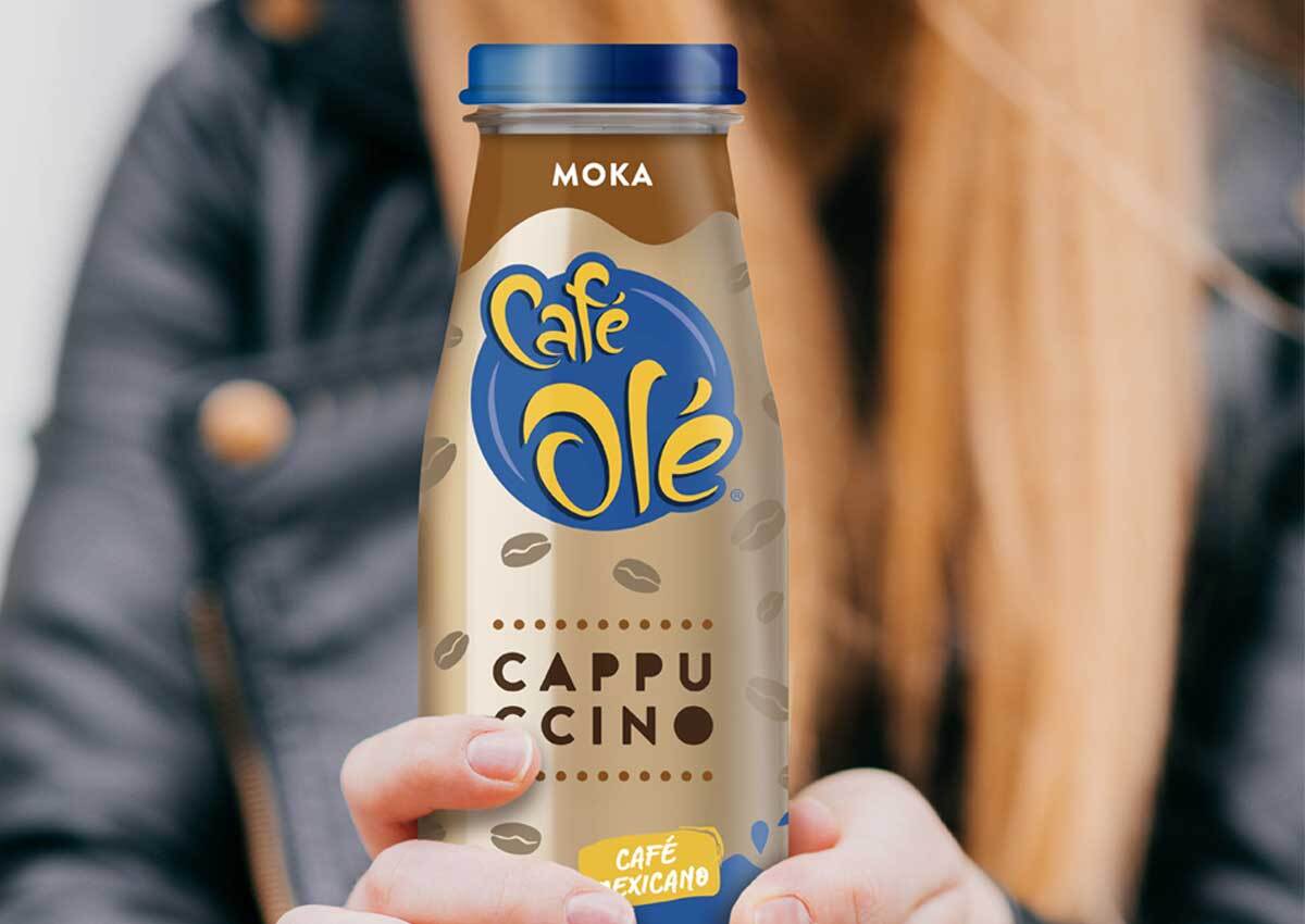
A transparent packaging design creates an immediate sense of trust and authenticity by allowing consumers to see the product inside. This approach in visual identity is particularly effective in categories like food, beverages, and cosmetics, where aesthetic cues of quality can strongly influence purchase decisions. For instance, clear windows in food packaging highlight freshness, while in cosmetics, transparency underscores purity and natural ingredients.
From a design perspective, transparent packaging complements minimalist aesthetics, creating a clean and modern look. It also provides an opportunity for creative layering of labels, graphics, or textures that interact with the product itself, enhancing the overall visual impact. Beyond aesthetics, transparency aligns with consumer demands for honesty and sustainability, reinforcing brand credibility and fostering long-term loyalty.
LIMITED EDITION PACKAGING
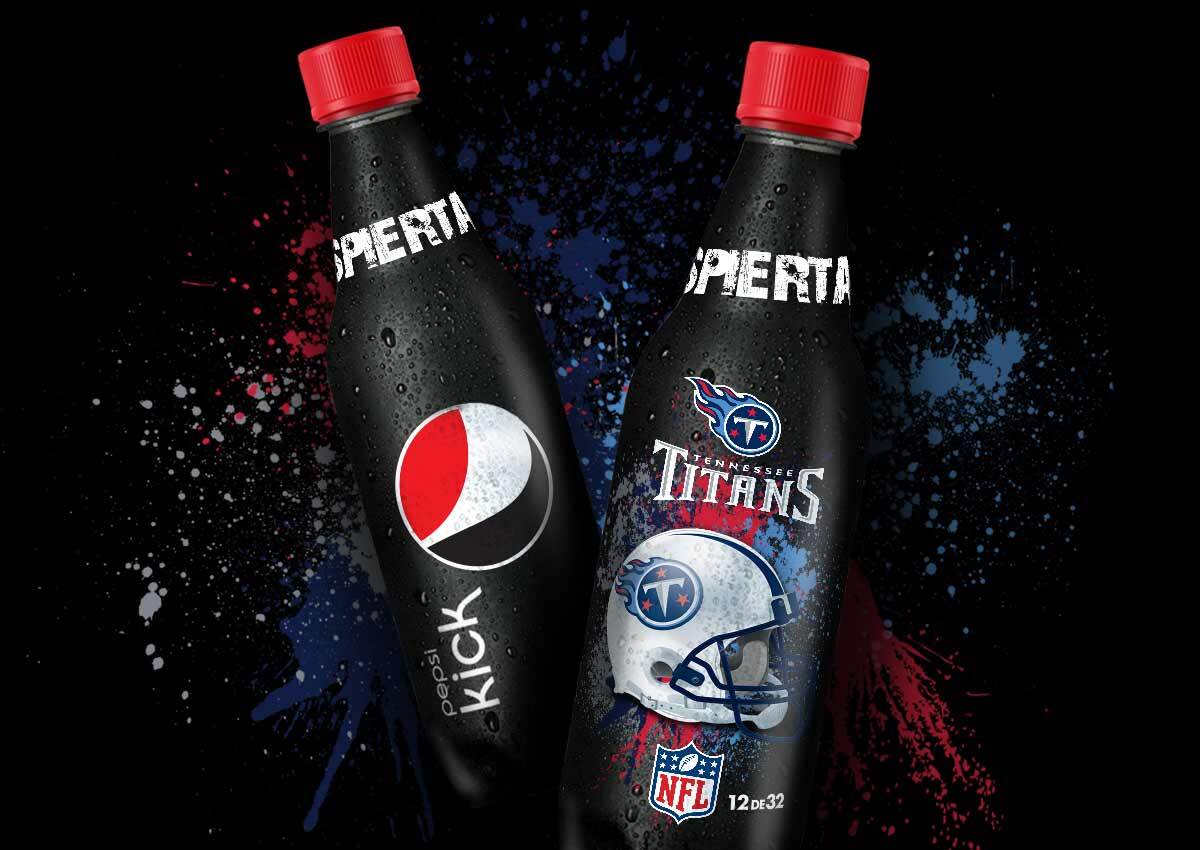
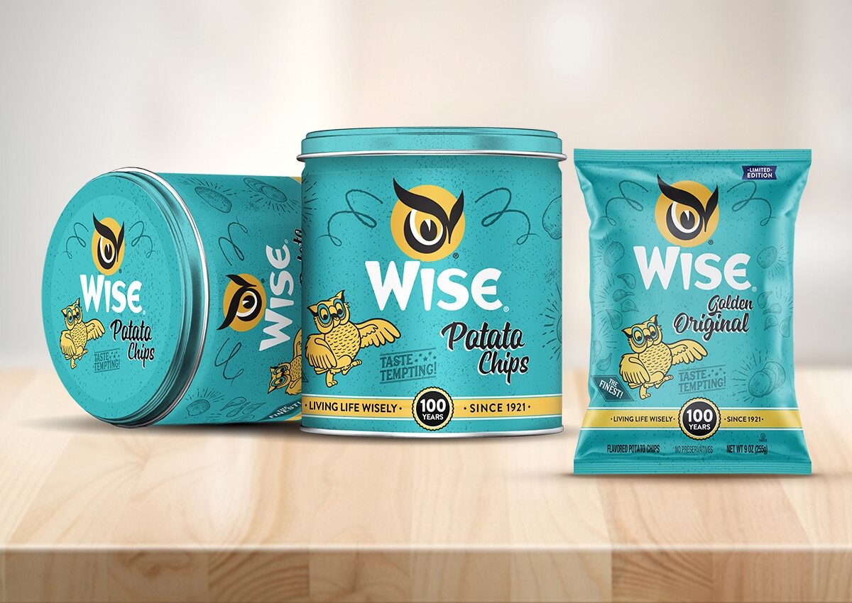
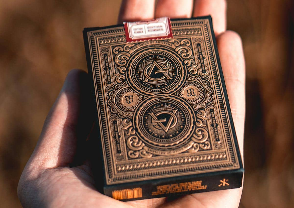
Limited edition packaging is a powerful way to create a sense of exclusivity and urgency, encouraging immediate consumer action. These designs often feature unique visual elements, such as commemorative themes, seasonal patterns, or region-specific artwork, which differentiate them from standard offerings. By aligning limited-edition packaging with cultural moments or consumer interests, brands can foster emotional connections that increase desirability
In addition to driving short-term sales, limited-edition packaging serves as a tool for brand storytelling and creating collectibility. These packages often become conversation starters, boosting word-of-mouth marketing and social media engagement. The ability to stand out on shelves while simultaneously generating buzz makes limited-edition packaging a strategic choice for capturing consumer attention and enhancing brand equity.
RETRO NOSTALGIC PACKAGING
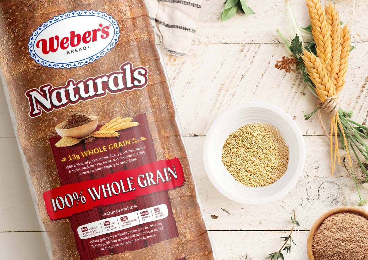
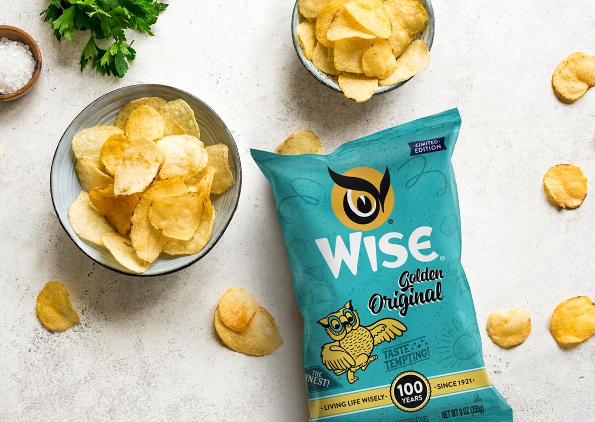
Retro-inspired packaging taps into the emotional power of nostalgia, evoking memories and positive associations with simpler times. This trend resonates particularly well with millennial and Gen X audiences, who often seek products that remind them of their childhood or past experiences. Throwback designs, vintage typography, and classic color palettes are commonly used to create an authentic, timeless appeal.
Nostalgic packaging is not just about aesthetics; it’s a strategic move to differentiate products in competitive categories. For example, snack brands might use retro visuals to highlight heritage and tradition, reinforcing a message of quality and trustworthiness. These designs foster emotional connections, giving consumers a reason to choose a product beyond its functional benefits.
SUSTAINABLE MATERIALS
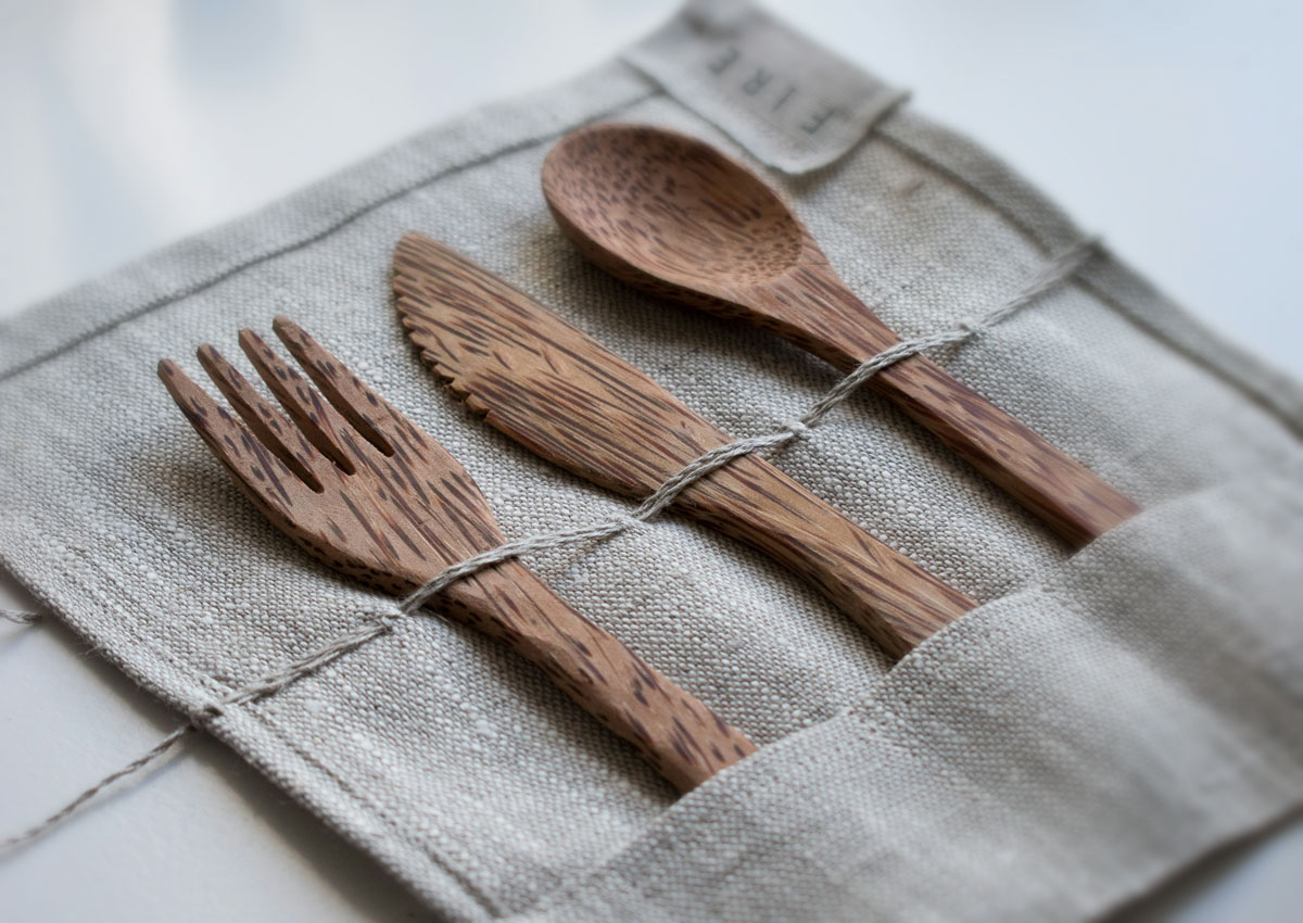
Sustainability continues to dominate packaging trends, with brands adopting eco-friendly materials to meet rising consumer demand for environmental responsibility. Recyclable, biodegradable, and compostable options are increasingly common, alongside innovative solutions like plant-based plastics or mushroom-based packaging. Beyond materials, refillable and reusable designs are gaining traction, allowing consumers to reduce waste while staying loyal to a brand.
Brands leveraging sustainable packaging also benefit from stronger positioning in terms of corporate social responsibility. Clear labeling about eco-friendly attributes can enhance transparency and trust, influencing purchase decisions. By embracing sustainability, companies can cater to modern consumers who prioritize both environmental values and product quality.
E-COMMERCE FRIENDLY PACKAGING
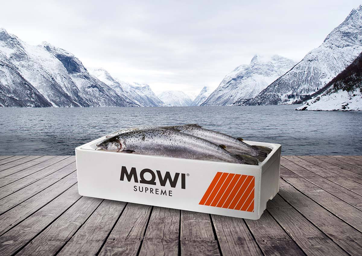
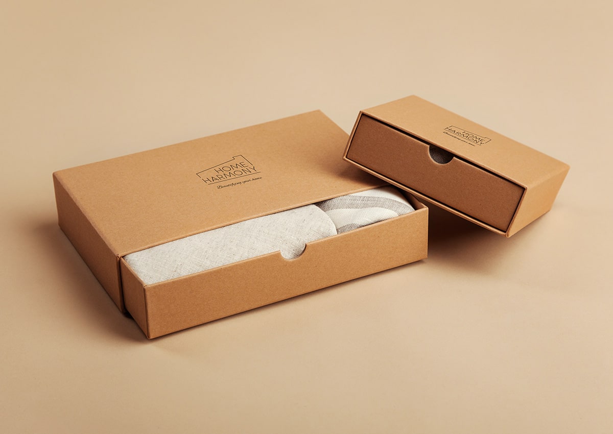
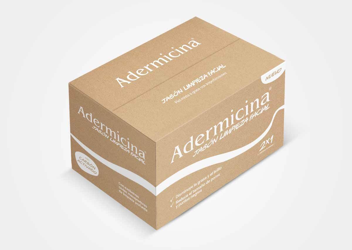
As online shopping continues to grow, e-commerce friendly packaging is becoming an essential trend. Packaging must withstand the rigors of shipping while maintaining its visual appeal. This means using durable materials, compact designs to optimize shipping costs, and easy-to-open structures for a better unboxing experience. Furthermore, minimalistic designs combined with striking branding help products stand out in crowded online marketplaces.
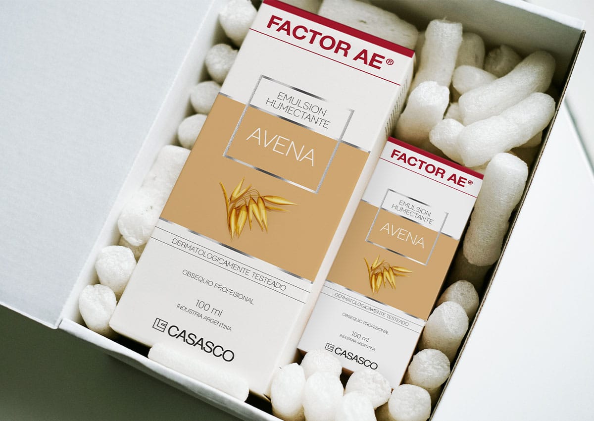
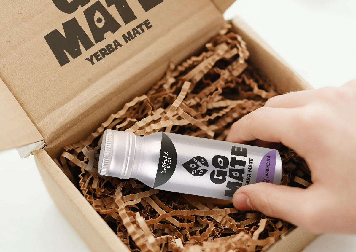
Unboxing has become a key moment for consumer engagement in e-commerce. Thoughtful designs that incorporate storytelling, product protection, and branding elements create memorable experiences that are often shared on social media, boosting brand visibility. E-commerce packaging is no longer just functional—it’s a crucial element of the customer journey that blends practicality with aesthetics.
MINIMALIST LUXE
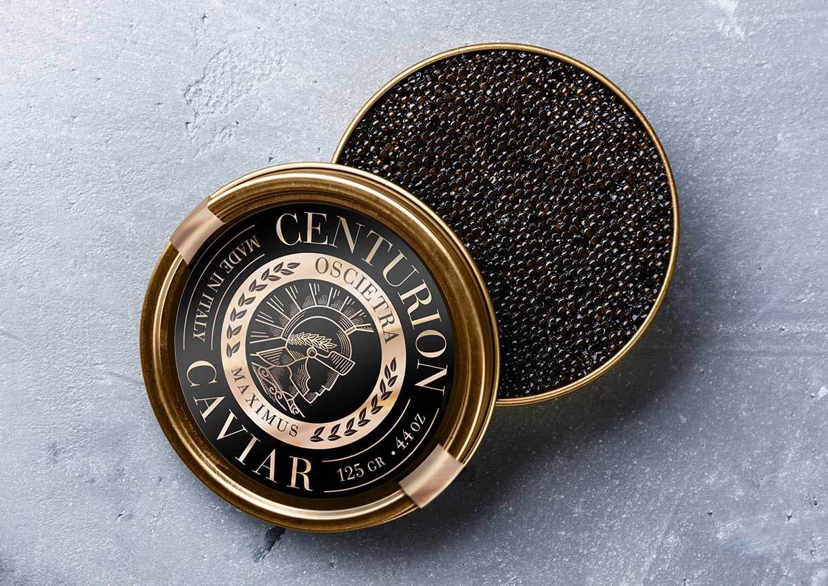
Minimalist luxe continues to redefine premium packaging by pairing simplicity with refined, high-end details. Designs in this trend rely on clean layouts, restrained color palettes, and ample white space, allowing the product itself to take center stage. Metallic finishes, such as gold or silver foils, and embossed typography elevate the aesthetic, creating a tactile and visual experience that feels modern and exclusive. This blend of minimalism and luxury caters to consumers seeking sophistication and a sense of elegance in their purchases.
The appeal of minimalist luxe lies in its versatility and ability to convey quality across categories, from cosmetics to gourmet foods. By removing unnecessary elements, these designs feel timeless while communicating the brand's confidence and focus.
REUSABLE PACKAGING
Reusable packaging aligns with growing consumer demand for sustainability, offering multi-functional designs that extend the product's lifecycle. This trend includes refillable containers, packaging that transforms into storage solutions, or designs that can be repurposed creatively. Such innovations not only reduce waste but also enhance brand loyalty by emphasizing eco-consciousness.
This approach positions brands as leaders in sustainability, appealing to environmentally conscious consumers who seek products with minimal environmental impact. Additionally, reusable packaging can serve as a branding opportunity, keeping the brand visible in consumers’ homes long after the initial purchase. By integrating functionality and eco-friendliness, reusable packaging delivers both value and sustainability.
VIBRANT CUSTOM COLORS
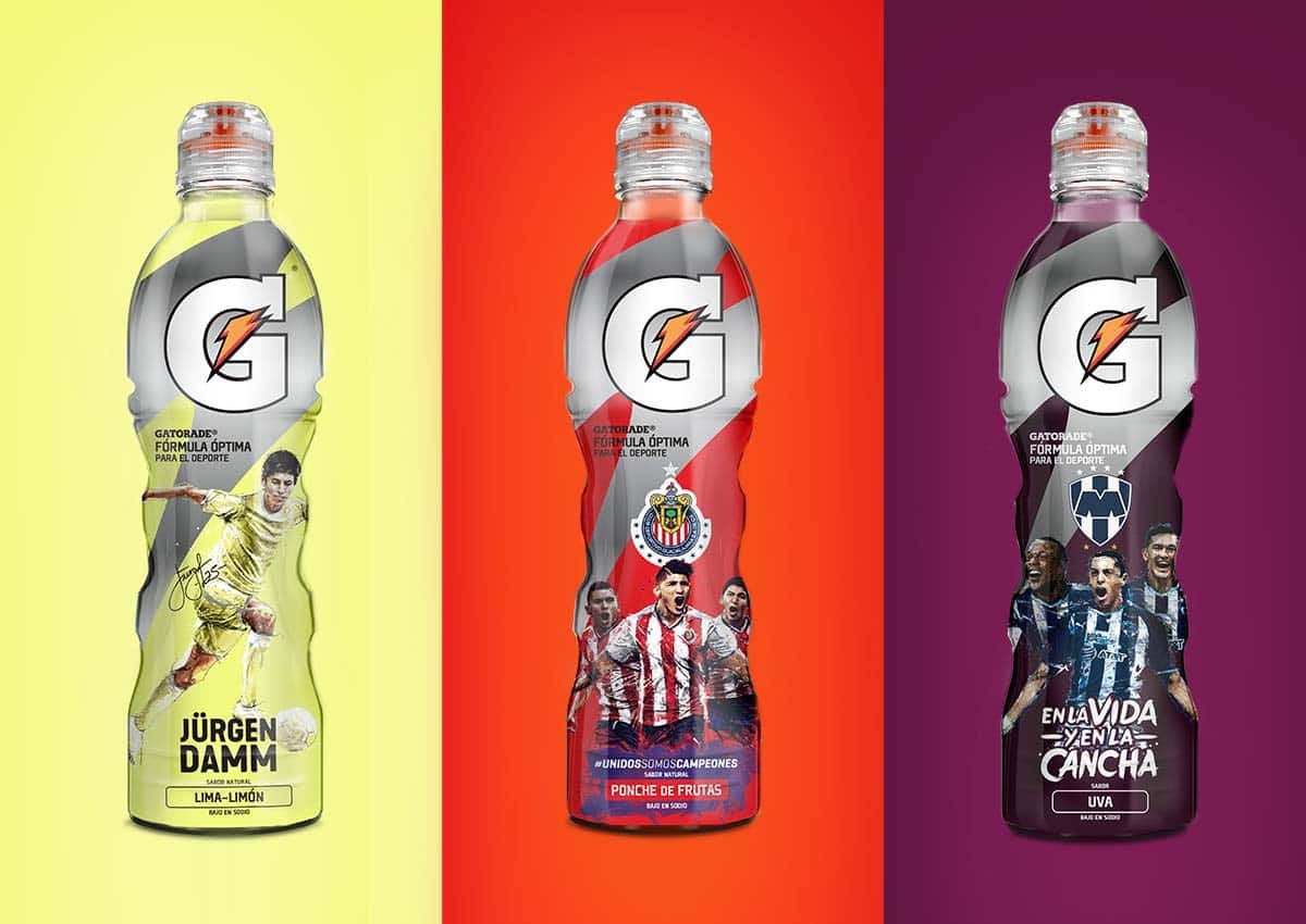
The use of vibrant custom color schemes in visual identities has become a powerful tool for brand differentiation in packaging design. Advances in printing technology allow brands to create unique, bold colors that align closely with their identity. Vibrant hues catch the eye, while custom shades can reinforce the emotional tone of the product—whether it’s calming blues for wellness products or energetic reds for cleaning solutions.
These custom colors go beyond visual appeal by helping consumers associate specific hues with a particular brand or product line. They create a seamless brand experience across packaging, advertisements, and online platforms, reinforcing recognition and loyalty in competitive categories and on busy retail shelves. Custom, brand-specific color schemes will allow products to stand out more effectively and communicate unique brand personalities.
FLUID AND GEOMETRICAL SHAPES
Packaging designs that incorporate fluid, asymmetrical, or geometric shapes challenge traditional boxy structures, providing a fresh and dynamic aesthetic. These unconventional shapes not only attract attention but also evoke feelings of creativity and modernity. They often serve functional purposes as well, such as ergonomic handling or improved stacking efficiency.
Such designs make products feel innovative and premium, appealing to younger or design-savvy audiences. By breaking away from conventional norms, fluid and geometric shapes allow brands to signal uniqueness and boldness, ensuring their packaging feels as forward-thinking as their product offerings.
METALLIC ACCENTS
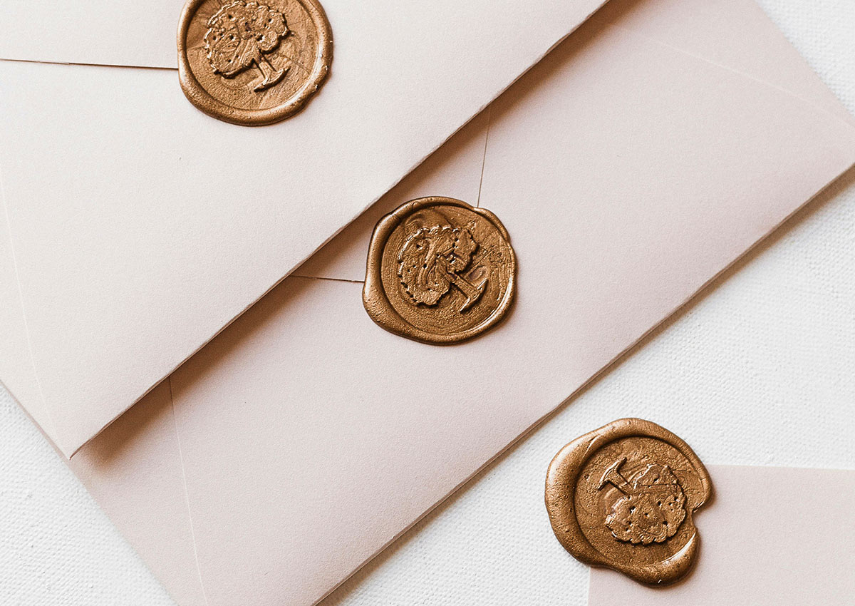
Gold, silver, and other metallic tones are increasingly used in packaging to evoke a sense of luxury, refinement, and exclusivity. These accents are especially prevalent in high-end categories such as premium beverages, cosmetics, and gourmet foods. By incorporating metallic finishes—whether through foil stamping, embossing, or metallic inks—brands create packaging that commands attention on the shelf while reinforcing the idea of superior quality. The shimmer and shine of metallic elements are visually captivating, making the product feel more aspirational and desirable to consumers.
Beyond aesthetics, metallic accents serve functional purposes, such as enhancing the tactile experience with raised textures or adding depth through reflective surfaces. These details elevate minimalistic designs, creating a balance between simplicity and opulence. In competitive markets, this approach helps brands differentiate their products, aligning them with a sophisticated and luxurious image that resonates with discerning customers seeking premium experiences.
COLORS THAT CONNECT
The growing trend toward colors that evoke comfort, balance, and self-care reflects a shift in consumer preferences, driven by a desire for emotional well-being and harmony in a fast-paced world. In packaging design, these colors—such as earthy neutrals, soft pastels, and warm muted tones—create an immediate sense of calm and approachability. Brands are leveraging these palettes to foster deeper connections with consumers, using color psychology to evoke trust, safety, and relaxation. This trend aligns with broader movements toward wellness and sustainability, as these hues often carry connotations of nature, mindfulness, and holistic living.
In terms of visual identity, incorporating these comforting colors helps brands position themselves as more relatable and human-centered. For packaging, these palettes serve as a tool to stand out subtly yet effectively on crowded shelves by offering a sense of reassurance rather than overstimulation. When paired with thoughtful textures, typography, and materials, these colors reinforce a cohesive brand message that resonates with modern values. Whether in personal care, home care, or even food and beverage industries, designs that prioritize emotional resonance through color are increasingly seen as a powerful way to build brand loyalty.
PACKAGING DESIGN FOR THE DIGITAL SHELF
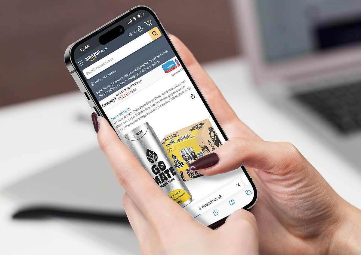
E-commerce platforms such as Amazon, Mercado Libre, and brand-owned online stores have transformed the way consumers interact with packaging.
On digital shelves, the first interaction with packaging is through imagery, making visual appeal paramount. Designs must prioritize clear and bold branding, ensuring that the product and its key features are instantly recognizable even at thumbnail size. Simple layouts, legible typography, and striking colors help brands stand out in crowded product listings.
Additionally, packaging design needs to reflect the product’s core benefits and usage directly in its visuals or through concise text to meet the fast-paced decision-making process of online shoppers. Moreover, functional aspects of packaging for the digital shelf focus on practicality and logistics. Packages should be optimized for efficient shipping, minimizing excess material while ensuring durability to protect the product during transit. This includes compact designs that prevent damage and frustration upon delivery. For the consumer's unboxing experience, brands can leverage clean, attractive inner packaging to create a positive, shareable moment that enhances brand loyalty. Ultimately, success on the digital shelf requires a balance of visual allure, functional resilience, and brand storytelling tailored to the e-commerce context.
PANTONE COLOR OF THE YEAR 2025
The Pantone Color of the Year significantly influences design and packaging by setting the tone for creative industries worldwide. It becomes a focal point for designers, shaping visual identities, product packaging, and marketing strategies. In packaging design, the selected color often reflects societal trends and consumer emotions, helping brands align with current preferences. For instance, a calming tone might appeal to wellness-focused consumers, while a bold hue could energize and draw attention on crowded shelves.
Beyond aesthetics, the Pantone Color of the Year also serves as a tool for differentiation. Brands incorporate the shade into limited-edition designs, seasonal collections, or promotional campaigns to demonstrate cultural relevance and trend awareness. This integration fosters emotional connections with consumers and enhances shelf impact in competitive markets. The chosen color also inspires complementary palettes, further enriching packaging innovation and storytelling across industries.
The Pantone Color of the Year for 2025, Mocha Mousse, is a rich and versatile brown tone that seamlessly blends warmth with sophistication. This shade is thoughtfully designed to anchor both bold and subtle palettes, showcasing its adaptability across diverse design contexts. Its selection reflects a growing preference for colors that evoke comfort, balance, and self-care, resonating with global movements toward wellness and emotional well-being.
Mocha Mousse also embodies the trend of creating inviting and harmonious spaces. It offers remarkable potential to infuse warmth and approachability into design, whether through minimalistic aesthetics or expressive, bold statements. Whether used as a subtle backdrop or a prominent feature, this color encapsulates timeless elegance while aligning with contemporary values of balance and connection.


