Client:
Mi Pancito
Country:
Nicaragua
Task:
Mi Pancito Bakery Branding: Refining Artisanal Heritage for Modern Retail
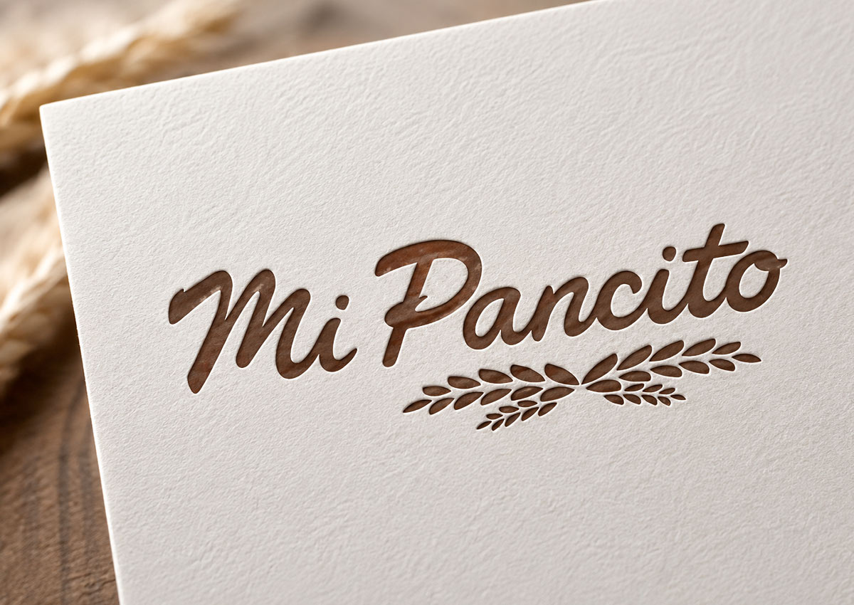
For Mi Pancito, a beloved Nicaraguan bakery brand, Imaginity led a subtle yet impactful branding and logo evolution. By cleaning up letterform geometry and streamlining the wheat icon, our team created an elevated visual identity that preserves the brand's warm, authentic, artisanal essence across Nicaragua and physical retail channels.
Imaginity | Design Agency | Branding, Packaging Design, Marketing
Visual Highlights:
-
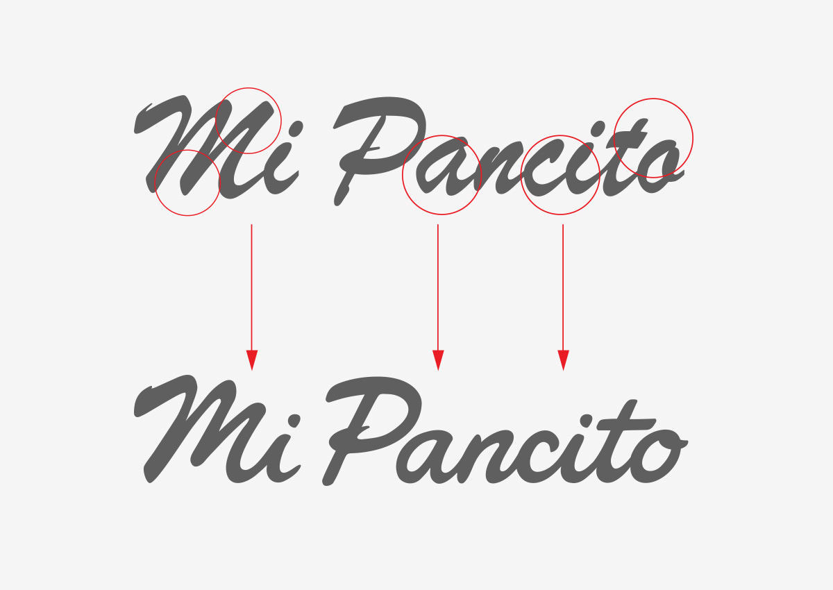
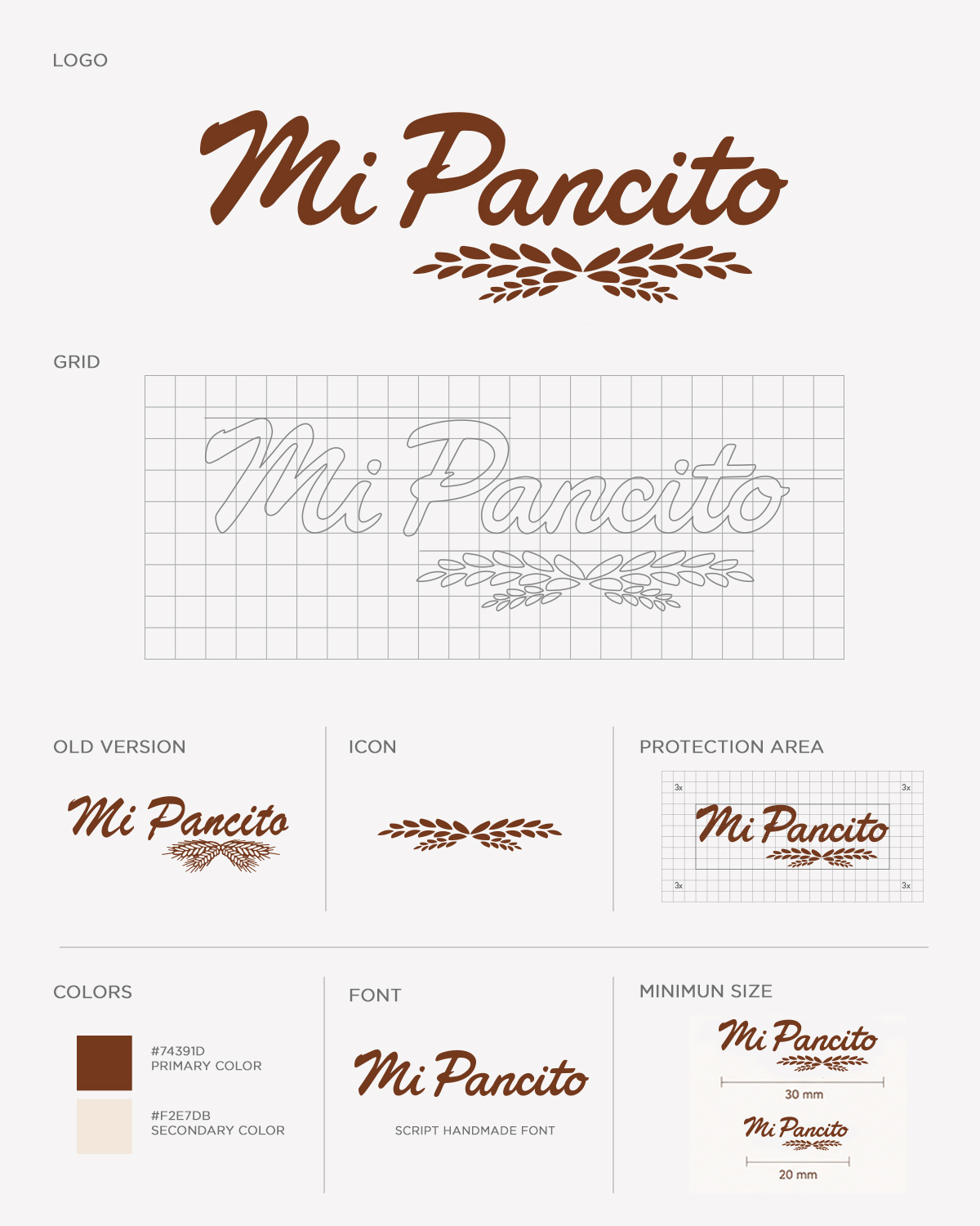
Precision Typography Clean-Up: Smoothing rough brush edges and stroke terminations while preserving the original cursive script layout for crisp visual clarity.
-
Streamlined Wheat Stalk Iconography: Replacing fine, intricate sketch lines with clean, solid geometric shapes to ensure effortless reproduction at small print scales.
-
Elevated Brand Equity: Removing unnecessary vector noise to deliver a polished, contemporary look that retains a friendly, artisanal warmth.
-
Comprehensive Brand System & Guidelines: Defining clear protection areas, minimum sizes, and a warm color palette anchored by rich mahogany brown and soft cream tones.
-
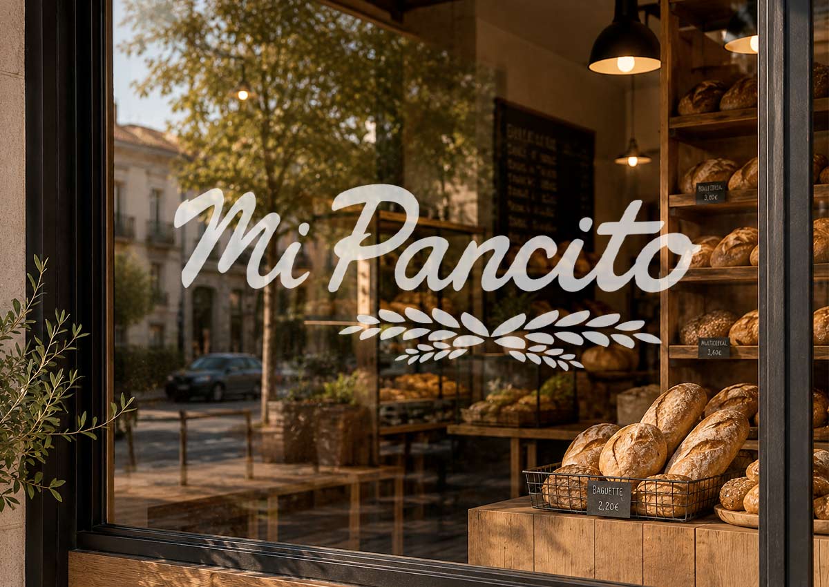
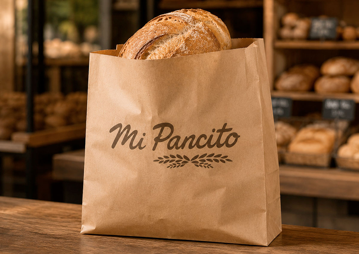
Multi-Touchpoint Versatility: Crafting a versatile visual identity that transitions seamlessly from outdoor storefront signage to kraft paper packaging and digital media.
The Challenge:
Mi Pancito enjoyed strong consumer recognition in Nicaragua, but its legacy logo suffered from technical limitations.
The original vector artwork contained rough hand-drawn edges and overly detailed wheat illustrations that lost legibility when printed on small labels, stamped onto paper bags, or rendered at low digital resolutions. The brand required a refined visual identity that maintained its emotional connection with loyal customers while delivering the crisp precision needed for modern CPG packaging and retail expansion.
Our Design Process:
Starting from a strategic creative brief, Imaginity initiated a design process focused on subtle evolution rather than complete overhaul. Our designers carefully adjusted every typographic curve, correcting stroke weight inconsistencies and smoothing letter junctions.
We redesigned the wheat emblem into clean vector geometry for optimal scalability. Combined with a warm color system and defined brand guidelines, this refined identity was applied across physical touchpoints—including window graphics, artisanal paper packaging, and digital channels—backed by precise prepress printing standards for all materials.
The Outcome:
The strategic brand refresh successfully transformed Mi Pancito into a polished, modern bakery brand while honoring its traditional roots. By establishing a clean, scalable visual identity, the redesign improved in store marketing performance, enhanced shelf and storefront visibility, and strengthened consumer trust.
This project highlights IMAGINITY’s portfolio expertise in preserving core brand equity through meticulous graphic craft and strategic branding.
IMAGINITY is a global packaging design agency specializing in consumer packaged goods (CPG), partnering with market-leading food, bakery, beverage, and FMCG companies across Nicaragua, Latin America, and international markets. Combining strategic branding, custom visual identity, disciplined brand architecture, and prepress print expertise, our agency delivers impactful visual storytelling across our entire portfolio to optimize in store marketing performance and drive commercial growth for global brands.