Client:
Jabonería Wilson
Country:
Ecuador
Task:
Branding, Packaging Design
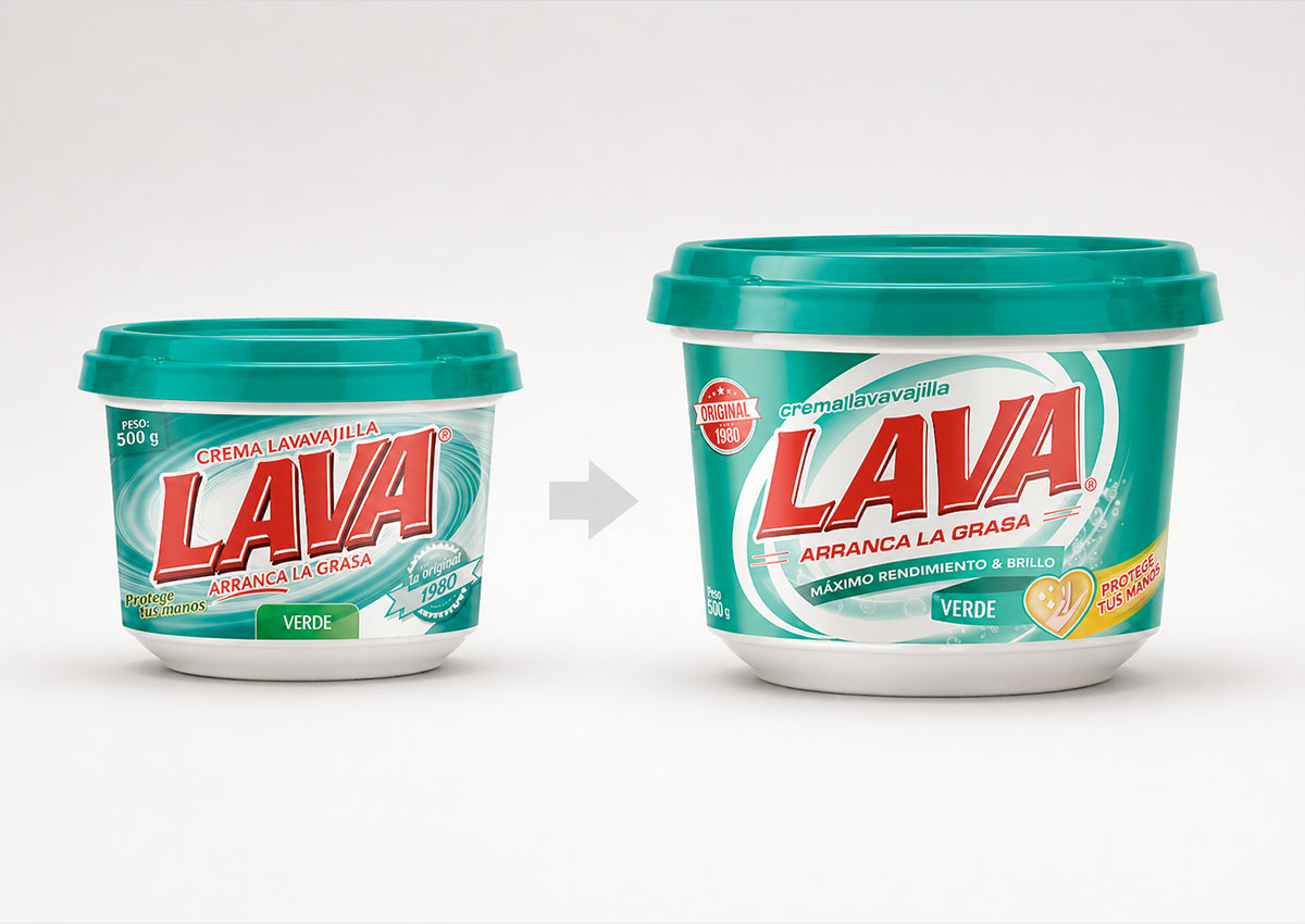
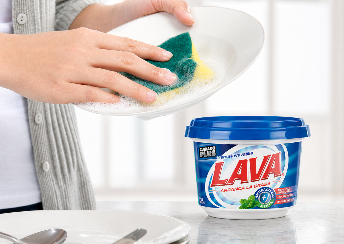
The Challenge: Modernizing a Household Icon for Greater Visibility
Jabonería Wilson challenged IMAGINITY to evolve the visual identity of Lava, a leader in the dishwasher cream category. The primary objective was to modernize the packaging design while leveraging a logo redesign to increase visual weight and shelf recognition. We needed to overcome visual clutter to ensure the brand remained the undisputed protagonist in a highly competitive retail environment across Latin America.
Imaginity | Design Agency | Branding, Packaging Design, Marketing
The Solution: Logo Optimization and Dynamic Visual Language
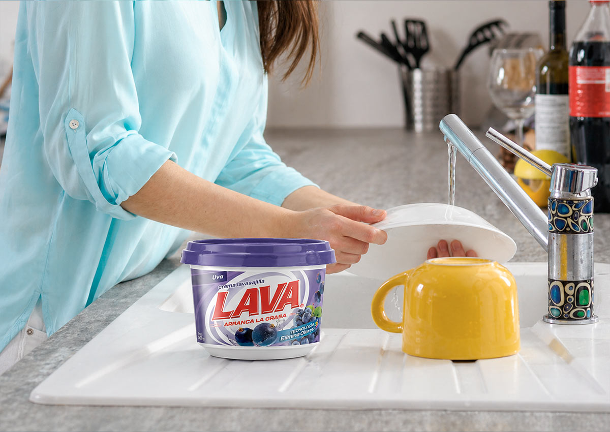
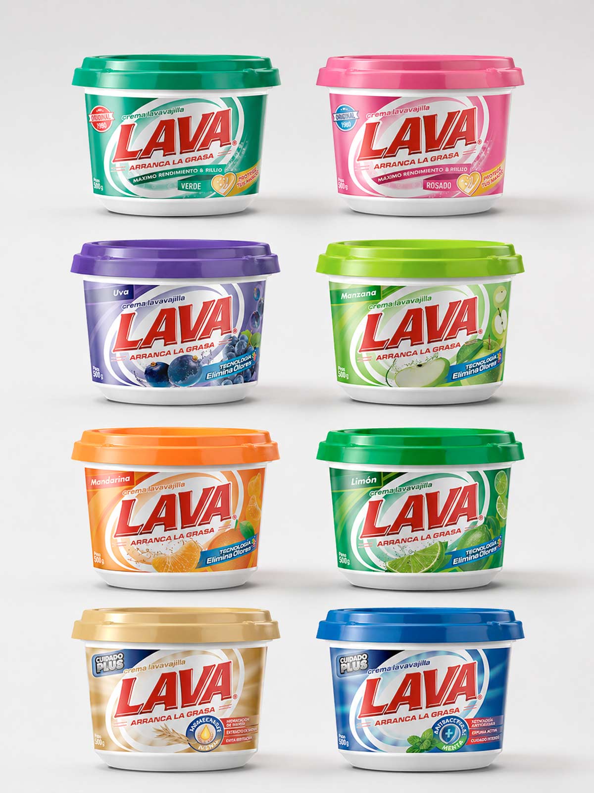
As a specialized packaging design agency, our design process began with a typographical refinement of the logo, adding a structural background to anchor the brand and enhance its memorability. We simplified the strokes to maintain the brand's essence while introducing concentric circles that evoke movement and a deep-cleaning action. This new graphic framework was meticulously applied across all fragrances and the "Plus" product line, ensuring a cohesive brand architecture.
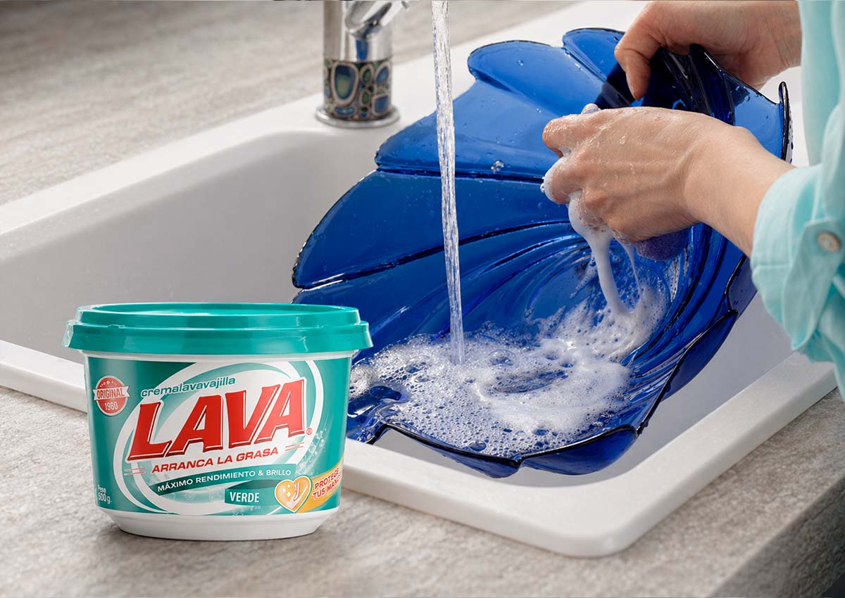
The Results: Unified Brand Presence and Category Leadership
The project resulted in a high-impact packaging design that delivers a unified and powerful visual identity on the shelf. By achieving total consistency across the entire product line, IMAGINITY significantly boosted Lava’s shelf presence and brand recognition in store. The successful relaunch solidified the brand’s authority, proving that a strategic visual identity refresh is essential for maintaining market leadership.
Visual Highlights
-
Enhanced Logo Presence: A refined typographical treatment combined with a structural "plate" element that increases brand recognition and graphic authority.
-
Dynamic Cleaning Iconography: The integration of concentric circles within the visual identity to symbolize movement, efficiency, and the shine of clean dishes.
-
Unified Product Architecture: A cohesive design system that seamlessly adapts to multiple scents and premium "Plus" line varieties.
-
Chromatic Optimization: Refined use of the brand's core colors to ensure a vibrant, clean look that maximizes impact in the home care packaging category.
Enhanced Logo Presence: A refined typographical treatment combined with a structural "plate" element that increases brand recognition and graphic authority.
Dynamic Cleaning Iconography: The integration of concentric circles within the visual identity to symbolize movement, efficiency, and the shine of clean dishes.
Unified Product Architecture: A cohesive design system that seamlessly adapts to multiple scents and premium "Plus" line varieties.
Chromatic Optimization: Refined use of the brand's core colors to ensure a vibrant, clean look that maximizes impact in the home care packaging category.