New packaging and branding design for Kotex Day’s line of pads and liners
New packaging and branding design. Icon design for Kotex Day’s line
Product development. Graphic design of female pads
Kotex Day’s | Branding, Packaging design | Imaginity
New packaging and branding design for Kotex Day’s line of pads and liners
New packaging and branding design. Icon design for Kotex Day’s line
Product development. Graphic design of female pads
Kotex Day’s | Branding, Packaging design | Imaginity
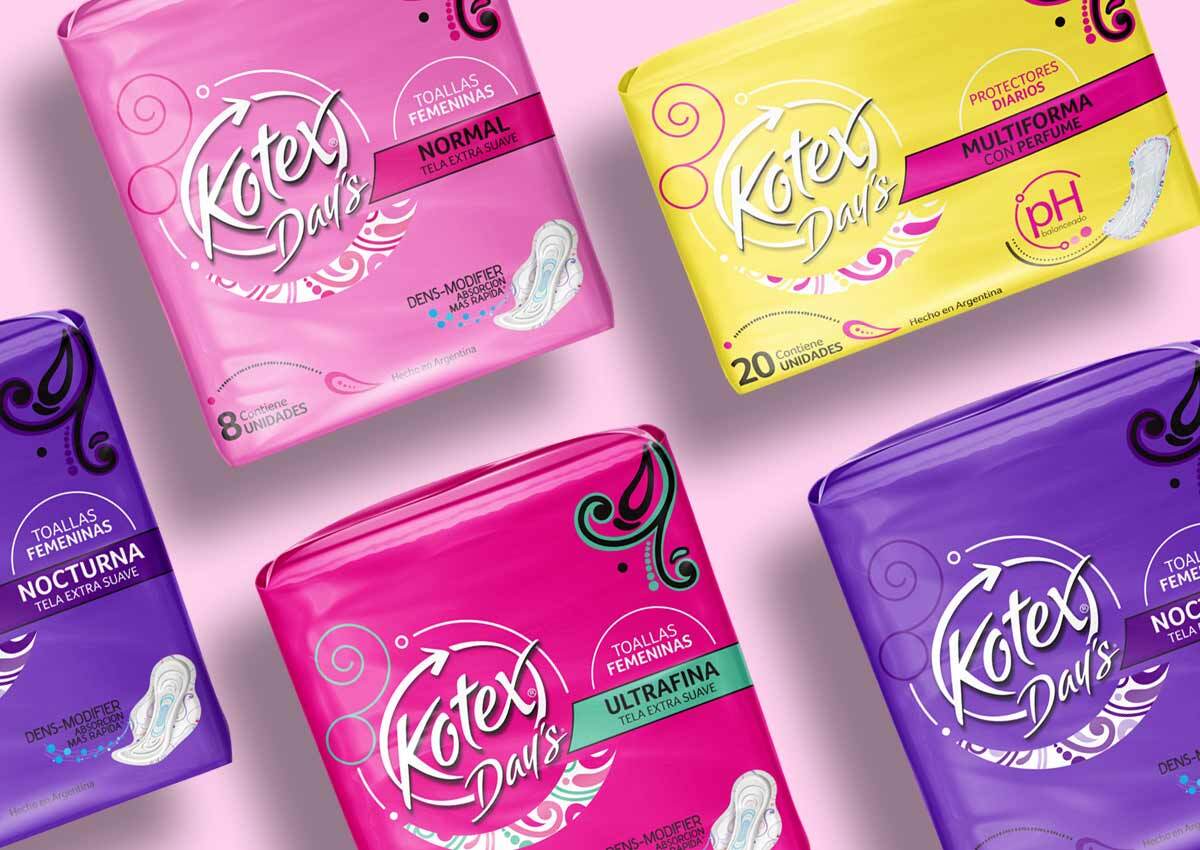
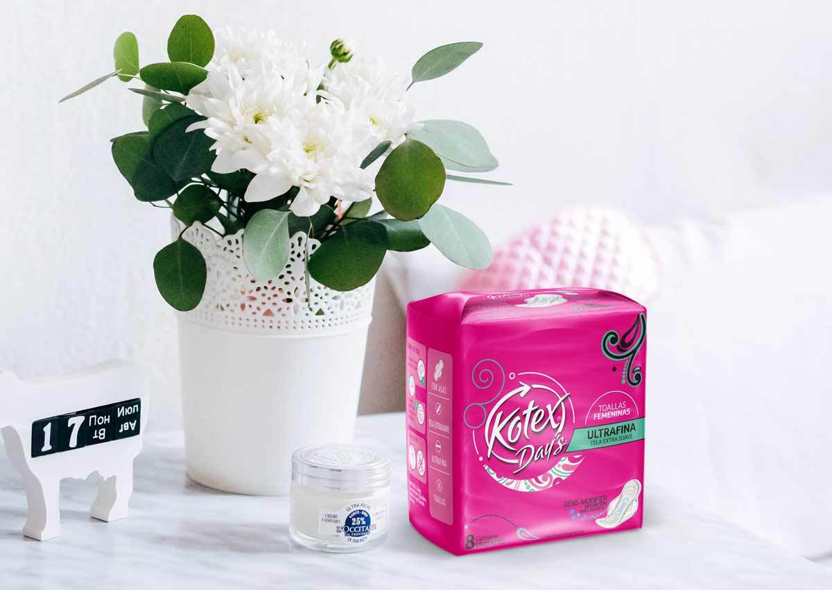
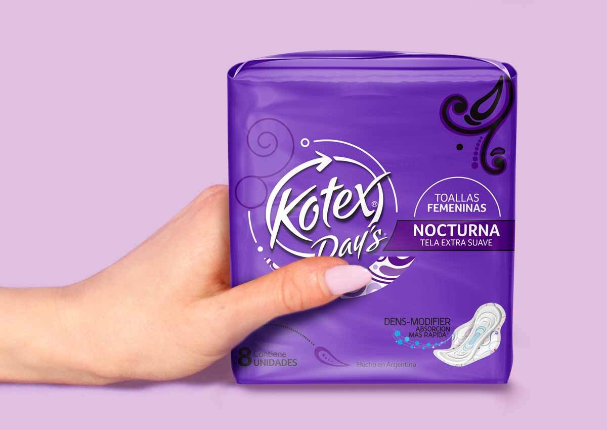
Kotex was previously known as Day’s in Southern Latin America.
We kept the existing color code in this market in particular to design a product line that aligns with the recently-launched Kotex Evolution products. The objective was to achieve brand unity, by maintaining the same image in the whole Kotex band and, at the same time, by differenciating the two product ranks.
As part of this project, we designed a logotype to transition from the Day’s brand to Kotex. To achieve this, we created a double-faced packaging.
For this purpose, we used a strategy that consisted in treating them as brand and sub-brand. On one side of the package, we used the Day’s logotype and added Kotex as sub-brand, and, on the other side, we used the Kotex logotype and added Day’s as sub-brand.
It was important that we showed the differentiation between this line and the Kotex Evolution line. Although the consumers´ profile is the same for both lines, Kotex Evolution is the brand´s premium line.
Moreover, we worked in the communication of the distinctive benefit of the pads, through the creation of an icon that explains the dens-modifier technology that the pads have as a core..
Another part of the project comprised to align the pad design: its blue core, the decoration and the pouch with the packaging design. As for the blue absorption center, the objective was to communicate the quick and effective absorption performance, without leaving the style and femininity aside.