Client:
Laboratorio Luar. Neuromag+
Country:
Argentina
Task:
Naming, Branding Branding, Packaging Design
Where science and design connect
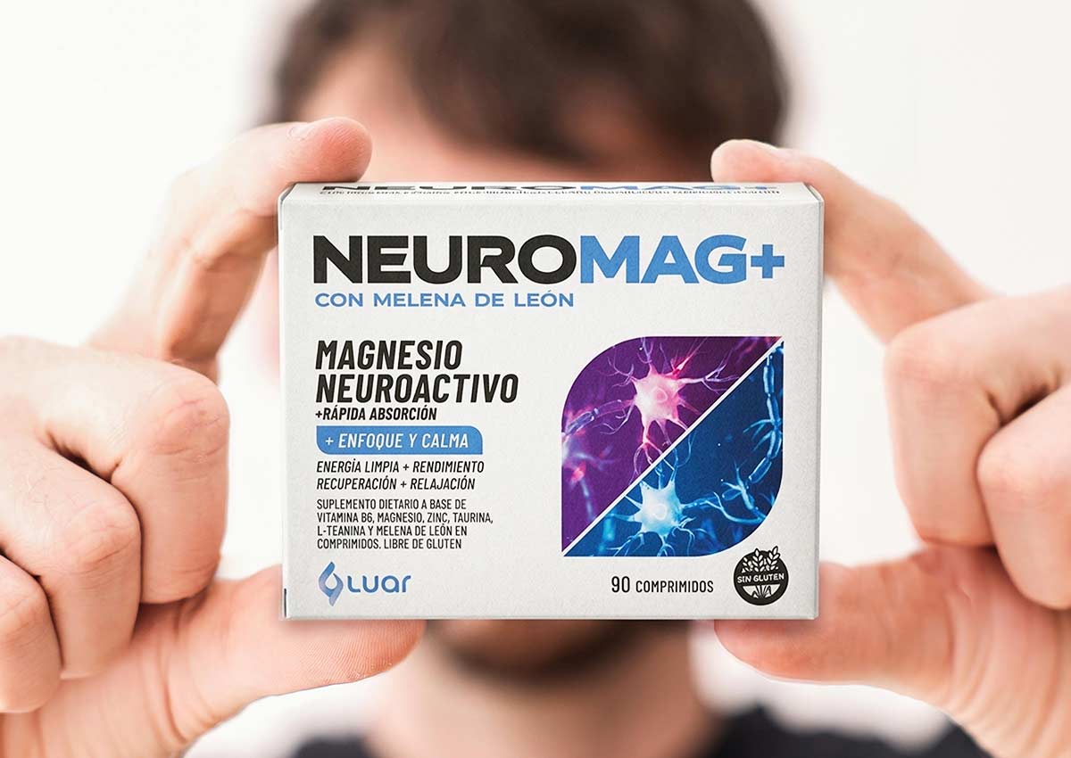
Imaginity developed the packaging design for Neuromag+, the new product from Laboratorio Luar aimed at optimizing neuronal activity and promoting a balance between focus and calm. Through a clear and coherent visual language, the design communicates the product’s benefits, highlighting its innovative and scientific nature. The proposal harmoniously arranges all graphic and typographic elements, achieving a modern, precise presentation aligned with the brand’s visual identity—reinforcing the trust and effectiveness associated with Neuromag+.
Imaginity | Design Agency | Branding, Packaging Design, Marketing
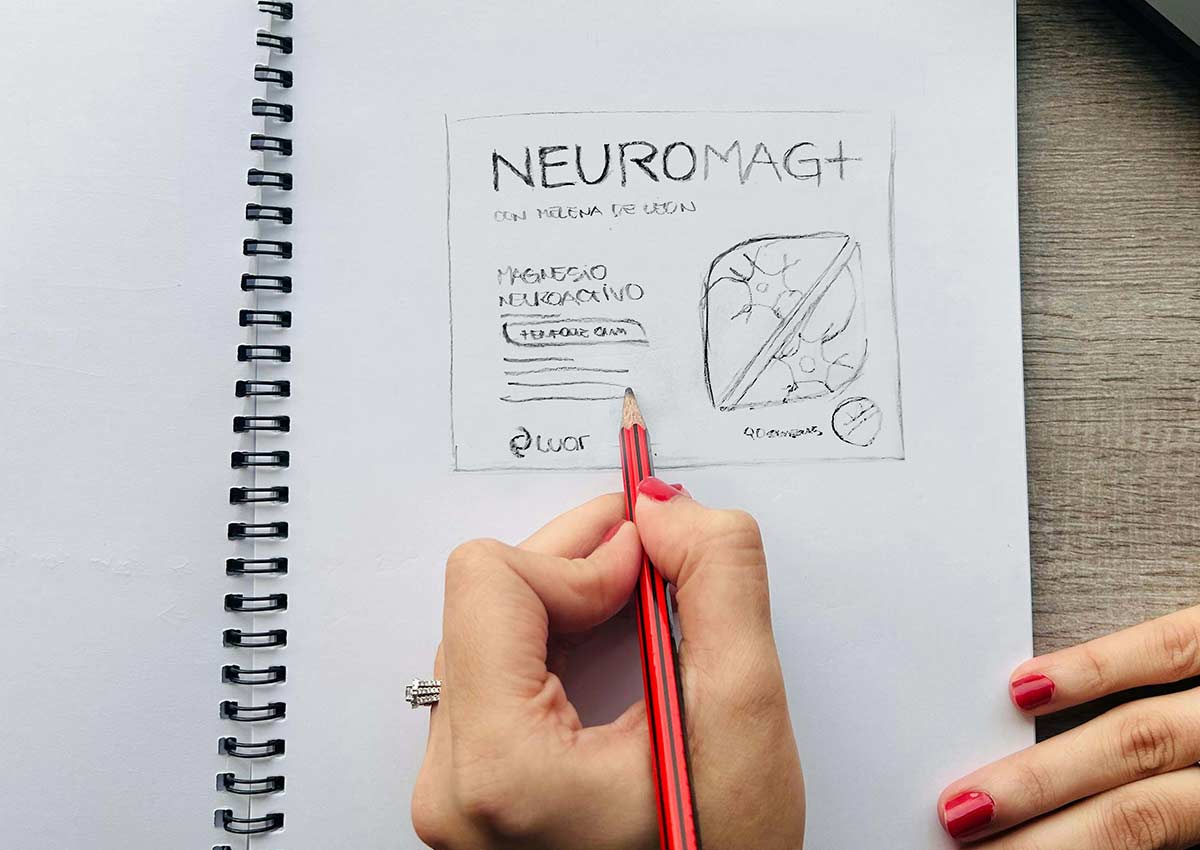
From Sketch to Reality
At Imaginity, we have perfected a creative process, leveraging our vast experience as a design agency to deliver the most innovative and effective design solutions.
A key element of this process is the invaluable stage of hand-drawn sketching.
The Challenge: Communicating the Dual Benefits of Neuroactive Magnesium
The primary challenge was to visually communicate Neuroactive Magnesium's unique functionality, which encompasses two seemingly opposite benefits: enhanced focus and performance, alongside calmness and recovery. The packaging required a design solution that could quickly and clearly convey this full spectrum of neurological benefits to the consumer.
The Solution: A Divided, Symbolic Visual Identity
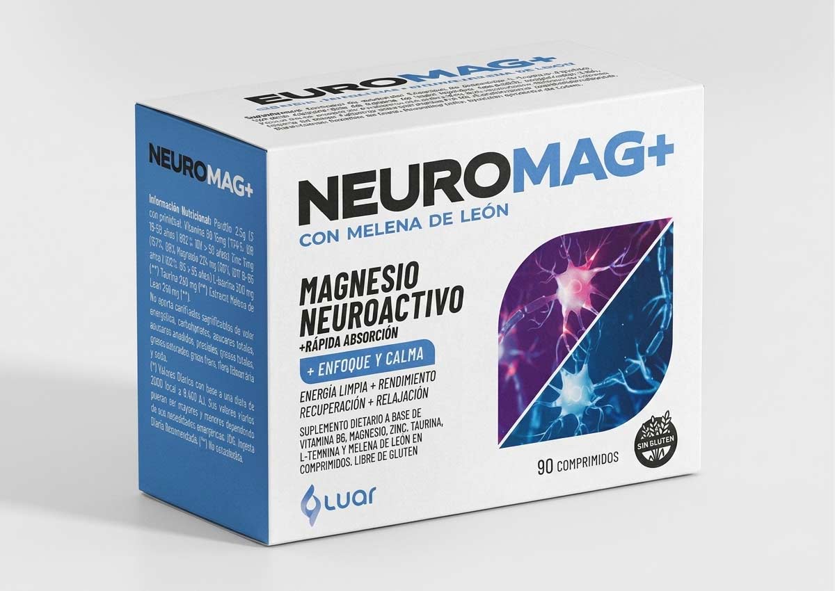
The solution involved creating a symbolic image storytelling composed of neurons—the elements that the product acts upon. This shape was strategically divided into two distinct parts: one side used magenta tones to represent activation and concentration (performance), and the other used blue tones to symbolize calmness and relaxation (recovery), ensuring the duality was instantly recognizable.
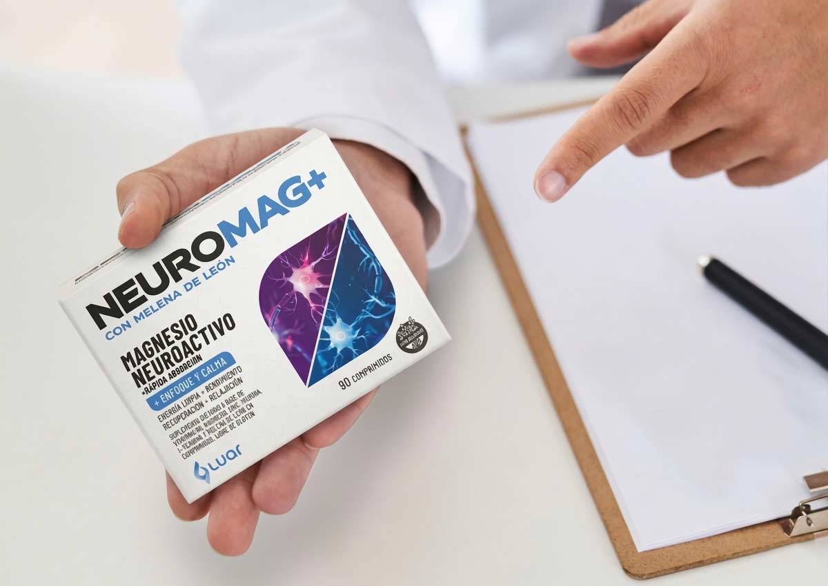
The Results: Rapid Visual Communication
The project successfully delivered a packaging design that harness the power of packaging. Visually communicates the product's functionality with speed and clarity. The two-tone, divided neuron graphic quickly informs the consumer of the dual benefits, supported by text, resulting in a strong visual message that enhances in store shelf presence and aids in consumer understanding.
A logo that conveys and gives meaning to the product
With a sans serif typeface and distinctive details that make it unique, this logo communicates trust, technology, and performance. Through the use of color, we separate the components of the name to convey that it is a product focused on neurological function and primarily composed of magnesium.

Imaginity is a packaging design agency specializing in OTC connected packaging and digital brand experiences. We help brands integrate physical packaging with digital platforms to enhance consumer engagement and product understanding.