Client:
Laboratorio Luar. Adevit
Country:
Argentina
Task:
Branding, Packaging Design
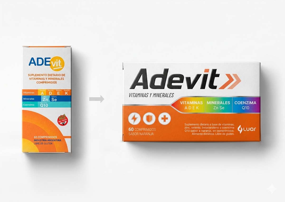
A redesign that strengthens the brand through branding and packaging design
Imaginity global design agency partnered with Luar Laboratory Argentina, to redesign their branding and packaging design, boosting visibility and strengthening brand recognition. By refining the structure and hierarchy of key elements, we achieved a clearer, more impactful visual presence.
Imaginity | Design Agency | Branding, Packaging Design, Marketing
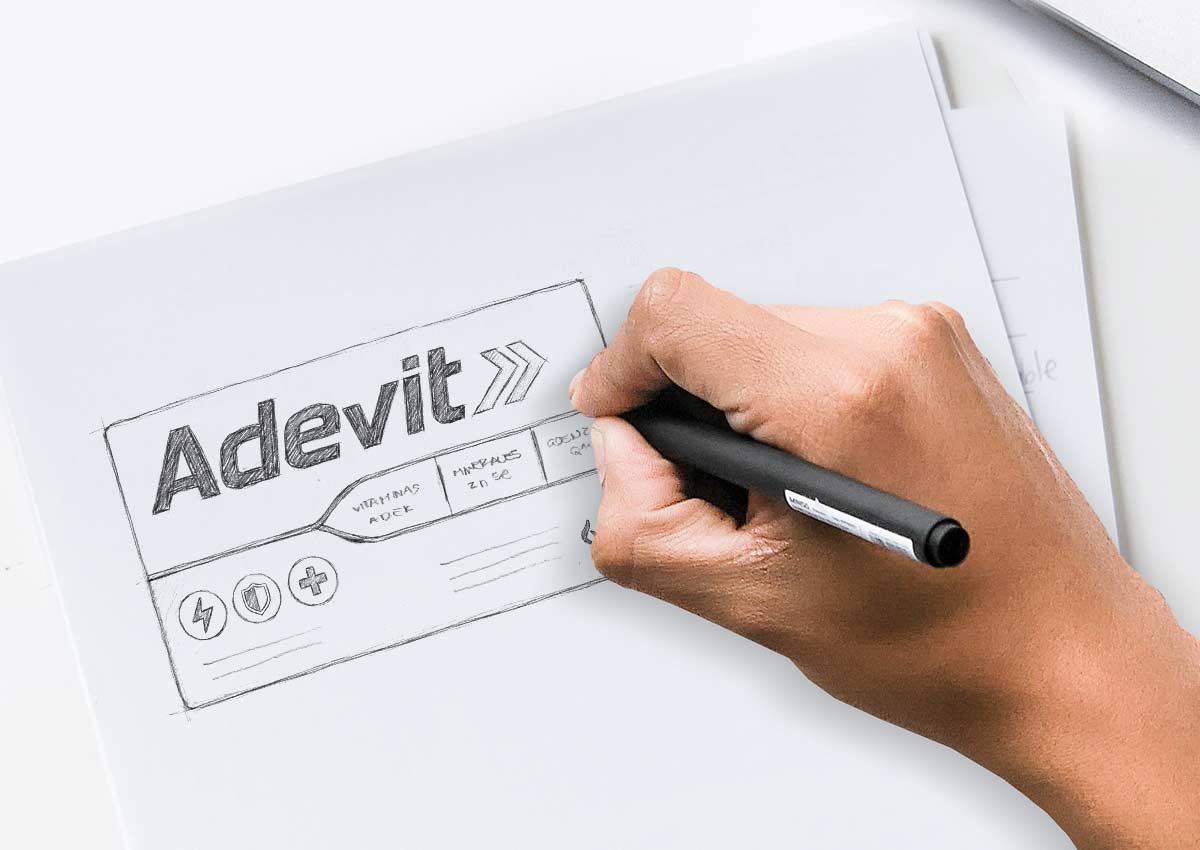
From Sketch to Reality
At Imaginity, we have perfected our design process, leveraging our vast experience as a design agency to deliver the most innovative and effective design solutions.
A key element of this process is the invaluable stage of hand-drawn sketching.
The Challenge: Enhance the current design
Redesign Adevit's current packaging to emphasize its key elements. Improve hierarchy, layout, and visual identity balance, increase clarity and impact, allowing the brand, benefits, and essential information to stand out more effectively in the packaging design category of pharma.
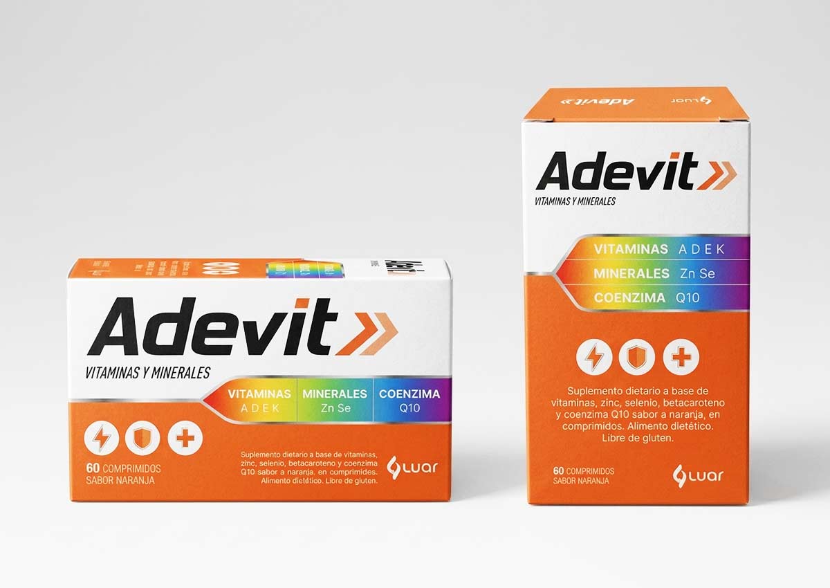
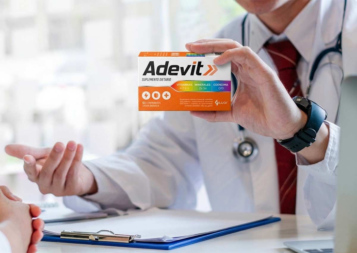
The Solution: A double facing packaging
As our first design decision, we chose to work with a double-facing layout, where the main face is now horizontal. This approach gives us the opportunity to optimize space and enhance key elements. In this way, we can apply the brand at a larger scale, making it more recognizable and allowing it to stand out. On the other hand, we were able to create areas that organize the information: a band that unifies and highlights the benefits, an orange area that groups the legal information, as well as the Luar brand and new icons that allow us to communicate the product’s benefits visually and quickly.
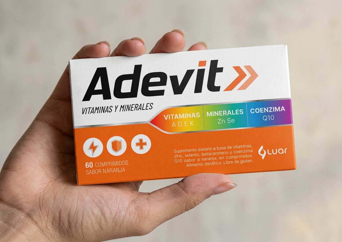
The Results: Impact and clarity
A powelfull packaging design with greater impact and visual appeal, focused on optimizing the main face and allowing key elements to stand out more clearly. Through improved hierarchy and use of space, the design enhances visibility, reinforces brand recognition, and creates a more striking presence in store, ensuring the product communicates its value at a glance.
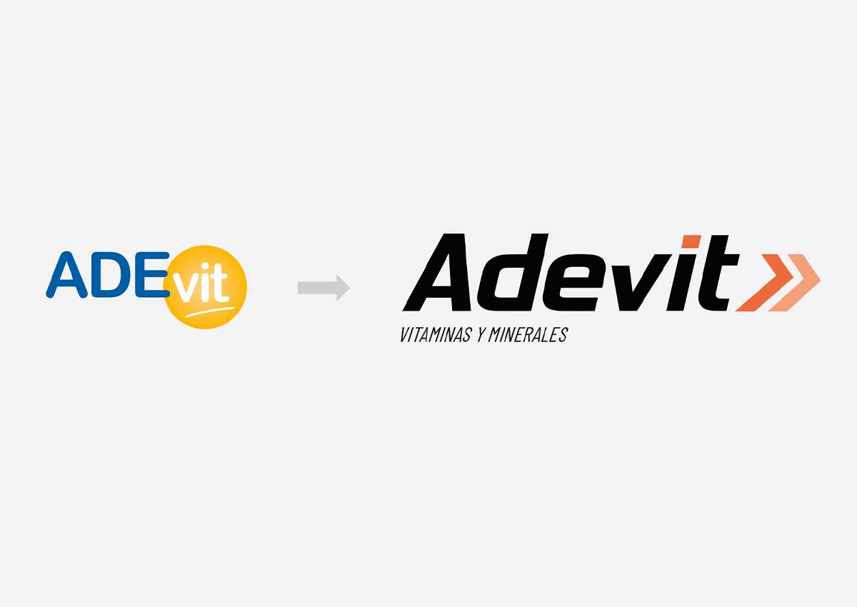
A new branding
A new design with a more modern style, focused on conveying greater seriousness, trust, and performance. A sans-serif typeface with unique, geometric features, paired with an isotype that abstractly communicates absorption and effectiveness. Regarding the color palette, we chose a scheme composed of black—more neutral and allowing for greater contrast and emphasis—combined with two shades of orange, the color that identifies the product.
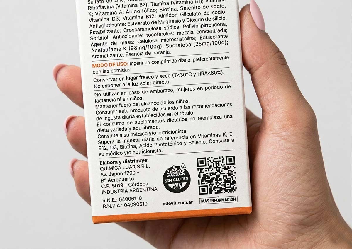
Connected pack
A newer form of packvertising is through the use of "connected pack". This is done by including a QR code on the pack, which can be scanned with a smartphone. When the code is scanned, it connects the user to additional information or resources related to the product, such as a website, product manual, or customer support center. QR connected packs allow consumers to easily access additional information about a product without having to search online or dig through paper materials. And the information accessed through the QR code can be changed or updated at any time, allowing consumers to access the most current information about the product.
Imaginity is a branding and packaging design agency specializing in pharma, OTC, and health products. We design packaging systems that enhance information hierarchy, build trust, and communicate efficacy clearly, helping brands stand out in highly regulated and competitive pharmacy environments.