Client:
artefacta
Country:
Task:
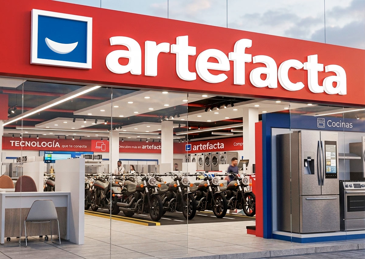
For the rebranding of Artefacta, a leading retail company in Ecuador, Imaginity developed a refreshed visual identity and retail brand architecture system designed to strengthen recognition, clarity, and trust across a multi-category business. The project unified Artefacta’s presence across home appliances, household goods, motorcycles, optics, and related services while preserving the brand equity already familiar to Ecuadorian consumers.
Imaginity | Design Agency | Branding, Packaging Design, Marketing
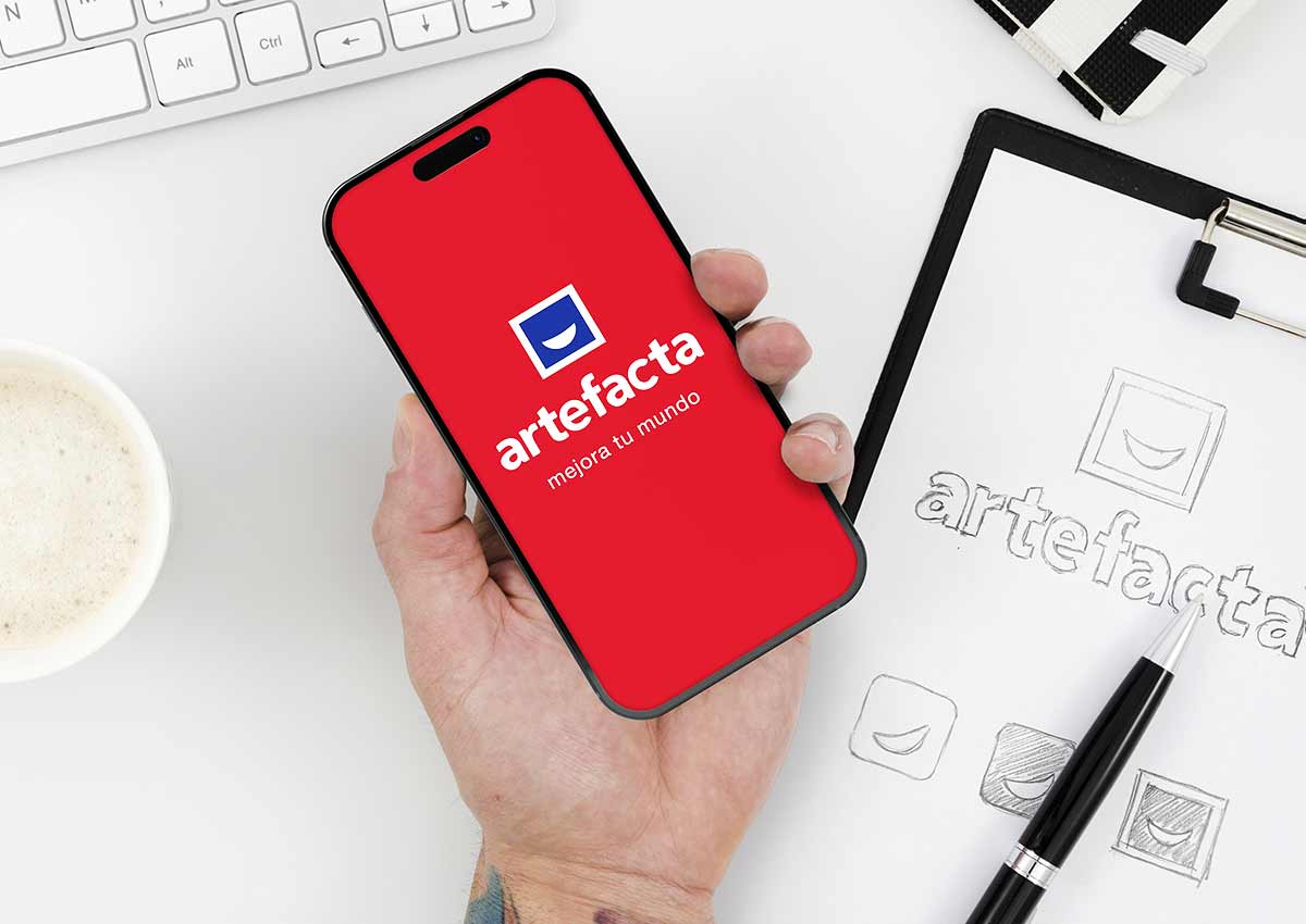
This Ecuador retail branding project focused on creating a cohesive visual identity and a clear brand architecture strategy that could work across stores, communications, sub-brands, and customer touchpoints. The result is a modernized retail brand system that improves consistency while keeping Artefacta’s iconic red, blue, and white palette recognizable in the market.

A Smile at the Heart of the Brand
Our challenge, as a leading design agency specializing in branding and logo design, was to develop a future-ready brand identity that would elevate artefacta’s image while preserving the recognition it had built over decades. The result is a new Primary Brand that enhances brand consistency, clarity, and trust across all product and service categories.
At the center of this transformation was a strategic logo redesign. We incorporated a smile into the new logo to symbolize the happiness Artefacta brings to customers’ lives. This visual element directly supports the new brand motto: “artefacta improves your world,” reinforcing the brand’s mission to enhance everyday life with quality products and service.
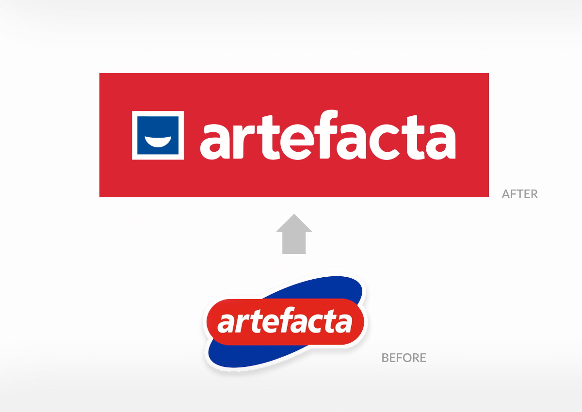
Brand Evolution with Visual Continuity
To ensure continuity and preserve brand equity, the updated logo maintained artefacta’s iconic color palette—red, blue, and white. These colors, deeply associated with the brand in the minds of Ecuadorian consumers, serve as a visual bridge between the legacy identity and the refreshed look.
By retaining this familiar palette, we reinforced brand recognition and trust, making the transition seamless for existing customers while signaling positive change. The updated color application was refined for a more modern and versatile expression, allowing the new identity to feel contemporary without disconnecting from Artefacta’s long-standing presence in the market.
This thoughtful balance between evolution and consistency is a key part of successful logo design and branding strategy, especially for large, multi-category retail brands. It enables forward movement while safeguarding the emotional connections built over time.

From a Familiar Logo to a Sharper Retail Identity
Artefacta’s visual evolution was designed to preserve the recognition the brand had already built in Ecuador while making the identity cleaner, more contemporary, and easier to apply across a complex retail ecosystem. The redesigned wordmark keeps the brand approachable and familiar, while the simplified construction improves legibility across storefronts, advertising, uniforms, digital channels, and small-format applications.
The smile icon became the emotional center of the identity: a simple graphic gesture that connects the brand to everyday improvement, service, and customer satisfaction. This balance between continuity and modernization is essential in a strong visual identity, especially for a retail brand with high public visibility and multiple customer touchpoints.
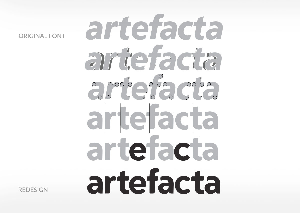
A Brand System Built for Consistency
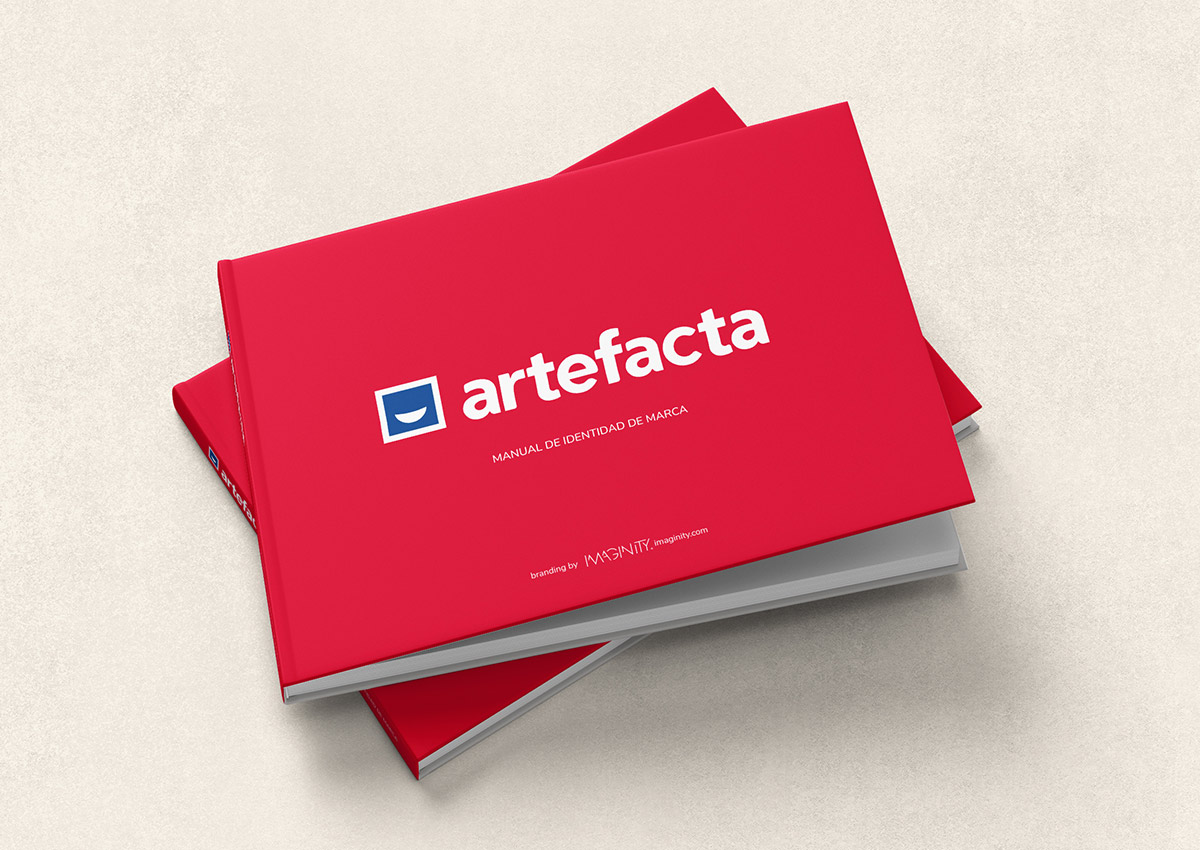
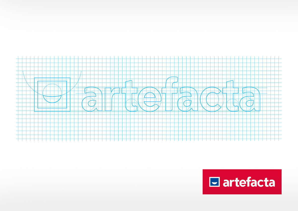
The new Artefacta brandbook translated the identity into a practical system for real-world use. Logo construction, typography, color, spacing, layout rules, and application examples were organized to help the brand behave consistently across every format. This is especially important for a multi-category retailer, where the same masterbrand must support home appliances, household goods, services, digital commerce, and specialized business units.
By defining clear guidelines, the brand system gives internal teams and external partners a shared visual language. It protects recognition while allowing the identity to scale, making the brand easier to manage across campaigns, stores, signage, catalogs, digital assets, and future extensions. This kind of structure is a key part of effective brand architecture.
Connecting Stores, E-commerce, and Sub-brands
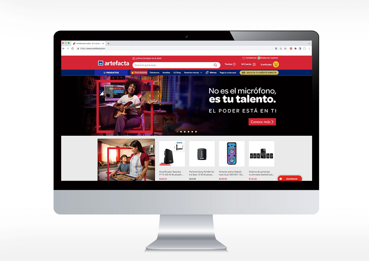
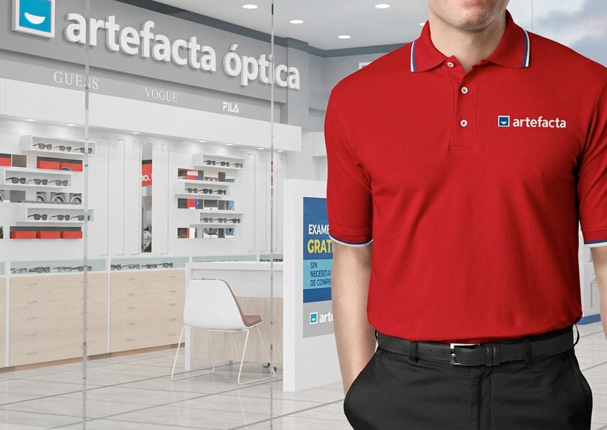
The Artefacta identity was developed to work beyond the logo. It needed to connect physical retail spaces, online shopping, staff uniforms, promotional materials, and sub-brand environments such as Artefacta Óptica. Each application had to feel part of the same brand while adapting to different customer journeys, from browsing products online to visiting a store or interacting with service teams.
The principles behind this unified system also apply to retail branding and U.S. shelf perception, where consistent visual cues across physical and digital touchpoints help shape recognition, confidence, and shopper choice.

This unified approach strengthens the customer experience and helps the brand remain recognizable across channels. In modern retail, consistency between store design, communication, and e-commerce is essential: shoppers should feel they are interacting with the same trusted brand wherever the purchase journey begins.