Client:
Wise Snacks Peppy. Packaging Design
Country:
USA
Task:
Packaging Design
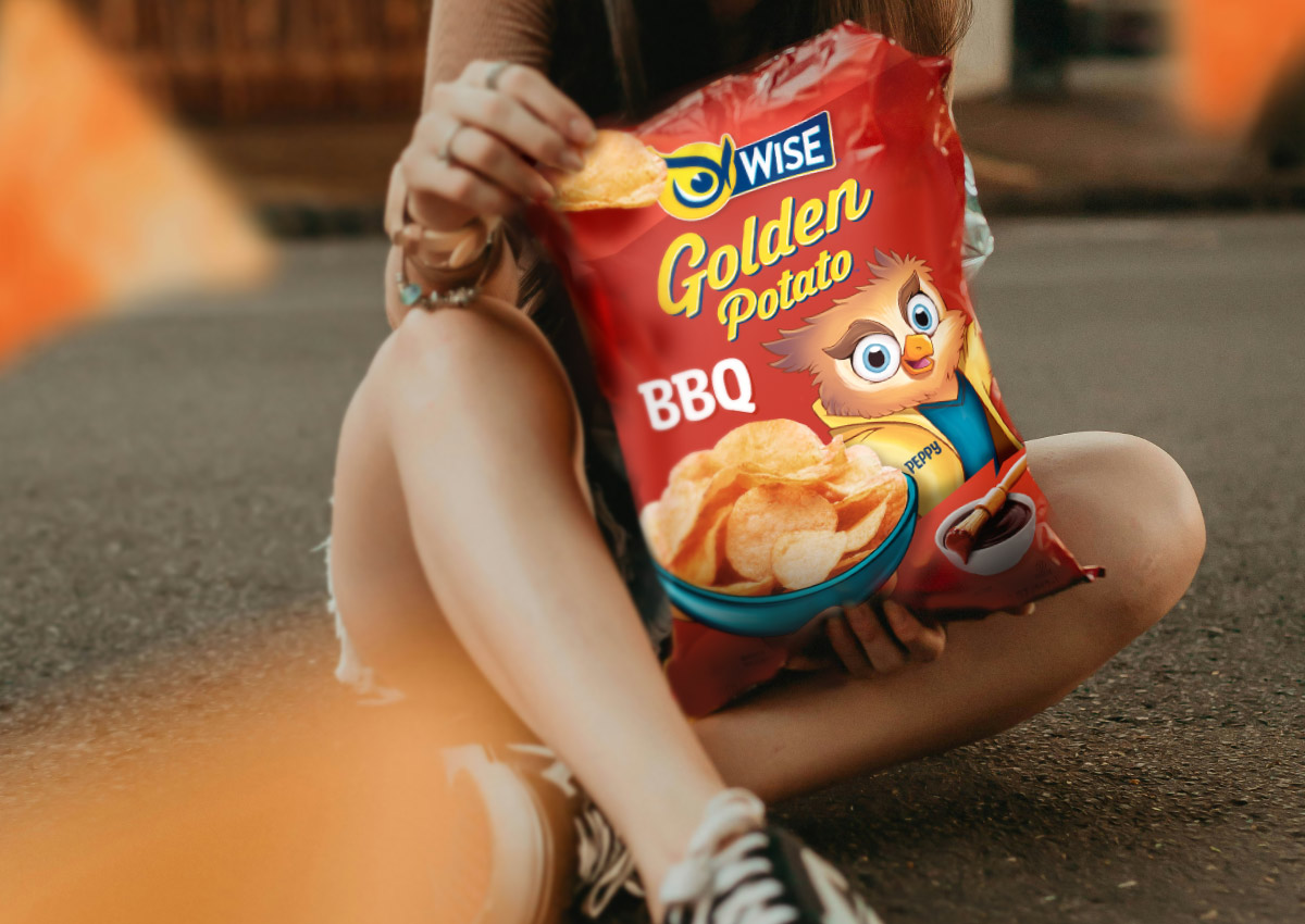
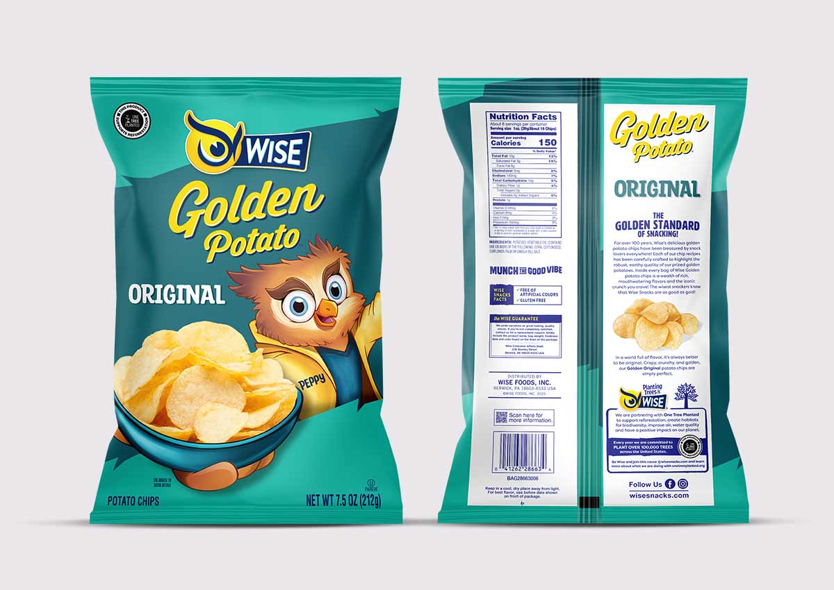
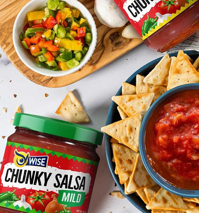
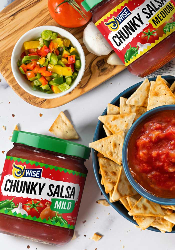
A new pack, a new Peppy
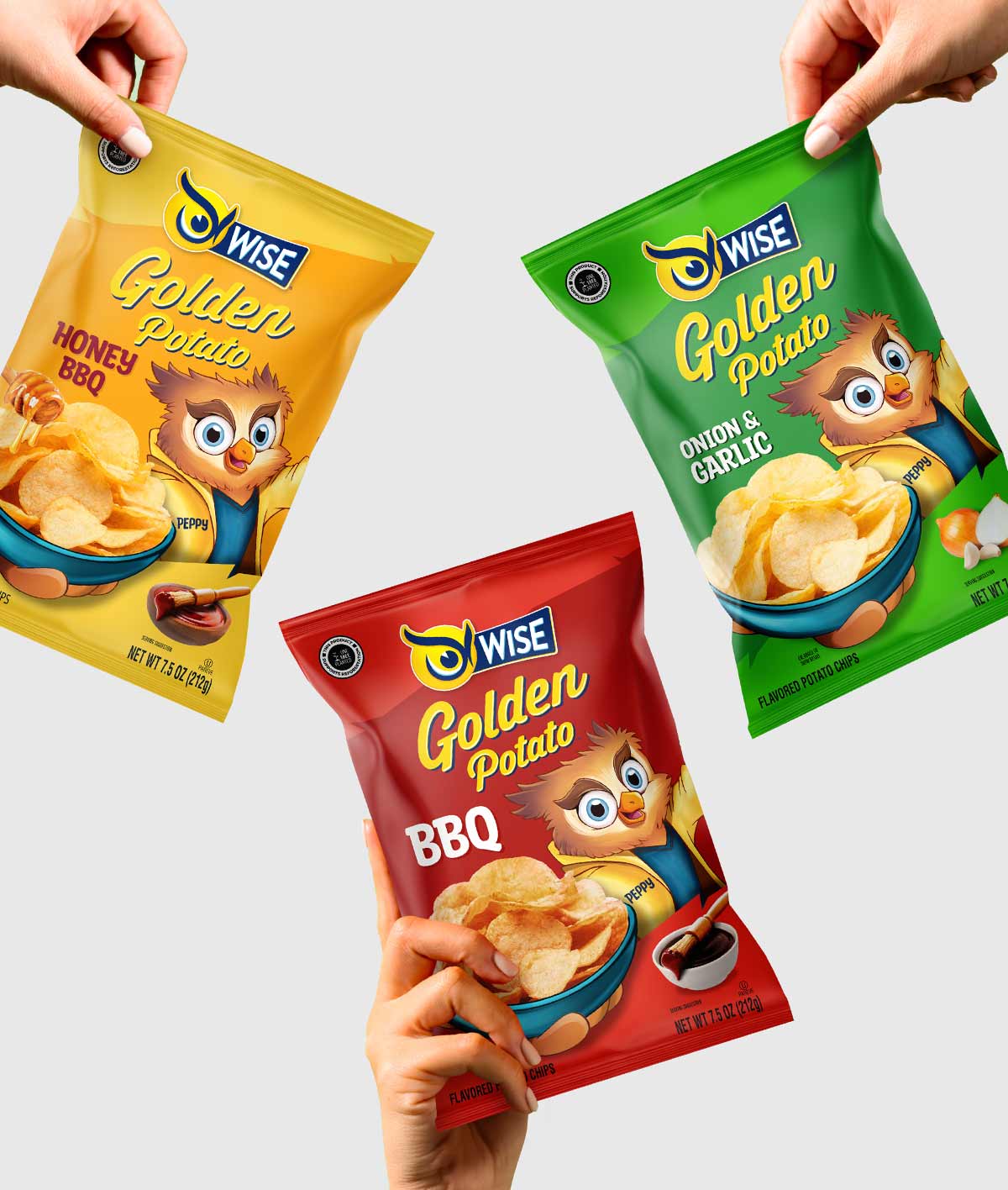
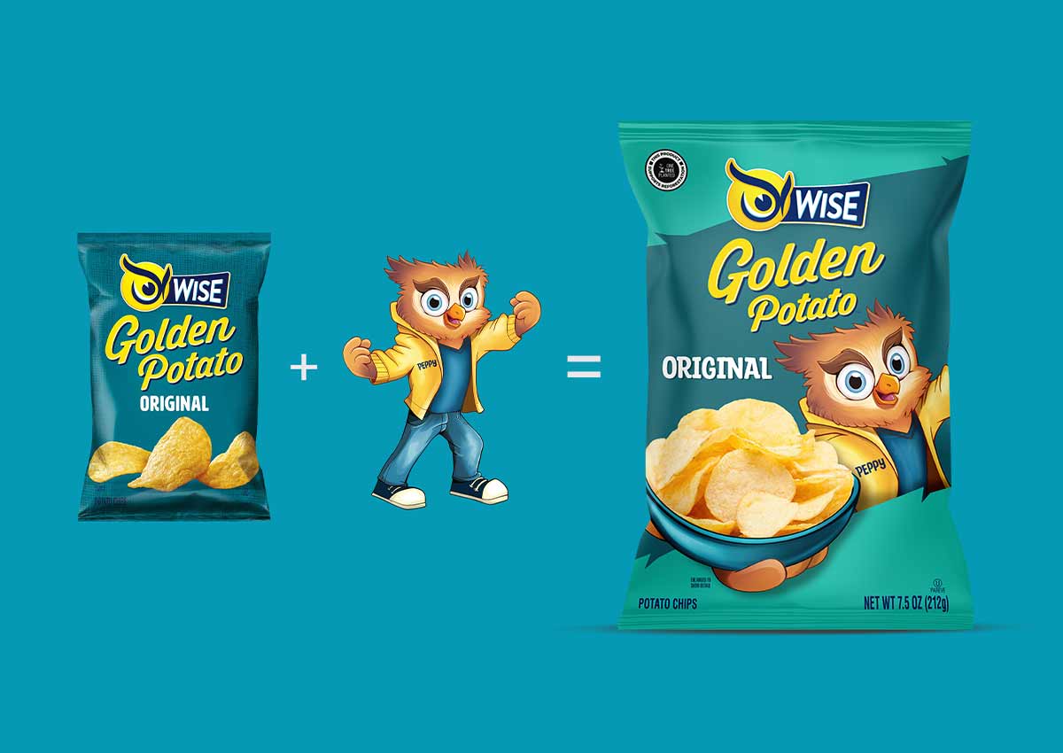
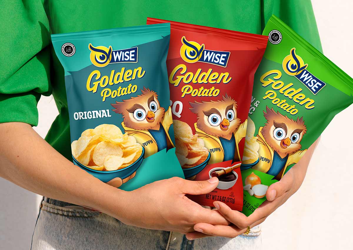
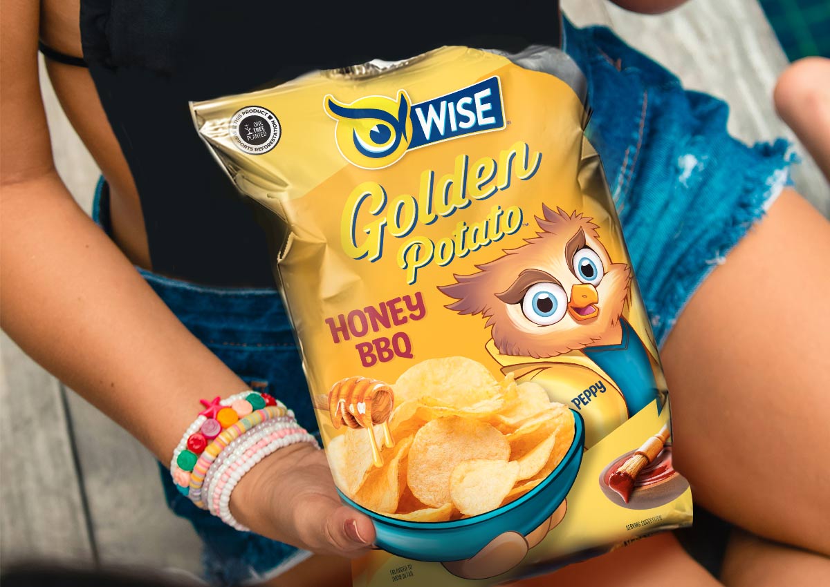
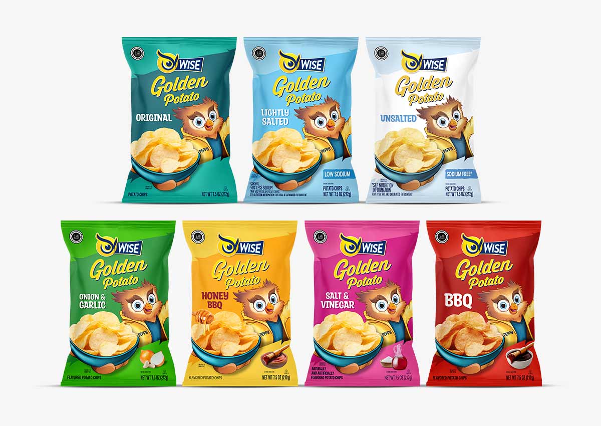
Imaginity, global packaging design agency, partnered with Wise Snacks to redesign the packaging for their Golden Potato line, incorporating the evolved version of their historical brand mascot Peppy. The challenge was to integrate this refreshed character into the packaging design in a way that felt purposeful and seamless—not simply added as an afterthought. Our goal was to maintain the brand’s existing Visual DNA—particularly its iconic color system and flavor distinctions—while giving Peppy, the Wise mascot, a more active, visible role.
Rather than placing Peppy arbitrarily, we positioned him holding a bowl of potatoes, reinforcing both the product and the mascot as central elements of the design. This placement allowed Peppy to play an active role in the story told by the pack, rather than functioning as a decorative addition.Imaginity | Design Agency | Branding, Packaging Design, Marketing
The Challenge
Wise Snacks, a beloved American brand, needed to modernize its visual identity to maintain relevance in a competitive snack food market. The goal was to refresh the Golden Potato packaging and streamline the brand's architecture to improve on-shelf navigation and clarify product offerings for consumers, particularly for their low-sodium variants.
The Solution
We collaborated with Wise Snacks to redesign their Golden Potato packaging, featuring an evolved version of their iconic mascot, Peppy. Rather than treating him as an extra element, we integrated Peppy directly into the brand's narrative—placing him front and center, bowl in hand, to create a more engaging and memorable design.
Additionally, we refined the brand architecture across the entire Original product line. This included unifying the low-sodium variants through a clear, color-coded system that not only improved shopper understanding but also reinforced the brand’s visual consistency in the packaging design across the entire product family.
The Results
The strategic redesign successfully rejuvenated a classic American brand. By placing the updated mascot at the core of the visual storytelling, the new packaging immediately enhanced shelf in store appeal and brand recognition. The simplified and intuitive color-coded system for the Original line streamlined the consumer's decision-making process, helping to minimize shopping friction and reinforce brand loyalty. The project delivered a cohesive and refreshed brand identity that is now poised to capture the attention of a new generation of consumers while staying true to the brand's heritage.
We also took this opportunity to revisit the brand architecture. We clarified the segmentation between the Golden Potato flavor range and the Original line, which includes regular, slightly salted, and unsalted versions. For the Original line, we developed a unifying color strategy based on light blue tones—using darker shades for higher salt content and lighter tones for unsalted—to enhance navigation and shelf clarity.
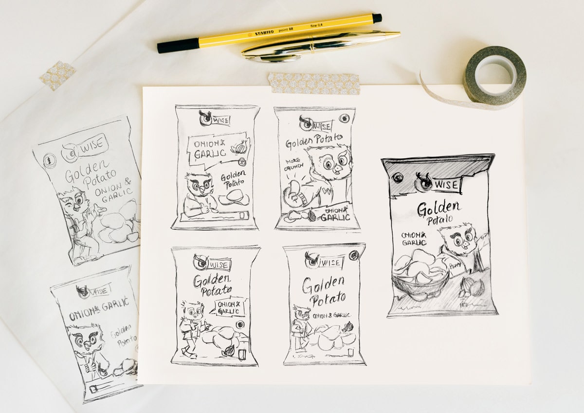
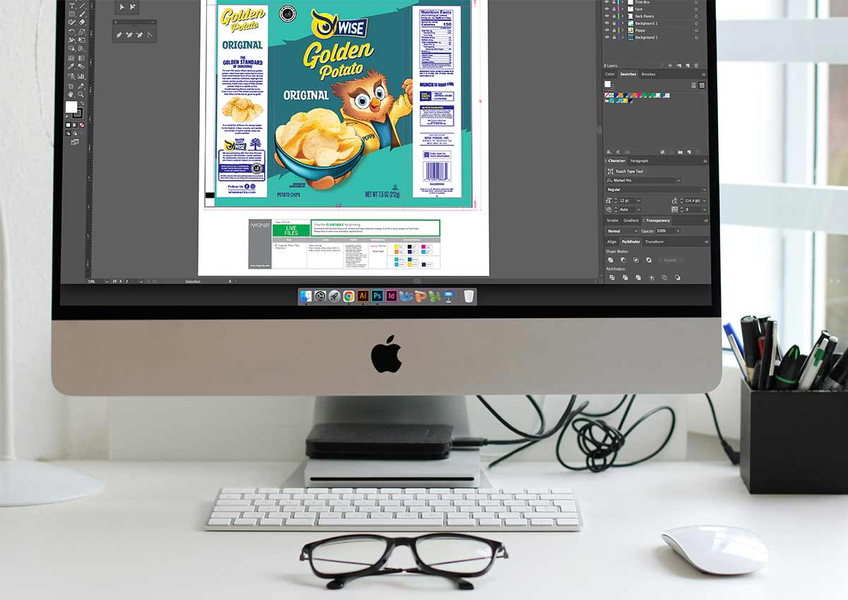
At Imaginity, we've perfected a workflow, based on our extensive experience as a design agency, to deliver the most innovative and effective design solutions. The invaluable hand-sketching stage is fundamental to this process.
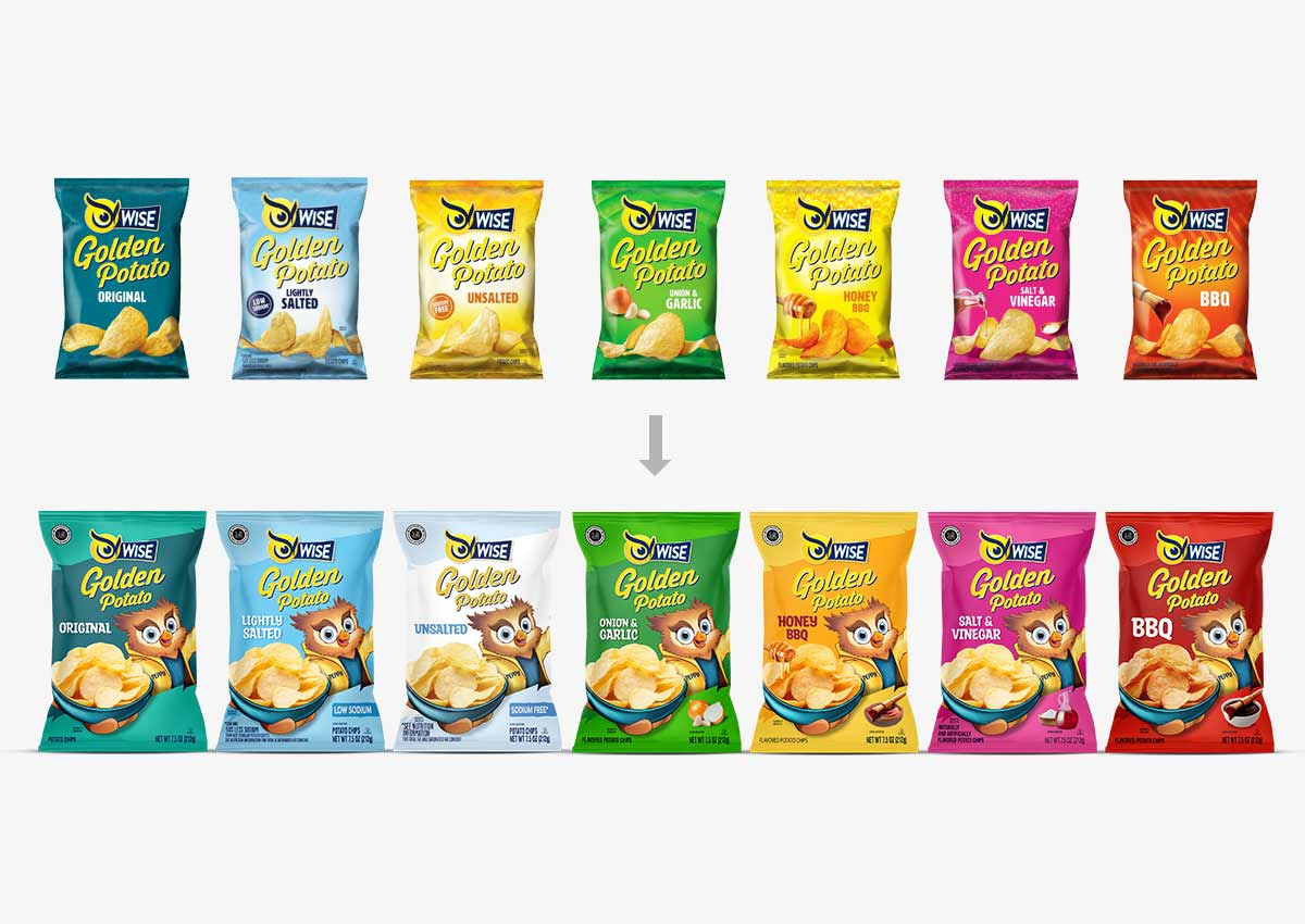
Brand architecture: A before and after that organizes, hierarchizes and boosts the brand architecture we organized the brand architecture by differentiating the flavor line and the original line (with its unsalted and non-salted versions).
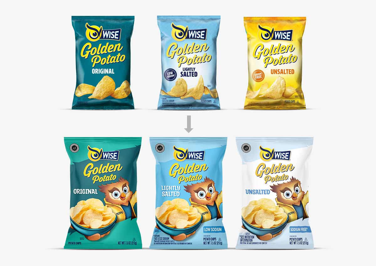
We worked on the original line, which includes the regular version, the slightly salted one and the unsalted one. In this one we revised the architecture to unify the versions with the lowest sodium content. We chose the light blue color as the color that crosses this line, in different shades, the darkest one being with more salt and the lightest one being unsalted.