Client:
La Perla Breads
Country:
Argentina
Task:
Packaging Design, Branding
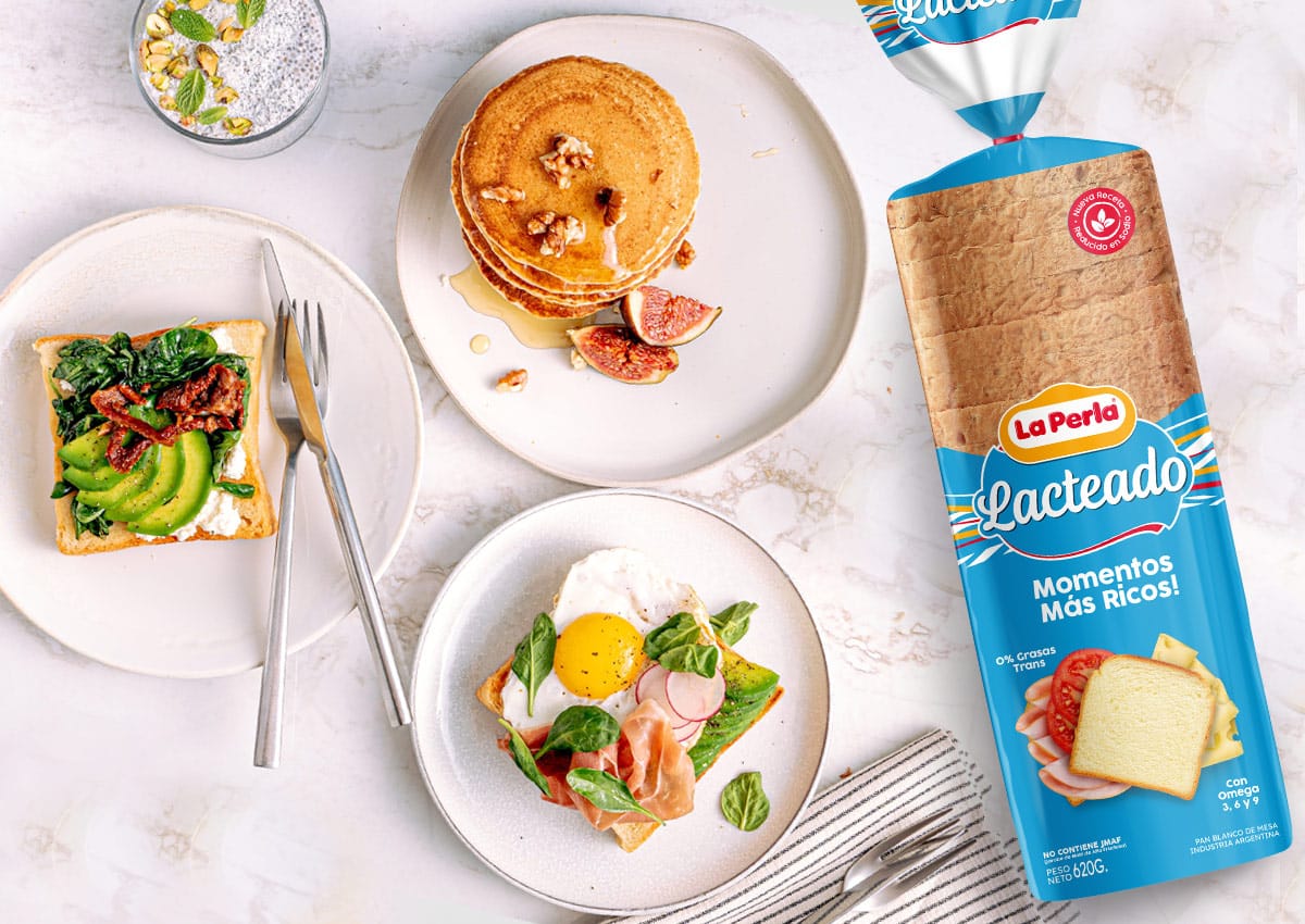
La Perla: Strategic Brand Refresh and Packaging Evolution
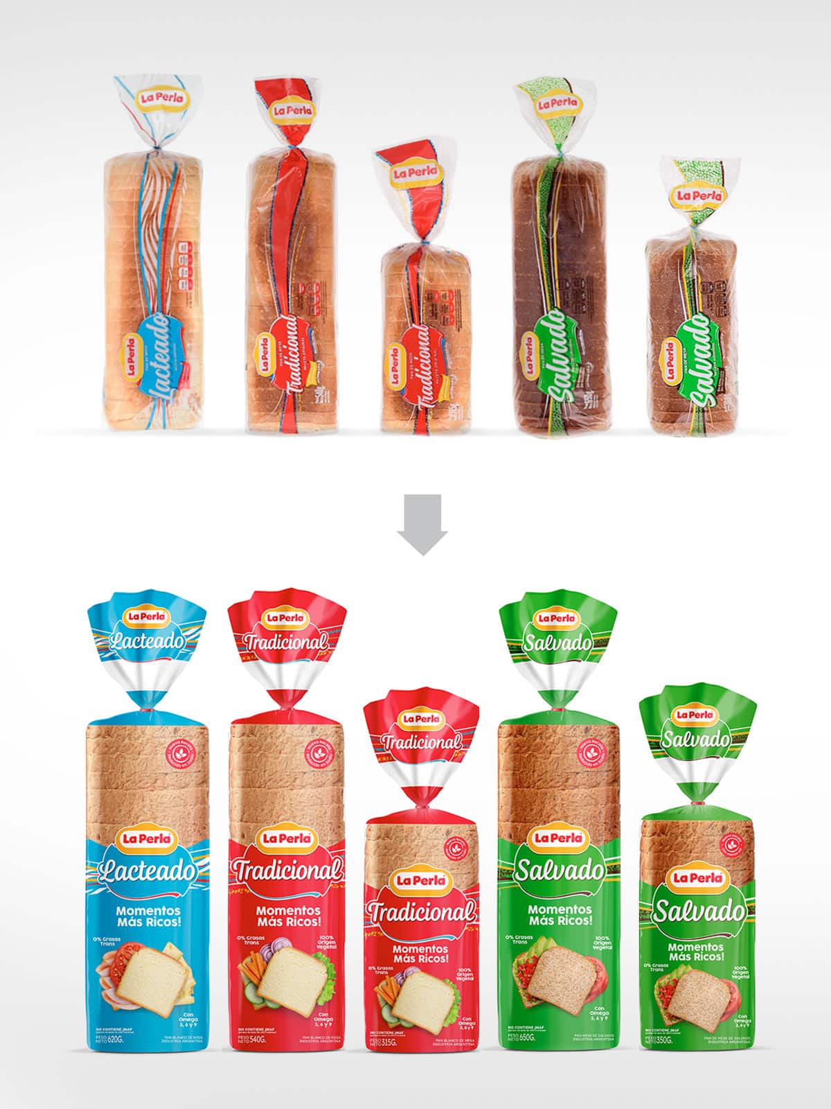
As a leader in CPG branding strategy, Imaginity was tasked with the visual identity redesign for La Perla’s core sliced bread portfolio. The project focused on modernizing the Tradicional, Lacteado, and Salvado varieties while respecting the established equity of the brand. By implementing a cleaner information hierarchy and high-quality product photography, we transformed the line into a contemporary market contender that emphasizes freshness and quality.
Imaginity | Design Agency | Branding, Packaging Design, Marketing
Visual Highlights
-
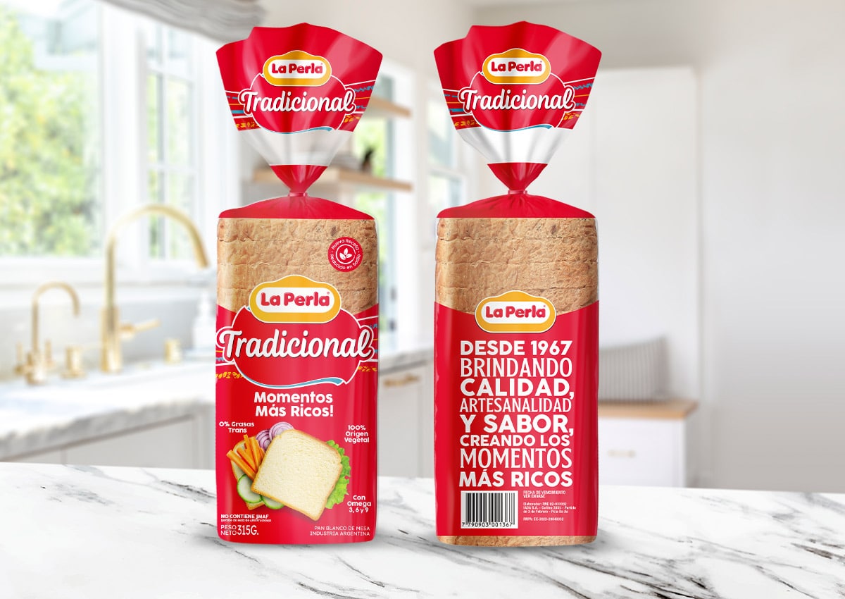
Modernized Brand Architecture: Refined typographic adjustments to the logo for improved legibility and premium brand perception.
-
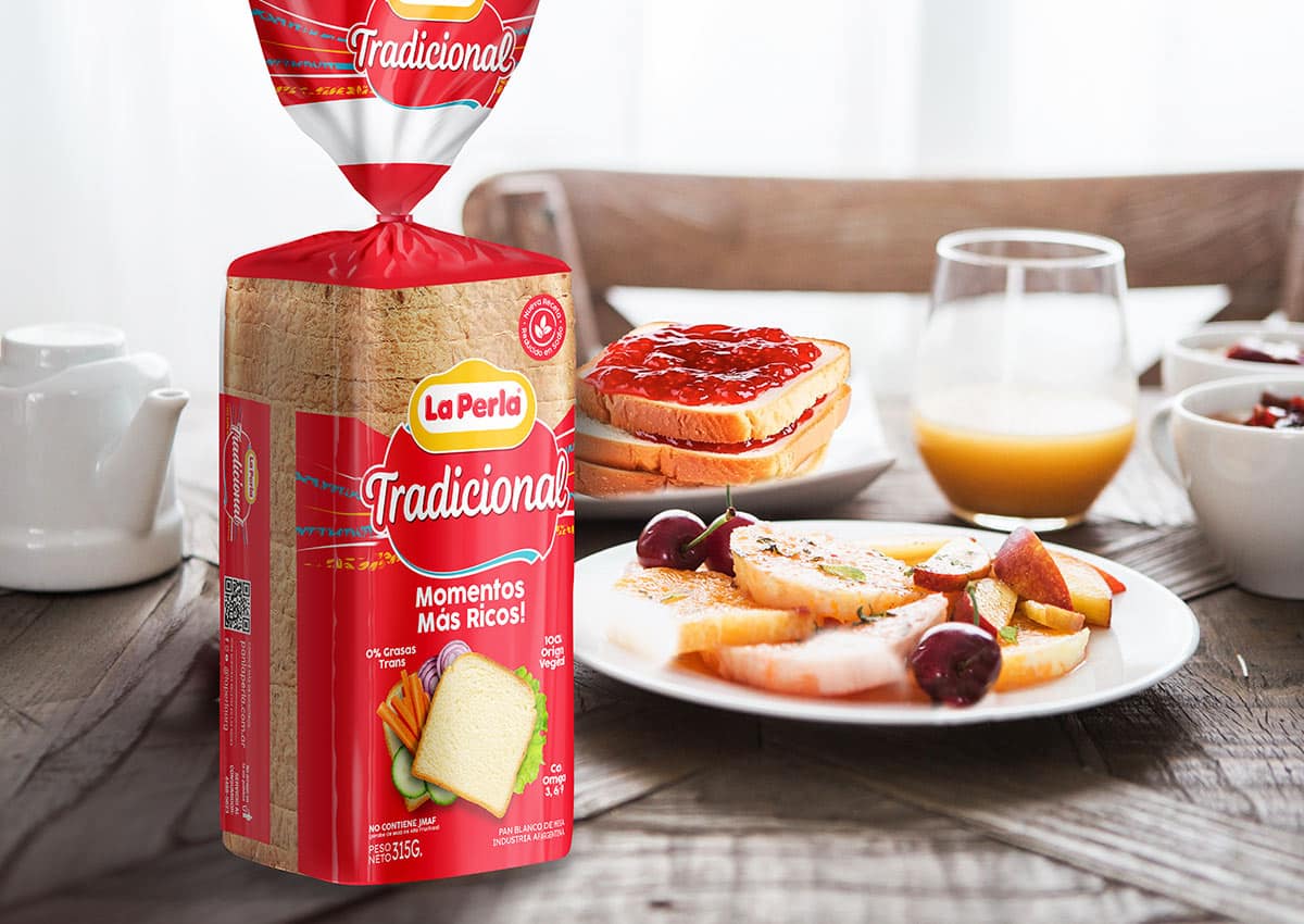
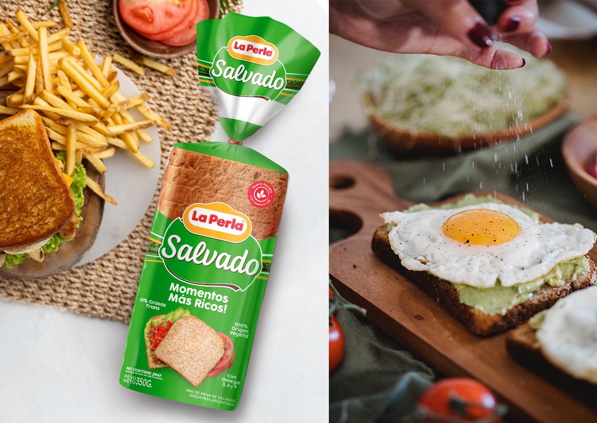
High-Impact Product Photography: A "deconstructed" and casual product image style that highlights the soft texture and appetite appeal.
-
Strategic Color Coding: Preserved traditional color markers (Red, Blue, and Green) to ensure seamless consumer recognition.
-
Clean Visual Hierarchy: A minimalist layout that reduces "visual noise," allowing the brand block and product quality to stand out.
-
Optimized Product Transparency: Packaging designed to highlight the product’s freshness through clear-film integration, enhancing consumer trust at the point of sale.
1. The Branding Challenge: Modernizing Heritage Without Losing Loyalty
The primary objective was to execute a brand refresh that would resonate with modern consumers without alienating the existing loyal customer base of La Perla sliced bread. The challenge lay in maintaining the "essence" of the brand—specifically its iconic color coding and brand blocks—while removing dated graphic elements. We needed to transition from a traditional commodity look to a premium FMCG aesthetic that effectively competes in a crowded retail landscape.
2. Our Design Process: Typographic Refinement and Visual Strategy
Our team conducted a market analysis of the bakery category to identify opportunities for differentiation. We focused our design solution on two key areas: typographic modernization and product presentation. By "cleaning up" the brand’s logo and introducing a more spontaneous, "decontracted" image of the bread, we shifted the focus toward quality and flavor. This strategic design approach ensures that while the brand remains recognizable, it feels significantly more relevant to today’s health-conscious and quality-driven shoppers.
3. The Outcome: A Clean, High-Impact Retail Presence
The project resulted in a visually cohesive and attractive packaging system that strengthens La Perla’s market positioning. The new design successfully highlights the rich texture of each bread variety, creating a stronger emotional connection at the point of sale. By balancing technical implementation with visual storytelling, we delivered a design that is not only beautiful but also highly functional for high-speed industrial printing.
