artefacta - Retail Branding
How We Created a Cohesive Brand Experience for artefacta
The Power of Retail Store Branding
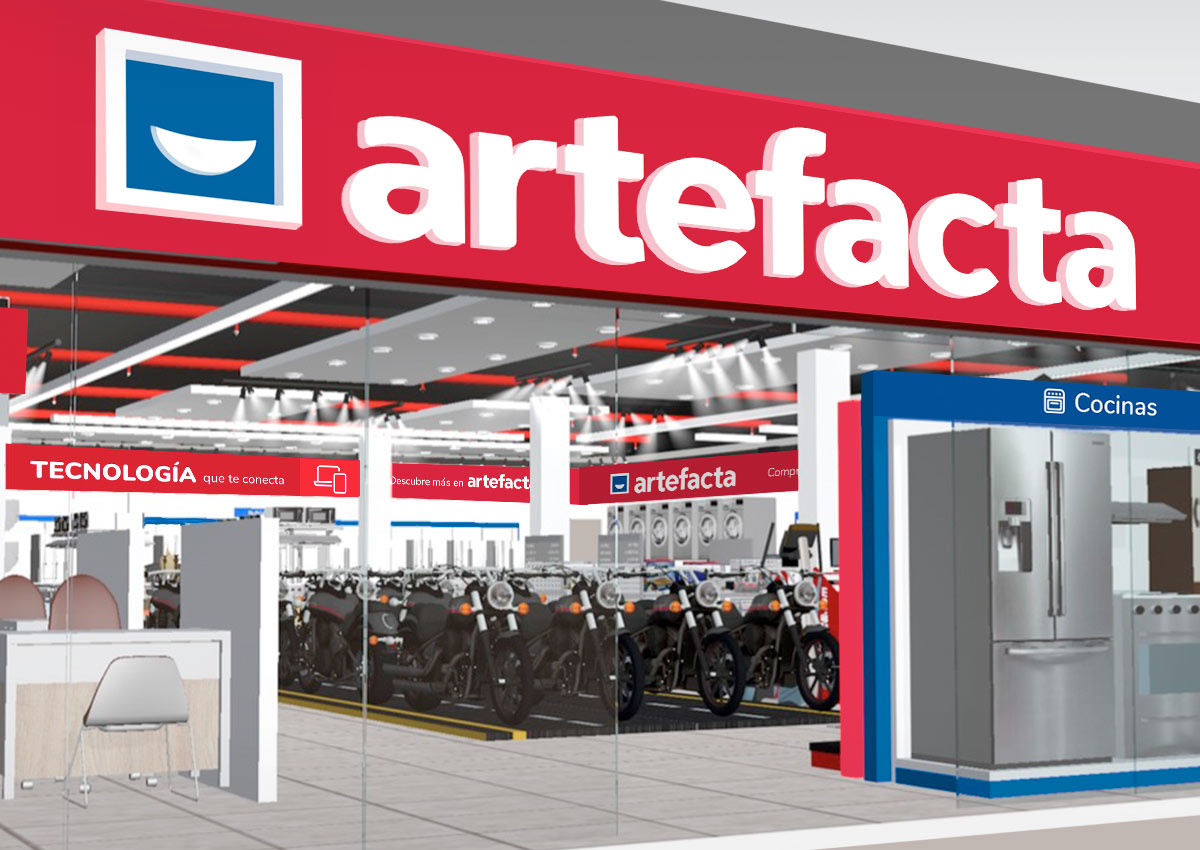
In today’s competitive landscape, a retail store is more than just a point of sale—it’s a vital touchpoint where customers connect directly with your brand. Successful retail branding involves carefully integrating every element, from signage and displays to materials and lighting, to create a cohesive representation of your brand’s personality and vision. It’s about crafting an environment that feels authentic, engaging, and aligned with the expectations of your target audience. At Imaginity, we specialize in designing retail brands that drive foot traffic, elevate the customer experience, and amplify the essence of your brand. By seamlessly aligning the physical store’s design with the brand’s overarching identity, we ensure consistency across all channels, transforming your retail space into a powerful extension of your marketing strategy.
Retail Branding: Communicating Values Through Design
Retail branding should extend beyond functionality, capturing the essence of a brand and aligning with the lifestyle aspirations of its customers. At [design agency], we specialize in designing retail visual identities that narrate a brand’s story while offering meaningful connections to consumers. By weaving elements that reflect the brand essence into the retail experience, we position brands as integral to their customers' lives.
Branding as the Evolution of a Living Brand
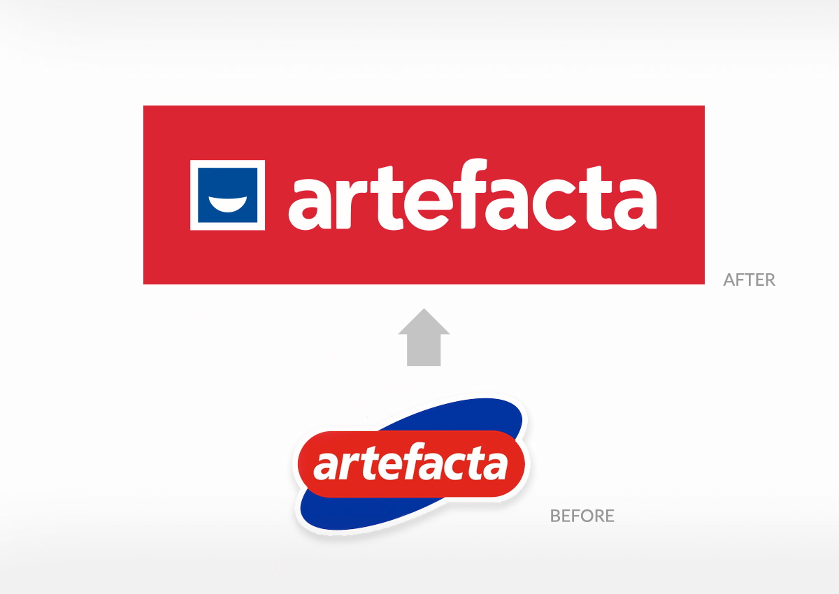

In the dynamic world of retail, a brand must evolve to stay relevant while retaining its core essence. At Imaginity, we understand that a successful retail brand is a living entity that grows with its audience, market trends, and technological advancements. Branding in this context is not just about maintaining visual consistency; it’s about nurturing the brand’s identity, ensuring its values and mission remain intact while embracing innovative opportunities to connect with consumers. This balance of continuity and change strengthens the brand’s resonance, fostering trust and loyalty among its audience.
Creating Retail Branding for Real-World Applications
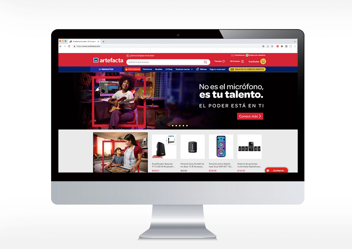
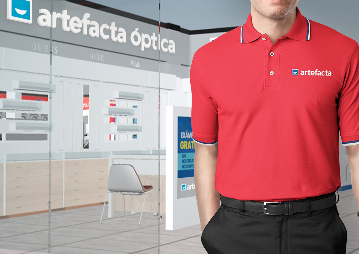
When designing for retail brands, it’s essential to consider the practical realities of where and how the brand will be implemented. Retail environments often present unique spatial challenges that demand flexible and adaptable branding solutions. For instance, if the brand is to be displayed in vertically constrained spaces, the design must ensure clarity and impact within those limitations. Similarly, brands that will be applied across a variety of mediums—such as storefront signage, shelf displays, and promotional materials—may require multiple formats, including both vertical and horizontal variations, to maintain consistency and effectiveness across all applications. At Imaginity, we prioritize creating branding systems that are not only visually compelling but also versatile and practical. By accounting for these factors during the design process, we ensure that your brand remains impactful and cohesive, no matter where it lives. This adaptability enhances brand recognition and maximizes its effectiveness in diverse retail settings, strengthening its presence in both physical and digital environments.
Ensuring Consistency: The Role of a Comprehensive Brand Manual


To maintain consistency and integrity in a retail brand's new identity, we create comprehensive brand and usage manuals. These guides include detailed specifications such as size applications, minimum size reductions, typography, color palettes, safe zones, background adaptations, and prohibited uses. By offering clear instructions, the manual ensures that the brand is implemented cohesively across all touchpoints while safeguarding its essence and visual identity. This brand manual acts as a vital tool for achieving uniformity in branding, whether on in-store signage, packaging, digital platforms, or promotional materials. It empowers teams and partners to apply the brand elements accurately, ensuring that every representation of the brand resonates with its core identity and message.
Branding for Retail Brands vs. E-Commerce Brands: Adapting to Unique Ecosystems

At Imaginity, we understand that branding for retail and e-commerce brands requires distinct approaches tailored to the unique challenges and opportunities of each environment. With significant experience in both worlds, we craft strategies that ensure your brand stands out.
Retail Branding: Creating Tangible Connections


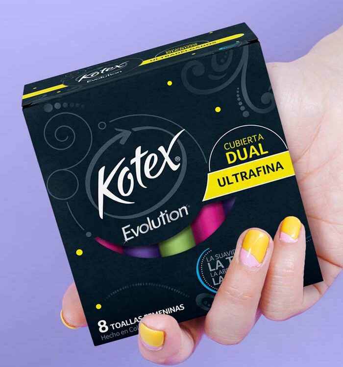
In traditional retail, branding must shine in an environment where customers physically interact with products. The emphasis is on tactile and visual elements—packaging that stands out on crowded shelves, signage that guides and informs, and displays that create a compelling brand presence. Retail branding demands a focus on shelf impact, clear communication of product benefits, and a strong alignment with the store's overall visual language. It's about creating immediate, emotional connections that drive impulse purchases and reinforce brand loyalty.
Branding for E-Commerce Brands: Standing Out in the Digital Space


In e-commerce, the challenge shifts to capturing attention in a virtual environment. E-commerce branding operates in a digital-first landscape where visual appeal and clarity are essential. Unlike retail environments, e-commerce brands must prioritize how their identity translates to small screens and online platforms. Here, consistency across product images, thumbnails, and banners is key to building trust and recognition. Here, branding relies on high-quality visuals, user-friendly layouts, and strategic storytelling to communicate value. Product images, descriptions, and videos must not only inform but inspire, while the brand's digital presence—from Amazon storefronts to Shopify websites—must convey trust and professionalism. Additionally, e-commerce branding focuses on optimizing the unboxing experience, ensuring the packaging and its design reinforce the brand’s promise and leave a lasting impression.
Bridging Both Worlds: Brick-and-Mortar and E-Commerce
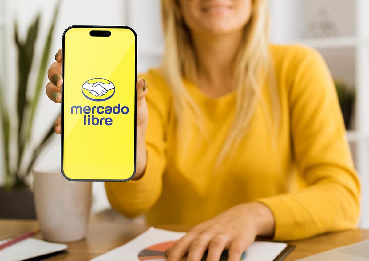

By understanding the distinct dynamics of retail and e-commerce, we craft branding strategies that are versatile, cohesive, and impactful across both environments. Our expertise ensures that your brand not only thrives in physical spaces but also excels in digital ecosystems, maximizing its reach and fostering meaningful connections with your audience.
Why Imaginity for Retail Branding?
At Imaginity, we combine strategic thinking with cutting-edge design to craft retail brands that leave lasting impressions. Our team works closely with clients to understand their vision, audience, and business goals, translating them into brands that not only look stunning but also perform.

