Customer:
Weber´s
Country:
Mexico
Task:
Naming. Branding. Packaging Design
The quality of the ingredients is represented both inside and outside the package
When the established Mexican bakery leader Weber’s decided to expand their portfolio with a premium line of specialty breads, they turned to Imaginity for a comprehensive brand transformation. Our task encompassed the entire creative funnel: from strategic naming and logo design to high-impact packaging architecture. By positioning the product at the intersection of artisanal quality and natural purity, we developed a brand identity that differentiates Weber’s in the competitive FMCG landscape.
Imaginity | Design Agency | Branding, Packaging Design, Marketing
Visual Highlights
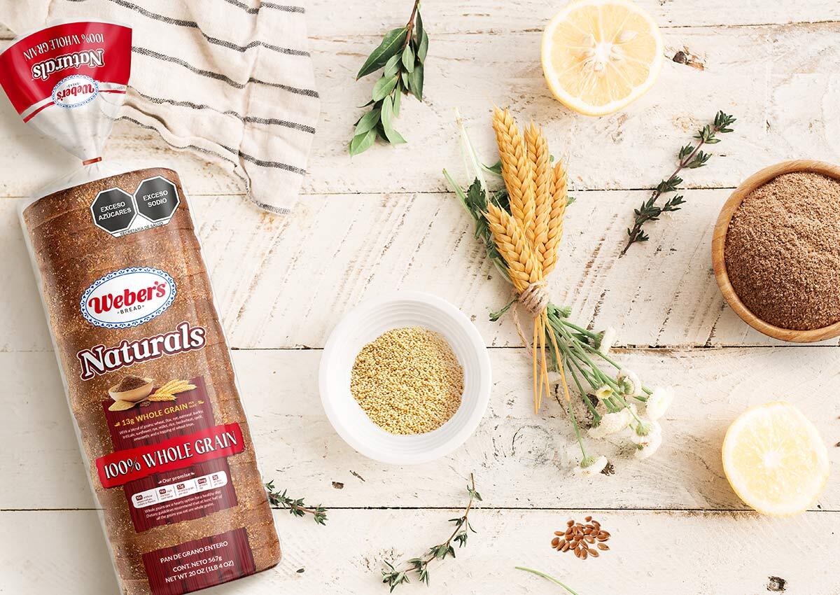
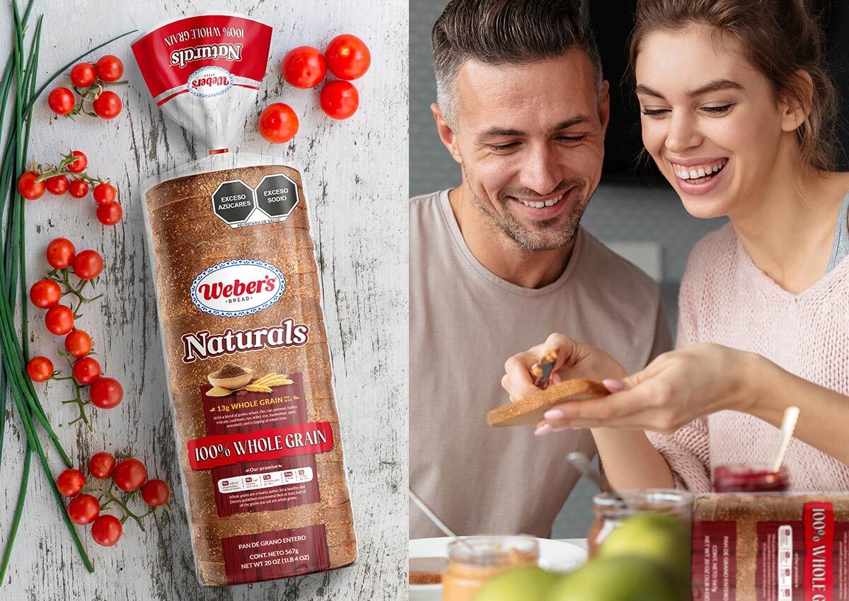
- "Naturals" Strategic Naming: A clean, evocative name chosen to communicate ingredient transparency and health-conscious value.
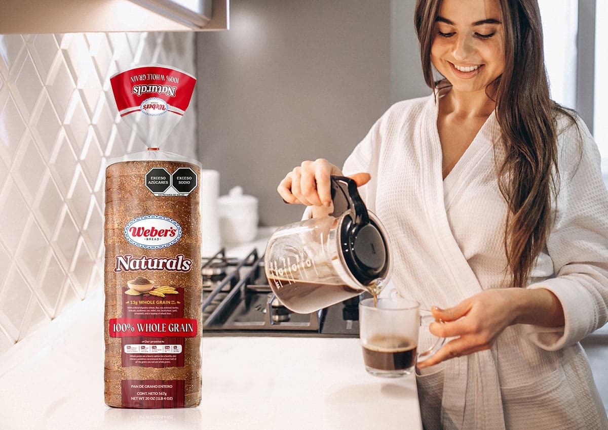
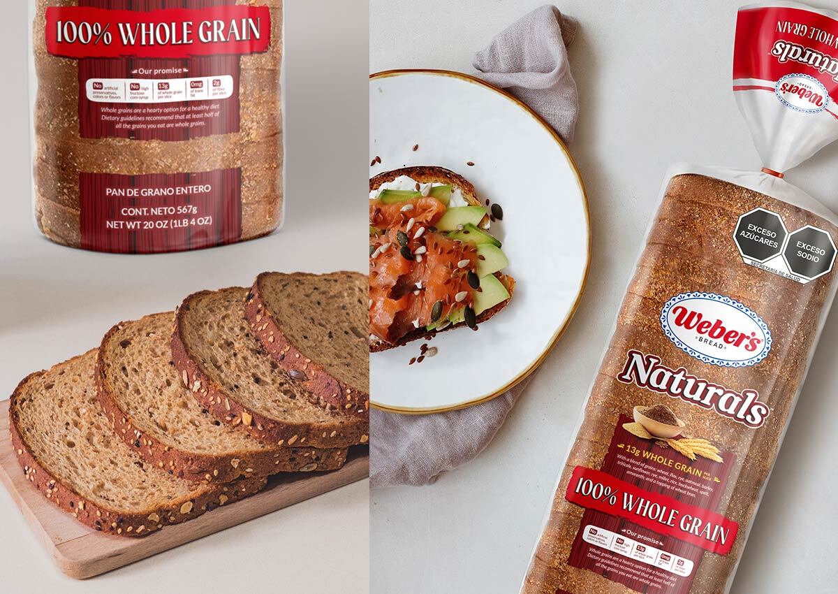
- Organic Texture Integration: The use of high-definition wood textures on the pack to signal "farm-to-table" authenticity and warmth.
- Dynamic Color Coding: A palette of varying wood tones that shifts across the product line to distinguish different specialty varieties.
- Gestural Graphic Elements: Hand-drawn, "unstructured" borders and flavor plates that emphasize a non-industrial, artisanal feel.
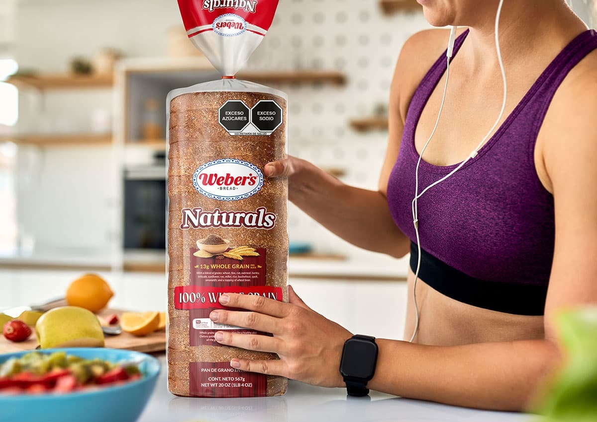
- Appetite Appeal Focus: High-impact product photography combined with clear windows to showcase the nobility of the ingredients.
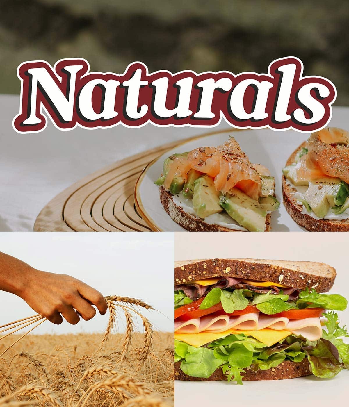
The Branding Challenge: Defining a New Category Identity
The primary objective was to launch a specialty sub-brand for Weber’s that felt distinct from their core commercial line. The challenge lay in creating a brand architecture that felt premium and artisanal without losing the trust associated with a major national brand. We needed a visual identity system that could scale across multiple formats—including individual loaves and two-packs—while maintaining a consistent story of authenticity and culinary excellence.
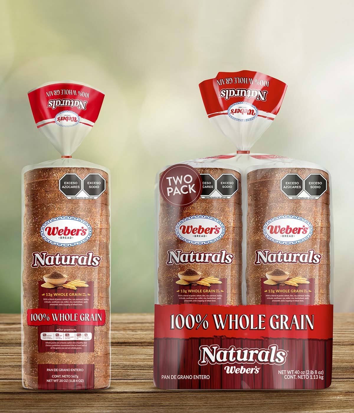
Our Design Process: From Naming to Packaging Architecture
Our process began with strategic naming, where "Naturals" emerged as the winner for its direct communication of product purity. In the packaging design phase, we focused on "packvertising"—using the physical container to tell a story. We utilized wood textures as a primary background to wrap the entire pack, creating a tactile and organic presence on the shelf.
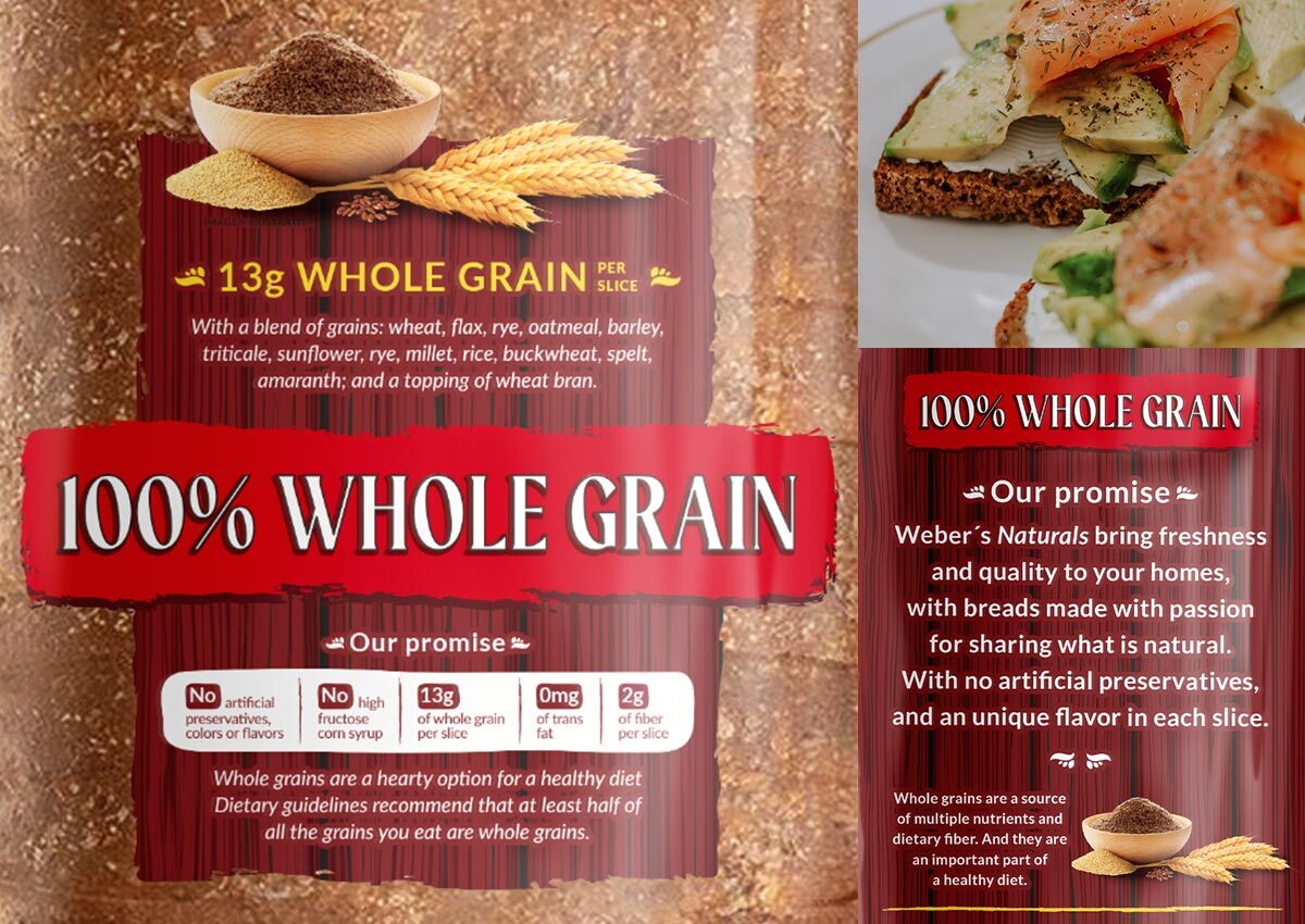
The information hierarchy was meticulously organized, placing the "brand promise" and ingredient selection on the back, while the front focuses on high-impact visual elements and clean legal typography.
The Outcome: A High-Impact Market Launch
The project resulted in a professional and highly competitive brand that successfully bridges the gap between the artisanal world and mass-market retail. By fusing visual storytelling with high-quality ingredients, Weber’s Naturals has been positioned as an irresistible choice for demanding consumers. This packaging innovation ensures that every detail—from the gestural brushstrokes to the color-coded variety plates—reinforces a message of superior quality, helping Weber’s secure a leadership position in the specialty bread category.
This integrated branding project for Weber’s Naturals showcases Imaginity’s ability to handle the full lifecycle of a CPG launch. Consistent with our expertise in visual identity design and retail packaging strategy, we have created a brand that doesn't just sit on the shelf—it tells a compelling story of nature and excellence.
Imaginity is a branding and packaging design agency specializing in bread, bakery, and food brands. We help companies develop strategic naming, visual identity, and packaging systems that communicate quality, enhance appetite appeal, and differentiate products in highly competitive retail environments.

