Customer:
Weber´s
Country:
Mexico
Task:
Packaging Design
Tradition and flavor in one pack
Expanding a legendary bakery brand like Weber’s requires a strategy that respects tradition while capturing new market opportunities. We worked on the simultaneous launch of their Bagels and English Muffins, creating a unified visual language that defines the "perfect American breakfast". By aligning these two products under a consistent architectural framework, we transformed the bread aisle into a destination for quality, freshness, and heritage.
Imaginity | Design Agency | Branding, Packaging Design, Marketing
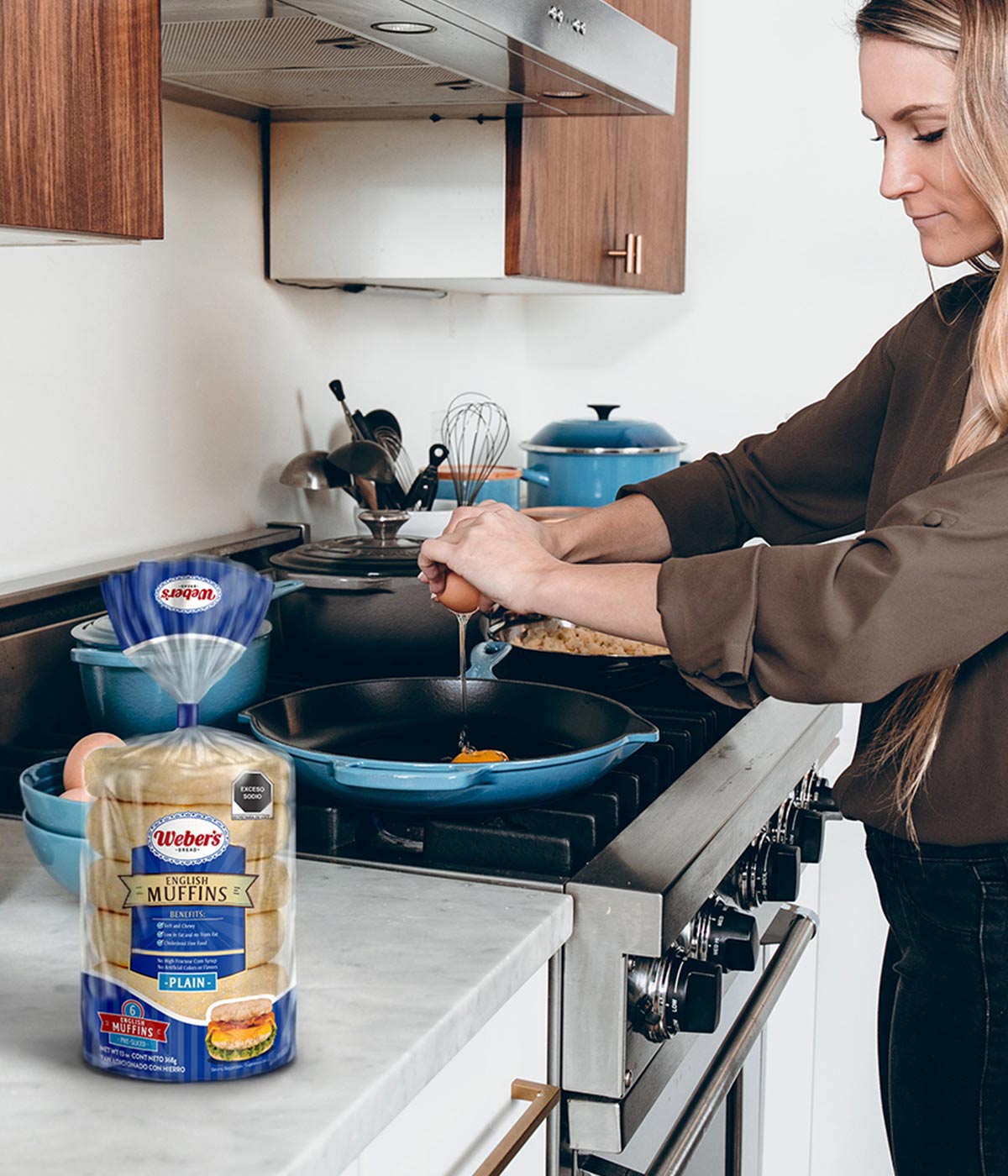
1. The Challenge: Integrating New Products into a Legacy Architecture
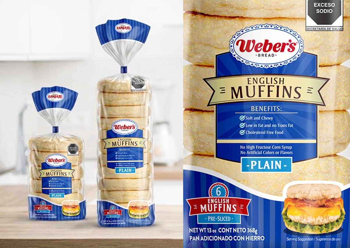
The primary objective was to launch Weber’s English Muffins (in 6 and 12-unit packs) while maintaining strict alignment with the brand’s established identity. We needed to create a design that felt like a natural extension of Weber’s esteemed bakery line—specifically alongside the new Bagels—ensuring the product looked like part of the family while effectively differentiating itself within its specific category.
Visual Highlights
- Structured Information Architecture: A central plate design serves as the anchor of the packaging, strategically organizing key information levels—from the brand logo and product name to specific benefits and varieties.
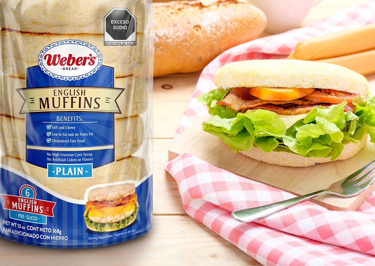
- Enhanced Appetite Appeal: The design integrates high-quality, "ready-to-eat" product imagery that showcases the English Muffins in an inviting context, significantly boosting sensory appeal and shelf impact.
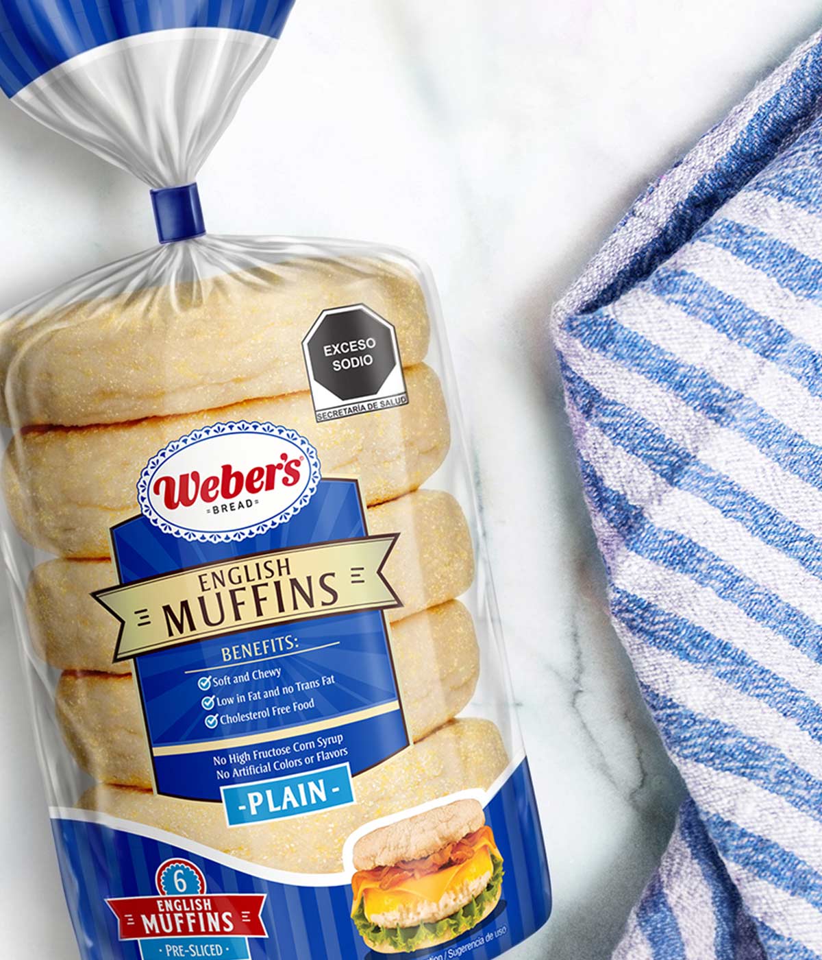
- Maximized Product Visibility: Strategic transparent windows allow the natural texture and artisanal quality of the muffins to take center stage, fostering immediate consumer trust through product transparency.
- Distinctive Brand & Color Strategy: To ensure family consistency, the design maintains the signature vertical-line texture; however, it strategically adopts deep blue as its primary color to distinguish the English Muffins from the rest of the Weber’s portfolio.
- Vibrant Flavor Differentiation: A cohesive color-coding system across the range allows shoppers to intuitively navigate the category and quickly distinguish between different product varieties.
- Dynamic Typographic Layout: By utilizing clean, modern typography, we established a clear visual hierarchy that prioritizes essential nutritional and product information while maintaining a premium, contemporary aesthetic.
2. The Solution: Strategic Differentiation and Visual Appetite
Our solution involved evolving the brand's visual assets to suit this new category. We replaced the traditional blue-and-white gingham pattern with a modern, two-toned vertical line pattern to distinguish the English Muffins from other varieties. The layout prioritized a central nameplate for clear information hierarchy, used a large transparent window to showcase product freshness, and featured high-impact "serving suggestion" photography to maximize appetite appeal.
3. The Results: Unified Brand Identity and Strong Shelf Presence
The project delivered a professional, unified packaging system that strengthened Weber’s institutional image. By using the Weber’s logo as a "trust mark" and balancing clear nutritional benefits with inviting visuals, we created a design that is easily recognized by loyal consumers. The final result successfully positions English Muffins as a premium American-style staple, standing out from the competition through a perfect blend of tradition and modern design.
As the perfect companion to the Weber’s Bagels launch, the English Muffins packaging completes the brand’s premium breakfast portfolio. We maintained the same structural hierarchy and transparent windows found in the Bagel design to ensure instant brand recognition. By simply evolving the color palette to a distinct blue and fine-tuning the pattern, we created a clear differentiation between the two products while reinforcing a powerful, unified block of Weber’s tradition on the shelf.
Imaginity is a packaging design agency specializing in bakery, bread, and breakfast brands. We work with companies to create packaging designs that highlight product freshness, enhance appetite appeal, and reinforce brand trust, delivering strong shelf presence and clear differentiation in competitive retail environments.