Customer:
Weber’s
Country:
Mexico
Task:
Packaging Design
An American classic from a historic brand
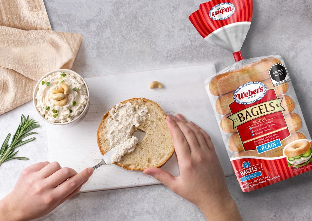
Building on Weber’s heritage as a legendary bakery brand, we designed the packaging for their highly-anticipated Bagels launch. By blending traditional cues with modern "appetite appeal", we created a visual identity that captures the chewy, authentic essence of a classic American breakfast, ensuring the new product felt both premium and familiar.
Imaginity | Design Agency | Branding, Packaging Design, Marketing
1. The Challenge: Launching a New Flavor with "American Tradition"
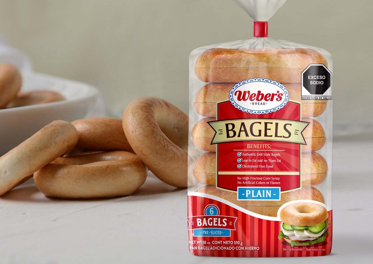
The primary objective was to introduce Bagels into Weber’s successful product line as a "delectable addition" with a classic American touch. The challenge was to create a packaging design that captured the product's unique texture and flavor profile while ensuring the new variety fit perfectly within the existing brand family, appealing to consumers looking for an authentic, traditional taste.
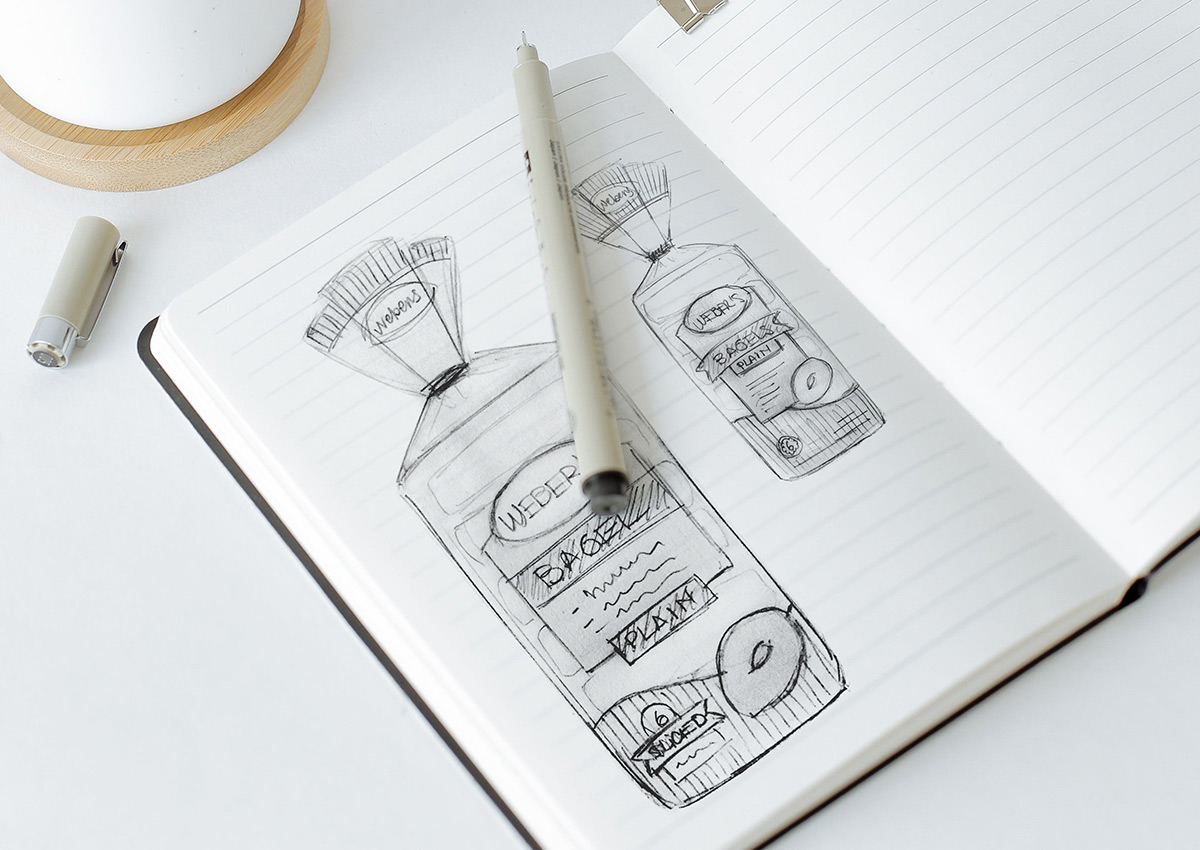
2. The Solution: Balancing Familiarity and Visual Appetite
Our design approach utilized a harmonious blend of innovation and brand consistency. We implemented a signature pattern of vertical lines and a central information plate to maintain a clear hierarchy. To drive "appetite appeal," we combined a generous transparent window—allowing customers to see the product's quality—with high-impact photography of a serving suggestion, providing a visual cue that highlights the bagel's soft yet crispy texture.
3. The Results: Captivating Shelf Presence and Brand Identity
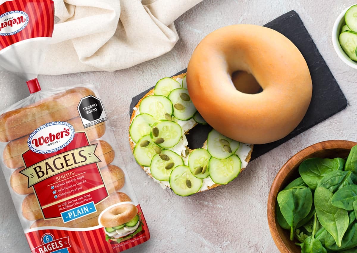
The project delivered a packaging system that effectively communicates Weber’s identity while standing out on the shelf. By reflecting the exceptional quality of the product through strategic visual cues, the design successfully entices customers to experience the brand's new flavor. The final result reinforces Weber's position in the bakery category, offering a modern look that respects the brand’s long-standing tradition of flavor and quality.
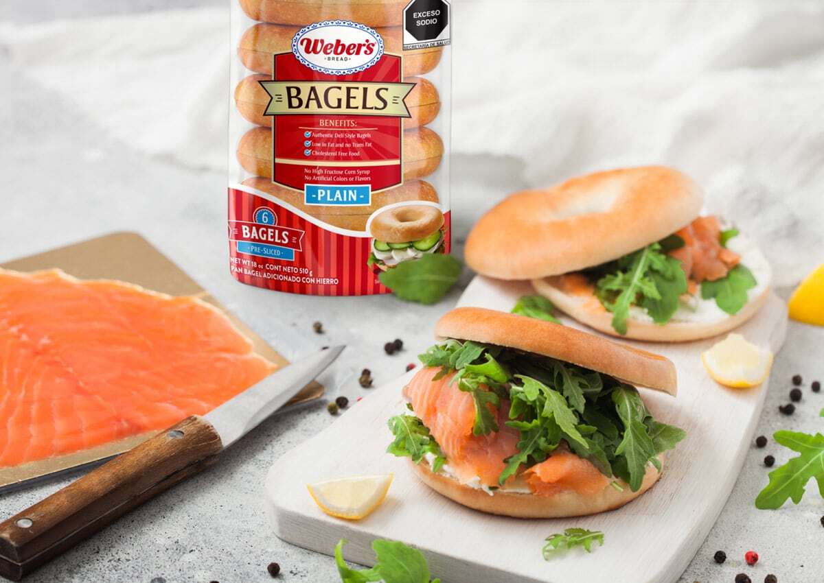
The launch of Weber’s Bagels served as the cornerstone for a broader category expansion. Designed to live side-by-side with our work for Weber’s English Muffins, the packaging utilizes a shared system of vertical lines and central information plates. While the Bagels focus on a 'chewy and bold' profile, they share the same DNA of transparency and appetite appeal as the English Muffins, providing a consistent brand experience for consumers looking to complete their morning ritual
