
Client:
Maestro Cubano
Country:
Uruguay
Task:
Branding, Packaging Design
The transformation of a classic
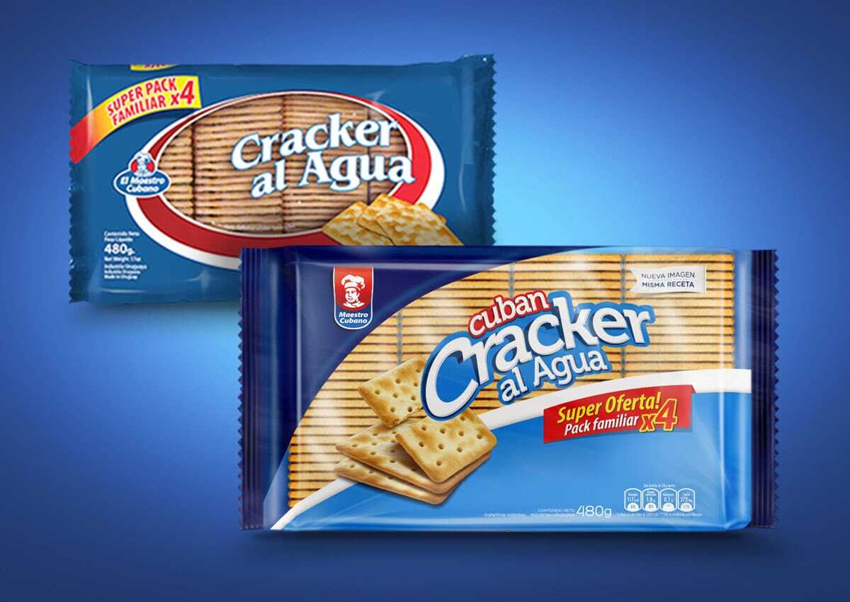
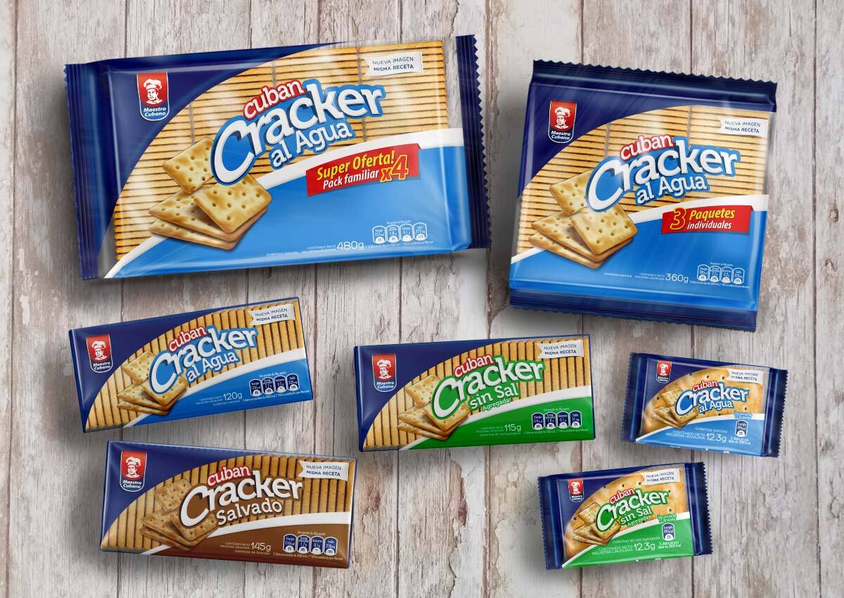
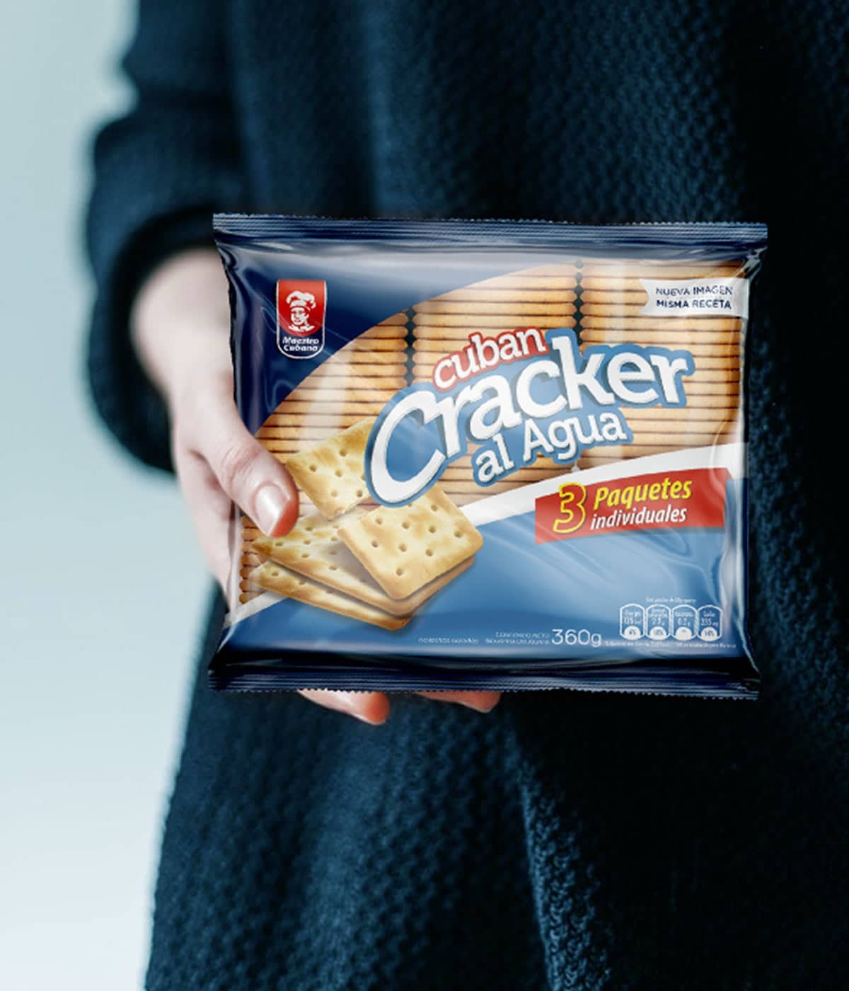
We transformed the packaging design and branding of Cuban Crackers Maestro Cubano in Uruguay. Faced with the need to update and give this crackers line a more modern style, we designed the packaging for each product in the line with the goal of maintaining their identity and recognition among consumers. Respecting the new brand architecture design by us, a window to see the content and a logo with more impact and distinction.
Imaginity | Design Agency | Branding, Packaging Design, Marketing
The Challenge
The Maestro Cubano Cuban Cracker line needed a significant visual transformation to stay competitive in a modern market. The goal was to update the packaging to a more contemporary style without losing the long-standing identity and recognition that loyal consumers have built with the brand over the years.
The Solution
We developed a design strategy that respects the brand's heritage while incorporating modern structural elements into the packaging design. Our approach focused on consolidating the brand area, establishing a dedicated brand area to ensure a consistent and recognizable brand architecture across the entire cookie line. We integrated a window into the design, allowing the product's quality to be visible to the consumer—a key factor in building trust and stimulating appetite. The Maestro Cubano logo was refined for greater impact and distinction, ensuring it stands out from the competition while maintaining its essence.
The Solution
The transformation successfully modernized the Cuban Cracker line, delivering a fresh and "uncluttered" look that resonates with today’s shoppers. By balancing a high-impact logo with functional elements like the product window, the new packaging maintains brand equity while significantly improving shelf-appeal in store. The result is a cohesive, modern product line that is both highly recognizable and visually distinguished in the biscuit category.