Client:
Maestro Cubano
Country:
Uruguay
Task:
Branding. Packaging Design
A more unified and stronger brand
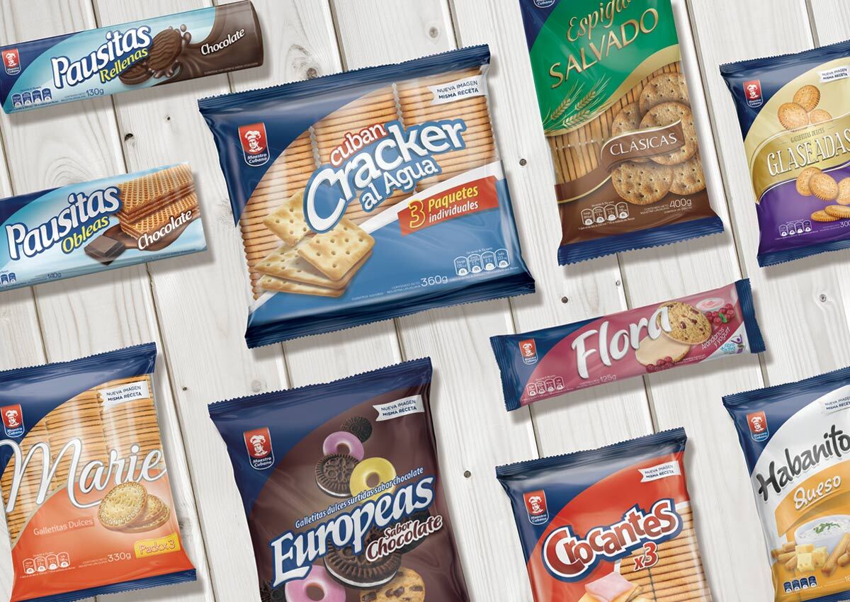
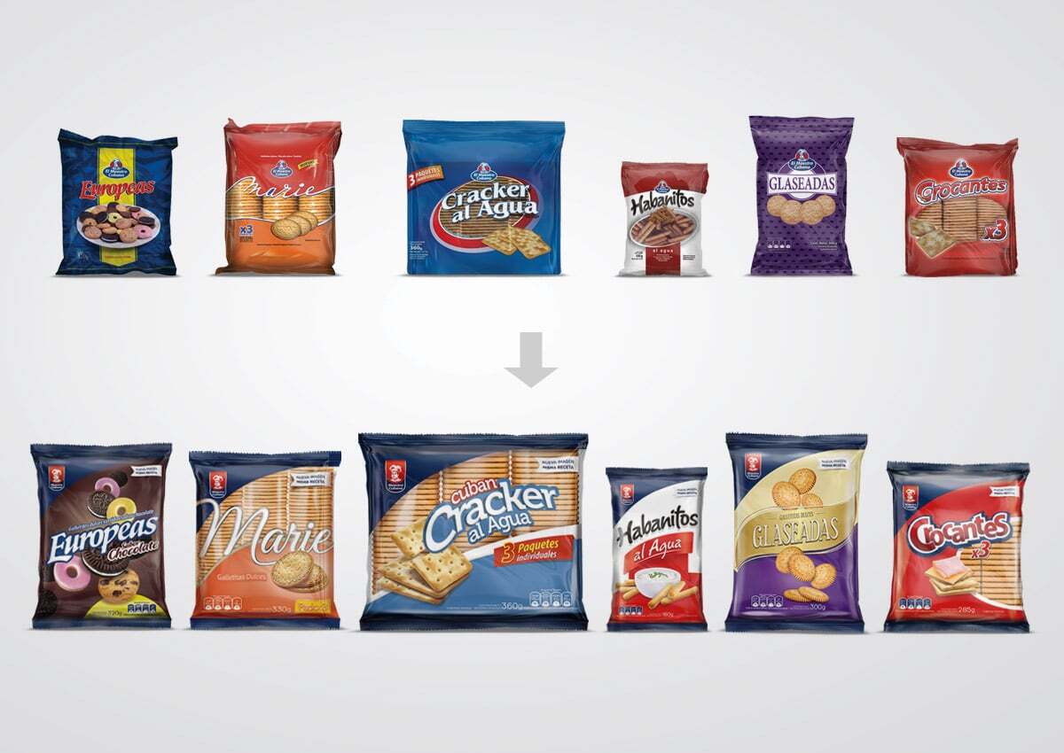
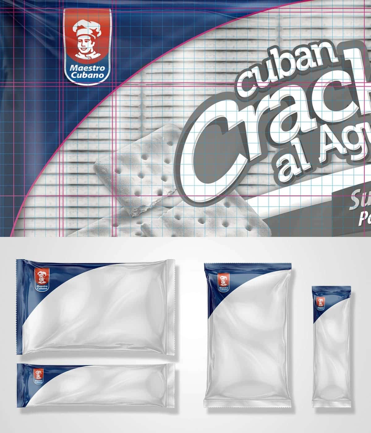
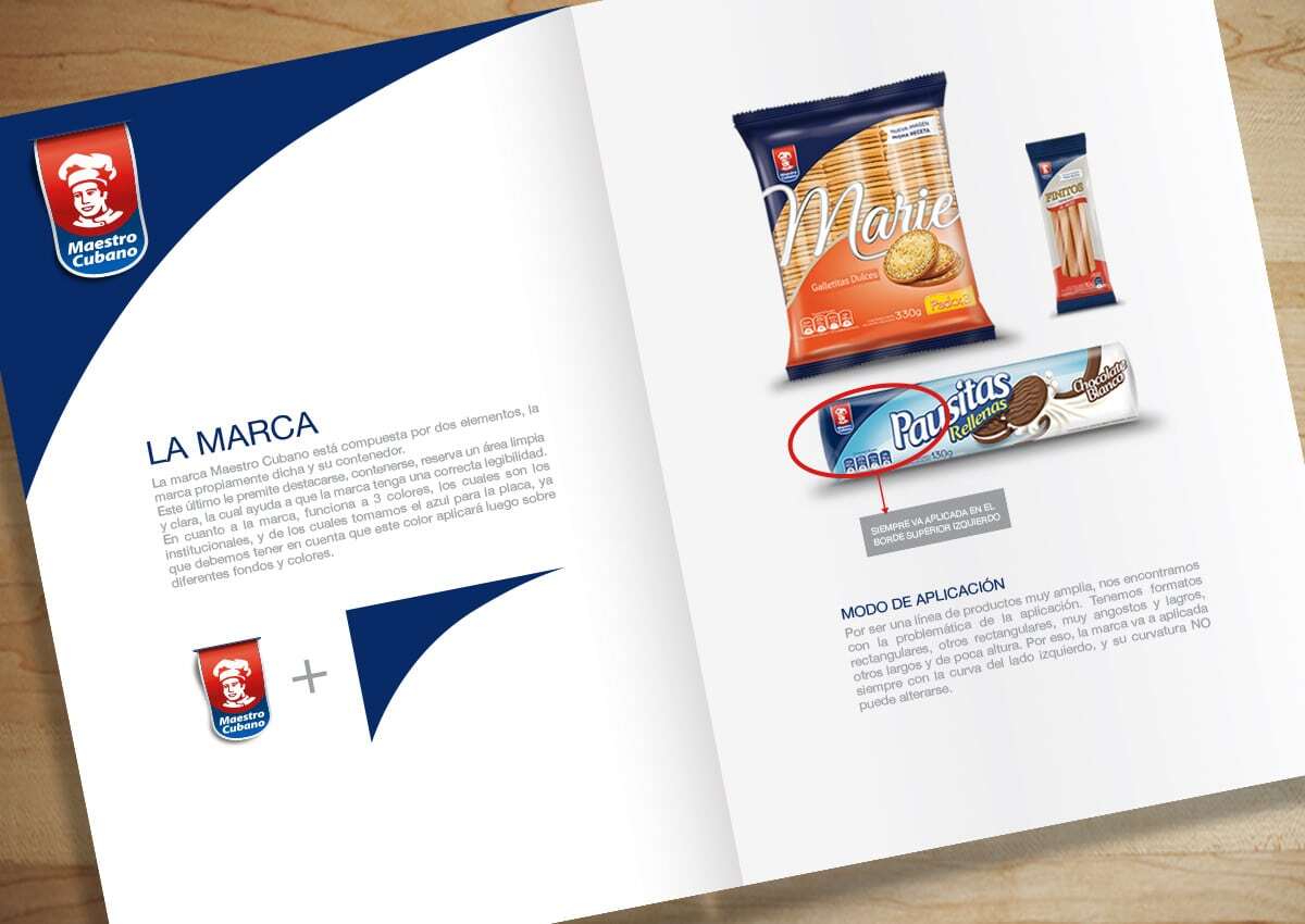
The Uruguayan Bimbo brand, Maestro Cubano, hired us to organize the architecture of it cookies and crackers product lines, seeking to be more unify, in order to become a stronger and more recognizable brand. Focused on solving the brand architecture, we analyzed the differences in the Maestro Cubano packaging applications, posing as a solution the creation of a brand module, that could flow down the line, unifying it and making it cohesive, allowing as well optimum stand out, logotype legibility and contrast between logotypes. To complete the transformation, we worked in the packaging design and branding of each of the products to make them more modern, highlighting palatability in each case and differentials of each of the products.
Imaginity | Design Agency | Branding, Packaging Design, Marketing
cookies The Challenge
The primary challenge was to reorganize the brand architecture across all cookies and crackers product lines to transform it into a stronger, more unified, and more recognizable brand. We needed to resolve inconsistencies in packaging applications to improve brand impact, legibility, and in store presence.
The Solution
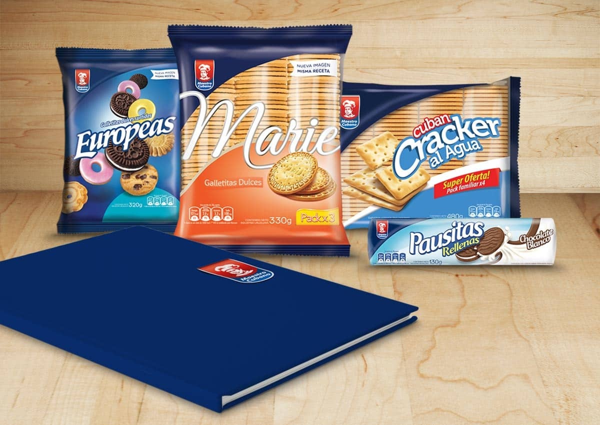
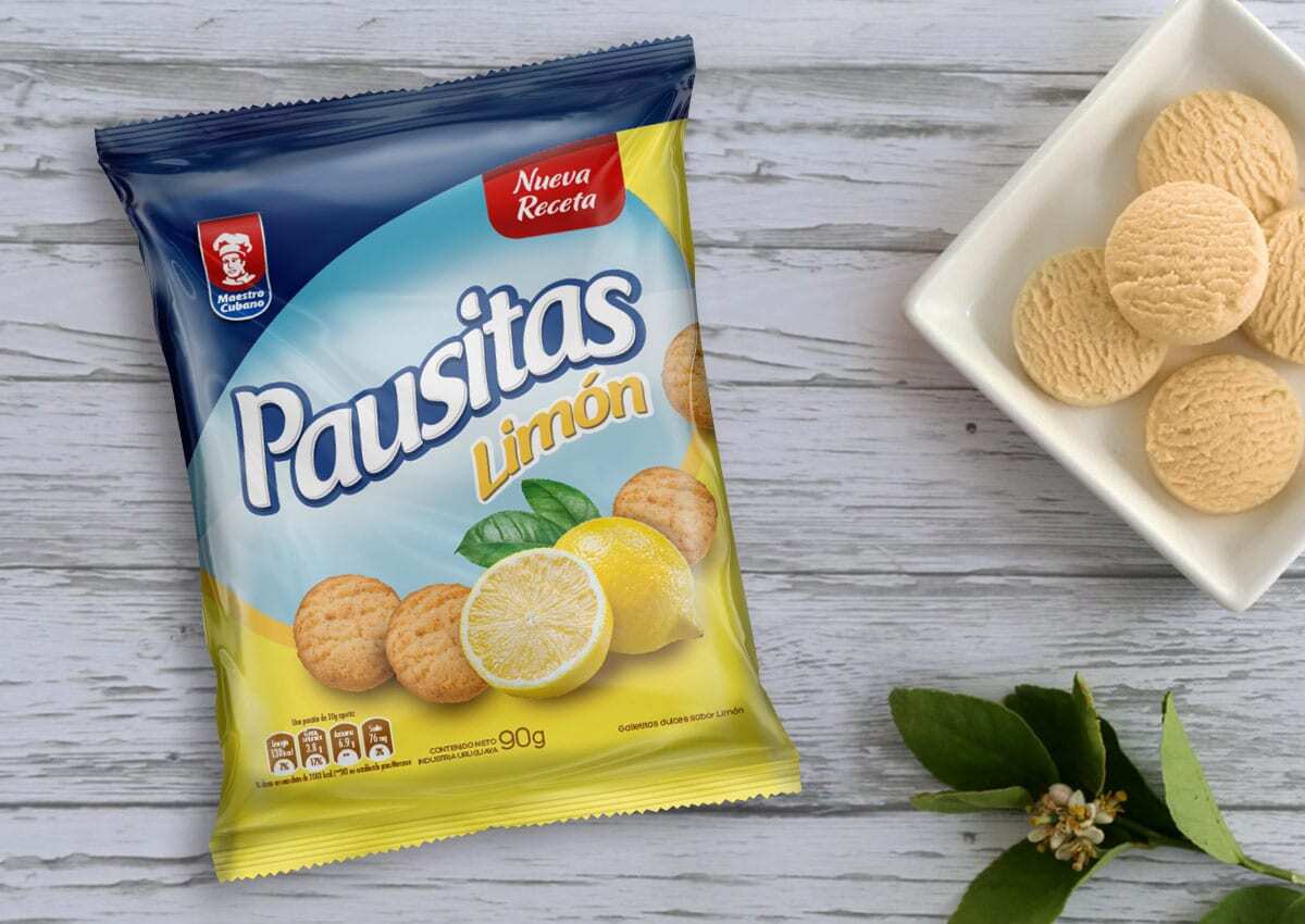
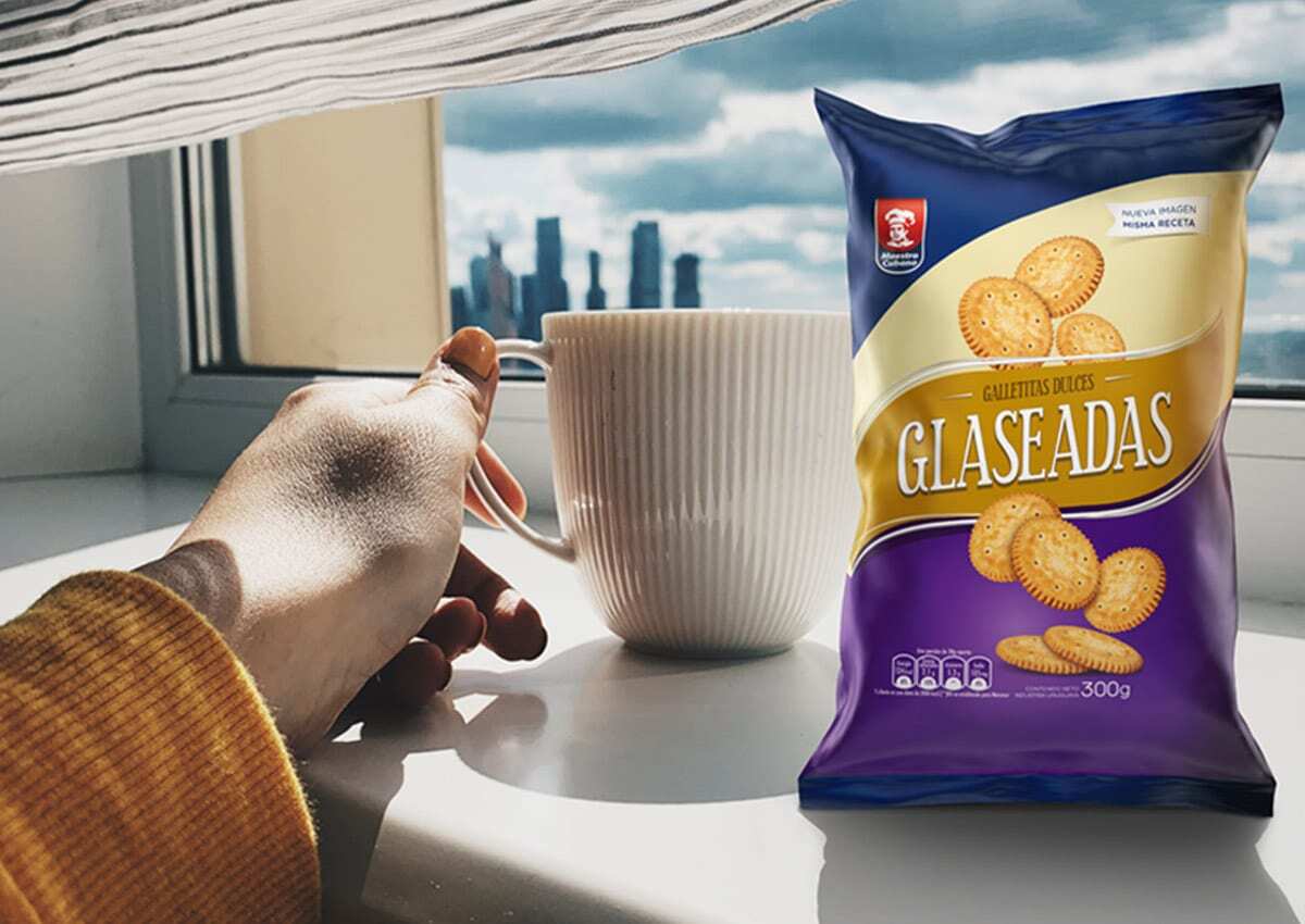
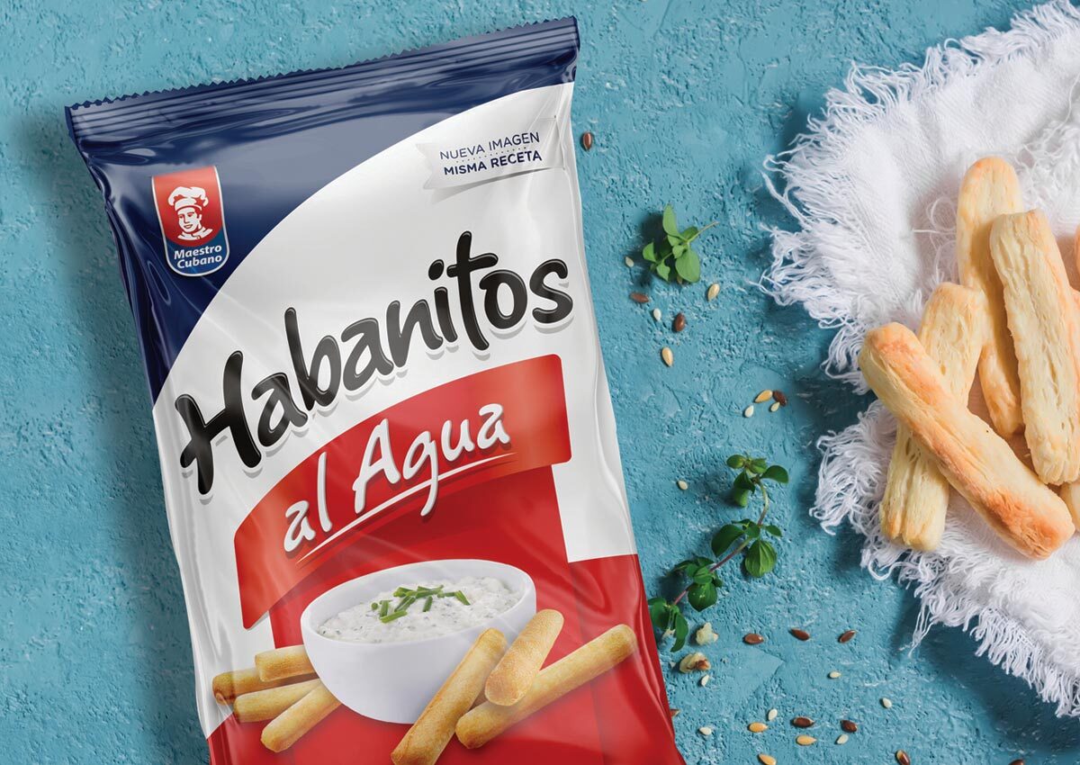
We conducted an in-depth brand analysis to create a cohesive visual system that would allow for a harmonious visual identity across the entire cookies portfolio. Our strategic approach focused on creating the Brand module. We designed a brand area that runs through all products and unifies all lines, ensuring optimal visibility and superior legibility and contrast of the logo in various formats. We refreshed the brand image and design of each product, integrating them under a single visual narrative while respecting their individual characteristics. To complete the transformation, we improved the packaging design and branding of the products to highlight their appeal and the unique characteristics of each item in the Maestro Cubano family.

The Results
The strategic intervention successfully transformed Maestro Cubano into a cohesive and powerful brand. By establishing a clear brand architecture system, we eliminated visual friction and significantly strengthened shelf standout. The result is a revitalized identity that blends brand heritage with a modern aesthetic, improving consumer navigation and consolidating its market leadership in Uruguay as a unified, high-trust brand.
