Packaging DesignClient:
Kotex
Country:
Latam
Task:
Kotex Evolution. Naming, Branding, Packaging design, Product design
We revolutionize feminine care
Imaginity global design agency worked with Kotex Latam to redefine its brand identity and packaging design for the feminine care category in Latin America. The objective was to create a bolder, more modern expression that connected with today’s women — confident, authentic, and free from traditional stereotypes.

The Challenge
Kotex aimed to reinvent its image in this packaging design category, breaking away from conventional representations of femininity that had shaped the category for decades. The brand visual identity needed a new image that felt contemporary, empowering, and more in tune with the mindset of modern women.
The Solution
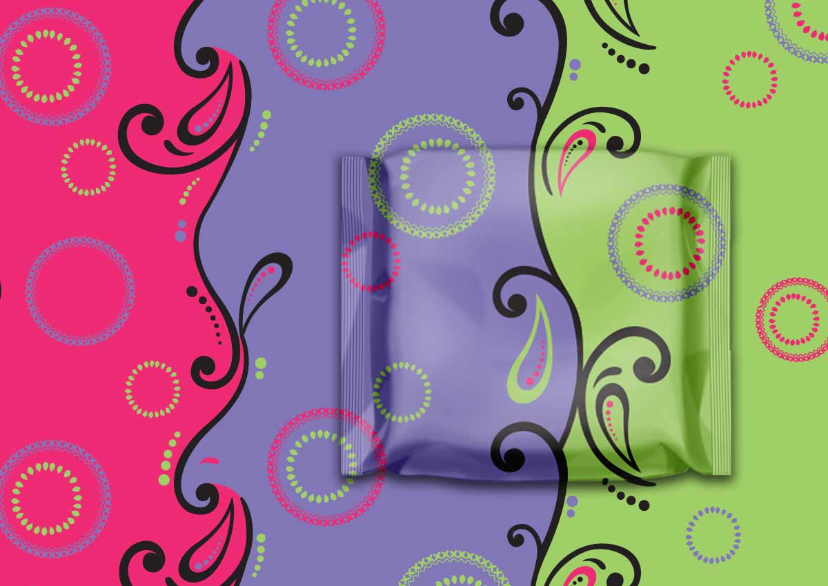
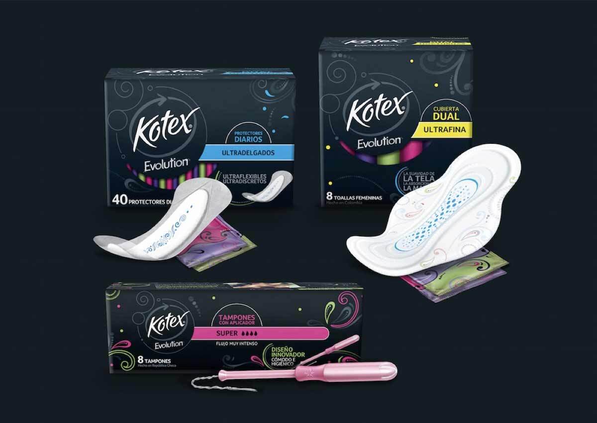
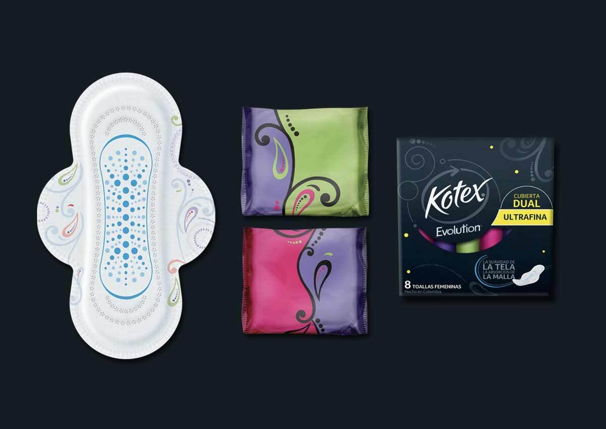
Imaginity reimagined femininity from a fresh, modern perspective with a new storytelling. Black became the signature brand color — strong, elegant, and distinctive — contrasted with bright, saturated accents that added energy and vitality. The new visual language was clean, dynamic, and forward-looking, capturing the confidence and individuality of the new Kotex woman.
Leverage the power of packaging to communicate the brand and its values, and its evolution alongside consumers.
The Results
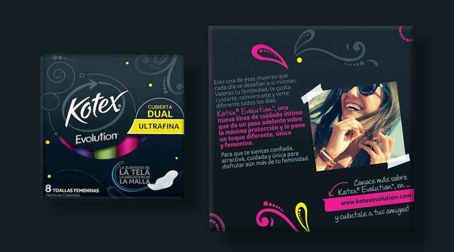
The new design marked a radical shift in the category, delivering a bold and disruptive look that immediately stood out on shelf in store. The brand achieved a stronger emotional connection with consumers and positioned Kotex Evolution as a symbol of empowerment, modernity, and authentic self-expression.
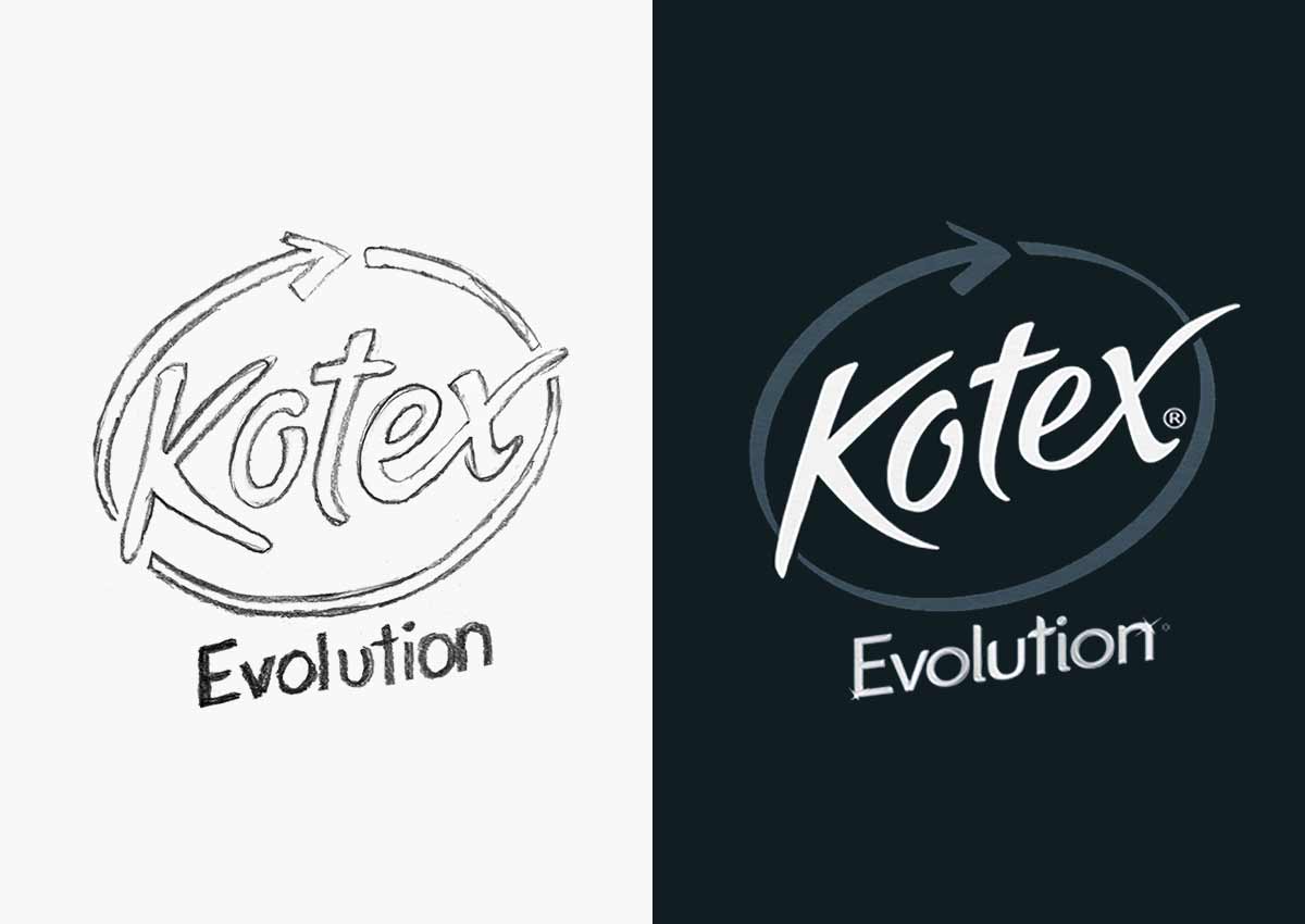
A new Branding
were the first step in the project. We worked on the Kotex logo to create the evolution sub-brand. A luxurious, premium brand that communicates the femininity and performance of this new line.

Feminine, premium, and innovative
We created the naming for the Evolution sub-brand and designed its logo — a sub-brand that conveys performance and quality while visually aligning with the brand’s new, modern style.

A new premium line, elevated through design
Black takes the lead, becoming the defining color of the line — a symbol of sophistication, confidence, and premium appeal within the feminine care category.

Functionality with style
A design that combines the product’s performance and reliability with a bold, stylish look — perfectly balancing function and fashion.
