Client:
Go Mate
Country:
England
Task:
Naming, Branding Branding, Packaging Design
A naturally intelligent brand
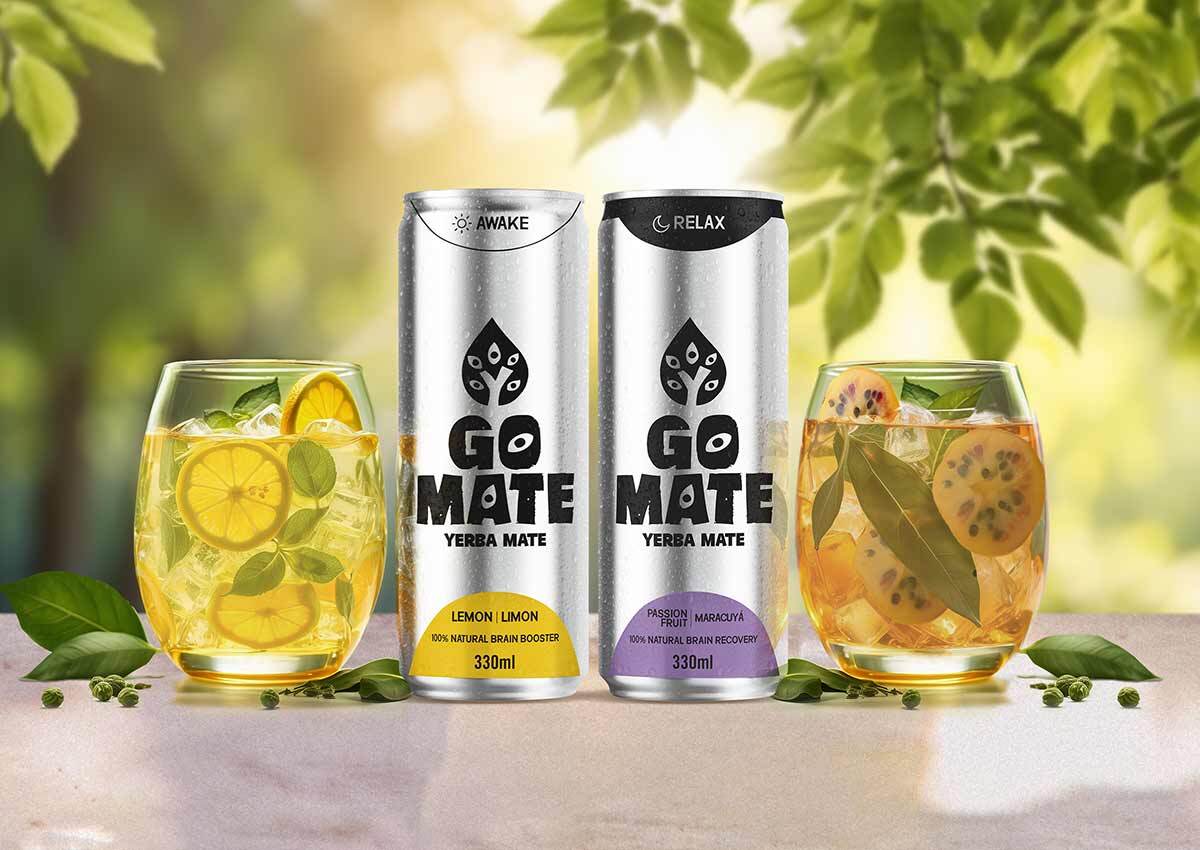
At Imaginity we worked building the naming, branding and packaging design for the for GoMate England, a new natural energy drink, based on yerba Mate, specially designed, to enhance the brain performance. A brand that combines the world of nature, yerba mate and energy, good performance and the sharpness of the senses. A vibrant and unique packaging design, a strong and natural brand.
Imaginity | Design Agency | Branding, Packaging Design, Marketing
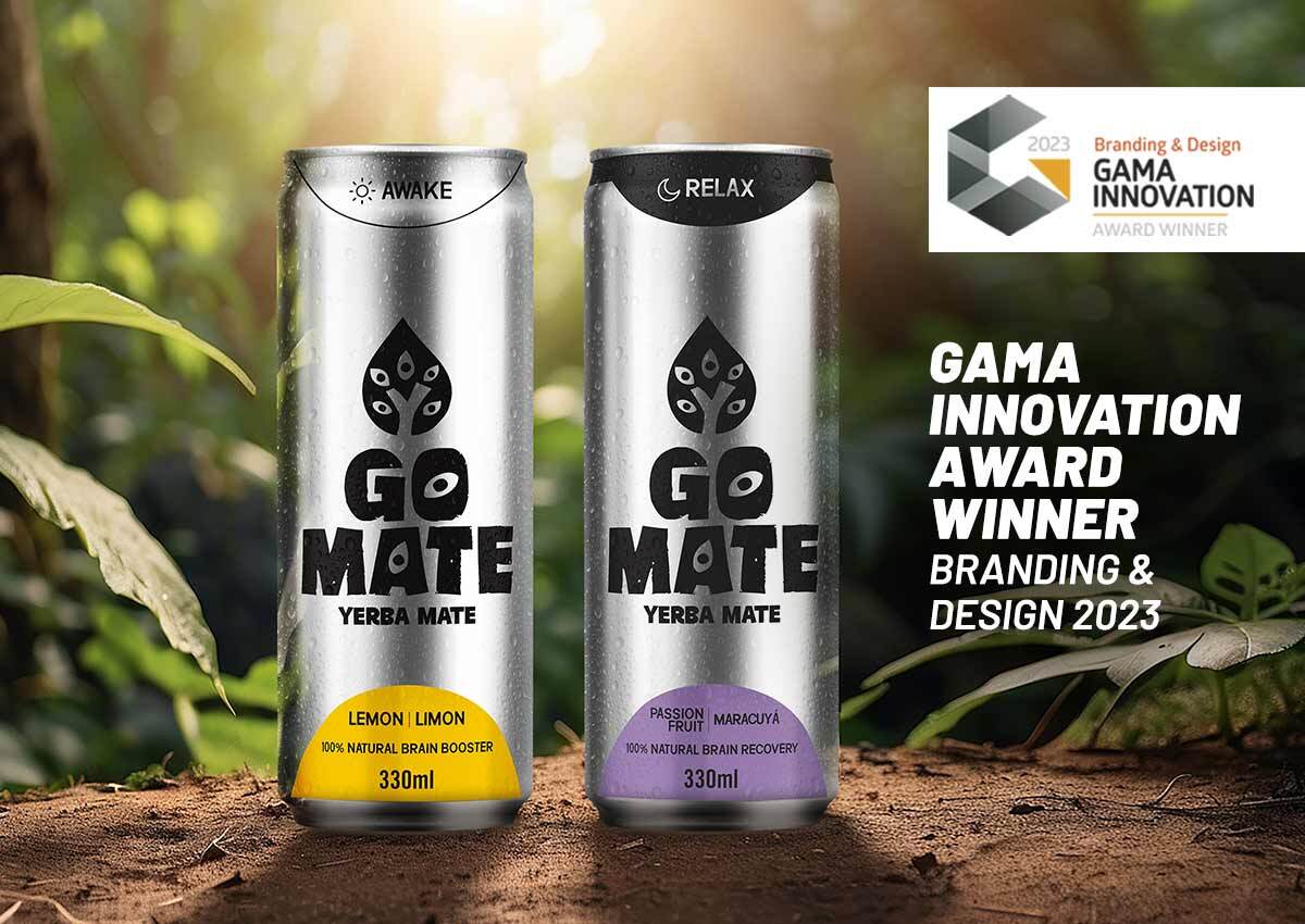
An award-winning design recognized by the Gama Innovation Awards.
The Gama Innovation Awards celebrates outstanding innovations from across the world identified by Gama from many thousands of new product launches over the previous year. And the expert judges, that act as the judging panel, come from some of the world’s leading names in Fast Moving Consumer Goods (FMCG).
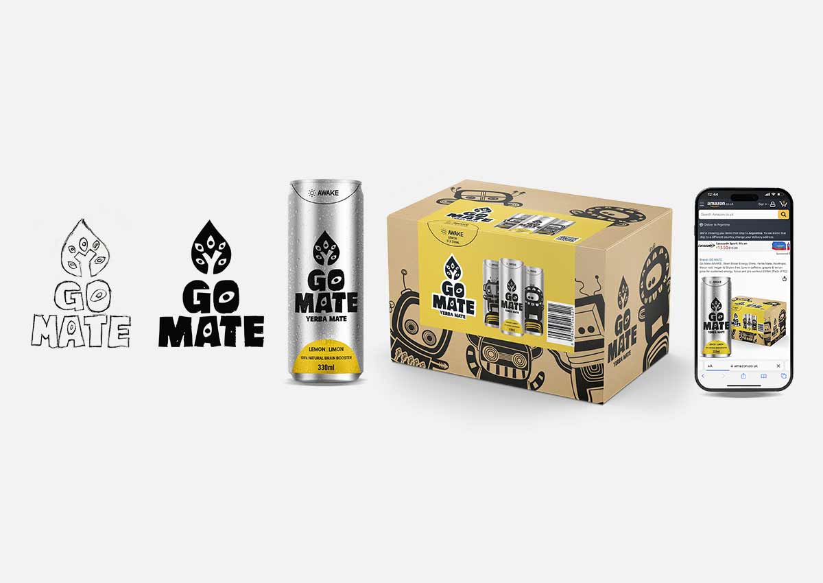
From skecth to reality
At Imaginity, we have honed a work process, drawing on our vast experience as a design agency, to deliver the most innovative and effective design solutions. Central to this process is the invaluable stage of hand sketching.
The branding designed for Go Mate includes elements that speak of nature, such as leaf shapes, as well as eyes, which speak of awakening, activating, and enhancing the mind.

The challenge: Create a new brand. Naming, branding, and packaging design
Design a visual identity that communicates the values of Go Mate while standing out and differentiating it from other energy drinks. The identity should reflect both performance and naturalness, and clearly communicate the two varieties: Awake and Relax.
The Solution: A unique design
A unique name that communicates the essence of the brand.
A branding that represents the brand through a distinctive typeface and an isotype that combines a leaf to convey naturalness and an eye to express the performance aspect.
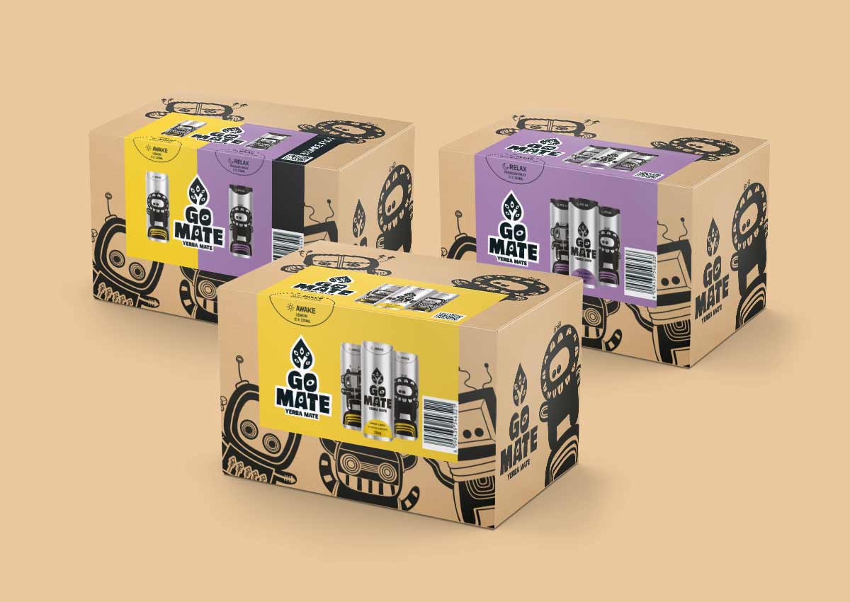
A brand whose architecture is based on the coding of its two varieties: Awake and Relax. A fixed coding area on the line is responsible for communicating them in this product line architecture. With Awake identified by its silver color and a sun, and Relax by the color black and a moon.
A packaging design whose silver background makes it stand out and differentiates it from the rest, combined with its clean and memorable language.

The results: A unique packaging design
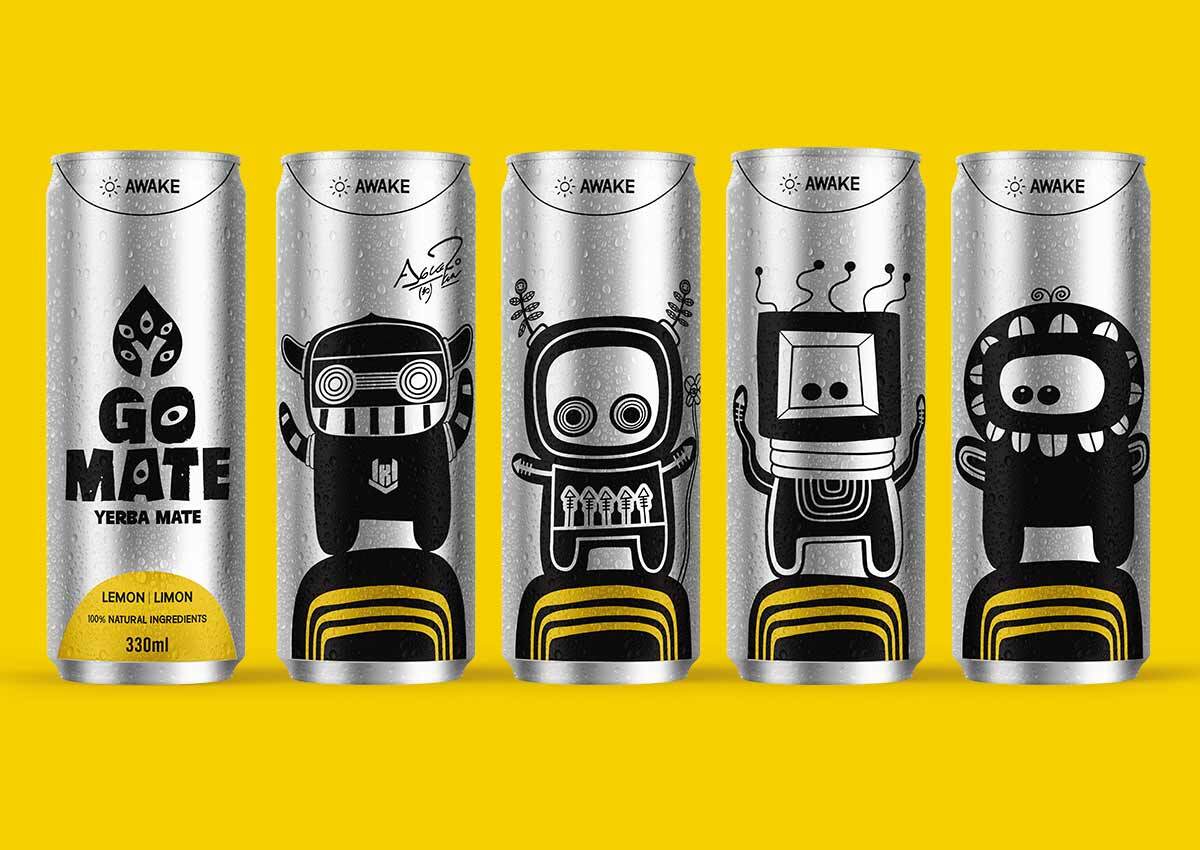
Combined with the front design, the backs of the cans help tell and build the brand's storytelling. Each can features a different, specially designed character, with personalities and elements that communicate the brand's values and distinctive features.
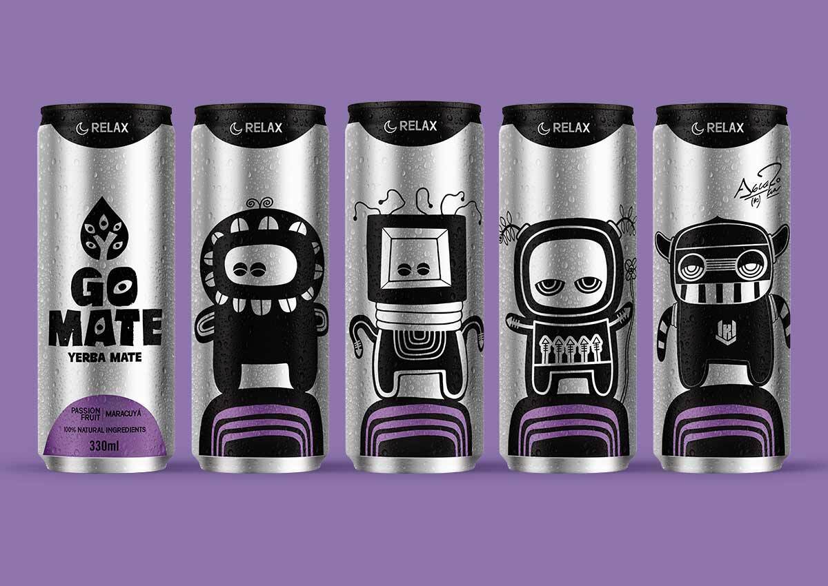
Custom characters
Created specifically for the brand, unique, and developed with a visual language that connects with the brand’s values.
The Relax characters have a different attitude from the Awake ones, illustrating the concept of this variety: serenity, balance, and recovery.
We create brands in a holistic way
We developed the brand from the ground up, using a variety of communication formats to build it in a cohesive and impactful way. This strategic approach ensures strong brand recognition in store and a clear, consistent identity across all touchpoints.

Kun Agüero, the brand ambassador
We also designed the limited edition of Kun Agüero, a renowned Argentine soccer player, who chooses Go Mate.
Imaginity is a packaging design agency specializing in beverage branding. We help emerging and established brands create distinctive packaging that communicates product benefits, builds recognition, and supports growth in competitive markets.